#I wanted to keep it simple. no blending. one gif dimension. not thinking too much about which font to use. just plain and simple
Explore tagged Tumblr posts
Text


#only friends the series#oftsedit#first kanaphan#khaotung thanawat#boyslovesource#tusersilence#tuserhidden#esmetracks#vishingwell#userrlana#zeystuff#gif: ofts#I wanted to keep it simple. no blending. one gif dimension. not thinking too much about which font to use. just plain and simple#its just a little silly fun set which I hope isn't out there already somehow because I didn't search beforehand#like its so silly that I even laugh at this set dksfhskh
253 notes
·
View notes
Note
I was wondering if you could do a tutorial on this gifset that you did i really like ittt
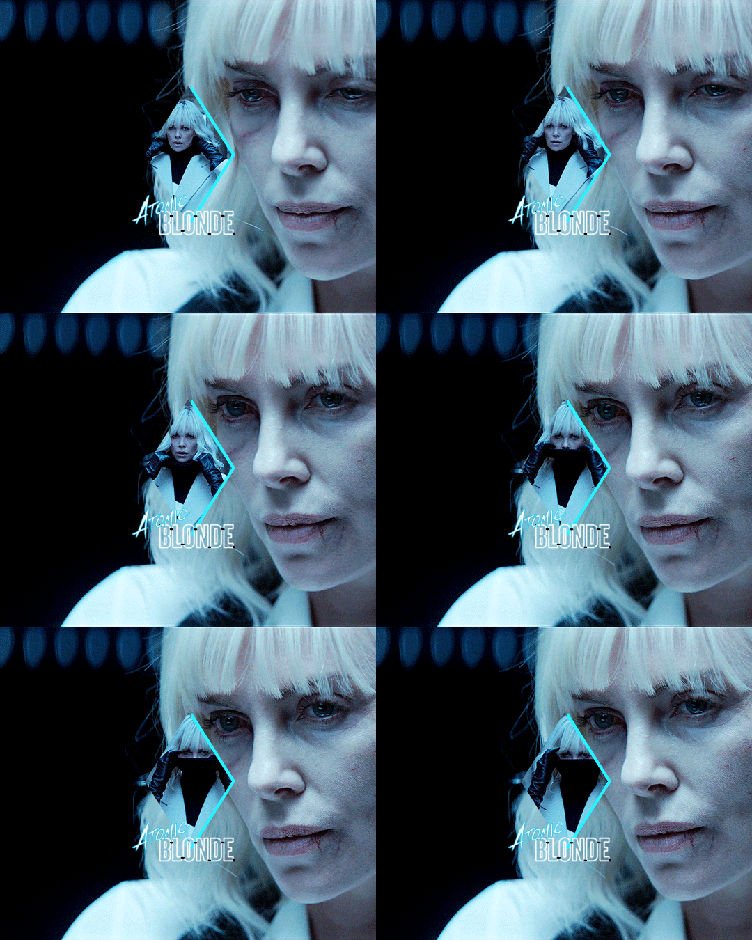
Thank you for sending this in, anon! I’m glad you liked it and wondered how it was made :) Fun fact: the day before you sent this, I had just started working on my next set in that “Select Filmography” series. I hope you like that one too when it’s ready!
I think I should start by saying I’m pretty new to giffing myself and there might be more efficient ways of getting to the same result. However, the point here is to show you the process I went through to make this gifset and hopefully help you understand how to make a similar one.
To follow this tutorial, you will need some version of Photoshop and some giffing knowledge. I know there are multiple ways of making gifs so I’m just letting you know I’m using the timeline and the “Convert for Smart Filters” option (I don’t really know how else to call it).
Now let’s get started!
STEP 1 - CHOOSE THE SCENES
It might sound obvious but, in my opinion, this is the most crucial step. It’s also the one that takes the longest (along with step 7, aka the coloring).
At this stage, you need to have a general idea on how you want your set to look like so you can choose the scenes accordingly. In my case, I knew I needed two types of shots for each movie: one close-up for the main gif and one mid shot for the shape. I also needed to take two other criteria into consideration: the movement (because of the shape) and the lighting (because darker scenes are such a pain to color). Last but not least, I didn’t want the characters to be talking (but that’s just a personal preference).
With all of that in mind, you can start saving a few screenshots of scenes that meet your criteria (or at least some of them). In the end, there won’t be that many to choose from so be prepared to make compromises.
STEP 2 - MAKE A DRAFT
Now that you’ve preselected a few scenes, you can make a first draft. This will help you turn your general idea into something more concrete.
Basically, this is your opportunity to organize your thoughts. What size do you want your gifs to be? What shape are you going to use? On which side do you want the close-ups to be? Do you want all of them to be on the same side or do you want to alternate from one gif to the other? Do the scenes you chose work together (gif-wise but also set-wise)? Are you happy with the way it looks, overall?
By answering all of the questions you might have now, you’ll save yourself a lot of time, trust me. Of course, you can totally skip this step if you already know exactly which scenes you’re going to use and how you’re going to present them together.
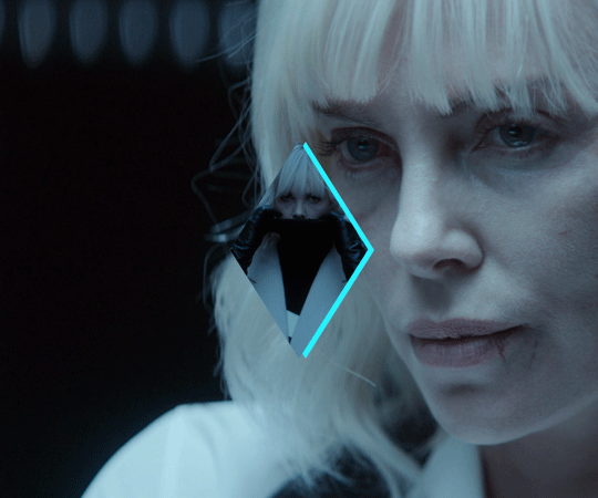
To give you an idea, this is what my draft looked like for Atomic Blonde.
STEP 3 - PREPARE YOUR GIFS
Once you have a clearer view on how you want your set to look like, you can finally start giffing like you usually would (i.e. importing, cropping, resizing, etc.).
It should then look something like this.
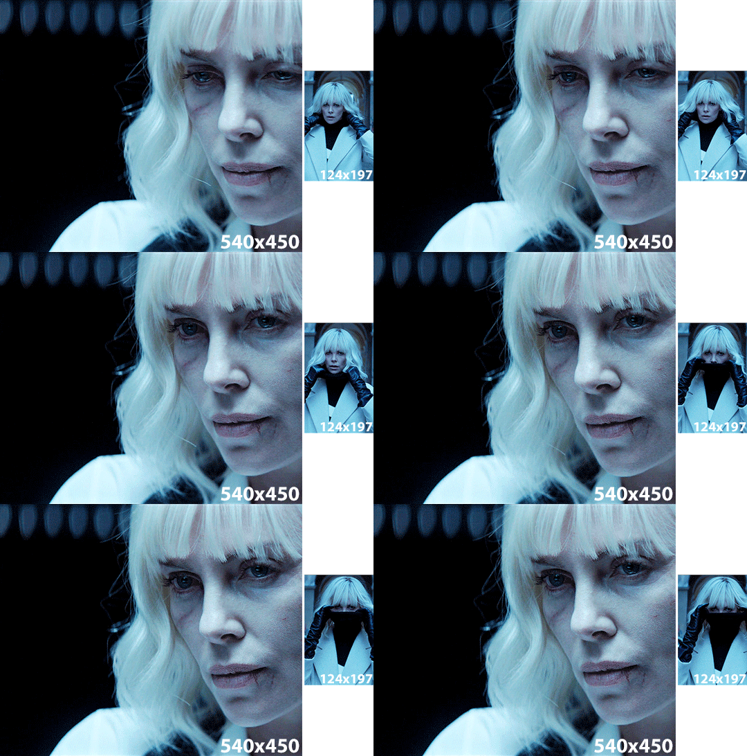
The important thing to mention here is that you want both of your gifs to be the same number of frames (32, in my case).
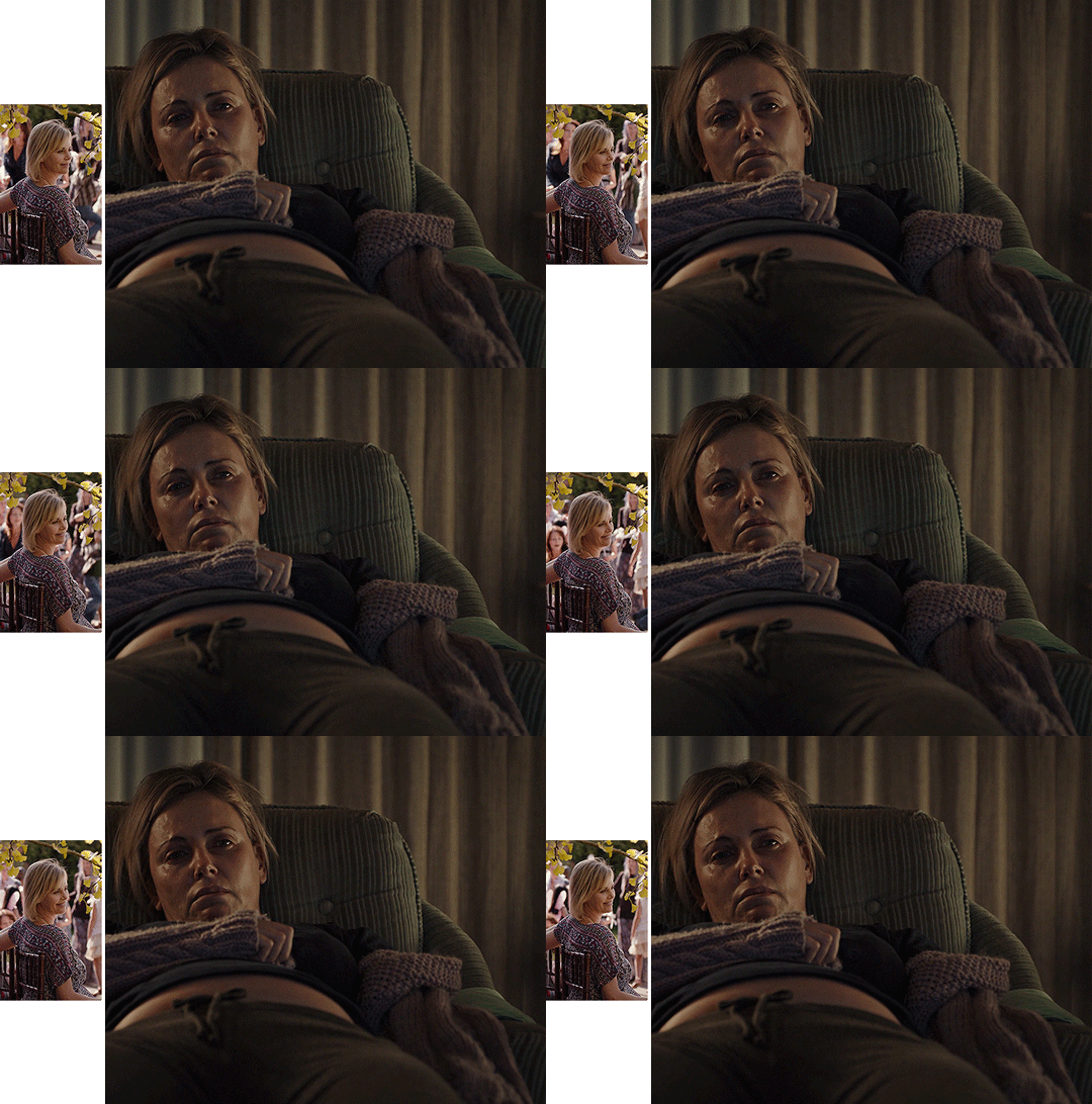
Ideally, you should also aim for the ~same~ coloring (especially for the skin tone, since both gifs will be so close to each other). This bit is particularly difficult when you chose scenes which have opposite lighting (see my two uncolored gifs below). Remember how I insisted on steps 1 and 2? It was to help you avoid this. So my advice would be not to choose these types of contrasted scenes, unless you can’t do otherwise and you’re ready to suffer!
STEP 4 - MAKE YOUR SHAPE
To make your shape, you can click right on the Shape Tool (U) and select the last one, Custom Shape Tool. From the Shape menu appearing on top, you will be able to choose the shape you want from the drop down list and start drawing on your gif.
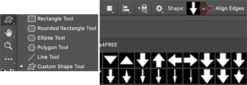
To be more precise with the dimensions, you can manually adapt the length and height from the Shape menu itself. I decided to go with the same ones as my gif.
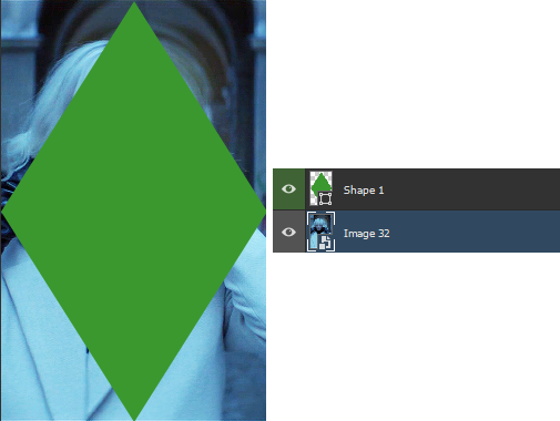
Once your shape is positioned like you want it to be, you can drag and drop the shape layer under your gif. Next, you will have to click right on the gif layer/smart filter and select Create Clipping Mask. The result is as below. Note that if the size of your shape was smaller than your gif, you would still be able to reposition your gif with the Move Tool (V).
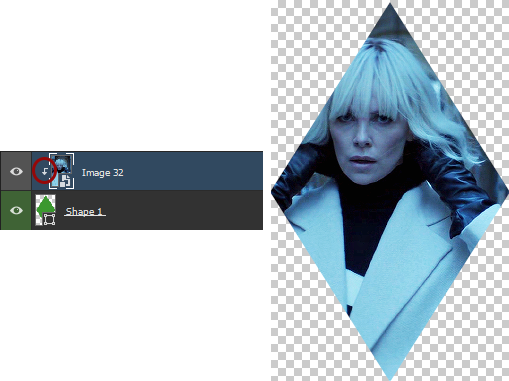
You can now export your shape gif, reopen it in Photoshop and convert it again to the video timeline and to a smart filter. This is where I’m not sure it’s the most efficient way of doing things but it’s the only way I found to keep the coloring of each gif separate. I also find it easier to work with a smart filter.
STEP 5 - COMBINE YOUR GIFS
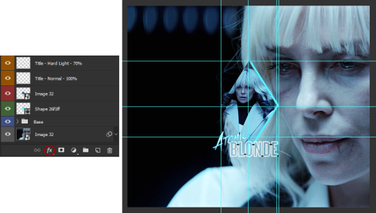
To add your shape gif to your main gif, you can simply click right on the shape gif you just reopened and select Duplicate Layer. You can then choose the project which contains your main gif to duplicate it in there. Now go to your main gif and reposition your shape gif where you want it to be (how many times did I say gif here?). Finally, you can draw a new shape, using the same dimensions as in step 4, reposition it and choose any color you want from the Shape menu.
Since you will be repeating this process with your following gifs, I suggest you add a few guides so you know exactly where you should place everything to make all of your final gifs look the same.
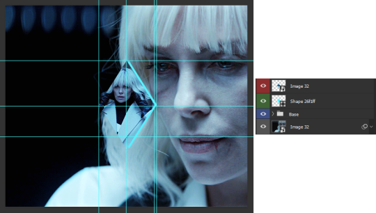
(In case you’re wondering, the “Base” folder contains my adjustment layers/basic coloring for the main gif.)
STEP 6 - ADD THE TITLE
This step is pretty simple: go on the web and type “[name of the movie] title”. Download the png you like most, open it in Photoshop and resize it to a length of about 150-200 pixels. Next, duplicate the layer to your main gif and reposition it. In case you need to resize it again, select the title layer and go to Edit > Free Transform (Ctrl+T).
This is optional but in case you want to change the way it looks, know you can always duplicate the title layer and play with the blending options (see below). The good thing with a png is that you can also add some effects by clicking on the “fx” button.
STEP 7 - ADD COLORING (OPTIONAL)
To be honest, I had not planned on coloring my gifs. But I had already spent so much time on them and I was still unhappy with the way they looked. I mean, see how grey-ish they are? Not great...
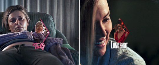
So the only thing left for me to do was to add some colors. Now, since coloring is worth a tutorial on its own and it already exists, I suggest you read through becca’s mega coloring tutorial (and especially steps 3 & 5). Seriously, shoutout to her for making this incredibly useful tutorial. She is so talented and I love everything she makes!
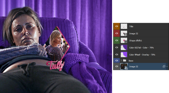
My Atomic Blonde gif barely even needed coloring so I’ll show you what I did for my Tully and The Old Guard gifs.
For the first one, once I had found which colors to use with which blending option and opacity level, I only had to remove the colors from the left side of the gif because there was barely any movement in that scene (phew!). For the second one, on the other hand, I decided to color frame by frame because there was way more movement, in comparison. This is quite a tedious process, which is why you want to limit yourself to a certain amount of frames.
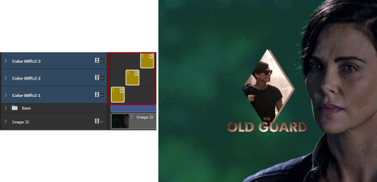
I’ll conclude by saying there are so many things you can do with coloring and what works with one scene might not work with another. So experiment with it: try different colors, play with the blending options and opacity levels, add some gradients and/or gradient maps, etc. Just know it will take some time to get to a somewhat satisfying result!
And that’s it... I hope this tutorial made sense and was somehow helpful. Of course, don’t hesitate if you have any questions! Also, if you do end up making a similar edit, pleeease send me the link or tag me in the replies or something ‘cause I would definitely love to see it!!
#asks#anonymous#tutorials#resources#completeresources#allresources#itsphotoshop#putting all of this process into words took so long i really hope it makes sense#also i can't help but wonder if it was my before/after post which prompted this ask...#gifs#gifs: tutorials
372 notes
·
View notes