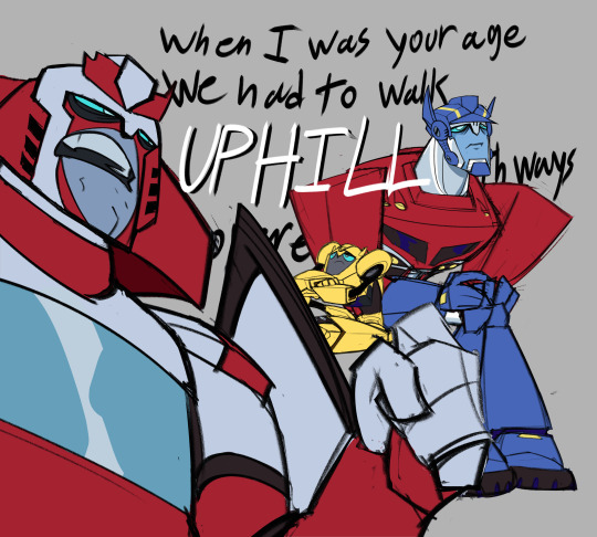
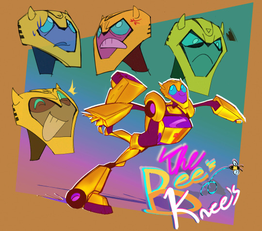
#I use bright colors to distract you from my poor understanding of anatomy
Explore tagged Tumblr posts
Text
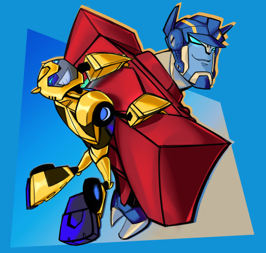
I like this cartoon. It lives on in my heart
#transformers#optimus prime#bumblebee#tf animated#tfa ratchet#tfa bumblebee#tfa optimus prime#tfa prowl#i love prowl... no really!#I use bright colors to distract you from my poor understanding of anatomy#did it work?#dadimus prime...#I have sooo many sketches#but we can save those for later#plz enjoy
3K notes
·
View notes
Note
i would love love love to know more about your creative process. i'm going to school for fashion and design and sketching in general has always been a struggle and i just wanted to pick your brain to find out how your process works
Since you’re in fashion, I’ll focus this to costume design so it’s applicable to you!
Sketching was very difficult for me in the beginning too. Things that would take others 5 minutes would take me 30. In retrospect it was because I didn’t have the visual vocabulary to determine what was cool and what wasn’t, and my drawing skills were poor. To fix that, I wound up doing a lot of research. A LOT. I have an entire sketchbook of costume drawings from ancient Egypt to 1990s fashion. Some examples, and you can see more detail of these at my website:
(These were done a few years ago, so please forgive the poor anatomy).
I don’t have the time to manually draw references anymore, so what I do now is just clipping a bunch of images through Evernote and creating a reference board from there. This was one of the notes for Esmeralda:
2. Determining the line of action and the focal point. This also ties a little into research. I study a lot of Yoshitaka Amano’s work, and his composition usually has one or two lines that make the composition pleasing. The same goes for costume design. You don’t want to over-design and over-detail every part of the costume. Look at a costume that you love, and rationalize why you love it using focal points and the line of action as your stepping stone.
… ugh okay, let’s just talk about the new Power Rangers movie and an example of (imo) poor costume design. These are their costumes.
The focal point is usually the point with the highest contrast. As a result, you want to put your focal point in places that have the most expression - the face, hands, maybe the feet if you’re being very active. For Power Rangers, these points are extremely important, since they do a lot of flashy fighting.
Only the chest is the brightest point on these costumes, and it’s so bright to the point where it’s taking away the focus from the helmets. And then you have all these minute secondary detailing along the abdomen and thighs, which isn’t bold enough to make a statement based on how thin these lines are, but distracting enough that it’s also taking away focus from the places that matter - the face, hands, feet. The detailing along these places equal the amount of detail the helmets have.
The line of focus should lead your eye into the points that matter. Ignoring the bright chest piece, the glowing lines lead your eye down the abdomen and around the thighs, which then abruptly stops at the knee. ?????
Let’s look at the older costume design from the first movie.
A bit cheesy because of the shiny latex, but it works. Hands and feet are clothed in white (the white ranger bands his with gold instead) to contrast with the colors they wear. This is particularly evident on the Black Ranger, and he’s still visible here despite it being a darkly-lit scene. In the previous image, he practically disappears into the background because there’s no contrast on anything besides his chest.
Their helmets are the most detailed of the costume, and are black, white and their power ranger color. The three colors and detail add focus to their face. If you look closer there’s some stitching and design around the abdomen, but it’s not competing with the focal points.
They also have a very simple repeating shape: the diamond. I find it particularly brilliant that they offset the diamond on the chest a tiny bit upwards, so it functions like an arrow, pointing your eye towards the face. There is no detail to compete with below the chest piece, so your eye lingers on the top half of their body, before moving on to the other high contrast points like the legs and hands.
^ So that is something I try to do regularly. If I have a reaction to a costume, I take the time to understand why I am reacting to it the way I do. It trains me to identify my preferences, which I put into the designs I create. My process might be too analytical, but I started off with a BA in Psychology, so this was what was comfortable for me. Others have a more organic way of thinking, so it really is finding out what’s suitable for you!
3. Finally actually drawing. This is something I still struggle with - don’t obsess over making a drawing perfect. In my drawings I used to do an underlay with a light marker, and I would literally soak the entire paper in marker fluid because I was afraid to commit to it. I don’t do that anymore. If it’s bad, it’s bad, and I just have to keep moving on to the next drawing. For this, mileage is the only solution and there really are no shortcuts.
Good luck with school, and thank you for letting me share my process!
121 notes
·
View notes