#I think my style is on like... a cartoony to more rendered scale
Explore tagged Tumblr posts
Note
i stumbled upon your dibs and i love them so much so i get to your page and BAM chucklefuck dungeonmeshi i love love loooooove the clarity of your style and the balance of detail and your character design and you draw those two in a way where i want to squish them like a squeaky toy. Thank you
xhjdsjdsflh hehe lmao thank you man!! I'm happy you like them!!
#I think my style is on like... a cartoony to more rendered scale#where it depends on my mood an the feeling I'm trying to get across#ask#answered#anon
11 notes
·
View notes
Text
a retrospective of my art of 2022
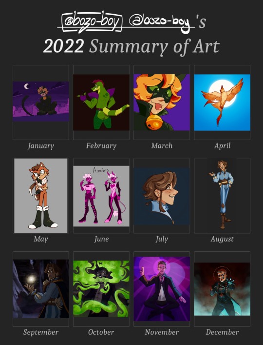
i love that you can tell what i’m hyperfixating on judging by the art. more detailed explanations below the cut!
january
i started off 2022 with a redraw of a piece from april of 2021. for christmas of last year, i got an ipad and apple pencil, so this was largely me exploring procreate and the feel of a new way of drawing. there’s a lot about this one that i still like, particular chat noirs cute lil face, but there’s so much i would do differently now that i’m more comfortable with the medium.
february
i was still finding my footing with this one. i was really into fnaf, and naturally, monty. the shine on the ass was using one of the in-app stamp brushes, which was quite fun to play with. honestly, going back, i would just add more depth and complexity to this one. i stand by the bones of this one.
march
this one was done so i could have a fancy new pfp. to be completely honest, i’m not a fan of this one. it’s a redraw of a screenshot from the show itself, and even at the time i was unsatisfied with how this turned out. in retrospect, i would’ve started the sketch small and then scaled it up so it would look a bit more,, normal. i find my art comes out much better when i start small.
april
this drawing is for a worldbuilding project i like to work on when i’m not obsessed with anything else at the time. in this world, there’s a city with a whole festival for phoenixes, and a legend involving a raven falling in love with the sun, but i won’t get into that right now. if i’m remembering correctly, one of my references for this one was a swallow. i still like the way the sun shines through the feathers and the more painterly style. i still stand by this one 100%.
may
oh boy may. this was when my apple pencil broke, and lined up with me getting into sonic, after watching the movie. one of my friends sent me a picrew, birthing this little nameless character. i’m still quite happy with this one, i think i got the style really good while still making it a little bit my own. my short lived sonic hyperfixation is still visible in the way i draw eyes while sketching, which i think it pretty neat. i wonder if, had my apple pencil not broken, i would’ve gotten more into the franchise.
june
AHHHHHH. sorry, this is from when i got back into a set of my ocs, affectionately dubbed “the sin boyz”. they’re all based on the seven deadly sins, and this is asmodeus, embodiment of lust. he’s definitely the most fun to draw because of him being quite high energy, and i’d love to come back to these characters once again. i don’t have much to say about the drawing itself, other than still liking how cartoony it is.
july
i’m not entirely sure what sparked this, but i got really back into the arcana, a game which i’ve been into for years now. this little fella is my character for the game, named zephyr! this piece is actually based on a sketch from i think a few months earlier. i still like this one, with his cute little face. i adore how his eyes turned out, and i’d love to try returning to that style, even just to experiment.
august
this is actually a reference photo for zephyr, but i wanted to fully render it to try to demonstrate some of the fabric textures. i still adore just about everything about this, aside from how his face turned out. i’ve always struggled a little with placing eyebrows too close to the hairline, dating back to my art from when i was like,, 12, where the eyebrows would actually float above the head. aside from that, i still love this.
september
when i made this, i was actually rereading lucio’s route (i’m obsessed with it in a train-wreck way) and found the imagery of the player investigating his abandoned room super compelling. the background from this is actually from the game itself, which is something i had never done before. i even slightly edited the background the reflect some of his magical light! this one is much less colourful and saturated than my other stuff, and i have mixed feelings about it. still though, i’m proud of it, and i think this style of lighting is reflected in what i make today, even if the colours are out of my comfort zone.
october
this is probably one of my favourite pieces of ghost fanart i’ve made. the lighting is a little unpolished in relation to the smoke, but i couldn’t care less cause i just think it looks so freaking cool. i was directly inspired by mummy dust, both in the vision in my head when he growls “duuuuustl, but also in the green stage lighting when it’s performed on stage. i love how swirly the smoke looks, and even now, i’m obsessed with drawing characters lit from below. it’s one of my favourite things i’ve ever made.
november
so uh,, i was a very passionate voter in the american music awards, and the news of ghosts win was so wonderful. i, like many others, was and still am obsessed with the outfit tobias forge wore, and found it super inspiring. i was really worried about this one, cause i basically never draw real people and really wanted it to actually look like him while still being my art style, and i think i did pretty good. this was also new for me because it has two light sources! this presented a really fun challenge and i’m still so proud of this, aside from the lighting on the glass part of the award itself. also, three.
december
i got a new apple pencil for christmas! i immediately had to make something with it and the wonderful pressure sensitivity. i was mostly just playing around with this one, and doing back i’d change a few things, even if it’s only from a few days ago. nonetheless, i had a lot of fun here and really like the colours.
summary
oh boy i sure did draw this year! i think i’ve improved a lot, specifically in shading and rendering. i went outside of my comfort zone a lot with lighting, like things with multiple light sources and coloured light. next year, i wanna go outside of my comfort zone in different ways, particularly with things like backgrounds and character interactions. if you’ve read this far, i hope you enjoyed my self-analysis, and i hope 2023 brings you joy!
3 notes
·
View notes
Text
Weekend Top Ten #446
Top Ten Julia Donaldson/Axel Scheffler Books
Did I tell you I’ve written a children’s picture book? Actually, I’ve written three, with two more in various stages of scribble. I never thought I wanted to write a picture book – I’ve been working on a children’s novel for long enough – but I told my kids so many stories I started wanting to put them down. I suppose I should probably try to show them to people at some point. That’d be nice.
Anyway, I’ve got two kids, they’re both still pretty young, and as such I’ve read a lot of picture books. They’re hard work. I don’t mean difficult to read, or boring, or annoying, or whatever; I mean, it’s an incredibly difficult style of book. The gulf between the great and the mediocre is wide. And some of the best books – some of the most fun to read aloud and for kids to discover – are those created by Julia Donaldson and Axel Scheffler.
Obviously the pair are rightly famous for their collaborations, not least of which is The Gruffalo. Scheffler’s artwork is distinctive and brilliant, and occupies that sweet spot of cartoony but complicated, where a child can look at the exaggerated features and relatively simple compositions and be inspired to create their own similar pictures; and yet his illustrations are dense with detail, full of gorgeous painted backgrounds, renditions of forests, cities, and distant shores, lovingly rendered in a surprisingly realistic level of detail. And Donaldson is a superb wordsmith, giving us some terrific verse and telling stories (often moralistic, as is the nature of these sorts of things) with humour and a degree of surprise. Rhyming in stories like this is fiendishly complicated, and very rarely does she ever stumble.
Kids love their books, and I love their books. We have pretty much every one of their collaborations, I do believe, and I’ve been reading them now for over eight years. And so – in lieu of pretty much nothing butt my appreciation of the pair of them – here are my ten favourites. These are pretty much just ones that appeal to me, but also I think there’s probably a decent correlation between the ones I like and the ones my kids have always liked, too.

Tabby McTat (2009): terrific, catchy verse, and dense, detailed depictions of inner-city hustle and bustle – it’s a great London book – but it’s the darker-tinged story, with its complexities of everyday life, and scenes of violence and sadness, that resonates. Of all their books, arguably the most filmic, and yet sadly un-adapted.
The Gruffalo’s Child (2011): its prequel gets the praise, but it’s the creepier story of a girl on a quest for discovery that appeals to me. A rite of passage and a cautionary tale of sorts, as the titular Child encounters the characters from the previous book, scared but bitter. The midnight setting and cold winter landscape adds to the sombre tone; like a Brothers Grimm story for the 21st Century. Also less of the annoying mouse.
Tiddler (2007): some of Scheffler’s most beautiful art as he depicts a vivid under-the-sea world, with his customary realism (the fish are all real, more-or-less anatomically correct, fish) with his obvious cartoonism (big eyes!). But it’s the gorgeous, hilarious, fantastic verse that tips it over the edge, a joy to read out loud.
Superworm (2012): another one with a great verse that’s fun to read out loud, and with – again – a case of beautifully-rendered critters. I love its subversion of the superhero tropes; Superworm helps people, and explicitly doesn’t fight the bad guy, but is saved. It also has a great villain with a cool hook, and a threatening henchman in the hungry crow.
Zog (2010): just a really, really fun book. It’s nice for preschool kids to get stories about schools and children growing up – even if they are all dragons – and Zog’s perseverance in the face of setbacks is also good to see. Princess Pearl is a cool, intelligent, caring female character who steps beyond cliched stereotypes, and there is a sensible anti-violence message too.
Charlie Cook’s Favourite Book (2001): a book where Scheffler is really the star, filling the pages with nuggets and in-jokes, rendering them in different styles as the reader flicks from book to book. Lots for eager kids to discover here as they follow along with the funny and inventive verse.
Room on the Broom (2001): one of the classics, and another one with a great big scary villain. The witch is a good, caring role model, always wanting to help, and the story is full of the fun of discovery, with new settings and new characters.
The Snail and the Whale (2003): again we get some truly cracking Axel Scheffler illustrations, as we go on a round-the-world cruise with the title duo. The variety of landscapes and how they’re rendered help reinforce the scale of the book, and it ends with a great ecological as well as can-do message of help and friendship.
Monkey Puzzle (2000): a great opportunity for Scheffler to flex as Donaldson takes him – and the reader – on a jungle tour, with a lost little monkey and confused butterfly. A nice story about family and togetherness, and a great way to learn about animals and for kids to spot differences. Really sweet.
Zog and the Flying Doctors (2016): hark, a sequel! Whilst I think The Gruffalo pales in comparison to its follow-up, there’s enough in Flying Doctors to merit inclusion alongside its predecessor. Going deep into the sexist tropes alluded to in Zog, here Pearl is elevated to protagonist as she proves her mettle in a patriarchal world. Quietly subversive, great for little girls. Fun, too.
So, there you go. I really do think Donaldson-Scheffler are tremendous, and I’ve read quite a few picture books in the last eight years. I’m sure some of you will be reading this thinking I’m being horrible for not including The Gruffalo, but whilst it’s a fun enough read I think it’s surpassed by its sequel, which manages a similar narrative arc of journeying through the woods and meeting distrustful strangers, but adds a degree of pathos and melancholy. Plus I’ve always found the little mouse rather annoying, even before he was voiced by James Corden.
Sorry. At least you made it into the gif at the top.
#top ten#books#kidslit#picture books#julia donaldson#axel scheffler#the gruffalo#zog#room on the broom#the snail and the whale
2 notes
·
View notes
Text
Process for Successful Drawings – Caricature Essentials
This is an example by Court Jones based on his video on Shape Design and Facial Features caricature lesson.
youtube
***
I figured a good way to end the course is with a caricature of Stan the Man himself, Mr. Prokopenko.

Stan’s likeness is a little tricky. It could go many different ways. Even with his heavy eyebrows and manly stubble, he still has kind of a baby face. So to help me out, I decided to use the Spirit Animal technique to come up with the exaggeration. After some thought, I’ve determined that Stan’s Spirit Animal is… a beet.
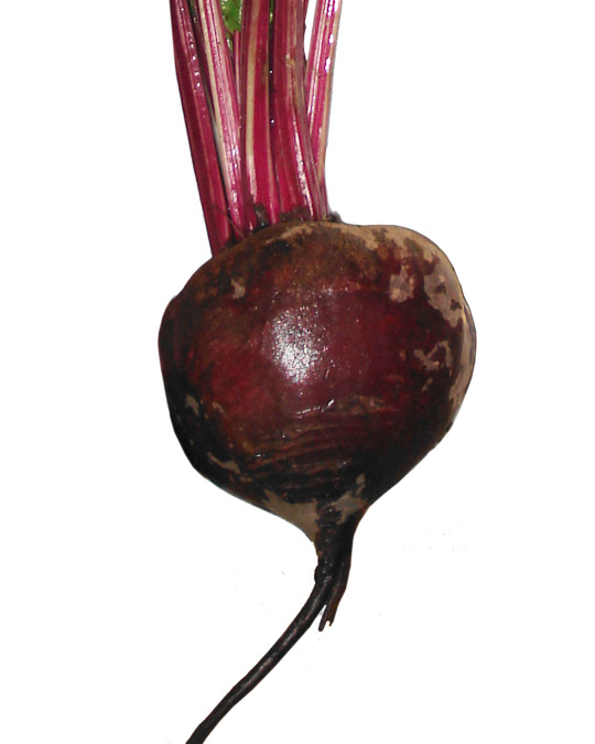
Now I know what you’re thinking, it’s just because he’s Ukrainian and I’m stereotyping. And that’s not true at all. Stan is actually a huge fan of beets. Every time I see him at lunch, he’s enjoying pickled beets or beet salad or just a big ole’ bowl of borscht. His favorite song is Beat It. The man is beet-crazy! If you see him at a convention or out on the street, feel free to just give him a handful of beets. He’ll eat them raw.
Thumbnail Sketch
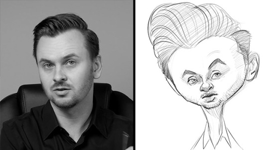
Of course Stan’s large cranium and thin neck coincidentally worked really well with the beet shape. So I begin with some thumbnail sketches, to try and figure out how to make Stan’s face work on this beet. I soon realize his features should sit low on his head, because his forehead and hair take up more real estate than on the average person. I think the concept here is a good start. But the features aren’t executed in a way that’s accurate to him. So I end this one and try sketching from a different angle.
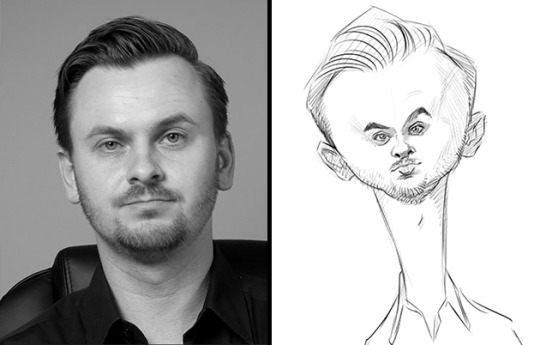
For this second sketch, I maintain the same basic concept of the inner beet spirit, but I thicken the beet-neck just a bit at the top. I also like the idea of really small features set into a large wide head. It’s funnier. This one is working much better than the first sketch. Although I’m not a fan of straight-on views. I prefer more dynamic angles that allow me to show the three-dimensional quality of a face. So I move on to a photo with a more interesting angle.
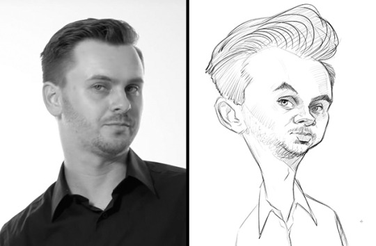
Again, I try to maintain the beetroot proportions for the head shape and then place the features on top of that. In this thumbnail sketch, I’m able to draw a more dynamic angle which I push even further to give it more visual interest. And there’s even a slightly sassy expression on his face that I try to make more obvious in my sketch. Because of the interesting angle and expression, I feel like this is the one that I can take to the next stage. The likeness needs some work, but that’s what the rough sketch is for.
Rough Sketch
I begin the rough sketch by tracing directly over the thumbnail. I use some simple guides to align the features in perspective on the head. And I slow down a bit to give more attention to each feature. More time than I allowed in the thumbnail sketch phase anyway. One of the distinctive traits about Stan that isn’t strictly physical is the darkness around his eyes. His eyes are heavy-lidded, but also a slightly darker tone than the rest of his face. So I try to indicate that in my rough sketch.
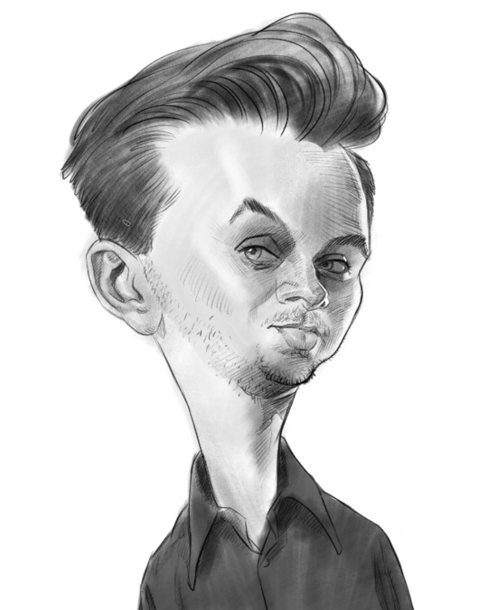
At this point, it feels pretty good, but I’m not entirely sold on the likeness yet. Something I’ve learned about likeness is that it’s usually easier to see with the use of light and dark values, rather than with just lines. I could continue crosshatch shading to darken the values, but for the sake of speed, I add some more shading with a large brush. It’s pretty rough and simple, but I think it does add some visual information to define the likeness which wasn’t there before, like the volumes of the forehead and cheeks. When I squint down and blur my eyes, I really see it. So It’s just enough to confirm that I’m on the right track even if it’s not perfect yet.
Abstraction
For this next stage in developing this caricature, I flip the rough sketch over to better see any structural problems and then draw a Reilly Abstraction on top of it. The rhythm lines of the Abstraction are drawn from one side of the head to the other to help check if things are lined up or if they need to be moved. Some features, like the eyebrows, are going to be asymmetrical, so I allow for that and look for unintended distortions and asymmetries. I discover that the ear I drew on the rough sketch was too low. But for the most part, everything else was in a good spot. Even if all the features are determined to be well-placed, these geometric rhythm lines are most helpful because they act as an idealized template of Stan’s head – sort of a cleanser, washing away the rough lines of the earlier sketch, so that I can trace much more nicely designed shapes and features in the right locations at the next stage.
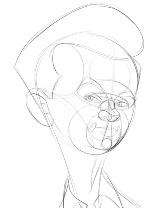
Oh, and besides the ear being too low, the Abstraction helps me figure out that the head would look better if the forehead was more bulging in front.
Final Sketch
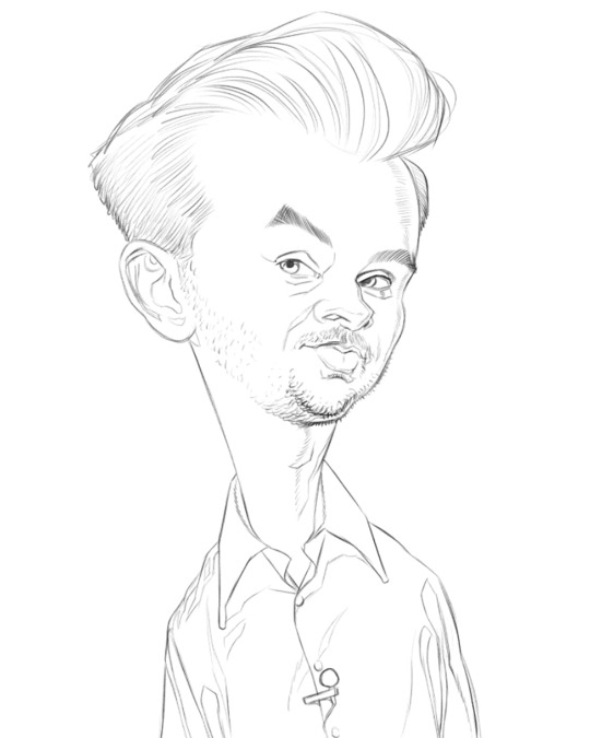
After a quick check, I flip it back around, dim down the Abstraction and begin my final linear drawing on new layer, tracing over the Abstraction, but with much more attention to the exact shapes of the contours and features and also to the quality of my lines.
This lesson is all about drawing caricatures with special attention paid to the visual design. As I’ve said, a good exaggeration and likeness is not enough. To draw at a professional level, you need to slow down and spend time creating a refined look or visual design. It doesn’t have to be realistic and based on anatomy, like my work. You can draw abstractly or simple and cartoony. But whatever it is, you need to figure out what you want the finished style to be and then keep working on this until you’ve achieved that look. Tracing over the previous drawing is a great way to do that.
Now, the problem with being the judge of your own progress is that while you’re learning, your artist’s eye may not be able to see all the flaws that a more experienced artist may see. As you continue your studies, your eye will improve, followed by your hand’s ability to make the right marks. But during this time is when it’s important to have a teacher, mentor or at least another artist at a higher level of development help you and let you know where you can improve. Eventually though, you’ll be able to look back on your older work and wonder why you missed all those drawing problems the first time around.
With my linear lay-in finished, I now add the soft edges. Wherever a form transitions from a light to dark value, that transition will be either a hard, firm, soft or lost edge. Once those transitions are all in, I finally start to add the values, which is the final stage of this drawing.
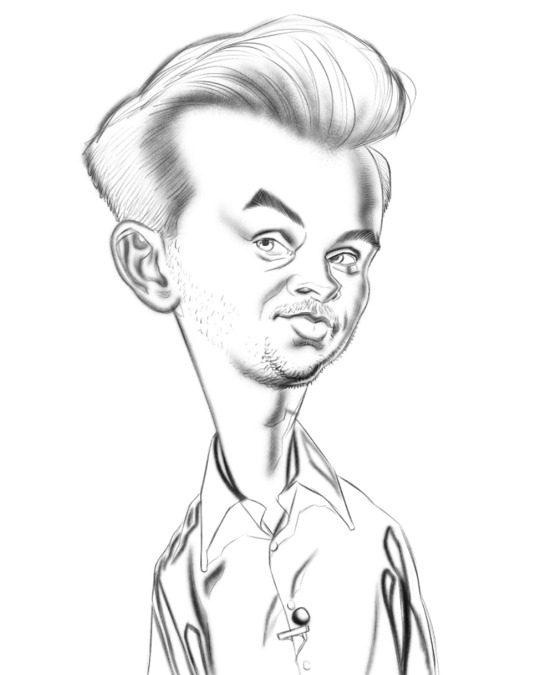
I always seem to have the most success in a drawing or painting when I work on a middle grey background. In the premium version of this course, I demonstrate shading drawings with different strategies. On my David Bowie caricature, I shade on a white background, which shows how it negatively affects my perception of the values on the face. Working on a white background prevents me from shading as darkly as I should because the bright white fools my eyes into thinking a value I use on the face is darker than what it really is. A light-middle grey, as I’ve used here, sets me up right in the range of what Stan’s caucasian flesh tone already is. So even before I begin, I’m in the right value range.
Most of the time in a realistically shaded portrait like this is spent working in the middle range of values. Or the halftones. The dark accents and bright highlights are fun and give the drawing more visual punch. But they wouldn’t work if the the middle values aren’t properly figured out and correctly placed first. The meat of the portrait is in the halftones. They are what’s going to sell it to the viewer. And the halftones are usually all within a very narrow range on the value scale. So there’s not much room for error. If you shade the halftones with too much contrast, the subject will look shiny or metallic. If you don’t have enough contrast, the portrait will look dull and flat. And if you don’t shade and cover the shapes evenly, you may get spotty or streaky effects where bits of light or dark peek through your strokes. So make sure you’re using the right tool for the job.
Most of the Photoshop brushes I’m using to shade here are very subtle brushes already. One stroke from them doesn’t cover much because they have heavy textures applied to them. I have to keep on adding stroke on top of stroke to lay down a value. It’s similar to using very light pressure with a hard charcoal or graphite on a rough paper. In fact, I think my main brush here is called “Shady Graphite” by Kyle Webster. It comes standard with the latest version of Photoshop. But you can find or even create similar brushes in other painting apps.
Also, it probably goes without saying, but when shading a drawing or painting, use the largest brush for an area that you can. You want to be able to cover broad areas with less brush strokes. But to get hard edges or for textures like the hair and stubble you’ll need a smaller brush. But those should be used sparingly, lest you end up with a streaky and sketchy rendering. Most of your time in a drawing like this will be spent using large brushes.
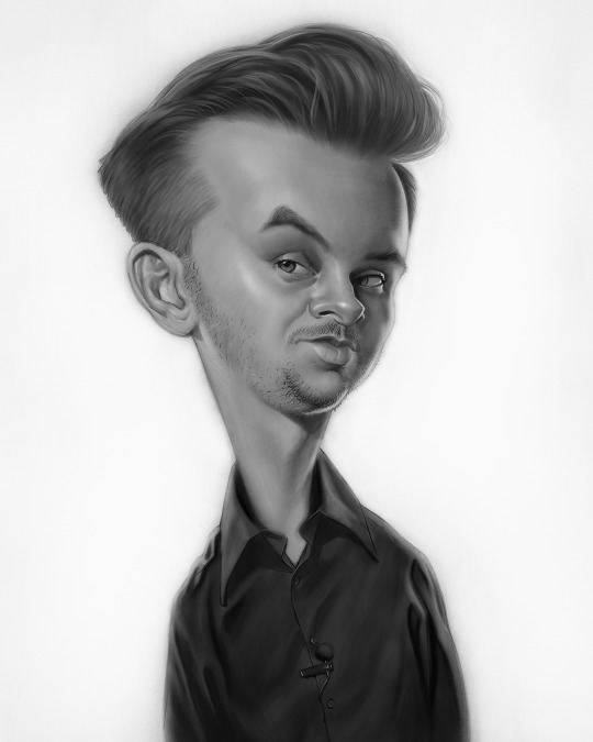
Some final bits of advice to create professional quality caricatures with a strong sense of design are: First and foremost, keep working on it until you can’t make it any better. Push yourself to draw and paint like the people you admire. If you get to the end and aren’t sure if it’s a success, get up, walk away and come back to look at it with fresh eyes. Or flip it in reverse one more time to examine it backwards. If there are any structural problems, they’ll be much more obvious. If you can correct those problems, then do so. If there are just too many problems to fix, you may need to go back a few steps and start again from your rough sketch or Abstraction.
77 notes
·
View notes
Photo
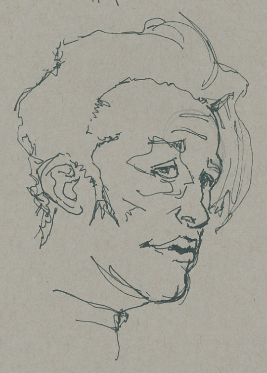
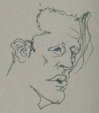
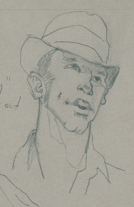
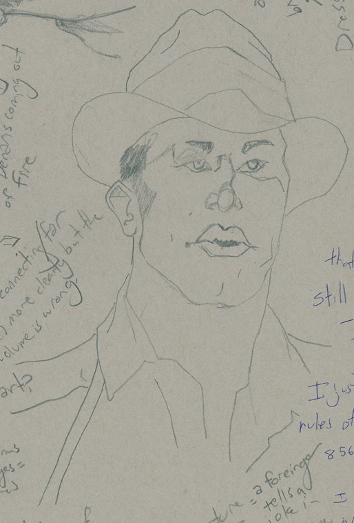
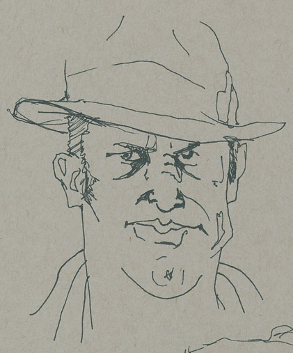
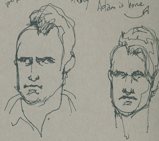
A longer form post I’d probably rather post to my art Blog but post here because all it is is a rambling about being stoned...
My thoughts on artistic style as a mathematical function..
I like to sketch while stoned, might have mentioned it before. One of the reasons is that being stoned is a pile of clever thoughts which may or may not actually be clever... but with a pencil in your hand rather than say something dumb, you draw something... different. Differently. And that is essentially the quest of drawing (at least for me) while I’m not stoned. Draw something that doesn’t look like a shitty failed Disney or Anime or “photo realistic attempt” sketch. The definition of an art style. Do something different and do it your way.
Another thing about being stoned is that I often think about the world and programming and how the two can describe each other. Analogies, man. Anyway, the attempt to apply the concept of programming everywhere got me thinking about what the mathematical definition of “style” is. I mean, in some way, it’s the essence of what the current “Deep Dream” or... whatever variant of “Deep .*” is behind those “your photo as a Picasa painting” You come up with an algorithm and you apply it to data (an image). But to be the creator of the style, to be drawing in that style... you must be subconsciously applying the algorithm to what you see.
When I’m stoned I occasionally see things warped, literally. A bulging, a fish eye lens flair, very faintly. When I feel it, a slight pressure, I tend to be able to “visualize” depth vividly and am able to (in some way) capture it better when sketching.
When I turn my eye onto a face and try to sketch it, that distortion remains. Is there. What I draw then looks like a sort of pinched caricature style...
A style is just a function applied by the artist. Disney has some scaling transforms going on and some serious saturation tweaking. Anime has their own scaling transformations, edge detection way up, and bucketed their RGB values rather sharply... And people striving for realism are attempting to strip away any and all transforms. To accurately render output the same as input.
Someone who strives for these styles and perhaps fails don’t have the algorithm down. Styles are proprietary stuff, though people share it that doesn’t mean everyone can learn it.. Some statement here about the medium of transfer and the transfer protocol... which would be speech.... People can also backwards hack it.
Anyway! Style as a mathematical function. To be able to reliably sketch is to reliably execute the same transform. But to know it... to see it... What is the “caricature” style transform? I want to distill someone’s essence and draw them not photo realistically. What is important? I need to be able to know what’s important to draw on/about a person in order to take that person’s image and do more with it. To look at a photo and then draw that face rotated 45 degrees more? And make it look like them? That requires an understanding of what attributes truly define that face. A tweet has only 120 characters to describe a thought. A sketch has only 15 strokes to describe a face. Can you use these optimally? A novel is thousands of words which would translate to a highly realistic painting- or so many pixels you’ve got yourself there a digital image. “A picture is worth a thousand words”... ha... Figured out the math there.
“A picture is worth a thousand words, and a sketch is worth a tweet”
Anyway, distracted. How to apply a transform to a face and reduce it to the 15 most important bits? Well that’s the artistic style, artistic knowledge right there. Anyone can draw a line. How do you see the right lines? Most humans have the eye, eye, nose, mouth thing... are you really going to spend...
The notion of a spherical transform on an image. Which points on the face and shift and to what bounds? Knowing which lines need to be anchored together, which points of the face must maintain RELATIVE position. That’s the style I want. The face wells, the gap between the eyes increases for example, but that brow remains pinned to the eye at just the right way to clearly spell out which individual is being sketched.
What are the key ratios that matter, I scream at a photo as I hold my pencil above my paper. I don’t really scream. But I think quite angrily to myself. “Why, dear brain, do you not tell me what the important bits are? Am ready to sketch. Just tell me which ones should I draw.” And the pen hovers and wonders and it draws too little here and too much there and obsesses about THIs curve when in fact it was tHAT gap that really mattered to catch to nature of the subject.
Here at least you can see me more clearly playing with shapes and distances, struggling to maintain spirit while distorting and freeing myself from the photo realistic, non-transformed shackles. I don’t want it to look “exactly” like them. I want it to look “like” them while at the same time being of a different shape. What does that mean....
As you may or may not be able to tell, I’m certain that the important attributes of TV!Miller are the fullness of lips/horizontal center of mouth, the arch of his nose, and the briefness of his brow. You can see drift and skew between the other parts of his face between sketches (jawline, shape and size of eye, hairline) and (in my opinion) are the least like him/where the flaw is in the image. This is a sign that I’m confused and I haven’t pinned the appropriate reference points for that part of his face. The face ripples as a transform rolls over it and I don’t know which parts to ensure remain locked together... confusion. I draw confusion.
In a set of Amos sketches to be posted soon, I focus on the eye shape to brow shape relationship, triangle nose, and the angle of the corner of his lips. Similar body parts (eyes, nose, mouth) but different attributes of each.
I feel like if I were able to figure out the small handful of characteristics that really matter for a face, I’d be able to drop/distort all other pieces and I’d still have “that” person. And that would get me to a much more cartoony/easy to draw style. And then I could draw more and more freely. A photorealistic comic would take way too much time. Figure out the important bits, drop all the rest.
But how to figure out the important bits? If you can know that, then you could write an algorithm to “draw” individuals in different artistic styles and have it still look like them. Wait, did I just spend this whole time coming up with an app idea...? Definitely stoned....
8 notes
·
View notes
Text
‘Simple Folk’ - Flat Illustration Workshop
Artist Influence
Before getting into any practical work, I wanted to establish a list of key principles in which I could use for my own work. I did this in my Saul Bass case study and found it to be very effective in taking direct influence from something. To get these, I looked at the following artists which have a flat and sometimes minimalistic art style.
Lillie Carre
Oliver Jeffers
Luke Pearson
Eleni Kalorkoti

Mirroring the Saul Bass case study, I made a list of rules to follow in order to maintain a similar style with the outcomes of this workshop. These rules were:
No gradients, just use flat colour to build tonal value
For texture, only use a subtle grain
Leave plenty of negative space to draw focus to the main subjects.
Throughout all of the work, these were the aspects of visual language that caught my attention as they are consistently used effectively.
Materials and Tools
Pencil
Paper
Scanner
Mac
Illustrator
Rectangle Tool
Ellipse Tool
Pentool
Direct selection tool
Pathfinder Window
Shape Builder tool
Process
The first task was to sketch someone and try to simplify their face as much as possible. The person I chose as my subject was Bob Ross. As well as being arguably one of the most influential artists, his hair is an iconic feature which is largely associated with him, so I thought this would make it easier for me to illustrate something which could be recognised as Bob Ross. Whilst sketching I kept in mind that geometry was a large part of the artists’ work I looked at beforehand. So my method of simplifying was to just construct the facial structure from circles and lines, and I feel like this is what mainly gave them their ‘cartoony’ effect much like the artists I looked at.
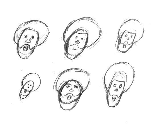
This is an important part of developing an idea because it allows for a quick way to generate lots of variations of one idea you may have in your head. So for this task I gave myself a very limited amount of time for each small sketch which made me make decisions I wouldn’t have thought of if I gave myself more time to sketch one idea. As an example, after a few times at sketching the beard, I found it quicker to use a shape which resembles a rounded rectangle for the top, which not only made it easier to repeat but in doing so I simplified my first idea further.
At this point, I had a simplified version of my subject which follows the rules I set myself before. Now I could take this into Illustrator as a reference and start the process of making a digital illustration with various shape tools.
I scanned the sketches in, and cropped the one I think worked best at showing the construction of shapes for the head, in this case the top left sketch. After this, beginning the digital process, I started with a rectangle by using the rectangle tool, which I then built up the different features on top. The hair was the next feature as this was the main feature which was going to decide how similar the illustration would look to Bob Ross. For this I just used a singular large circle using the Ellipse tool, but by holding “Shift” whilst dragging the tool I was able to keep a 1:1 ratio and therefore a perfect circle. Following this was repeating the use of these two tools, along with the direct selection tool to select individual points of paths to adjust the position of to create all of the other facial features (beard, mouth, nose and eyes). At this stage I had used an outline for all of the shapes so I could easily see where everything was placed, as with a fill certain shapes may get hidden under others. Once I had the general structure, I selected all of the shapes, and used the Shape Builder tool to combine shapes or get rid of unwanted areas, to create a combination of more complex shapes which would then take the shape of the final face. However I was still using outlines, and at this point I was satisfied with the shape and positioning of the face and features, so I added colour which then made it easier to see it was a person and separate the large areas of skin from the large areas of hair.

At this point I was happy with how the face had developed, but I thought there was an element missing between what I had created and the examples I looked at in the beginning of the workshop. Because of this, I looked back at my rules and the examples of work to find shadow and highlights were something I had not included, which at this point I thought would transform it into something closer to the artists’ work.
The next step was a personal extension to the workshop, as the workshop didn’t ask for anything more than singular flat colours. For the shadows and highlights, instead of using shapes to construct them, I used the pentool in an attempt to get more organic lines and create a juxtaposition between the geometry of the face and liquidity of the tone above it. With the highlights, instead of creating fill objects with the pentool, I created a single path which I added a stroke to in order to make it as accurate as possible. This was to not redirect the face from it’s original geometric aesthetic.

Reaction
Overall, this workshop was a success for me. I learnt how to simplify someone into a character which could be used for a huge range of things. Because it is in vector format, it is perfect for print or large scale digital use. As well as this, from the start of the project I have wanted to explore illustration and how that could be used in my final outcomes. With this style of simple flat illustration I feel like I can apply these skills to work in the future without ignoring my initial artist research. The styles of my original artists show through this workshop so I am confident this has helped me develop skills I can use effectively to create something I will be happy with.
Looking forward, I am planning on further exploring illustration in similar but varying styles. Maybe using more abstraction in terms of the visual language (colour, line etc.) to create something with more inhuman qualities.
Linking to the Brief
Illustration has always been something I’ve wanted to explore, so it was good for me to do so whilst looking at a key style. The artists I’ve previously looked at I’ve found rarely use patterns, so finding a link between this workshop and the pattern workshop was quite difficult. As a primary aspect of their work, patterns would deter the audience from the work itself, which further solidifies my point of using excessive pattern will make something less effective in communication. Lillie Carre is the most noticeable use of pattern out of the examples I chose. Her pattern usage however is completely hand-made, making it more authentic than the digitally produced patterns. The hand-rendered quality is portrayed well and this is complemented by the roughness of the patterns, which still tessellate but not perfectly systematically. This is a perfect example of how they can be used subtly but powerfully.
Lillie Carre also makes work tailoring to a younger audience, which makes her work all the more relevant to the brief as I am also aiming to do so. Book illustration is a good example of how culturally, this type of work can influence a group of people. The illustrations featured in books is exactly what turns them from a book into a story; an experience for a young person.
0 notes
Text
Weekend Top Ten #480
Top Ten Videogame Logos
I like games. I’ve been playing them for a long time; since the 1980s, which was over seven years ago. In that time I’ve seen many ages of gaming come and go – remember full motion video? – but one thing I have noticed is that game packaging has shrunk and shrunk and shrunk. From large sturdy cardboard boxes the size of two hardback books back in the early nineties, to slim ‘n sexy DVD cases around the turn of the millennium, to – well – absolutely nothing these days as we oxidise games from the air. And one of the things that used to – and, I guess, still can do – make a game’s box art really pop was a sexy, elaborate, or otherwise just really frickin’ cool logo.
Now, by “logo” I’m basically talking about the design and typeface of the title itself. I don’t really mean the lambda sign from Half-Life, or – to step outside specific games for a second – the famous Ghostbusters symbol. Some games do actually end up with iconography incorporated into their title design, and you might see a little bit of it here; but for the sake of argument, I’m using “logo” to mean “title”, and how pretty that title is.
And I gotta say, some games had very, very pretty titles.
Now, I know, from research, that 8-bit games released in the eighties often had wild and wacky logos. However, there’s precious little of that on my list, because I didn’t really notice it at the time. I can appreciate it now, looking back, but it meant nothing to me forty years ago because, well, I wasn’t born or was simply far too young to notice. I didn’t really pay attention to box art until I had my Amiga, and that was about 1990. So there’s precious little here that’s genuinely old. That being said, I do seriously think that the golden age of logo design was that late eighties/early nineties period, as we transitioned from 8-bit to 16-bit home computers, with a legacy that continued into the PC dominance years of the mid-to-late-nineties. I think at this point the industry benefited from beginning to have certain established patterns and artists, but was still loose enough to allow a huge deal of experimentation and a feel of general lawlessness. It was in this era that Roger Dean reigned supreme, a vastly talented artist whose airbrush style defined the Amiga 500 for me. His work can be seen on this list, and – surprise – it’s at number one. Dean was so good that not only did his artwork grace dozens of boxes, but he also designed the greatest logo for a game developer of all time.
(Just as an aside: I had a lot of Psygnosis games for the Amiga. I remember vividly my cousin and I would desperately try to parse the wording of that logo – “Is it a P-S-V? P-S-V-C?” – during the brief time it appeared on screen whilst the game loaded. Ah, those exotic early years, full of wonder and possibility… but I digress)
Anyway, there were loads of bright, bold, colourful logos in those days. I think they mostly wanted box art that leaped out from a crowded computer shop shelf, and generally there was probably an assumption that the audience would be either young or nerdy, so there was no outward desire to be elegant or minimalist. Huge, chunky logos were popular; large text, airbrushed artwork, characters incorporated into the logo itself; plenty of shading and embossing effects were used to make a logo stand out proud on the box.
As time wore on, and the target audience aged and maybe wanted to appear a bit cooler, logos seemed to grow smaller. 3D extruded block text was replaced with simple white font work and elegant design. As such, into this new millennium, there are very few really exciting logos nowadays. Even my beloved Half-Life has a really minimalist design, which works, yeah, but it’s not exactly an all-timer. We do still get some very good logos now and again; I’ll go to bat for Halo any day of the week, but even that is twenty years old now. BioShock’s was pretty cool, too, with its rusted brass façade, but even that’s, what, 14 at this point? Blimey.
I think the evolution of the game logo can best be illustrated by comparing the original Doom logo to the one used in the 2016 remake. Vibrant colour versus flat white. I know which I prefer.
So there we are; my ten favourite game logos. And as these are game logos, I’ve banned anything that’s adapted from external media, whether it’s a Star War or Spider-Man or even Cyberpunk 2077 (which does have a cracking logo but is more or less a version of the one used in the original role-playing game). Anyway. Let’s have at it.
Shadow of the Beast (1989): not the first Roger Dean box art, but arguably the most famous, and certainly the one that caught my attention. Well, actually, it was Beast II in 1990 that I saw, but I’m picking this original logo as it’s a bit cleaner without the “II”. Anyway, what’s not to like? Dean’s fantasy-metal style is evident, with a logo that’s kind of threatening to look at, the pointed curls descending from the letters connoting teeth or claws, but the brushed, metallic detailing giving it a technological bent. Supremely cool, freakish, and a style carried very strongly into the game (and moreso the sequel).
Elite (1984): a rare example of a relatively minimalist piece of box art for the eighties, but all the same this logo is something else. Huge and bold, carved out of solid gold, its eagle wings suggesting the power of flight whilst the strangely-crowned head suggests something almost majestic or godlike. It’s the perfect logo for a game about space exploration, yet it also has echoes of Nazi symbolism or even Judge Dredd, giving the game a subtle sense of menace.
Lemmings (1991): unlike the other two, this was a fun, bouncy game, whose childish, cartoony stylings hid a dark and fierce puzzling heart (and also supremely distressing scenes of Lemmings getting mutilated). But this logo is beautiful, its jolly, chunky green typeface reflecting both pastoral beauty and the hair of the little critters; the misaligned letters reminiscent of the undulating hills the levels hint at (but don’t actually contain, particularly). And we get the heads of the Lemming poking out, squarely cementing them as an important part of the experience, their character the defining characteristic of the game itself and all its associated art.
Doom (1993): a seminal moment in gaming, and a seminal logo too. Surprisingly colourful for a game about the ravages of hell, this is a bold and bright bit of typography, the extruded letters suggestive of the 3D nature of the game itself; the almost terracotta tiles meshing with the complex mechanical geometry on the letters reminiscent of the game’s merging of the supernatural with the highly technological. And there’s the pointed extremities of the word, directed down like fangs, hinting at the horrors and dangers to come. Quite simply brilliant.
Minecraft (2009): the most recent game on the list, but its logo is almost a throwback. Thick, square, blocky letters reflect the cuboid nature of the gameworld; the angle away from the camera suggests height and importance, subtly hinting at the scale of the game itself. This is an iconic piece of iconography, instantly recognisable by children – to the extent that trying to draw a logo like Minecraft, or recreate the Minecraft logo itself, is fairly common in our house. I also like that one of the letters appears to be a Creeper.
Pac-Man (1980): and here we have the oldest logo! But so iconic. The chunky font, with letters comprised of thick shapes, devoid of some of their detailing, is cool enough; despite being released at the beginning of the eighties it has an almost sixties vibe. The “C”, of course, looks like Pac-Man himself. But what really makes it art is the offset colours, giving it the air of a misprint or of looking at 3D without glasses. It’s a deeply cool effect and helps make the logo feel timeless.
Dizzy (1987): another oldie, making its first appearance in ‘87’s Dizzy: The Ultimate Cartoon Adventure, although the logo design was very slightly tweaked and refined by the follow year’s Treasure Island Dizzy. Simplistic 3D block letters, but what makes it sing is that they’re dizzy; linework suggests them spinning, but it’s how the perspective differs from letter to letter, giving them a confused and discordant feel, that gives it just that little bit extra.
Zool (1992): perhaps a lesser-known and less iconic logo, unless you were a huge Amiga game in the early nineties. The airbrushing to give it a metallic, embossed effect is very of the moment, but what I love is the eyes. The double-O is rendered as Zool’s cross-looking eyes in his ninja bandana. On one hand, making the Os eyes is rather first-base, but partly it’s how they’re executed that I like; it’s also just because the big angry eyes are rather funny.
Pokémon (1996): first appearing on the cover of Pokémon Red and Green in ’96, the general Pokémon logo is a beaut. Again, it gives the appearance of simplicity, but the execution is complex. Chunky, friendly lettering, yellow like kid favourite Pikachu; kids’ll love that. The blue outline and drop shadow help it pop and give it a subtle, almost 3D effect. And the letters are discordant; rather than a regimented logo, it’s all over the shop, different sizes and weights of letter, all jostling for position on the page. It perfectly encapsulates the tone of the game.
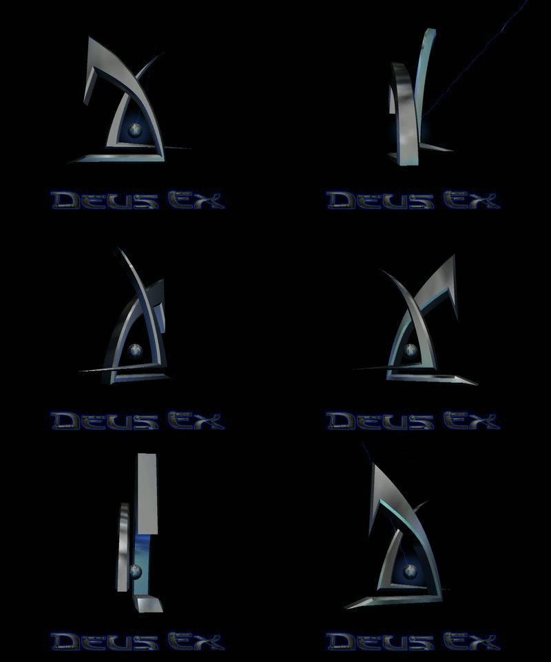
Deus Ex (2000): I’ve more-or-less steered clear of the sci-fi design of “metallic logo that’s otherwise just the title”. I like logos with a bit of something extra; hence no Perfect Dark or Halo, despite those being great in and of themselves. Deus Ex takes the spot, though, partly because the letters seem built out of something, cobbled together in a dystopic, cyberpunk-y way. As you play a cyborg, this feels apt. And then there’s the logo itself, a towering corporate-looking edifice, a brilliant juxtaposition of two shapes that together suggest a D and an X. It’s slick and shiny, and is present in the game itself as a gently rotating loading screen, reflective of the advanced 3D graphics the game possessed.
Honourable mentions go to Theme Park, with a logo that’s suitably corporate and also reflective of a roller coaster, and Quake, just for that really cool nail-through-the-Q effect.
0 notes