#I needed to practice compositions and shapes
Explore tagged Tumblr posts
Text

citizen
#I needed to practice compositions and shapes#Ich versuche etwas herauszufinden#my art#traditional art#meine Hände waren noch nie so grau#der Transvestit
143 notes
·
View notes
Text
Good news! I'm slowly unlocking the ability to draw again. Unfortunately I can't draw any of the things I want to yet bc all of that is Too Much Effort so I just keep drawing xenaut as some weird reptilian creature over and over bc my go to when I'm art blocked is dragon monster shit. I don't want to be drawing this though. I wanna do landscapes and design new characters and do fanart and stuff but my brain said no so I can't.
#this wasn't normal art block lmaooo#i wws burned out as shit#my creativity is still in shambles but at least i can sketch a bit more regularly#the juice isnt flowing but i can go through the motions at least#lineko.txt#its like my minds eye doesn't work for art anymore#im like ohhhh i wanna do a cool sci fi landscape.... and then no solid mental image appears#i see colors and vibes but no shape or composition#probably just need to practice using it again but UUUUGGGGHHHH
10 notes
·
View notes
Text
last month i did some life drawing sketches of cq, under the cut for artistic nudity
i used line-of-action for model poses so ya i referenced images for all of them ✌️


#life drawing is p cool. was practicing connecting curves between a whole bunch o different curves on the body to add to the flow n Shape#idk if i see the results rn but i need to work on composition so I'll see if i keep trying to use it in fanartsss#cquackity#c!quackity#c never cc#artistic nudity#tntblr#p-q art
5 notes
·
View notes
Text
"Boil water to turn fan" as if multistage steam turbine generators are not one of the sexiest kinds of machines every made


nuclear power is impressive until you get up to why. "we use the most precisely engineered machinery ever created to split atoms to release energy" oh yeah how come? "boil water to turn a fan" get the fuck out
#its genuinely crazy the math and engineering that go into making these absolutely massive steam turbines#its an incredible balancing act to optimize between the interconnected variables of pressure velocity and temperature in order#to extract as much energy as possible from the steam as it moves through the system#especially like. those generators need to maintain a very precise rotational speed in order to prevent the coupled generator#from going out of phase with the power grid#(3000 RPM for 50 Hz grids and 3600 RPM for 60 Hz grids)#like the reactor part sounds like a lot of engineering work (and it is!) but like. the turbine is fucking incredibly impressive too#each one of those turbine stages needs to have very specifically shaped blades in order to control steam pressure drop and steam velocity#and the blades need to be able to physically handle being in a wet (at least for nuclear plants where the steam is pretty wet) high temp#environment and constantly being spun at high rotational speeds for decades at a time.#we had to develop specialized nickel titanium superalloys with tightly controlled crystalline structures in order to build turbines this big#stare into the depths of “wow we really just use steam to spin a big fan that sounds simple” and you encounter#the lifes work of thousands of mathematicians computer engineers material scientists and mechanical engineers#the first device we could call a steam turbine was made as a toy in tthe first century ancient greece and egypt#the first steam turbine with a practical use was described in 1551 in Ottoman Egypt. it was used to turn a spit of meat over a fire.#the first modern multistage impluse steam turbine was made in 1884 and revolutionized electricity generation and marine propulsion#in the 141 years since there have been more improvements than one could even list#from major design changes credited to great men to miniscule efficiencies and optimizations gained from tweaking the composition of an alloy#idk. i think its beautiful to think about the web of human knowledge woven collectively by thousands of hands across history#could you imagine what the ancient greek engineers who first put together the prototype for an aeolipile would think to see what we have#made now. could they even recognize our designs as belonging to the same category of object as their little toy#anyway#appreciate the humble steam turbine with the same eye you give to the reactor core#mine#just my thoughts
63K notes
·
View notes
Note
How to draw like you no borax
Good question!
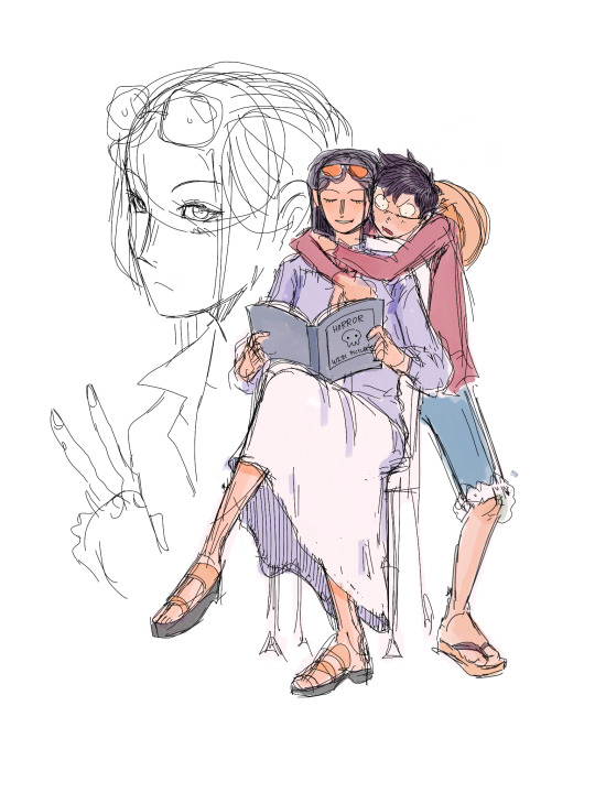
I'd warn against following my process (at least if you want to learn), but I'll be honest and show you, lol. (Heads up: this is just how I do FAN art. When having fun, I generally care less about the fundamentals.)
1. I slap down super rough sketches, jotting lines/expressions like bullet points of my idea. Pretty much stick figures with just enough detail to remember who's who later. Not shown here, I also move, resize, and add details to express the intended composition if I'm planning something larger. You may notice a lot of curved lines / haphazard circles.
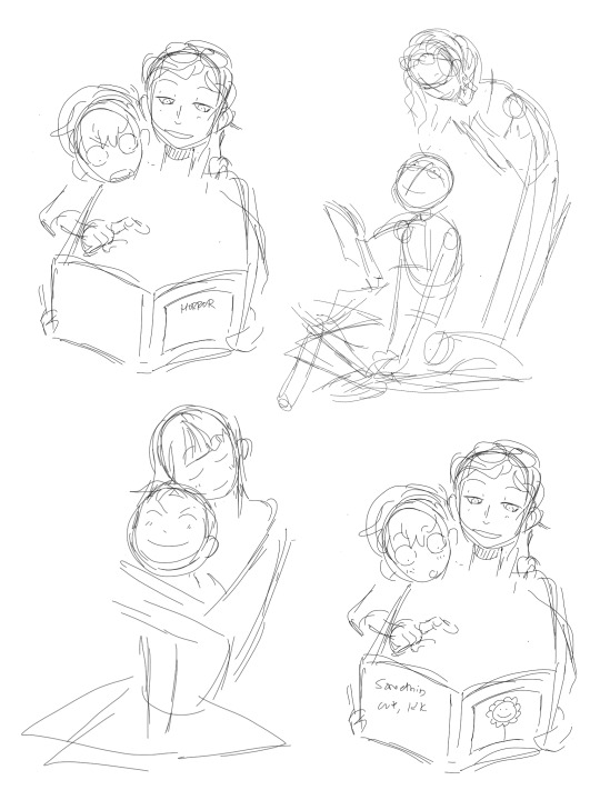
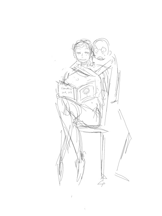
2. I refine the sketch by drawing it with more intention and build structure with slightly blockier shapes. If I'm really struggling with a pose, this is also where I'll find references or look at myself for bits and pieces to fill in the gaps. (When practicing, I would highly recommend using a reference from the start so all your limbs are an appropriate length and you don't need to say things like "that's passable" right before posting. If you're a perfectionist you'll leave that thought with the rough sketch.)
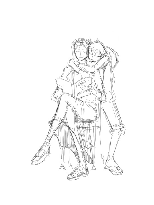
3. I'll decide around here whether or not to leave the sketch as is or commit to lineart (not likely). I guess I'd say I "shape the lines" here by going over some to add thickness/weight, and by adding basic sort-of-shading to break things up a little. Then I'll just fill in space if the page looks empty. (Usually this is where I incorporate the borax, but I hear baking soda works nicely if you're worried.)

4. Onto coloring. I don't feel confident enough to pretend I know what I'm doing here, lol. I just choose my base colors, imagine the general direction of the light source, then add minor gradients to the light and dark layers so they don't look flat. Then I just add some BS highlights and outline them. I've only recently found the motivation to properly practice coloring and just go with the flow tbh.
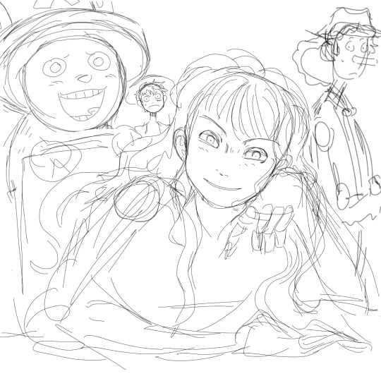
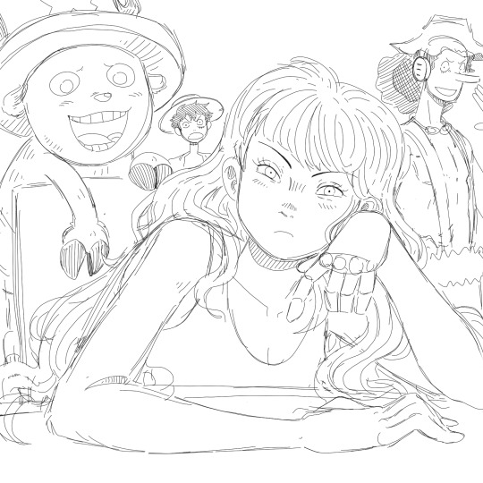
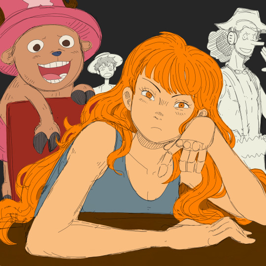

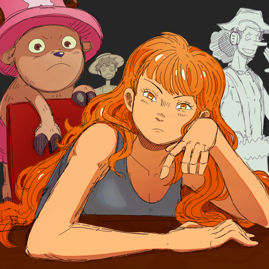
You may notice that Nami's forearm is too long, her hand looks like a pancake and Chopper has no joints! My kind sibling explained to me once that my anatomy is poor, but cohesive enough that nothing stands out too bad, lol. That's why it is important to use references!! And if you're me, practice all parts of anatomy at the same time with full bodies so that even when you're at a loss, your hands aren't that much better than your feet.
All in all, to draw like me, just have a very hedonistic approach to art, ha. Draw what you want, avoid getting burnt out on any single piece (sometimes that happens when you try to perfect drawings one at a time), and follow my personal motto:
Make fun, not masterpieces.
Idk how helpful this was, but there you have it!
485 notes
·
View notes
Text

Happy halloweeen. :)
This is the commentary track(?) to my digitober. It's just rambling, so don't expect anything too interesting.
This first picture came out on a whim, I originally didn't intend to do anything for this october. I had just arrived home from helping my mom out with something, and was in a good mood. I think this picture, as sketchy as it looks, reflects that feeling. I'm content with it - and it's halloween themed! All the better.
For the second, I tried to follow the "official inktober" list (something I'd drop quickly in the following days). I'm disastrous at making backgrounds, so I gave it a shot for practice sake. I think it's not a bad result, it almost kinda tells something of a story.
"Boots", hah. It's not terrible, but it's also missing a lot of polish. I think the idea behind it works well for a cute/sexy picture of Angewomon. Maybe some day I'll revisit it? I should put more practice into drawing the human form in the meanwhile lol.
I really dislike the fourth one. I think Lianpunmon deserves better art, so I'll definitely do it again some day. My skills are so undeveloped, it's very obvious seeing this poor hatching.
Speaking of hatching, I bit more than I can chew with this one. The composition isn't interesting enough either, and just like with Lianpunmon there's no story here. At least Angewomon seemed to be interacting with the viewer lol.
The sixth is something I liked better. It's kinda shody, but there's something of an urban fantasy thing going on.
The Vamdemon one I can see the faults: I need better line control, the shapes aren't locked in as well as they should be. Yet, I'm partial to it…
Rapidmon deserves better lol. I still really dig the idea behind this drawing, I just wish I'd have given myself the patience and time needed to render a kickass explosion.
SkullGreymon, I have little to comment. It has zero story, but it's carried by the vibes. It's the first (and arguably last lmao) time I think I was cooking with the halftones.
The tenth is arguably the peak of the entire month. It has some story, a neat composition, and acceptable execution. Strangely enough it was one of the quickest to make: I had an idea, and it came out in a few minutes (compared to some other drawings where I was fighting for my life), and it ultimately was one of the most interacted with drawings in my entire blog. Funny how that goes.
I like a lot the Piemon one, as bland as it is. It's like a design piece, more than a drawing. It helps that the perspective deformation hides my poor linework haha.
I went too hard on the Mephismon X one, to the detriment of the piece. Instead of adding texture, it just looks dirty. Damn.
The thirteenth one was my poor attempt at making a background. Originally, Bakemon was gonna have this devious, whimsical look, but as I finished drawing the stairs I thought "I'd be kinda tired after climbing a few floors", so I changed Bakemon's expression to reflect that. Just a little trivia.
The Jesmon is what I'd argue was my peak. Shapes are locked (as best as my skill lets them), values worked well, it told a story. It's my favourite of the month.
Fiftenth was made, mostly, trying to catch some Adventure buff to the ammount of interactions I'd get. I mean, I had fun drawing the characters, but the reality is that I had petty reasons. I don't dislike it though.
I know exactly what I wanted to do with the sixteenth, and I didn't achieve it. Looking back, I think I should've done it in BW, rather than grayscale, to make it pop more. Fix the composition too. It's too plain. Shame, I really like Lilithmon X's design.
Seventeenth was also one where I just phoned it in. I think the values are all over the place; though I do like the harsh light. Impmon is a lot of fun to draw, all things considered.
Greymon was fun, lots of fun to draw. But this was another piece where I went too crazy trying to use halftones, I ended up making something that lacked impact or presence. I do like, in a self deprecating way, how the background seems okay until you look at it directly and see that it's kinda bad lol.
I made Nefertimon's torso too long! I only realized when I was doing the finishing touches lol. Yet I like the whole thing a lot, I think the texture and lightning kinda sells it as a photo (the white border was an attempt at selling that further). Saw someone refer to it as "the last thing I see before I die", and that comment might stay with me forever lol.
The twentieth is another I had a clear picture in my head as to what I was actually hoping to make, but failed to. Instead of landing some sort of finish, it's on a weird gray (lol) area. Making clouds is hard y'all.
Twenty one is one where I managed to stick the landing to what I had in mind. I think the composition needed a few more minutes of baking, but overall I'm content with the result. Death-X-DORUgoramon is a complex design, so any degree of succesful translation is a win in my book.
I think I needed to draw some more background Kuramon for the twenty second. Y'know, to really sell the swarm thing. It's kinda too clean.
Before twenty three, I had never given myself the time to draw a tree shilouette. It was fun to turn off my brainfor a bit and just draw line, after line, after line, after line. I did the tree first, and then I tried to figure out how to make Shurimon. Originally, I wanted him to be hunched over more dramatically, almost as if he was climbing down the tree, but I was incapable of drawing it in a satisfactory manner. So this is what I got.
Twenty four is so bad! I think Monitamon came out fine, but the background elements are so poorly done! I'm so embarrassed! lol
Kabuterimon was really fun, very dramatic looking. I think it has some serious readability issues with the hands, but I don't dislike the idea I had at all.
Hackmon's drawing was done almost like a sibling piece to the fourteenth, Jesmon's. Like, Huckmon is somehow watching his exhausted future, yet he stands stoic. On it's own, I think it's plain. Like, it has some charm, but it's lacking in impact compared to the fourteenth. But maybe that's for the best of the story?
The Wizarmon sticker came through me realizing I wasn't practicing my lineart! So I did a sticker instead. This was actually version two, but number one was so bad I had to redo it. Despite it being a humble sticker chibi, it's overall the day I spent the most time drawing.
Twenty eight came from me realizing I hadn't done any Alphamon! So I did what I thought would look badass. As much as I like Alphamon, though, his shapes are difficult for me to grasp so it came out shoddy and weak lol.
Twenty nine, Ragna Lordmon vs Ragnamon, was hurt by me recording it. While an exciting thing to do, I felt like I wasn't allowed to do anything but move forward quickly, or to change things (I'd have moved both Ragnamon and the main Ragna Lordmon body closer to the center) that would've made the composition flow better. It's not an abject failure, and the video is fun to watch, but still…
Dorumon is a simple piece that I was a bit surprised to make. My birthday is not information I tell people, but I was just compelled to share a bit of myself. I dunno, it feels weird. I'm weird. It came out cute at least.
And at the last! Noble Pumpmon again. I'd love to tell you that I applied everything I learned throughout the month and it's my best piece and stuff, but that isn't the reality. It's a better show for a similar amount of effort compared to the October 1st drawing, but it's not some crazy good display of betterment. A bit, yes, but less than I had hoped.
If you made it this far into this silly wall of text I wrote, I thank you. I thank everyone who interacted with my drawings, it pleases me a lot to see that someone gave it a like, or a share, or a comment. I learned about myself, and my limits, through this experience. It was tiring, but setting myself the goal of "make a drawing a day" was, paradoxically, liberating. Like, now I had a reason to draw! (despite me having some comission work to do lmfao). It was nice. This was one of the most entertaining octobers in recent years. Thanks again to everyone who participated in some fashion.
186 notes
·
View notes
Text
How to Create Paper Cut-Out Reliefs: Tips and Techniques for Beginners
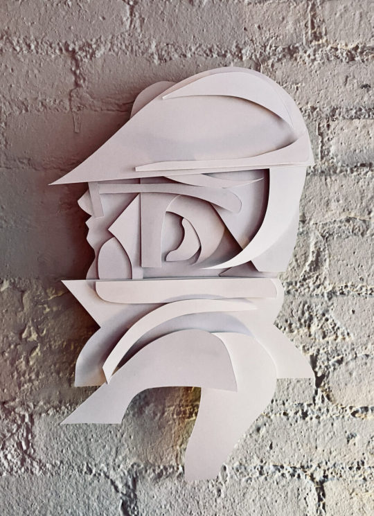
Back again with another lil' series of 2D wall relief paper cut-out forms. Both of the pieces below follow the same process and technique. Im really happy with the process and outcomes. Im working on animating them as we speak. I'll add them to this post later. My paintings inspire my drawings, and my drawings are inspired by those same forms found in my paintings. It makes sense that every so often I want to make those forms "pop out" and off the surface of a flat plane. Alas, it all starts with a quick sketch. See below, just a series of light loose free flowing lines take the lead, forward ->
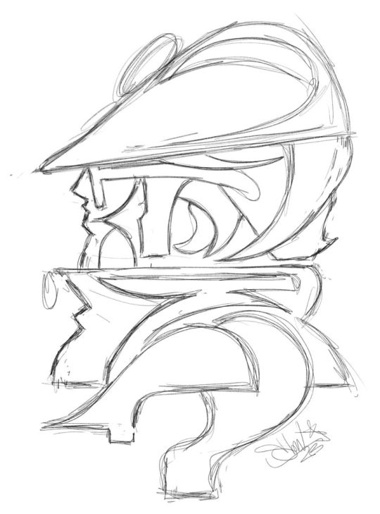
Here we have a dude posing for a profile style portrait. Most likely, this is inspired by the NYC B-Boys from the years 1983 - 87ish. Either way, it's nostalgia for me. Once the sketch feels good, I'll break out the paper and x-acto knife. I keep telling myself that one day Ill work with another material other than paper for these works, perhaps wood or metal.. It will happen, I can foresee it for sure, hang in there. Im using a white bristol paper for the cut outs, I believe it is the vellum type and not the glossy, but either or will work just fine. I love to cut paper and the whole medium of paper art in general.
Paper cut-outs, also known as paper cutting or Kirigami, is a traditional art form that involves cutting shapes and designs out of paper. The history of paper cutting can be traced back to ancient China and Japan, where it was practiced as a folk art. The Chinese and Japanese would create intricate designs, often featuring animals, plants, and mythical creatures, and use them as decorations for festivals and special occasions. I always loved it and have felt inspired by these pieces.
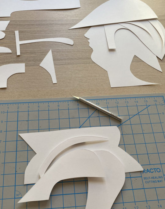
Using the sketch above, I apply the "map" of the shapes and forms that I see. Sometimes I redraw those forms on the paper that I will cut out, and sometimes I just "draw" with the x-acto knife to recreate the forms. Sometimes, it's a combination of both of those techniques. There is also a series of "out-take / byproduct" cut outs that do not make the final piece, those can be saved and used for the next piece, obviously!
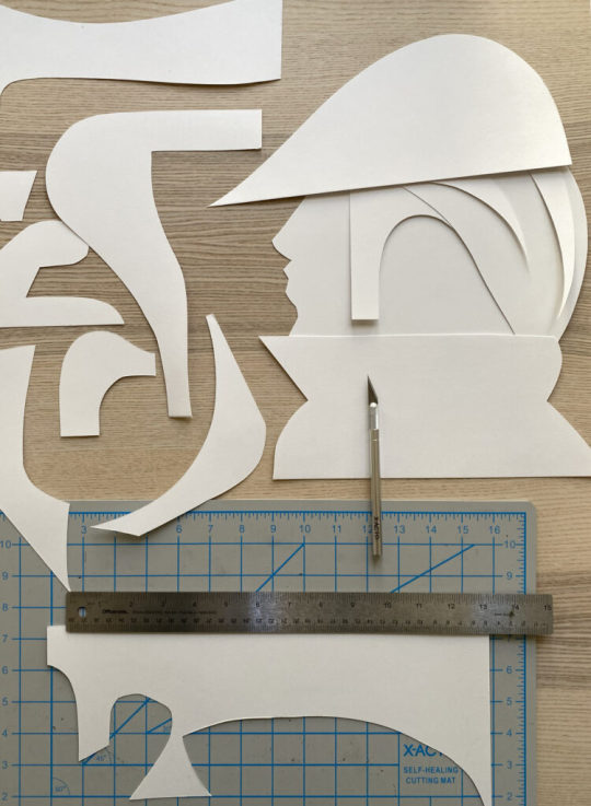
I layer the forms on top of each other to compose the arrangement as a whole, its fun to watch it all come together, in the next phase, you will need some kind of durable tape or you can make little paper forms that can be pasted to both sides of the forms as they stack, this will create the gauge and depth of the piece once it is placed onto the wall.
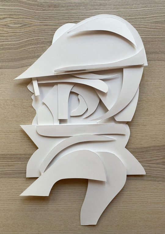
This is the final composition above, I love it! I used a roll of duct tape to make small cylinder forms that connect the pieces together, the piece as a whole comes "off of the surface of the wall" by about 1.5 - 2" inches - you can play with this a bit but keep in mind, the tape makes the piece heavier and it will want to comply with gravity :)

I hung the piece (also temporarily adhered via the same duct tape) for the photoshoot and to also get a good look at how it will function on the wall. I have an old painted fire place in my studio that is a great surface for hanging things, I love the contrast of textures between the bricks and the paper, as you know, the shadows will be super cool to see too.
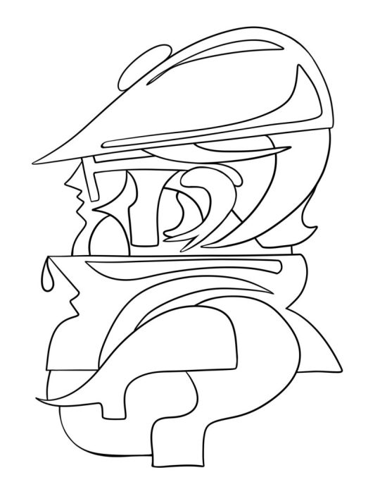
Once I had the whole piece constructed I took a few pictures of it. I immediately wanted a clean vector line drawing of the whole character. I brought the photo into adobe Fresco and used a vector brush to draw this lovely variation. This is how my brain works, I switch paths because I know they are really pipelines to the "next thing" that I will push this to, so forward we go.
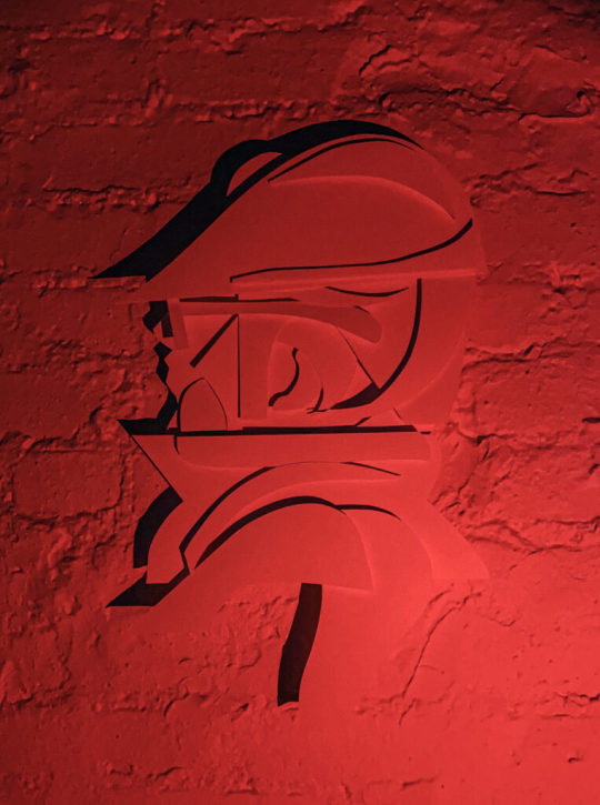
Then, it was light source and photo shoot time. Im not really happy with these picture as traditional "photographs" as I know I can do a much better job, but, as a series of "sketches" for a planned photo shoot, these will really help to make those plans a reality. I love neon colored lights. I have a bunch of them from various places and spaces that I found on the internet. Amazon has a great selection of flashlights with various colored light options. Get a few and play around with how the light can effect your work and the shadows that it creates. This is where the depth and gauge of your pieces play a role. The photos below are also a part of the same session, which all took place over a few days.
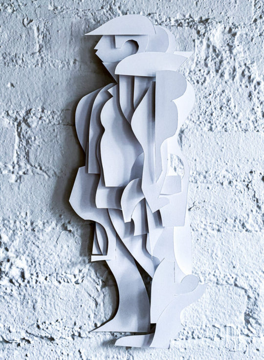
Here is another variation with a different character.. What do you think? Shall I make more?
#art#ryan seslow#ryanseslow#paper cut out#paper#paper art#2D design#2D#portrait#character design#graffiti#bboy#nyc#sculpture#paper sculpture
240 notes
·
View notes
Text
Nights are a little hard for me right now so before bed ill just talk about some of my fav artists


wilhelm m busch
Simple, clean, fluid. Ahhhhhhhhhh so many of his figures are nicely shaped, and his pen feels like it never stops moving. I've learned that a well placed squiggle where clothing fold should be do a pretty good job conveying what u need


Denys wortman
I'm always sad there's not much of his work online. I bought his book a while ago and mWUAH. This guy is a genuis at handling crowd composition. Groups of 2 groups of 5 groups of 10 groups of 50??? Hes done them all. He makes pencil work look so easy. Do u know how many sketchbook drawings I've destroyed because I wanted to try out his shading???
Not much honestly. I gotta practice more
189 notes
·
View notes
Note
How dexterous are phocid hands? I I know they’re fully capable of various works like weaving, intricate tattoos and stone carvings but is there any special aid they use to do this or are they comparable to a typical human and improve with practice and time at a similar rate to us? I’m wondering things like how writing utensils and other tools are shaped! I imagine a pencil would look different for lots of different creatures.
Phocids are actually quite unique among sirenians because their hands are, mechanically, completely unaltered human hands. They've got a blubber layer and different skin composition but the hand bones and the ability to grip and manipulate tools are completely comparable to a human hand of the same size. When the aquatic Sirenians were being engineered, phocids' hands were not changed from the basic human blueprint because there was no need; they were models of tail-driven aquatic locomotion.

^ phocid hands. They have four fingers each consisting of three phalanges, an opposable thumb with two phalanges, and fingernails (fingernails are very important for tool manipulation). because phocid hands are not really designed to bear weight despite them being quadrupedal, they can suffer from wrist and elbow pain if they spend a lot of time on land.
when working with slender tools they would need expanded grips (like the padded pencil grips you can get to reduce wrist pain)

Just to see what I could come up with I made an ink-pen with an expanded bowl for phocids to grip onto. The bulb part is the refillable ink reservoir. Obviously this type of writing cannot be done underwater. I think most writing utensils would need to be adapted to phocid hands not because of how they work mechanically but just because of their size.
Underwater, the main writing system is woven. Signs are made using knotted and interwoven lengths of waterweed which can be read at a glance, but also read by touch, as well. This is important to phocids because their necks are quite long, their arms are quite short, and sometimes they can't actually look at what their hands are doing. So most reading and writing is done without even looking; they make a cat's cradle kind of web of fibres and knit out a message. sitting back to read a nice book is, for a phocid, a matter of unrolling a tapestry scroll and running it between their fingers to feel the tactile woven pattern.
77 notes
·
View notes
Text
One simple programming lesson I'd LOVE to help new programmers get right: Stop using inheritance for everything. I don't know what it is, but I feel like it has to be something about how educational content is structured by either: - The formal education system - and/or online learning platforms ... but anecdotally, I have continued to see inheritance get completely overused when developing software. I'm also speaking about this because *I* was a huge offender of this early in my career. I wrote absurd amounts of code that completely abused inheritance. Why the heck do you think I have an entire course on refactoring?! My hunch, and I don't want to upset too many people (just a few), is the following: - People start learning to code - They eventually come across Dont Repeat Yourself (DRY) - They start to see patterns in their code and start over-using DRY because if it looks remotely similar, we might as well refactor it to a common spot! - These developers start learning OOP principles - Inheritance is the one that sticks because we always talk about memorable things like how a car is a vehicle and a cat and dog are animals - People suck at creating composition examples I guess, so nobody remembers to use it??? (The jury is still out on this) But then a discovery is made... One that will shape the next few months or few years of terrible programming practices: Since DRY is the single most important thing evarrrr (please pick up on the sarcasm, I beg you) ANDDD we need a common spot to put that reusable code for easy access... We can put it into the base class! Nice, now any time we want to use that helper method, we can just make sure our class inherits from the base class. Awesome! Oh, now we need to customize it a bit for this new class? No worries, we'll just override that behavior in this class. Perfect! ... after 42 months and 1337 derived classes going up to 69 levels deep in a hierarchy, you realize something unfortunate. Composition was the way. Don't spend the next 42 months refactoring your code -- get a head start and the next time you type "abstract class" or you skip sealing a class, ask yourself "Could I compose this instead?" This rant is brought to you by my receding hairline and the white in my beard. Thanks! ---- 📨 Sign up for my email newsletter! 🗣️ Share with your network!
43 notes
·
View notes
Note
Do you have any advice for drawing & animating quicker or is it all practice? Perfectionism also ties a lot into my workspeed, and I've always wanted to make a comic, so I'm trying to find away around it.
Practice helps for sure! You become able to capture the shapes you want faster and learn to streamline certain aspects of your style.
But also if I had to point out other factors that helped me get faster:
Less frames per page. It's easier to make a less cramped layout look good. Yes, you will need more pages to show the same succession of events. But juggling a ton of speech bubbles and panels every time will really slow you down, especially if you suffer from perfectionism.
Less frames per animation. All my current animations are low FPS. Use references to pinpoint which keyframes to prioritise and experiment with timing to make the most out of the few drawings you have. Post production can help smoothen things out with tweening and light camera shakes.
Flow/composition over everything. Most people won't care about the anatomy or perspective being subpar if the flow is good. 90% of my animation frames look like actual shit, but I like the way they move, and that's how most people will perceive them anyways. People usually blitz through comic panels as well. As long as the art in a particular panel isn't distractingly worse than the rest of the comic, no one will care.
Storyboard. When I was making the comic page by page, I often ran into the issue of having to go back and change things because the flow ended up being weird when reading the whole thing together. Storyboards help you settle on the overall flow and composition super early on, so you won't need to redraw the same scene several times over.
Lasso fill. I saw a post on twitter about someone being shocked at how much lasso fill has sped up their colouring process. It couldn't be that good, I thought. It was that good.
229 notes
·
View notes
Note
toskarin the wise, how do you get better at art at a consistent pace? I'm struggling to find the drive when I don't know where I'm going with my methods
the important first step is to find something that inspires you, something that you don't think you can replicate.
the next step is rather simple: trace the artwork and disassemble it. you don't need to worry about plagiarism since you're not posting it anywhere. take note of the lines— do they flow into each other smoothly, or are they jagged and coarse? stop a few times to look at the incomplete composition— does the frame look empty? when does it stop looking empty? speculate and sketch the 3d shapes that make up the image. if it's a portrait, where would their ribcage be? what shape is their scalp underneath their hair? their shoulders underneath the fabric of their clothes?
once you're satisfied with the result, do it again, without tracing the reference. you can still look at it, of course, but not having a guideline to follow will inevitably lead to the artwork drifting from the image you had in your mind. once you've done that, compare the two images you made. you'll likely think that the first one looks "better". ask yourself why. what did the original catch that you didn't? was it the anatomy, the shading, the perspective? was the line weight more measured? was the posing more dynamic? pick a few issues that jump out at you and practice on those and only those. as you keep doing this you'll be able to spin more of those plates at once, and with that more acute vision you'll notice more things that the original was doing that you didn't pick up on— more habits that you can form.
if you keep doing this, keep picking up bits and pieces and little flourishes that inspire you, you'll eventually form a repertoire that's varied enough to the point where you're the only one who wields it. people who can't see the magic behind the curtains will only see the whole rather than the patchwork of influences that made it up, and hopefully you'll be making art that hits your exact tastes! good luck
TL;DR: get really into niche enough pornography that it necessitates you in particular making said art
67 notes
·
View notes
Text
Had issues with layout in the ask post so here's the rest!
However 1 artist comes to mind for now and that's Murata Yusuke; I'm rereading Eyeshield21 (again lol) and each time his art makes me go "wah so damn good".


From colours, to how dynamic and alive pieces can feel, to lighting/shading, to textures, etc. Lot of the pieces also have this feel of mundanity in it which I really like, and I also how at time I feel like I'm there as well. I love the mixture of realism in lighting/shading (and at times anatomy) with the manga/comic style!
The last image also was a bit of an inspo for my latest Luffy art!
As for tutorial, I might elaborate in another post at some point (cus it's quite a broad thing to go about). Like I've mentioned before, I'm soaking up things along the way! Which includes things like colour theory, lighting/shading, composition, etc. But I personally don't recommend forced research/practice; art needs to be fun after all, take things at a time but it might be nice to try something new with each piece, however how subtle.
I can recommend Saito Naoki's YT channel! I watch his 'whimsical correction' videos during lunch at times haha - Each 'correction' (more like professional advice) has a certain goal/theme which can be improved upon, which can be story wise, appeal, anatomy, etc.
--
Anyway, some advice I have for now are kinda my 'cheats' will follow now! [Disclaimer: these are things that work for me and are by no means the 'correct' way of doing things. So if I say things like "avoid this", it's something I personally do.]
My strength lies I think mostly in my lighting/shading at this moment!


My flats aren't bad or anything, but I feel like it really comes alive after shading. And the first thing to do is to establish where the light source is. Try to avoid 'pillow shading', work in bigger shapes and don't be afraid to do so. Working digitally, I can recommend to take a big brush and just put it very roughly on your character. You have the means with digital art to easily erase parts that are too much and to refine shapes afterwards.
One cheat is bouncing light.
(This was a Multiply mode layer set back to Normal mode for sake of visibility.)


You gotta have a bit of understanding of volume of where to apply it, but it's light that's been reflected by e.g. the ground back up again. This little variation in shading can add a lot. Note that it's better to go from the OG shading colour and sliding it on the colour wheel (hue) to be either warmer or cooler and then sliding in the square/triangle (saturation and value).
More examples of bouncing lights:


It depends how intense the light is reflected; the more, the harsher the contrast is compared to the OG shading colour.
Second cheat is 'light terminator' and 'substance scatter', not sure if it's really the correct terms but oh well.


This reddish tone (again on the Multiply shading layer) is kinda the border line from light to shade. It's reddish on skin (if you have red blood haha) but you apply it on other things with other colours too!


Make sure you don't overdo it and put it everywhere, also note if you use harsh or blended brush strokes, maybe even both for variation! Try it out and see what works best for you!
--
That's it for now; this took more time out of me than planned 💀 you better appreciate this anon! /jk
My main motto regarding art is "fck around and find out". This mindset also helps with keeping art fun!
#hopefully it wasn't too overwhelming lol#this became kinda lengthy after all#with 'cheat' I meant something quite easily achieved to add an extra oomph to your art btw#ask kawaii
55 notes
·
View notes
Text
★ NEVER SAY NEVER. [ 002 ] the pinkette.

synopsis. something about the eight most well-known boys of your campus just didn't sit right with you, so you never gave any effort to interact with them. but after a series of... interesting incidents, they can't seem to leave you alone. pairing. college students! vampires! ot8! ateez x fem! reader. genre. fluff, angst, eventual smut, college au, vampire au.
chapter warnings. innuendos if you squint, wooyoung is still a bit annoying but it's ok because it's wooyoung. word count. 1.9k
chapter i // chapter ii // chapter iii

The car ride to wherever Wooyoung and his seven friends lived felt a lot longer than it actually was. He talked the entire way there and if you weren't so polite—ignoring the fact you cursed him out multiple times already—you would have put on you headphones to drown him out.
Most of what he said was not worth replying to, but sometimes you caught yourself having actual conversations with him. The way he could talk to anyone without previously interacting with them surprised you a bit. And if you weren't so stubborn, you would have admitted it was a bit admirable, a skill you never really mastered.
On the bright side, you think, at least he let you take care of the music. He hadn't heard more than half the songs on your playlist and you felt it was your duty to introduce him to the most life-changing songs you've ever listened to. Sometimes he'd ask you something about a song, and you'd accidentally ramble on and on about anything related to it; the composition, the lyricism, the artist.
When you did that, he'd stare at you for however long he could any chance he got. He enjoyed listening to you talk, your voice soothing and free of any innuendos he'd normally receive when talking to anyone from campus. Your eyes practically glistened when he asked about a particular song that played (one titled "Reflections" if he remembered correctly) before you went off on another tangent about how the song makes you feel, arms and hands flailing around to emphasise your points.
At that point, he promised himself he would not get you to talk about music around Hongjoong, in fear that he'd never see you again. The musical composition major would probably propose to you on the spot.
"Oh! And also, the way they used–" You abruptly cut yourself off, looking down to pick at the cuticle of your thumb, confidence gone in the blink of an eye. "I– uh– Sorry. I'm rambling again."
Wooyoung slowed down before completely stopping at a red light. As soon as those words left your mouth, he shook his head in objection. "Don't be sorry. I like listening to you."
You looked up at him and upon finding no trace of deception or false reassurance on his stunning face, you nodded, dropping your hands in your lap. The man next to you felt an urge to grab ahold of one of them, but he knew you'd throw him out of his own car.
The tenseness in the air didn't last much longer as you noticed Wooyoung pull into a driveway leading up to the grandest mansion you'd ever seen. There seemed to be two floors, probably a third in the basement, and the walls were painted a clean white. The design of the house was quite modern, utilising geometric shapes and large, clear windows.
The lawn was neatly trimmed and the grass healthy. There wasn't much to see out front, but you assumed they'd prefer to use the privacy of a garden in the back.
At the sight of the residence, your jaw just about dropped and you whipped your head to the left, staring at the brown-eyed boy.
"This is where you live?"
He shrugged nonchalantly, but the smug smile stretched across his face told you everything you needed to know.
"Are you guys part of the mafia or something?"
He choked at that question, quickly denying it, but you only sighed in disappointment.
"That's too bad, maybe I'd have found you a bit cooler."
"Hey!" He pouted. "I'm very cool."
You tilted your head, unbuckling your seatbelt and getting ready to leave the car. "Hmm... I don't really think so..."
"Plenty of other people do." Wooyung got out of the car with you, still pouting at you over the roof of the vehicle as he moved to the trunk to pull out your bag. "You ought to as well."
"I don't know, Woo. I'm not really one to care what others think." You pouted back at him mockingly before your expression became confused. Upon your words, his pout turned into another mischievous grin. "What?"
"You just called me Woo," he sang playfully as he led you to the entrance. "Are we on nickname basis now?"
"What are you talking about? I clearly said Wooyoung."
He narrowed his eyes at you, shrugged, and then turned away from you to unlock the front door. "Either way, I like it when pretty girls say my name." And with that he entered the house and left you standing there, staring with wide eyes and blushing cheeks.
After you finally pulled yourself together and reminded yourself you didn't like him at all, you stepped inside. As you kicked off your shoes, your project partner instructed you to wait for a second while he informed whoever was home that they had company. You obliged, not wanting to see anything that would haunt you. What would that be? You didn't have an answer for yourself, but you'd rather not find yourself walking into the living room and seeing a half naked man.
As Wooyoung rounded the corner again, you had gotten up from where he put your bag, getting ready to follow him wherever he wanted to work with your sketchbook in hand.
"You're in luck, most of them are out and Seonghwa-hyung is almost done cooking." He led you to what you assumed must be the kitchen. "We can eat first and then start working."
You held back a gasp, but couldn't stop the amazed look on your face as you took in your surroundings. You shouldn't have been so surprised considering the fucking hallway was pretty, but the kitchen was absolutely divine.
It also took on a modern style, sleek white cabinets and counters surrounding the space. In the middle of the room was a kitchen island with a matching white marble surface, one side occupied by a large sink and the other with five barstools. But, most of all, it was so clean.
Not that you expected a house where eight men live together to be dirty and a mess, but you also kind of did. Yes, you were aware that they were all rich and could probably afford you and your entire bloodline, including a cleaner, but that thought never really crossed your mind.
As you continued observing the kitchen, your eyes landed on a man on the other side of the island, leaning against a counter with his arms crossed, watching you. His eyes scanned your body, assessing you before he lifted a hand and ran it through his pastel pink hair. Seemingly satisfied—though you're not sure of what—he nodded and smiled at you.
Wooyoung briefly introduced you to each other, though you already knew perfectly well who this was, and you weren't exactly happy to be in the same room as him. But, for obvious reasons, being rude to your project partner's best friend was not a very good first impression. And as much as you didn't really care about first impressions, you knew—and dreaded—that you'd had to come over quite often for this project.
A look of realisation crossed Seonghwa's features, his round eyes lighting up. "Ah, I know where I've seen you. You also take linguistics, right?"
You nodded to confirm that. He usually sat all the way in the back, though your professor encouraged him to move up front since he was such a good student. He always kind of intimidated you, but seeing him now, in sweatpants and a large sweater, hair blow-dried and fluffy; you wonder why you would ever think he's scary. Nevertheless, he's just like the others.
Wooyoung tilted his head in confusion and turned from where he sat at the counter to look at you. "I thought you're an art major?"
"I am," you took a seat next to him, leaving one barstool of space between you. "I'm double majoring in art and linguistics."
The man you answered hummed and turned to his older friend. "What are you making?"
"I didn't know we'd have a guest, so it's just bulgogi with rice noodles." He turned to address you, "Hope you don't mind."
"Oh, not at all! I could eat anything right now." Neither of the boys missed the way your eyes lit up at the mention of food.
The three of you continued to converse as Seonghwa prepared three plates for you to eat. He fished out some utensils from a drawer and set them in front of you, then him and Wooyoung.
"Oh, YN," Wooyoung said, sounding as if he suddenly remembered something, getting up and grabbing some cups from a cupboard. "Grab some drinks from the fridge, there should be plenty of options so choose whatever you want."
But as you moved to the fridge, Seonghwa quickly blocked your path with a slightly nervous sounding laugh. "No, that won't be needed!"
You tilted your head and blinked at him and Wooyoung could hear the way the elder's heart skipped a beat. Another nervous chuckle escaped his mouth before he explained, "We ran out of drinks yesterday, follow me to the pantry and I'll show you what options we do have."
"Uhhhh... okay...?" Though still confused and slightly suspicious of the way he was acting, you followed him to the other side of the kitchen. You thanked him as he held the door to the pantry open to you, but completely missed the chilling glare he sent Wooyoung.
Fourty-five minutes later, the three of you had finished eating. You offered to help wash the dishes, but the pinkette immediately shut you down and sent you and Wooyoung to work in the living room.
"Thank you for the food, it was really delicious. If I could cook, I'd ask you for the recipe." You smiled at him, placing yours and Wooyoung's plates next to the sink.
"Well," he started, bracing one hand on the cupboard next to you and leaning in slightly. "I could always teach you, if you'd like." His eyes briefly moved from yours to the area slightly below before he resumed eye contact.
And there it is. That's a shame. You thought you had misjudged him, but you supposed you were wrong.
At your expression, he burst out laughing (it was a very pretty, melodic laugh), standing up straight again and putting some distance between the two of you.
Maybe you weren't wrong...? At this point, you didn't know what to think of the man in front of you.
"I'm just kidding, Wooyoung already told me about your... feelings towards us. I just felt like messing with you a bit" He trailed off, smile stretching a bit further to reveal his perfect white teeth. "You're kind of cute when you're flustered, though."
Now that he mentioned it, you could feel the warmth on your face. As the realisation showed itself on your face, he laughed once more and rested his hand on your shoulder. He turned you and led you towards the living area, where you could already see Wooyoung making himself comfortable on the couch.
"I'll leave you guys to do your work now. I might join you once I finished cleaning, but I have a paper due tomorrow morning so don't wait for me."
"Hyung, you're not part of our project, why would we wait for you?" Wooyoung raised one of his disgustingly symmetrical brows.
With a shrug, he answered, "To balance out your annoyingness."
He didn't stick around to hear Wooyoung's whiny complaints, instead turning back to the kitchen with a loud laugh. The brunette rolled his eyes and patted the spot on the couch next to him.
"Now," he said once you sat, albeit with so much space between you three people could fit comfortably, "Where do we start?"

[ lilo's notes ... ] woohoo the next chapter!! i think i'll make the upload schedule fridays, so expect new chapters then. what do we think of the story so far? i'm so happy about all the positive comments i've been getting, thank you guys so much. whoever though seonghwa would be the one she'd like, is wrong... so any other guesses? i have a few ideas on what to do for that project, and i think it'll actually be quite cool. so please look forward to that ^^
ଘ(੭˃ᴗ˂)੭ taglist ... @atinytinaa @marievllr-abg @legohwas @moonsangie @kiss-hwa @cqndiedcherries @ateezourstars @r1kitti @sarahleighflora @kyukyustar @cqndiedcherries @ateezourstars @kitty4hwa @hyukssunflower @aestheticsluut @neohyxn @mrowwww @darkdayelixer @itsokaytobedumb00 @hwa-sans @purplelady85 @meginthebuilding27 @stopeatread @mothworked @foliea @euphoric-emily16 @teezers99 @mulletjoonsupremacy @imalildelulu @sunukissed @blehhhidk @ad0rechuu @seongfury
NEVER SAY NEVER © seonghwaddict, 2023
#★ NEVER SAY NEVER — seonghwaddict#ateez#ateez x reader#seonghwa x reader#hongjoong x reader#yunho x reader#yeosang x reader#san x reader#mingi x reader#wooyoung x reader#jongho x reader#vampire au#college au#fluff#eventual smut
557 notes
·
View notes
Text


I'm obsessed with this stupid stained glass window and lemme tell you why, Tumblr. As someone who did a lot of reading on stained glass as a direct result of this stupid window and her visit to a cathedral with intricate stained glass windows.
Macbeth had this made. Let's start there. This man had this huge ass window not only made, but either made specifically for this space OR a much more absurd concept is that this was a recovered piece from Moray. The latter is absolutely ridiculous as a theory from a practical standpoint, but the former brings up a lot of questions as to why. Especially why with that particular composition.
SPEAKING OF THE COMPOSITION. Stained glass was, where churches and castles were concerned, often used to depict a story for the masses. This meant that they needed to tell a story without words, being able to speak to even the most illiterate among them. This means that the colours, the positions, and the shapes all have meaning. Kings would often be depicted as larger than their subjects, for example. Positioning within the frame also had meaning. However, despite being depicted as the King in the glass, Macbeth and Demona are the same size — depicted as equals. Not only equals, but with her positioned above him, he has depicted Demona as a "heavenly" figure. This is further highlighted by the 'halo' of the moon behind her.
Additionally, the colours chosen for a stained glass could have meanings as well. Hear me out on this one, as I'm aware this was an animated show and colours were likely chosen just for visuals and not for any meanings... but half the fun is tilting at windmills, alright? BLUE: Associated with the heavens, but also hope. GREEN: Growth and rebirth, life over death. RED: martyred saints, but additionally could represent strong emotions such as love or hate. Or love and hate.
I know these are likely me just squinting at details that weren't meant to be taken so seriously, but there's so much love and attention poured into this series that I feel like no one who worked on the show would be put off by my... squinting. ANYWAY. I will take one for my house, thanks. Hope my husband is ready for us to make one of these ourselves... but with window paint. Because I can't be trusted with large pieces of glass.
sources: Cumberland Stained Glass, Scottish Stained Glass
#posting this at night because it's just me babbling#gargoyles#this show has me in such a fucking chokehold it isn't even funny
30 notes
·
View notes
Text
When Augustine is being genuine, he calls her Joy. Always Joy.
All the bitting, the fighting, the snipping.
Joy.
Somewhere in the ether Cristabel and Alfred are tangled up, looking down at their myriad long play, hearing the rumors of who they were what they could've done to save him save her, if they were given five minutes, five words, five days... it's a broken record.
They were both beyond salvation, nobody likes a peace maker.
And yet, at the end of it, he calls her Joy and his mouth is dripping with honey and his chest painted with the desecrated remains of her heart.
And she calls him Augustine, all nine letters, and again very softly, pleadingly. Mean souled little man, that person, miserable ass, man-shaped worm, chattering imbecile, vile condescending son of a bitch. Augustine, Augustine, you promised.
He knows her like he knows his own soul like she knows the sternum, he knows her violence like the taste of blood in his mouth, knows her taste like the taste of in-season melons, like the taste of lives past.
She's quick enough in the draw to know every nasty little inch of the Saint of Patience's body down to the millimeter down to the composition of his genetic code down to the taste of his skin.
There's no practical application in that.
She needs not to wrap her arms around him to perceive the marrow of his bones. She needs not to see him to know it's his lungs and his lips and his breath...
He smells like nicotine. Yuck. Pfaugh. She will stain her hands so his remain clean.
My girl, my child, my chick, my dove.
My Joy.
I'm profoundly tired of looking at your face, sick of stirring in the storm of your eyes, I'll eat Cristabel's rotten soul at the red table of your rotten-peach heart instead, I'll call your ribcage my tomb, the pillows of your lungs my grave.
May I burn in your pyre, may our ashes be mingled and fuel a lonely star in the furthest loneliest part of the universe where none can bother our slumber.
Corrosive effervescence, poisonous delight, drunken familiarity.
Shush, my kiwi, my pipsqueak, my bleeding-heart dove, let us rest easy now.
Joy will show you what fervid decided devoted passion looks like - one last crack of this frail wishbone - Mercy will teach you a lesson in forgiveness.
#Or M- and A-. Mercymorn and Augustine. Patience and Joy. are so in love with each other they can't even be in the same room#mercistine#mercymorn x augustine#dios apate#mercymorn the first#augustine the first#the locked tomb#htn spoilers#flash fic#writing#nonsense also
222 notes
·
View notes