#I might put a read under later. idk for now. and holy shit finding og gifs was almost like hell
Explore tagged Tumblr posts
Text
YES the chained up scene is literal remake perfection ✨
Btw I’m not a film major or anything, I’m just here to ramble because listen. The writers and the cinematic director took an almost static scene, cleaned up the script, and made it so much more dynamic. In the og, you’re kind of passively just watching Leon and Luis talk. I mean it’s alright but visually a little boring; although you do get this rotating camera effect. But even that doesn’t last long and you’re treated to some static below-the-shoulders angle.
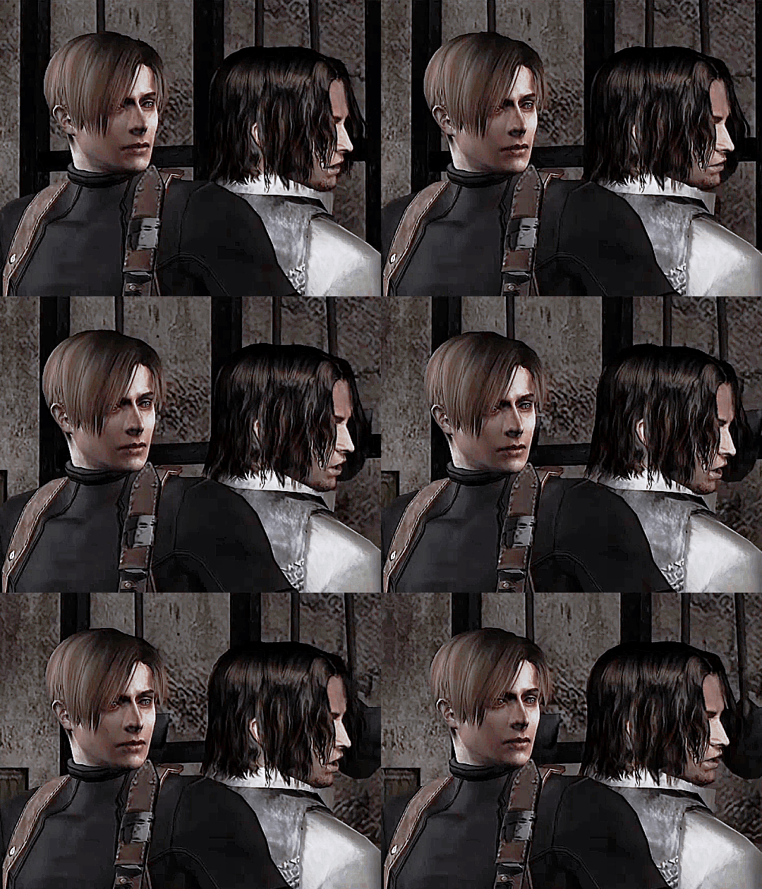
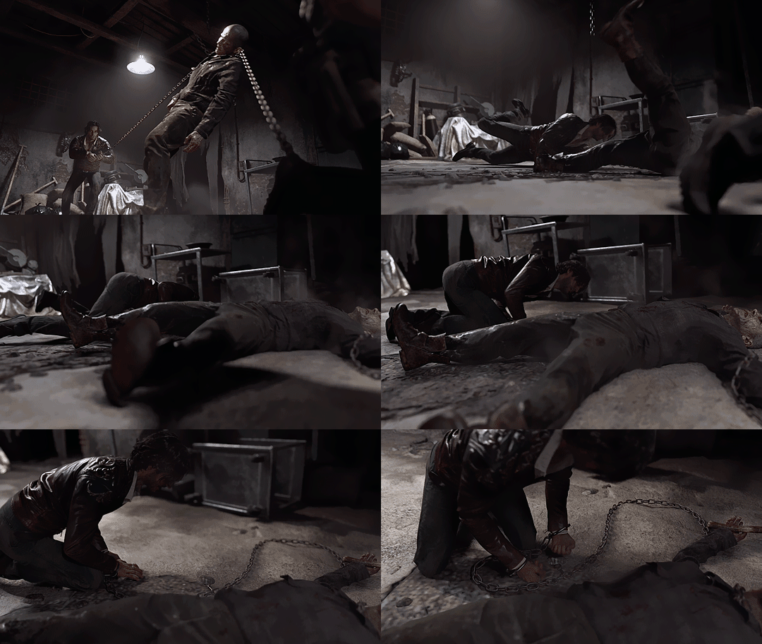
In the remake, the chains are there to act as visual representation for the push and pull of conversation. And it’s cut in between the speaking. Also a nice “show and not tell” way to differentiate between their personalities. So not only is it more visually stimulating and symbolic but the scene itself doesn't feel like an info dump.
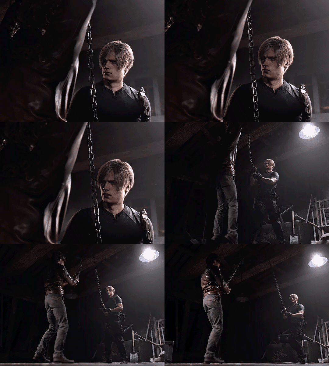
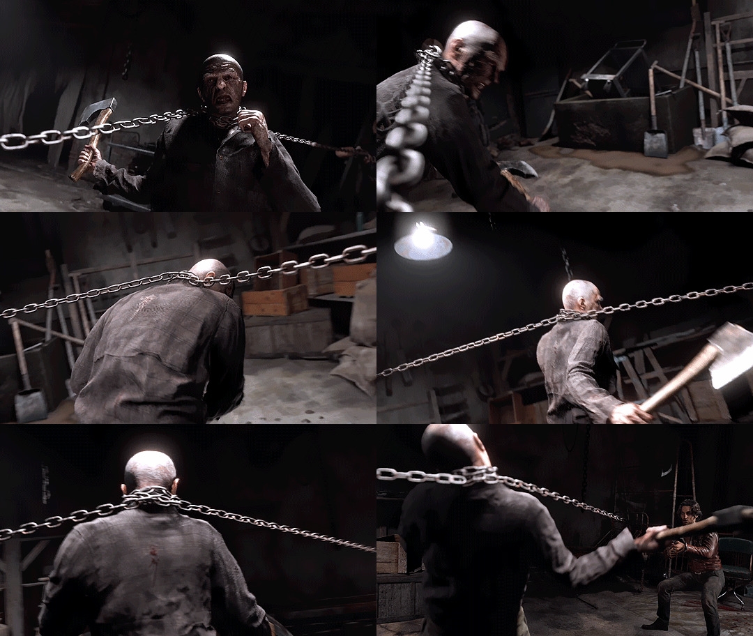
And it truly isn't this time. The writers were definitely trying to avoid how it was done in the og where the two were just straight up revealing personal history like it’s a coffee date. Another thing, the camera is far more dynamic too. When the Ganado was being wrestled on chains, the “camera” doesn’t just stick to using different cuts and angles to convey the action like before.
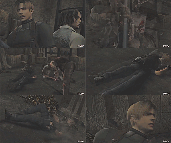
The camera is actually an interactive part of the scene. Circling from Leon to Luis, to traveling over the chains. It follows the movement of the Ganado which makes it feel a bit more personal. The remake does a lot of following character’s movements in general; almost like you’re a paparazzi with a camera.
If you compare the camerawork and editing between the og and the remake, you'd find that they're almost similar. Like yes, you still get your quick cuts, campy zoom-ins and angles. But what the remake does is improve upon that style especially by adding handheld camera movement. It feels like a proper evolution. They’ll do something like what I pointed out before or have certain shots just linger instead of using a cut to show the next action like they did here.
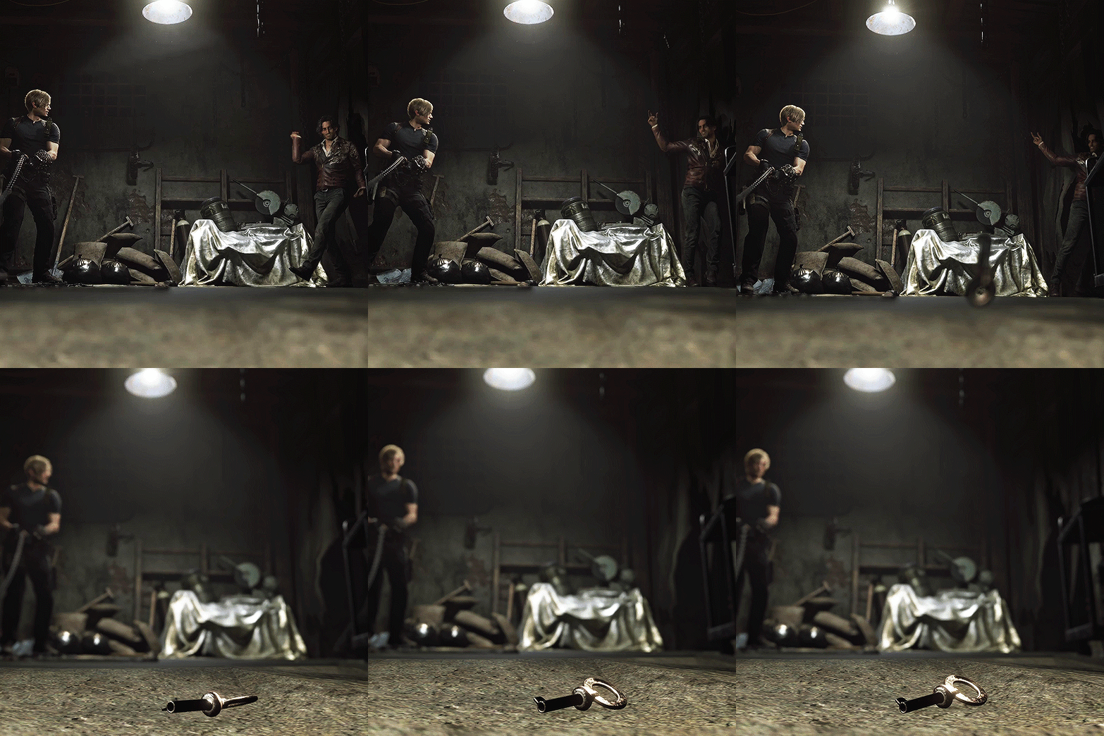
Even the part where Luis throws the key is framed interestingly. Because the og has a lot of shots of just the important objects themselves. Either a zoom-in or static frame. But what the remake does here is a subtle elevation; shifting focus from one subject to another in literally one shot. It’s a simple solution but so fucking cool.
As a last note, I like this reimagining too because the writing actually takes into account prior events. With Leon having been attacked by a village and Luis barely knowing who Leon even is, it makes sense that they treat the other like strangers in their own respective way. There’s no reason for them to be having a friendly a conversation. And imo, the remake does a great job of leaving the audience with a curious impression of Luis and sets up the future interaction with Leon. Like again, in the og there was none of that. Luis leaves and you meet up with him with no sense of continuity of the last interaction.
#this is kinda long sorry y’all 😅#I might put a read under later. idk for now. and holy shit finding og gifs was almost like hell#resident evil 4 remake#re4 remake#luis sera#leon kennedy#re4r#re4make#re4 analysis
210 notes
·
View notes