#I had a lot of fun with the pastel color pallet! I wanted more purple but the cotton candy blue and pink ended up winning some how
Explore tagged Tumblr posts
Text

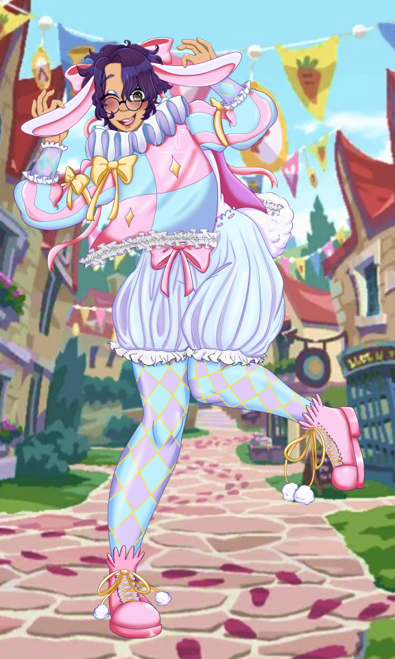

"Bunnies are usually Yuuta's thing, but I'll join in just this once!"
I've been working on this for a bit in between work and other things and I'm glad to finish it! I've watched the first half of the White Rabbit festival and its very fun so far. A nice little break for chapter 7's intensity! (In case anyone still doesn't know I haven't been as active lately because I have a full time job now! I'll still be making content though, just a bit slower! <3)
Voice lines Under the Cut:
Set Home: Let’s hop to it! Hehe~
Home Idle: There's so many pretty flowers here! And look, even the bushes are shaped like rabbits, how cute!
Idle 2: The history of Deuce's hometown is so interesting, I have read about the white rabbit before, but hearing the local folk tales and legends adds an entire new perspective!
Idle 3: I gotta make sure to get pictures of everyone in their outfits! It’ll be a great section in my scrapbook. Maybe I can get one of Deuce and his mom too?
Idle Groovy: -LOCKED-
Home Login: All the ticking clocks in town make me feel a little nervous…I’m not sure why?
Tap: The ears on my costume are floppy! I hit myself in the face a few times hehe!
Tap 2: Ortho’s been taking pictures along with me, the two of us have tons of great shots! I’ll have to make sure to get pictures of him, sometimes he forgets to take some of himself.
Tap 3: Even though I think Deuce’s outfit is pretty goofy I told him he looked handsome and distinguished! You gotta look out for your homies!
Tap 4: Silver was staring so intensely at me, it kinda freaked me out! But…it turns out he just wanted to tell me my shoe was untied. Then he even kneeled down to tie it for me…He seems like an alright guy.
Tap 5: Epel kept trying to compliment my look by saying it was “cool” and “statuesque”! Is it so bad to just look cute? **sigh** I don’t get it…
Tap 6: The glasses I’m wearing are styled after the pair the White Rabbit wore. They're a little smaller than my normal glasses, but they have their own charm.
Tap Groovy: -LOCKED-
Bonus meme bc I loved the silhouette:
#twisted wonderland#twst oc#q#yume ume#yuusona#disney twisted wonderland#twst mc#twst white rabbit festival#white rabbit festival#myart#pumpkinart#twst yuu#twst yume#I had a lot of fun with the pastel color pallet! I wanted more purple but the cotton candy blue and pink ended up winning some how#tried a new thing with yumes hair not sure how i feel but im done with this piece 0v0
161 notes
·
View notes
Note
📏🌈
OOH YAY UHMM - What's your go-to canvas size? so. uh. you may not be surprised why my art program tends to lag really bad when i tell you this. it depends if it's a smaller fun piece or if it's a big detailed shaded piece but uhh- my last piece ended up being around 2500 x 3500 and the one i'm working on now is around 2100 x 2900 i think? it depends on how square or rectangular the canvas is but i usually make them as big as i can get away with and feel like you can still see detail rather than pixels when you zoom in lol so. on average lowest would be around 2000 x 2000 and highest may be around 3000 x 4000 or something. i try to keep it below 4000 and above 2000 basically. detailed enough to be.. well, detailed lol. but not too detailed that it's unnecessary/lags the fuck out of everything. - Do you use more warm or cold colors?
honestly i've been experimenting with my shading a lot lately, in the past I usually use a dark blue color for shading and then add a few effects (color/saturation/multiply) from the original colors so it has a tint of blue but still reflects the original color, but I've been trying to experiment with it more. I did use more reds for shading in the last ghost trick piece I did even though the lighting was a solid white, the characters had a lot of red in their original color palettes so it felt fitting. (again pls don't look if you haven't played the game/watched someone else play it i don't wanna spoil anybody for the cool twists it's great <3) but uh yeah right now it's not very consistent I'm experimenting a lot more with it. in the piece I'm doing right now I have a dark purpleish color as the main shade that seems to work well with the more dull colors but with the pinks/yellows/blues i've been using the purple color on hard light or soft light to make it match better. i want the piece to have more pastel coloring by the end and i'm trying to keep the color pallete cohesive and consistent despite slightly changing the shading colors for certain pieces of the design. i think mostly it depends on if the piece is standalone or if there's a background for me to blend it into? like again in one of the ghost trick pieces i did the sky was a nice teal/blue/greenish color so I used that for some of the back shading, but it was also in front of a yellowish moon so I used that for the highlights. a nice blend of both i think.
i tend to have a blue bias for sure though lol i probably use cool tones more often, i prefer more.. not dull or desaturated color palettes but just not oversaturated? the bright colors can mess with my eyes a little so I personally tend to de-saturate colors at least a little bit. but with the current piece i've got the original colors are more saturated than i typically use so I'm trying to keep it a blend of both and keep the original saturation while still toning it down to a saturation i'm comfortable with.
but yeah i've been stepping out of my comfort zone with color/shading lately, it's been fun! thanks for the ask btw this was fun! sorry i ended up going on so long lol..
5 notes
·
View notes
Note
What influences went into Etienne's aethetic?
ASK THE MUN ANYTHING YOU’VE WANTED TO KNOW ABOUT THEIR CHARACTER. THEY MUST ANSWER!
I dated a lot of goth girls in my youth. lol
This is just going behind the cut because it’s long. TLDR; I’ve always liked goth stuff. Etienne/I discovered that wearing pinks annoyed some men IC and OOCly and never went back. Besides spring colors are actually just a reminder of transience and therefore the inevitability of death.
Seriously, I just… really like Victorian things, ornamental things. When I lived next to a grave yard I walked in it early-ish in the morning every day. I listened to a lot of dark music growing up, some of which is considered kind of goth standard, like Rasputina and Voltaire. IAnd I wasn’t kidding about dating goth girls.
I was also obsessed with visual kei and gothic lolita for a long time, so I’ve been surrounded by a lot of the visual ideas I use toward Etienne’s look for a long time. And I have some friends I know from other hobbies who have similar tastes to mine who also inspired me a lot with the fashion and aesthetics they reblogged.
I already had the color pallet of their design down when I first created Etienne, I thought they’d be more pastel grunge or straightforwardly goth. Having played in Balmung about a year until my hiatus, and playing around and observing people on Ultros when I came back to the game two years later (I think? About?), I felt deeply aware of the homogeny of people’s character design choices. I’d already made a dark-skinned character but I wanted to make a character who was more idealized to my specific tastes and had a specific character design and look rather than things I just threw together at the time in character creator because I thought it looked neat.
Etienne’s initial look and aspects were very much in direct response to how much I hated Charibert. I don’t want to derail and rant about that, but I knew I wanted a dark-skinned, gender-noncomforming elf, who was, shockingly, not a monster.
Initially Etienne’s pallet was more purples and grays, though they’d throw in some pinks here and there as pops of color. I’d say their look was more romantic goth than anything to begin with.
In terms of look and presence I was deeply influenced by Naomi Campbell’s looks she modeled in the 90s, especially Givenchy and Alexander McQueen - but even more specifically, this picture.

I had that little muse voice you get sometimes where my character said, “Yes! That’s like me! I’m like that!!” And that’s when I could no longer deny all the messages Etienne had been sending me about not actually being at all comfortable with the labels I initially played them with.
I did like the idea of them utilizing color more - after all, dark colors aren’t just about the darkness in the soul or whatever, it’s a gesture of nonconformity. However, Ishgard is an entire city of sad Catholic goths. So. What’s rebellious about wearing dark colors? What’s controversial about that? I began to experiment more and more. I got a kind of reputation for being fashionable among my friends in-game, and so then I pushed myself to be more daring and interesting with my choices. I want to say very much that I never felt pressure, it was more of a motivation to really consider things thoroughly.
I feel like I really settled into what Etienne’s aesthetic was all about, look and attitude wise, with this glam.
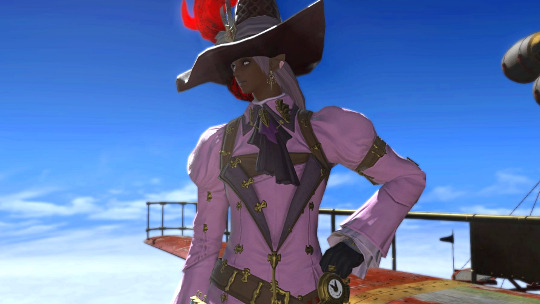
This was a version of the hat that was not dyeable, and I had a lot of fun attempting to find colors that would coordinate with it. And I realized the pink looked great!
Etienne ICly wore this to a meeting when they worked at an adventuring guild, and two different men complained about the overt pinkness of the outfit. One of them complained at length, not just in their internal monologue in their tags, but also in muttering and so on. Adventurers, as you may or may not have noticed, generally wear drab colors, so apparently, the pink was a bit of an eyesore. To the complaints, Etienne simply said, coolly, “It’s spring.”
I knew I was onto something there, and Etienne decided to go all-in with a mostly-spring color pallet. Because celebrating the colors of flowers that are fleeting and will fade quickly is a reminder of transience and mortality. And it annoys men. And that’s more or less where Etienne’s fashion tastes and aesthetic come from! As a supplemental, here’s some out-of-date-rambling I did about how I coordinate outfits from over a year ago.
Thank you for the ask, @ren-roelanberry !
8 notes
·
View notes
Text
Fashion, pastel goth, and glams in Eorzea
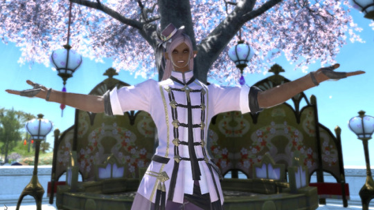
When I returned to Balmung about a year and a half ago, I fantasia’d Etienne with a very specific sort of soft grunge / pastel goth look in mind. While the definition of pastel goth (much like ‘goth’ in general) is vague and not very agreed-upon. In the case of Etienne’s design philosophy, it is, at its core, an embracing of elegant, feminine lines and shapes with a heavier Victorian/gothic fashion sense, while embracing a spring and summer color pallet. I classify Etienne as a pastel goth just as much because of their attitude as much as their look. I do not consider pastel goth to be ‘goth lite’, as some might categorize it. Also, I’m more of the philosophy of creating an aesthetic rather than following one, if that makes sense. Since I can’t define what pieces turn up in the game and not everything I’d like Etienne to wear is available to them, it’ll never be exactly what I’d want or imagine. But I find that to be part of the fun and the challenge.
I was very flattered recently to receive a message asking for tips on what items dye well for a pastel goth aesthetic. I’d say the Heavensward gear is best for goth stuff in general, there are a lot of gems in the leveling gear, and people are moving away from that for the time being which will give you a more standout, if possibly quaint, look. I wouldn’t say there’s a particular color or dye that works better. I bought some of the pastel pink dye for my wedding and have used it on a few other items and found it quite satisfying, but you can get a good look out of everything if you follow through with your colors and it happens to be shades that work on your character. Even the ice blue and rose pink dyes you get in the early game could be put to good use in the right context.
Siince I realized I had a ton of things I wanted to say on the subject of glams, pastel goth and fashion, as well as wanting to use visual aids. Here’s some basic ideas and philosophies that help me dress Etienne in all their pastel goth glory. All of these things are purely my opinion, every single one of them, so feel free to disagree. Preferably far away from me. I’m only an amateur when it comes to fashion. I like it a lot but I have not taken a single class or cried over a dress form or anything like that. If I get something wrong, I hope you can at least get my gist.
1. The Character Creator, Hair, Makeup, And Other Considerations
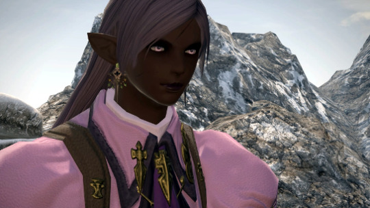
Everyone’s got that POTD haircut these days, right? But I love it!
When it comes to character customization your mileage can vary by races. I won’t begin to tell you what looks good. Aside from retainers, I’ve heardly touched any of the character creators aside from mi’qote and elezen. I’m a little obsessive about trying to make sure that my characters don’t look like everyone else’s, and that’s something that’s only brought about by long-term experience in the game. Remember that shades look different between haircuts, and if you think a skin tone or hair color looks good in the character creator, you probably want it a shade or two darker. The swatches are liars and things IG tend to look more washed out than in the CC. This shade of lavender looks like pink in the swatch, lavender looks gray or silver, etc. You can waste a lot of time, and potentially gil or fantasia on experimenting with this, but I’d say 98% of the time I’ve gone back to redo a character’s look it was mostly rectified by darkening up my color choices. So you may want to simply pick what you like instinctively, and then go a shade or two darker. I happen to like to highlight with a lighter shade of the hair’s original color to give some illusion of depth and texture, but this doesn’t work with every hairdo. Paler eyes give an illusion of life and depth to characters, but wash out very easily in screenshots or may give a lack of distinction. Lip color you can take a bit more risk on. Darker purples, reds, and even greens or blues depending on what you’re going for / your character’s skin color (the latter look great on gray and blue skin tones) look pretty awesome, and again, better to err on the darker side. A brown can be an excellent choice for a ‘neutral’ lip color that still provides a made-up, polished look.
Bright colors look best on warmer and/or darker skin tones, so if that’s part of your character, you’re in luck.
One of the best pieces of advice on creating a customizable character to RP was to simply make it and walk away, and return to it the next day. This requires a lot of patience, but I think the results speak for themselves. You may otherwise wind up playing your character and finding you dislike your choices - or you made some very basic mistake.
2. Building A Silhouette
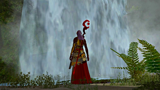
Shh... I know this isn’t pastel.
Shape of an outfit is, in my opinion, just as important as the colors you choose. This, like many other aspects, has many factors out of your control as we cannot have items custom made and builds have little variation. It’s a video game, and frankly it’s not like most of us are getting our IRL clothes bespoke either. Just as much as you want to think about what colors you should be wearing (and if you’re a RPer like me, why your character might wear it) but if the lines look good. I tend to build an outfit around one specific, notable piece of gear. Usually it’s a coat or something like that, but it may also be a hat or boots. I take a look at the shape of the item and consider the overall silhouette of the outfit. The Thavnarian bolero is lop-sided and worn with pants beneath, as the bloodhempen casting robe. The ‘real’ bottoms for these sets are pants. I’m not fond of the way that breaks up the great line at the waist of these items and makes things look a bit lumpy and uneven. I thought a skirt was a great way to rectify this, plus it adds an interesting motion when you’re moving.
Having a lot of really ornate pieces all together at once, as well as potentially your weapons, can create a busy shape which makes an outfit seem muddled. Your admirers won’t know what to focus on. An outfit should, much like the main character of a Shonen Jump series, have a design that is simple, recognizable, distinct and attractive in silhouette.
3. Colors and Dyeing

If there’s one thing I come to again and again, it’s that you shouldn’t wear all one color.
This warddrobe color guide infographic literally changed my outlook on fashion forever, and thus, my entire glam life, and I keep the rules at the bottom for ‘foolproof combinations’ in mind at all times.
I tend to avoid traditional neutrals, if I must I’ll go with the various shades of gray that are somewhat underutilized IG. Cream yellow and bone white are ones I’ve used a bit on one of my mi’qo alts to great effect, but they are more yellow and ecru than just plain white.
I don’t have a cap that shows it, but I used to have a glam that was mostly grays with salmon pink gloves and shoes that dyed so that just the socks were that color. Using pops of color this way are an opportunity to cheat and use colors that might not look great in large amounts, or are unflattering on your character for the most part.
Remember that the more colors you have, the more bright pops, the more risk you run of looking busy, or that you simply threw together colors you liked without further consideration. That being said, I tend to enjoy using color families. Most of the light colors have darker counterparts.

When you dye an outfit a light color, many of the details get changed slightly to their darker shades. You can then pull out those colors for other pieces of your outfit and match it up. I was delighted to find out, when I got this hat in a drop, that it bore similar colors to the coat I’d already dyed colibri pink. Just because something isn’t dyeable doesn’t mean it’s going to clash with everything you own. If you like a piece, hold onto it. You never know. This is less of a problem in SB, but... just don’t ask to see poor Neondemon, my fashion retainer. Even his beefy Roe arms can’t hold all of my collection.

Plum purple wound up dying half of the boots that actual bright purple, and half of them a deep purple that coordinated with the trim and the other darker elements of the coat. In any case - dark hat, dark gloves, light shoes with a darker trim, and a very bright coat.
I also think it’s important that your earrings, etc., match the other materials you’re wearing, and that the shape compliments the outfit as well. Don’t let your earrings work against an outfit.

Here we have the combination of light coat, light hat, dark gloves, dark pants and shoes. I loved the line of the Ala Mhigan jacket and its art noveau little hat, so I decided to keep it. Even though this is a set of tomestone gear that basically everyone has, I’ve received a lot of compliments for the choices I made in dyeing this pairing it with the overall look of my character. In spite of it being an ‘ordinary’ outfit with zero alterations, I absolutely loved wearing this and how Etienne looked in these color choices. I don’t think you have to break new ground with every outfit or find the most unique, rare pieces. It may not be realistic to spend your time on that. When you dye things in unusual colors, it brings out qualities others might not have noticed or appreciated about that item. The details on the Ala Mhigan casting set are so much more noticeable in this light color, and it looks very pleasant with the snowy white trim. In spite of doing very little to ‘develop’ this glam aside from deciding on the colors, it’s one of my favorites so far.

Dark jacket, dark pants, light gloves, light shoes + paissa. #aesthetic
4. Take Risks, Get Feedback, Make Friends, And Have Fun

Or just marry someone really cute and stand next to him.
I’ve met so many awesome people because they complimented my look or my glam and I took a few minutes to chat with them about it. Complimenting others has gained me a lot of insight into different ideas, where gear comes from, how it dyes and how to pair it up with things. Allow yourself to be a work-in-progress. The one person you truly have to answer to when it comes to glams is yourself, so there’s no reason to worry to much about getting good.
I dye all my leveling gear.

I just feel like I’m having more fun when I’m pretty.
23 notes
·
View notes