#I feel so bad wanna write or draw or ANYTHINGGG
Explore tagged Tumblr posts
Note
I fucking adore your comic panelling, any advice on how to do it? Like specific ratios or ways to divide the page?
god there's so much advice i COULD give but i really dont wanna end up writing a book here. so I guess I'll say this: however you divide the page you should be CONSISTENT with it, i literally just learned/internalized this but it's made comic paneling soo much easier. when you break that consistency it will be more impactful. hold up lemme grab some pages.
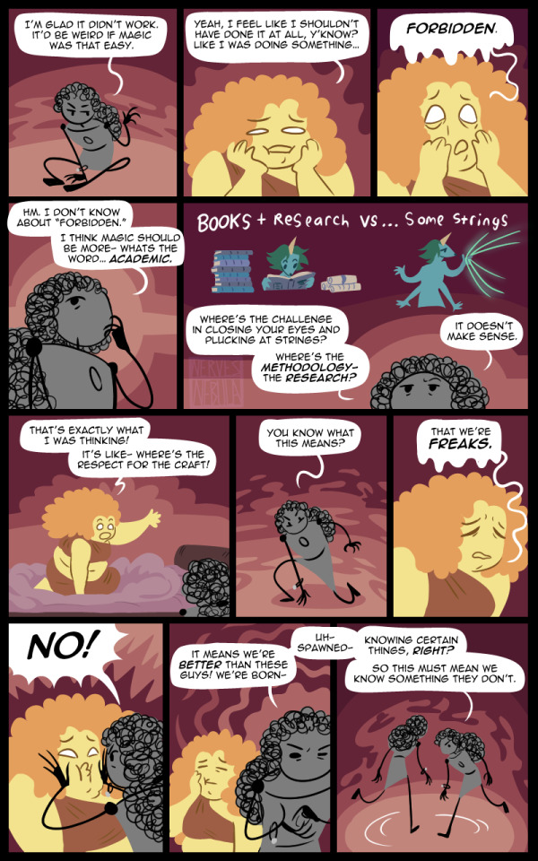
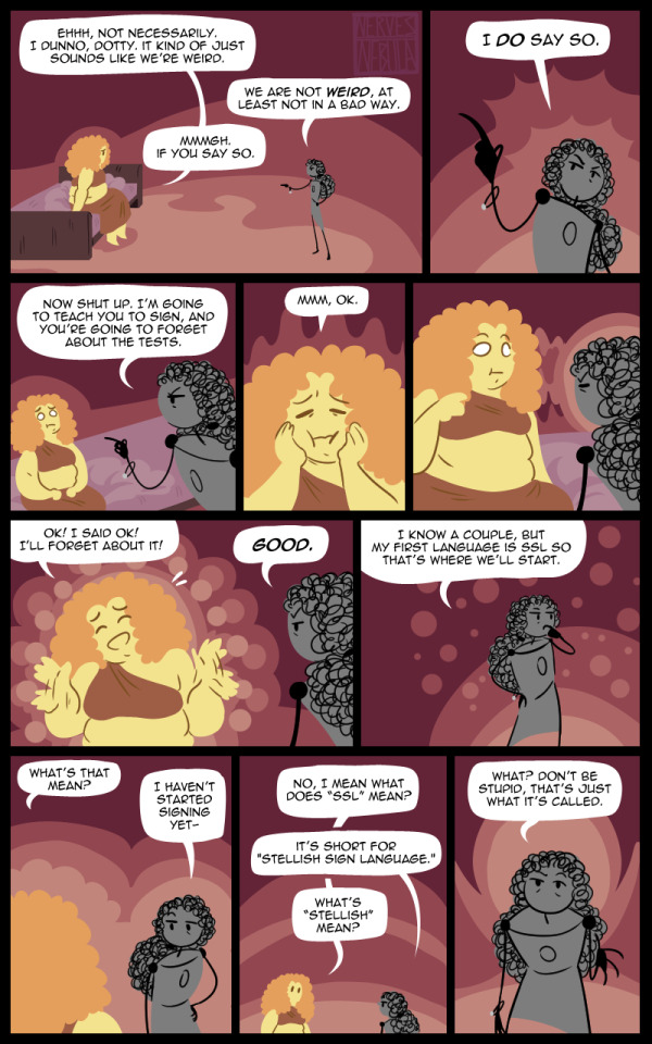
so i recently started making loose stitches a 4 tier comic. it's not the exact same for each page cuz i'm lazy but i think it's made legibility way better. before i think it was kinda uhhhhh a little all over the place. not BAD but a little difficult to tell where your eyes supposed to go sometimes. which isnt great for a commic.
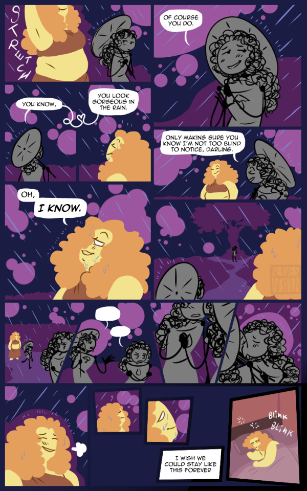
the page on the left in particular has always bothered me cuz i always read the top panels incorrectly and it's like. fuck man what is the paneling here why is it in two columns ????? that's so hard to understand. but the page on the right can be more or less easily understood (by someone who knows how to read comics) even without panel borders because it's just a simple 4 panel square.
one thing my comic professor really stressed was that he didn't like weird paneling or weird borders. for the most part, a square is fine. AND HE'S RIGHT. weird paneling is fun and cool but should be used sparingly or with intention, cuz if you do it too much then like. how tf are ppl gonna read your comic.
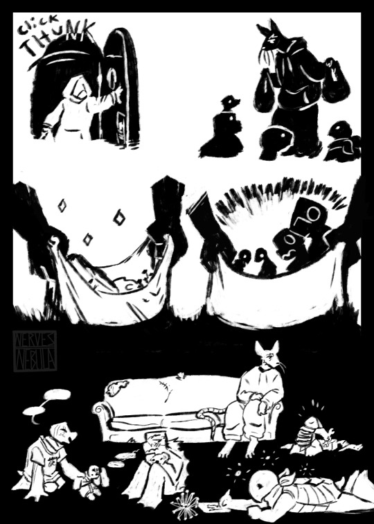
that being said there are a lot of cool ways to cut up panels even if they're just squares hold on lemme grab some examples
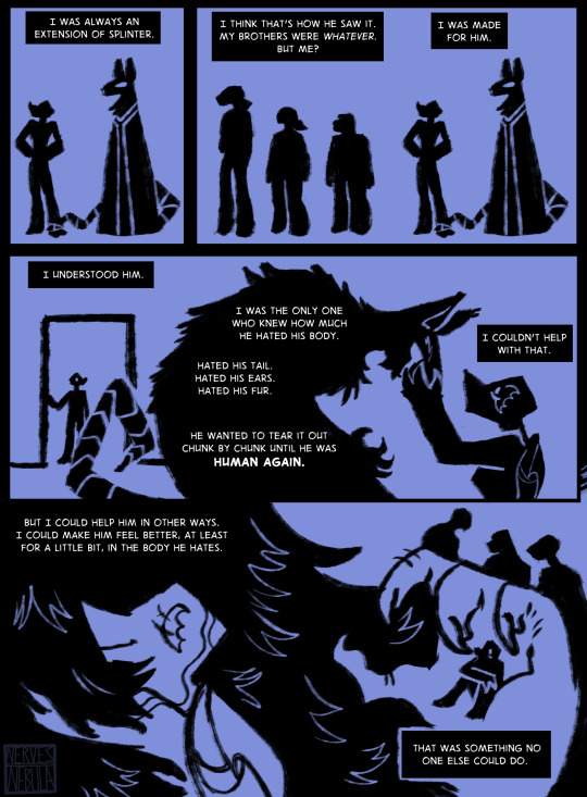
so the panels here are all square but the image in the one at the bottom is almost like a mural. one thing i really like to using is a lot of heavy BLACK, what can i say silhouette's have my entire heart.
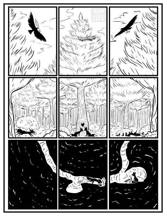
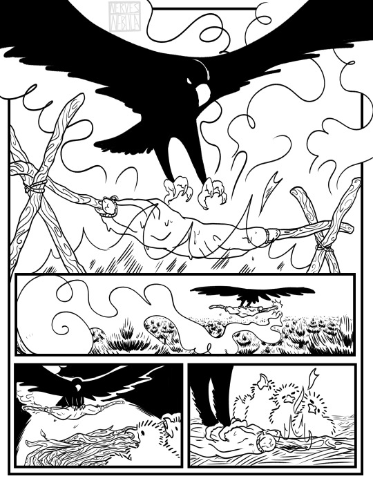
in my fable comic, I used a 3 tier system. it wasn't the same exact size across all pages but all pages had 3 tiers of paneling. that way i can be a little more flexible with the SIZE of the panels to emphasize the more important things, without it feeling like it's all over the place
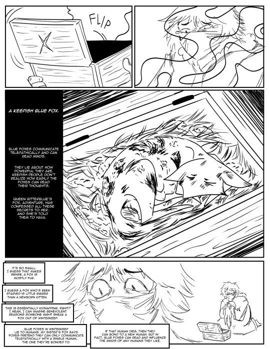
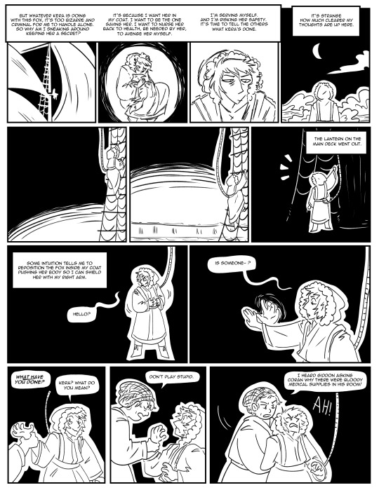
meanwhile in my comic final i used a 4 tier system where each tier was nearly the same across every page, but you can collapse tiers together for establishing shots and big reveals so that they're more impactful. it's still fully within the grid system I set up so it doesn't feel like it's messing with shit either.
ok i just spent a lot of time rambling about this one particular concept and it's probably not even what you wanted to hear about :') i didnt even go into ratios or anythinggg guhhhh sowwy
other than all that i'd just say you gotta keep looking at what comic artists have written and take note of how they use space and cut things up. there's this book called How To Read Nancy and it has all these exercises for understanding the building blocks of nancy. for real the author is OBSESSIVE and goes through everything of a 3 panel nancy strip from body language to spot blacks to the minutia of the background. we used this book in my class and did some of the exercises in the back and i think it's really good at getting you to THINK about what you're drawing. and you can easily pirate it if you're broke.
also try to make sure things dont get stagnant on a page. zoom out if you're only doing close ups (i try to make sure every page of loose stitches has at least one full body shot even tho I'm lazy and wanna just do talking heads- talking heads arent interesting!!)
also, take advantage of the fact you're drawing a COMIC. you can do shit in comics that you can't do in other mediums, try to implement them when u can! ALSO PRACTICE. you're not gonna get better just by reading and watching. you gotta do it lol. ok ok that's enough and you didn't even ask for that stuff you asked about PANELING sfdasfsd byeee
29 notes
·
View notes
Text
Sorry for another hiatus; my body's falling to shambles like a poorly made cloth doll & it's kinda killing my motivation for uhhh everything, but hopefully'll be sorted out soon.
Love y'all, please please feel free to send or tag me in things! Sad that I missed all your wonderful creations this month :(
#💬 beskar.txt#I'll be catching up on all these fics as soon as my mind's a little clearer🫶#I feel so bad wanna write or draw or ANYTHINGGG#truly think the past couple years of wildness are catching up with me#was supposed to get surgery yesterday but couldn't afford it so there're just shards of broken teeth cutting into my mouth rn lolol#so that's top priority but then there are a million other things to fix#just insanely overwhelmed & unusually fatigued#be back when I'm sure I won't have to immediately take another break haha
9 notes
·
View notes