#I even drew the iterators body designs there is much under those clothes
Explore tagged Tumblr posts
Text

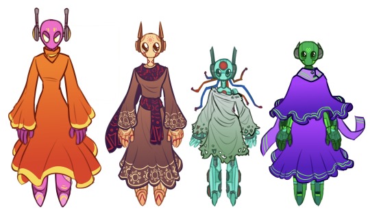
Rain World rot. In my brain
#rain world#rain world downpour#downpour spoilers#spearmaster#artificer#hunter rain world#gourmand#survivor rain world#monk rain world#rivulet#saint rain world#five pebbles#seven red suns#looks to the moon#no significant harassment#I spent so much time doing these pls look at them#I even drew the iterators body designs there is much under those clothes#( i have to make robot designs complicated or ill die)#slate’s art tag
678 notes
·
View notes
Text
Metal band story devlog 10: OKAY. CHARACTER DESIGNS. LET’S GET TO IT.
So initially when I finally decided it was time for some character designs I faced a problem. It was not a lack of skill or frustration at my art, it was the fact that I don’t know what I’m designing really. let me explain:
I think a very important thing to do in general is to be aware of your shortcomings and I try to apply this rule to myself as often as possible without it being self destructive. one of those shortcomings is my inability to draw things that I’m not personally familiar with.

I don’t think I would have ever drawn shoes that weren’t my own, so you can imagine what that says about characters and people.
This tends to bleed into art block and a good solution for it is to usually find inspiration somewhere. I don’t like doing that, nothing wrong about it and before you accuse me of being on my high horse I will gently remind you and myself that there is nothing new under the sun. I will inevitably end up being inspired by something even if I’m not actively aware of it but I find that basing a design on someone else’s design feels derivative, which setting aside the legal issues of me wanting to publish potentially copied designs, isn’t very nice of me to do to my fellow artists. I’m better than that. In any case I needed to try to start somewhere so I tried making a design for character A. this is the classical musician. I didn’t base the design on their personality because that never not felt weird to me. I don’t want to know what someone is like when I see them, that’s not how people work.
here is the pathetic first attempt, where i went in with “they’re probably tall and skinny” in mind:
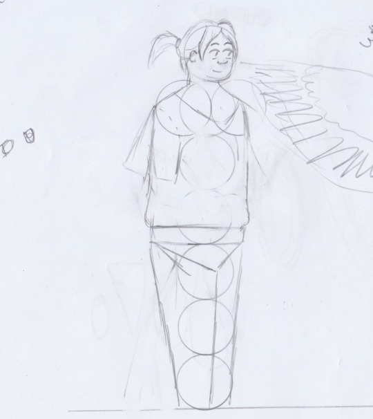
I knew that A would be a classical musician, so I really wanted to include at least a vague reference to one of my favourite pianists, Nahre Sol. I think she’s very cool and so I opted to make A’s hair similar to her’s.

The actual image is upside down
It still looked boring as fuck tho so as is the case with character design, you iterate.
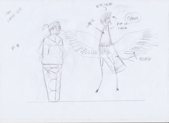
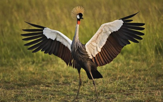
Here you can see I drew a crane, which is a thing you can do when you think designing people is boring as fuck which it usually is if you don’t have fun with the shapes. I really liked how the crane’s body looked like a teardrop and how long the legs were, it also was mostly black and white which went well with the “classical musician who wears classical clothes” vibe.
So I tried a more geometric approach, with long legs but It didn’t fit into the vibe I had in mind and the feet were so comically large i anticipated people would be distracted by it:
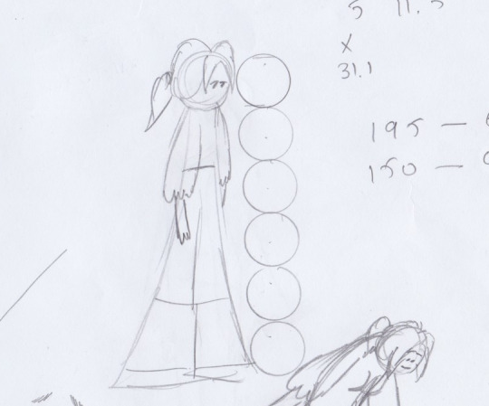
I defaulted back to a more organic looking teardrop shape and ended up with this which i liked:
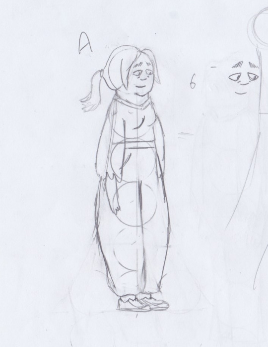
Let’s note a couple of things about this: I liked the eyes, but i very quickly realised I can’t have that be the default shape of the eyes, because please look at this monstrosity:
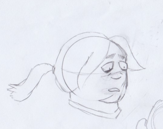
I came back to it the next day and made a realisation: those are some big legs. So I decided to lean into it and thought It would be cool if she was strong and muscular, and you’ll note that I’m saying “she”, we’ll get to that in a moment.
I had taken the time to think about the fact that I'd like her more if she was more in context. Because floating in the void like that, she’s just some character which was bothering me. So I started small and made a height chart with some general body types/shapes:
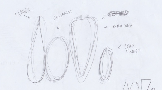

This made me more confident in the design because it had some story now, she was very tall and imposing.
I was reminded of a tweet by Pseudonymjones where she talks about a kid who saw her and called her “the lady with the big muscles” which i thought was cool as fuck in may 2019 and still think is cool as fuck now.
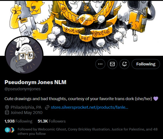

This made me like the character so much more and It made sense to me because of everything that I knew so far about the character and the setting that she would be trans. All my research showed that metal musicians would be very likely to be normal understanding human beings and I already know what not to do and what’s preferable from the research I did for Almost Home.
So I present to you the first sketch of Leila:
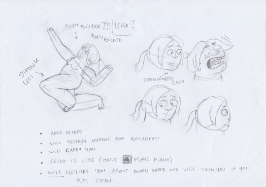
Note: when designing characters I always design them naked, because clothes a character design does not make. They help, but you can’t start there.
Obviously the design will evolve naturally (and by the end of this devlog update) and get polished the more I draw her but I think this is a solid start. For starters let’s fix those ankles and draw some more sketches to get a feel for what Leila is like when she moves.
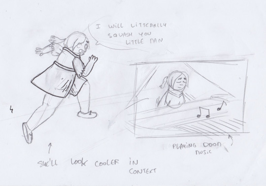
Okay, I’m digging the vibe. I also drew this other one where I forgot to factor in the pelvis when accounting for the length of the legs, so i went ahead and tried to edit it:
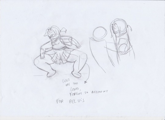

It looks a bit better, the legs still look gigantic but I think I want to keep that. I imagine she goes to the gym quite frequently on account of being a tryhard. Perhaps that’s one of the things I could explore in the story?
I also tried messing around with her face a bit. I ended up sticking to the one I originally made, which felt the most natural. Maybe that says something about me and how I go with the first thing I see, but it is what it is.

Also here’s a tip for anyone who might need it, you know those doll dress up games where you drag PNGs onto the model? You can use that system when trying to make variations of a design. I did it with a light pad.
This was when I consulted a friend of mine, Alaa. He pointed out the limbs i drew looked kind of ballooney. This wasn't from a lack of reference, it was the abstraction that was done improperly. You see here's two things to keep in mind: firstly I didn't want her to look muscular despite how strong she is. Obviously some of it is bound to show what with her legs as you'll see but I wanted her to seem like a quirky human at first. Secondly, while it's true that I tried to make the limbs with contracted muscles bigger if that's not tastefully done then it just looks silly. So here's where we're at now:
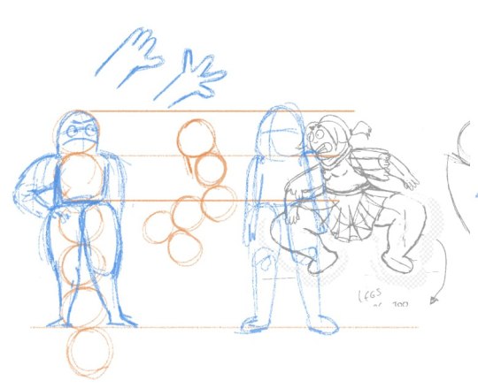
To the left here's you'll note two things, Alaa suggested making her five heads tall instead of 6 which we'll get to in a moment, and the fact that the musculature seems more real now. Here's what i decided to take from his suggestion: i like that the muscles look nicer in the legs, so i changed the legs to match and shortened the pelvis to make her a head shorter. Now about that missing head. Initially while this made the proportions better this also made her shorter which goes against the “awesome towering person” effect i wanted to give her so i had 2 options. I either could keep the extra length but try to fit it in somewhere which could work but it would add extra time to this entire process which I do not have and I am one human being; OR I could simply scale her up. This would make her base circle bigger which would require some quick math every time i need to put her in a scene but that's not an issue for me.
And this is where we ended up. This is something we can use to make a turn around ref sheet once we have an outfit(s). For reference, I drew Graham from Almost home who is about the size of an average human:
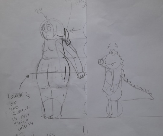
Yes, Charlie and Graham are not actually short. Everyone is just taller than them cause that's my experience being short, It just never came up lol
Here's what I like about this and here's what I'm glad I did not include: I like the cartooney proportions that still show some respect to the human. I like that she has the stubborn belly fat that some body builders struggle with. I like that while she looks imposing and is to some extent, a lot of her personality traits will contrast that and give her depth and nuance. (Also in case you're curious, her base circle is 1.2 times the size of average characters)
A final note, which is by no means an insult to any stylistic approach or artist, there's a fine line to tread between “muscular curvy woman” and “pixar mom”. Here's a drawing on the back of a receipt that a friend drew with some suggestions on how to push the proportions. Solid suggestions, but they don't really fit the vibe I'm going for which is fine- when we make art not everyone is going to like it and that's just how things are.
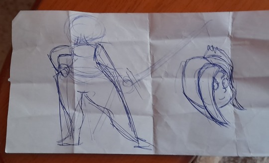
And yes, she's still naked. Clothes come at the very end when we know we have all the proportions and visual quirks figured out. Buuut that's something I won't include in the devlog. Gotta draw the line of “okay, spoilers” somewhere. Next week, we'll start doing the rest of the cast.
Devlog updates on Tuesdays.
#comic#webcomic#kinocomix#devlog#graphic novel#metal#writing#webcomics#lgbtq#original character#character design
2 notes
·
View notes