#I don't choose what the autism hyperfocuses on week to week i just live here
Explore tagged Tumblr posts
Text
The Doofenquestion, a scientific experiment
because this is where I'm at in my life now I guess
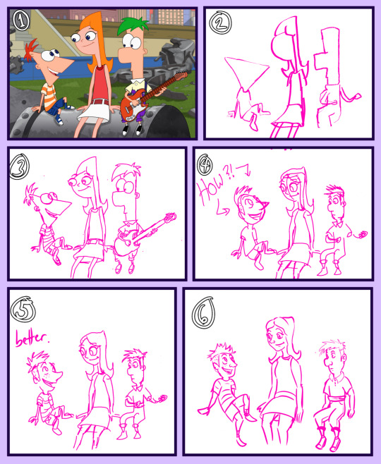
Okay so the other week I finished watching Phineas & Ferb, and I did an art exercise redrawing screencaps with a human Perry the Platypus.
Which is already a lot to unpack on its own.
But then I got to looking at other people's fan art of human!Perry, and this of course led to me seeing a lot of human Perry facing off against Doofenshmirtz.
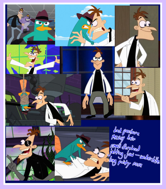
What struck me is this: anytime someone chose to interpret Perry as an adult human, they had drawn a sexy secret agent man. Simple enough. Makes sense. I did the same thing. But then, who's that cute little sexy anime protagonist 20-something twink in a labcoat next to him?? Certainly that can't be Dr. D!
No, no, I don't think so... I mean, it's nothing against those artists! If you want a sexy young twink Doof, you do that! I fully support it!
But it got me to thinking...
Is it possible to draw a sexy Heinz Doofenshmirtz and still have him recognizable as himself??
What would he look like in a more grounded style in the first place???
And am I foolish enough to try????

I had only the answer to one of those three questions. For I knew in my heart that I *am* foolish enough to try.
I have outlined my methods and my results below. I think you will find that my data is sound and my results even soundier.
Okay here's the deal:
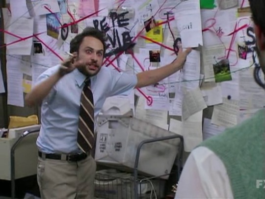
The Question:
For the purpose of being thorough, the first question I must answer before anything else is "What would Doof look like in a more grounded style?"
From my findings there, I will seek to answer the Follow-Up Question: Is it possible to draw a hot and sexy Heinz Doofenshmirtz while remaining true to his intended character design?
The Disclaimer:
'Phineas & Ferb' is far from a perfect show and I'm actually not a huge fan of creators making characters canonically "ugly" or "repulsive", but that IS what they intended for Heinz in his design, and that interests me.
However, I'm less interested in declaring a certain type of person ugly and more interested in how a realistically-drawn Doof - or at least a Doof in my art style - might look. I am curious how that might compare with the versions of him that are drawn to align with modern "traditional" beauty standards (shippable-twink!Doof, if you will). I'm not here to call out other people's art so I won't post other people's art. And I am not here to make sweeping judgments on beauty standards. I am simply here to do something very pointless VERY thoroughly and hopefully in a way that is fun and not harmful.
The Method:
Step 1: devise a step-by-step process to convert the style of the show into my own style
Okay, to get the hang of this, I am starting from a completely non sexy lens to avoid bias in creating the conversion method. And also because the only other characters with features as exaggerated as Doof's are all children and we don't sexualize children here. I guess this kind of functions as a control group. Which is probably the correct use of that term. Trust me I am a scientist.
It goes like this:
Find reference pic
Extract basic shapes
Trace the pic
Begin working out more realistic anatomy placement and have a brief crisis about Phineas' weird fucking head
Iterate on that sketch to bring it closer to my style
Iterate again
And one more time to be extra sure
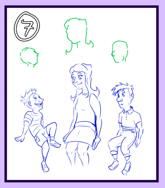
There they are! Not bad! And now I have an idea of how the most dynamic and exaggerated shapes of the show's art can be applied to my own style!
Step 2: test this process on other characters from the show
With a process now established, it is time to apply the same logic to a couple of the adult characters. And also to try and condense the process to fewer steps!
First let's try Ferb's dad Lawrence - for whom I have used the traditional "George Jetson" approach.
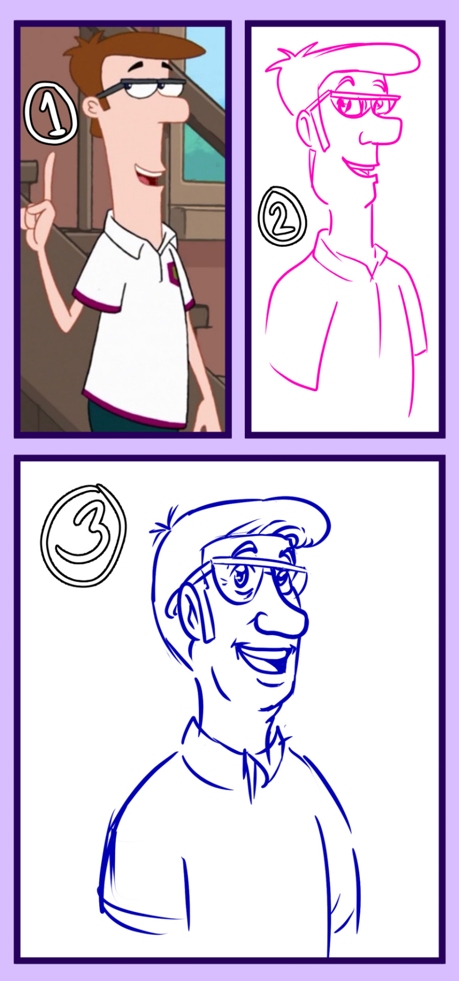
Hmmmm. Not exactly right. But close...
And of course Major Monogram! Doing this was like correcting the anatomy on a Picasso. Both will get you kicked out of the Louvre.

I'm not gonna lie this one turned out great. There are things I could correct with more iteration, but science is notoriously fast-paced, so it's time to confront our white whale!
Step 3: Draw the Doof.
The same process: Reference image, find the shapes, trace, convert style, iterate

Hm. This isn't quite right... I feel like this is Dr. D.'s horrible license photo or something. Still, it's a start.
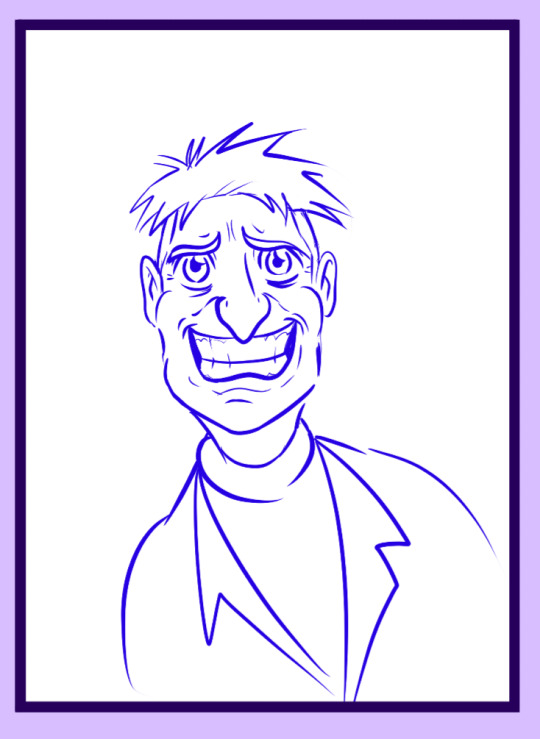
And then we have--
Hey! How dare!!!! I have been cut off at the 10 image limit. CURSE YOU, WWW.TUMBLR.COM!!!!
Okay fine.
[To be continued.]
Edit: find part 2 here
#I don't choose what the autism hyperfocuses on week to week i just live here#like i enjoy pnf but i don't consider myself a big big fan#but my brain this month is like DRAW THE PLATYPUS#phineas & ferb#pnf#perryschmirtz#perry the platypus#my art#image description#image desc in alt text#dr. doofenshmirtz#alt-text#shitposting#perry the human#fan art#fanart#heinz doofenshmirtz#pnf human perry#perryshmirtz#perry pnf#doctor doofenshmirtz#ferb fletcher#phineas flynn#candace flynn#major monogram#francis monogram#lawrence fletcher#owca#you're all fucking welcome#phineas and ferb
184 notes
·
View notes