#I don't care if my lineart looks good anymore
Explore tagged Tumblr posts
Photo
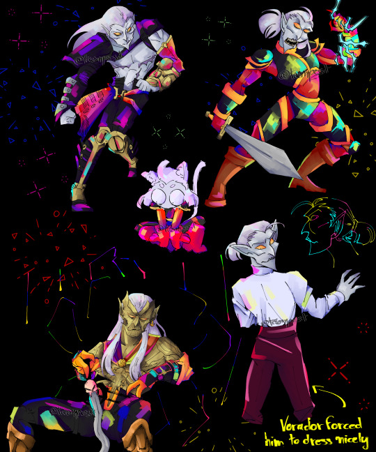
kain posting kain posting kain posting kain po-
#legacy of kain#lok#as you can see I went fucking BONKERS with the colors#this all started as a way to try something a bit unusual (better poses sksksk)#and then I went oh I kinda want to draw Kain I need to get better at drawing him love that little gremlin *points at BO Kain*#I had fun drawing these (though I kinda had to force myself a little bit for elder Kain#like I made a lot of mistakes that I had to correct and that was annoying#but it was worth it#alas I am not immune to his old citizen swag#I'M GAY IS WHAT I MEAN)#and as you can see#there is np easter bunny there is no tooth fairy *and there are no rules in my art anymore*#I just slapped random colors and aren't things way better with no rules?#*a congress full of clones of me wearing fake mustaches nod silently and applaud in a manly way*#my art#not caring about stuff looking good is so great for my brain fr#I don't care if my lineart looks good anymore#I don't care if I color correctly anymore#life good
49 notes
·
View notes
Text
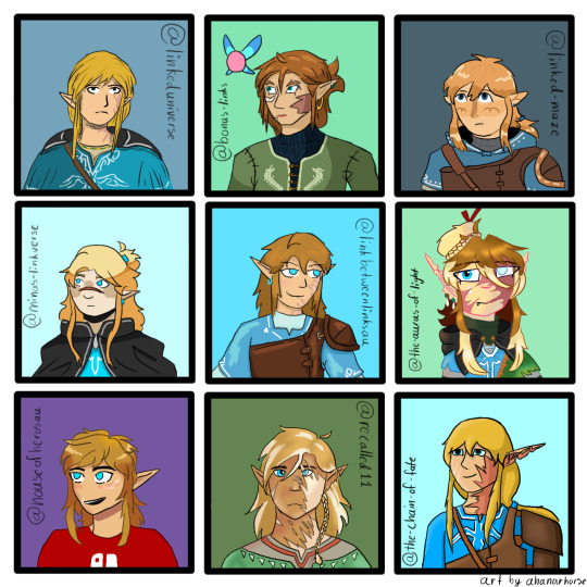
Look at all the Wildlings!
I wanted to draw other links meet aus, and here we are, 9 different botw/totk Links all together! I picked 9 different aus and tried to draw each of the links in the creator's style, and I think I succeeded, they're all pretty close actually! (Little note: no one cares but I'm very proud because I didn't trace any drawings at all and I didn't eyedrop the colors from the reference a single time)
Going from left to right and top to bottom
@linkeduniverse Wild!
I love Wild so much, the chaotic little gremlin. I also love your art style! It's very light and pretty. I know it's changed a lot, but all of them are nice. Wild needs a hug, everyone needs a hug, I'm going to break into the comic just to give them a hug, he deserves it. I love him so much, he inspires me, I want to be just like Wild, a chaotic little arson gremlin.
@bonus-links Slate
He seems very serious, I think he needs a hug. I love his hair, and his shirt(the dragons are really cool!). I love his little fairy friend too, I had to include her. I love your art style so much, I don't even know what to say about it, I just love how you do everything. The way you draw faces though are especially nice, I don't know, you have such a wonderful art style I want to steal it(I won't though)
@linked-maze Wild
Adorable little boy, he's very cute. Very smol. Very squishy. I love him so much. He needs a hug too, I'm gonna give him a big hug. Your art style is very nice, and I love Wild's design! His hoodie is cute, I need one like that too.
@minas-linkverse Hoods
Hoods is adorable, like, I'm internally screaming, he's so cute, and so is your art style! I just want to squish him. Poor little guy needs a hug, can I give him a hug? I'm giving him a hug. Also I love the way you shade hair, it's simple but it looks really good.
@linkbetweenlinksau Wild
My crazy boy, my gremlin, I love him so much your honor. That's my arson hazard right there, he's not yours anymore I'm stealing him forever I love him so much. I also just love your style, like, it's very squishy, I'ma squish the boy(/vpos). Your art style is so beautiful, every time I see you draw anything I'm inspired, I want to draw just like you one day.
@the-auras-of-light Tears
Gurl, how many layers do you have on an average drawing??? Your characters are so detailed, also the lineart coloring? You must have infinite patience or something, I don't know how you do it. Also I love the way you draw hair, it's very fun, I want to draw hair like that more often. And the lighting, I love how you draw lighting, mind telling me how you do it? (I'm also stealing Tears' hat, it looks fun)
@houseofheroesau Wild
Arson boy, little gremlin, partner in crime, the ultimate hazard to society, I love him so much. He could light my house on fire and I wouldn't care, I love him. He looks like he could get away with just about anything, especially the way you draw him, he's very cute.
@recalled11 Wild
I just need to know, what brush do you use for the hair? It's so pretty, I love the way you shade everything(especially the hair). It's so detailed, how long does it take you to draw your characters? I just love the way you do it, I need to take notes.
and my own au, @the-chain-of-fate Wild, my arson boi
If any of y'all(au creators) want a closeup of your boy to save ask me and I'll take a better picture, the quality of this one got eaten just a little bit.
Also, I had so much fun drawing all these characters, I want to do it again! If anybody would like, give me a character and an au to draw(yes, request your own au too!) I would love to do this again sometime!
#ahanar's art#lu wild#bonus links slate#lm wild#minas-linkverse hoods#lbl wild#tears taol#hoh wild#recalled wild#tcof wild
113 notes
·
View notes
Note
Okay I cant -- I need to say it out loud.
I am 100% sure, at this point, you are my favourite artist so far. And I have to honestly thank you for a lot of stuff so let me get to the point before my anxiety takes me back --
I came across you less than a month ago. I don't remember if I saw your art before reading your fictions (Mon Horrible Cherì was my first) or the other way around, but both inspired me so much I can't describe it properly. Art itself is my absolute weak spot. In my past years I always struggled working on that, I was never happy with my results, and mostly had drawn to pay bills than for my own happyness. In the end I hated it at the point that every line I drew was a cut on my hand instead of a moment of joy. And that was horrendous.
But then I came across your art, at some point - and I was amazed. Your style is something I wished to achieve years ago, or very similar to that at least, so I was totally into looking for more, and more, and more. I can't produce art of that quality, but for the first time I wasn't envious of another artist's ability and talent, I was just... Amazed. I felt very happy, can't say why, but your style totally fascinated me. It still do. Anytime you post something new it gives me a shot of serotonine, it makes me feel happy and inspires me to get back on my Huion and draw something too. I started to push it through everyday, and in less than a month I grew a lot. You don't know that, but you pushed me into art with a passion I didn't had since I was 16, and I turned 30 couple months ago. Now it gives me joy everytime I draw. It doesn't matter if the art I produce is no good, or if I change my style everytime (I'm trying a lot of styles right now), the only thing that matter is the way I feel when I sit here and just let my inspiration go. And I feel happy. Happy to draw. Happy to experiment. Happy to share. Somehow I don't feel ashamed of my art anymore, and I was for a long time. I improved so much in these weeks. I watched carefully almost all of your timelapses (I am in love with all of them btw) and followed your tutorials more than once. Your examples, the way you work, is just inspirational for me. I've seen someone was thankful to you for the way you use references and says people out there to do it too: I want to thank you for that too. References was a taboo until last month for me, and I was SO wrong! Those helps so much!
So, well. I am not sure I wrote this all correctly, english is not my native language (I'm italian) and I may have done some mistakes, well, I do not care. I just hope I was able to express you my gratitude for all you did for me - I had to let you know how much this means to me everyday.
Oh also: I love every part of your art, but I could stare at your linearts for days and never get bored by that. And the way you color! Don't make me start on that. I could speak for hours. Not sure you'll want that, believe me.
So, thank you. Thank you from the bottom of my heart. Thank you for making me believe in myself again. Thank you for giving me back my passion. Thank you for reminding me everyday I can draw for myself, for my own happyness. And thank you for making me happy.
You are a great artist.
Thank you! <3
i put off replying to this because i wanted to draw you something, but i just haven't had the energy after work and dont want u to think im ignoring you 😭
but i dont have WORDS. i'm so fucking proud of you. i'm so happy for you. browsing your blog and seeing the sheer amount of art and AUs you're making is so inspiring. your happiness is contagious and i hope you only continue to grow, and continue to foster all that joy for art.
thank you <3
43 notes
·
View notes
Note
I am all about constructive criticism. I mean, how am I supposed to get better at writing/drawing if people won't be honest with me and give me tips to get better. I personally think that people who can't take constructive criticism aren't very bright. How are they supposed to get better at things if they don't listen to others who are just trying to guide them?
Also, I would love some more tips on how to make the shell better. If you are willing, of course. :)
I am horrible at drawing. I usually have to trace things to get a decent drawing. (For instance, I traced like five different things to make Mikey a pony.)
I'm so much better at coloring than I am at drawing. My writing needs work, too, but I'm getting better.
First of all, can I just say that you shouldnt worry about tracing art to improve your own (as long as u aren't posting it as soley your own but thats a whole other rabbit hole) I did too! It helps build ground work for a good understanding of anatomy and poses.
However there are a few holes in tracing. Forst of all it is quite limiting in the outcome of your work, as your art is stuck static in one pose. this can alkost hinder your ability to see things in '3D' and visualise objects for multiple angles. it can also lead to 'skin wrapping' , which i think is the hole you fell into here (and also a term i just made up now)
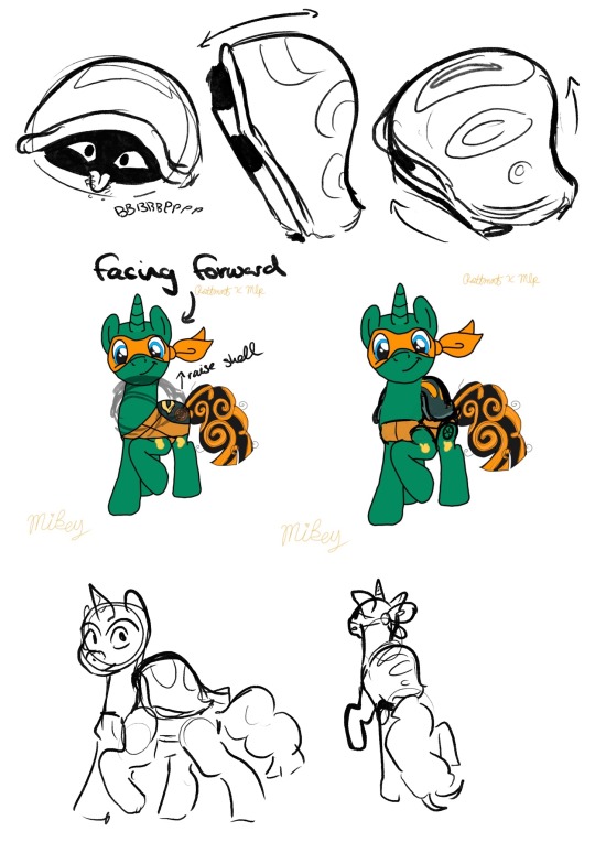
with the shell, you only coloured it within Mikey's trace lines - this caused the shell to loose a lot of its mass - making it look, quite frankly, not like a shell.
a way to improve on this is to look at more references of Mikey's shell in the show and its shape from different angles. this can help you get a good idea of how it should look, and it is a good idea to practice drawing it from these angles. this will improve your ability to think in a 3D space, (which is so darn hard, but seriously useful)
however, and you may have noticed this yourself, when you add new additions to the figure, the line art just doesnt line up! the line quality is different!
This is because the line you have done for the addition is Your Line. And we love your line.
so lets make the rest of the traced lineart fit into your style, instead of you fitting yours into theirs okay?
You may notice that when you trace art, the line work is just not the same, the lines are shakier than the original and it just doesn't look as good. this is not a reflection of your skill.
It is because, usually, (at least when I did it) you follow the original line so closely that it turns out shaky, probably taking your pen off the page a few times to take a break from the oen stroke. while the original artist did that line in one sweeping stroke.
a way to fix this, and make the line arr cleaner and more you, is to instead use the drawing as a very close reference. for example:
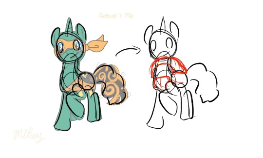
instead of tracing the exact lines of the art, merely trace the general shapes of the art. not only then do you add your own flair and gesture to the drawing, you are then more free to add more shapes to this sketch.
You can still use the reference drawing as closly as you want, but try to focus less on getting the exact lines copied, and more on the general shape. you linework wont be perfect the first time, it might be really messy compared to your usual tracing, and thats fine! you should see some of my sketches before i refine them!
But these will be your lines, theyll be smoother and more gestural, and overtime you will get better control over your penstrokes doing this.
Okay I cant really think of anymore to add here, I hope this helps! i think this was just one big word vomit lol. Keep drawing!! cause no matter what you do, as long as you are actively drawing you are always improving! dont be afraid to push yourself out of you comfort zone! who cares if it doesnt turn out the way you wanted it to? Its your art, You Created That with your Own Hands, and I think that is amazing.
<3
#asks#animal-lover-forever#i really hope this helped#its always hard for me to articulate my thoughts like this lol#YOU ARE GETTING BETTER#YOU ARE ALWAYS GETTING BETTER#art help#i hope#rottmnt#rottmnt mikey#mlp
36 notes
·
View notes
Note
It's not about quantity, it's about quality. Even if they arent the same scale, I'm sure I'm not alone in saying they would be appreciated.
And I'll be honest, engaging in a dialog about kink that is just ping ponging ideas back and forth sounds fun. Sometimes you don't need one massive work to lay out like a blanket to cover all the reasons and facets and quirks you like about a certain kink. Sometimes you don't even need a patch work quilt that you build upon. Sometimes you've earned the Worlds Worst Bonus from your job at the Cotton Ball Factory and you're just throwing little ball after ball at the topic, not caring where they land or if you've hit the same aspects again and again, and then you look back and see you've done a pretty good job covering the topic anyway.
Even if you aren't writing a novel, with your art you do a great job of making kink... I hesitate to say Feel Real but you make it Make Sense in a Real Way. Like of course if you lived in a world with Boob Growth Lotion, you can't just rub it in with your hands or else you'll get Boob Hands and that's Fun because Of Course that would happen. And I just kinda wanna see what you can cook up if you didn't have to find a way to visualize and show and make it look good.
bit of a delayed response to this one while turning over possible replies in my head... struggling to explain a few more conceptual blocks. writing's always been a weird subject matter for me, in one way or another. pls bear with me
so like. comparatively, inflation kink fics span back a good two decades, at least. there's an established pool of tropes, visual metaphors, ideal pacing or story beats to hit, tones or themes that set the mood, key phrases that really get at the brain, and points of finality that overall mesh really well for a good story. not to say there's no originalities to be had in this space anymore, but there's a lotta prior work to draw from, were i to need assistance filling a void in a sentence or two.
but the thing is, with the more nonsensical stuff like That Comic Thing You're Referring To, there isn't a lot of pre-existing stuff i can reference! i often find that i completely lack the language framework needed to put those weirder scenarios into words. i'm just making it up as i go, after all! and so drawing it out in some loose manner becomes infinitely easier than trying to capture all the nuances of it in a paragraph or two, because i get to lean a bit heavily on the storytelling mechanic of "Show, Don't Tell" as support.
though these scenarios being physically sketched-out-on-paper may end up leaving them a bit more concise than intended in their delivery, i'd like to think the concept i'm exploring's still getting conveyed effectively (even if i can't put the scenario to art in the way I'm /fully/ hoping to, whether due to the limits of my artistic skill, or just other general constraints of anatomy & form in a physical space) because ironically, despite a "concise" delivery, a drawing still remains open-ended enough to have its blanks filled in by the viewer's own preferences/themes/biases in enjoyment (in the same weird way the sketch of a piece can sometimes look more visually interesting & carry more emotion than that piece's finished lineart would) with the open-ended nature guiding one's thoughts to what potential fun lies outside the final panel. as you experience art, art experiences you, etc. etc. etc.
as for making it feel "real", honestly sometimes it's less about realism and more about exploring the fun and wild "consequences of over-indulgency" (said with as much love and appreciation as possible, just so we're clear!!); it's acknowledging the dangers of going wild with a Topical That Changes You without hesitation, it's of not thinking it through before leaping directly into in the path of that TF raygun beam, it's of playing with dangerous and ancient magicks because the spellbook had funny drawings that poked at the kinky parts of your psyche, it's of getting too lost in the sauce to have an escape plan.
consequences, for lack of any better word, can help ground fantasies into something more tangible! makes it feel more Real, despite very much being weird fantasy nonsense at its heart
anyway. run-on-sentences and streams of consciousness aside, i appreciate that my weird brand of nonsense is enjoyed all the same
#asks#this isn't me saying the literature will never happen btw!#but it is me saying an inflation fic is a much more likely possibility to happen “Soon” kinda thing#whereas a weird boob-TF fic is still lightyears away from realistically happening despite it filling my thoughts so much harder
4 notes
·
View notes
Note
*inhales deeply*
Woah, your art is so beautiful. How HOW!? I mean, practice of course 😂 blah it's so goodd!! Like the lighting! And the backgrounds! And the EVERYTHING!
*pokes fingers together*
So, do you have any tips or anything for aspiring artists?
BDLSSJKDODHDSKSS THANK YOU SO MUCH?!!?! oh goodness genuinely asks like these make me so happy because thank you for taking time out of your day to send this in?!?!? 😭😭💗💕💖💕💗💕
TIPS?!?! oh man im not gonna tell you to practice, practice, practice because its so basic and everyone always says that AHAHAH hmmmm....
I think what helped me a lot honestly was saving/bookmarking art that i like and think is pretty!! It inspired me a lot to draw more and try to get to their level 😂 also for more practical reasons!! You can look for one(1) thing to apply to your own art. Things like how they draw eyes, how they color skin, what kind of brushes they use!!! If you like it, you get used to it. If you don't, you try something else or tweak it until you do. Once you start mixing things in your routine and get used to it, it eventually becomes your own style!!
I also used to watch a lot speedpaintings to see what other artists processes were. So when i first started out i actually had much looser lineart and rendered a LOT. I dont do this anymore, i dont know what changed, but thats just what happens when you keep drawing!! Things change and thats okay!!!
Also genuinely, and i think this helped me the MOST, draw a character you're obsessed with and WANT to create for. Who cares if it gets repetitive!!! I drew yamaguchi so much i could draw him in my sleep 😅😅
ANOTHER IMPORTANT THING!! Whatever gets your creative juices flowing, just go for it. Dont be scared of messing up or not being good enough to make what you imagined!! It'll all build up and help you get better!!! Then one day, you could go back and redraw your old art and feel better about yourself 🤣🤣
17 notes
·
View notes
Text
Krita
If I were facing the same way as the character, I'd say left.
All my personal stories now are stories I've had since I was a child, just more refined, thought-out, and gay.
Macan Gadungan from Tokyo Afterschool Summoners. He's fun to draw but doing his hair gives me a brain adema. It's terribly specific as far as length, consistency, color, and all that, despite it not actually looking that complicated at all.
Maybe online 80/20 for myself
I get a lot of subconscious inspiration from videogames and book-readings.
Watercolor. It's beautiful and sophisticated while also being messy and untamed. I will never be good at it ever.
I used to have a published comic called "Consistently Inconsistent." The idea was similar to Shen's "Bluechair," but I started it durring a rough period in my life and never got into it because of that. I won't ever revamp it.
A one-word file name describing the picture, with -wip for WIPs (of course), -sk for sketches, -lineart for... line art, and some other miscellaneous shit.
Traditional Thai clothing. It's so pretty that it's my mind's eye's ideal look for kind of clothing. We should all wear and learn more about traditional Thai clothing.
Any kind of music that I'm in the mood for.
Nothing about the human body is simple so nothing about it is easy to draw. (I like drawing faces so I'd say face.)
Georgia O'keeffe. I love her paintings, but I'm not interested in taking those aspects with me.
Long hair and defined lips. Every man, woman, other gender, or genderless person is getting sexy lips here.
At my desk, on my bed, or the couch.
Nothing I can think of.
Nope. When I'm drawing, I'm only drawing. If I get distracted by fiddling with anything else, I stop drawing.
Barely any. I used to take good care of my shit. Now I'm a digital artist, and other than Microsoft's shitty surface pens, I have nothing to break.
Morning Glory flowers. Just like traditional Thai clothing, it has a certain quality of beauty that I strive to empliment into my art.
Hands. People say hands are hard to draw. I disagree. I like them. I don't have much of a problem. (Use your own hand as a reference!)
Not the whole of the art style, but cross hatching used a lot in manga. I always use cross hatching.
Strech out and pop my fingers.
I use vector layers when I do lineart, which is almost never. (So no.)
On occasion yes. Mostly for animals though.
Uh... nothing I can think of right now. But I've been told I look like Jacob Elordi.
Nothing, people don't comment on my art because it's borring. (This isn't a self-burn or self-degridation, my art is boring and I don't care, I draw boring art because I like to.)
I draw busts of my characters to warm up.
No.
This question covers a lot of stuff, so I can't answer it.
Uh... IDK. Maybe my pic of Bonnie from FNAF Ruin. I really liked that one and people seem to think it sucks. I don't really care about that shit anymore though. I draw what I want.
Weirdly Specific Artist Ask Game
Didn't see a lot of artist ask games, wanted to make a silly one.
(I wrote this while sick out of my mind last year and it's been collecting dust in my drafts, I might as well let it run free) 1. Art programs you have but don't use
2. Is it easier to draw someone facing left or right (or forward even)
3. What ideas come from when you were little
4. Fav character/subject that's a bitch to draw
5. Estimate of how much of your art you post online vs. the art you keep for yourself
6. Anything that might inspire you subconsciously (i.e. this horse wasn't supposed to look like the Last Unicorn but I see it)
7. A medium of art you don't work in but appreciate
8. What's an old project idea that you've lost interest in
9. What are your file name conventions
10. Favorite piece of clothing to draw
11. Do you listen to anything while drawing? If so, what
12. Easiest part of body to draw
13. A creator who you admire but whose work isn't your thing
14. Any favorite motifs
15. *Where* do you draw (don't drop your ip address this just means do you doodle at a park or smth)
16. Something you are good at but don't really have fun doing
17. Do you eat/drink when drawing? if so, what
18. An estimate of how much art supplies you've broken
19. Favorite inanimate objects to draw (food, nature, etc.)
20. Something everyone else finds hard to draw but you enjoy
21. Art styles nothing like your own but you like anyways
22. What physical exercises do you do before drawing, if any
23. Do you use different layer modes
24. Do your references include stock images
25. Something your art has been compared to that you were NOT inspired by
26. What's a piece that got a wildly different interpretation from what you intended
27. Do you warm up before getting to the good stuff? If so, what is it you draw to warm up with
28. Any art events you have participated in the past (like zines)
29. Media you love, but doesn't inspire you artistically
30. What piece of yours do you think is underrated
34K notes
·
View notes
Note
I'm probably extremely late to say this but I love you MCSM drawings, (especially the Jesskas-) your style is super amazing and I look up to you-
this question was hanging in my ask box for ages. literally. i'm extremely late to answer it too and i'm sorry for even bringing it up, since i’m not into mcsm anymore. decided to do it anyways because my attitude to my art hasn't changed much since then and it's just interesting to me. i have some *art thoughts* about it. so, sorry this answer goes off on a weird tangent honestly? the idea of someone looking up to me was crazy to me then. like, totally unbelievable. and it's still kinda wild to me. i'm rarely happy with my art. not in a hopeless, self-deprecating way, i don't hate it or anything. but i consider myself a pretty average artist. i'm not able to draw *lots* of stuff, on a technical level. and i'm not a very hard-working/dedicated person either to study stuff like perspective and shading in a more deliberate way. i also don't like drawing much. i know it sounds absurd but i'm much more into writing and making storyboards. the process of finalizing sketches is dull and boring to me most of the time but it's what needs to be done so... yeah i believe i currently have zero pieces of my art which i'm 100 percent satisfied with. there's always stuff that doesn't sit with me right. there's always something i kinda regret. i don't even feel like an artist sometimes because there's this idea that artists are free, creative and unbound. i'm nothing like that. my style's rigid, it doesn't change much with time. i'm not very comfortable with experiments, too. my lineart's heavy and careful, my coloring is pretty flat. there's little room for wildness and freedom. maybe it doesn't look like that from another perspective but i guess it's because i try to sprinkle my stuff with jokes and somewhat interesting storytelling but again, i've accepted it. i know that my way of drawing is just a part of me, like a limb or a language. it's inseparable from my way of thinking, even though i often feel trapped in it. i still look at other artists and think "i wish my mind could work like this". and sometimes it's really weird to get positive feedback, especially when i know all the "flaws" and all the unpleasant details about my process but i just wanted to say that... it's okay?? it's okay if you (you as in anyone who reads, not you specifically) draw like that too, if it's a bit painful and tiresome and slow at times. we work it out, every time we draw! and "weak spots" are just back sides of things we're good at and uh. thanks for the ask and your kind words haha! even if it's been a lifetime ago
20 notes
·
View notes
Text
As someone who is slowly learning how to do digital art alone, I may have some advices to give to those who want to start and don't have time/resources to spend a lot of time trying and testing out drawing processes.
These are some things that I've found useful but Boi, it got me a lot of time to get to it. Of course, this is just what I think can be a good advice for who is a newbie like me, you can try it as a way to start your coloring process but it's not something professional t.t so take it with a bit of salt
First advice I wanna give is to do like I did during this drawing process: while I keep everything on different layers (skin tone / armor / hair /detail / background), don't just start with one layer and then start another one after rendering the first one.
Multiple times I've noticed how the different tones didn't match to each other, or the colors were simply horrible to see next to each other. I've spent a lot of time fixing this type of issues in my old drawing, always deleting the layers (fully rendered) or trying to change the tone with horrible results.
Instead, if you too happen to have this problem, I'd advice you to first coloring everything with the base color. As you see in the video, as first thing I simply filled the lineart with base colors. It's not clear but I assure you I've changed his skin tone multiple times because it didn't match the armor. Same with the mask and the red details.
This is something you can easily do at the beginning to see if the colors match and are nice to see all together in the bigger picture.
It's really something easy and I'm 100% sure they teach you this literally at the beginning of art school but Boi I'm stupid. I only learn when I do things myself t.t
Change colors as much as you want until you've reached your desired tones. Be careful of saturation levels. To make everything more balanced, play with the hue level for every base color you've used. You don't like how the red is in contrast with the blue? Change the red layer' hue/saturation values a bit and you'll find the perfect type of red you need.
After you are happy with the overall results, start with the rendering.
This is something I recommend to do if you still aren't used to the use of tones/saturation.
If you need some examples of the pieces where I struggled, here you go: this one is probably my fav one even now that I draw from pc.
Before:
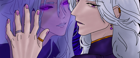
As you can see there isn't balance in the colors. Fulgrim's skin is too much out of everything and in general there is too much differences between the colors. It just doesn't look harmonious. Then:
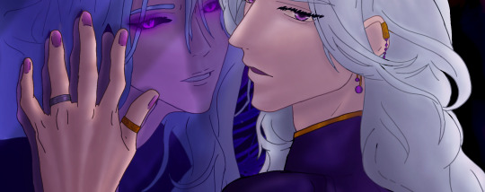
I assure you I haven't re-drawn anything here, just fixed the saturation, tones and hue levels (and added a bit more of shadows), yet now everything matches. (i also have changed the color of the lineart in a few places, look at the hair for example).
This might looks obvious to others, but I've spent a lot of time on this piece with the only focus on making those colors look nicely together and with time I've learned from my mistakes.
Another example: the commission I did a few weeks ago. I had to draw an Imperial fist, so you'd expect to see a yellow armor. Considering that I painted the background with red colors, bright yellow would have been quite a shock to see: that's why the base color is not yellow but orange. Same thing the clothes aren't white anymore but a light pink.
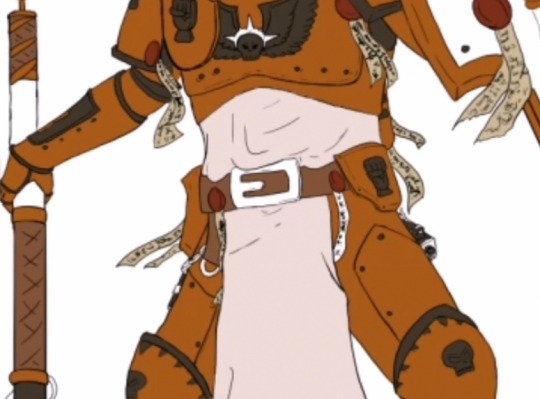
On a white background it looks weird for an IF armor, yet this is the result at the end:
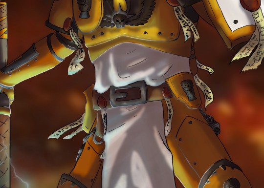
Yellow is only for the parts hit by the light, where the shadow are more on the red tones. (don't mind the light blue for now)
Of course, you have to take in consideration many things before changing the hues of the original colors, but I hope this could help c:
#Art tips#For newbies like me#Just in case you're struggling with the colors like used to do#Kind of rambling#Video#My art#Digital art#Long post#Might also be wrong but at least it's a start
18 notes
·
View notes
Note
happy out of touch thursday!
Ooh I didn’t know page cliffhangers were a thing but I know what you mean! There really is this undertow that pulls the reader through the story, always to the next panel and next page. I wouldn’t even know what to look for to make that happen (except questions like you said?)
yeah!! It's an important thing to do with any manga!! Leading the leader to the next page with a mystery. Furthermore, in every page you can lead the reader to the next panel as well, with the art and bubbles too. Sugisaki does both really well. Heres an example from a random page. I could go on and talk about the next page too for a clearer example study, but I think this is enough to get a rough idea of what im talking about.

its all a lot of manga-comic-paneling technical stuff that she does to make things very fun to read. That's why its easy for you (and me!) to get sucked into reading the same volume for the millionth time after just trying to reference one scene. I mean even looking at this one page again, its so masterful. The way the buildings at the end lead to the next bubble? Genius. I haven't even spoken about how the screentones prioritizing certain objects while also setting the mood. Then the unique panel arrangement with a slight dutch angle? The lineart skill and also her use of blacks? Sugisaki is a queen at fun paneling. Theres a reason why every panel feels like a masterpiece. This is all super geek nerd stuff from a comic makers perspective, but I could just rant. endlessly. It's just so good. Chefs kiss. Again, I have my gripes with sugisaki's artistic choices and storytelling, but I can't deny that she's a genius at a lot of other things. Even just studying this one page blew my mind again.
I can’t blame anyone for avoiding backgrounds lol. But it’s a shame because she goes all out on them when she does try! The level of detail is delicious.
true. And so many of her backgrounds are so western themed. I wonder if she had to do a lot of research. Did she travel a lot for her references? hmmmm
Nah, thanks for rambling! It’s interesting to see her works analyzed from a comic creator!
I RAMBLED MORE ∑(°〇°)
It is orz We stare at our pieces for hours so there isn’t that element of freshness!
ohhhh good point. I hadnt thought about it like that. I guess its like cooking a meal -- like, it tastes so much better if someone else makes it. Because if you cook it yourself you're basically already smelling it and taste testing it the whole time. I read about that.
Oh yeah, I miss the days of deviantart tutorials where they wrote paragraphs beside each stage to explain why they did things. I try to do that in my “tutorials” since I liked them so much!
I also like that style of tutorial!! Yo people shit on deviantart all the time and I get it but it had some real good trends. Like art memes? I still have so many art memes saved. Nowadays hashtags are so cliquey and you kind of have to already know about them to participate. But back then you could just look up art meme and find so many fun challenges. I still have a big folder of all these art memes I wanted to fill out thanks to deviantart! I dont care if its not cool anymore!!! >U
Σ(°△°|||)︴ so that’s what’s in there… 🧠
i have nothing to say except that was cute and funny xD
Ye, I color correct to try to match my irl colors since so much gets lost in scanning, but I’ll definitely add more contrast and alter it if I think it’d look better that way.
yeah that makes sense i do the same thing when I scan my traditional stuff. Its hard to digitize! Sometimes I wonder if those really industrial scanners they have in art schools would make a difference. What would it actually look like if something could be *perfectly* scanned? idk. Maybe it always has to be touched up by human hands first. I don't know! :U Technology!
Stuff that’s fine in person like paper texture and color intensity (or lack of) become kind of distracting when they’re turned into digital scans, at least for my works, so I do what I can to fix those.
I get that. They weirdly look like mistakes even though they're not. Thats the beauty of traditional work though, that it's hard to replicate authentically. I've gotten into these metallic watercolors lately? They do NOT scan well lol. But They look so pretty shimmering in the light...
only half related but heres something interesting. I have a distant relative who does prints himself, and what he does afterwards is put clear paint on after printing, so it looks like it has brush strokes after it dries, even though it was printed. It shocked me at first!
I see what you mean on your piece– The second one does look much bolder and has a stronger impact!! Your color corrections changed the piece a lot! Do you like to use layer modes to add shadows and lights or is it easier to mix the colors on just a few layers and then adjust afterward?
Yeah, im glad you noticed!!! So when I'm doing those kind of corrections, I usually just combine the whole painting to one layer and then use a brightness/contrast layer in clip studio paint. Makes things a little more saturated.

Agreed 100% on dark pieces. They’re a whole different mood! Oh canson mixed media are pretty durable! I used them a lot back in the day. The number of pages in the sketchbooks are great too. I mostly used strathmore 400 and fabriano 25%, but now I’m finally switching over to cotton papers.
oooooh. What is cotton paper like? owo
I’ve never painted the front of a sketchbook either! Just lots of stickers… But having your own style on the front would set the mood for whatever you put inside! :3c What do you think you’d put on there?
I just did it yesterday! lol

Ahh I know that struggle with other language videos orz I wish there was a TTS for the subtitles or something (but then I’d miss out on the personality in his voice, dang) I guess that ensures we absorb the information lol! I didn’t know it got taken down wtf… That’s awful!! Why him of all channels?? I’m glad he didn’t give up after a setback like that. He is inspiring…
Yeah! So, from what i gathered... he had this google drive folder that was open to the public, so people could submit their art to be corrected in his videos. Well, japans laws being what they are, probably some of the art sent to him in the folders were considered against american law. Specifically, anime characters drawn in a lewd way that were submitted to him that could be read as being child-like in appearance. Naoki didn't see the art and doesn't think that it was sent in with any ill will, but that's what he guessed happened. And because google drive and youtube are both owned by google, his entire account got taken down with no chance of recovery. He was really devastated when he talked about it, especially because he uses that channel to support his family. But im really happy he's staying positive and continuing to upload, because his knowledge is so great. And not giving up, like you said, is amazing. But yeah, that's pretty much the sum of what happened to him.
Awesome I’m happy the references can be useful!! I have the digital version of the Artist’s Masters book too (wanted to read it before investing~) so I’ll add that to my drive if you want to check it out! And thanks, I really appreciate what you sent too ;v; I’m just trying to soak it all in now but I’ll let you know once I start applying all the lessons! I really like the skin ones at the moment. I “know” the rules about core shadows and subsurface scattering but actually putting them into practice is so much harder so it’s nice to see clear examples! o7
Oh yes, when you have time id love to hoard it! I mean, read it! :D I also have a lot of other tutorials and art books I can send as well.

Do you like motivational books? I feel like some of those I have are my favorites. Like "Growing Gills: How to Find Creative Focus When You're Drowning in Your Daily Life" and my audiobook version of "the subtle art of not giving a fuck"
I actually never seal my works unless it’s a gift. I’ve seen some artists use wax for watercolor and gouache but idk how archival that is. It’s tempting for postcards though since being waterproof is important! So I just put those gift paintings in a glass frame. For dry stuff like charcoal I do use a spray fixative though; I like Krylon workable fixative because it lets me keep adding afterward (though it gives everything a sandpaper texture so not the most pleasant to touch).
ohhhhhh yeah framing is a good way to preserve them. Do you put the glass over the frames too or do you leave it out? I've seen some artist used packing tape over their stuff (I was planning to do it over my sketchbook cover to waterproof it), and recently I've seen people use something called "matte Mod Podge" to glue their work down as well, but it takes like a whole day to dry each page. I have a matte cover spray that dries quicklky but the fumes from it are suuuper thick and toxic, and I don't like using it because i don't want it to harm my kitties (or myself I guess, and i also feel weird about spraying it into the environment?). I've never heard of Krylon but it sounds super handy even if it makes the texture eeeeh.
I’ve heard that about hairspray too! For personal stuff or in a sketchbook it must be really convenient. Some artists say it yellows the paper but then some never have issues so maybe that depends on the brand of hairspray (and the quality like you said)?
Yeah it needs to be really high quality hairspray. I used it for my art one time and I didn't get a yellow texture or whatever. I also tried a cheaper brand and it kinda just made stuff wet and didn't even really seal anything. Hmm.... you know, thats a good question as to how its holding up now. Ill have to dig for that sketchbook to check when I get the energy. It was kinda funny though, I did buy and use the nice hairspray on my art... and afterwards gifted it to my mom for her hair because she said it was a great brand LOL
Hahaha honestly the cleanup is what makes watercolor so wonderful in comparison to oils. Just wash it away with water =v=
True, it really makes it easy to bust out and have fun with!
You DON’T like mixing them!? But the urge to smear colors around on a palette…! Irresistible
8U NOOOOOOOOOO. LOL. When I'm mixing oils the only thing I can think is "this is going to be such a pain to clean"!!!!!!!!!! And the texture is so... eeeew. DISLIKE! It's like the oils are specifically trying to run away from me. Jail! Jail for oils!
I like mixing colors in general though lol. All my poor green watercolors are neglected because I just like mixing blue and yellow too much~ That wastes a lot of time though so just having your stuff ready is way more efficient~
Ohhh that means your watercolor sets will all look unique, as well as your pictures! Seeing used pallets are so aesthetic. Mixing real colors sure is different from digital, I'm learning. You really do need magenta and cyan and neon yellow to get any bright mixes, and white doesn't necessarily make things brighter. It's weird to me! An entirely different skillet.
I’ll wait a million years to see that Kirby (still half-dried probably. damn oils ;;;;)
I will check on kirby. I have checked on Kirby.
KIRBY IS DONE!!!!!!!!!!!!!!!

Lool on top of the regular mess of oil paints you also had to deal with cats around just waiting to smear it onto the fur! Plus their loose hairs would find a way onto the wet paint no matter what.
YES. BOTH OF THAT. YES.
Still love cats but making art with them is Extreme Hard Mode!! An ice cooler is a brilliant way to keep them out xD Maximum security from paws.
kirby actually was stepped by a few paws before he knew safety for a time.
[Also. You have cats? What’re their names? How cute/troublemaking are they?? o//]
YES I HAVE CATS!!!! god i know this message is getting super long but LOOK AT MY BOYS!!!!
Jungle (nicknamed Juju, medium boy, medium, and medium fry), about 1 year 3 months old. He's named Jungle because he's such a creature. He paws around and looks at you with big eyes like he's taking the world in. Sometimes he acts like a cat (cat shaped? Uses litter box, check), or a lizard (kind of walks like a iguana), or a bird (he doesn't meow, he squeeks and it sounds like a high pitched bird chirp). He just does what he wants and never takes no for an answer. Me and Ashley (my wife) thought he was an idiot for a while but he's really not, hes just Weird and unpredictable. He had a couple injuries when we got him and can't raise his arms above his head, and his tail is broken in two places. Charm points: He's slightly cross-eyed, drools when he's pet and is VERY embarrassed about it (tries to lick it up afterwards), is vERY soft, and checks on you if you make any loud noises. A kind but stoic soft boy.

Second is Sandy (/Tiny, Tiny baby, Small boy, Small Fry) whos about 9 months old. He's named after Sha Wujing/Sandy in journey to the west. He's a little psychopath. A little bully with a lot of energy. He's also so sweet too though, you can pick him up virtually anytime and he also actively seeks cuddles. If you're doing something and he wants attention he will try to kill and replace whatever you're holding out of jealousy. If you give more attention to another cat, the kill bill noises go off. Charm points: he has a fat bottom and a tiny head, he doesn't come to his name because he expects to be waited on, and he'll play fetch if he feels like it. His texture is carpet-y. He's my current therapy cat.

Third is Neopoliton (Neo/Big Boy), about 7 years old. He's named because of the three colors on his nose -- chocolate, vanilla, and strawberry. This boy isn't fat, just big boned. Truly a dumpus cat. Very soft, very shy. He's EXTREMELY polite. Charm points: general anxiety, has a pronounced snaggel tooth, THICC.

And an Honorary mention for Hammond, who passed away this year in a tragic accident. I can't make a list of my animals without mentioning my most beautiful and precious son. Hammond was almost 3 when he passed and he was my best friend. He followed me everywhere and constantly snuggled me. We even took walks outside together without a leash. I make art of him because he's my spirit guide now. He passed away two days after Sandy was born and I see a lot of Hammond in him. Jungle and Sandy both came to us this year after we lost him. Not to get heavy, but he means a lot to me.

It’s wild that you’ve had the opposite experience though!! Professional paints giving you less color… They’re supposed to make life easier, not harder! @@ Well, I got a couple used Daniel Smith paints and everyone says they're the best brand, but they’re ridiculously hard for me to rewet so they can be frustratingly weak too. I guess tubes are a way to guarantee you’re picking up all the color, but pans shouldn’t be fighting back quite so much!!
:0
._.
Y... you're supposed to wet them in advance?
Coughs. Maaaaybe that was my problem >>???????
???????????
How did you learn to draw so well? Like was it from classes or a book on fundamentals or just trial and error?
//// thanks for the kind question!
I guarantee you I would have improved faster if I’d taken a class, but I hope some of the materials I’ve used over the years can be of use to you too:
Andrew Loomis’ books - I never made it past the first chapters, but those had some great advice.
Youtube - Proko’s bean method. Figure drawing references will greatly improve anatomy and “drawing what you see”. It’s boring imo, so doing just 5-10 minutes a day can keep one from burning out while still seeing improvement. Speed painting videos are a nice way to relax and study.
Will Terrell’s People Drawing series - He’s a humble man with personal advice for artists. I watch his videos when I feel discouraged or lost.
Art, art, art - Whenever I see an artwork that I like, I figure out exactly what pleases me: line thickness, nose shape, finger positions, composition, the way the hair bends in the wind, etc. Then I try to incorporate that specific characteristic into my own art.
I have growing folders of (I’m a bit embarrassed) almost 8,000 pictures, organized by characteristics, for the sole purpose of studying their prettiness. Sometimes we don’t need a tutorial to spell everything out, just an example can help us envision our own works’ potential. Also, staring at pictures is a relaxing way to study too!
And of course, trial and error~ I don’t post my sad, failed paintings or all the weird sketches I make, but they exist and teach a lot!
39 notes
·
View notes
Text
A totally self indulgent compilation of my favorite works on this blog of the year June 13, 2019 - June 13, 2020
I wanted to do this for the blog's first anniversary but then completely forgot about it lol.
The following lists are all in chronological order according to the date each post was first published.
Top 10 panel edits:

#1: Don and Gilda - Chapter 138: Demon serch (1)
Date: Jun 14th, 2019
Time: ~ 1:30 h
My very first redraw from my very first edit posted here, so it deserves an honorable mention. Back then I was young and inexperienced, I didn't even apply a gray filter (lmao I was so unskilled I even unintentionally scratched the picture, I hadn't realized until today). I'm actually very happy my first redraw was of Don, boy deserves all the love.

#2: Emma and Ray - Chapter 140: I’m Here!
Date: Jun 28th, 2019
Time: ~ 1 h
Back then this looked like so much work to me!!! And to this day, I think it turned out pretty well. I'm particularly proud of how the bow turned out. This is one I was really proud of right after having finished it; it gave me the confidence to try redrawing bigger areas. Also, the edit were I first applied the opacity of layer / opacity of brush for the gray filter that would have stuck with me.

#3: Krone's birthday edit
Date: Jul 15th, 2019
Time: 15 mins
I don't know I just really like how Krone's hair vanish to a more sketch-like style here– and consequently, how I managed to replicate such effect. I think Krone's beautiful.
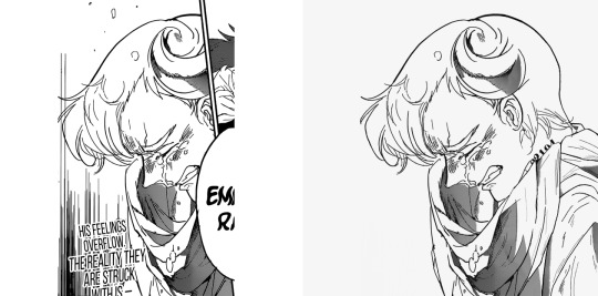
#4: Emma, Norman and Ray - Chapter 153: Coward
Date: Oct 4th, 2019
Time: 4:07 h (and 67 layers lmao)
Probably the single panel redraw I'm the most proud of. That Norman panel was beautiful and very poignant at the end of a chapter I adored, so I believe it deserved all the time I've spent working on it. It's far from being perfect - the back of his head is too plain, and the difference between my brushes and the original brushes is pretty visible - but I still like it very much and am extremely attached to it. The horn looks kinda big but I honestly believe it to be more of an issue with the original than with what I had redrawn lol. Funny enough, the whole picture didn't make it to the final edit and had to be trimmed.
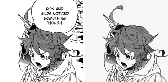
#5: Full Score Trio - Chapter 154: A Breakthrough
Date: Oct 11th, 2019
Time: 29 mins
I don't have a particular reason for this I just think Emma's hair turned out amazing. It took just half an hour and I didn't even use references like. Wow. @Redrawing skills where did you go please come back
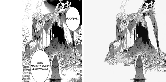
#6: Mujika and Queen Legravalima - Chapter 158: The Reason I Was Born
Date: Nov 17th, 2019
Time: 2:09 h
Sis I love this so freaking much. The shift from redrawing almost exclusively people and clothes to redrawing this mess was so fun and refreshing. Even though it's a mess I think it turned out very clean and overall it looks beautiful? I remember after finishing this I felt so powerful, like now that I had redrawn this thing I would have been able to redraw anything I set my mind on lol.
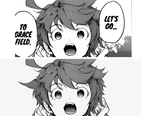
#7: Emma - Chapter 161: Never Be Alone
Date: Dec 13th, 2019
Time: 57 mins
Again no particular reason except this is a very cute Emma and I think the redraw turned out pretty well. There's this big lock on the left that doesn't make a lot of sense but overall I really like it. Cute Emma is cute, and I love her determination.
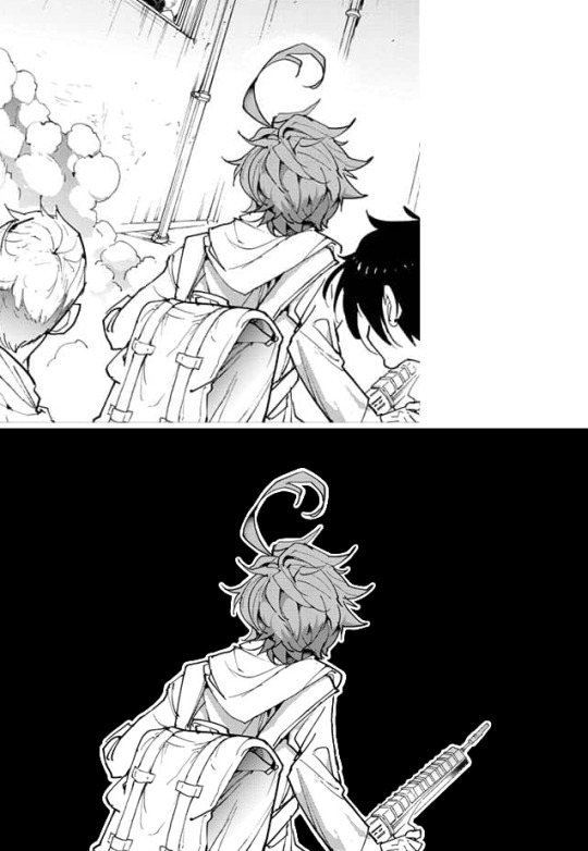
#8: Emma - Chapter 166: Going Back Home
Date: Mar 9th, 2020
Time: 3:45 h
I'M SO FREAKING PROUD OF THAT RIFFLE I have not the slightlest idea why this took so damn long BUT I'M SO PROUD OF IT
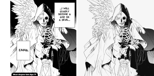
#9: Norman's birthday edit
Date: Mar 21st, 2020
Time: 1:04 h
This is cool! I didn't know I could manage to draw this, but I did it! The feathers were particularly hard to clean but I think they turned out fine.
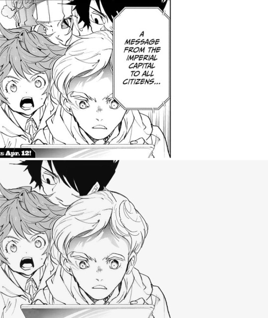
#10: Full Score Trio - Chapter 174: A New World (part 1)
Date: Apr 6th, 2020
Time: 2:11 h
I just think they're very pretty? I can't understand if I like Ray's face a lot, or not at all, but I think overall there was a lot to redraw and it turned out pretty cute! Sorry Gillian.
(Also insert pretty much every panel from the chapter 177 Isabella edit– I've spent so many hours on basically every panel there's no way I could choose only one).
Top 5 edits as whole:
#1: Emma and Ray - Chapter 140: I’m Here!
Date: Jun 29th, 2019
Complessive time: 2:57+ h
The very first edit I'm actually proud of; I'm really attached to it. It's the first edit I had put all of my effort into, and I remember feeling anxious people would have left it without notes. It kinda feels weird to think about it now, because I really don't care about notes anymore; yet, it somehow makes me happy to think that past-me wasn't let down. Thank you @neverlandstrio for your support, you may not remember but it really meant a lot to me back then! And it still makes me smile. You're the best!!!!!!
#2: Mujika and Queen Legravalima - Chapter 158: The Reason I Was Born
Date: Nov 20th, 2019
Complessive time: 7:12+ hours
This whole edit was an hella wild ride. It's midnight before a school day, when I think: "Mh, it's been a while since I last made an edit, why not make one about Musica and the queen from the last chapter?" And seven hours after this was born. I'm particularly proud of the queen's redraws on the 3rd, 7th and 9th picture (ofc), the areas which have been redrawn are pretty huge yet I think the difference with the original is almost impossible to notice?? @Redrawing skills where did you go please come back (part 2)
#3: Emma - Chapter 174: A New World (part 1)
Date: Apr 12th, 2020
Complessive time: 6:53+ h
I think the panels that were selected work very well together, especially considering the close-up / full body alternation. I love Emma, and I've always been kinda sad noticing that edits that focus one her take the less notes... She deserves all the love. Also, fun fact: for the last but one panel, I had redrawn Emma's whole left ear before remembering she doesn't have one, so I had to redraw the panel from the start. Besides from the error with the ear, the reason why this (and all the others after) took so long is because official panel take way longer to clean.
#4: Isabella and her children - Chapter 177: Mother
Date: May 22nd, 2020
Complessive time: 13:41+ h (ahah.)
Lmao tbh I can't understand how this has so few notes it's like. Technically speaking, probably the best edit I've ever done. I don't even like Isabella that much, I haven't got the slightlest idea why I decided to spend so many hours on this. Anyway, I find the composition (full body on the left / headshots on the right) really good looking in this as well! And I think the redraws turned out fine, especially Isabella's.
#5: The Promised Neverland manga ending countdown→ 1/7 chapters: chapter 1 - Grace Field House
Date: Jun 9th, 2020
Complessive time: 1:59+ h
I don't know how I came up with that idea for the composition but I find it really beautiful??? I think it does a pretty good job conveying the sudden, terrific shift of atmosphere from the first chapter, and I think that sharp bridge is very nice. I'm very, very proud of this.
Honorable mention #1: Full Score Trio - Chapter 154: A Breakthrough
Date: Oct 13th, 2019
Complessive time: 3:44+ h (+ 1:13 h of working on a panel that ultimately didn't make it to the final edit)
A very good chapter, and the edit turned out surprisingly amazing??? All the redraws look great and make it almost impossible to distinguish them from the original; honestly I feel like I'll never be able to redraw so neatly again lol.
Honorable mention #2: Don and Gilda (+ Norman) - Chapter 160: Shackles
Date: Dec 11th, 2019
Complessive time: 3:14+ h
That one is really one of my favorite scenes; I'm telling you peoples, Gilda and Don are a blessing to the earth. I think I've never mentioned it, but Gilda's hair is a nightmare to redraw??? More specifically, it takes me h o u r s to fill the texture without making it look too weird, it's the worst.
Honorable mention #3: Norman and Ray - Chapter 179: Compensation
Date: Jun 6th, 2020
Complessive time: 4:16+ h
I was so glad to finally be able to make a Norman / Ray edit, and it turned out it was just in time before the series' finale. I like how it turned out and I'm pretty satisfied with the redraws (even though my sister helped me with the lineart of some panels - it was exams time and I really couldn't afford to spend more time on it), too bad we didn't have more chapters that focused on the boys. Ray sweetie one day I'll fix your ear it's just today's not that day.
Btw, I justed realized I have never done an Emma / Norman centered edit? I'll have to make one eventually. I remember considering focusing on them alone for the chapter 154 one, but then I thought "even if the manga is gonna ignore Ray, I will chose to do not" lol.
Top 5 long posts:
#1: Reconstruction of how the Grace Field children were settled in the three bedrooms
Date: Aug 28th, 2019
I just had really a lot of fun doing it. I love putting all the little things to their own place, it's so calming to do and that's why I love making this kind of things. Also, loved how @temporoom contributed to the post! It was so nice of them to add what they had noticed to come up with more exact conclusions, that's one of the things I love the most about the internet.
#2: A study of how many times the characters of The Promised Neverland call each other through the first season of the anime
Date: Sep 10th, 2019
I REALLY LOVE IT! I mean it *was* kinda stressing to note everything, but it was very also very satisfying to see everything methodically divided and organized! And it's not just that– it's also the fact that it looks good. That's one post I have fun rereading because it's actually pretty! Also, even though it can be very stressing to learn to use new programs and sites, it's always very satisfying to look at the final result. Again, I really adore compiling these tiny little details! I would love to make more posts of that kind if i had the time.
#3: The Promised Neverland musicals headcanons
Date: Oct 27th, 2019
I mean it's literally. Putting my two favorite fandoms together how could I not love it. This is another one I really enjoy rereading, I find all the musical / character associations so fitting! I really want to make a second part, I hope to find some time to do it.
#4: Considerations on the reward / eventual series' finales (and Emma's sacrifice)
Date: May 7th, 2020
It's always nice to put down all your thoughts regarding a particular matter. It can take a lot of time (at least for me it does because... I need time to think about things), but it's so satisfying to see all of them there once you're done. Bonus points when, like in this case, it was something asked by someone else because “Wow! Somebody wants to hear my opinion on this subject! I'm flattered (◍•ᴗ•◍)”
#5: Some other considerations on the series' finale and Emma sacrificing herself
Date: Jun 13th, 2020
Pretty much the same as above. It's like some kind of clarity when the post is done and signed. Another fun fact, I had to censore the post a lot; the first version was extremely sharp and harsh, but I believe it's right to express your opinions calmly and politely.
Bonus: A thread of what the tpn characters would wear at the Oscars
Date: Feb 9th, 2020
Imagining all the children in those pretty dresses makes me so incredibly happy (╥﹏╥) I go back to look at that post a lot. I really love red carpets, I love looking at pretty dresses!!!!!
Lmao it's so funny how the post of mine I like the most are also the ones with the less notes
Anyway this was just a personal report! You don't have to read it all (or any of it actually). But it was indeed fun making it! Here's to many more months in the fandom!!!
#This was supposed to be posted on July 13th as one year and one month since I made the blog#but Tumblr decided to be a jerk and deleted all of it 😊#So here we are#tpn#tpn manga spoilers#long post#Again this is just a personal report don't stress over reading all of it#But it was fun to make!#To the people I tagged: sorry for tagging you in this long post but also it would have felt weird not to do so? I hope you don't mind#It felt like... Giving credits foe something you've done y'know
40 notes
·
View notes
Note
Hello there! I read all of your how to zine thing and I've been thinking how to organize a portfolio online... Do you have any suggestions or tutorials on how to do one? I use Google drive but I don't like it anymore (it seems unprofessional) so I was wondering if you have any tips óvò thank you in advance and sorry for my English!!
aaaa it’s ok I’m no native English speaker either, so don’t worry!!
For your question, I personally have started using the Adobe Portfolio (it seems to be free?) as I have the Adobe CC for uni purposes and thus already an Adobe account. I innicially wanted to have it for design stuff only but then discovered I could make a second portfolio so I made one for my internet illustration/art stuff as well and used it as portfolio for zines (idk if it interests you but in case you want some inspiration, here’s the link.) I’m still kinda unsatisfied as it doesn’t really have a gallery option where you can click through the images individually, it really is catered to mobile users and the images look uncomfortably large on the desktop for me, but in general building them is kind of intuitive even if the layout options are rather limited.
I personally don’t have much experience with other portfolio websites (I only tried deviantart’s portfolio before and wasn’t really satisfied with it either, but that’s been years ago.) I would recommend doing some research (maybe some of my followers also has suggestions?) and maybe also consider using a general website from a website builder like weebly or wix (I think there are also free options?) as they are a bit more flexible in their layout.
EDIT: I added a list with some website builders and portfolio websites on the How to Apply post, if any of you have more suggestions, I’ll add them to the list as well. Just a note that I don’t have experience with every website on the list.
Some of my study friends also from other universities used a PDF file with their best works and sent that to agencies, so that might be an option, too, especially if you’re only allowed to a very limited number of pieces. With programs like InDesign it’s fairly easy to make a cohesive and nicely designed PDF (I recently got some suggestions for similar programs as a lot of people suffer from Adobe raising their CC prices but I haven’t tried any of them so I can’t vouch for them.)
For me, it largely depends on what specifically the portfolio is for.If I were to apply for an agency job, I’d try to fit in as much of my range as possible while still trying to focus on what the specific job is for. I think that tactic works for zines as well, even though it’s more illustration-heavy than necessarily corporate or editiorial design. I started to categorise my works more by projects/purpose so that the individual concepts are gathered together instead of having “sketches” “illustrations” “typography” etc. as throughout time, you’ll get more and more interdisciplinatory projects so you can’t sort them that easily. Of course you can sort them also on the main focus for the individual projects (a magazine might be sorted into editorial or typography for example.)
I made an extra category for my comic project to have everything together, currently most of them are just some illustrations but I’ll add more concept art and stuff like that later on.I also like displaying commission or zine works in a seperate category so it’s easier to see what people can expect from hireing me, plus it also shows that I actually already have experience with zines and commissioned work. Of course you don’t need to put all your commissions/zine works into it, especially if you don’t like them/don’t find the result very pleasing anymore. A portfolio is always courating your own works by what you consider your personal qualities.
As I already have mentioned in the portfolio post, I also try to kick out works that are older than 3 years from the portfolio staples that I use when zines only ask for a few of my best pieces (like 3-5) but I keep them in my online portfolio site if I still like them on a general basis, especially if the style is something I still can pull off. I also never use pieces I never published anywhere online so I usually just link to the tumblr post if there’s only a limited number of pieces allowed. I just try to keep my tumblr organised and aesthetically pleasing and check if all the links still work.
For the layout, I recommend using something simple and neutral as the work itself should be the focus, not the very fancy design around it. This especially should be the case if you want to display several styles and/or moods/colour schemes. If your style is very pastell-y and cute, of course a more cute and pastel design compliments it well. But if you also have very dark colours and for example gory designs, it most likely will clash with the works and thus isn’t a very wise descision. Safe colours are always white and any completely desaturated greys that are somewhere in the lighter and mid-range shades. Black can look good, too, but imo should be handled with a bit more care. I probably would recommend a darker grey instead as it doesn’t swallow too much light. You want your work to pop but having too much contrast between your work and the background can also get uncomfortable for the eye.
I also would recommend not using too fancy and playful fonts as they easily distract you from the actual work. I also wouldn’t use Times New Roman and Arial as they aren’t very comfortable to read (and don’t have a very good design.) Calibri is always a very safe and well-designed font that most likely is an option everywhere, but of course just look through the font options and test what suits your works the best.When picking a font colour, please always check the contrast to the background, especially when you use more saturated colours. I also wouldn’t recommend using 100% saturated colours as they are also very uncomfortable for the eye.My prime example of very little readability is bright red on pitch black background. It’s one of the most uncomfortable combinations to read as red is very aggressive to the eye and through the very high saturation also is difficult to distinguish in front of the very dominant black. Having a red-ish grey would work much better, especially if it’s a lighter shade, and not using black but a darker grey would take away the tension as well. Just play around a bit until you get to a visually satisfying result.
Always be aware that starker contrasts also always draw the eye, so you want the most contrast in your works and not in what surrounds them. If you have especially light works with maybe a very delicate lineart and little contrast, you might want to use a white, pastel colour or light grey with a fairly light font (that still has enough contrast to the background to be readible)
The most general advice I can give is focussing on displaying your works and not distracting from them. I would try to have a very simple and cohesive site that puts everything together in a harmonizing way and also doesn’t have too many subcategories so that navigation is easy and smooth.
I hope that helped in some way? ^^;
8 notes
·
View notes