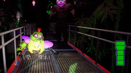
#I WAS JUST TRYING TO FIND A REF SO I COULD SEE THE CATWALK
Explore tagged Tumblr posts
Text
Okay I never really planned to ever say something relating to me working on a drawing, but I have to share this
So I was drawing something (that I won’t specify what exactly), and it related with that upper spot in Monty’s Gator Golf, which I think is called a catwalk, idk
But I grabbed 3 references for it.
As I was inserting them into the image as references for me to use. But I have a specify way I like to put references in. I don’t like them to be overlapping, and I don’t like there being an awkward gap in between 2 references. So, I zoom in really close to make sure that the boundaries of each image are touching, but not overlapping or leaving a gap.
So i insert the first 2 images, nothing wrong, everything’s going well.
Then I get to the third one. I thought everything was fine, but then I looked at it, and I jumped so badly

Apparently, when I grabbed this image as a ref, I didn’t see a problem
I SEE IT NOW AND I HATE IT
#I WAS JUST TRYING TO FIND A REF SO I COULD SEE THE CATWALK#AND I THOUGHT “Oh they’re using their flashlight good I can see how it looks”#I DID NOT EXPECT TO THEN GET JUMPSCARED BY A FLIPPIN B U F F H E L P Y#I FELT LIKE I WAS GONNA JUMP OUT OF MY SKIN#LIKE WHAT THE HECK?!?!#I hate that#I don’t know how I didn’t see it before#This is like the angriest I’ve gotten while drawing (I think)#I cannot believe he was just hiding in plain sight#and I didn’t see him until I started drawing at 2 AM#I GOT THIS IMAGE FOR THE DRAWING YESTERDAY#HOW DIDNT I SEE IT?!?!#random post#rant#I am angry & scared still both at the same time T^T#Like that literally jumpscared me and idk how#I cannot believe this
2 notes
·
View notes
Photo

I did these quick drawings of a cat walking forward to help out a friend figuring out a walk cycle for their animation, but I like the drawings enough and figured you guys might find a visual guide like this helpful so here it is! Here’s some of the critique that went along with it as well:
I stuck to realism so that you could apply this to your own work.
1)First thing I want to point out is that the head is bent low enough that we can see the shoulder take the weight of the feet. I would also do this in your animation. It’ll take a little longer, but showing the shoulders roll as a cat puts their weight onto each foot will really add a lot of realism to your work. You can also see how the leg in front is almost placed right below the cat’s center of gravity. Keep in mind how your character is going to stay balanced, if their leg is too far out, they would tip over, so cross the legs in front. They don’t call it the ‘catwalk’ for nothing! Also notice the chest. Cats have chests that rest behind their shoulders, and it’s a crucial part of makes a cat’s walk look so distinct.
2) Here I laid out the bone structure and I would highly recommend you do a quick pass of your animation to just lay out the bones of your character first, and they don’t have to be as detailed as mine, just little lines and circles to represent bones and joints would help you out a long way! Keep these shapes simple and then you can see if your walk looks good played back to you before you try to put the character on top.
3) These are just some basic pose suggestions and you can see in those drawings how the weight of the cat has shifted so that the leg can support it. If you want more reference, look up the Lion King song “Be Prepared” As Scar has a scene where he moves towards the camera in a similar fashion that I would highly recommend slowing down and looking at frame by frame. I tried looking up refs on youtube quickly, but didn’t find many good exact results, but youtube has a plethora of cat videos so never be afraid to look up reference! :D
366 notes
·
View notes