#How do you find irl friends no glue no borax
Explore tagged Tumblr posts
Visit Tumblr Blog
Explore Tumblr blogs with no restrictions, modern design and the best experience.
Last Seen Tumblr Blogs


Fun Fact
Average visit duration of Tumblr.com is 10 mins and 25 secs.
Text
I just wanna meet someone from my city that's a therian / kemonomini / jirai / otherkin / just general freak (pos)
Is that too much to ask for 😭😭😭😭
#But also I don't wanna dox myself publicly 😭😭😭😭#How do you find irl friends no glue no borax#jiraiblr#jiraiblogging#jirai kei#landmineblr#jirai girl#landmineblogging#landmine girl#landmine kei#jirai onna#kemonomimi#therian#otherkin#theriantropy
79 notes
·
View notes
Text

…make a psd look interesting?
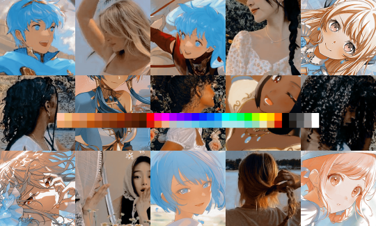
aka, how to fuck up a psd no glue no borax. have you ever looked at your psd and gone, damn, this shit doesn’t fuck? happens to the best of us. here are easy ways to spice up your psds so you don’t end up with the editor equivalent of communion bread
for example purposes, i made a simplistic psd to test these methods on. they should work with most psds, but, as always, fuck around and find out on your own for best results <3
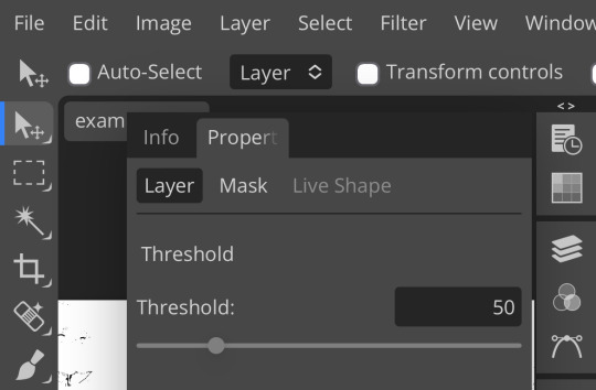
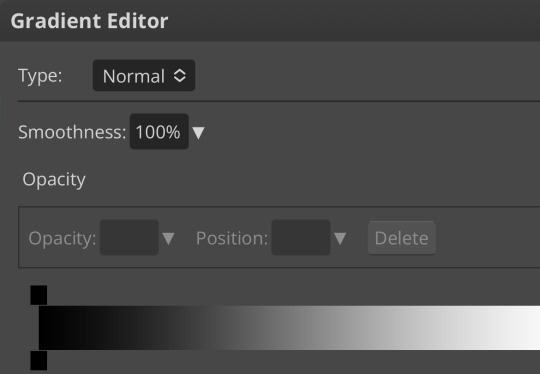
i. threshold + gradient map
this one is an easy way to add specific colors to your psds. step one: add a threshold layer, and adjust it your liking. typically, i set mine to somewhere between 60-40. if you’re making a psd to work on dark skintones, you may want to set it even lower, but if you’re working with, say, pjsk characters, you can go pretty high
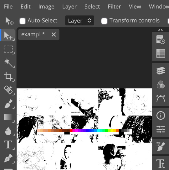
wow flashbang. you can see on my example behind that it doesn’t work super well on irl pictures, and my pjsk images don’t have threshold at all lol. next thing you want to do is set the blending mode of your threshold layer to either multiply or darken—they’re basically the same thing
(psst, if you want to know more about blending modes, check out this post!)
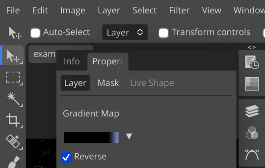
waow crunchy! but still boring right? still boring. not to worry, here’s the fun part: add a gradient map layer, tap it, and go to the slidey icon on the side, which’ll bring up a page like this:
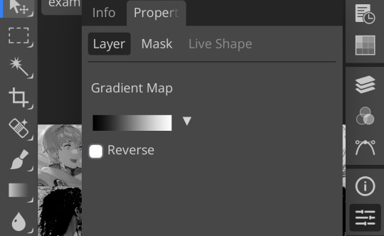
click the gradient in the middle there to edit it. once in, edit the black color to be at about 80-90%, and then change the white color to whatever you like. edit out, and tap the little square next to the text that says “reverse” which should make your gradient look more or less like this:
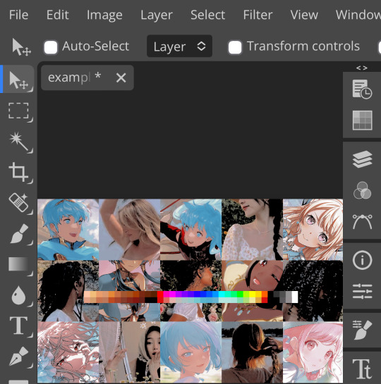
then change the blending mode on your gradient map to ‘screen’ which’ll axe all the black and just leave your color. now your image looks like this:
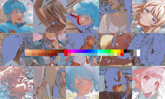
boy howdy, isn’t that fucked up! it is more interesting, but if you don’t want to be looking at that abomination, change your color in your gradient map to be darker, which’ll give you something more along the lines of:

…which is much more reasonable. this is a fun way to add color to your shadows slash lineart, and can be a quick and easy way to make a psd look less flat.
ii. noise gradient map
some of you may be thinking, but, canarysage, what the fuck is a noise gradient map? to which i reply: you’re boring. let me show you.
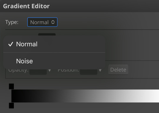
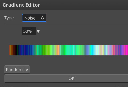
kinda fucked up, right? well, that’s the goal. unfortunately, there isn’t a way to directly edit a gradient map, but you can just click that little button that says ‘randomize’ a couple times until you get something you like! you can also mess with the percentages but i don’t do that because it looks weird

boy howdy, that’s weird looking. not to worry, though. once again, our best friend blending mode is going to come in handy
i typically go to soft light and set the opacity to about 20-30%, but, as with anything, feel free to mess around and do whatever you want. luminosity is also a fun setting for noise gradient maps, just make sure to crank the opacity way down for the sake of my eyes

wow, much better! you can see that the gradient map added a bit of purple coloring and a funky little texture. super cool! thank you, gradient map!
iii. channel mixer
i already have a post on channel mixer and i’m not rewriting all that so if you don’t know how channel mixer works check that shit out but the tl;dr is: ideally, all your channels should add up to 100 (including negative numbers) but that rule can be broken if it looks cool enough. capiche?
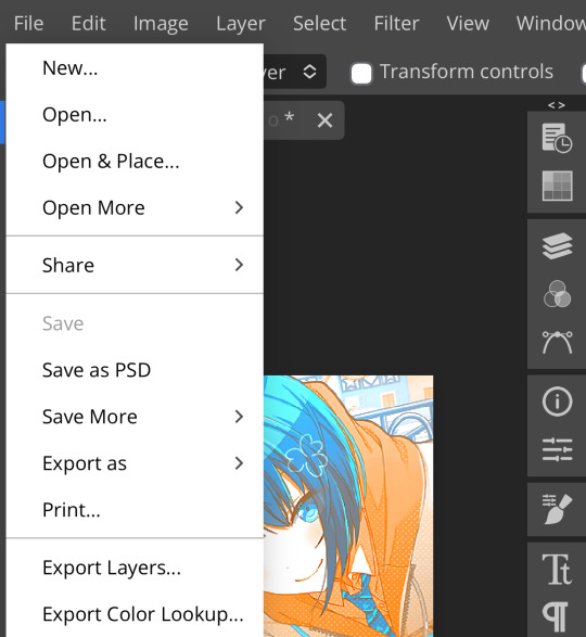
iv. color lookup
photopea has a few default color lookups that are pretty easy to use, but i have a couple of presets that i like to add if i’m feeling stuck. to make your own color lookup, open up a psd, and go to file > export color lookup
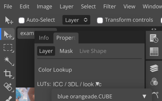
then save it and open it from your files. when you open a color lookup layer, you’ll see an arrow next to the text saying LUTs—click that and your new color lookup should be there
once you tap that, you’ll get a compressed version of your psd added to your folder. it’ll look something like this:
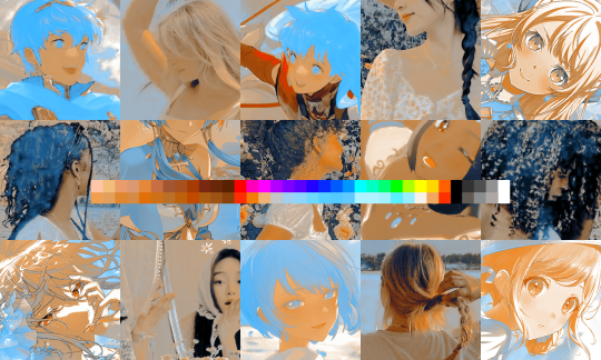
holy orange and blue, batman. luckily, you can apply blending modes to color lookups just like any other layer—mess around with them until it looks how you want!
waow much more reasonable! i set this one on color and about 55% opacity, but that is really dependent on what your color lookup looks like and how you want your psd to look. remember, there’s no right way to do things!
an additional note: if you want to, you can save the psd you’re working on as a color lookup instead. if it looks too simple or just isn’t turning out how you want, that’s a good way to incorporate it later :3 just follow the same steps as above!
v. no shame in starting over
if you’ve added and taken away, duplicated and removed, fucked around and found out, and your psd still isn’t how you want: it’s alright to just axe it. the edit police aren’t gonna kill you for it, i promise. if you’re worried about wanting it later, just save it as a psd and come back when your brain is refreshed ¯\_(ツ)_/¯
psd-making isn’t an exact art, so, obviously, there’s no real simple solution to making it look how you want. you just have to mess with it and see what you’ve got. these are just my methods of making my psds less blagh, but, obviously, my editing is moderately more deranged than your average editor.
…so that’s how you do it.
107 notes
·
View notes