#Hermann Püterschein
Explore tagged Tumblr posts
Text


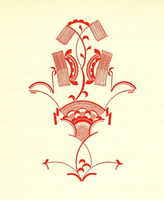
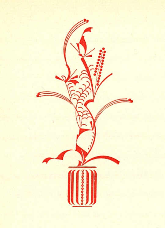
Decorative Sunday
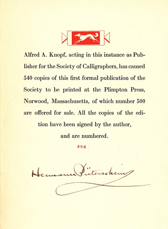
Today we present all the chapter-head designs from Paraphs by Hermann Püterschein, printed in an edition of 540 copies at the Plimpton Press in Norwood, Connecticut, and published in New York by Alfred A. Knopf in 1928. It was the first (and the only) production of the Publications of the Society of Calligraphers.
The Society was an entirely fictitious organization promulgated by the American book and type designer, and popularizer of the term "graphic design," W. A. Dwiggins (1880-1956). Dwiggins had "founded" the Society in 1919 as a vehicle to promote his ideas about design and to promote himself as a designer of books rather than as the advertising designer with which he began his career. Dwiggins was the secretary of the Society and his alter ego Hermann Püterschein was its president; it had no other official members, although many were in on the ruse.
The Society produced three other publications (not part of the stated "Publications of the Society of Calligraphers") before Paraphs (1919, 1924, 1925), and a plethora of printed ephemera, letterheads, envelopes, documents, certificates, etc., to legitimize its official status. Dwiggins goals appear to have been successful as he soon became sought after by book publishers and type foundries, and Paraphs was the last Society publication.
The chapter-head illustrations for Paraphs are typical Dwiggins designs. Our copy is another donation from the estate of our friend Dennis Bayuzick.
View more posts related to W. A. Dwiggins.
View more Decorative Sunday posts.
#Decorative Sunday#decorative design#W. A. Dwiggins#W.A. Dwiggins#WAD#Hermann Püterschein#Paraphs#Plimpton Press#Alfred A. Knopf#Society of Calligraphers#fictitious societies#graphic design#book design#Dennis Bayuzick
71 notes
·
View notes
Photo


Typography Tuesday
This pamphlet, Caledonia, A New Printing Type Designed for Mergenthaler Linotype Company by W.A. Dwiggins was published in 1939 by the Mergenthaler Linotype Company in Brooklyn, New York. W.A. Dwiggins (WAD) writes about the process of creating Caledonia, and under the pseudonym Hermann Püterschein he also writes about himself.
WAD condenses his process into a few paragraphs and figures, but it must have taken a significant amount of time at the drawing table to move the Scotch Modern face away from the “woodenness” of the 19th-century design and develop a “liveliness of action.”
That quality is in the curves - the way they get away from the straight stems with a calligraphic flick, and in the nervous angle on the under side of the arches as they descend to the right. (fig.5) The finishing strokes at the bottoms of the letters, cut straight across without “brackets,” making sharp angles with the upright stems, add “snap” to many of the old “modern face” designs - and why not to Caledonia?
He christened this typeface Caledonia because he was inspired by the work of early Scotch typefounders like Alexander Wilson.
Writing as his alter ego Hermann Püterschein, WAD discusses his approach to modern design:
Any relatively competent design looks important if you set it up in mediocre surroundings. The design of books in the United States has never been forceful. Consequently this artist’s designs, which have a kind of original force, are conspicuous...
Left to himself he would have gone on as he started: a student of historical design, conservative, timid. My ideas opened up a prospect. He is clever at adapting.
He creates an illusion of machines. But his machines are a masquerade, there are men inside them.
See more posts with W. A. Dwiggins
See more Typography Tuesday posts
#typography tuesday#typetuesdays#W. A. Dwiggins#caledonia#scotch modern#typeface design#Mergenthaler Linotype Company#alison#20th century
24 notes
·
View notes