#Flamme who developed the method
Explore tagged Tumblr posts
Text
Flamme's and Frieren's backstory episode is probably my favorite so far. Their relationship makes me want to bite.
These two women that are so so so so so similar. Who loved magic for magic's sake. Who lost everything to demons. Who made the selfless-selfish choice of turning their beloved magic into a weapon for destroying demons. Who can't say with their whole chest anymore that they love magic, because are they worth of it? They, cowardly magicians who deceit and hide their power?
And who still cling on to their love of magic. Quietly. Humbly. Flamme, who in facing death, in looking back at a lifetime of training Frieren into a sleeping weapon, didn't regret it, but did need to leave her with one last lesson. Who taught Frieren her favorite spells for making flowers. Even cowardly magicians can still love magic.
The very understated, quiet understanding between them. My favorite spell creates a field of flowers. Teach me that spell.
#Frieren#CRYING!!#I love that it was Flamme who came up with the method to deceive demons#it is very classic human cunning. very The Art of War.#Neither of them could have defeated the Demon King by themselves#Flamme who developed the method#and Frieren who had the lifespan needed to train it up to its needed potential#I love that Flamme never regretted teaching Frieren to be the ultimate demon killing weapon#and yet she predicted how that would take a tool on her mentally. emotionally.#and she set things up to help her in the future.#CRYING AGAIN!!
65 notes
·
View notes
Text
Sousou no Frieren typology
Frieren - INTP 5w6 sp/so Double Bird
The conflict between her and Serie is basically Ti-Te clash. Her way of approaching a magic is also very typical of Ti-user. To her, magic is about studying and discovery. A Te-user wouldn't see it that way. Look at Serie and Fern, magic is fun and they both love magic. But they still focus more on utility than just the understanding.
The story is about Frieren developing Fe-inferior. Learning to connect to people, to put herself in other people's shoes, to uphold values of people who she holds dear (Himmel, Hero's Party and Fern). She became more emotionally open as the series progress (look at her expression in ep 1 and ep 28, it's night and day).
Fern - ISTJ 1w9 sp/so Lion-Bird
An adorable prude who's very pragmatic and efficient. Her fighting style sums up strong Te-user approaches to fighting. Using the most effective mean to fight. It doesn't look fancy but it's pure brutal efficiency.
I do practice martial arts and my approach is similar to Fern. She only uses 2 spells - barrier and Zoltraak (basic offensive magic). It's similar to my approach to martial arts. Just master the basic and knock people out fast. You don't need anything fancy, really. The basic is usually more than enough, if you master it.
Stark - ESFP 6w7 so/sp Badger-Lion
Adorable labrador. Nothing to elaborate, he is the easiest to type.
Himmel - ENFJ 2w3 so/sp Double Badger
This is the man. A role model for me.
Eisen - ISTP 6w5 sp/so Double Badger
He is a little hard to type, but we see consistently throughout the series and manga that he is a head type. Fear is his driving force and he is an attachment type, so 6-core.
Heiter - ENTP 7w6 so/sp Lion-Snake
Sly old fox. He grows up becoming a dependable and upright old man (with a touch of playfulness) showing healthy line of 7-1. But he never lost his playfulness and inner brat.
Serie - ENTJ 8w9 sp/so Lion-Bird
Serie is the epitome of Te-dom. Her mindset is pure utilitarian. Magic is a tool for killing. She loves magic and advancement in magic study is all she wants. However, unlike Frieren, it's not just about understanding but about application. She is pretty hands-off but when need arises, she will get her hands dirty (and loves doing it) showing grittiness of Se-tert and 8. She is pretty withdrawn though owing to her 9-wing.
Flamme - INFJ 6w7 so/sp
Flamme is all about Ni. She knows exactly when and how Frieren will fuck up and plans ahead ... for millenia. She understands Frieren well enough to see where she will go. Flamme shows good usage of balanced Fe-Ti. Fe-Ti are tools to her (unlike Himmel), so she can detach herself more. She understands the culture and mindset of demons and exploits it hard (Fe-Ti working together). Her method is underhanded but pragmatic. She is an obvious head type. Her reasoning and tactics came from the head (analysis) rather than the gut (instinct).
Denken - ESTJ 3w2 sp/so
Denken is a good example of healthy and mature ESTJ and 3w2. He is very pragmatic and strategic but not callous. He is aware of his own standing and isn't afraid to assert himself but also cooperative and levelheaded. We must remember that Denken is an old man at this point. He is an example of a 3w2 integrating to incorporate good aspect of 6w5 (cooperation, genuineness, tactical thinking and a sense of duty).
He used to be stereotypical ESTJ 3 - cutthroat, ambitious to a fault and cold. But the death of his wife and the situation of his hometown shapes him into a wise old man.
Ubel - ESTP 7w8 sp/so
Why do people think she is Ne-dom. She is all about sensory experience in the here and now. That's Se-dom.
4 notes
·
View notes
Text
RESEARCH: Spectral in Use

‘A Delicate Sight’ by Sam Winston
A Delicate Sight is a project initiated by the visual artist Sam Winston, known for his work of exploring language through writing and his acquaintances to drawing. In 2015, Sam Winston put himself through a month-long “darkness residency”, in order to question the effect of darkness and sensory reduction on his creative process. At the end of the residency, the artist sealed the works he had done in the dark, and subsequently tried to re-create with the help of sight what he thought he did during this period. After this experience and over the course of five years, Sam Winston invited other creatives to perform a darkness residency which could last from a few hours to one night.
This project is documented by a film, an exhibition to come, and a book. They put the works of Sam Winston in perspective with those of the authors Bernardine Evaristo and Max Porter, as well as the poets Raymond Antrobus and Don Paterson – who all accepted to be part of the experience. The book was designed by London-based studio A Practice for Everyday Life: from the start, the book shows the peculiar attention to sensation that comes with the darkness, with the title printed in reverse on the paper jacket, to be seen in transparency. The book will be launched at the Barbican for the exhibition opening, and the public will be invited to take part in the darkness experience, and to use the unwrapped book jacket as support for their creation. Some of the jackets will be drawn upon by Sam Winston himself, and distributed as gifts.
The beginning of the book is a plain gradient of black to white, announcing the texts written during the residency, a white that fades again after the final contribution. This fading is visible on the edges of the book. While reading, it gives the impression that the texts emerge from the darkness. This feeling of something barely apprehensible is supported by the use of Spectral from Production Type: even though this typeface was initially commissioned for screen reading, the lightness permitted by the media conveys a fragile aspect in the context of a printed book. Titles are set in Spectral Light and texts in Spectral Regular.


https://fontsinuse.com/uses/42789/a-delicate-sight-by-sam-winston#zoom-4
L’écriture de l’ombre
L’écriture de l’ombre (“shadow writing”) is a book about graffiti photography, published by Editions Terrain Vague:
The graffiti artists, by archiving their ephemeral productions, develop new photographic practices that Bernard Fontaine tries to define through an artistic and sociological analysis. In this essay, the photography of graffiti is brought to light thanks to a methodical and referenced reflection, which leaves the floor to different actors with unique approaches.
Spectral by Production Type is used throughout the book design. Primarily intended for on-screen reading in web apps, Spectral has been designed with relatively wide spacing. For the use in print typography and especially in larger sizes, this has to be adjusted by applying some negative tracking, as designer Arthur Calame has done here. The text typography employs Spectral with its optional oldstyle figures.


https://fontsinuse.com/uses/31072/l-ecriture-de-l-ombre
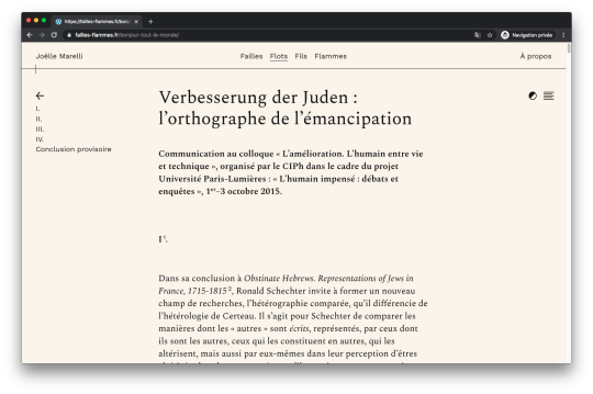
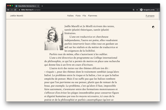
Failles Flots Fils Flammes website
The website was designed by studio des formes, who chose to work with Spectral from Production Type. The elegance of the typeface and its synthetic aesthetic manage to render a literary aspect to the texts, while being perfectly adequate to the materiality of the surface of the screen. This digital journal, neither a diary nor a blog, is in between: it finds a specific form for a type of space not yet defined on the web. Spectral helps reconciling the apparent antagonic aspects of a private yet literary writing made visible. Conceived in the legacy of Elzevir typefaces but optimized for immersive reading on screen, Spectral brings a literary style rooted in our visual imagination for centuries into the mutable space of web design. One detail we enjoyed in particular is the possibility to switch from light to dark mode, making even more visible the will to create a reading and writing space dedicated to the web: the usual hierarchy between black typeface and white paper (twisted here with the use of a light colored tone) is overthrown, showing at the same time the new mobility of text on screen.
Spectral is complemented with Work Sans for menu and navigation.


https://fontsinuse.com/uses/38063/failles-flots-fils-flammes-website
Left Alone magazine, Issue One, July 2017
Our Place studio designed the zine using their own OP Grotesque (designed by Alex Gross) and Spectral, Production Type’s open-source family that had just been released through Google Fonts at the time. Initially intended for screen use, this is very likely Spectral’s first printed use.


https://fontsinuse.com/uses/22162/left-alone-magazine-issue-one-july-2017
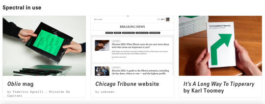
Oblio Mag
Oblio is a magazine that describes the world of visual design from an unusual point of view: the projects that were never realized due to failure, rejection, lack of time or money. We interviewed seven studios and three designers, asking them about the meaning of visual design, their vision related to failure and the future evolution of visual designers. During the meetings, each of them showed us projects that were never completed or realized. In conclusion they provided us useful advice aimed at those who, like us, have yet to take their first steps in this world.
The two main typefaces used in this edition are Spectral (Production Type) and Everett(Type.weltkern). Selected headlines use Ortica Bold (Colllettivo).


https://fontsinuse.com/uses/47334/oblio-mag
‘Its a Long Way to Tipperary’ by Karl Toomey
Ballinger and Spectral used together for a book series conceived and designed by Karl Toomey (KTOOMS). In the author’s own words:
If you’ve ever wondered how far it is to Tipperary, I may have the book series for you. Created during lockdown, and using the 1912 hit tune It’s a Long Way To Tipperary as inspiration, this is an eight-part walking tour cobbled together from home using Google Maps and Wikipedia. Kicking off in London (home to both myself and the song’s fabled homesick Irishman), our tour heads west across England, Wales and the Irish Sea before plodding inland to our final destination, Tipperary in Ireland.
The images show the first realized volume, “Stage 01: London to Oxford”, with seven more in the making.


https://fontsinuse.com/uses/43370/it-s-a-long-way-to-tipperary-by-karl-toomey
0 notes