#Exploring the Reasons Behind Companies Choosing Not to Give Dividends
Explore tagged Tumblr posts
Text
Exploring the Reasons Behind Companies Choosing Not to Give Dividends
Written by Delvin Dividends are a common way for companies to distribute profits to their shareholders. However, there are instances where companies opt not to provide dividends, which may raise questions among investors. In this blog post, we will delve into the reasons why some companies choose not to give dividends for their stocks. 1. Growth and Reinvestment: One of the primary reasons…
View On WordPress
#dailyprompt#Dividends#Exploring the Reasons Behind Companies Choosing Not to Give Dividends#Financial#Financial Literacy#Growth Stocks#knowledge#Stocks
0 notes
Text
Why NewRetirement is my favorite retirement planning tool
Over the past week, I've shared two terrific retirement planning tools. First, I explored the pros and cons of Personal Capital. Next, I looked at OnTrajectory, which is the best traditional retirement calculator I've found.

Today, I want to talk about NewRetirement. Since I discovered it two years ago, NewRetirement has become my favorite tool for retirement planning. I like NewRetirement because it offers amazing levels of customization. Plus, it explains its assumptions and offers ample information about every subject it tackles. And it does all of this without ever becoming overwhelming. It's comprehensive and customizable, yet clear. Most importantly, NewRetirement is more than just a retirement calculator. When I say it's a retirement planning tool, I mean that. NewRetirement offers three levels of service. Planner, the basic level of service and the bulk of what I'll review in this article is free. You do need to provide an email address, but once you do, you're able to create a personalized retirement plan. (I'll show you what that's like in a moment.)If you like the basic level of service and want more, you can upgrade to PlannerPlus for $6/month. This gives you access to advanced retirement planning tools, more detailed reports, and the ability to print your plan. (NewRetirement is offering GRS readers a 30-day free trial of PlannerPlus, by the way.)At the highest level, you can pay NewRetirement for personalized advice from a Certified Financial Planner. Unlike Personal Capital, NewRetirement won't pester you over and over to use their advisors. But the service is available for those who need it. As I mentioned, I've been using NewRetirement for a couple of years. In order to give an honest and complete review today, I created a second NewRetirement account and walked through the process of setting everything up from scratch. Do I still like the tool as much as I did in April 2017? Let's find out. Disclosure: Before I begin this review, I need to make one thing clear: I am an investor in NewRetirement. When I first found the service two years ago, I liked it so much that I started an email conversation with founder Stephen Chen. That grew into a friendship. Since then, I've invested $50,000 of my own money into the company. (Also, I was the first-ever guest on the NewRetirement podcast!) Having said that, I've done my best to provide an honest review here. Getting Started with NewRetirement After you register for an account, NewRetirement starts by asking you a series of basic questions. (You can opt to by-pass these questions if all you want is a simple retirement calculator.) Here's how I answered using my current financial state.

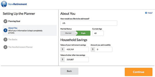
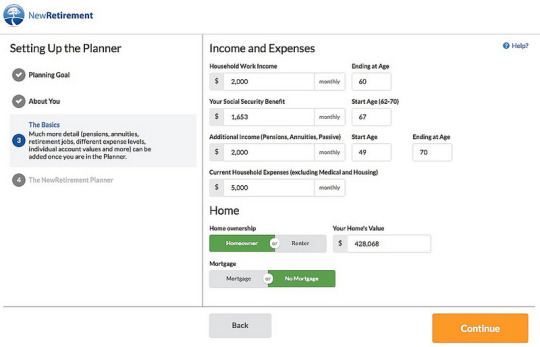
When you've finished entering your basic info, you're presented with the NewRetirement dashboard. It's here that you first get a hint that this retirement tool is more robust than any of the others. Front and center is a progress barand because you're new, that progress bar is nearly empty.

Even if you didn't flesh out your initial data, NewRetirement would give you some useful info. (Meaning that if you read this article and want to look at what the tool does, you can click over and get a quick overview of your financial future in just a couple of minutes.) The fun really starts, however, when you dig deeper into NewRetirement. Digging Deeper into NewRetirement As the dashboard implies, NewRetirement features 33 different retirement planning sections divided into ten broad categories. In each section, you can enter data and/or change assumptions. If all of this were dumped on the user at once, it'd be overwhelming. Fortunately, it's a step-by-step process that never gets out of control. The ten main categories that NewRetirement tackles are: Basic profile and goals, including your age, life expectancy, desired legacy, and plans for retirement. (The latter is a written statement. I love it! Most retirement tools are all about the numbers. NewRetirement digs deeper.)Social Security, where you can enter your estimated retirement benefits and start date. If you don't know what to expect from Social Security, NewRetirement links to the official government website and a Social Security calculator.Work and other income. In this section, you can specify how much you earn from your job, but also input money from dividends, interest, rental properties, and other sources.Annuities and pensions. If you have access to an annuity or pension, you can enter your info in this section. I won't have either of these, so I skip this section.Savings and assets. This is a large section in which you list your tax-advantaged retirement accounts, regular investment accounts, bank accounts, large assets, and ongoing retirement contributions. Under other assets, I included the various businesses I own pieces of (including NewRetirement itself!). I did not, however, value this website.Expenses and inflation. Here you can choose both an optimistic inflation rate and a pessimistic inflation rate. You can also enter any known large one-time expenses in your future, such as buying a home, sending the kids to college, or charitable giving. You can tell NewRetirement which account the expense will come from, the age it will occur, and the reason for the expense. Pretty cool. Lastly, if you think your core spending will change over time, you can specify that here. Right now, for instance, I think I'm spending $5000 per month. If I think that spending will drop to $3500 per month when I turn 55, I could model that in this section.Housing, where you enter the current value of your home, the balance on your mortgage, and project future home appreciation. Another cool feature: You can model future changes to housing or mortgages. If I think that Kim and I will sell our current home and downsize in a decade, for instance, NewRetirement will let me do that. (Minor quibble: When I'm projecting my future, I assume that we'll sell this house in ten years and then rent a place. NewRetirement won't let me explicitly model that. My workaround is to model buying a new home for $1, then bumping my monthly expenses by $1500 to compensate for rent.)

Medical and long-term care. As you probably know, medical costs are one of the fastest-rising yet most oft-overlooked chunks of the average American budget. NewRetirement includes an entire section for modeling current and future health-care costs.Debts. NewRetirement allows you to list all of your current debt (plus links to advice on how to manage your debt, if it's problematic).Estate planning. This section doesn't have a lot of resources but offers a bit of information. Plus, it lets you track whether you've completed important estate-planning documents. Nearly every step of the way, NewRetirement offers you the ability to learn more about relevant topics. For instance, when you enter your expected longevity, NewRetirement links you to a life-expectancy calculator and suggests five related articles.

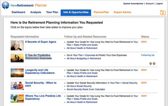
As you tick boxes indicating that you'd like to learn more about a particular topic, relevant articles are added to the info and opportunities tab in the main menu. This is an excellent, useful feature, something I've never seen in another retirement tool.
Forecasting Your Future with NewRetirement Yesterday, it took me about an hour to work through all 33 retirement planning sections in the NewRetirement tool. I've been entering the same info into retirement planning tools for two weeks now, so I know where to find it. If this is your first time, it might take you a bit longer. When I'd finished, the progress bar in the dashboard was no longer empty. It looked like this:

The NewRetirement dashboard contains an Analysis section that's available from the start. After you've entered your basic data during registration, you can use this section to look at a forecast for your financial future. But the analysis becomes more useful after you've entered more complete information. By default, the dashboard displays your Savings Over Time graph (which is very similar to the graph that OnTrajectory keeps front and center at all times).
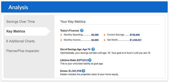
There's a key metrics view where you can see the core basic parameters and some of the ramifications.
Or, if you want more info, you can access a handful of other charts.
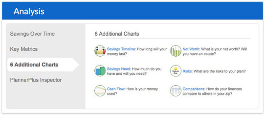
I'm a fan of the Savings Timeline chart because it gives me a quick look at my current financial trajectory.

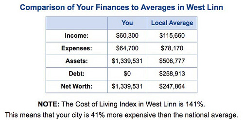
And as much as I preach that you should not compare yourself to others, I like the compare yourself to others tool haha. (From my past articles about NewRetirement, I know that other GRS readers like this comparison tool too.)
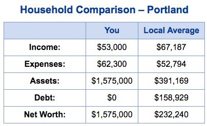
Just for kicks, here's the same comparison view from when I first reviewed NewRetirement in 2017:
As you can see, there's plenty available with the free version of NewRetirement. In fact, it's this free tool that made me rave about the company two years ago. I still love it. I do think OnTrajectory is a strong competitor for NewRetirement. That's a good thing. For many people, OnTrajectory may be a better choice. But the features I've reviewed so far in this article are free at NewRetirement. OnTrajectory costs money after the first two weeks of use. In the future, I intend to promote both OnTrajectory and NewRetirement. They're both excellent. (If you haven't read it yet, here's my OnTrajectory review.) PlannerPlus at NewRetirement As you can see, the free version of NewRetirement packs quite a punch. Without paying a penny, you can do more with it than with 95% of the other retirement planning tools on the web. But what if you want more? For $6/month, you can upgrade from the entry-level NewRetirement service to what the company calls PlannerPlus. Doing so unlocks another menu of options.
Behind the scenes, NewRetirement takes the data you've entered, crunches it based on the tool's assumptions investment returns, inflation, health-care spending, etc. then creates a series of data tables projecting your future financial health. In order to make these raw numbers more accessible, PlannerPlus provides its Plan Inspector, which lets you browse dynamic charts to explore your retirement plan. Here, for instance, I'm looking at how even with optimistic assumptions, my savings will only last until I'm age 75.

With the free version of NewRetirement, you can enter as many expenses as you want, but nothing about the process is guided. It's all sort of free-form. For many folks, that's fine. Others want more help, though. For these people, PlannerPlus includes an advanced budgeting tool.
The budgeting tool in PlannerPlus allows users to model expenses at a far more detailed level. For instance, I could use my existing data from Quicken to enter actual expenses for almost everything.

Most retirement calculators ask for just a couple of Big Picture numbers. The good ones let you explore some level of detail. Like OnTrajectory, NewRetirement allows you to get as detailed as you want so that you can explore a variety of what-if scenarios. With the PlannerPlus upgrade, you can also customize the software's alerts. Do you want NewRetirement to pester you when you use faulty assumptions? When your data is incomplete? When you could take steps to improve your future financial health? If so, do nothing. But if the alerts bug you, you can choose which ones to dismiss. PlannerPlus also allows you to print your plan and/or export it to a spreadsheet. The Bottom Line NewRetirement isn't perfect and I don't want to pretend that it is. As I worked through the tool yesterday, I encountered a couple of minor bugs. Sometimes I couldn't figure out how to model my plans for the future. (How do I convey that I think we might sell the house in ten years, then find a place to rent?) For as much reporting as NewRetirement currently offers, it could always offer more. (We money nerds love to have lots of reports and graphs.) That said, the company is very responsive to bug reports. They update the software regularly, so when users report issues, changes can usually be made within a few days. Plus, NewRetirement is a work in progress. The company is constantly working to improve things, to give more value to their customers even the folks who use the free level of service. Every month, founder Stephen Chen sends me a list of coming upgrades and his plans for the company's future. Much has changed in the two years since I first discovered the tool. Much will change in the years to come. Ultimately, NewRetirement isn't a retirement calculator; it's a retirement planning tool. To me, that's like the difference between a pocket calculator and a spreadsheet. Each has its uses, no doubt. Sometimes, you want the pocket calculator. But sometimes, you want the more powerful option. If all you're after is a quick overview of your financial future, you can use the basic retirement calculator at NewRetirement or one of the dozens of other retirement calculators on the web. (Use OnTrajectory if you want a robust retirement calculator.) But if you want to actually formulate a retirement plan, if you want a retirement planning tool that will actually guide you through the process, NewRetirement is an outstanding choice. NewRetirement is offering Get Rich Slowly readers a free 30-day trial of PlannerPlus. You do have to enter your credit card info to start the trial, but if you decide that the service isn't right for you, you can cancel without hassle. NewRetirement isn't a scammy company. They want you to be happy.

Author: J.D. Roth In 2006, J.D. founded Get Rich Slowly to document his quest to get out of debt. Over time, he learned how to save and how to invest. Today, he's managed to reach early retirement! He wants to help you master your money and your life. No scams. No gimmicks. Just smart money advice to help you reach your goals. https://www.getrichslowly.org/newretirement-retirement-planning-tool/
0 notes
Text
Why NewRetirement is my favorite retirement planning tool
Over the past week, I've shared two terrific retirement planning tools. First, I explored the pros and cons of Personal Capital. Next, I looked at OnTrajectory, which is the best traditional retirement calculator I've found.
Today, I want to talk about NewRetirement. Since I discovered it two years ago, NewRetirement has become my favorite tool for retirement planning.
I like NewRetirement because it offers amazing levels of customization. Plus, it explains its assumptions and offers ample information about every subject it tackles. And it does all of this without ever becoming overwhelming. It's comprehensive and customizable, yet clear. Most importantly, NewRetirement is more than just a retirement calculator. When I say it's a retirement planning tool, I mean that.
NewRetirement offers three levels of service.
Planner, the basic level of service — and the bulk of what I'll review in this article — is free. You do need to provide an email address, but once you do, you're able to create a personalized retirement plan. (I'll show you what that's like in a moment.)
If you like the basic level of service and want more, you can upgrade to PlannerPlus for $6/month. This gives you access to advanced retirement planning tools, more detailed reports, and the ability to print your plan. (NewRetirement is offering GRS readers a 30-day free trial of PlannerPlus, by the way.)
At the highest level, you can pay NewRetirement for personalized advice from a Certified Financial Planner. Unlike Personal Capital, NewRetirement won't pester you over and over to use their advisors. But the service is available for those who need it.
As I mentioned, I've been using NewRetirement for a couple of years. In order to give an honest and complete review today, I created a second NewRetirement account and walked through the process of setting everything up from scratch. Do I still like the tool as much as I did in April 2017? Let's find out.
Disclosure: Before I begin this review, I need to make one thing clear: I am an investor in NewRetirement. When I first found the service two years ago, I liked it so much that I started an email conversation with founder Stephen Chen. That grew into a friendship. Since then, I've invested $50,000 of my own money into the company. (Also, I was the first-ever guest on the NewRetirement podcast!) Having said that, I've done my best to provide an honest review here.
Getting Started with NewRetirement
After you register for an account, NewRetirement starts by asking you a series of basic questions. (You can opt to by-pass these questions if all you want is a simple retirement calculator.) Here's how I answered using my current financial state.
When you've finished entering your basic info, you're presented with the NewRetirement dashboard. It's here that you first get a hint that this retirement tool is more robust than any of the others. Front and center is a progress bar…and because you're new, that progress bar is nearly empty.
Even if you didn't flesh out your initial data, NewRetirement would give you some useful info. (Meaning that if you read this article and want to look at what the tool does, you can click over and get a quick overview of your financial future in just a couple of minutes.)
The fun really starts, however, when you dig deeper into NewRetirement.
Digging Deeper into NewRetirement
As the dashboard implies, NewRetirement features 33 different retirement planning sections divided into ten broad categories.
In each section, you can enter data and/or change assumptions. If all of this were dumped on the user at once, it'd be overwhelming. Fortunately, it's a step-by-step process that never gets out of control.
The ten main categories that NewRetirement tackles are:
Basic profile and goals, including your age, life expectancy, desired legacy, and plans for retirement. (The latter is a written statement. I love it! Most retirement tools are all about the numbers. NewRetirement digs deeper.)
Social Security, where you can enter your estimated retirement benefits and start date. If you don't know what to expect from Social Security, NewRetirement links to the official government website and a Social Security calculator.
Work and other income. In this section, you can specify how much you earn from your job, but also input money from dividends, interest, rental properties, and other sources.
Annuities and pensions. If you have access to an annuity or pension, you can enter your info in this section. I won't have either of these, so I skip this section.
Savings and assets. This is a large section in which you list your tax-advantaged retirement accounts, regular investment accounts, bank accounts, large assets, and ongoing retirement contributions. Under “other assets”, I included the various businesses I own pieces of (including NewRetirement itself!). I did not, however, value this website.
Expenses and inflation. Here you can choose both an optimistic inflation rate and a pessimistic inflation rate. You can also enter any known large one-time expenses in your future, such as buying a home, sending the kids to college, or charitable giving. You can tell NewRetirement which account the expense will come from, the age it will occur, and the reason for the expense. Pretty cool. Lastly, if you think your core spending will change over time, you can specify that here. Right now, for instance, I think I'm spending $5000 per month. If I think that spending will drop to $3500 per month when I turn 55, I could model that in this section.
Housing, where you enter the current value of your home, the balance on your mortgage, and project future home appreciation. Another cool feature: You can model future changes to housing or mortgages. If I think that Kim and I will sell our current home and downsize in a decade, for instance, NewRetirement will let me do that. (Minor quibble: When I'm projecting my future, I assume that we'll sell this house in ten years and then rent a place. NewRetirement won't let me explicitly model that. My workaround is to model buying a new home for $1, then bumping my monthly expenses by $1500 to compensate for rent.)
Medical and long-term care. As you probably know, medical costs are one of the fastest-rising yet most oft-overlooked chunks of the average American budget. NewRetirement includes an entire section for modeling current and future health-care costs.
Debts. NewRetirement allows you to list all of your current debt (plus links to advice on how to manage your debt, if it's problematic).
Estate planning. This section doesn't have a lot of resources but offers a bit of information. Plus, it lets you track whether you've completed important estate-planning documents.
Nearly every step of the way, NewRetirement offers you the ability to learn more about relevant topics. For instance, when you enter your expected longevity, NewRetirement links you to a life-expectancy calculator and suggests five related articles.
As you tick boxes indicating that you'd like to learn more about a particular topic, relevant articles are added to the “info and opportunities” tab in the main menu. This is an excellent, useful feature, something I've never seen in another retirement tool.
Forecasting Your Future with NewRetirement
Yesterday, it took me about an hour to work through all 33 retirement planning sections in the NewRetirement tool. I've been entering the same info into retirement planning tools for two weeks now, so I know where to find it. If this is your first time, it might take you a bit longer.
When I'd finished, the progress bar in the dashboard was no longer empty. It looked like this:
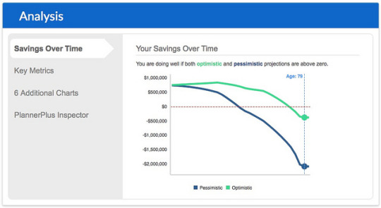
The NewRetirement dashboard contains an Analysis section that's available from the start. After you've entered your basic data during registration, you can use this section to look at a forecast for your financial future. But the analysis becomes more useful after you've entered more complete information.
By default, the dashboard displays your Savings Over Time graph (which is very similar to the graph that OnTrajectory keeps front and center at all times).
There's a “key metrics” view where you can see the core basic parameters and some of the ramifications.
Or, if you want more info, you can access a handful of other charts.
I'm a fan of the Savings Timeline chart because it gives me a quick look at my current financial trajectory.
And as much as I preach that you should not compare yourself to others, I like the “compare yourself to others” tool haha. (From my past articles about NewRetirement, I know that other GRS readers like this comparison tool too.)
Just for kicks, here's the same comparison view from when I first reviewed NewRetirement in 2017:
As you can see, there's plenty available with the free version of NewRetirement. In fact, it's this free tool that made me rave about the company two years ago. I still love it.
I do think OnTrajectory is a strong competitor for NewRetirement. That's a good thing. For many people, OnTrajectory may be a better choice. But the features I've reviewed so far in this article are free at NewRetirement. OnTrajectory costs money after the first two weeks of use.
In the future, I intend to promote both OnTrajectory and NewRetirement. They're both excellent. (If you haven't read it yet, here's my OnTrajectory review.)
PlannerPlus at NewRetirement
As you can see, the free version of NewRetirement packs quite a punch. Without paying a penny, you can do more with it than with 95% of the other retirement planning tools on the web. But what if you want more?
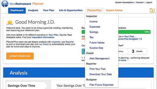
For $6/month, you can upgrade from the entry-level NewRetirement service to what the company calls PlannerPlus. Doing so unlocks another menu of options.
Behind the scenes, NewRetirement takes the data you've entered, crunches it based on the tool's assumptions — investment returns, inflation, health-care spending, etc. — then creates a series of data tables projecting your future financial health. In order to make these raw numbers more accessible, PlannerPlus provides its “Plan Inspector”, which lets you browse dynamic charts to explore your retirement plan.
Here, for instance, I'm looking at how even with optimistic assumptions, my savings will only last until I'm age 75.
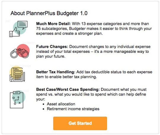
With the free version of NewRetirement, you can enter as many expenses as you want, but nothing about the process is guided. It's all sort of free-form. For many folks, that's fine. Others want more help, though. For these people, PlannerPlus includes an advanced budgeting tool.
The budgeting tool in PlannerPlus allows users to model expenses at a far more detailed level. For instance, I could use my existing data from Quicken to enter actual expenses for almost everything.
Most retirement calculators ask for just a couple of Big Picture numbers. The good ones let you explore some level of detail. Like OnTrajectory, NewRetirement allows you to get as detailed as you want so that you can explore a variety of what-if scenarios.
With the PlannerPlus upgrade, you can also customize the software's alerts. Do you want NewRetirement to pester you when you use faulty assumptions? When your data is incomplete? When you could take steps to improve your future financial health? If so, do nothing. But if the alerts bug you, you can choose which ones to dismiss.
PlannerPlus also allows you to print your plan and/or export it to a spreadsheet.
The Bottom Line
NewRetirement isn't perfect and I don't want to pretend that it is. As I worked through the tool yesterday, I encountered a couple of minor bugs. Sometimes I couldn't figure out how to model my plans for the future. (How do I convey that I think we might sell the house in ten years, then find a place to rent?) For as much reporting as NewRetirement currently offers, it could always offer more. (We money nerds love to have lots of reports and graphs.)
That said, the company is very responsive to bug reports. They update the software regularly, so when users report issues, changes can usually be made within a few days.
Plus, NewRetirement is a work in progress. The company is constantly working to improve things, to give more value to their customers — even the folks who use the free level of service. Every month, founder Stephen Chen sends me a list of coming upgrades and his plans for the company's future. Much has changed in the two years since I first discovered the tool. Much will change in the years to come.
Ultimately, NewRetirement isn't a retirement calculator; it's a retirement planning tool. To me, that's like the difference between a pocket calculator and a spreadsheet. Each has its uses, no doubt. Sometimes, you want the pocket calculator. But sometimes, you want the more powerful option.
If all you're after is a quick overview of your financial future, you can use the basic retirement calculator at NewRetirement — or one of the dozens of other retirement calculators on the web. (Use OnTrajectory if you want a robust retirement calculator.)
But if you want to actually formulate a retirement plan, if you want a retirement planning tool that will actually guide you through the process, NewRetirement is an outstanding choice.
NewRetirement is offering Get Rich Slowly readers a free 30-day trial of PlannerPlus. You do have to enter your credit card info to start the trial, but if you decide that the service isn't right for you, you can cancel without hassle. NewRetirement isn't a scammy company. They want you to be happy.
The post Why NewRetirement is my favorite retirement planning tool appeared first on Get Rich Slowly.
from Finance https://www.getrichslowly.org/newretirement-retirement-planning-tool/ via http://www.rssmix.com/
0 notes
Text
GUEST OPINION Mobile loyalty – the ace in the pack
Shaped by the shifting tides of discerning customer demands and digital investment, the retail landscape is caught in a constant cycle of evolution. Adam Croxen, Managing Director, Future Platforms, shares his insight on how developing mobile loyalty can surprise and delight both retailers and consumers alike.
According to the results of our recently conducted research, the majority of consumers are ready for mobile loyalty, so why, when there’s already a clear immersion of the smartphone in our shopping experience, are retailers falling short?
Cards, stamps, coupons; there was a time and place for them. But the sheer friction of the purchasing and loyalty processes, as well as the disjointed experience they create, has triggered frustration and despondency amongst many consumers, whose wallets now bulge with redundant plastic cards. And so, driven by a transference of customer needs and behavioural patterns, the time has come for retailers to change their game – and investing in mobile loyalty could just be the ace in the pack.
Following our research, which encompassed a cross-section of some of the leading high street brands, we found that the frontrunners who are embracing the mobile loyalty game-plan are already reaping the dividends, though the results indicated that these innovators are few and far between: many businesses are just not pulling it together.
To understand the benefits of developing your mobile loyalty capabilities, we need to take a look at a couple of stand-out examples that were highlighted by our research, John Lewis and Starbucks, both of which are way ahead of the pack and are blurring the lines between service and loyalty in order to craft a seamless experience in which the user can benefit.
In the most basic terms, from logging on to purchasing with John Lewis (whether that’s in-store or online), there’s a comprehensive journey and a collection of history, all gathered together in one place. Meanwhile, with Starbucks, you have the ability to load up a card, use that money to pre-order a coffee and walk in, off the street, to pick it up – with your name already on the cup.
What’s so significant about these examples? Aside from removing the friction of the experience, cleverly amalgamating the loyalty offering with delivering service capabilities achieved better adoption against other brands that roll out separate apps for each aspect.
At best, separate apps cause disgruntlement and confusion, even a sense of a despondency with customers. For the retailer, the repercussions are potentially costly as this makes it difficult to extract and understand the loyalty and purchase cycles of their customers.
Wheels in motion
For John Lewis and Starbucks to up the ante within the mobile loyalty scene, there has to have been a notable increase in consumer mobile usage.
As of Q2, 2016, Starbucks had some 19million app users in the US alone, 21 per cent of the company’s transactions were made via a mobile application and roughly seven million mobile transactions were being made each week.
John Lewis has now called mobile ‘the number one platform to make an emotional impact with customers’ and its app users proved to be the most loyal customers, with nine average visits over a 12-week period (versus 2.1 visits on mobile web).
Indeed, a research study by mobile technology provider Veoo found that 1 in 3 UK consumers use loyalty schemes that are integrated into their mobile phones. That said, the UK falls way behind the US where 48 per cent of consumers use the wallet function on their mobiles – due in part to the fact that UK retailers are comparatively slow off the mark to offer mobile loyalty schemes, opting instead for the antiquated programmes.
Providing further evidence of a hike in consumer mobile usage, research from the Centre for Retail Research found that 50 per cent of UK users now make regular purchases with their Smartphones (which are now the UK’s most-used internet devices), even if there’s a store nearby.
This propensity to use mobile devices shows no sign of abating either, a conclusion bolstered by PayPal’s Mobile Global Snapshot Report that revealed m-commerce as an industry has grown by 42 percent since 2013.
But what’s really driving this upswing? Stepping away from loyalty for the moment and honing in on ‘usage’, there’s a definite shift of weight towards a service-oriented experience. However, do take heed not to fall into the trap: many companies jump onto the mobile tech bandwagon with their initiatives being led by marketing teams. There seems to be a predisposition that lends the thinking process towards ‘how can we market to them’ or ‘how do we push promotions to them’. But the wheels of thought for winning brands are turning differently, and instead they consider ‘how can we improve the service we offer’ – because, if the service is improved, then the consumer will likely engage more.
The brands really taking a view of ‘how best can I service my customers needs’ are those most successful in gaining increased levels of adoption. Removing the friction from an instore experience – whether that be alleviating the need for queuing, or ensuring my receipts are in one place, regardless of whether the purchase was instore or online – provides huge benefit to a consumer, ensuring continued use of the digital services.
With mobile devices ever-present amidst the majority of consumers, retailers have an opportunity to capitalise: some of the physicality can be simply digitalised – but there’s no need to overcomplicate a loyalty programme either.
Redemption processes can be unclear at the best of times, so without even having to go too far with the technology, the experience for the consumer can be eased. For instance, consumers can be reminded to collect via the use of beacons, so as to ensure they make use of their rewards, which in turn will make them feel the value. It becomes a frictionless process; they have the mobile with them, their knowledge and understanding of how or when to redeem rewards is heightened and overall, it feels more oriented around the user, as opposed to the business.
Beacons of opportunity
The research clearly illustrates that it’s time to increase the pace of innovation in retail with mobile technologies, but retailers are left with a quandary: which technology should I adopt, and why?
In order to seek the right solution, you must first understand your customer. It’s a reoccurring, though imperative, theme. First, focus on the customer and the service that you offer them, and then you can focus on the operational opportunities that the technology presents. I think part of this digitalisation of retail has significant operational opportunities in terms of getting the business to work more efficiently, and identifying cost-savings by having better data from their customers.
In terms of which technology to choose, I believe that beacons offer the stand-out solutions in the physical retail environment. Adoption has been slow, but this is in part because not many physical retailers have got a compelling app strategy.
Loyalty has multiple benefits and can be a real Trojan horse: as an example, if you put the Boots Advantage card onto an app and make that a primary channel, then you will most likely find a greater number of people walking into the store will have that app – and this is where the beacons technology really kicks in. The more people you have using an app, the greater the opportunity there is to use beacons. You’re more likely to engage with a loyalty programme when you can add it on your phone rather than have another card clogging up your wallet, which you’ll most likely forget about anyway. Beacons really are the headline technology in this respect.
Once you’ve decided on which technology to adopt, you can then explore what the stores can do with it too. It works not only for the customer, but also the business. Retailers already have a lot of information about customer flow, but beacons can supercharge this knowledge by getting granular about who’s moving around the store in what way.
In addition to that, you can layer the information, looking at purchase activity or what the customer has done online for instance – and this presents a powerful picture of different customers’ behavioural patterns. The data can then be analysed, information about what’s going on in that business can be extracted, and you can explore how to better support the customer – this could be in terms of store layouts, till positioning, placement of staff – or even increases or reductions to staffing levels. All this will help to reduce costs and drive efficiency.
Surprise and delight
Of course, loyalty schemes should not be limited to either an in-store or an online experience. Ideally, they should be integrated. Whether I’m in-store or online, I want to be able to redeem or collect my rewards. But I want to do this in a frictionless way. Redemption should be seamless, clear and easy. Transparency in this respect is important. And mobile digital presents a great opportunity for businesses to offer customers more clarity.
It also generates real potential for enhanced personalisation; there’s a great sense of benefit from employing surprise and delight. With the data we have about our customers, we can surprise them with relevant rewards, which are wholly unexpected, and therefore create a wow factor for customers. And they could be for surprising reasons too, from ‘because you look down today’ to ‘for having a winning smile’. Or we can delight them by giving extra rewards, tailored specifically based on previous purchases or behaviours. The benefits are real, and can only help to engage the customer more.
The good, the bad and the ugly
If I had to underscore two brands from our research which demonstrate best practice then it would have to be John Lewis and Starbucks. They both have an incredible range of features, and what stands out most is the frictionless nature of them. They’re just simple. It doesn’t take a lot of effort. It’s always with you. Being integrated with the app, you can do a lot more with them.
On the flip side, the worst examples were those still using plastic cards and operating with separate apps for loyalty and ordering. The brands that used them as marketing not service channels also fell off our best practice radar.
To conclude, the driving focus of your mobile loyalty investment should come from within your own business and should be used to create a long-term roadmap and vision for success. Consider how your mobile loyalty solution is going to work both now and in the future, and where your short- and long-term priorities lie. Any mobile loyalty solution requires constant attention beyond initial release. Don’t just ride on the wave of your fanfare launch, but remain committed to revising, learning and growing. Retailers all have the potential to form a winning hand – it’s just finding the right combination of cards to play.
The post GUEST OPINION Mobile loyalty – the ace in the pack appeared first on InternetRetailing.
from InternetRetailing http://ift.tt/2k8KpPO via IFTTT
0 notes