#Dehon et Cie
Explore tagged Tumblr posts
Text



Shakespeare Weekend
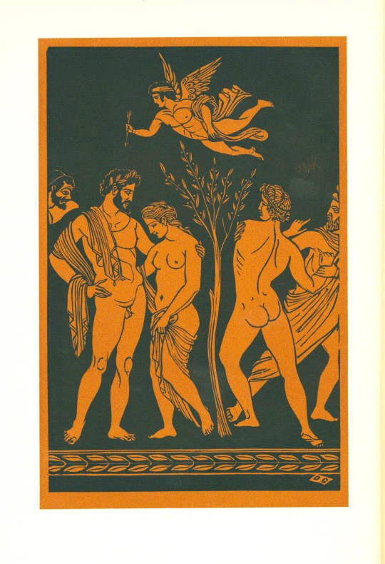
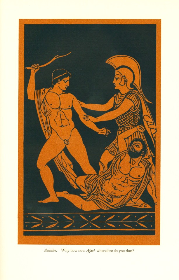
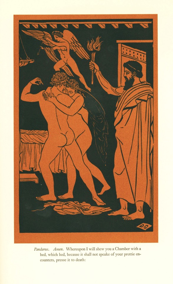
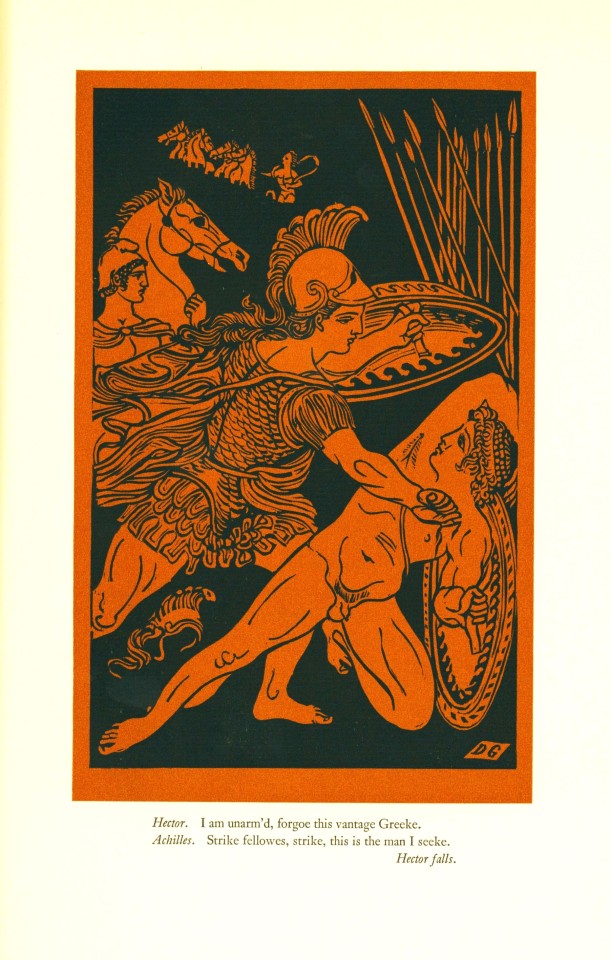
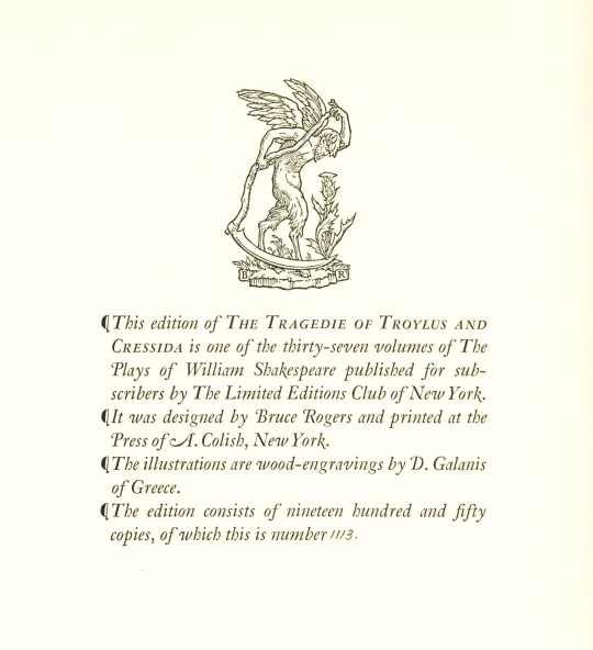
This weekend we look at Shakespeare’s tragic comedy, Troilus and Cressida the thirty-fourth volume of the thirty-seven volume The Comedies Histories & Tragedies of William Shakespeare, published by the Limited Editions Club (LEC) from 1939-1940. Troilus and Cressida was written in 1602 and according to the Stationer’s Register performed publicly by the Chamberlain's Men shortly thereafter. It was published in quarto twice in 1609 and included in the First Folio in 1623. Historians have noted the play’s tone bounces between tragedy and comedy in an often confounding way and some critics have argued the play be classified as a “Problem Play” in that it is centered around social and political problems but offers no resolution to them.
LEC's edition of Troilus and Cressida was illustrated by Greek artist Demetrius Galanis (1879-1966). Galanis was a successful early twentieth-century artist, friend of Picasso, and contemporary of other prominent art figures including Matisse, Braque, and Chagall. Although he was an established painter, Galanis illustrated Troilus and Cressida with evocative wood engravings, the compositions of which recall ancient Greek vases. The images were printed in black on a terracotta background by Dehon et Cie in Paris, creating stunning high-contrast illustrations that capture the action of the play.
The volume was printed in an edition of 1950 copies at the Press of A. Colish. Each of the LEC volumes of Shakespeare’s works are illustrated by a different artist, but the unifying factor is that all volumes were designed by famed book and type designer Bruce Rogers and edited by the British theatre professional and Shakespeare specialist Herbert Farjeon. Our copy is number 1113, the number for long-standing LEC member Austin Fredric Lutter of Waukesha, Wisconsin.
View more Limited Edition Club posts.
View more Shakespeare Weekend posts.
-Jenna, Special Collections Graduate Intern
#Shakespeare Weekend#shakespeare#william shakespeare#troilus and cressida#demetrius galanis#wood engravings#press of a. colish#bruce rogers#herbert farjeon#limited editions club#lec
48 notes
·
View notes
Photo
Staff Pick of the Week - Part One
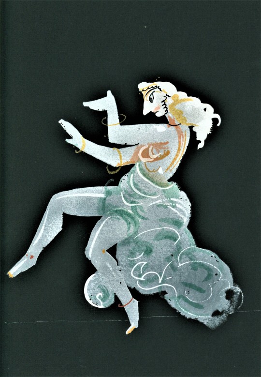
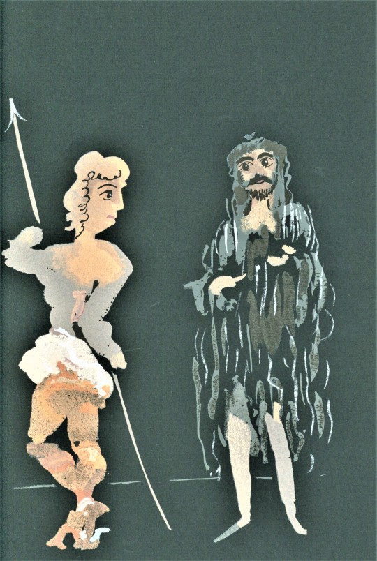
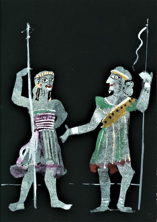
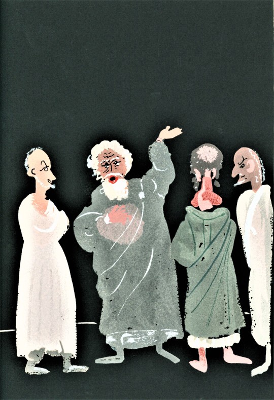
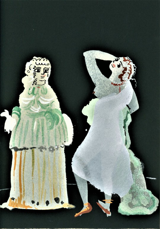
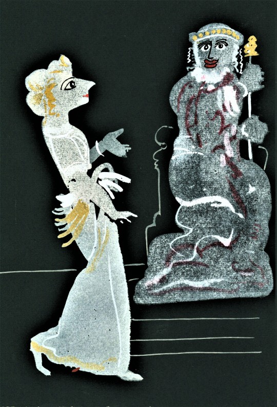
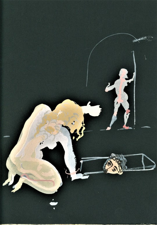
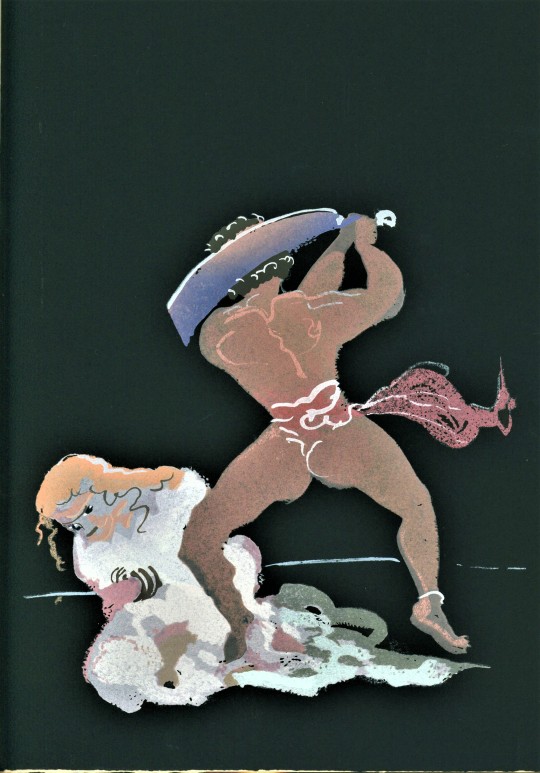
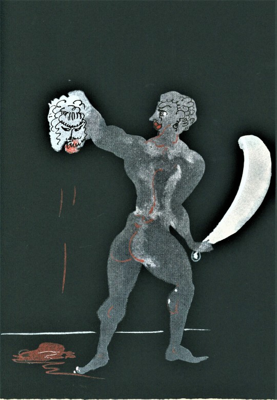
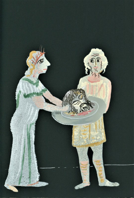
In honor of the unusual nature of the Limited Edition Club’s 1938 edition of Oscar Wilde’s one-act play Salomé, my staff pick this round will be a two parter! The Limited Editions Club had approached French artist André Derain to illustrate a volume for the club, and after a back and forth about potential titles, it was Derain who suggested Salomé. It was the intention of the club to print Derain’s illustrations alongside Lord Alfred Douglas’s English translation of the play, but after learning more about the publication history they were struck with the idea to produce a two volume edition: one in Wilde’s original French to accompany the illustrations of this great French artist, and one in English. This post will dive into the French volume, while part two will take a look at the English volume.
Design for the French volume was handed over to René Ben Sussan, with printing completed in Paris by Dehon et Cie. To play off of Derain’s illustrations, Sussan chose the bold Peignot, then a brand new typeface. Peignot was designed by A. M. Cassandre, best known as a commercial poster designer, who was of the opinion that “in most of our faces of type, the lower case letters are all wrong.” Cassandre’s solution was to design a “multi-case” typeface, consisting of twenty-six letters combining capital and lowercase letterforms. The font retains ascenders and descenders for readability, but there is no lowercase in the traditional sense.
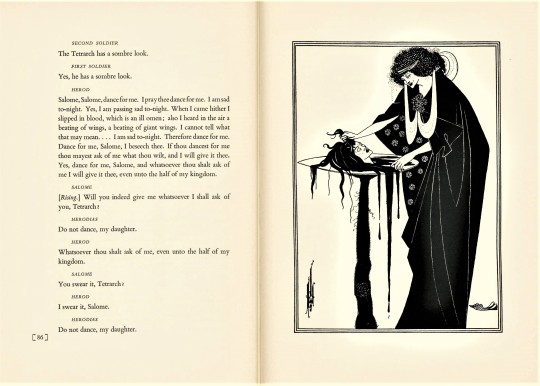
Compare the interplay between text and image in the French volume against the English volume (illustrations by Arthur Beardsley with Bembo type):

André Derain produced twenty-four gouache illustrations on coal-black paper for the French volume, of which ten were selected for publication. They were reproduced by hand by Jean Saudé, a master of the pochoir technique. No small feat for an edition of 1,500! No wonder the publishers limited it to ten of Derain’s illustrations. The paper used for the French volume is a brighter white, rag paper made by Arches paper mill in the Vosges region of France.
Wilde wrote Salomé while living in Paris in 1891, a year of immense success for Wilde. He published four books that year, Intentions, Lord Arthur Savile’s Crime, A House of Pomegranates, and his most enduring work, The Picture of Dorian Gray. Wilde had written two plays during the 1880s, Vera; or, The Nihilists and The Duchess of Padua, but neither had been successful (nor have they been much revived or revisited since). But with his growing acclaim as prose writer, Wilde again turned to drama. In an interview with the Pall Mall Gazette, Wilde explained his decision to write the play in French as a sort of challenge to himself, likened writing in French to picking up a new instrument that he had been listening to his whole life.
View Part Two of my staff pick!
You can find more posts about Limited Editions Club here.
Explore more Staff Picks here.
-Olivia, Special Collections Graduate Intern
#Staff Pick of the Week#Salomé#Oscar Wilde#Limited Editions Club#André Derain#gouache#René Ben Sussan#Dehon et Cie#A. M. Cassandre#Peignot#Jean Saudé#pochoir#Arches paper#severed heads#Olivia
33 notes
·
View notes