#DVCAXIAL2018
Explore tagged Tumblr posts
Visit Tumblr Blog
Explore Tumblr blogs with no restrictions, modern design and the best experience.
Last Seen Tumblr Blogs


Fun Fact
69% of Tumblr users are millennials.
Photo


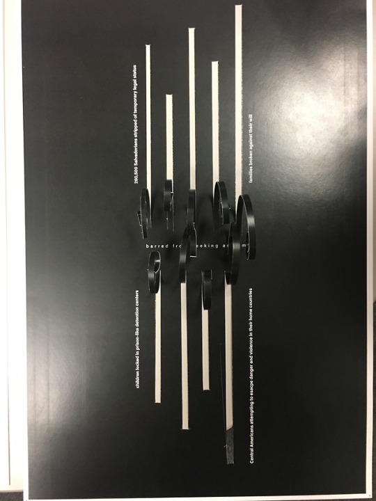
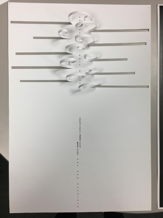
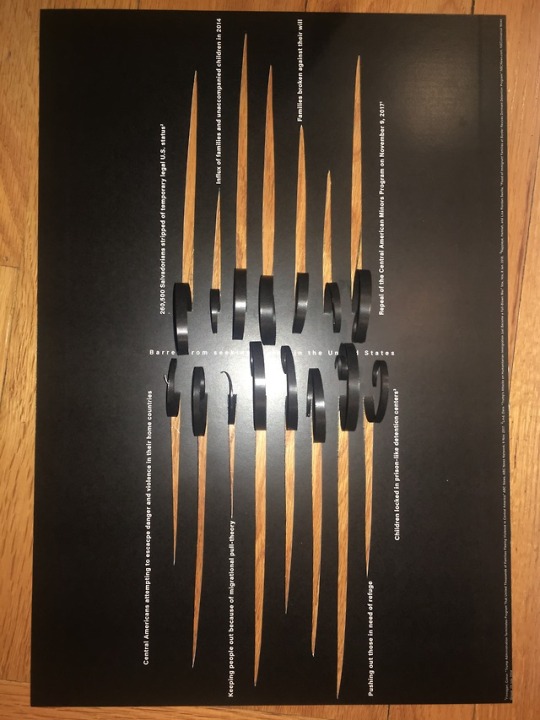
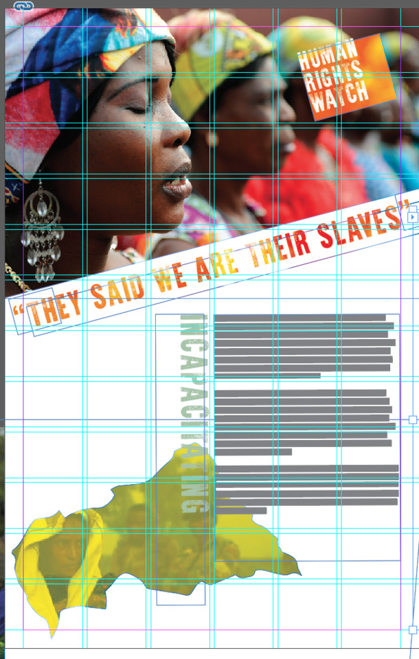
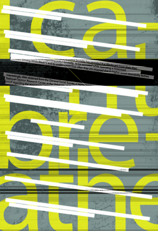
SKETCHES 2/4
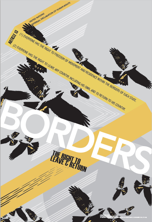
TYPE II | Preliminary sketches for Human Rights poster.
0 notes


Text
Final Reflection
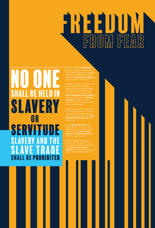
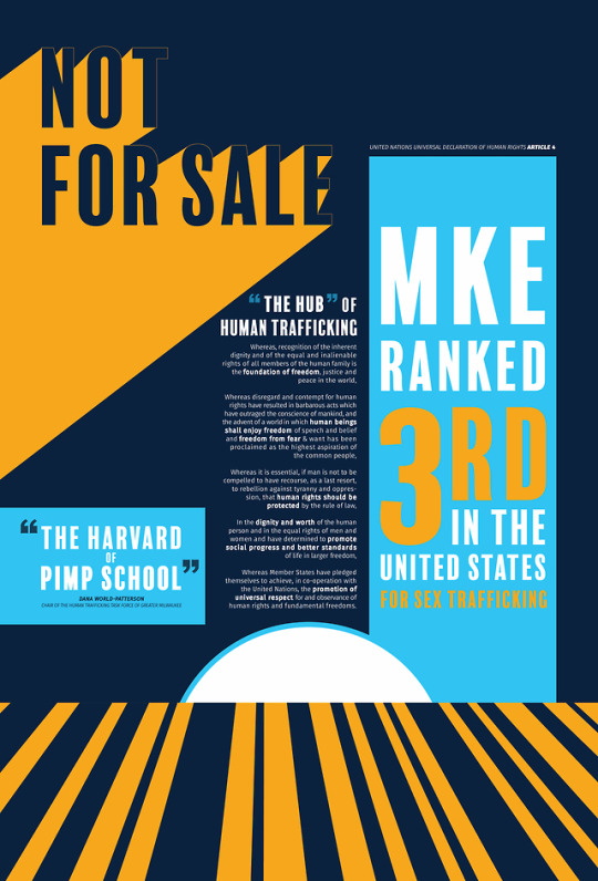
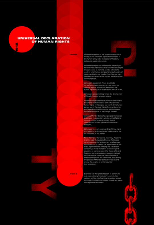
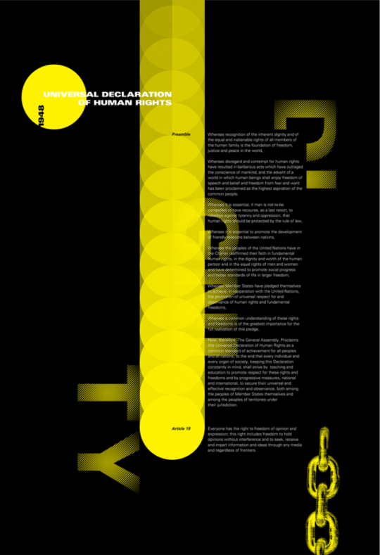
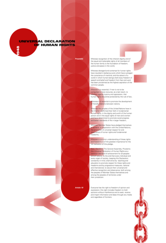
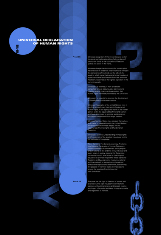
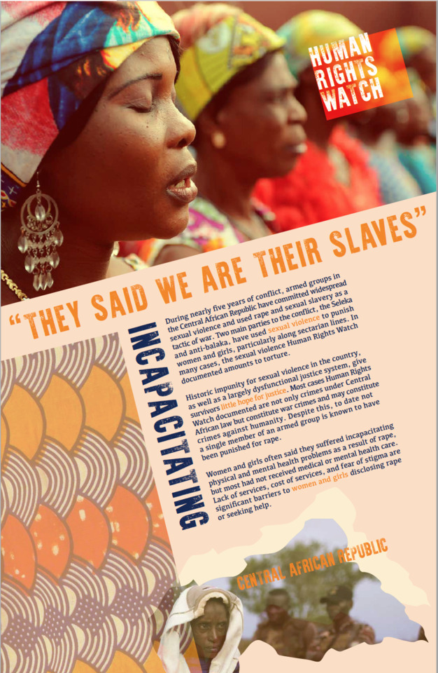
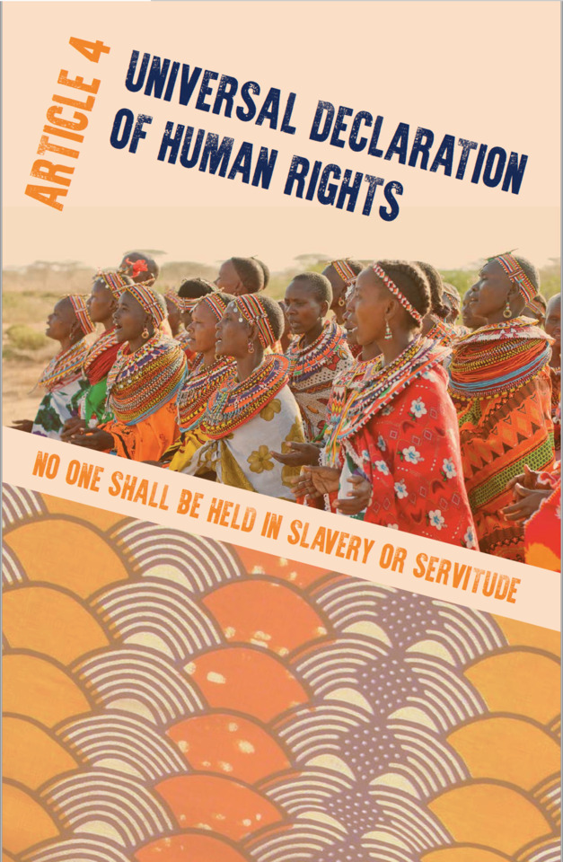
My goal for this project was to create a design that inspires hope for women in a situation where their government isn’t helping. They are being sexually violated in cruel, violent, inhumane way and are heavily impacted after. I also want to bring awareness to those who read it – my audience of young people, instructors, and all others who visit Kenilworth Studios. I am satisfied with how my posters turned out through choice of type, imagery, style and mood.
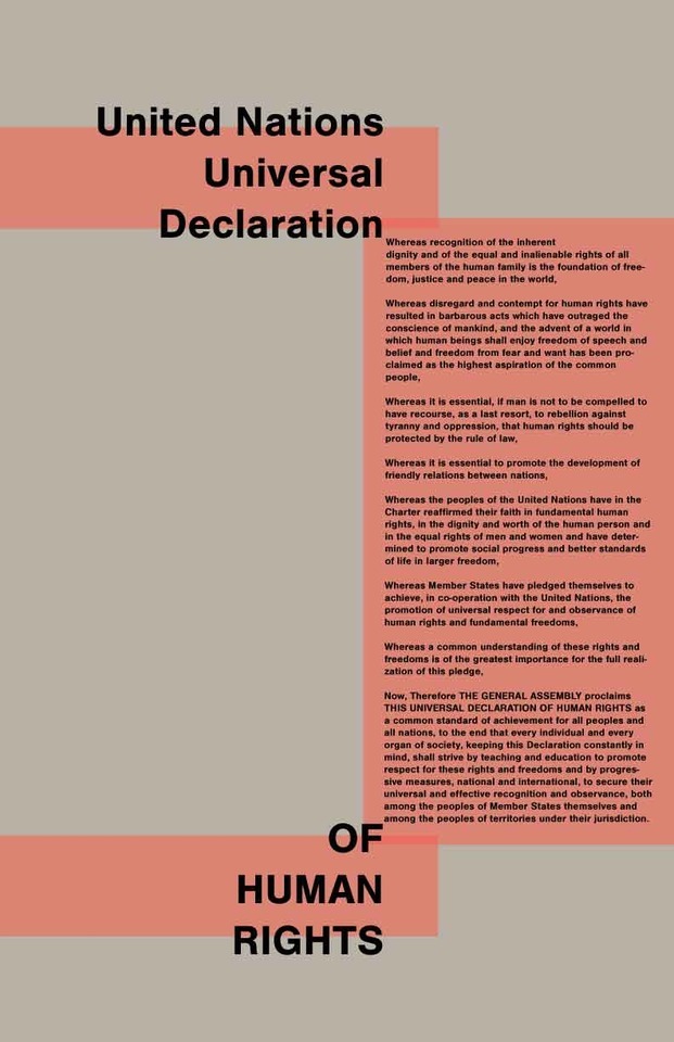
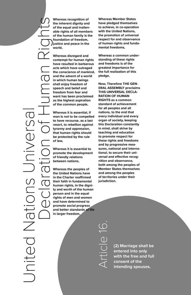
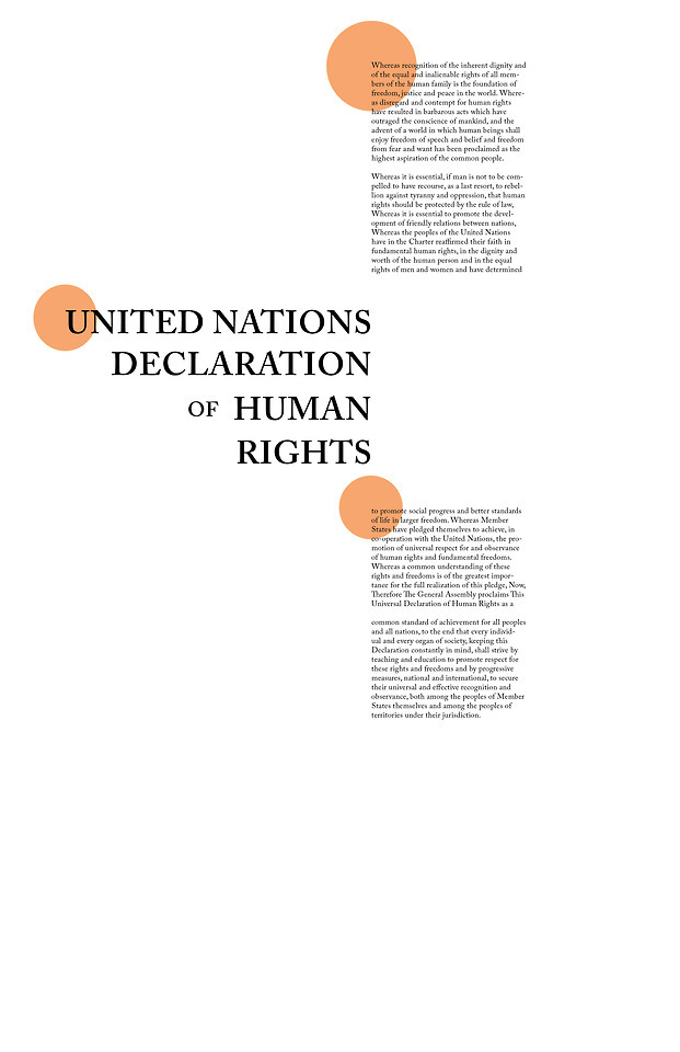
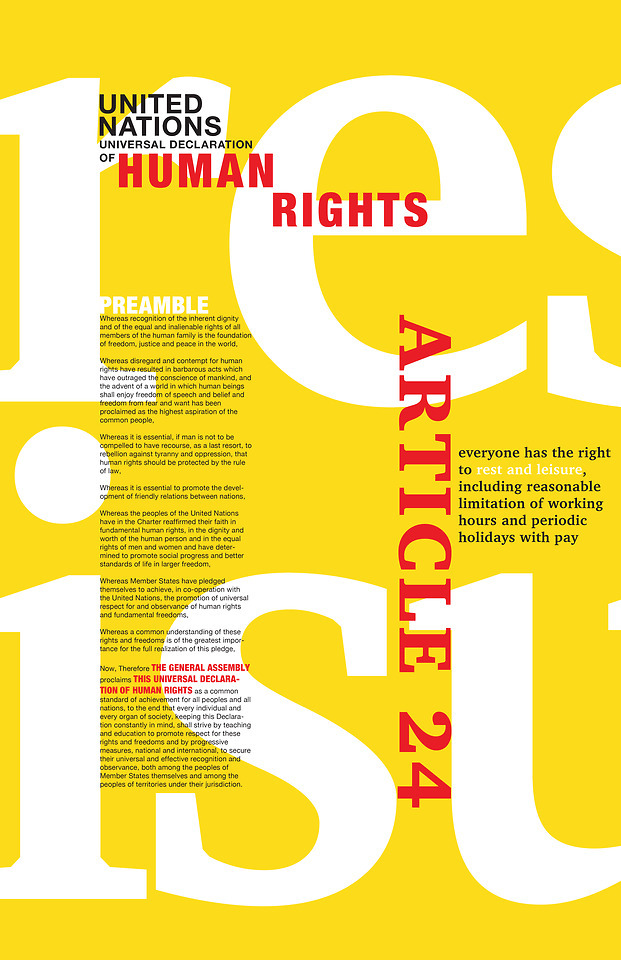
I am overall happy with the copy on my posters. The article from the Human Rights Watch had very sad yet very real information. I pulled my copy from the summary of the report without including the individual instances. I also paired down the preamble to emphasize meaning and allow it to be a smoother read.
For my Typefaces, I downloaded “War is Over” from DaFont. The typeface for the copy is called “Kefa.” I believe these two were appropriate for the textile and cultural feel that I was going for while also catching the eye.
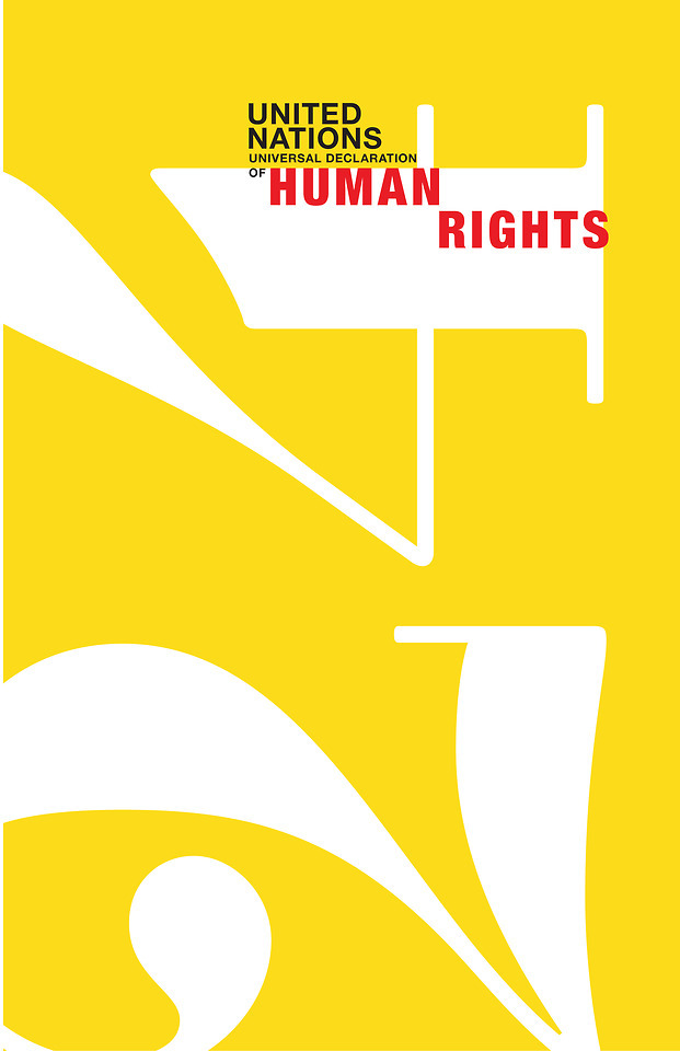
Looking back, there are some things I would change with what I know now. First, I would change the color scheme to be a little less primary. While feedback through the critique process assured me, it stands out, it might be more readable with better color overlay contrast on the yellow. This is something that I played with through the process. I wanted each headline to be different and incorporate all three colors. My final design is my best solution, I think it is still readable, just not intended to be the first read.
0 notes