#ColumnPerspective
Explore tagged Tumblr posts
Text
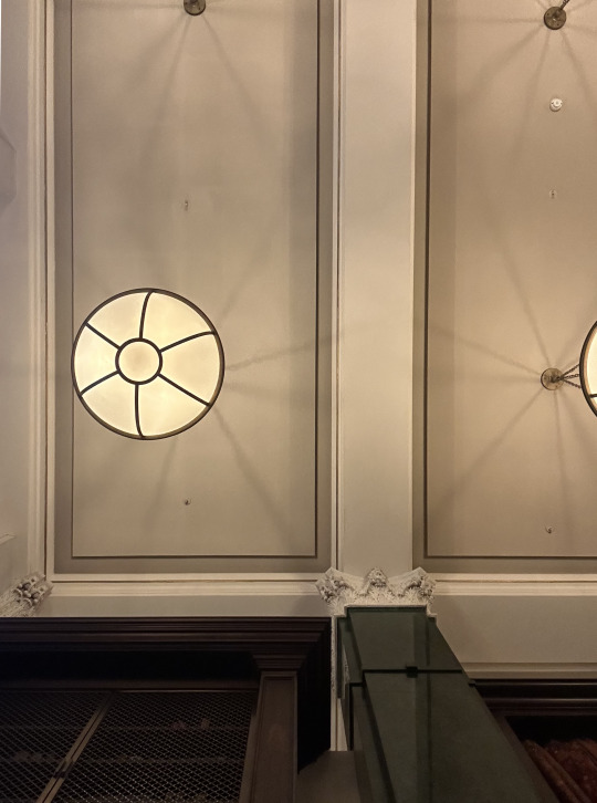
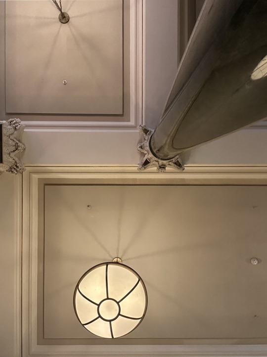
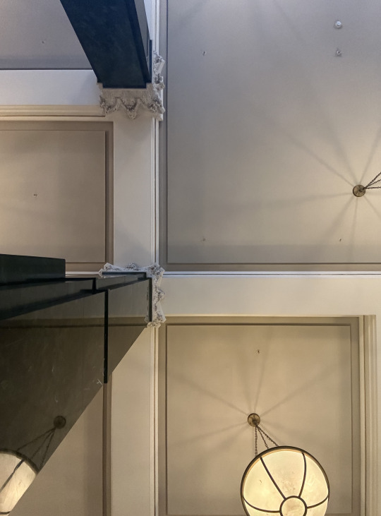
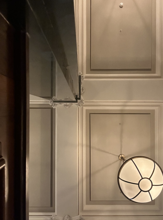
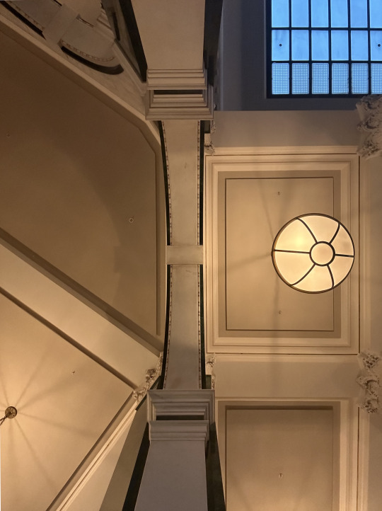
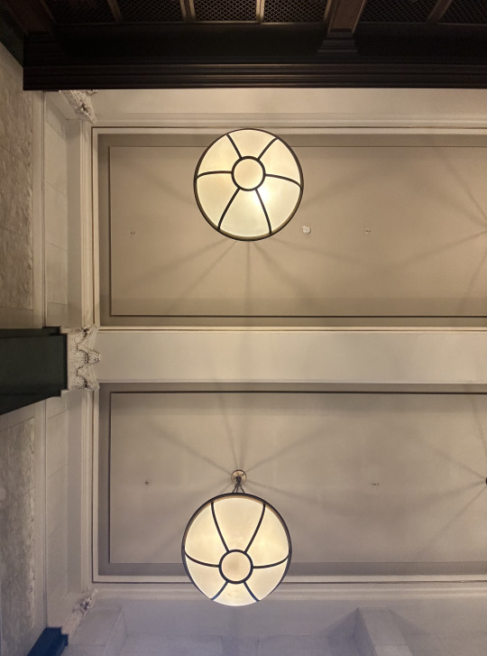
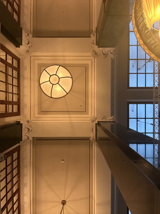
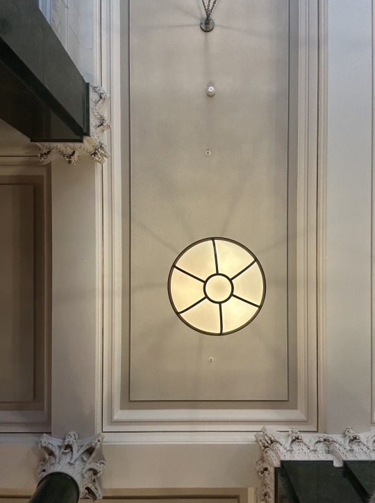
Heavens Above - Capturing The Ned's Ceiling and Columns
Entering the grandeur of The Ned, formerly the Midland Bank headquarters, is like stepping into a time capsule of opulence and prestige. Designed by the renowned architect Edwin Lutyens in the 1920s, this architectural marvel stands as a testament to an era of financial power and architectural ingenuity.
As I traversed the corridors of this historic building, I couldn't help but marvel at the fusion of historical grandeur and contemporary luxury. The soaring columns and intricately carved details spoke of a bygone era, while the modern amenities and stylish décor breathed new life into the space.
The conversion of this iconic structure into a five-star hotel and members club was a masterstroke of architectural vision and entrepreneurial spirit. Collaborating with Soho House and the Sydell Group, the new owners have transformed the former banking halls into a vibrant hub of hospitality and social activity.
But perhaps the most striking feature of The Ned is its commitment to preserving Lutyens' architectural legacy while infusing it with a contemporary twist. The green marble that once adorned the banking halls now reflects the modern world, offering new perspectives and vistas for visitors to appreciate.
In a world where banking has become increasingly digitized and impersonal, The Ned stands as a reminder of a time when banks were not just institutions but pillars of the community. It embodies the concept of a 'listening bank,' where customer service and human connection were paramount.
As I gazed up at the celestial ceiling, inspired by the ancient Egyptian goddess Nut, I couldn't help but feel a sense of awe and reverence for the architects who dared to dream and the visionaries who brought their dreams to life.
As I stepped into the majestic atrium of The Ned, my eyes were immediately drawn upwards to the breath-taking ceiling overhead. Stretching high above, the solid structural grid of decorated beams formed a mesmerizing pattern that seemed to dance with the play of light and shadow.
The camera angle, carefully chosen to capture the essence of the space, allowed the vertical structure of the towering columns to take on a new perspective. Each column, adorned with intricate detailing reminiscent of a bygone era, stood as a silent sentinel of history, bearing witness to the passage of time.
But it was the reflections that truly mesmerized me. As I adjusted my lens, the polished green marble surfaces of the columns and beams came to life, mirroring the bustling activity below with a sense of timeless elegance. The interplay of light and reflection created a symphony of visual delight, transforming the space into a work of art in its own right.
At this moment, I understood the genius of Lutyens' design. By marrying the solidity of the structural grid with the beauty of decorative embellishments, he had created a space that transcended mere functionality to become a feast for the senses.
As I framed my shot, I couldn't help but marvel at the audacity of the architects who had dared to dream on such a grand scale. The Ned was more than just a building; it was a testament to human creativity and ingenuity, a reminder that even in the most mundane of spaces, beauty could be found if only we took the time to look.
#TheNed#ArchitecturalMarvel#CeilingDesign#ColumnPerspective#HistoricElegance#StructuralBeauty#ReflectionsOfHistory#ArchitecturalPhotography#TimelessGrandeur#lutyenslegacy#architecture#berlin#area#london#acme#chicago#puzzle#edwin lutyens#massimoscolari#oma
1 note
·
View note