#Colour Specification
Explore tagged Tumblr posts
Text
Small Space Interior Solutions
“In the smallest of spaces, creativity thrives. A well-designed nook can hold a universe of functionality and dreams ”
- Anonymous
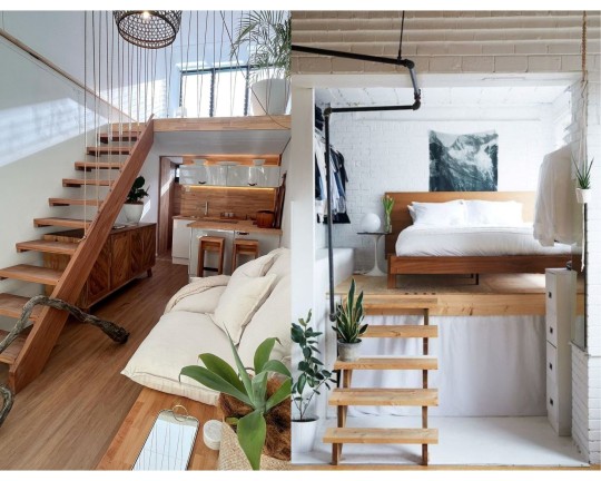
Small-space interior solutions are vital as urban living embraces compactness. Effective designs optimize functionality, enhance comfort, and evoke spaciousness within limited areas. They address the modern need for efficient use of resources, especially in densely populated areas. Such solutions foster creativity, adaptability, and innovative design thinking. They also cater to the rising demand for practical yet aesthetically pleasing environments, enabling individuals to live and work comfortably in constrained spaces. Outlined below are four major steps that effectively provide insight into approaching solutions for designing small interior spaces.
1. Space Optimization Strategies
Space optimization involves utilizing every inch efficiently. Multifunctional furniture like sofa beds and storage ottomans serve dual purposes, saving room. Clever storage solutions such as wall-mounted shelves, vertical cabinets, and under-bed drawers maximize unused areas. These ideas create more floor space and keep the room organized. Vertical storage not only stores items but also draws the eye upward, creating an illusion of height. Hidden compartments within furniture or walls offer discreet storage. By integrating these strategies, a small space can be transformed into a functional and visually pleasing environment, accommodating various needs while maintaining an uncluttered feel.
2. Design Elements for Visual Enhancement
Design elements for visual enhancement encompass light and color palettes, mirrors, minimalistic decor, and texture incorporation. Thoughtful use of lighting, both natural and artificial, influences the perception of space. A well-chosen color scheme, often light and cohesive, creates an airy feel. Mirrors and reflective surfaces amplify light, creating an illusion of more room. Minimalistic decor maintains a clean look, reducing visual clutter. Texture and subtle contrasts add depth and interest without overwhelming. By skillfully blending these elements, small spaces can feel more open, inviting, and visually engaging.
3. Furniture Selection and Arrangement
Furniture selection and arrangement play a pivotal role in optimizing small spaces. Properly scaled furniture ensures a balanced aesthetic without overcrowding. Modular and foldable pieces offer adaptability, transforming to suit varying needs. Flexibility in furniture layout permits functional zones, enhancing flow and purpose in confined areas. Strategic placement, particularly against walls or in corners, preserves floor space.
Careful consideration of traffic patterns ensures effortless movement. A cohesive design language ties furniture styles together, avoiding visual fragmentation. Incorporating focal points draws attention away from limited dimensions. Embracing vertical storage in furniture, such as tall bookshelves, capitalizes on height and minimizes footprint. Multifunctional pieces, like storage ottomans, contribute to the efficient use of space.
In sum, furniture selection must harmonize with the available area, offering both comfort and utility. Thoughtful arrangement maximizes flow and accessibility while expressing the room's intended purpose.
4. Practical Tips for Effective Design
Practical tips for effective interior design involve maximizing natural light, decluttering techniques, and creative use of mirrors. Harnessing daylight not only enhances the space but also creates an illusion of openness. Implementing efficient storage solutions and minimizing clutter maintain a clean and organized look. Mirrors strategically placed reflect light and create the perception of expanded space. Integrating indoor and outdoor areas through seamless transitions blurs boundaries and enlarges the visual expanse. These practical strategies optimize functionality and aesthetics in compact spaces, fostering comfort and livability.
Author: Trushna Agale (Interior Designer)
2 notes
·
View notes
Text



#Hello DIVAS 💜 have some GRAPHICS 💜#waiting for a specific person to see this cuz I think they'll like it =^◕⩊◕^=#blinkies#colourful blinkies#stamps#stamp#stamp gif#rentry decor#rentry dividers#rentry resources#rentry stuff#rentry pixels#rentry graphics#caard resources#caard#divider#dividers#2000s
1K notes
·
View notes
Text
people seriously pretending EEAAO is overrated suddenly bc it swept awards? it swept awards largely because it is very very very good. I cried like someone who's just had a religious revelation BOTH times I watched it bc it touched something raw and real and beautiful but it was also just very, very funny. everyone's performance kills and the concept is creative and interesting and doesn't distract from the emotional core. you guys are just contrarian.
#red said#also there are posts and tweets like THIS IS JUST FOR MCU FANS#like please go on demonstrating how you've adopted 'mcu fan' as a shorthand for 'person who likes films i don't'#or 'person who likes films that are popular'#because the defining features of mcu films are that they're high budget irony poisoned derivative works#targeted at a broad audience so aiming to be accessible and inoffensive#and it really seems. like 'accessible' is the part of that you object to#bc EEAAO is a highly original A24 indie film with a 14.5m budget which is NOTHING#it's made mostly with practical effects and sets#and most importantly it's beautifully painfully earnest. it's never trying to shy away or go Hey Look How Silly This Is 😏#everything is driven by its earnest desire to talk about specific themes#i think the people comparing it negatively to mcu films are stuck on the fact that it's about a multiverse and it's got jokes#and colourful action scenes#but they miss that the referential jokes (like racacoonie) and setpieces aren't the point of the film
23K notes
·
View notes
Text

“He will bring a rose for you,” her father had promised her, but a rose was no good, a rose would not keep her safe.
based from this post.
#brienne of tarth#asoiaf#valyrianscrolls#mine.#this is actually a warm up but I once again got carried away bc I liked the Concept….#relating brienne to roses is so batb specific germ rlly said I WILL have a batb insert in my book#but I kind of like doing that ^ blurring effect hehe like I think it looks nice??? kind of washes out my colours tho but oh well
2K notes
·
View notes
Text


me and the beloved mutuals together until the bitter end
#mine#original#HEHE !! i rlly popped off w the colours on this one#also this is specifically for my hockey mutuals.im kising u all on the mouth
2K notes
·
View notes
Text

Itadakimasu
(I swear satoru is also there.)
#geto suguru#jjk#jujutsu kaisen#satosugu#bear art#I am really really proud of this one#The colouring specifically!
492 notes
·
View notes
Text
thinking about the fact that the only place in the base game you could find the specific white flower with 5 petals in Shaman Village is Malenia boss arena… aka the Haligtree roots.
(that flower also looks like jasmine, which is what “Marika” means in Japanese - 茉莉花)


you can find the same 5-petal flower in Shadow Keep architecture too (Messmer splattering the flower bearing his Mother’s name and her golden ring symbol everywhere in his castle 😭 I bet it’s him who told Malenia about Marika being named after a flower)

Also the lily in the boss arena is Calla lily, not the one Miquella or Trina like, so I always assume it’s Malenia’s favourite, and if she’s growing them along with jasmine…
Such a small environmental design detail, but it’s so in line with my theory that the Marika’s Soreseal found in the Haligtree was meant to help seal away Malenia’s rot (like the eye Messmer got), it just didn’t work.
yet Malenia kept it always, and grew the flowers her mother was named after in her new home. something to remember her by…
Extra edit: Trina was growing jasmine along with her purple lilies as well.

There's something tragic about Miquella, on his path to abandon everything that made him Marika's child, left the flower bearing his Mother's name - the flower he probably planted together with his sister at the Haligtree roots - with his discarded love.
#elden ring#queen marika the eternal#malenia blade of miquella#messmer the impaler#my mama’s girl Malenia agenda WILL WIN!!!#er brainrot#someone on twt told me [only you could find out sth like this] crying 😭😭#they were spamming the same 6-petal flowers everywhere in Lands Between just change the colour#so yes I don’t think it’s mere coincidence that you can only find this specific white flower with 5 petals in two places#miquella the unalloyed#st trina
673 notes
·
View notes
Text
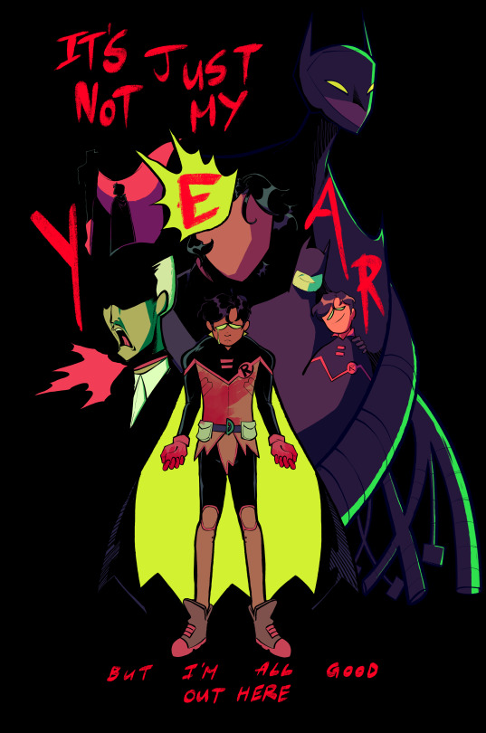
♫ I do what I want/Crying in the bleachers and I said it was fun/I don't need anything from anyone ♫
(ID in Alt) you guys ever think about your own posts and get upset?? Anyway Damian Wayne I love you I'm so sorry your life is like that
#dc comics#dc#damian wayne#dc robin#batman and robin#alfred pennyworth#dick grayson#bruce wayne#lyrics are ofc from American Teenager by ethel cain#the lyrics are a bit too specific to specifically be a damian song and the verses talk about like. christian church and substance abuse#but thag chorus???? ohhhh baby#its also stephcore btw. to me at least#ANYWAY this took. forever and i did while feeling sick/off in the run up to my period so frankly it's a miracle it got finished at all#but yknow for now im fairly happy w this one. played around w the colours and challenged myself to really put my all into the linework#there's some details here n there that r wrong (failsafes design is. all kinds of wonky) but like. who give a shit#anyway my brain and hands are on vacation for the next few days <3#btw the blood on damians hands is a reference to the upcoming B&R cover (for 11 or 12 i think?) where damians-#-beating the living daylights out of bane. B&R has mostly been chill n slow so far but these issues...ohhh i am SEATED#uhh anyway yeah <3#OH WAIT#mine#< haha. art tag i always forget
1K notes
·
View notes
Text
"300 tracks"
you know those hand signals tyler does during the line "300 tracks in my Adidas track jacket"?

i, like probably everyone else, assumed that was him signing 3-0-0 with his hands.
but no. he's signing F-0-0.
consider the ASL signs for F vs 3:
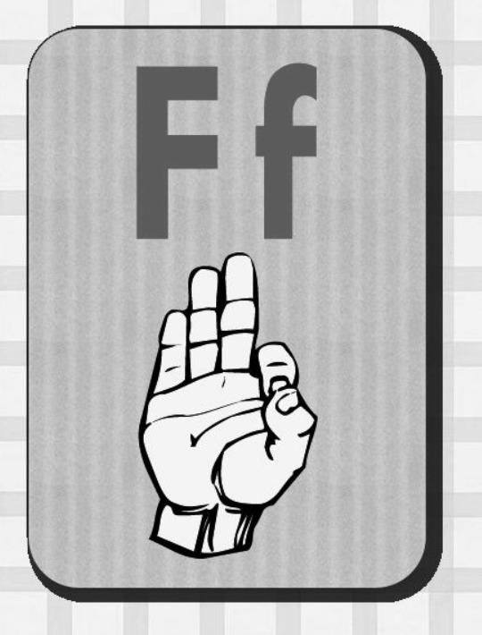
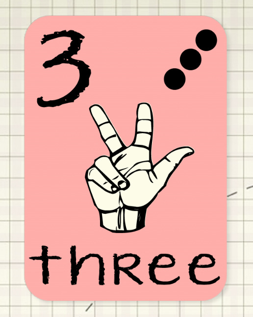
yeah, he's definitely signing F there
so what does F-0-0 mean? well, funny thing about that--you know hexcodes? those 6 digit codes that indicate a specific colour? well, there are also three digit codes as well, where you basically double each number to get the full 6 digit code. wanna guess what #F00 is?

yup, that's pure red babey!!
and, better yet, wanna know what its complementary colour is?
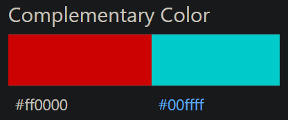
why it's pure cyan of course!!! y'know, like the whole __cla_im00FFFF.jpg = CLAIM CYAN = I AM CLANCY thing.
tyler, you sneaky sneaky bastard.
#twenty one pilots#overcompensate#clancy#i am clancy#claim cyan#fucking. colours man.#its all about the colours#specifically red and cyan#i am SO excited that they're actually. blatantly referencing the dichotomy in this era#colour theory my beloved#tumblr clique#cliqueblr#the clique#clique theories#theories#man idk how to tag this
2K notes
·
View notes
Text

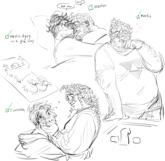
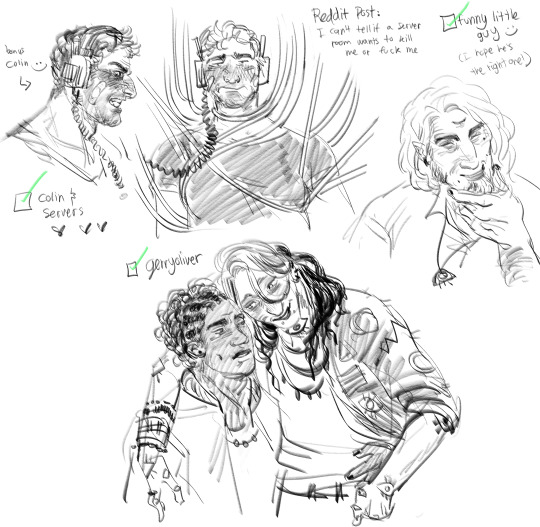
art requests from the bird app
#art cabinet#ohhh lord i cant tag everyone here but maybe just the main guys#colouring is a bit sloppy in the first pic hehehe but i only wanted to communicate one specific effect#tma#the magnus archives#the magnus protocol#timartin#martim#martin blackwood#tim stoker#timothy stoker#gerryoliver#timsasha
438 notes
·
View notes
Text
old 3l desertduo design concept
#for those of you who said you liked my 3rd life designs ^_^ heres an early version of them#my art#desert duo#3rd life#grian#gtws#trafficblr#most of the changes have to do with the colours of things but there r a few other noticeable ones#this specific version is from the beginning of 2023 when i was starting to redesign the designs from june 2022
3K notes
·
View notes
Text
there are fixations where you're like oh my brain has latched onto something per my usual adhd patterns and then there are fixations where you touch a piece of media for the first time and immediately you're like ah... so this is what it is like, to meet your soulmate. and your soulmate. is a shounen manga from 2004
#i watch the first episode of death note and suddenly see the world in colour like in one of those fanfictions#now that ive collected a few of these i really am seeing such a pattern of my Media Type#it boggles the mind still that this series is something that feels like it was made in a lab specifically for me and i somehow didnt pick it#up until my twenties. i mean i maintain thats a good thing but still it's odd#like this feels like it should have been formative media for me but thank god it wasn't#rookposting#it is nice to be so into something that i feel like i can create for again#and thank you all for tolerating me slamming through your walls shouting about a twenty year old series
432 notes
·
View notes
Text
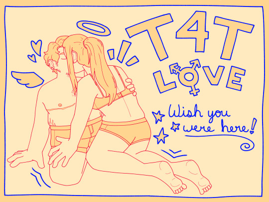
Get transgender or get out!!
#my art#transgender#trans#transmasc#transfem#t4t#trans man#trans woman#pride#i had so much fun with this !!! primary colours... beloved#ive been doing a lot of trans art recently ive just been inspired yknow#also this drawing is modelled after my gf and i#i didnt use refs or anything tho i didnt want it specifically to be a drawing of us
6K notes
·
View notes
Text


The Quest Continues...
(part 1- part 2)
#Fourfold Soul#<- That's the title of the project I've been working on!#I am very excited to finally show off the cowboy (gender redacted) I've been cooking in a slow boil!!! Yeehaw!#Yes this is the game project. YES I am commited to the bit of having the main character go through a long running pronoun-quest.#This character does not have a name so I cannot formally tag them...#(Okay. Technically they have an internal name for coding/scripting reasons...and I have a nickname for them.#But the important part of making a video game character you get to eventually name is that the name must come from *you*!)#The girl here is a npc so she has a temporary name. So I also cannot tag her. Hmm...#I have several FFS comics thumbnailed out. This one got made first because it's the funniest without context. Lore wise it's weak.#I would love to post the sexy clown but you have to wait just a few more comics.#Fun artist woes moment to share: This is the first time I've had to colour these characters traditionally. *That* was NOT fun.#Going from a specific digital colour palette to being at the whims of my limited colour choices in markers? Hell! On! Earth!#I might also be extra frustrated because this sure is 3x the length of what I usually do for comics! I spent a Whole Day on this.#Past me thought it was soooo funny and needed all the extra panels for pacing. I hate past me. That guy needs to be exploded.
565 notes
·
View notes
Text


i finishedddd my 2bdamned design yayyyyyyyy
#madness combat#_myart#2bdamned#i think every detail has a specific intent/meaning which i'm really proud of. even down to the colour palette#except for the tape on the tablet being D9 that was just from DISSENTER. idk what that means (like is it referring to FellowD9? idk)#contrasting this with the old first concept is bizarre. i hesitate to praise myself but i think i've come i decent way since starting this
195 notes
·
View notes
Text

Lamb ref
#coolcatbeans#possly art#cult of the lamb#cotl#cotl Lamb#Pushing Daisies au#Pushing Daisies#idk what tag to use specifically for the au lol#idk if I’m 100% satisfied with this ref but it’s good enough lol#gets the points across has all the colours and the outfits#so I’m content
567 notes
·
View notes