#Cinzel Campaign
Explore tagged Tumblr posts
Text


Two portraits of player characters for my Cinzel homebrew campaign in June.
The Yuan-ti /half-elf woman is Jahni and the leopard half-elf/tabaxi is Noya.
2 notes
·
View notes
Photo


Chapter 7
This week’s chapter talked about how fewer physical prints of magazines and newspapers are being produced these days and how moving digital is creating many new roles for designers everywhere. A designer that stood out to me in particular this chapter was Len P. Small. I found it interesting how Small is also working to make print copies, but also creating and designing many digital works as well such as interactive content, videos, in-house marketing campaigns, and designs and content for mobile and tablet platforms. Upon reading this, one of the beautiful and positive aspects about us moving toward a more digital society is that we are able to expand our creative outlets and share it online for many to observe. Even though I myself still do prefer print on some occasions, I feel going digital allows more people to express their creative ideas and to reach a larger target audience.
This week we finished sketching and putting together our new typefaces for our Remaking Language project. In the beginning, I liked the sketches I was creating but I felt like they could have looked better. When given the advice during class that I should experiment subtracting some elements from each of my typeface sketches, I realized this is what I needed! After experimenting some I ended up having a final result I was pleased with and immediately constructed them in Illustrator. For my Sans Serif typeface, I decided to use the font Roboto and combined the two letter forms “V” and “T.” For now I’m still pondering on a name for my typeface but for now I’m thinking of calling it “volt.” As for my Serif typeface, I chose the font Cinzel and combined the letter forms “O” and “S.” I ended up not including one of the sides from the “O,” to give it a cool warped look. I wish to name this specific typeface “Odyssey,” and if possible, for the second part of this project try to incorporate the color palette from the notorious film “Space Odyssey.” Overall, I really enjoyed working on the first part of this project and am excited to work furthermore with InDesign for part two!
1 note
·
View note
Text
Evaluation
Evaluation
In this module, I was asked to research and design an Editorial as well a campaign.
For my editorial brief, I had been very active and went out to look at different magazines as well as taking pictures for my magazine which would also fit the theme. For the Social Cause brief, I was told that we were able to collaborate in pairs with another student if we wish. I chose to pair with Krystian and we both had selected to move forward with the Mental Health brief.
EDITORIAL
During my first week on the editorial, I was slightly naïve as this was something completely new to me. I began to research and look through different magazines and analysing the anatomy. The creative tasks set to us assisted me with this as I had gained knowledge on Typography as well as other aspects which make a magazine. I decided to research through multiple magazines all of different types which would help me narrow down my particular style I would be going for. I then came down to my chosen style of vintage/gothic themed.
In the course of my second week, I had begun to generate ideas together with my classmates. During the ideation, I had a feint idea on my masthead design, aiming for something Serif and perhaps quite thick, however, what really aided me during this process was a small workshop where we were briefed to create 21 different mastheads designs in different styles. I felt like this really helped me in picking and choosing as well learning about new typeface styles I may want to approach.
After figuring out my masthead, I decided to go out to the city centre in search of some quality pictures for my magazine. Since my design was vintage and old fashioned, I had to be very cautious but managed to pick up some great pictures. I also had thought about editing these pictures for an even further vintage theme.
Throughout my final weeks on this brief, I had began forming my editorial. I started off with my front cover using a picture I had taken to cover the whole page along with Serf font which looked rather serious and gothic. I used the typeface ‘Cinzel’ for the headlines and titles on my editorial.
Moving onto my double page spreads and back cover, I followed the same style I had for the front cover. I had added noise onto my pictures and heavily edited them for a more vintage look. I also edited the background of my magazine to a cream/tea colour to also give off newspaper style.
I am somewhat satisfied with our final outcome but think there are some things yet to be improved. I think I could have developed further on:
- Enhancing the editorial with further type manipulation
- Working on my allignment.
Social Cause Brief During my first week, I had already chosen my desired brief and began researching on how to elevate this and create something big for my campaign. I was then notified that for this brief, we were able to collaborate with another student if we wished to. Krystian, who was also doing the mental health brief, decided to collaborate with me for this particular brief. We began researching and mindmapping together to gather ideas. Reason as to why I chose this particular brief is because I struggled with mental health previously and thought I could create a good campaign strategy to others around my age who are currently struggling or have previously struggled. We were able to call each other various times on Teams in order to stay track on the brief and were able to finish out research by Week 1. During our second week, we had began analysing out mindmaps in order to pick up some ideas which we can bring into effect. We looked at different mental health issues, causes and how we could prevent them. We decided our target audience be teenagers and young adults, this way we would create something relatable. I had an idea in mind for my part which was a 30 Day Self Care Challenge. What really helped me to elevate this was a class discussion around my brief where I mentioned fictional character. As a class, we were able to come up with the fictional character ‘Percy’. I had done some research into this previously, and had mentioned to the class my character be in the shape of a puzzle, which would fit the slogan ‘findyourpiece’. From here, it was up to me to create my 30 Day Self Care Challenge in a style I wanted, while following my strict colour palettes and design. I had developed this following my palettes and had thought of tasks to include on the self care challenge. My partner and I had shared everything we had been doing, together on Teams calls in order to help one another. I had developed this and shared it during a tutorial which I was then given feedback on how I could improve this. Again, I shared with my partner what I was going for and we both agreed to share our outcomes. I had previously used far too colour in my self care challenge which didn’t exactly follow the palette too well but was quick to change this. I also had added a new idea changes the boxes to puzzle pieces in the self care calendar.
I personally believe I could have really worked through the calendar differently, perhaps in a completely new style which could even be physical? Overall, I do feel accomplished with what we have created and worked through. I believe our ideation process was our strong suit as we were able to move smoothly and confidently into our next few weeks from there.
0 notes
Text

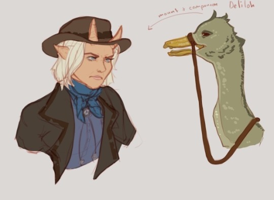
Hikari and Deliloh
These are two more NPC characters from my Cinzel homebrew campaign.
She’s a bounty hunter ranger with a feathered reptilian mount named Deliloh. She’s a lawful good bounty hunter who refuses to use underhanded methods to get her quarry. She’s stubborn and hits like a truck, but damn she cute right?
#dnd art#dnd campaign#Cinzel npc#npc art#Cinzel Campaign#ttrpg Art#tieflng#tiefling ranger#cowgirl art#Wild West vibes#western Cinzel
2 notes
·
View notes
Text

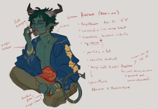
Harun Sketch
Harun is a non-player character (NPC) for a home brew setting of mine. This is an older sketch.
They/He are actually an Enchantment/Divination wizard not Illusion/Divination, but they are still actively a whore.
Do not trace, do not repost without credit.
#dnd tiefling#dnd5e#dnd ocs#dnd campaign#tiefling#tiefling character#dnd npc#Harun#Cinzel Campaign#dnd character#dnd art#ttrpg art#pathfinder art#dnd artists#ttrpg artist
3 notes
·
View notes
Text

Cockadoodledad
This is a PC character design that I made for one of my players for my homebrew campaign Cinzel.
I still have a lot of prep to do so I’m grateful the game won’t start until June.
1 note
·
View note