#Chinesegal's art
Explore tagged Tumblr posts
Text
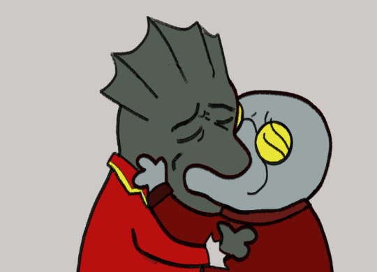
Andrei and Strauss, sitting in a tree...
@iravaid
@medeaft
I thought you guys would appreciate this?
#kissing meme#vtm#vtmb#vampire: the masquerade#vampire the masquerade#vampire: the masquerade bloodlines#vampires#vtm andrei#vtm strauss#maximillian strauss#romance#old man yaoi#my art#chinesegal#chinesegal's art
45 notes
·
View notes
Note
What are "analysis-averting antimemes"? Can you explain how the living engines in your world came to be? Can any inqnimate object come to life?


I will answer this soon.
180 notes
·
View notes
Note
Hi! I feel like I share your opinions on hotel Transylvania and I would love to know your problems with the films, especially the "zing" concept.
Hey, I'd assume you found me via my recent tweets, because that's first time in ages I shat on Hotel Transylvania!
I am indeed a proud, card-carrying hater of the first movie (and whole franchise by extension, but never watched the sequels, only the reviews) and would talk about it whenever provoked.
I agree with you, @chinesegal, that the movies were underwhelming, cliché and too juvenile. Which would be fine for a movie intended for kids, provided the overall message was wholesome, or at least entirely harmless. Keyword: "would".
I checked and this seems to be the first instance of me talking about HT, 10,5 years ago, and I still stand by those words:
I watched Hotel Transylvania last month and the single thing I hated about it was "LOVE AT THE FIRST SIGHT THE ONLY ONE THAT COUNTS! GO FOR IT OR YOUR LIFE WILL BE RUINED FOREVER! ZING!" moral that popped up at the end. This movie literally just gives love at the first sight name "zing" and shoves how irreplaceable it is up the viewer's throat during the third act.
This is straight up toxic. How THE FUCK did they get away with legitimizing literal love at first sight in the year 2012? And how come so very few people talk at all how messed up this is?
I am still confused why audiences and reviewers were positive towards this. Writing is so bad: annoying characters (especially Mavis's garbage love interest), lackluster worldbuilding (monsters as fantasy racism metaphor is fine, but why waste vampires if they do nothing vampiric?), unfunny jokes.
And while the visuals are... okay, I suppose, neither design nor animation were anything to run home about. A friend with animation degree was always so confused why animation in HT is treated like it was extremely revolutionary. I would not know, but wasn't particularly impressed either. Madagascar and Cloudy With a Chance of Meatballs beat it to a punch in regards of using 2D design language in 3D animation. Also, early HT concept art was much more interesting than the bland final result (RIP DILF Dracula).
All in all, you want to see a shitty Adam Sandler movie that at least leans into the horror/monster humor, just watch Little Nicky. If you want to see nice animation from Genndy Tartakovsky, then watch pretty much anything he did other than Hotel Transylvania. There will be also much better writing. Samurai Jack, Sym-Bionic Titan and Primal are especially worth anybody's time.
30 notes
·
View notes
Note
I'm planning on drawing a genderbend of Beckett, and if its OK I want to ask for your opinion on HCs for body type and how she would dress. I think a female version of Beckett would look like a "handsome woman", with angular features and hairy like all gangrel, and she would probably not care much about fashion either, preferring to dress utilitarian.
I'm so flattered you asked my opinion, but ohhhh dear, I'm rather horrible at colors, clothes, and faces. Ummmmm....make her a fat, hairy butch woman. One must be able to Pat The Tum. Do any visual artists want to save me chime in?
I lost the screenshots, but when I designed a Beckett in Sims, I gave him a cozy sweater for everyday wear and a more British Professor-y type look for special occasions. Butch fashion lookbooks are fun to flip through! This article links to several companies and has p cool pictures itself.
More importantly, have fun and be yourself @chinesegal! Make the art you want to see.
#ask#chinesegal#text post#vtm#cuthbert beckett#I'm sorry I'm not more helpful!#rest assured that my inability to recognize ppl#annoys AND entertains my friends
2 notes
·
View notes
Note
Not against the use of tentacles as walking limbs or anything against pentapods but it would be good to take a look at these links(below) so you can take your own conclusions about tentacles as limbs @chinesegal .
They (as any other post from this blog) are quite a nice read and i recommend you to check these and hopefully you can get your own conclusions;).
I love your pentapods! Theyre really cute. I have cephalopod-like aliens myself that walk on their tentacles on land, and I'm wondering if the tentacles need a rigid internal structure to be able to support their weight on land, like spines or something.
Ah thank you! Terrestrial tentacles are ALWAYS choice! And while I don't know about NEEDING a super rigid internal support I gave mine something kinda like that!

Not like anything as hard as bone but a little bit of cartilage to mostly house the big nerves and blood vessels and support the actual weight a bit more. I think that's the biggest issue with tentacles. They can sploot out under the body a lot easier than a rigid skeleton. It all comes down to what feels right, less gravity will be a lot easier on a squishy limb!
#specbio#speculative evolution#speculative biology#main advice is to follow your heart#art of the not mine variety
83 notes
·
View notes
Note
Hi! I love your lampies fanart. I really appreciate that someone out there cares about the show too. Can you tell me about your lampies headcanons?
ah, i appreciate that someone is interested in my weird posts! thank you.
that said, asking about headcanons is easy to suggest but quite difficult to actually do. half of my "headcanons" are canon by way of a non-fandom (among other reasons) and even then, there's just so many of them it becomes impossible to explain to a newcomer without it sounding like the ramblings of a madman. if you have anything more specific you want to know, i can give answering a shot, but just asking after headcanons is a little bit too broad.
1 note
·
View note
Text
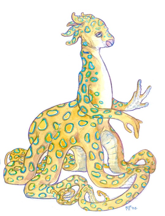
Commissioned art for @chinesegal of her original alien species!
#commissions#I want to start taking more art commissions soon#so let me know if you guys are interested :)#aliens
305 notes
·
View notes
Photo

Gift art for some Mutualz characters belong to @lagtops @chinesegator @vinegardude
9 notes
·
View notes
Photo
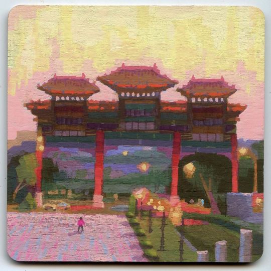
Pleinair April #22. Gate of The Grand Hotel in Taiwan, I believe. Took the photo 20some years ago after visiting this touristy spot with my in-laws. @warriorpainters @cottonwoodartsbook @blickartmaterials @winsorandnewton #pleinairpainting #pleinairpril #pleinairpril2020 #taiwan #taipei #gate #chinesegateway⛩ #chinesegate #sunset #redgate #gouache #gouachepainting #art #artoninstagram #artist #artistoninstagram #nopleinnogain #coaster #coasterpainting #園山 #園山大飯店 #夕陽 #台灣 #台北 #杯墊 #不透明水彩 https://www.instagram.com/p/B_TKDNLjXf8/?igshid=nagowo89pi2q
#22#pleinairpainting#pleinairpril#pleinairpril2020#taiwan#taipei#gate#chinesegateway⛩#chinesegate#sunset#redgate#gouache#gouachepainting#art#artoninstagram#artist#artistoninstagram#nopleinnogain#coaster#coasterpainting#園山#園山大飯店#夕陽#台灣#台北#杯墊#不透明水彩
0 notes
Text

@chinesegal
And now I'm finally getting back to this, haha.
My TL;DR: Elfquest as a series handles humans poorly in the context of race and culture. In humans, darker skin and complexions are codified as signs of aggression, malice and foolishness. Lighter complexions are associated with the helpful humans of Abode, the ones who are more peaceful, more tolerant, less religious, and more “civilized” than their peers.
This is less obvious towards the middle of the series, where we're primarily dealing with Junsland, but it pops back up again almost as soon as we swing to the Forevergreen, and it's still an issue come the Jinks series.
This type of colourism also extends to the elves themselves to an extent: the Sun Villagers are deemed "brown-skinned rabbits! yap yap yap! always talking!" by Strongbow, just one of similar sentiments shared by other characters, and the High Ones and the Gliders are both explicitly depicted as more civilized, more intelligent, simply capable of more in many ways than the rest of their peers. The Gliders are also noted, repeatedly, as being very pale - I didn't think to actually collect how many times it occurred, but both Aroree and Winnowill's pale skin and ethereal elegance is highlighted in the same manner as Timmain's.
I was a bit hesitant while initially making notes on this on how much I think this is a deliberate choice vs prejudices born of the fact they're in their fucking 70's? But then I remembered the concept art for a friendly group of trolls in one of the latter books.

Given the "too ethnic" trolls resemble their canon antagonistic counterparts, I'm pretty comfortable treating the things I'll note below as intentional on their parts.
Cutting the rest of this post, because it's got a decent chunk of pictures.

From the very get-go of Elfquest, dark skin and "savage behaviour" is explicitly linked. The ethereal, pale, gentle and naive elves are put in stark contrast to a human that does not even look particularly like a human. (As a bit of aside nerdery: ten thousand years ago, homo sapiens largely looked the same as they do now. The visual language here is more akin to early suppositions on what neanderthals might look like, a sister species of ours that died ~40k years ago.)

This theme starts right at the beginning of the series, but it'll continue all the way throughout it. When characters, even those from the same tribes, are seen as wise, they're depicted as light-skinned.


Even when it doesn't particularly make sense. Nonda from the Original Quest is of the Hoan-G’Tay-Sho. Her skintone is shown to be a match to Cutter's, if not also Skywise's. However, when compared to her husband fellow villagers, she's very pointedly pale.

This is in sharp contrast to how the Hoan-G'tay-Sho are depicted otherwise. In the Original Quest, it's noted that they are the same complexion as Suntop, who is notably darker in most scenes than the majority of the Wolfriders.

When we see the descendants of the Hoan-G'tay-Sho later on in the series, off in the Forevergreen, their skintone is hard to quantify. The art throughout this arc is not very consistent, and characters switch appearances regularly. However, the costumes are largely consistent, and I feel comfortable saying that the influences they're drawing from are not European - the Forevergreen arc runs at the same time as Shards, which is set in the 1300's, but..


There isn't much difference between that and the tribal societies we'd seen previously, because the Pini's write their non-white humans largely only in one way. Regardless of the geographic distance between societies, almost all groups of non-white humans in the series share the same traits of being aggressive, superstitious, easily misled, and xenophobic.


And they're also, almost unerringly, largely sexist.
The Hoan-G'tay-Sho in the Forevergreen's exact treatment of women is up for grabs, but Door inherits the previous leader's "woman" - and aside from Pei-Lar, her and the slaves are the human women that we primarily see.
In Mender's Game, the comic shows the Asian-adjacent society as actively torturing their women for dishonouring them. CW on this link for severe abuse.
In Shuna's storyline, her first husband and Bee's tribe is shown to be heavily sexist. Her behaviours outside of her designated role are not initially punished, but ultimately are in the end, with the implication that this is normal for her first husbands' culture. Throughout the story, Shuna notes things such as that "the chief invited me to sit beside him. Later, I would learn it was unheard-of to honor a woman so." and then later, "though patriarchal and restrictive to its women, the hill-hopper clan was not so inclined to look down on a female forest deity. I enjoyed many privileges denied my humbler sisters."
And, of course, Nonna is tossed out from her husband's tribe for not fitting the appropriate gender roles. Sexism is prevalent in many places throughout Elfquest, in the white-coded societies as well as the rest, but it's noteworthy in that it's linked so explicitly to the non-white societies.. to the degree that even the Sun Villagers note that there are expected behaviours of maidens, ones that the wolfriders do not necessarily conform to.
The wolfriders help them change, though, over time - and to bring us back to the human aspect of this criticism, this is a trend unfortunately evident throughout the entire series. Little Patch is tossed aside by his kin, but returns as a blonde hair, blue-eyed adult to eventually lead them. Shuna leaves the white society of Junsland and joins into Bee's tribal network, educating and enlightening those that she speaks to. When the Gliders - and eventually, the Wolfriders - interact with humans, they're inevitably seen as an ideal.


Even Shuna's son with Bee, described as
This is just part of a larger, unfortunate aspect of how the Pini's treat a lot of their human societies as well. For those in tribes, which is to say the majority of the societies depicted, they simply aren't treated with much respect by the narrative or even by those within it.


There's a lot that could be said here, but the tl;dr is: it's just shitty.
As an aside, while writing this, I was initially hesitant about including Demontricker as an example of this unfortunate trope of light-hiared, light-eyed, frequently blonde outsiders teaching their darker kin important moral lessons and/or leading them in societal change. The art in the Demontricker comics does not suffer the flipflopping of other issues - the characters all look to be of the same ethnicity, and as if they did come from the same place.
However, then I remembered the concept art from Finalquest, iirc. Wendy Pini notes hooked noses as one of the features she views as too ethnic for the protagonist trolls. And as you can see in most instances throughout this post..

.. one of this duo looks significantly more ethnic than the other. Spoiler alert: the blonde is Demontricker, the protagonist of this piece. And later on, the antagonist he faces may look a little similar to a number of other tribally associated characters in the series.

And my final tl;dr bit here at the bottom is, the racism aspect of all of this, that the treatment of humans in Elfquest is mostly only tolerable to me when it is focused on the Junsland, tbh!
I'm not a particular fan of the Shards arc - my interest in the story has always sat very firmly on the less human-focused sections! - but the humans in the arc felt very straight forward in the treatment. It's relatively standard fantasy tropes, from top to bottom, and while they're not to my taste, it is what I would expect of a relatively low-fantasy series in the 90's. Someone who's invested in or even has just read more of that particular subgenre would be able to give critique on that aspect! For me personally, I didn't enjoy it, but I am already predisposed towards not, lol.
17 notes
·
View notes
Text

A redrawing based on helpful suggestions from @mauesartetc
#school for little vampires#fanart#cartoons#illustrations#comic strip#comics#artists on tumblr#my art#Chinesegal's art#sflv#die schule der kleinen vampire#vtm#vampire the masquerade#vampire: the masquerade#vtm jack#vtm nines rodriguez#nines rodriguez
34 notes
·
View notes
Photo
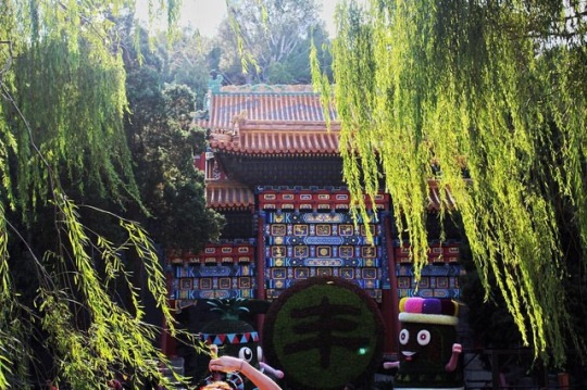
Try to visit Beihai Park on your China trip. It's next to Jingshan Park and the Forbidden City. Everytime I went there I saw people dancing and drawing chinese characters onto the floor on Qiongdao Island. It's incredible how many huge parks you can find in and around Beijing! These weeping willows and the traditional colourful gate mark the entrance of the part of the park on Qiongdao Island. 🌿 ------------------------------------------- Join us! 🌐 facebook.com\siriustravelpics ------------------------------------------- 📷 All photos taken by us. Repost: Please ask and credit. 📷 #china #beijing #beihaipark #beihai #qiongdao #北京 #琼岛 #北海公园 #中国 #背包旅行 #worldlovers #travelasia #followbeijing #worldcapture #instabeijing #weepingwillow #colourful #chinesetradition #tradition #art #gate #chinesegate #paifang (hier: 北海公园)
#paifang#beijing#china#gate#instabeijing#北海公园#beihaipark#中国#tradition#colourful#worldlovers#北京#weepingwillow#worldcapture#qiongdao#chinesetradition#chinesegate#琼岛#背包旅行#followbeijing#beihai#travelasia#art
0 notes
Text

Andrei, Strauss and Smiling Jack in the style of School for little vampires.
#artists on tumblr#chinesegal's art#chinesegaldraws#vampires#vampire the masquerade#vtm#vtm art#vtm bloodlines#vtm smiling jack#smiling jack#school for little vampires#character design#character lineup#vtm andrei#tzimisce#maximilian strauss#maximillian strauss#vtm strauss#sflv#cartoons#horror#fanart#tremere#brujah
96 notes
·
View notes
Text
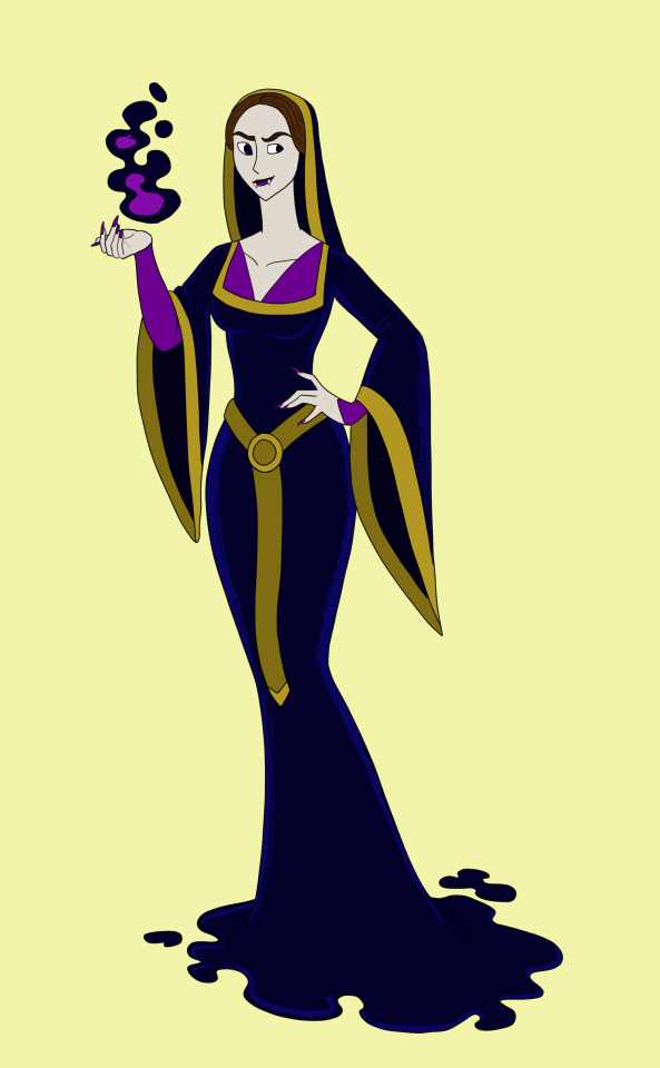
Vaguely based off Lucita of Aragon from VtM. In my head she was a noble-woman from Castile or Aragon who was turned shortly after the reconquista.
#vampires#vampire women#fantasy#artists on tumblr#my art#Chinesegal's art#original characters#16th century#spain
12 notes
·
View notes
Text
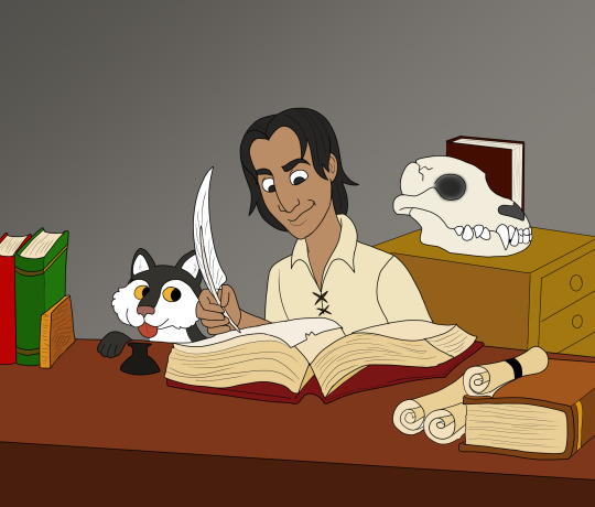
Portrait of a scholar as a young man
The happiest day of Beckett's adolescent life was when his father finally let him into his study. There he was free to read any of the countless books and scrolls collected over so many years, as long as he promised to be careful. He devoured book after book, spending hours completely immersed into the fascinating worlds of classical literature, chivalric romances and illuminated manuscripts.
When most boys were courting girls and practicing to take up their parent's trades, young Beckett was copying greek bibles into english or immersing himself in Orlando Furioso. But he wanted more; not merely read about adventures, but experience them as well. One day he would be well-known across the world as a dauntless adventurer scouring the world for knowledge, but that day has yet to come.
Baby Beckett's expression makes it seem like he's just discovered a cache of 17th century playboy :). Since Beckett is describing as having a smirk "befitting of a swashbuckler" I tried to do the description justice.
Beckett is meant to be around 12 or 13 here. Just for fun I gave him a puppy, what if he still misses his beloved pet as a vampire?
The wolf skull is meant to be foreshadowing his future as a Gangrel.
@badass-at-fandoming do you like it?
#vtm#vampire: the masquerade#vtm beckett#beckett#cuthbert beckett#fanart#artists on tumblr#Chinesegal's art#my art
19 notes
·
View notes
Text
My uncle Beckett
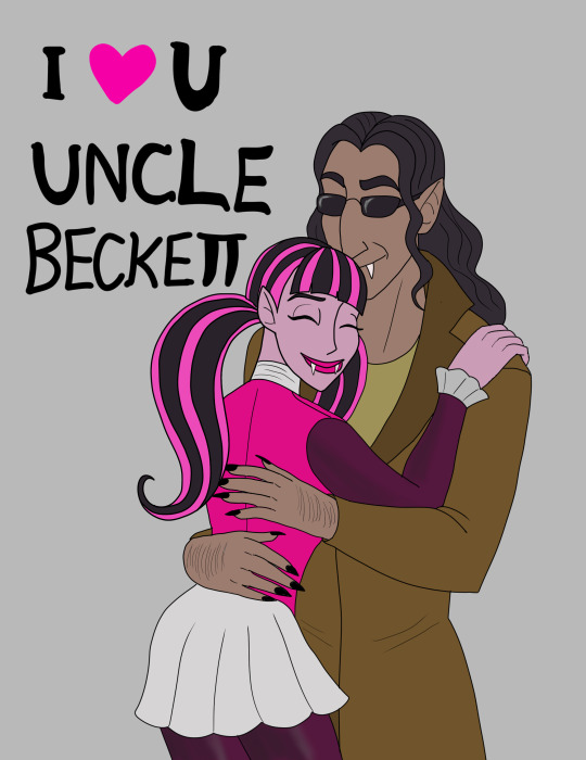
Just a silly idea i had after reading a particular entry in "Beckett's Jyhad diary". Even though its probably OOC I still think it would be cute as heck.
#monster high#monster high draculaura#draculaura#monster high g1#mh g1#vampire the masquerade#vampire: the masquerade#cuthbert beckett#vtm#vtm:bloodlines#vampire the masquerade bloodlines#vtmb#vtm beckett#vtmb beckett#vampires#cartoons#cute#artists on tumblr#chinesegal's art#my art
67 notes
·
View notes