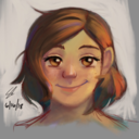
#Cel shading isnt my thing
Explore tagged Tumblr posts


Text


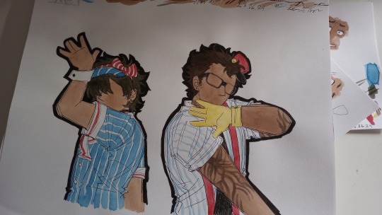
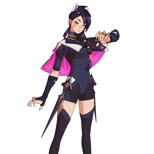
the drawrings from the mesmerizer cover i just finished <3
but more importantly, i must now explain to you the hashtag situation i created for myself because of my foolish yet absolute refusal to colour it digitally:
SO doing animation on paper is fine. its normal, hell for me its easier than digital, i just use this shitty lil 15 dollar light panel and go to town you know? historically animation was done on paper and/or clear celluloid/acetate plastic sheets (thats why they're called cels after all) for decades and its still being done that way today.
but usually. nowadays. when animation is done on paper it is still coloured and shaded digitally. we are in the age of digipaint. and thats good. before digipaint we used stuff like poster paints or other flat, consistantly coloured paint and applied that on the under side of the clear acetate cels with the ink lines drawn or xerox'd over top.
but acetate sheets for animation are expensive and hard to source where i live. so. instead of something sensible like drawing all my lines and then digitally painting the final pieces. what i did was um. i still painted it with watercolour. so this was the situation:
faceless...........
i drew the main piece, and then on the same type of paper i used my lightbox to draw on new faces (to save paper i put them all over the paper, using things like quickly traced hair, etc to help line it all up later. for the paint i had to carefully try to match the skin tones around the facial features so when i digitally re-attached them they would match up........ hell of my own creation
i was chatting with my father about it, he doesnt know much about animation at all (his preferred art is b&w sketches and linework) so he didn't understand why i was complaining about the hell of my own creation so much as first. he was like "isnt watercolour what most animation was made with?" and i was like NOOO no no absolutely not <3 backgrounds, the final layer under all the sheets of clear acetate, sometimes may be done in something other than poster paint, gouache, acrylics, whatever paint they used to colour the cels: maybe something like oil or watercolour for stylistic purposes
but no one in their right mind would make even a simple barely moving PV with just watercolours <3 <3 <3 <3 <3
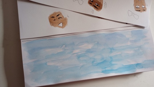
the bg was easy tho LOL took longer to dry than to paint :)
#art#traditional art#watercolour#fanart#vocal synth#synthesizer v#synthv#genbu#utau#utauloid#gao#it probably wouldve been easier to do this method of like#creating all the pieces separating and constructing them later if i had planned things out better#but im gonna be honest i didnt know what the bg was gonna be until like a day ago when i painted it LOL#the rest had been done for weeks.... and i was like well. strip of vague sky colours. its gonna scroll across. done <3#also yeah lol i had trouble figuring out how to do the hypnotized eyes since scribbling in eyes black is my default state#so i did like. the opposite. scary lightless pupil visible eyes instead :)
7 notes
·
View notes
Text
hey so why the fuck is princess lexa from the oathbound reality now???
(long post of me just kind of rambling)
so. lexa. right? (and also orin i guess this is about him too but i dont care about him at all sorry) she was the first fully original cel shaded skin (not counting cel shaded optional styles) it was their first real attempt at it so they looked kind of clunky and strange. which is like. understandable yeah sure. she (and orin also) come from some reality in which they are implied to be robots or cyborgs or whatever, specifically referring to someone as their “father.” its also implied lexa escaped wherever she came from and orin was sent to retrieve/rescue her. they were clearly trying to go for some kind of “anime girl thats secretly a sadistic killer robot” thing. and so their home universe is just kind of implied to be a cel shaded anime universe (similarly to other, non-original anime skins)
right. ok. so. WHY IS PRINCESS LEXA????????? NOT CEL SHADED ANYMORE?????? HUH???????????????????

this shit has fr been bothering me since she was revealed. how did that happen. what. AND THEN HER DIALOGUE WITH OTHER CHARACTERS WAS SHOWN AND SHE IS APPARENTLY FROM THE OATHBOUND MEDIEVAL REALITY NOW????????? HUH????????????????? like. i just cant stop thinking about it. and then i started thinking about it more in depth. and now im just wondering. can spending time in a reality that is not your original one (in fortnite canon at least) literally alter your fundamental appearance like that??? like. ok hear me out.
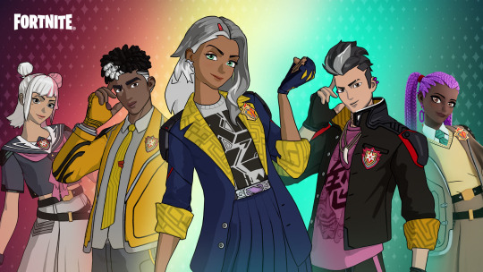
the anime legends pack. is something that released during c3s4. and it involves three random, relatively recognizable fortnite characters... becoming cel shaded


(for simplicity i’m only showing midas)
so this is something that already HAD been shown to be possible? an already existing character’s snapshot becoming cel shaded when they were not originally that way. except this also isnt the first time a previously cel shaded anime skin has gotten the ability to become un-cel shaded. the "Wish, Set, Match” quest pack from this same season also had erisa (cel shaded skin from c4s2 who is a cat princess) in a tennis outfit and also with the option to just. NOT be cel shaded. (cant find a good render that is non cel shaded but trust me it exists)

except this also ALSO isnt the first time they did this for a cel shaded anime-implied skin. because thats what they did with the academy champions set
WHICH, HEY, COMPLETELY UNRELATED TANGENT BUT: THE FUCKING ACADEMY?????????? AS IN. THE ACADEMY THAT LENOX ROSE (C3S4) IS LITERALLY STATED TO HAVE “ESCAPED” FROM????????? MULTIPLE TIMES OVER??????? NOT ONLY IN HER VERY OWN BIO BUT ALSO BY MULTIPLE NPC DIALOGUES FROM THE SEASON????? she is literally a character from some kind of television show that was putting her in danger, only referred to as “the academy.” and how she’s “The first to escape The Academy... But not the last.” (direct quote from her description) and then these mfs just come on out as the “academy champions”?????????????? what does that mean????????????? what does it mean to be the champion of this implied danganronpa ass anime show????? how did they escape???? what the fuck?? god i wish they had done literally anything with this
anyways. i dont know what my conclusion is. uh. so yeah i guess snapshots can just kind of Become cel shaded or Not cel shaded anymore. this has a lot of implications and i REALLY WISH THEY’D DO ANYTHING WITH SNAPSHOT LORE BEYOND JONESY!! im not even going to get into how much i’ve been obsessing over cuddle team leader/syd and her countless snapshots and the implications of ragsy or cuddle team master more than possibly being from mega city ANYWAYS I’M GETTING OFF TRACK! i need more people to talk about this kind of stuff with </3
#fortnite#rambling#this is my first time doing anything like this i am just.#having so many thoughts#im aware im definitely reading way more into things than epic games intended but uh#idc im coping i wanna pretend like they actually care about these characters#if they wont flesh out their original characters and lore then i guess its up to my headcanons to do the heavy fucking lifting#live laugh love#if anyone has anything to add feel free btw
23 notes
·
View notes
Photo

ice kween ∩(︶▽︶)∩
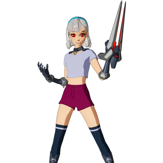
#wow something that isnt just cel shaded !!11#yeah so obviously shading is very tedious for me but i think that when i sit down and actually take time on something#i can produce some things i am actually slightly proud of#when i start taking commissions#this is what you can expect for my fully-shaded pieces!!#mei#Overwatch#mei overwatch#digital art#art#my art#fanart#not my design!#i believe this design belongs to Shourca#them thiddies
24 notes
·
View notes
Note
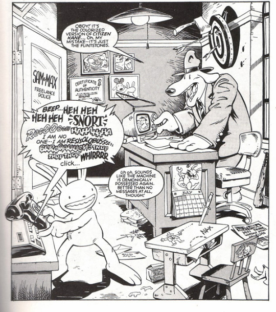
possibly a weird question but like i find the juxtaposition between cartoony lines and realistic-ish detailed shading in AGS really interesting, and i wanted to know like how did you settle on that style and what inspired it? (i think youve said in the past that you were inspired by sam & max which rules but im sure that isnt the only influence)
ok i’ve been sitting on this question for 16 days bc it was sent right before i had to leave on a very long trip and it deserved a more detailed answer than i could afford it at the time. thank you for waiting! i am going to write a lot more words than i should bc i dont really get to talk about how the sausage is made. i dont talk about this kind of stuff a lot because all of my knowledge and fumbling attempts to make a comic comes from a place of complete and utter ignorance of the genre, medium and the tools i use. i hope by writing things about the process, people who want to make webcomics feel more at ease knowing that no one knows what the hell they are doing.
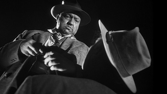
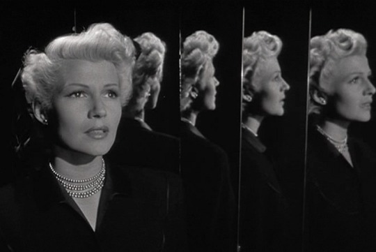
first things first: here’s a secret about the creation process of AGS. the soft shading of the comic is entirely because every time i do cel shading it looks like total shit. i have absolutely no aptitude for it even now. when i first started AGS i had no skill at soft shading either, but i could do slightly more interesting moody things with it pulling from media i had grown up with. i grew up watching a lot of old movies on turner classic movies, so a lot of the aesthetics demonstrated by directors that worked in a grey scale medium really stuck with me. i loved the noirs (welles was really good at this kind of work, especially in “the lady from shang-hai” and “touch of evil”) that used heavy shadows to obfuscate and set the tone of a scene or imply the motivations of a character. these movies and old twilight zone episodes (which i think still stand as really spectacular triumphs in use of grey scale contrast to invoke an unnerving atmosphere) represent the kind of imagery i want to pull from in my comic, when its busy not being a screwball comedy of errors.
the line work inspiration is another thing where it was just kind of what my body was able to produce. it’s not something i tried to consciously cultivate, its just kind of how things wound up. the comics i grew up reading probably influenced me the most. i think a lot of kids who make comics now grew up reading their parent’s comic collections and for me that was “bloom county���, “calvin and hobbes”, “the far side” and, later in my adolescence when i started reading comics on my own, “sam and max”.

i went through the anime influence pre-teen years and that has definitely stuck around in some ways. i also grew up in that time where cartoon network had the rights to air looney tunes cartoons and my favorites were the chuck jones and tex avery shorts. i never really set out to be like “i want a cartoony style” and if i had my way i would be drawing in a semi-realistic painterly style, but this is what i’ve adapted into so im trying to do it the best i can. purcell draws backgrounds the way i wish i could.
i hope this answers some of your question, even if the overall answer is “idk my hands just do that”
31 notes
·
View notes
Note
Isnt cel shading for 3D models or is there like,,, another kind of cel shading?
Cel shading can be used for 3d models and digital art! It's the same concept to make things more 3d using hard shadows. Although in my technique we do soften them it still is cel shading!! So yeah kinda? Cel shading is a technique used in digital art not only 3d rendering.
7 notes
·
View notes