#CSS Layout
Explore tagged Tumblr posts
Text

Responsive Animated Web Layout
#animated web layout#animated website design#responsive web design#html css#divinector#css#frontenddevelopment#webdesign#html#css3#frontend#create a website#make a website#css layout#css animation examples#css animation tutorial#css tricks
3 notes
·
View notes
Text

Flexbox Navigation Menu
#navigation menu#css menu#html css menu#css flexbox layout#html css#learn to code#code#frontend#css#html#css3#css layout#frontenddevelopment#css tricks#navigation bar
6 notes
·
View notes
Text
Propiedades de las Cajas o Bloques en HTML y su Importancia
En HTML, todos los elementos, desde un simple párrafo hasta una imagen compleja, se representan como cajas. Estas cajas tienen propiedades que nos permiten controlar su tamaño, posición, espaciado y otros aspectos visuales. Comprender estas propiedades es fundamental para crear diseños web personalizados y atractivos. ¿Qué es el Modelo de Caja en CSS? El modelo de caja es una representación…
#CSS#css box model#CSS layout#CSS properties#desarrollo web#diseño responsive#Diseño web#Diseño web personalizado#Flexbox#Grid#Guía CSS#HTML#layout#Modelo de caja CSS#Posicionamiento CSS#propiedades CSS#Tutorial CSS#z-index
1 note
·
View note
Text
Mastering Flexbox and Grid for Complex Layouts

View On WordPress
#Advanced CSS Techniques#ahsan mahmood#aoneahsan#CSS grid#CSS Layout#Flexbox#Front-end development#Responsive Design#Responsive Layouts#User Experience (UX)#Web design#Web Layouts#zaions
0 notes
Text


lucky star themed blinkies, pngs, and stuff for your websites! heres something cool for heyspace too: konata dancing for sites link click
#lucky star#konata izumi#pixels#graphics#neocities#gifs#pngs#graphic designs#digital design#anime#kawaii#my space#4chan#website decor#websites#coding#heyspace#layouts#programming#code#html#html css
25 notes
·
View notes
Text

New website template.
#neocities#website template#html#css#templates#layouts#design#cute#sailor moon#foryou#website resources
30 notes
·
View notes
Text

WEBSITE LAYOUT for NEOCITIES
DRAGGABLE 'windows' that MAXIMIZE and MINIMIZE

Maximize enlarges windows to fit the page, and minimizing makes the window reduce down to the 'taskbar' as a button that can be reopened. Start button currently is holding links, but adding more window buttons there is possible.
This layout code is VERY simple and customization is very encouraged.
MOBILE FRIENDLY!

#pixel art#2000s web#pixel gif#scenecore#goth girl#webcore#myspace#emo kid#scene kid#neocities#oldweb#yesteryear#yesterweb#html css#layout#website layout#template#webpage template
95 notes
·
View notes
Text

I CANT USE CSS ON ARTFIGHT...............
#I WAS REALLY HOPING TO FIX THE FUCKING. PARAGRAPH WIDTH. SIGH#idk why but it stretches across the ENTIRE page like. it takes up the full width of the browser and it BOTHERS ME. ON ALL THE PAGES#i could try manually putting shift breaks but im worried it might not look so good on mobile. ugghh... auyggghhh.....#im already learning CSS and API so i thought i could put it to good use but. AUGH#this whole time ive had to go into the inspect panel myself and change the padding so i dont have to read the length of the screen#like a fucking typewriter... i would have also loved to use custom fonts and animations......#i did find a guide for BBCode which the site uses on default and it covers basic styling but its not the same. sniffle#you CAN unlock CSS if you donate $25 to the page which seems fair. and if i could do it i would but. i do not have any way of#sending or receiving money online </3 i really need to figure out how to do that so i can set up comms like i said i would last summer#but it intimidates me.... and im already kept on a short leash when it comes to that so it feels like a lot of things could go wrong#i think toyhouse allows CSS or some sort of code...?? i remember seeing some oc pages with custom layouts#if thats the case i'll try fiddling with it but im not very familiar with using toyhouse so thatll take a while#(thanks again for the code sal ^_^ ill put it on my pin once its ready but im trying to learn my way around the site heh ;;)#at least i can use my pixel dividers.. ive been digging around for pixels to use and found some really cute ones#yapping
49 notes
·
View notes
Text


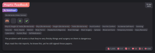
The Hesperus (beta) main work index is now fully themed and re-written! An example above and a display of it for an actual fic of mine on desktop and mobile below.
All tags have been edited into a 'pill form' to make it easier to tell apart relationships, characters, and additional tags. No more long blocks separated only with commas!
The new icons are all custom made. Archive warnings have been minimised and turned into icons alongside the tags. Text for the lower stats has also been iconified! (All editable if you so wish.)
#ao3 skins#archive of our own#ao3#ao3 css#ao3 theme#ao3 theme dark#AO3 Theme Hesperus#Massive chunks of the skin are technically completed#I'm just rewriting parts to follow a higher standard of organisation#Working from the ground up with it lets me clean up especially janky code I wrote months ago when I wasn't as on top of AO3's layout
260 notes
·
View notes
Text

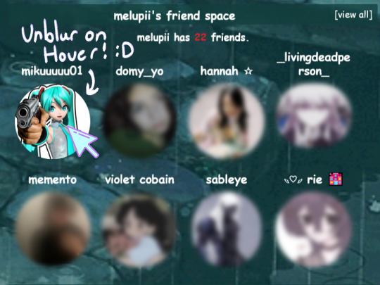
SPACEHEY UNBLUR ON HOVER EFFECT
Made a code and wanted to share the link for it here because I'm not sure it will reach anyone otherwise,,
Saw some other people with a similar effect but couldn't find the code for it so I just ended up figuring out how to do it myself ^^
Please let me know if you use it or at least leave a kudos on my blog on spacehey,, thank you !!! <3333
https://blog.spacehey.com/entry?id=1274182
PLEASE ALSO REBLOG THIS POST,, I'D APPRECIATE IT VERY MUCH !! :333
#spacehey#myspace#please reblog#please repost#page decor#page design#coding#css#html#html css#profile layout#profile decor#decor#web graphics
8 notes
·
View notes
Text
CSS Web Layout
#css web layout#css layout#homepage design#html css#css#frontenddevelopment#webdesign#html#css3#divinector#homepage#css effects
0 notes
Text

Website using HTML and CSS
#website design#html css#frontend#css#html#css3#frontenddevelopment#webdesign#website html css#css tricks#css website#web layout html css#neduzone
7 notes
·
View notes
Text

im making a concrete decision.
im gonna keep my website very barebones for now. trying to make it look cool actually genuinely stresses me out and makes it not enjoyable and makes me self conscious so im just gonna keep it mostly to the content
#literally when i try to think of a layout or anything at all i get stresseddddddddddddddddddd#im never getting shit done#the problem is?#i think i understand css fairly well and can make pretty much any layout AND make it responsive#THE ISSUE is trying to make shit look 'cool' or whatever
11 notes
·
View notes
Text
I wonder if I'm cursed to only be able to code if it's web archive related
#looks at my hands. ive created a monster#i think its funny that exactly every april i go on a mad psychhonauts web archive coding spree and update everything#then immediatly dissapear the rest of the year lol.oh well#ive been scraping code left and right for my personal site because i keep like. changing the css its so annoying#so i havent gotten anywhere with it i can choose colors or a theme or a layout im just 🧍♂️#dustbunnies.txt
6 notes
·
View notes
Text
ohhhh i hate making responsive web pages grrrr wdym i need to find a way to completely transform this navigation bar for 480px wide screens augh
#soda offers you a can#i can't get away with making a sidebar navigation menu with screens this narrow#so like. i need to terraform the whole thing entirely with css and i don't even know where to start with that shit#i don't even know if my html layout will let me do that rn hee hoo
11 notes
·
View notes
Text

22 notes
·
View notes