#COVER8
Explore tagged Tumblr posts
Visit Tumblr Blog
Explore Tumblr blogs with no restrictions, modern design and the best experience.
Last Seen Tumblr Blogs


Fun Fact
The Tumblr office adopted Tommy, an 11-year-old Pomeranian.
Text
youtube
(Outside of F1)
Hi! I try to sing this song for the first time
I know the story about this song. But I'd rather skip that part. XD
Since composer of this song found lyric sheet, I try to sing this all day. The full version is coming soon, If Everyone like this. Thanks!
#ulterior motives#lost media#lostwave#angels of passion#ekt#everyone knows that#cover8#80s music#80s#music#youtube#christopher saint booth#Youtube
2 notes
·
View notes
Text
Fairy Friends as Zodiac Sun Signs
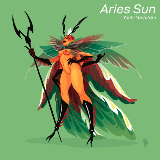
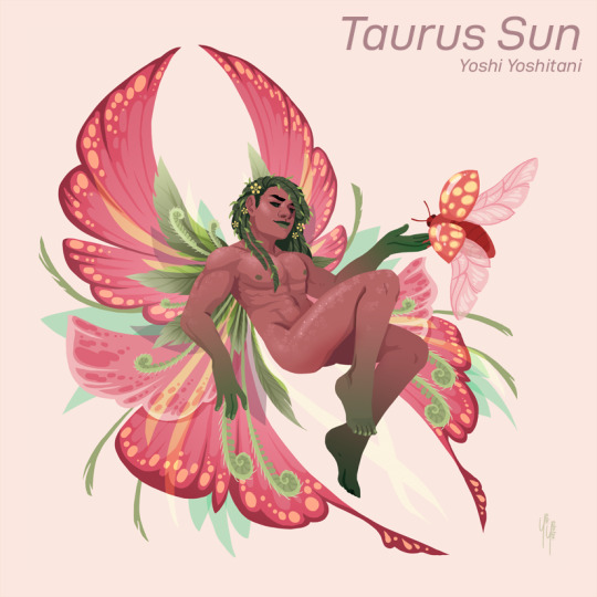
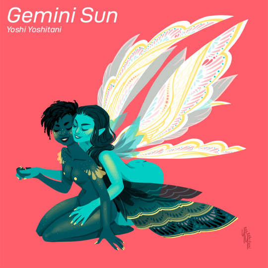
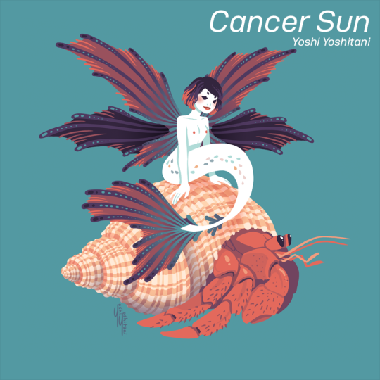
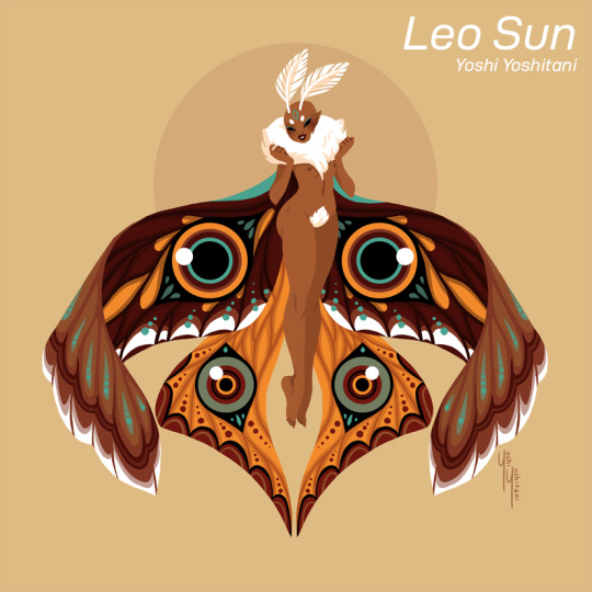
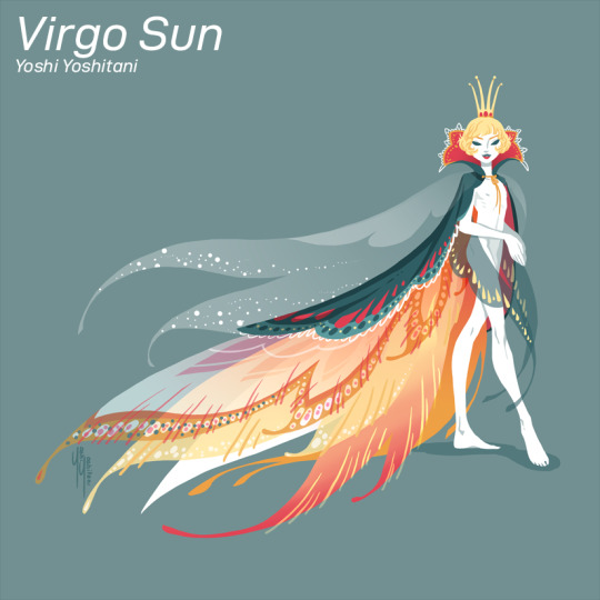
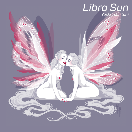
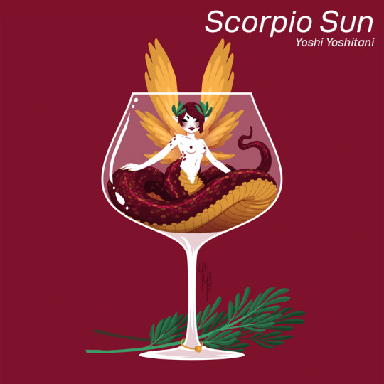
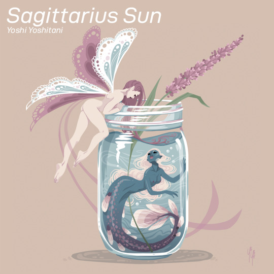

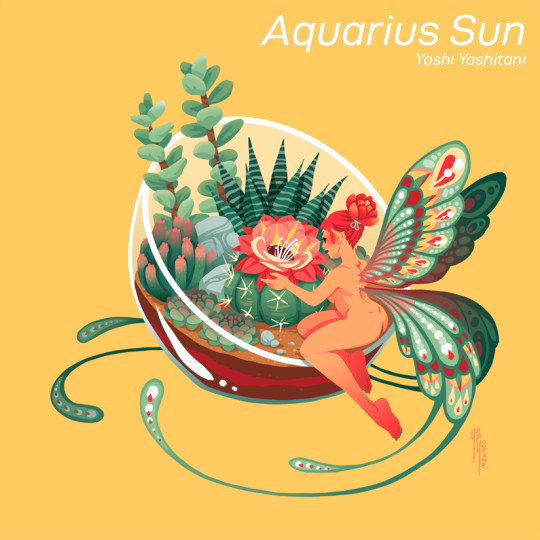
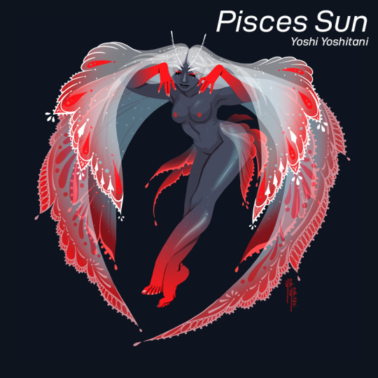
If you want to see more fairies, check out my artbook
348 notes
·
View notes
Text
Sneaker #COVER8
Сегодня в рубрику попадает магазин Sneaker. Ранее о ней уже заходил разговор и довольно неприятный. Хотя в первую очередь это вина дизайнера. Но рубрика положительная и плохому места нет. Начнем...

Как писалось ранее "Сам кроссовок с фотостоков и не факт в покупке прав" И хочешь не хочешь требуется убрать его...


Но круг и текст))) это еще хуже когда не уместно. Да будем работать с готовой концепцией логотипа. Представим, что все авторское и нет неприятных казусов. Разберем строение:

1.логотип не центрирован 2.текст и знак распадается по горизонту друг от друга 3.слово "shop" перенимает баланс 4.соотношение стилистики знака и шрифта - не совпадают 5.название теряется в ранговом расположении приоритетности. *6.хотелось бы не статического, а динамического лого "Дизайнер" создавший это - либо без рук, либо сантехник. А если не брать кроссовок с фотостока, а уделить на 10 минут больше и отрисовать индивидуально?

Оффер с верху предварителен и не несет в себе отношения к реалям. Логотип лишь демонстрирует как можно сделать в плане рабочего процесса при создании.
Теперь есть: до и после, плагиат и индивидуальный знак.

Сохранив концепцию логотип, придали индивидуальность, а так же знак забрендировали и спрятали букву "S". Текст по стилистике одинаков с кроссовком. А возможность использовать его в айдентике на столько обширная, что даже не могу раскрыть все карты). Магазин действительно круто продает публикации, а с лого такого плана...может стать брендовой сетью магазинов.


На этом рубрика с магазином закрыта, надеюсь идея понятна была изложена. Спасибо за просмотр! Если же владелец магазина читает статью... "В любом случае буду рад преобразить фирменный стиль и поднять премиальность магазина"
Вопросы и предложения сотрудничества присылать: [email protected]
2 notes
·
View notes
Photo


Here are some of my favorite indie games in the running for 2019 Indie of the Year award over at Indie DB.
Top to bottom:
The StoryTale
Blazing Beaks
Noita
A Legionary’s Life
Hypnospace Outlaw
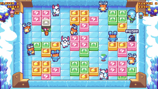
Pushy and Pully in Blockland
Starmancer
Chinatown Detective Agency
Eight Dragons
Ion Fury
In fact, I went over all 100 nominees and picked out the pixel art(ish) ones and put them all in one big beautiful article in Retronator Magazine. There’s still one day to vote for the winner, so check out my full selection in Indie DB 2019 Indie of the Year awards.
114 notes
·
View notes
Photo


TPN. UTI. Cover8.
TPN. Novum. Home.
TPN. NDM. Animation. 0000.
1 note
·
View note
Text
LEISURE TOWN Queen Cooling Mattress Pad Cover(8-21 Inch Deep Pocket)-Fitted Quilted Mattress Topper Down Alternative Fill
New Post has been published on https://www.homeguide411.com/product/leisure-town-queen-cooling-mattress-pad-cover8-21-inch-deep-pocket-fitted-quilted-mattress-topper-down-alternative-fill/
LEISURE TOWN Queen Cooling Mattress Pad Cover(8-21 Inch Deep Pocket)-Fitted Quilted Mattress Topper Down Alternative Fill
S
0 notes

Text
Learn Japanese Calligraphy CD Set
Learn Japanese Calligraphy CD Set
Japanese Calligraphy is all about movement and movement simply cannot be taught in a book. This is why we offer our unique courses on CD-ROM. Each CD in the series shows detailed explanations, stroke order, and frame by frame analysis and there are over thirty videos showing proper technique for brushing the character.
Along with the correct way to brush the character, student samples and videos…
View On WordPress
0 notes
Photo


You’ve heard about Courier of the Crypts often on this blog but I wouldn’t hold it against you if you don’t remember it—my posts have been spread out sparsely throughout its epic, 8-years-long development cycle. Funny enough, I never got to write about its release in April this year though, so I’m celebrating the return from my daily-writing hiatus with the well deserved news that yes, young courier has finally reached his final destination.
In a true labor of love, my good friend Primož Vovk took on designing, coding, and drawing the whole game, all the way back in 2011, after he came up with the idea for the 48-hour game development competition Ludum Dare 20 (we’re at LD 45 by now).

The initial premise was simple enough: become a courier who needs to deliver a letter deep into the crypts and do it before your magical torch runs out of its protecting flame.
What happened in the 8 years following was an expansion into a grand puzzle/action adventure full of creepy underground levels, deadly enemies, obstacles, an intriguing storyline, and plenty of (secret) reasons to replay individual stages. I can’t really do it justice with words so I’ll let the trailer speak for itself:
youtube
Along the development path, Primož was joined by Zdravko Djordjević on sound and music, and I provided a tiny contribution of mine by drawing the portraits for in-game dialogues.

I still have the last 20% of the story to play through, so I can’t speak of the full experience (despite doing the portraits, the game was as much a mystery to me as anyone else), but what I’ve experienced so far was a very delightful jump back into 80s/90s-era challenging, top-down adventuring.
The game got its v1.1 update recently, which brings difficulty selection if you’re not old-school enough (or too much) for the normal mode, and leaderboards to additionally reward your skills for finding the game’s many secrets and collectibles.

If you’re reading this article on the day of writing, you’re even more in luck. The game is still on its Black Friday sale and will cost you just $13 (Windows only from Steam, Humble, or Itch). Now is the time to get it, but later just as much as your money supports 8 years of dedication to get this wonderful, mostly-solo project into your hands.
52 notes
·
View notes
Photo


This took a while, but I’ve successfully upgraded the hair system in Pixel Art Academy to support 8 viewing directions.
Alongside I also redesigned which individual parts the hairstyles are constructed out of. In the GIFs above you can see long, medium, short, and very short cuts, all created out of small sprites categorized by placement (left, right, front, back), hair type (straight, wavy, curly), length, etc. All haircuts can also be recolored and they are drawn with normal maps so they can be dynamically shaded.

I’m quite happy with the system and I hope it will provide for a nice amount of customization for the players. It will be available with the next alpha release, probably in July.
104 notes
·
View notes
Text
Citibank #COVER8
What the bank logo would look like if we were doing the rebranding

In short about the logo: 1. has a simple and very readable look. 2.There is also a thickness separator in the name. 3.The rainbow has the image of a dome and protection means.
Of course he is recognizable but does not have a clearly rehearsed personality. Since there are a lot of such logos. But how can you transform it?

Like this! Yes, this is a rebrand of the bank and has a short sign. This version is just more positive. Minimalism ... what could be better? This option is already ideal, it is only possible to correct the ends of the font. Though there are a lot of rainbows in logos.
But perhaps it is better to beat the protection and warmth with an individual sign? Let's start ...

we find central places ...

and space for the "T" letter.

here is the logo) ... But that's not all! But the outline of the idea is already there ... We continue to torment the logo)))

Leave the outline line and set it 45 degrees. We all think ... what could be better than a heart? Only two hearts! Although the "warmth" was played with love, the rainbow has survived. Now the logo can be used in monochrome.
And now a little corporate identity ...


Which option is better? NEW or OLD version.
---------. GRAPHIC DESIGN " INDIVIDUAL AND BRANDED DESIGN FROM A TO Z "- FORM STYLE- LOGOS- IDENTICS AND PRINTING---------More cases in the community:www.vk.vom/quin8studio---------.👉 Add to bookmarks and like.📧 [email protected].🌐 also subscribe @quin8studio (telegram, tweeter, ok, vk).#logo #quin8studio #logos #design #designer #identity #vector #helpdesigner #logodesigner #branding #best #brandmark #logomark #mark #logomaker #graphicdesign #designinspiration #ГрафическийДизайнер #ИщуДизайнера #НуженДизайнер #Логотип #РазработкаЛоготипа #СозданиеЛоготипа #НуженЛоготип #ЗаказЛоготипа #Дизайнер #Брендинг #ГотовыйЛоготип #ШаблонЛоготипа
0 notes
Text
Learn Japanese Calligraphy CD02
Learn Japanese Calligraphy CD02
Section 2: Kaisho Basic
This is the second section of the Takase Shodokai Japanese Calligraphy Series.
Here we continue to focus on the basic strokes of the kaisho font. Remember that kaisho is a bold and precise style. Our emphasis in this section is to continue to practice the lines and strokes previously introduced.
Lesson 7 – 主 shu (Lord)
Lesson 7 gives us a chance to revisit the three yo…
View On WordPress
0 notes
Text
Learn Japanese Calligraphy CD01
Learn Japanese Calligraphy CD01
CD01 – Section 1 Kaisho Basic 1
This is the first section of the Takase Shodokai Learn Japanese Calligraphy Series.
This section introduces Japanese Calligraphy using the kaisho (Block) font. Kaisho is probably the most commonly seen Japanese font today and is noted as being bold and powerful with precise and crisp lines.
By the end of this section the student will have a good understanding of the
View On WordPress
0 notes