#But uh... maybe the solution here is to work on making Canada (and the world in general) safer for Jewish people?
Explore tagged Tumblr posts
Visit Tumblr Blog
Explore Tumblr blogs with no restrictions, modern design and the best experience.
Last Seen Tumblr Blogs


Fun Fact
Forty percent of Tumblr users are between the ages of 18 to 25.
Text
So, Canada has decided to stop sending arms to Israel after an NDP motion. The Liberals made major amendments to it so as to firmly condemn Hamas as well. It's kind of a mixed bag. Honestly, it's naive of me but I didn't expect there would still be so much outrage, even if the motion did call for an acknowledgement of Palestine as a state. All the Conservatives voted against it - to be fair, some of them wanted to wait for the motion to be passed because the amendments were super last minute and the Bloc Quebecois were annoyed that because of this there wasn't a French translation.
I guess it's a step in the right direction. I think it's still weak but you can read more on it here.
Source 1, Source 2, Source 3
#I think the biggest thing that confuses me is that there are still comments about Israel being the only safe place for Jewish people#I don't doubt that - a large (I think unfortunately a majority) percent of the hate crimes this year#have been against Jewish people in my country#But uh... maybe the solution here is to work on making Canada (and the world in general) safer for Jewish people?#I know you can't change people's individual attitudes but really#i think saying 'ah yes jewish people will be safe in this place far away from us#where we don't have to deal with this issue in our own country. not anywhere else though' is... weird#also I think if your argument is genuinely that one group's safety has to come at the expense of an entire other group of people#you need to start thinking outside of such a limited narrow scope#storyrambles#<-i'll probably delete my tags after i'm just... sigh...#i know i'm naive to a degree but i really think these opinions are not... especially radical#also i think canada is reticent to show too much support because that might get conversations going around our occupation#of indigenous land and the landback movements#but that's my own thoughts and a separate (though related) matter
10 notes
·
View notes
Text
Deobi Playlist (EP 5) | The Boyz Imagine

Ep 5: in which Kevin says it’s okay to be different
The Boyz x Hospital Playlist inspired drabble series.
Main Characters: Hyunjae, Juyeon, Kevin and OC (Mae)
Sides: the rest of The Boyz.
Genre: fluff, slice of life, comedy, BROMANCE BRUH
EP 1 | EP 2 | EP 3 | EP 4 | EP 5 | EP 6 | EP 7 | EP 8 | EP 9 | EP 10 | EP 11
----------
“I managed to take out his tumour, but I’ll need him to stay for a few days just so that he can recover fully. He’s under anesthesia for now but he should be up soon,” Kevin flips through his newest patient’s medical file and scans the page for his details. His name is Yeon Hanjo, eight years old, who had suddenly collapsed to the ground a week ago with no indication of an illness whatsoever. An MRI scan of his head and body had shown that the small child had been keeping a tumour hidden within the side of his skull for some time and after some thorough deliberating and research about the best methods to go about the operation, Kevin had managed to successfully draw the tumour out without any mishaps or complications.
Mrs. Yeon bows before Kevin once more with barely restrained tears coating her eyes. She holds a tissue in her hand, which seems already wet and crumpled into a ball, and Kevin reaches out with another tissue that she takes gratefully.
Mr. Yeon is at her side, one hand on his wife’s shoulder to provide her comfort, “Thank you, thank you so much Dr. Moon. We--We don’t know what we would’ve done without you.”
Kevin lets out a small, genuine smile, “it’s my duty. Hanjo’s life is just as important as anybody else’s, if not more.”
A few hours after the parents have left and Kevin has done his rounds as he is supposed to, he makes way to Hanjo’s room with a box of chocolate in hand.
Hanjo is already awake, blinking at the night sky from his hospital bed. The child turns his attention towards the door when Kevin pokes his head in with a smile, “hello Hanjo. How are you feeling?”
The child shrugs, and looks away.
Being familiar with the way children react when they are forced into an unfamiliar setting where strangers prevail, Kevin steps in, closes the door behind him and takes a seat at Hanjo’s bed. The child is still not looking at him, chin adamantly pointed towards the outside world.
“I bought something for you,” Kevin opens up his box of chocolates and offers him the box. Hanjo peeks into it for a few seconds of silence, looks up at his face, then pushes the box away.
While Kevin isn’t used to children not wanting any chocolate, that doesn’t dissuade him from trying. He closes the box and sets it on Hanjo’s bedside table.
“In a few days, you can go back home. Aren’t you glad?” Kevin chats on despite the reluctance in Hanjo’s body behaviour, “what’s the first thing you want to do when you go back, Hanjo?”
Still, the child stays silent. Kevin sees his lower lip tremble but decides it is better off not to mention it. He takes it as a fact that Hanjo might be shy, unwilling to converse because he’s a stranger. The only solution to that though is for Kevin to keep trying, which he does day after day. Every time he’d bring something different -- a different candy, or toy that boys his age would’ve liked -- but Hanjo refuses every single item without delay.
When the date of Hanjo’s discharge looms closer and closer, Kevin can’t help himself but urge him to speak by prompting the child with good news, “you must be excited, only three days left!” he grins at the child in hopes of getting a smile back, at least.
Hanjo, on the other hand, merely blinks. Then, a fat tear rolls down his cheek before he bursts into tears.
“Hanjo,” Kevin’s demeanor softens then, gently tugging the said child in his arms and scooping him close against his chest. The child keeps on crying, his face now red and tears cascading down his cheeks, staining Kevin’s white coat. His parents, having heard the commotion from outside, quickly slip in with mirroring expressions of worry and take the child from Kevin’s arms, who is left confused and slightly concerned at the child’s suddenly sad countenance. He cannot, for the life of him, understand how Hanjo’s mind works. Kids like him shouldn’t be crying like their world is tearing apart, shouldn’t be subdued and silent and just afraid of everything.
No, there’s something that’s bothering Hanjo. And Kevin finds his answer a few hours later.
“Hanjo spent most of his life in Florida, where he was born,” Mrs. Yeon says to him. After Hanjo had fallen asleep, she had ushered to buy Kevin a coffee at the cafeteria. She now sits opposite him, coffee cup clasped between frail fingers with skin wrinkled and saggy from years of work, eyes rimmed with blue aprons and mouth tugged down in a tense, awkward line, smeared with a pale chalky lipstick.
“We moved here just a few months ago. He hasn’t told me anything, but his teacher tells me that he hasn’t been very...interactive with the other kids,” she purses her lips as if in discontentment, “he barely talks, not because he doesn't understand. We talk to him in Korean all the time at home. Somehow though, he barely says a word here. It’s like he doesn’t want to make even the slightest bit of effort.”
“Have you tried talking to him about it?” Kevin asks with furrowed eyebrows.
She shakes her head, “no, well. We’ve tried asking him about school and stuff, maybe mentioned his teacher’s comments once or twice but that was it. We don’t want to push him either.”
He can’t help but feel a pang of sympathy for the said young boy, knowing all too well how strange it is to move oneself to another country altogether, a country where the language is different, the people are different, and how it feels like your entire life has just turned upside down because of that mere fact.
“Oh that’s just like little Kevin when he just moved here,” Hyunjae can’t help but snigger, prompting Mae to whack him across the back of his head.
“Ouch!” Hyunjae throws her a scowl, “why are you even a doctor? You should just become part of the mafia. Seriously! That hurt--”
She proceeds to shove a piece of lettuce in his mouth to muffle his protests. Juyeon and Kevin exchange knowing glances, before shrugging.
“You should talk to him,” Mae suggests, and though she’s trying very hard to act normal, Kevin can feel the unease rolling off her, how she’s not looking at him and permanently fixating her gaze on her platter of food. He makes a mental note to ask Juyeon about it later.
For now, he replies, “yeah I should. It’s just a saddening thought. Children shouldn’t have so much trouble earlier on in their lives.”
“Hey touff, we all haff prwabems,” Hyunjae attempts to say with his mouth still full. He swallows before gulping down some water. Slamming his cup down, he jabs a finger in Mae’s direction, “you and I have a problem.”
“The only problem that I’ll have with you is killing you by asphyxiation, and before you ask, there is food involved,” Mae cooes.
Hyunjae shivers, “psychopath.”
“Nu-uh, Sociopath? Probably. But psychopath?” she scrunches her face up as though contemplating the thought, “nah, I’m too kind.”
“You flatter yourself too much,” Juyeon rolls his eyes.
“Can we focus on the problem at hand?” Kevin waves his chopsticks around dramatically, ignoring Hyunjae stealing his piece of chicken and replacing it with some ginger instead.
“Kevin, we all know that you’re the wondrous child talker here,” Hyunjae says, “we’re all counting on you to babysit our kids one day.”
“Excuse me? Is there kindergarten written on my forehead?”
“You mean, there isn’t kindergarten written on your forehead?” Hyunjae gasps dramatically, “here, let me--”
“Don’t you dare, Lee Jaehyun.”
Kevin waits until Hanjo’s parents leave with promises that they’ll be here to watch over him tomorrow morning, before slithering inside the children’s ward. Hanjo spots him, but doesn’t say anything as the said doctor sidles up to his bed and takes a seat on the abandoned chair next to him.
“I’ve got a surprise for you,” Kevin murmurs. The child watches as he pulls out a box of pocky sticks. His mother had stated that Pocky is the only asian snack he eats. Surely enough, Hanjo doesn’t hesitate to grab it with his little chubby fingers and Kevin gazes down at him with a fond sympathy gripping his chest.
But then, Hanjo glances up at him uncertainly. Kevin puts a finger to his mouth, “can you keep a secret?”
Hanjo pauses, contemplates him for a moment. Then, he nods.
“Cool, because I can’t actually sneak in any outside snacks,” Kevin whispers with a soft chuckle at the alarm washing over Hanjo’s face, “it’s okay, don’t worry. This is between you and me, alright?”
It takes a few seconds for the child to decide that Kevin’s intentions aren’t all that bad, before he slowly pries open the packet and digs into the snack with barely restrained excitement. Kevin just watches him with fondness, glad that for once it seems like he’s done something for Hanjo, when the child suddenly sticks out the packet, urging him to take some.
“Oh,” Kevin blinks in surprise, before drawing a pocky stick, “thanks, Hanjo. That’s so nice of you.”
Hanjo just nods, before returning his attention to the said chocolate covered sticks. As his mother had stated, it is indeed his favourite snack.
“Do you often eat pocky, Hanjo?” Kevin asks.
The child shrugs, urging Kevin to ask, “do any of your friends eat pocky?”
At this, Hanjo’s mouth pauses as if in contemplation and Kevin knows that he has hit a nerve. Not just any, but a sensitive one. He hurries to continue talking for fear that he might lose momentum, “you know, I never really had any friends when I first moved here. I used to eat pocky because it reminded me of the snacks my mom used to buy for me, back when we were still in Canada.”
He can practically see the cogs turning inside Hanjo’s brain as he mulls over the newly acquired information.
“I was shy back then. I didn’t know how to approach people. They all spoke Korean, I understood them. But I was so scared that they couldn’t understand me for some reason. After all, I never spoke Korean back when I was in Canada, just with my parents.”
Kevin let the information sink in for the child who was now gazing up at him with newfound interest alight in his big brown eyes and it takes everything inside the said doctor not to squeal at how adorable he looks. Instead, he pauses and waits, waits with the hope that Hanjo will react to this, however he wants.
“How?”
Kevin blinks. Hanjo’s mouth is open, curiosity filling his features as he continues hesitantly, “how...did you...make friends?”
While Kevin wants nothing more than to punch the air in success, he decides that this is not the right moment to be celebrating that fact. Instead, he clears his throat and allows his arm to rest on the side of the child’s bed.
“Actually, the pocky sticks helped me. The kids at my school always brought the same type of pocky sticks and then one day, when one of the girls in my class didn’t have any snacks, I offered her one,” Kevin smiles at the memory flashing before his eyes, “I thought she’d laugh at me when she started talking to me because of my accent. I wasn’t completely fluent. Surprisingly though, she was very interested to know what I had to say, despite the fact that I was so scared she’d just turn away from me.”
“What was her name?” Hanjo asks.
“Her name?” Kevin tilts his head, “actually, she works here too. Her name’s Mae, she’s a doctor from the Cancer department.”
Hanjo pauses for a few seconds, before he looks down at the box of pocky in his hand, “I don’t like talking in Korean,” his voice is small, barely a whisper, “I don’t like it here. Everything is different. Everyone is different.”
“You know, Korean is one of the hardest languages to learn. And you know English. Do you know how amazing that is?” Kevin smiles down, one of his hands going to pat his head, “I know how it feels. It doesn’t feel like home, because home is far far away. But it will get better, Hanjo. It’s okay that you’re not fluent in Korean. You’ll get there, eventually. Look at doctor Kevin, see?” he motions towards his own chest, “I was in the exact same position as you were, once. But it really gets better, trust me.”
Hanjo is frowning at the snack in his hands now, as though there are different thoughts flying about in his brain, thoughts too complicated for him to explain. But he surprises Kevin when he suddenly looks up and holds out his pinky.
“Promise?” Hanjo asks, “promise it gets better?”
“I promise,” Kevin hooks his finger with the child’s, “and you know what? You made your first friend right here,” and he pats his own chest with an amused smile. Hanjo’s lips tilt up in a mirroring expression, albeit hesitant, and Kevin’s heart melted right then and there in a puddle of Hanjo goo.
-----------
Knock knock.
Kevin blinks away the drowsiness as he raises his head from his desk where he’d been napping just a few seconds ago. Rubbing the sleep away from his eyes, he spots Hyunjae and lets out a groan at the mischievous smirk on the latter’s lips.
Whenever Hyunjae’s in a mood, he’ll have some kind of face that warns people about it.
“Get lost, Hyunjae. Not in the mood,” Kevin groans while his friend saunters in as though he hasn’t been straight out rejected. Kevin buries his face back into his arms and Hyunjae quickly lays his head just beside him.
“What?” Kevin asks with his eyes still closed.
Hyunjae merely giggles, before blowing softly on his face.
Kevin whips his head around, “you’re so annoying. Get lost.”
“But Kebiiin,” the taller man whines and nestles his face even closer so that Kevin’s soft hair tickles the bridge of his nose, “I have important news!”
“What news?” comes Kevin’s mumble.
“I’m getting married.”
“To who?”
“To you.”
“No you’re not.”
“Okay fine, to Juyeon.”
“No you’re not.”
“Okay fine, to Mae then.”
“Do you know,” Kevin asks slowly, “why is she acting so weird?”
“Weird?” Hyunjae snuggles even closer, breathes in Kevin’s soft vanilla scent, “like usual Mae kind of weird or weirder than weird?”
“No, she hasn’t been talking to herself. But she has been avoiding me.” “Oh.”
“Oh?” Kevin whips around to look at him in alarm.
Hyunjae draws back to stand, leaning against the opposite doctor’s empty chair as Kevin straightens to look at him with growing concern, “what do you mean by ‘oh’?”
“She did ask me something weird the other day.”
“About?”
“About who you were crushing on.”
“WHAT?” Kevin’s eyes grow wide, “what did you tell her?!”
“That I had no clue.”
“Oh thank god,” Kevin visibly slouches in relief. Then, his eyes grow wide, “wait--Does she know then?! That I--” All it takes is for Hyunjae’s face to take on a suspicious air for Kevin to realize that he is not out of dangerous waters yet. He scrambles up and holds onto Hyunjae’s sleeve, “what?” Kevin demands like it’s a life or death situation. Which it is to him, “why do have that look on your face?”
“Look Kev, mate, I definitely did not do anything.”
“But?”
“I never said there was a but.”
“You implied it!”
“Okay fine,” Hyunjae huffs, “but, someone seems to have leaked this information to her, like it or not--”
“What?!”
“--and we all suspect that it’s the Neurosurgery resident, the one that comes from Toronto--”
Kevin sucks in a sharp breath, “Jacob Bae?”
“If anyone asks, this did not come out of my mouth,” Hyunjae is quick to defend while raising his arms in the air in mock surrender, but Kevin is too preoccupied at the thought that his secret is now out in the open for everyone to dissect and digest. How in the world does Jacob know about this? He barely even talks to him!
Unless...unless it’s that obvious?
His head snaps up so suddenly, eyes dark and so vividly intense on Hyunjae’s that the latter can’t help but yelp in return, “Hyunjae,” Kevin says slowly, “you’re sure...you’re sure you didn’t say anything?”
“Are you implying that I lied to you?!” Hyunjae gasps mockingly, “Kevin, I’m--”
“Shut up and be serious for one second.”
“Of course I didn’t! Who do you take me for?!”
“Shit,” is the only thing that Kevin has to say, “Shit. Shit.”
#deobi playlist#theboyz au#theboyz fanfic#theboyz scenarios#theboyz#tbznetwork#deobidrabbles#theboyz imagine#the boyz imagines#the boyz fanfic#the boyz au#the boyz scena#the boyz hyungseo#the boyz juyeon#hyunjae fanfic#hyunjae#kevin moon scenarios#kevin moon imagines#kevin moon#the boyz kevin#hospital playlist#kpop fanfiction#kpop imagines#q#tbz changmin#sunwoo#sangyeon#jacob bae#younghoon#juhaknyeon
56 notes
·
View notes
Text
Pluralistic: 26 Mar 2020 (EFF's videoconferencing backgrounds, the ideology of economics, LoC plugs Little Brother, Canada nationalizes covid patents, Exponential Thread, Sanders on GOP stimulus cruelty, record wind power growth, social distancing and other diseases, Badger Masks)
Today's links
EFF's videoconferencing backgrounds: With a deep cut from the NSA's secret listening post.
The ideology of economics: Economics doesn't have "laws" it has "policies."
LoC plugs Little Brother: Open access FTW.
Canada nationalizes covid patents: An Act respecting certain measures in response to COVID-19.
Exponential Threat: Trump threatened to sue media outlets that aired this spot.
Sanders on GOP stimulus cruelty: "Millions for plutes, but not one cent for workers."
Record wind-power growth: Covid stimulus could start a Green New Deal.
Social distancing and other diseases: Do we trust IoT thermometer companies, though?
Badger Masks: UW Madison's open facemask design.
This day in history: 2005, 2010, 2015, 2019
Colophon: Recent publications, upcoming appearances, current writing projects, current reading

EFF's videoconferencing backgrounds (permalink)
Telework is a quiet reminder that we live, in some sense, in an age of wonders. As terrible as lockdown is, imagine it without any way to videoconference with your peers and colleagues.
But it's also a moment where we tremble on the precipice of cyberpunk dystopia, when calls for mass surveillance – both for epidemiology and stabilizing states that are bruised and reeling – meet a world where everything is online and amenable to "collection" by spooks.
This is, basically, the moment that EFF has been warning about for 30 years: the moment when the "digital world" and the "real world" fully merge, and where the distinction between "tech policy" and "policy" dissolves.
One way you can help keep this in your colleagues' minds is to use EFF's amazing, free/open graphics as your videoconferencing background (most of these are the creation of the brilliant Hugh D'Andrade).


Now, those are all great, but this one is Room 641A at AT&T's Folsom Street center, where the whistleblower Mark Klein was ordered to build a secret room so the NSA could illegally spy on all US internet traffic.


The ideology of economics (permalink)
Thomas Piketty's "Capital in the 21st Century" advanced a simple, data-supported hypothesis: that markets left to their own will cause capital to grow faster than the economy as a whole, so over time, the rich always get richer.
https://boingboing.net/2014/06/24/thomas-pikettys-capital-in-t.html
He's followed up Capital with the 1000-page "Capital and Ideology" – whose thesis is that the "laws" of economics are actually policies, created to "justify a society's inequalities," providing a rationale to convince poor people not to start building guillotines.
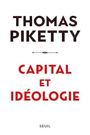
The first ideology of capital was the "trifunctional" system of monarchist France, dividing society into "those who pray," "those who fight," and "those who work."
After the French revolution, we enter the capitalist phase, then social democracies, and now, "meritocracies."
"Meritocracies" invest markets with the mystical power to identify and elevate the worthy, in a kind of tautology: those who have the most are worth the most. You can tell they're worth the most because they have the most.
("That makes me smart" -D. Trump)
In Piketty's conception, "Inequality is neither economic nor technological. It's ideological and political," where "ideology" "refers to a set of a priori plausible ideas describing how society should be structured" (think: Overton Window).
https://bostonreview.net/class-inequality/marshall-steinbaum-thomas-piketty-takes-ideology-inequality
The major part of the book seeks to explain how the post-war social democracies gave way to the grifter meritocracies of today, pulling together threads from across the whole world to tell the tale.
On the way, he described alternatives that were obliterated, and others that were never tried, and shows how "meritocracy" gave us Trump, xenophobia, Brexit, and the Current Situation.
In particular, he's interested in why working class people stopped voting (spoiler: they no longer perceive that elites will pay attention to them irrespective of how they vote) — and what it would take to mobilize them again.
The elites' indifference to working people is grounded in an alliance between the Brahmin Left (educated, well-paid liberals) and the Merchant Right (the finance sector). Notionally leftist parties, like the Democrats, are dominated by the Brahmin Left.
But more than any other, Macron epitomizes this alliance: proclaiming his liberal values while slashing taxes on the wealthy — punishing poor people for driving cars, exempting private jets from his "climate" bill.
Life in a "meritocracy" is especially cruel for poor people, because meritocracies, uniquely among ideologies, blame poor people for poverty. It's right there in the name. French kings didn't think God was punishing peons, rather, that the Lord had put them there to serve.
"The broadly social-democratic redistributive coalitions of the mid-twentieth century were not just electoral or institutional or party coalitions but also intellectual and ideological. The battle was fought and won above all on the battleground of ideas."
As Marshall Steinbaum writes in his excellent review, Piketty's work doesn't just highlight new ideas in economics: it highlights the intellectual poverty of the economics profession and its tunnel vision.
"Economists cannot be allowed to be the arbiters of the intensely political concerns Piketty takes up in the book, and the good news is that there is reason to believe they won't be."
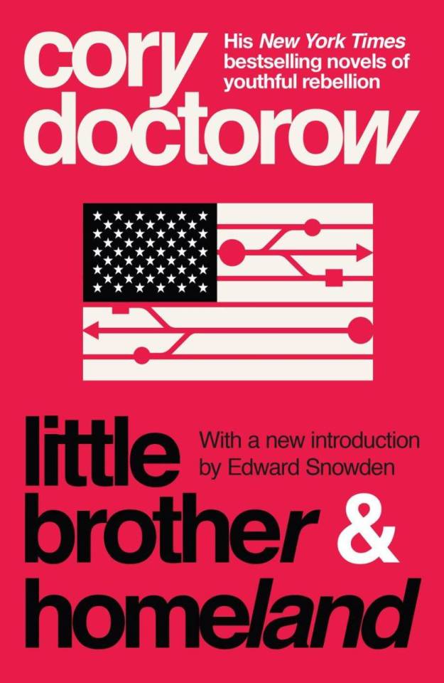
LoC plugs Little Brother (permalink)
Honored and pleased to have my book Little Brother included on the Library of Congress's excellent collection of open-access ebooks in its collection, which you can always access gratis but which may be of especial interest during the lockdown.
https://blogs.loc.gov/thesignal/2020/03/more-open-ebooks-routinizing-open-access-ebook-workflows/
If you enjoyed Little Brother and its sequel Homeland, you might be interested in the third Little Brother book, Attack Surface, which Tor is publishing on Oct 12.
https://us.macmillan.com/books/9781250757531
If you're looking for more topical reading, Infodocket's carefully curated list of coronavirus resources is here for you:
https://www.infodocket.com/2020/01/31/2019-novel-coronavirus-resources/
Canada nationalizes covid patents (permalink)
Canada's Parliament has passed Bill C13, "An Act respecting certain measures in response to COVID-19," amending patent law to create automatic compulsory licenses for any inventionused to fight covid, including diagnostics, vaccines, therapies or PPE.
https://www.parl.ca/DocumentViewer/en/43-1/bill/C-13/third-reading
As E Richard Gold writes, it's an "important signal that Canada will not support IP delays…While most firms are helping find solutions, this will prevent those who try to take advantage-by raising prices or limiting supply-or those who cannot deliver to block what is needed."

Exponential Threat (permalink)
"Exponential Threat" is a remarkable – and factual – political ad, one that contrasts Trump's statements on coronavirus with the spread of the disease in America.
https://www.youtube.com/watch?v=bkMwvmJLnc0
More remarkable: Trump has threatened to sue the media for airing it, which is a totally cool and normal thing for someone who has sworn a solemn oath to uphold the Constitution and the Bill of Rights to do.
https://assets.donaldjtrump.com/2017/web/hero_images/Redacted_PUSA_Letter.pdf
"In case you needed more, here's an (admittedly incomplete) list of Trump statements on the novel coronavirus and COID-19"
http://www.joeydevilla.com/2020/03/25/exponential-threat-the-covid-19-themed-ad-that-the-trump-pence-campaign-doesnt-want-you-to-see/
Jan. 22: "We have it totally under control. It's one person coming in from China."
Feb. 2: "We pretty much shut it down coming in from China. It's going to be fine."
Feb. 25: "CDC & my administration are doing a GREAT job of handling Coronavirus."
Feb. 25: "I think that's a problem that's going to go away. They have studied it. They know very much. In fact, we're very close to a vaccine." [White House | New York Post]
Feb. 26: "We're going very substantially down, not up."
Feb. 27: "One day it's like a miracle, it will disappear."
Feb. 28: "We're ordering a lot of supplies. We're ordering a lot of, uh, elements that frankly we wouldn't be ordering unless it was something like this. But we're ordering a lot of different elements of medical."
March 2: "You take a solid flu vaccine, you don't think that could have an impact, or much of an impact, on corona?"
March 2: "A lot of things are happening, a lot of very exciting things are happening and they're happening very rapidly."
March 4: "If we have thousands of people that get better just by, you know, sitting around and even going to work – some of them go to work, but they get better."
March 5: "I never said people that are feeling sick should go to work."
March 6: "I think we're doing a really good job in this country at keeping it down… a tremendous job at keeping it down."
March 6: "Anybody right now, and yesterday, anybody that needs a test gets a test. And the tests are beautiful. They are perfect just like the letter was perfect. The transcription was perfect. Right? This was not as perfect as that but pretty good."
March 6: "I like this stuff. I really get it. People are surprised that I understand it. Every one of these doctors said, 'How do you know so much about this?' Maybe I have a natural ability. Maybe I should have done that instead of running for president."
March 6: "I don't need to have the numbers double because of one ship that wasn't our fault."
March 8: "We have a perfectly coordinated and fine tuned plan at the White House for our attack on Coronavirus."
March 9: "The Fake News media & their partner, the Democrat Party, is doing everything within its semi-considerable power to inflame the Coronavirus situation."
March 10: "It will go away. Just stay calm. It will go away."
March 13: National Emergency Declaration.
March 17: "I felt it was a pandemic long before it was called a pandemic."
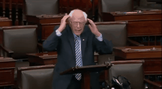
Sanders on GOP stimulus cruelty (permalink)
This Bernie Sanders floor speech in the Senate on the GOP's relentless attempts to punish poor people in the covid relief package is a must-watch
https://www.reddit.com/r/SandersForPresident/comments/fp3my0/bernie_goes_full_sanders_on_the_republicans_for/
tldr: GOP Senators are freaking out because some people in line to get the pittances they're doling out actually earn EVEN LESS than $1k-2k/month, and so they might get a raise in the form of covid relief.
That is, rather than taking the fact that this bare-minimum subsidy package exceeds "normal" income as a wakeup call to raise the minimum wage for the first time since 2009, the GOP is calling for cuts to aid to the most vulnerable Americans.
As Sanders points out, these same Senators had no problem with the Tax Scam, which poured trillions into the accounts of the richest Americans, directly and indirectly through stock-buybacks, which also left US business vulnerable and in need of trillions more today.
Now those bailed-out plutes want workers to risk death to "restart the economy," and the GOP will ensure they'll starve if they don't.
As ever, The Onion nails it:
https://politics.theonion.com/gop-urges-end-of-quarantine-for-lifeless-bipedal-automa-1842461351
"GOP Urges End Of Quarantine For Lifeless Bipedal Automatons That Make Economy Go"
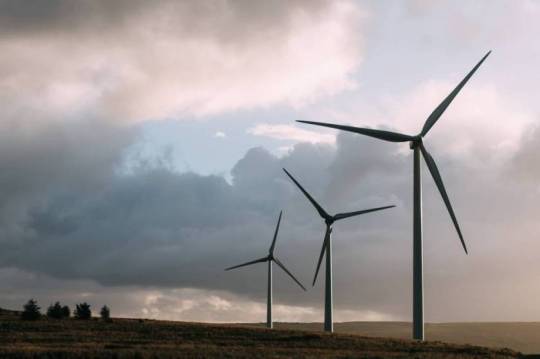
Record wind-power growth (permalink)
As the world's wind-generation capacity increases, you'd expect annual growth to fall proportionately (it's easier to double a very small number than a very big one!), but this year should see the largest proportional growth ever, a 20% increase!
https://www.theguardian.com/environment/2020/mar/25/worlds-wind-power-capacity-up-by-fifth-after-record-year
That number is uncertain (hello, coronavirus), but on the other hand, there's a massive stimulus package in the offing that could be used to restart the economy by saving the planet with renewable energy.
The non-adjusted, pre-virus projection for this year's total growth in wind power was an additional 76GW (to meet climate projections, that number has to rise to 100GW/year, and then to 200GW/year).
Social distancing and other diseases (permalink)
Though the evidence is a little shaky, it appears that social distancing has dramatically reduced the spread of other infectious diseases, like flu.
https://qz.com/1824020/social-distancing-slowing-not-only-covid-19-but-other-diseases-too/
The data comes from an Internet of Shit "connected thermometer" company that (allegedly) anonymizes its data and uses it for health surveillance; they report a massive drop-off in high temps relative to other years and pre-distancing levels.
The claims are plausible, but they're also an ad for an IoT company that sells a product no one needs, so take them with a grain of salt.
I'd be interested in STI transmission after weeks/months of government-recommended masturbation-over-hookups:
https://www1.nyc.gov/assets/doh/downloads/pdf/imm/covid-sex-guidance.pdf

Badger Masks (permalink)
A local hospital asked researchers at the UW Madison Engineering Design Innovation Lab to design them a field-expedient face-shield that could be mass-manufactured to protect its staff from coming cases.
https://www.wired.com/story/tinkerers-created-face-shield-being-used-hospitals/
Using hardware-store parts, the UW makerspace, and teleconferencing with self-isolating collaborators, the team designed an excellent mask, the Badger Shield:
https://making.engr.wisc.edu/shield/
They've manufactured and delivered 1,000 Badger Masks to the hospital and a Ford plant in MI is making 75,000 more this week for Detroit-area hospitals. Here's a technical spec you can follow if you have access to equipment and parts:
https://www.delve.com/assets/documents/OPEN-SOURCE-FACE-SHIELD-DRAWING-v1.PDF
It involves just 3 pieces: polyethylene sheets (laser- or die-cut), an elastic headband, and a 1" thick strip of self-adhesive polyurethane foam. For initial production, Midwest Prototyping used office-supply-store electric staplers for assembly.
The design process started with a teardown of an existing, approved mask, and the project lead, Lennon Rodgers, worked with collaborators to replicate it, sanity-checking successive designs with his wife, an anaesthesiologist.
They started hand-delivering prototypes to the hospital, who refined the design further, swapping in latex-free elastic and lengthening the shield. Tim Osswald from UW used his polymer engineering expertise to find a supplier who could create a custom die.
Now, more than 1M Badger Masks have been sought, with manufacturers like St Paul's Summit Medical tooling up to meet demand.
Other designs are popping up across America. San Francisco's Exploratorium is making 200+ shields/day using its own makerspace.
This day in history (permalink)
#15yrsago If the Constitution was a EULA https://web.archive.org/web/20050330012000/http://slate.msn.com/id/2115254/
#10yrsgo Discarded photocopier hard drives stuffed full of corporate secrets https://www.thestar.com/news/gta/2010/03/18/hightech_copy_machines_a_gold_mine_for_data_thieves.html
#5yrsago TPP leak: states give companies the right to repeal nations' laws https://wikileaks.org/tpp-investment/press.html
#5yrsago Woman medicated in a psychiatric ward until she said Obama didn't follow her on Twitter https://www.independent.co.uk/news/world/americas/woman-held-in-psychiatric-ward-after-correctly-saying-obama-follows-her-on-twitter-10132662.html
#5yrsago Sandwars: the mafias whose illegal sand mines make whole islands vanish https://www.wired.com/2015/03/illegal-sand-mining/
#5yrsago Australia outlaws warrant canaries https://arstechnica.com/tech-policy/2015/03/australian-government-minister-dodge-new-data-retention-law-like-this/
#5yrsago As crypto wars begin, FBI silently removes sensible advice to encrypt your devices https://www.techdirt.com/articles/20150325/17430330432/fbi-quietly-removes-recommendation-to-encrypt-your-phone-as-fbi-director-warns-how-encryption-will-lead-to-tears.shtml
#1yrago Article 13 will wreck the internet because Swedish MEPs accidentally pushed the wrong voting button https://medium.com/@emanuelkarlsten/sweden-democrats-swedish-social-democrats-defeat-motion-to-amend-articles-11-13-731d3c0fbf30
#1yrago EU's Parliament Signs Off on Disastrous Internet Law: What Happens Next? https://www.eff.org/deeplinks/2019/03/eus-parliament-signs-disastrous-internet-law-what-happens-next
Colophon (permalink)
Today's top sources: Slashdot (https://slashdot.org/), Naked Capitalism (https://nakedcapitalism.com/), Late Stage Capitalism (https://www.reddit.com/r/LateStageCapitalism/).
Currently writing: I'm getting geared up to start work my next novel, "The Lost Cause," a post-GND novel about truth and reconciliation.
Currently reading: Just started Lauren Beukes's forthcoming Afterland: it's Y the Last Man plus plus, and two chapters in, it's amazeballs. Last month, I finished Andrea Bernstein's "American Oligarchs"; it's a magnificent history of the Kushner and Trump families, showing how they cheated, stole and lied their way into power. I'm getting really into Anna Weiner's memoir about tech, "Uncanny Valley." I just loaded Matt Stoller's "Goliath" onto my underwater MP3 player and I'm listening to it as I swim laps.
Latest podcast: Data – the new oil, or potential for a toxic oil spill? https://craphound.com/podcast/2020/03/23/data-the-new-oil-or-potential-for-a-toxic-oil-spill/
Upcoming appearances:
Quarantine Book Club, April 1, 3PM Pacific https://www.eventbrite.com/e/quarantine-book-club-cory-doctorow-tickets-100931360416
Museums and the Web, April 2, 12PM-3PM Pacific https://mw20.museweb.net/
Upcoming books: "Poesy the Monster Slayer" (Jul 2020), a picture book about monsters, bedtime, gender, and kicking ass. Pre-order here: https://us.macmillan.com/books/9781626723627?utm_source=socialmedia&utm_medium=socialpost&utm_term=na-poesycorypreorder&utm_content=na-preorder-buynow&utm_campaign=9781626723627
(we're having a launch for it in Burbank on July 11 at Dark Delicacies and you can get me AND Poesy to sign it and Dark Del will ship it to the monster kids in your life in time for the release date).
"Attack Surface": The third Little Brother book, Oct 20, 2020. https://us.macmillan.com/books/9781250757531
"Little Brother/Homeland": A reissue omnibus edition with a new introduction by Edward Snowden: https://us.macmillan.com/books/9781250774583
This work licensed under a Creative Commons Attribution 4.0 license. That means you can use it any way you like, including commerically, provided that you attribute it to me, Cory Doctorow, and include a link to pluralistic.net.
https://creativecommons.org/licenses/by/4.0/
Quotations and images are not included in this license; they are included either under a limitation or exception to copyright, or on the basis of a separate license. Please exercise caution.
How to get Pluralistic:
Blog (no ads, tracking, or data-collection):
Pluralistic.net
Newsletter (no ads, tracking, or data-collection):
https://pluralistic.net/plura-list
Mastadon (no ads, tracking, or data-collection):
https://mamot.fr/web/accounts/303320
Twitter (mass-scale, unrestricted, third-party surveillance and advertising):
https://twitter.com/doctorow
Tumblr (mass-scale, unrestricted, third-party surveillance and advertising):
https://www.tumblr.com/tagged/pluralistic
When live gives you SARS, you make sarsaparilla -Joey "Accordion Guy" DeVilla
20 notes
·
View notes
Text
AND THE NOMINEES ARE...
okay guys! this is going to be a really long post, so here are the links for voting, and a full list of authors and works will be under the read more with links to go and read the nominated works or peruse all works of nominated authors.
this poll will be open all of the rest of january, with voting closing at 11pm AEST on the 31st, with the results going up as soon as i can put them together after that. congrats to everyone nominated! thanks everyone who sent in nominations!
Best Hockey RPF Author 2017
Best Hockey RPF Work/Series (Sid/Geno)
Best Hockey RPF Work/Series (Nicky/Ovi)
Best Hockey RPF Work/Series (Mitch/Auston)
Best Hockey RPF Work/Series (Other)
Author Nominees:
angularmomentum
sevenfists
theundiagnosable
LottieAnna
pukeandcry
crispierchip
itsacoup
stevenstamkos
Work Nominations:
(Further sorted into pairings) (if a work has no attached link i have not been given permission by the author to link it directly, but it can likely be found using the ao3 search function) (if you can’t find a work that you nominated in this list it is likely because it didn’t meet nomination guidelines)
PLEASE TAKE NOTE OF INDIVIDUAL WORK WARNINGS AND TAGS AND USE YOUR OWN JUDGEMENT WHEN DECIDING TO READ THEM.
Sid/Geno
Shelter by 71tenseventeen
Sidney was five the first time he met Troy. Well, that he remembers, anyhow.
Thalassophile by Anonymous
Thalassophile- (n.) a lover of the sea, someone who loves the sea, ocean
Adventures with Vanya (series) by bumblybee
“I’d like to introduce our guest for today, Evgeni Malkin, author of Hockey with Vanya.” Sidney nails the pronunciation, and Malkin even glances up at him with a little smile. “Mr. Malkin is going to read us his book, and then you’ll all have the opportunity to talk to him. How does that sound?”
Sonatina by CoffeeStars
It had started at a promotional event for the Pens at a sporting goods store. A little boy with bright eyes had handed his new skates over to be autographed and said, very politely, “Will you please sign it? It’ll be super lucky if you do, and I can skate really fast and score a bunch of goals like you.”
Of Two Seas by itsacoup
“You are lucky, little sailor,” the man says once Evgeni has looked his fill, and his voice is melodious, with a high edge to it but also an odd, gravelly way of speaking. “Lucky and strong. Strong enough to be my champion.” He drops his arm as he speaks the last word, turning towards Evgeni with a half-smile.
Telemachy by itsacoup
Sidney steps back to survey his work; his eyes glisten as he looks at Zhenya, and from the moisture springs forth revelation: cold-hands blurring-vision gasping-for-air-that-isn’t-there. “Return to us an Oracle, or leave your life upon the mountain,” Sidney declares. His voice trembles, and it’s more a plea than a command. He grabs the back of Zhenya’s neck, tugging until he can reach Zhenya’s face and push an insistent kiss against Zhenya’s brow. Sidney pulls back to stare at Zhenya for a long moment, the soft hazel of his eyes gone dark with indescribable worry. Zhenya’s heart thumps as his entire body roils with sensation, burning cold and freezing heat and fear and exhilaration and confusion, and he cannot break Sidney’s gaze.
Catch a Glimpse of Gold Through His Skin by reginalds
The poster reads, from the top:
Times When it is Okay to Interrupt Mr. Malkin:
1.) Hitler invades Russia
2.) Fire
3.) German U-boat spotted in the Allegheny
4.) Sidney Crosby walks in the room
Motherland by sevenfists
The first Zhenya heard about it was an email from Sidney in the middle of August.
The Best-Looking Boys by sevenfists
He was just a kid, just like Sidney, and far away from home. When Sidney didn’t look away, Evgeni mimed swinging a baseball bat, and Gonch was right; it was clear he had no idea what he was doing.
That was the first time Sidney thought they could maybe be friends.
The Real Thing by sevenfists
Sitting at the table was Sid: Sid as Zhenya had first known him, almost a decade before: dorky, long-haired Sid, his cheeks round with baby fat. He couldn’t have been older than twenty, and even that was generous.
“Wow,” baby Sid said. “Are you Evgeni Malkin?”
All the Way Through by sevenfists
“I hope you’re going to tell me that you’re in a loving, committed, long-term relationship,” Jen said.
“Well. No,” Sidney said. “We’re—it’s a casual thing.”
“Not anymore,” Jen said. “Congratulations, you’re in love.”
The Biblical Sense by sevenfists
“Sid, I’m so—I’m sorry,” Geno said. “My stupid—I’m ruin everything, I—”
“Shut up, Geno,” Sidney said, already intensely weary of listening to Geno’s self-recrimination. “You’ve barely even done anything.”
Geno’s voice dropped what sounded like an entire octave. “But I want to.”
My Fingers Laced to Crown by Squidbittles
It’s been ten years since Canada’s Crown Prince Sidney Crosby married Prince Evgeni Malkin, and they’ve found a love they never expected. Despite their best efforts, however, they remain heirless.
Amid mounting frustration and pressure from the public, they escape to the north for a much-needed delayed honeymoon in the hopes of finding a solution to the problem of succession.
Nicky/Ovi
love on a deposit of frozen pleistocene carbon by angularmomentum
Sasha is the only person to have lasted more than a year at Wrest Island Arctic Research Station, except, of course, for Dr. Bäckström.
Or: Sasha’s head over heels, in a slightly more than figurative sense.
running from the weather by angularmomentum
Alex starts playing for Dynamo at sixteen.
kith by angularmomentum
Sasha makes prefect in his second to last year. It’s earlier than anyone but him expected, but right on track for his two year plan, which is: be head boy, get a contract to play Quidditch professionally, and beat Bäckström off in the baths.
Goldenrod by Ferritin4
“You’ve gotta be crazy to fly one of those things,” Dima says, looking up at the icy arcing contrails of the Swedish jets as they rocket overhead. You have to be crazy to fly, Sasha thinks, and you have to be good.
A More Fascinating Name by pukeandcry
Although Sasha had never made the younger Mr. Backstrom’s acquaintance, he was at least familiar enough with his reputation to know that chief amongst his qualities was the quite publicly known fact that Mr. Backstrom was as notoriously uninterested in achieving an advantageous marriage as Sasha himself.
Something, then, must have upset the order of things. What that was he could not say, but Lord Backstrom was now, it would seem, in active search of a husband for his son.
the washington royals by screamlet
Sasha doesn’t remember the very first time he met Nicky, but Michael Nylander is kind enough to remind them when he arrives to meet the team, carrying an honest to fuck laminated newspaper clipping of the first time Prince Alexander visited Sweden to meet his future husband, Prince Nicklas.
Wolfborn by waspabi
A wolfborn on an airplane was either unbearably reckless or a hockey player. Most of the time, both.
Mitch/Auston
the dreams i’ll dream instead by afterthefair
“So, when do you want to bond?” Marner asks without any preamble as soon as they’re within three feet of each other.
Auston hears Chucky’s whispered, “What the fuck?”
Strome cracks up. “Jesus, Marns, can you say hi before you ask someone to fuck you?“
Marner laughs. “Sorry. Hi, Auston. I’m Mitch. We’re gonna play together forever.”
as long as it’s about me by Anonymous
It takes about the length of their first practice for Toronto media to decide that him and Mitch are best friends. And, like, Auston’s been warned about the press in the city a million times, so he gets it. They want a story. He’d be fine with it, honestly, except for the small issue that Mitch Marner is the most annoying person on the entire planet.
They used to shout my name, now they whisper it by CheapLemonIceLolly
Being a star athlete changes you.
think we’re overthinking it by LottieAnna
The first time Mitch picks up a guy, Auston’s convinced he’s hallucinating.
(Or: Auston and Mitch eventually talk about their feelings, even if they keep putting it off. Whatever.)
turn the world gold by LottieAnna
Mitch: hey ill be in az 2morrow, what r u doing?
we belong to you and me by LottieAnna and theundiagnosable
“You’re not allowed to take the high ground while proposing we defraud your government, Marns.”
“Not with that attitude,” Mitch says. “Look, I’m not proposing we defraud anyone, I’m just-”
“Proposing?” Auston finishes, wry.
Three Loves by MycroftexMachina
Mitch Marner: secret genius.
torch this place we know by theundiagnosable
Sportsnet @sportsnet
BREAKING: LEAFS’ MITCH MARNER TRADED TO PITTSBURGH PENGUINS sportsnt.ca/news/2kT45f9Q …
bring it to the top by theundiagnosable
“What’s going on, Matts?”
“Maybe I just want to do something fun, I don’t know.” Auston says, defensive. “Maybe I’m being nice.”
“Okay,” Mitch says. He doesn’t sound convinced. “And…”
“And,” Auston winces, already regretting every decision he’s ever made, “I sort of need you to pretend to date me so I can win a bet with my sister.”
Other Pairings
take a sip of my secret potion by bluejayys (gallagher/galchenyuk)
Brendan’s gonna get to know Alex– maybe even work up the courage to ask him out on a date.
put it in the rearview mirror by thedeadparrot (gallagher/galchenyuk)
At the end of the season, the Gallys go on a road trip from Montreal to Florida. There are a lot of feelings involved.
and i’ve just let these little things slip out of my mouth by crispierchip (skjei/vesey)
Jimmy comes out to Brady in November.
Underneath the Charging Sky by pukeandcry (d. strome/latta)
Dylan hadn’t expected to be in Tucson this year. He hadn’t expected to still be so fucked up about Connor. He hadn’t expected a lot of shit, and Latts was definitely on that list.
we let our battles choose us by electrumqueen (gen-ish)
Auston straddles a lot of lines. He’s the sunbelt kid, you know? The trailblazer.
beginner’s guide to sex (and love) by viennajones (mcdavid/draisaitl)
“Uh, so when you said you could help me, did you mean…” Connor thinks that he understood Leon alright, but making sure is probably a good idea.
Leon looks a little sheepish. “Not to sound super cocky or whatever, but I’ve been told I’m pretty good in bed. I could show you a thing or two. If you want.”
I Lie Only For You by leyley09 (wilson/latta)
“So, instead of telling his mom the truth, Tom wants you to pretend to be his boyfriend. And you said yes to pretending, even though you want to be boyfriends for real.”
“When you say it out loud, it sounds stupid.”
“It is stupid.”
if this is the stars by theundiagnosable (marner/w nylander/matthews)
“Babe,” Mitch says, collapsing onto the couch. “Matts, I just got hit on by the hottest barista I’ve ever seen in my life.”
“Nice.” Auston high fives him.
through the woods we ran by stevenstamkos (hischier/patrick)
“Tell me about your faeries.”
Nico does not want to talk about faeries, not in the comfort of his bed with Nolan stretched out next to him, but he knows that Nolan is only trying to learn as much as he can about Nico. Nolan has asked him about everything, his likes and dislikes, his home in Naters and his family, his history. And now his faeries.
let’s just see what tomorrow brings by capebretons (hischier/patrick)
The first time Nolan sees Nico, it snows.
It’s the first snow of the winter, late November, cold enough to make Nolan’s cheeks pink, and his ears, and the tip of his nose. It’s the cold, that’s all. It’s got nothing to do with Hischier.
and dreams paled by antoineroussel (rinne/saros)
A young man sits up, facing away from Pekka, and rubs his eyes furiously. His skin is golden, left shoulder scarred lightly, and he wraps one of the red furs around his waist, apparently not wearing much else. Pekka, startled, makes a choked noise, and the man turns around. He gets to his feet with a boyish smile, and sits himself down on the chair opposite to Pekka.
triple the fun by allfleshisgrass (benn/seguin)
Tyler finds a three-headed dog, adopts it and tries to be the best doggy daddy in Dallas.
A Different Kind (series) by Nuanta (benn/seguin)
Set in a world where scents hold powerful magic, omegas are marginalized and despised, and are treated as slaves. Born into the noble Seguin family, Tyler was sold off to a life of captivity once he presented. Now, the defiant omega finds himself under the supervision of a soft-spoken Knight-Captain, alpha Jamie Benn, who doesn’t let any of his junior knights take advantage of omegas. Not only that, but Jamie seems to care about Tyler’s opinions, wants to change the world…if the system would only let him. When the world turns on its head, though, Tyler will do whatever it takes to prove he deserves his life and his freedom, and maybe a little more.
place your hand in mine, i’ll leave when i wanna (series) by jolt (benn/seguin, mcdavid/d strome, marner/matthews)
Tyler knows he looks like the kind of douchebag who listens to rap or, like, ska bands from the early 2000s, but he actually has a secret affinity for happy pop songs and, unabashedly, Blink-182 and Fall Out Boy and stuff. The music a lot of people pretend to have grown out of or be too cool for.
Tyler thinks Jamie looks like the kind of guy who loves songs about trucks, but mainly because he thinks he’s built like one.
Home at Last by crispierchip (barrie/landeskog)
This would be Tyson’s luck.
Have sex with the guy you’ve been hopelessly drooling over for the past year only to wake up bonded to him. Perfect.
(stronger than a) Bourbon Street Hand Grenade by dexsnursey (barrie/landeskog)
Nate grins and ducks his head, and Tyson is considering giving him a hug and maybe a big smooch too, when Gabe speaks up, because of course he does. “I’ll believe it when I see it.”
“Oh no,” Nate groans, and really, that should have been his warning.
Instead, Tyson finds himself raising his eyebrows, puffing up his chest and declaring, “Oh it’s on like Donkey Kong, Gabriel.”
Nate sighs, this loud, chest deep thing, and Tyson really needs to learn when to keep his mouth shut.
10,000 Weight in Gold by oflights (barrie/landeskog)
“What’re some of your biggest pet peeves? Wanna know what mine is?”
“Uh, what’s yours?”
“When people say Tyson, and they’re talking to you instead of me.”
tell me if you love me or not by underwaternow (barrie/landeskog)
It starts in Sweden.
Stop Making Sense by Vidriana (w nylander/kapanen)
“Well, here’s how I see it,” Kappy starts. “You have two options.” He holds up a finger. “One: You just tell them the truth.” He shrugs.
“What’s option two?” Willy asks.
Kappy raises a second finger. “Option two: You get a fake boyfriend,” he says, with much more gravitas than this ridiculous statement could possibly warrant.
should have said (say it) by theundiagnosable (w nylander/hyman)
“Okay,” Zach says, slow. “You said- no food, isn’t the wedding in-”
“Five days,” Auston finishes, “yeah.” He sounds even more calm than usual, a little monotone, actually, which is how Zach knows he’s internally losing his shit.
#hockey rpf#hockey rpf poll#best hockey rpf of 2017#bennguin#nicky/ovi#sidgeno#marnsthews#marnsthew#vote!#rec list#hockey rpf fic recs#fic recs
179 notes
·
View notes
Text
13 Great Landing Page Examples You Gotta Save for Your Swipe File
Here’s our starting principle:
A polished, professional landing page can improve your conversion rates. (And a messy one can hurt them.)
Pretty simple, right? You’ve probably heard something similar before. But what the heck does it mean to be “polished” and “professional” on a landing page, anyway? And when it comes to conversions, what’s the magical x-factor that sets exceptional marketers apart?
With these questions in mind, we want to show off some fresh landing page examples to inspire your next creation. Go ahead and save their smartest, slickest, and snappiest elements for your swipe file.
Throughout, we’ll offer an Unbounce-certified perspective on what makes each page so darn good—and, occasionally, how each could be improved. (Incidentally, all of ’em show off what you can do with the Unbounce Builder.) Let’s go.
What makes a landing page effective?
Before looking at the examples, it’s worth highlighting some of the qualities that most great landing pages share. (Ain’t got time for that? Jump ahead for the top landing page examples.)
Here are a few fundamental practices of high-converting landing pages:
Use a clear and concise value statement (above the fold) so visitors understand the purpose of your page immediately.
Match your primary headline to the ad your visitor clicked to land on the page in the first place (or the button of the email CTA, for example).
Include social proof and testimonials to back up your claims.
Focus the whole page on a single offer, with just one primary call to action (CTA).
Use a conversion-centered layout to make your CTA stand out (think about whitespace, color, contrast, and directional cues).
Test new ideas using A/B testing. Sometimes what works will surprise you.
Not sure your own landing pages are hitting the mark? Try out Unbounce’s Landing Page Analyzer to get a personalized checklist of tactics that can kick your conversions up a notch.
The Best Landing Page Examples of 2019 [Updated!]
1. Athabasca University
Image courtesy of Athabasca University. (Click to see the whole thing.)
Athabasca University pioneered distance education in Canada in the 1970s. Today, it uses landing pages to boost its online enrolment initiatives, including this example representing its 14 certificate programs. It’s a smart choice since landing pages allow AU to focus a visitor’s attention on a particular slice of its many online program offerings.
Industry: Education
Why it inspires…
Smart copy: It might be worth testing out a more direct headline, but the copy here matches the school’s other branding initiatives elsewhere. It’s also very sharp. The target is clear: people who might further their education but don’t feel they have time to pursue it. This landing page says otherwise (in words and in its hero image).
You-oriented copy: This page is all about me (or, uh, “you”) and not about the “Great and Powerful” Athabasca University. Marketers working in education understand the need to appeal to self-interest better than many of their counterparts in other industries, who can slip into bragging. I’m not sure what part of Maslow’s hierarchy of needs calls for tech bro flexing, but AU does better by appealing to a desire for self-actualization.
Testimonials: A little bit of inspiration never hurts. Here, the social proof shows pathways to personal success before people make a significant investment. I’d test to see if doubling down doesn’t produce even better results here. Giving each testimonial more visibility and offering a smidge more biography—along with portraits to humanize them—might provide a little boost. (Of course, it might not. But that’s why we test!)
Z-pattern: This page is a classic example of a Z-pattern at work. That is—its visual hierarchy takes advantage of the way people typically scan a webpage. In this case, the eye is encouraged to travel from the Athabasca University logo to their tagline (“Open. Flexible. Everywhere.”), then diagonally across the heading to the supporting copy, and then finally right to the call to action. (Pow!) Other visual queues also encourage the eye to move down (including, cleverly, the pointed tip of Athabasca crest).
2. blow LTD.
Image courtesy of blow LTD.. (Click to see the whole thing.)
If you look past the buzzy “Uber for beauty” thing, UK brand blow LTD. solves a genuine problem in a genius way. They offer affordable, professional beauty services that come to you, and—more importantly—you can book an appointment with one of their pros straight from their app. Smartly, landing pages are a big part of their campaign strategy. The example, for instance, promotes in-home eyelash extensions in clever ways.
Industry: Beauty
Why it inspires…
Crystal-clear value statement: This landing page doesn’t mess around with cute copy (e.g., “Eyes That Amaze”). Instead, it clearly states the offer and relies on value (and maybe a little bit of novelty) to win over prospective customers. A promise doesn’t get more unambiguous than “Eyelash Extensions At Home,” and that’s precisely why this headline is so effective.
Promo code: Providing a promo code to visitors sweetens the pot, but it’s also doing something more. The call to action (“Book Eyelash Extensions”) redirects to their main website, where they might get distracted or frustrated. The promo provides extra motivation to carry visitors through to complete a booking. Want these savings? Then ya’d best use that code before you forget.
Social proof: People are understandably picky about who does their hair and makeup, so providing social proof is a must. The testimonials here have been selected to highlight the personalized nature of the experience too. Since blow LTD. only works if prospects feel they can trust their professionals, providing social proof helps humanize the service and start building relationships.
Simple steps: Looking further down the page, we might pause over the “How It Works” section. In this post-Uber world, the service offered by blow LTD. is pretty easy to understand, so why bother including a three-step breakdown of it? That’s just the point, though. This landing page includes these steps to highlight this simplicity. I mean, come on—step three is “Sit Back & Relax.” That’s something I can get behind.
Subtle app promotion: Rather than aggressively funneling visitors into an app, the landing page ends with a gentle reminder that you can download the app on your iPhone or Android. (I’d test a mobile variant of the CTA that goes straight to the app.) Some people will certainly get excited about booking with blow LTD. on the go, but visitors don’t feel too pressured to whip out their smartphone. Once a visitor has converted, there’ll be plenty of other opportunities to onboard them to the app.
3. Blue Forest Farms (Agency: Champ/Cannabis Creative)
Image courtesy of Blue Forest Farms. (Click to see the whole thing.)
We love this incredible design for Blue Forest Farms by Champ and Cannabis Creative. Hemp farmers sometimes have trouble disassociating themselves from cannabis culture. (Tie-dye colors, bong water, and that funky smell coming from your older brother’s van.) But this stellar B2B landing page takes modernized and, dare we say, adult approach to wholesale hemp oil extracts. From its clean design to persuasive copy, it makes a strong case that this is an industry that demands to be taken seriously.
Industry: Hemp
Why it inspires…
Expert copy: Unlike B2C landing pages, this page speaks to a professional crowd. By which I mean, people who know what it means when plant extract contains “natural terpenes” and has been “decarboxylated.” We might suggest going with a more impactful headline, but wholesalers are likely very aware of the benefits. Cutting to the chase can’t be a bad thing.
A ‘refined’ approach: Blue Forest Farms market hemp oil in several states, from crude oil to white label products ready for the market. Beyond just listing these options, this landing page lays out the process through which their hemp is refined, emphasizing the care and craft that go into it.
Low-intensity lead gen: I’ve seen shorter forms, but the lead gen here is relatively straightforward for B2B. (They could test including first and last name in the same field and change some of the language.) It’s smart to leave an optional field for additional notes since wholesale deals are far more complex than most.
Simple design: The kind of conversation that needs to happen in wholesale will stretch beyond a single landing page. Instead of cramming too much information onto the page, Blue Forest Farms keep it short and sweet to encourage contact as soon as possible.
4. Border Buddy
Image courtesy of Border Buddy. (Click to see the whole thing.)
Ever try to cross the border with a 10-pound wheel of Wisconsin cheddar strapped into the passenger seat (and disguised as your wife)? Me neither. But if I did, I’d want Border Buddy behind me. This landing page works by evoking common anxieties and then offering to solve them without fuss.
Industry: Customs
Why it works…
Presenting the problem: The headline starts with the pain and insecurity (“Importing and Exporting Is Hard”) that any visitor who hits this landing page from a PPC campaign is likely to be feeling. Crucially, though, the promise of a solution appears with equal clarity above the fold: “We do the hard part for you,” says Border Buddy. Perfect.
Simplicity: Bringing your purchases across the border can get very messy, so keeping this landing page clean is essential. There’s no more information here than what you need to know. No legalese either. You’ll have a customs broker worrying about all those small details for you.
Speed: At Unbounce, we have a lot to say about the impact that page speed can have on your conversion rates. But Border Buddy is already ahead of the curve on this one. On mobile, this landing page takes less than three seconds to hit first meaningful paint. Border Buddy avoids weighing down the page with unnecessary media or scripts, ensuring immediate visitor engagement. (Prepping an SVG version of their logo could shave a few kilobytes off of what’s already a very lean page.)
Unexpected vibrancy: Sometimes marketers associate the push for faster speeds with a need to sacrifice the visual appeal of a landing page. This example from Border Buddy shows it that doesn’t have to be the case. They’ve made careful choices in terms of font, layout, and visuals to maximize impact and reinforce branding (without distracting the visitor).
F-pattern: Like the Z-pattern, the F-pattern layout mimics the way our eyes move across the screen when we look at content. It reduces cognitive load and ensures that the key pieces of the message (including the call to action) are located in the places that they’ll most noticeable.
Slow-loading pages can cost you conversions. Find out more about optimizing your landing page for speed, like Border Buddy did, with Unbounce’s Speed Boost and AMP support.
5. Bouquet Bar (Agency: Power Digital Marketing)
Image courtesy of Bouquet Bar. (Click to see the whole thing.)
Power Digital Marketing created this gorgeous landing page for Bouquet Bar. Though other landing pages target specific holidays, this one says that you don’t need an excuse to treat someone you love (or, y’know, need to impress) to a bouquet. You can do it “Just Because.” Ryan Picardal, the designer who worked on it, describes their goals:
For a fairly new brand, our team realized that we needed to capitalize on not only driving sales from these landing pages, but also expanding their audience. In order to achieve that, we needed to focus on putting enticing messaging and imagery at the forefront, and ensure that all key benefits Bouquet Bar provides are clearly visible and eye-catching.
Industry: Florist/Gifts
Why it works…
Choose your own adventure: While maintaining focus is important, sometimes a single call to action doesn’t quite capture the types of visitors your landing page receives. In these cases, it can be quite effective to provide multiple options. For buyers who want to craft something personal, the first call to action invites you to create your own bouquet. But for those short on time or imagination, “curated selections” provide a shortcut to celebrating an important person or occasion.
Just Because: 75% of roses sold in the US are purchased by men for Valentine’s Day. And 25% of all adults report buying flowers as gifts on Mother’s Day. It’s likely Bouquet Bar does a significant amount of business around these two days, but the “just because” messaging here invites business during the other 363 days of the year.
The right color palette: This point touches on Bouquet Bar’s overall branding, but it’s worth pointing out in the context of the “Just Because” page. Orange, particularly the deep shade they’ve chosen, aligns with the brand’s warm, sophisticated personality. A lot of what gets labeled as the psychology of color is fairly dubious—using pink won’t suddenly make your funeral home appear more cheerful—but the accents here definitely support the identity that Bouquet Bar wants to establish.
Evocative photography: The gallery helps contextualize the product as an “expression of love, gratitude and friendship” by showcasing people receiving the gift. Images of people can be more effective at evoking emotions than words, so a company like Bouquet Bar is wise to employ them here. The photos also, much more practically, show scale. This can be a real concern when purchasing products sight unseen. It’s an excellent lesson for anyone practicing ecommerce.
6. Class Creator
Image courtesy of Class Creator. (Click to see the whole thing.)
Australia-based Class Creator uses this Unbounce landing page to make inroads in the US market (and, hopefully, help the company secure US partners) when school’s between sessions in their home country. The page showcases many of the product’s features as well as the primary benefits. It targets high-level decision makers who need as much information as possible before they buy.
Industry: Education/SaaS
Why it works..
Breakin’ the rules: I know what you’re going to say. “That’s not a landing page. It’s a homepage. It breaks all the rules. Just look at that navigation bar! Look at all those different links. The Attention Ratio is out of control!” Grumble, grumble, grumble. But there’s a lesson here for anyone looking for landing page inspiration: stay flexible. Tim Bowman, Class Creator’s CEO, told me they’ve found it more success with this homepage than a traditional conversion-focused landing page. I wanted to include it here as an example of just what you can do.
Floating navigation bar: If you must include a navigation bar, it’s best to keep it in view at all times. This also lets Class Creator keep the primary call to action (“Demo School”) at the top of the page so that no scrolling is necessary for their visitors to find it.
The numbers don’t lie: Above the fold Class Creator marshals some pretty serious numbers as a form of social proof. They leverage the 10,000+ educators in 13 countries who’re already using their software as a powerful persuasive device.
Easy access to a product demo: In the SaaS space, it’s remarkably common to see companies throw up too many barriers between potential customers and demoing their product. (“Submit your firstborn for access to our 5-minute free trial.”) Class Creator knows that it’s essential for prospects to get their hands dirty with a demo or trial version of the software. This ensures that they get to evaluate the product in action, generating qualified leads (with a simple email form) and carrying them further down the funnel.
Smart use of lightboxes: This landing page (acting as a homepage) already has a ton to say about Class Creator. Relegating any additional information to lightboxes works to keep it out of the way. It’d certainly be worth their while testing different versions of this page that swap out features for benefits or put the testimonials in a more prevalent place.
Editor’s Note. If you’re looking for the creative freedom to make whatever you want, the Unbounce Builder offers that flexibility, whether you want to make a popup or sticky bar, a long-form landing page, or an SEO-optimized page. Learn more here.
7. Good Eggs
Image courtesy of Good Eggs. (Click to see the whole thing.)
The good people at Good Eggs know how to use slick marketing (just look at their rockin’ homepage!). In fact, I think a lot of their landing pages would be a great fit for this post about about landing page design. This particular example, which promotes free coconut water, is no exception, but it also offers a masterclass in restraint. It shows how to use a promo to score conversions without becoming overbearing.
Industry: Grocery Delivery
Why it inspires…
Freebies: Free seems universally good. But in this case, the promise of free is doing more than appealing to our instinctual love of not paying for stuff. It builds good will, provides a sample of a product that Good Egg carries, and quickly establishes a lifestyle match between the service and the visitor. What do I mean by lifestyle match? Well, if you’re thrilled by the getting free coconut water from Harmless Harvest, you already know Good Eggs will be a great fit for you.
Added value: At first, I was taken aback by the headline here because I thought you’d hit harder with the whole free thing (like, I dunno, “Free Coconut Water” could work?). But it’s likely the average Good Eggs customer has more on their mind just getting a deal. Here, the promotion helps show off brand values of wellness, sustainability, and ethical labor practices. So it’s not just free, it’s also a good thing.
Testimonials: It can be a little risky to mention your competitors, but Good Eggs gets around this problem by letting a customer do it for them. Sometimes testimonials can get a little samey, repeating the same point in different voices. (That’s not always a bad thing.) Here, though, they’ve been carefully selected to reinforce the three value propositions listed above.
8. Jet Pet
Image courtesy of Jet Pet. (Click to see the whole thing.)
For every person living in Vancouver, there must be at least six dogs. Jet Pet understands this city’s love of pooches, and they’re big fans of using the Unbounce Builder to advertise their premium dog boarding service and three locations to locals. We’ve included it here because this landing page is an inspiration for anyone targeting a select geographic area.
Industry: Pet Care/Boarding
Why it works…
Clear value statement: A simple heading (“Dog Boarding Vancouver”) lets the searcher know they’ve hit the jackpot. For paid campaigns, Jet Pet can also use Unbounce’s Dynamic Keyword Replacement (DTR) to swap in a search keyword (“Dog Kennels Vancouver”) for improved message match. Then, when a prospect clicks on an ad in Google, they’re brought to a page with a headline that matches their expectations.
Two-stage form: Typically, using multi-step forms can lead to higher conversion rates than a single long form. Here, a two-stage form reduces psychological friction in two ways. First, it minimizes the perceived effort in signing up for the service. (And even if the second form proves frustrating, someone who’s already filled out the first form is invested and more likely to continue onward. Sunk cost fallacy FTW.) Second, a two-stage form can delay asking for more “sensitive” questions until later.
Friendliness: Speaking of the form, I love that the first thing they ask you (and the only required field on the first page) is your dog’s name. I’d expect this question if I walked into one of their locations with my pup on a leash, but seeing the same question here made me smile. Jet Pet’s page is full of friendly gestures like this one that make them memorable.
Trust building: Trusting somebody else with your dog requires significant peace of mind. So it’s important that Jet Pet uses copy that builds that trust and leaves their customers feeling secure that they’ve left Fido with ”loving experts” who have his best interest in mind. The reassuring language that Jet Pet uses across the page reinforces this message, including emotionally loaded terms like “care,” “safe,” and “love.”
Video testimonials: You don’t always need a video to have an effective testimonial, but in Jet Pet’s case, I think this is a smart move. There’s a lot of questionable testimony out there, so showing actual dog owners speaking to the camera helps build further credibility. (I’d love to see the dogs in these videos too.)
9. Mooala (Agency: BuzzShift)
Image courtesy of Mooala.. (Click to see the whole thing.)
So it turns out you can milk a banana. Who knew? (Mooala Organic, that’s who.) Created by BuzzShift, the landing page reflects the brand’s playfulness and sense of fun embodied by their mascot. It’s also straightforward in a way that inspires a lot of confidence in their product. Cameron Gawley, BuzzShift’s co-founder and CEO, puts the choices here in a whole-funnel context:
This specific page worked well in the consideration phase of our social ads. Our goal was to add value via a coupon, by capturing an email as a soft conversion and then nurture them forward in the rest of the journey. Most brands have a huge opportunity to grow lower their CPA and increase conversions by focusing more on awareness and consideration.
Industry: Beverages/Dairy Alternatives
Why it inspires…
From landing page to offline purchase: As Gawley points out, the promise of a coupon does double duty as a soft conversion. It builds an email nurture track and encourages an in-store purchase. Since tasting is believing, this is a crucial component of Mooala’s digital marketing strategy.
Meeting objections head-on: Banana haters gonna banana hate. But Mooala should be commended for immediately kicking one possible objection to the curb: “What is Bananamilk, you ask? It’s not a sugary-sweet banana smoothie, as you might think.” By boldly tackling this concern, the copy helps reset expectations and promote the product as “a light, dairy alternative that you can enjoy guilt-free.”
A smartly placed animation: Videos and animations can be extraordinarily useful, but they can also serve as a distraction if not positioned correctly. I love the inclusion of animation at the bottom of the page, where it’ll draw the eye toward the CTA instead of distracting from Mooala’s primary messaging.
Social queues: Encouraging visitors to follow the brand’s social media accounts increases the opportunities to be delightful and stay top of mind.
10. Pared
Image courtesy of Pared. (Click to see the whole thing.)
We’re happy to show off this slick landing page from Pared, an app that matches (or, ahem, pairs) restaurants to pre-qualified kitchen staff. Like the example from Class Creator, Pared doesn’t need a complicated website to get their message out there. Unbounce’s drag-and-drop builder gives them the ability to make changes and track conversions. According to Dave Lu, Pared’s president and co-founder, it’s been effective, even three years later:
From day one, I was able to quickly pull together a website and landing page for my startup. Because of Unbounce, I can iterate and A/B test changes without needing to involve a designer or developer. This is tremendously liberating and powerful for any marketer.
Industry: Restaurants/Staffing
Why it inspires…
Speaks to its niche: Pared isn’t a service for everyone and they know it. Instead, they have a specific clientele whose needs they match in a big way. This landing page starts with one particular problem these people encounter: “Never be short-staffed again,” and goes from there. (They use other web assets for recruiting Pared Pros.)
Explainer video: The landing page includes a short explainer that runs viewers through the problem and their solution to it in simple, approachable language. App landing pages, in particular, benefit from these types of videos.
Big names and logos: The page includes logos from a wide variety of recognizable eateries and restaurants who use the service. It also includes killer testimonials from chef-owners at San Francisco institutions like Little Gem, Octavia, and Jaridiniere (now sadly gone).
11. Twinwoods Adventure (Agency: Bluespark Digital)
Image courtesy of Twinwoods Adventure. (Click to see the whole thing.)
You need to see the real page for the full effect. This landing page for Twinwoods Adventure captures the thrill of indoor skydiving through a captivating (and humorous) hero animation and tons of incredible action shots. Bluespark Digital created a page that buzzes with energy and excitement while staying focused on the conversion.
Industry: Adventure
Why it inspires…
Capturing the experience: Twinwoods Adventure sell an experience, so social proof is critical in carrying visitors over the golden line from curiosity to conversion. (You can return a lousy product, after all, but bad experiences will be with you for life.) The page hits you with the double whammy of testimonials and review scores from Google, Facebook, and TripAdvisor.
Hype video: Some concepts demand video. Indoor skydiving is one of them. The mid-page video here does an incredible job of creating hype for the experience by showing off a range of skill levels. If you thought the wind tunnel was nothing but an oversized hairdryer, boy, you were wrong.
Keep the number handy: Like many of the pages we’ve featured, the design encourages scrolling downwards (clicking the arrow below the CTA carries you to the benefits). But Twinwoods likely do a lot of booking over the phone, so a floating phone number keeps that particular call-to-action visible no matter where people end up on the page.
Additional info: Before you get me into a jumpsuit, I’ve got more questions. (Like, where’d you guys get the wind tunnel anyway?) That’s why it’s a relief to find the info I need tucked away on the page. Arguably, these sections could be a little more evident as buttons, but Twinwoods Adventure smartly includes this additional info without stretching the page.
12. Wavehuggers (Agency: Everett Andrew Marketing)
Image courtesy of Wavehuggers. (Click to see the whole thing.)
Created by Everett Andrew Marketing, this brilliant landing page connects safety and fun together through carefully selected visuals and clear, concise messaging. According to Mark Chapman, Founder and President of Everett Andrew, this design was all about standing out:
Our goal in creating the page was to cut through the clutter and crowded market of businesses here in southern California offering surf lessons—both on Google and Facebook. Getting each important conversion component (i.e. social proof, urgency, hero shot, CTA, etc.) into the page, mostly above the fold, was tricky but in the end we found a way to segment these out so each part catches the eye.
Industry: Surf Lessons
Why it inspires…
Yelp score: Even the crummiest of products or services can gather together a few positive testimonials. (“The CEO’s mom thinks we’re cool.”) That’s why high scores from Yelp, TripAdvisor, Amazon, or Google can complement testimonials, as they do here. It’s much more challenging to maintain strong scores on these sites. (Just remember that visitors can always verify your score for themselves.)
Timed special offer: Like many of the examples here, Wavehuggers add urgency to the landing page with a limited time promotion. It may not seem like much—this kind of thing is almost a marketing cliche at this point—but even small tweaks like adding “for a limited time only” to a promo code can affect your conversion rates.
Safety, comfort, fun: Prospects are likely seeking out lessons to feel more comfortable on the water. Everything on this landing page focuses on the promise of a positive experience. The copy on this landing page reassures them throughout that surfing is “not as scary as you might think.”
Real customers: The photographs here don’t have the polish of some of the others on this list (see Western Rise below), but guess what? They shouldn’t. A stunning stock photograph of a professional surfer hanging ten would be far less effective than these visuals of kids having fun on their boards. From the cursive fonts to the hand-drawn arrows, Wavehuggers’ style reflects the relaxed vibes of surfer culture.
13. Western Rise
Image courtesy of Western Rise. (Click to see the whole thing.)
Sometimes when prepping a piece like this one, you end up buying the product. I’m very, very close to pulling the trigger on a pair of Western Rise’s AT Slim Rivet Pants. And why not? This sharp landing page quickly establishes the appeal of the product through visuals and copy that stresses the benefits of these “elevated” pants. It may be time to give up on my ratty jeans altogether.
Industry: Clothier
Why it works…
Bold visuals: These pants may be handmade in Los Angeles, but many of the photos here (including the hero shot) scream Brooklyn. It’s easy to imagine wearing the AT Slim Rivet Pants as you peddle your fixie through traffic, balancing a latte on your handlebars on the way to a chic rooftop cocktail party.
Stressing the benefits: I never thought I’d be writing about the common pain points associated with wearing pants, but here we are. On this landing page, Western Rise addresses them all. Jeans are prone to tearing and tend to overheat. Chinos get dirty and wrinkled. Dress pants are for squares, man. By promising versatility (“pants for all day, every day”) and keeping the benefits up front, Western Rise offers a solution to a problem you didn’t know you had.
“Tech specs”: Though there’s some clever copy on display here, Western Rise is extremely straightforward about the features of the AT Slim Rivet Pants in the “Tech specs” section on the page. They provide precise details about materials (“Durable Nylon Canvas” and “Gusseted Crotch”) and design (“Media Pocket” and “Extendable Hem”) in a clear, concise way.
ABT: Always Be Testing
There you have it. These are some of the best landing page examples I’ve come across here at Unbounce, selected to represent a wide swath of industries with many different conversion goals. I hope you’ve found some qualities to inspire you.
But I have one final piece of advice for you: no page is ever perfect—or, more to the point, every page can be better. And what works for one page (with one target market) won’t necessarily work for you. With this in mind, you should always be testing your landing pages. If you’ve got a page you’re already planning to tinker with, try running it through our Landing Page Analyzer for some actionable steps you can take.
Be the Michael Jordan of landing pages
When I was in middle school, I had a friend who gave up playing basketball after watching Michael Jordan in the NBA Finals. “I’ll never get anywhere near his level,” he told me, “so what’s the point?”
Great landing page examples like the ones above should inspire you. But sometimes seeing other people’s awesomeness can have the opposite effect.
But don’t give up!
The good news is that everything you see here was built with Unbounce’s drag-and-drop builder. Though many take advantage of custom scripts to kick it up a notch, all these examples started in the same place as you will—with a brand, a blank page, and a big idea. Heck, some of these inspiring landing pages even started as Unbounce templates, though you’d never know it by looking at them. And we’re not tellin’.
So swipe a few ideas from these examples, load up your favorite template, and, yeah… be the Michael Jordan of landing pages.
If you’ve got a landing page you’d like to show off—yours or even somebody else’s—please share below.
from Marketing https://unbounce.com/landing-page-examples/best-landing-page-examples/ via http://www.rssmix.com/
0 notes
Text
13 Great Landing Page Examples You Gotta Save for Your Swipe File
Here’s our starting principle:
A polished, professional landing page can improve your conversion rates. (And a messy one can hurt them.)
Pretty simple, right? You’ve probably heard something similar before. But what the heck does it mean to be “polished” and “professional” on a landing page, anyway? And when it comes to conversions, what’s the magical x-factor that sets exceptional marketers apart?
With these questions in mind, we want to show off some fresh landing page examples to inspire your next creation. Go ahead and save their smartest, slickest, and snappiest elements for your swipe file.
Throughout, we’ll offer an Unbounce-certified perspective on what makes each page so darn good—and, occasionally, how each could be improved. (Incidentally, all of ’em show off what you can do with the Unbounce Builder.) Let’s go.
What makes a landing page effective?
Before looking at the examples, it’s worth highlighting some of the qualities that most great landing pages share. (Ain’t got time for that? Jump ahead for the top landing page examples.)
Here are a few fundamental practices of high-converting landing pages:
Use a clear and concise value statement (above the fold) so visitors understand the purpose of your page immediately.
Match your primary headline to the ad your visitor clicked to land on the page in the first place (or the button of the email CTA, for example).
Include social proof and testimonials to back up your claims.
Focus the whole page on a single offer, with just one primary call to action (CTA).
Use a conversion-centered layout to make your CTA stand out (think about whitespace, color, contrast, and directional cues).
Test new ideas using A/B testing. Sometimes what works will surprise you.
Not sure your own landing pages are hitting the mark? Try out Unbounce’s Landing Page Analyzer to get a personalized checklist of tactics that can kick your conversions up a notch.
The Best Landing Page Examples of 2019 [Updated!]
1. Athabasca University
Image courtesy of Athabasca University. (Click to see the whole thing.)
Athabasca University pioneered distance education in Canada in the 1970s. Today, it uses landing pages to boost its online enrolment initiatives, including this example representing its 14 certificate programs. It’s a smart choice since landing pages allow AU to focus a visitor’s attention on a particular slice of its many online program offerings.
Industry: Education
Why it inspires…
Smart copy: It might be worth testing out a more direct headline, but the copy here matches the school’s other branding initiatives elsewhere. It’s also very sharp. The target is clear: people who might further their education but don’t feel they have time to pursue it. This landing page says otherwise (in words and in its hero image).
You-oriented copy: This page is all about me (or, uh, “you”) and not about the “Great and Powerful” Athabasca University. Marketers working in education understand the need to appeal to self-interest better than many of their counterparts in other industries, who can slip into bragging. I’m not sure what part of Maslow’s hierarchy of needs calls for tech bro flexing, but AU does better by appealing to a desire for self-actualization.
Testimonials: A little bit of inspiration never hurts. Here, the social proof shows pathways to personal success before people make a significant investment. I’d test to see if doubling down doesn’t produce even better results here. Giving each testimonial more visibility and offering a smidge more biography—along with portraits to humanize them—might provide a little boost. (Of course, it might not. But that’s why we test!)
Z-pattern: This page is a classic example of a Z-pattern at work. That is—its visual hierarchy takes advantage of the way people typically scan a webpage. In this case, the eye is encouraged to travel from the Athabasca University logo to their tagline (“Open. Flexible. Everywhere.”), then diagonally across the heading to the supporting copy, and then finally right to the call to action. (Pow!) Other visual queues also encourage the eye to move down (including, cleverly, the pointed tip of Athabasca crest).
2. blow LTD.
Image courtesy of blow LTD.. (Click to see the whole thing.)
If you look past the buzzy “Uber for beauty” thing, UK brand blow LTD. solves a genuine problem in a genius way. They offer affordable, professional beauty services that come to you, and—more importantly—you can book an appointment with one of their pros straight from their app. Smartly, landing pages are a big part of their campaign strategy. The example, for instance, promotes in-home eyelash extensions in clever ways.
Industry: Beauty
Why it inspires…
Crystal-clear value statement: This landing page doesn’t mess around with cute copy (e.g., “Eyes That Amaze”). Instead, it clearly states the offer and relies on value (and maybe a little bit of novelty) to win over prospective customers. A promise doesn’t get more unambiguous than “Eyelash Extensions At Home,” and that’s precisely why this headline is so effective.
Promo code: Providing a promo code to visitors sweetens the pot, but it’s also doing something more. The call to action (“Book Eyelash Extensions”) redirects to their main website, where they might get distracted or frustrated. The promo provides extra motivation to carry visitors through to complete a booking. Want these savings? Then ya’d best use that code before you forget.
Social proof: People are understandably picky about who does their hair and makeup, so providing social proof is a must. The testimonials here have been selected to highlight the personalized nature of the experience too. Since blow LTD. only works if prospects feel they can trust their professionals, providing social proof helps humanize the service and start building relationships.
Simple steps: Looking further down the page, we might pause over the “How It Works” section. In this post-Uber world, the service offered by blow LTD. is pretty easy to understand, so why bother including a three-step breakdown of it? That’s just the point, though. This landing page includes these steps to highlight this simplicity. I mean, come on—step three is “Sit Back & Relax.” That’s something I can get behind.
Subtle app promotion: Rather than aggressively funneling visitors into an app, the landing page ends with a gentle reminder that you can download the app on your iPhone or Android. (I’d test a mobile variant of the CTA that goes straight to the app.) Some people will certainly get excited about booking with blow LTD. on the go, but visitors don’t feel too pressured to whip out their smartphone. Once a visitor has converted, there’ll be plenty of other opportunities to onboard them to the app.
3. Blue Forest Farms (Agency: Champ/Cannabis Creative)
Image courtesy of Blue Forest Farms. (Click to see the whole thing.)
We love this incredible design for Blue Forest Farms by Champ and Cannabis Creative. Hemp farmers sometimes have trouble disassociating themselves from cannabis culture. (Tie-dye colors, bong water, and that funky smell coming from your older brother’s van.) But this stellar B2B landing page takes modernized and, dare we say, adult approach to wholesale hemp oil extracts. From its clean design to persuasive copy, it makes a strong case that this is an industry that demands to be taken seriously.
Industry: Hemp
Why it inspires…
Expert copy: Unlike B2C landing pages, this page speaks to a professional crowd. By which I mean, people who know what it means when plant extract contains “natural terpenes” and has been “decarboxylated.” We might suggest going with a more impactful headline, but wholesalers are likely very aware of the benefits. Cutting to the chase can’t be a bad thing.
A ‘refined’ approach: Blue Forest Farms market hemp oil in several states, from crude oil to white label products ready for the market. Beyond just listing these options, this landing page lays out the process through which their hemp is refined, emphasizing the care and craft that go into it.
Low-intensity lead gen: I’ve seen shorter forms, but the lead gen here is relatively straightforward for B2B. (They could test including first and last name in the same field and change some of the language.) It’s smart to leave an optional field for additional notes since wholesale deals are far more complex than most.
Simple design: The kind of conversation that needs to happen in wholesale will stretch beyond a single landing page. Instead of cramming too much information onto the page, Blue Forest Farms keep it short and sweet to encourage contact as soon as possible.
4. Border Buddy
Image courtesy of Border Buddy. (Click to see the whole thing.)
Ever try to cross the border with a 10-pound wheel of Wisconsin cheddar strapped into the passenger seat (and disguised as your wife)? Me neither. But if I did, I’d want Border Buddy behind me. This landing page works by evoking common anxieties and then offering to solve them without fuss.
Industry: Customs
Why it works…
Presenting the problem: The headline starts with the pain and insecurity (“Importing and Exporting Is Hard”) that any visitor who hits this landing page from a PPC campaign is likely to be feeling. Crucially, though, the promise of a solution appears with equal clarity above the fold: “We do the hard part for you,” says Border Buddy. Perfect.
Simplicity: Bringing your purchases across the border can get very messy, so keeping this landing page clean is essential. There’s no more information here than what you need to know. No legalese either. You’ll have a customs broker worrying about all those small details for you.
Speed: At Unbounce, we have a lot to say about the impact that page speed can have on your conversion rates. But Border Buddy is already ahead of the curve on this one. On mobile, this landing page takes less than three seconds to hit first meaningful paint. Border Buddy avoids weighing down the page with unnecessary media or scripts, ensuring immediate visitor engagement. (Prepping an SVG version of their logo could shave a few kilobytes off of what’s already a very lean page.)
Unexpected vibrancy: Sometimes marketers associate the push for faster speeds with a need to sacrifice the visual appeal of a landing page. This example from Border Buddy shows it that doesn’t have to be the case. They’ve made careful choices in terms of font, layout, and visuals to maximize impact and reinforce branding (without distracting the visitor).
F-pattern: Like the Z-pattern, the F-pattern layout mimics the way our eyes move across the screen when we look at content. It reduces cognitive load and ensures that the key pieces of the message (including the call to action) are located in the places that they’ll most noticeable.
Slow-loading pages can cost you conversions. Find out more about optimizing your landing page for speed, like Border Buddy did, with Unbounce’s Speed Boost and AMP support.
5. Bouquet Bar (Agency: Power Digital Marketing)
Image courtesy of Bouquet Bar. (Click to see the whole thing.)
Power Digital Marketing created this gorgeous landing page for Bouquet Bar. Though other landing pages target specific holidays, this one says that you don’t need an excuse to treat someone you love (or, y’know, need to impress) to a bouquet. You can do it “Just Because.” Ryan Picardal, the designer who worked on it, describes their goals:
For a fairly new brand, our team realized that we needed to capitalize on not only driving sales from these landing pages, but also expanding their audience. In order to achieve that, we needed to focus on putting enticing messaging and imagery at the forefront, and ensure that all key benefits Bouquet Bar provides are clearly visible and eye-catching.
Industry: Florist/Gifts
Why it works…
Choose your own adventure: While maintaining focus is important, sometimes a single call to action doesn’t quite capture the types of visitors your landing page receives. In these cases, it can be quite effective to provide multiple options. For buyers who want to craft something personal, the first call to action invites you to create your own bouquet. But for those short on time or imagination, “curated selections” provide a shortcut to celebrating an important person or occasion.
Just Because: 75% of roses sold in the US are purchased by men for Valentine’s Day. And 25% of all adults report buying flowers as gifts on Mother’s Day. It’s likely Bouquet Bar does a significant amount of business around these two days, but the “just because” messaging here invites business during the other 363 days of the year.
The right color palette: This point touches on Bouquet Bar’s overall branding, but it’s worth pointing out in the context of the “Just Because” page. Orange, particularly the deep shade they’ve chosen, aligns with the brand’s warm, sophisticated personality. A lot of what gets labeled as the psychology of color is fairly dubious—using pink won’t suddenly make your funeral home appear more cheerful—but the accents here definitely support the identity that Bouquet Bar wants to establish.
Evocative photography: The gallery helps contextualize the product as an “expression of love, gratitude and friendship” by showcasing people receiving the gift. Images of people can be more effective at evoking emotions than words, so a company like Bouquet Bar is wise to employ them here. The photos also, much more practically, show scale. This can be a real concern when purchasing products sight unseen. It’s an excellent lesson for anyone practicing ecommerce.
6. Class Creator
Image courtesy of Class Creator. (Click to see the whole thing.)
Australia-based Class Creator uses this Unbounce landing page to make inroads in the US market (and, hopefully, help the company secure US partners) when school’s between sessions in their home country. The page showcases many of the product’s features as well as the primary benefits. It targets high-level decision makers who need as much information as possible before they buy.
Industry: Education/SaaS
Why it works..
Breakin’ the rules: I know what you’re going to say. “That’s not a landing page. It’s a homepage. It breaks all the rules. Just look at that navigation bar! Look at all those different links. The Attention Ratio is out of control!” Grumble, grumble, grumble. But there’s a lesson here for anyone looking for landing page inspiration: stay flexible. Tim Bowman, Class Creator’s CEO, told me they’ve found it more success with this homepage than a traditional conversion-focused landing page. I wanted to include it here as an example of just what you can do.
Floating navigation bar: If you must include a navigation bar, it’s best to keep it in view at all times. This also lets Class Creator keep the primary call to action (“Demo School”) at the top of the page so that no scrolling is necessary for their visitors to find it.
The numbers don’t lie: Above the fold Class Creator marshals some pretty serious numbers as a form of social proof. They leverage the 10,000+ educators in 13 countries who’re already using their software as a powerful persuasive device.
Easy access to a product demo: In the SaaS space, it’s remarkably common to see companies throw up too many barriers between potential customers and demoing their product. (“Submit your firstborn for access to our 5-minute free trial.”) Class Creator knows that it’s essential for prospects to get their hands dirty with a demo or trial version of the software. This ensures that they get to evaluate the product in action, generating qualified leads (with a simple email form) and carrying them further down the funnel.
Smart use of lightboxes: This landing page (acting as a homepage) already has a ton to say about Class Creator. Relegating any additional information to lightboxes works to keep it out of the way. It’d certainly be worth their while testing different versions of this page that swap out features for benefits or put the testimonials in a more prevalent place.
Editor’s Note. If you’re looking for the creative freedom to make whatever you want, the Unbounce Builder offers that flexibility, whether you want to make a popup or sticky bar, a long-form landing page, or an SEO-optimized page. Learn more here.
7. Good Eggs
Image courtesy of Good Eggs. (Click to see the whole thing.)
The good people at Good Eggs know how to use slick marketing (just look at their rockin’ homepage!). In fact, I think a lot of their landing pages would be a great fit for this post about about landing page design. This particular example, which promotes free coconut water, is no exception, but it also offers a masterclass in restraint. It shows how to use a promo to score conversions without becoming overbearing.
Industry: Grocery Delivery
Why it inspires…
Freebies: Free seems universally good. But in this case, the promise of free is doing more than appealing to our instinctual love of not paying for stuff. It builds good will, provides a sample of a product that Good Egg carries, and quickly establishes a lifestyle match between the service and the visitor. What do I mean by lifestyle match? Well, if you’re thrilled by the getting free coconut water from Harmless Harvest, you already know Good Eggs will be a great fit for you.
Added value: At first, I was taken aback by the headline here because I thought you’d hit harder with the whole free thing (like, I dunno, “Free Coconut Water” could work?). But it’s likely the average Good Eggs customer has more on their mind just getting a deal. Here, the promotion helps show off brand values of wellness, sustainability, and ethical labor practices. So it’s not just free, it’s also a good thing.
Testimonials: It can be a little risky to mention your competitors, but Good Eggs gets around this problem by letting a customer do it for them. Sometimes testimonials can get a little samey, repeating the same point in different voices. (That’s not always a bad thing.) Here, though, they’ve been carefully selected to reinforce the three value propositions listed above.
8. Jet Pet
Image courtesy of Jet Pet. (Click to see the whole thing.)
For every person living in Vancouver, there must be at least six dogs. Jet Pet understands this city’s love of pooches, and they’re big fans of using the Unbounce Builder to advertise their premium dog boarding service and three locations to locals. We’ve included it here because this landing page is an inspiration for anyone targeting a select geographic area.
Industry: Pet Care/Boarding
Why it works…
Clear value statement: A simple heading (“Dog Boarding Vancouver”) lets the searcher know they’ve hit the jackpot. For paid campaigns, Jet Pet can also use Unbounce’s Dynamic Keyword Replacement (DTR) to swap in a search keyword (“Dog Kennels Vancouver”) for improved message match. Then, when a prospect clicks on an ad in Google, they’re brought to a page with a headline that matches their expectations.
Two-stage form: Typically, using multi-step forms can lead to higher conversion rates than a single long form. Here, a two-stage form reduces psychological friction in two ways. First, it minimizes the perceived effort in signing up for the service. (And even if the second form proves frustrating, someone who’s already filled out the first form is invested and more likely to continue onward. Sunk cost fallacy FTW.) Second, a two-stage form can delay asking for more “sensitive” questions until later.
Friendliness: Speaking of the form, I love that the first thing they ask you (and the only required field on the first page) is your dog’s name. I’d expect this question if I walked into one of their locations with my pup on a leash, but seeing the same question here made me smile. Jet Pet’s page is full of friendly gestures like this one that make them memorable.
Trust building: Trusting somebody else with your dog requires significant peace of mind. So it’s important that Jet Pet uses copy that builds that trust and leaves their customers feeling secure that they’ve left Fido with ”loving experts” who have his best interest in mind. The reassuring language that Jet Pet uses across the page reinforces this message, including emotionally loaded terms like “care,” “safe,” and “love.”
Video testimonials: You don’t always need a video to have an effective testimonial, but in Jet Pet’s case, I think this is a smart move. There’s a lot of questionable testimony out there, so showing actual dog owners speaking to the camera helps build further credibility. (I’d love to see the dogs in these videos too.)
9. Mooala (Agency: BuzzShift)
Image courtesy of Mooala.. (Click to see the whole thing.)
So it turns out you can milk a banana. Who knew? (Mooala Organic, that’s who.) Created by BuzzShift, the landing page reflects the brand’s playfulness and sense of fun embodied by their mascot. It’s also straightforward in a way that inspires a lot of confidence in their product. Cameron Gawley, BuzzShift’s co-founder and CEO, puts the choices here in a whole-funnel context:
This specific page worked well in the consideration phase of our social ads. Our goal was to add value via a coupon, by capturing an email as a soft conversion and then nurture them forward in the rest of the journey. Most brands have a huge opportunity to grow lower their CPA and increase conversions by focusing more on awareness and consideration.
Industry: Beverages/Dairy Alternatives
Why it inspires…
From landing page to offline purchase: As Gawley points out, the promise of a coupon does double duty as a soft conversion. It builds an email nurture track and encourages an in-store purchase. Since tasting is believing, this is a crucial component of Mooala’s digital marketing strategy.
Meeting objections head-on: Banana haters gonna banana hate. But Mooala should be commended for immediately kicking one possible objection to the curb: “What is Bananamilk, you ask? It’s not a sugary-sweet banana smoothie, as you might think.” By boldly tackling this concern, the copy helps reset expectations and promote the product as “a light, dairy alternative that you can enjoy guilt-free.”
A smartly placed animation: Videos and animations can be extraordinarily useful, but they can also serve as a distraction if not positioned correctly. I love the inclusion of animation at the bottom of the page, where it’ll draw the eye toward the CTA instead of distracting from Mooala’s primary messaging.
Social queues: Encouraging visitors to follow the brand’s social media accounts increases the opportunities to be delightful and stay top of mind.
10. Pared
Image courtesy of Pared. (Click to see the whole thing.)
We’re happy to show off this slick landing page from Pared, an app that matches (or, ahem, pairs) restaurants to pre-qualified kitchen staff. Like the example from Class Creator, Pared doesn’t need a complicated website to get their message out there. Unbounce’s drag-and-drop builder gives them the ability to make changes and track conversions. According to Dave Lu, Pared’s president and co-founder, it’s been effective, even three years later:
From day one, I was able to quickly pull together a website and landing page for my startup. Because of Unbounce, I can iterate and A/B test changes without needing to involve a designer or developer. This is tremendously liberating and powerful for any marketer.
Industry: Restaurants/Staffing
Why it inspires…
Speaks to its niche: Pared isn’t a service for everyone and they know it. Instead, they have a specific clientele whose needs they match in a big way. This landing page starts with one particular problem these people encounter: “Never be short-staffed again,” and goes from there. (They use other web assets for recruiting Pared Pros.)
Explainer video: The landing page includes a short explainer that runs viewers through the problem and their solution to it in simple, approachable language. App landing pages, in particular, benefit from these types of videos.
Big names and logos: The page includes logos from a wide variety of recognizable eateries and restaurants who use the service. It also includes killer testimonials from chef-owners at San Francisco institutions like Little Gem, Octavia, and Jaridiniere (now sadly gone).
11. Twinwoods Adventure (Agency: Bluespark Digital)
Image courtesy of Twinwoods Adventure. (Click to see the whole thing.)
You need to see the real page for the full effect. This landing page for Twinwoods Adventure captures the thrill of indoor skydiving through a captivating (and humorous) hero animation and tons of incredible action shots. Bluespark Digital created a page that buzzes with energy and excitement while staying focused on the conversion.
Industry: Adventure
Why it inspires…
Capturing the experience: Twinwoods Adventure sell an experience, so social proof is critical in carrying visitors over the golden line from curiosity to conversion. (You can return a lousy product, after all, but bad experiences will be with you for life.) The page hits you with the double whammy of testimonials and review scores from Google, Facebook, and TripAdvisor.
Hype video: Some concepts demand video. Indoor skydiving is one of them. The mid-page video here does an incredible job of creating hype for the experience by showing off a range of skill levels. If you thought the wind tunnel was nothing but an oversized hairdryer, boy, you were wrong.
Keep the number handy: Like many of the pages we’ve featured, the design encourages scrolling downwards (clicking the arrow below the CTA carries you to the benefits). But Twinwoods likely do a lot of booking over the phone, so a floating phone number keeps that particular call-to-action visible no matter where people end up on the page.
Additional info: Before you get me into a jumpsuit, I’ve got more questions. (Like, where’d you guys get the wind tunnel anyway?) That’s why it’s a relief to find the info I need tucked away on the page. Arguably, these sections could be a little more evident as buttons, but Twinwoods Adventure smartly includes this additional info without stretching the page.
12. Wavehuggers (Agency: Everett Andrew Marketing)
Image courtesy of Wavehuggers. (Click to see the whole thing.)
Created by Everett Andrew Marketing, this brilliant landing page connects safety and fun together through carefully selected visuals and clear, concise messaging. According to Mark Chapman, Founder and President of Everett Andrew, this design was all about standing out:
Our goal in creating the page was to cut through the clutter and crowded market of businesses here in southern California offering surf lessons—both on Google and Facebook. Getting each important conversion component (i.e. social proof, urgency, hero shot, CTA, etc.) into the page, mostly above the fold, was tricky but in the end we found a way to segment these out so each part catches the eye.
Industry: Surf Lessons
Why it inspires…
Yelp score: Even the crummiest of products or services can gather together a few positive testimonials. (“The CEO’s mom thinks we’re cool.”) That’s why high scores from Yelp, TripAdvisor, Amazon, or Google can complement testimonials, as they do here. It’s much more challenging to maintain strong scores on these sites. (Just remember that visitors can always verify your score for themselves.)
Timed special offer: Like many of the examples here, Wavehuggers add urgency to the landing page with a limited time promotion. It may not seem like much—this kind of thing is almost a marketing cliche at this point—but even small tweaks like adding “for a limited time only” to a promo code can affect your conversion rates.
Safety, comfort, fun: Prospects are likely seeking out lessons to feel more comfortable on the water. Everything on this landing page focuses on the promise of a positive experience. The copy on this landing page reassures them throughout that surfing is “not as scary as you might think.”
Real customers: The photographs here don’t have the polish of some of the others on this list (see Western Rise below), but guess what? They shouldn’t. A stunning stock photograph of a professional surfer hanging ten would be far less effective than these visuals of kids having fun on their boards. From the cursive fonts to the hand-drawn arrows, Wavehuggers’ style reflects the relaxed vibes of surfer culture.
13. Western Rise
Image courtesy of Western Rise. (Click to see the whole thing.)
Sometimes when prepping a piece like this one, you end up buying the product. I’m very, very close to pulling the trigger on a pair of Western Rise’s AT Slim Rivet Pants. And why not? This sharp landing page quickly establishes the appeal of the product through visuals and copy that stresses the benefits of these “elevated” pants. It may be time to give up on my ratty jeans altogether.
Industry: Clothier
Why it works…
Bold visuals: These pants may be handmade in Los Angeles, but many of the photos here (including the hero shot) scream Brooklyn. It’s easy to imagine wearing the AT Slim Rivet Pants as you peddle your fixie through traffic, balancing a latte on your handlebars on the way to a chic rooftop cocktail party.
Stressing the benefits: I never thought I’d be writing about the common pain points associated with wearing pants, but here we are. On this landing page, Western Rise addresses them all. Jeans are prone to tearing and tend to overheat. Chinos get dirty and wrinkled. Dress pants are for squares, man. By promising versatility (“pants for all day, every day”) and keeping the benefits up front, Western Rise offers a solution to a problem you didn’t know you had.
“Tech specs”: Though there’s some clever copy on display here, Western Rise is extremely straightforward about the features of the AT Slim Rivet Pants in the “Tech specs” section on the page. They provide precise details about materials (“Durable Nylon Canvas” and “Gusseted Crotch”) and design (“Media Pocket” and “Extendable Hem”) in a clear, concise way.
ABT: Always Be Testing
There you have it. These are some of the best landing page examples I’ve come across here at Unbounce, selected to represent a wide swath of industries with many different conversion goals. I hope you’ve found some qualities to inspire you.
But I have one final piece of advice for you: no page is ever perfect—or, more to the point, every page can be better. And what works for one page (with one target market) won’t necessarily work for you. With this in mind, you should always be testing your landing pages. If you’ve got a page you’re already planning to tinker with, try running it through our Landing Page Analyzer for some actionable steps you can take.
Be the Michael Jordan of landing pages
When I was in middle school, I had a friend who gave up playing basketball after watching Michael Jordan in the NBA Finals. “I’ll never get anywhere near his level,” he told me, “so what’s the point?”
Great landing page examples like the ones above should inspire you. But sometimes seeing other people’s awesomeness can have the opposite effect.
But don’t give up!
The good news is that everything you see here was built with Unbounce’s drag-and-drop builder. Though many take advantage of custom scripts to kick it up a notch, all these examples started in the same place as you will—with a brand, a blank page, and a big idea. Heck, some of these inspiring landing pages even started as Unbounce templates, though you’d never know it by looking at them. And we’re not tellin’.
So swipe a few ideas from these examples, load up your favorite template, and, yeah… be the Michael Jordan of landing pages.
If you’ve got a landing page you’d like to show off—yours or even somebody else’s—please share below.
from Digital https://unbounce.com/landing-page-examples/best-landing-page-examples/ via http://www.rssmix.com/
0 notes
Text
13 Great Landing Page Examples You Gotta Save for Your Swipe File
Here’s our starting principle:
A polished, professional landing page can improve your conversion rates. (And a messy one can hurt them.)
Pretty simple, right? You’ve probably heard something similar before. But what the heck does it mean to be “polished” and “professional” on a landing page, anyway? And when it comes to conversions, what’s the magical x-factor that sets exceptional marketers apart?
With these questions in mind, we want to show off some fresh landing page examples to inspire your next creation. Go ahead and save their smartest, slickest, and snappiest elements for your swipe file.
Throughout, we’ll offer an Unbounce-certified perspective on what makes each page so darn good—and, occasionally, how each could be improved. (Incidentally, all of ’em show off what you can do with the Unbounce Builder.) Let’s go.
What makes a landing page effective?
Before looking at the examples, it’s worth highlighting some of the qualities that most great landing pages share. (Ain’t got time for that? Jump ahead for the top landing page examples.)
Here are a few fundamental practices of high-converting landing pages:
Use a clear and concise value statement (above the fold) so visitors understand the purpose of your page immediately.
Match your primary headline to the ad your visitor clicked to land on the page in the first place (or the button of the email CTA, for example).
Include social proof and testimonials to back up your claims.
Focus the whole page on a single offer, with just one primary call to action (CTA).
Use a conversion-centered layout to make your CTA stand out (think about whitespace, color, contrast, and directional cues).
Test new ideas using A/B testing. Sometimes what works will surprise you.
Not sure your own landing pages are hitting the mark? Try out Unbounce’s Landing Page Analyzer to get a personalized checklist of tactics that can kick your conversions up a notch.
The Best Landing Page Examples of 2019 [Updated!]
1. Athabasca University
Image courtesy of Athabasca University. (Click to see the whole thing.)
Athabasca University pioneered distance education in Canada in the 1970s. Today, it uses landing pages to boost its online enrolment initiatives, including this example representing its 14 certificate programs. It’s a smart choice since landing pages allow AU to focus a visitor’s attention on a particular slice of its many online program offerings.
Industry: Education
Why it inspires…
Smart copy: It might be worth testing out a more direct headline, but the copy here matches the school’s other branding initiatives elsewhere. It’s also very sharp. The target is clear: people who might further their education but don’t feel they have time to pursue it. This landing page says otherwise (in words and in its hero image).
You-oriented copy: This page is all about me (or, uh, “you”) and not about the “Great and Powerful” Athabasca University. Marketers working in education understand the need to appeal to self-interest better than many of their counterparts in other industries, who can slip into bragging. I’m not sure what part of Maslow’s hierarchy of needs calls for tech bro flexing, but AU does better by appealing to a desire for self-actualization.
Testimonials: A little bit of inspiration never hurts. Here, the social proof shows pathways to personal success before people make a significant investment. I’d test to see if doubling down doesn’t produce even better results here. Giving each testimonial more visibility and offering a smidge more biography—along with portraits to humanize them—might provide a little boost. (Of course, it might not. But that’s why we test!)
Z-pattern: This page is a classic example of a Z-pattern at work. That is—its visual hierarchy takes advantage of the way people typically scan a webpage. In this case, the eye is encouraged to travel from the Athabasca University logo to their tagline (“Open. Flexible. Everywhere.”), then diagonally across the heading to the supporting copy, and then finally right to the call to action. (Pow!) Other visual queues also encourage the eye to move down (including, cleverly, the pointed tip of Athabasca crest).
2. blow LTD.
Image courtesy of blow LTD.. (Click to see the whole thing.)
If you look past the buzzy “Uber for beauty” thing, UK brand blow LTD. solves a genuine problem in a genius way. They offer affordable, professional beauty services that come to you, and—more importantly—you can book an appointment with one of their pros straight from their app. Smartly, landing pages are a big part of their campaign strategy. The example, for instance, promotes in-home eyelash extensions in clever ways.
Industry: Beauty
Why it inspires…
Crystal-clear value statement: This landing page doesn’t mess around with cute copy (e.g., “Eyes That Amaze”). Instead, it clearly states the offer and relies on value (and maybe a little bit of novelty) to win over prospective customers. A promise doesn’t get more unambiguous than “Eyelash Extensions At Home,” and that’s precisely why this headline is so effective.
Promo code: Providing a promo code to visitors sweetens the pot, but it’s also doing something more. The call to action (“Book Eyelash Extensions”) redirects to their main website, where they might get distracted or frustrated. The promo provides extra motivation to carry visitors through to complete a booking. Want these savings? Then ya’d best use that code before you forget.
Social proof: People are understandably picky about who does their hair and makeup, so providing social proof is a must. The testimonials here have been selected to highlight the personalized nature of the experience too. Since blow LTD. only works if prospects feel they can trust their professionals, providing social proof helps humanize the service and start building relationships.
Simple steps: Looking further down the page, we might pause over the “How It Works” section. In this post-Uber world, the service offered by blow LTD. is pretty easy to understand, so why bother including a three-step breakdown of it? That’s just the point, though. This landing page includes these steps to highlight this simplicity. I mean, come on—step three is “Sit Back & Relax.” That’s something I can get behind.
Subtle app promotion: Rather than aggressively funneling visitors into an app, the landing page ends with a gentle reminder that you can download the app on your iPhone or Android. (I’d test a mobile variant of the CTA that goes straight to the app.) Some people will certainly get excited about booking with blow LTD. on the go, but visitors don’t feel too pressured to whip out their smartphone. Once a visitor has converted, there’ll be plenty of other opportunities to onboard them to the app.
3. Blue Forest Farms (Agency: Champ/Cannabis Creative)
Image courtesy of Blue Forest Farms. (Click to see the whole thing.)
We love this incredible design for Blue Forest Farms by Champ and Cannabis Creative. Hemp farmers sometimes have trouble disassociating themselves from cannabis culture. (Tie-dye colors, bong water, and that funky smell coming from your older brother’s van.) But this stellar B2B landing page takes modernized and, dare we say, adult approach to wholesale hemp oil extracts. From its clean design to persuasive copy, it makes a strong case that this is an industry that demands to be taken seriously.
Industry: Hemp
Why it inspires…
Expert copy: Unlike B2C landing pages, this page speaks to a professional crowd. By which I mean, people who know what it means when plant extract contains “natural terpenes” and has been “decarboxylated.” We might suggest going with a more impactful headline, but wholesalers are likely very aware of the benefits. Cutting to the chase can’t be a bad thing.
A ‘refined’ approach: Blue Forest Farms market hemp oil in several states, from crude oil to white label products ready for the market. Beyond just listing these options, this landing page lays out the process through which their hemp is refined, emphasizing the care and craft that go into it.
Low-intensity lead gen: I’ve seen shorter forms, but the lead gen here is relatively straightforward for B2B. (They could test including first and last name in the same field and change some of the language.) It’s smart to leave an optional field for additional notes since wholesale deals are far more complex than most.
Simple design: The kind of conversation that needs to happen in wholesale will stretch beyond a single landing page. Instead of cramming too much information onto the page, Blue Forest Farms keep it short and sweet to encourage contact as soon as possible.
4. Border Buddy
Image courtesy of Border Buddy. (Click to see the whole thing.)
Ever try to cross the border with a 10-pound wheel of Wisconsin cheddar strapped into the passenger seat (and disguised as your wife)? Me neither. But if I did, I’d want Border Buddy behind me. This landing page works by evoking common anxieties and then offering to solve them without fuss.
Industry: Customs
Why it works…
Presenting the problem: The headline starts with the pain and insecurity (“Importing and Exporting Is Hard”) that any visitor who hits this landing page from a PPC campaign is likely to be feeling. Crucially, though, the promise of a solution appears with equal clarity above the fold: “We do the hard part for you,” says Border Buddy. Perfect.
Simplicity: Bringing your purchases across the border can get very messy, so keeping this landing page clean is essential. There’s no more information here than what you need to know. No legalese either. You’ll have a customs broker worrying about all those small details for you.
Speed: At Unbounce, we have a lot to say about the impact that page speed can have on your conversion rates. But Border Buddy is already ahead of the curve on this one. On mobile, this landing page takes less than three seconds to hit first meaningful paint. Border Buddy avoids weighing down the page with unnecessary media or scripts, ensuring immediate visitor engagement. (Prepping an SVG version of their logo could shave a few kilobytes off of what’s already a very lean page.)
Unexpected vibrancy: Sometimes marketers associate the push for faster speeds with a need to sacrifice the visual appeal of a landing page. This example from Border Buddy shows it that doesn’t have to be the case. They’ve made careful choices in terms of font, layout, and visuals to maximize impact and reinforce branding (without distracting the visitor).
F-pattern: Like the Z-pattern, the F-pattern layout mimics the way our eyes move across the screen when we look at content. It reduces cognitive load and ensures that the key pieces of the message (including the call to action) are located in the places that they’ll most noticeable.
Slow-loading pages can cost you conversions. Find out more about optimizing your landing page for speed, like Border Buddy did, with Unbounce’s Speed Boost and AMP support.
5. Bouquet Bar (Agency: Power Digital Marketing)
Image courtesy of Bouquet Bar. (Click to see the whole thing.)
Power Digital Marketing created this gorgeous landing page for Bouquet Bar. Though other landing pages target specific holidays, this one says that you don’t need an excuse to treat someone you love (or, y’know, need to impress) to a bouquet. You can do it “Just Because.” Ryan Picardal, the designer who worked on it, describes their goals:
For a fairly new brand, our team realized that we needed to capitalize on not only driving sales from these landing pages, but also expanding their audience. In order to achieve that, we needed to focus on putting enticing messaging and imagery at the forefront, and ensure that all key benefits Bouquet Bar provides are clearly visible and eye-catching.
Industry: Florist/Gifts
Why it works…
Choose your own adventure: While maintaining focus is important, sometimes a single call to action doesn’t quite capture the types of visitors your landing page receives. In these cases, it can be quite effective to provide multiple options. For buyers who want to craft something personal, the first call to action invites you to create your own bouquet. But for those short on time or imagination, “curated selections” provide a shortcut to celebrating an important person or occasion.
Just Because: 75% of roses sold in the US are purchased by men for Valentine’s Day. And 25% of all adults report buying flowers as gifts on Mother’s Day. It’s likely Bouquet Bar does a significant amount of business around these two days, but the “just because” messaging here invites business during the other 363 days of the year.
The right color palette: This point touches on Bouquet Bar’s overall branding, but it’s worth pointing out in the context of the “Just Because” page. Orange, particularly the deep shade they’ve chosen, aligns with the brand’s warm, sophisticated personality. A lot of what gets labeled as the psychology of color is fairly dubious—using pink won’t suddenly make your funeral home appear more cheerful—but the accents here definitely support the identity that Bouquet Bar wants to establish.
Evocative photography: The gallery helps contextualize the product as an “expression of love, gratitude and friendship” by showcasing people receiving the gift. Images of people can be more effective at evoking emotions than words, so a company like Bouquet Bar is wise to employ them here. The photos also, much more practically, show scale. This can be a real concern when purchasing products sight unseen. It’s an excellent lesson for anyone practicing ecommerce.
6. Class Creator
Image courtesy of Class Creator. (Click to see the whole thing.)
Australia-based Class Creator uses this Unbounce landing page to make inroads in the US market (and, hopefully, help the company secure US partners) when school’s between sessions in their home country. The page showcases many of the product’s features as well as the primary benefits. It targets high-level decision makers who need as much information as possible before they buy.
Industry: Education/SaaS
Why it works..
Breakin’ the rules: I know what you’re going to say. “That’s not a landing page. It’s a homepage. It breaks all the rules. Just look at that navigation bar! Look at all those different links. The Attention Ratio is out of control!” Grumble, grumble, grumble. But there’s a lesson here for anyone looking for landing page inspiration: stay flexible. Tim Bowman, Class Creator’s CEO, told me they’ve found it more success with this homepage than a traditional conversion-focused landing page. I wanted to include it here as an example of just what you can do.
Floating navigation bar: If you must include a navigation bar, it’s best to keep it in view at all times. This also lets Class Creator keep the primary call to action (“Demo School”) at the top of the page so that no scrolling is necessary for their visitors to find it.
The numbers don’t lie: Above the fold Class Creator marshals some pretty serious numbers as a form of social proof. They leverage the 10,000+ educators in 13 countries who’re already using their software as a powerful persuasive device.
Easy access to a product demo: In the SaaS space, it’s remarkably common to see companies throw up too many barriers between potential customers and demoing their product. (“Submit your firstborn for access to our 5-minute free trial.”) Class Creator knows that it’s essential for prospects to get their hands dirty with a demo or trial version of the software. This ensures that they get to evaluate the product in action, generating qualified leads (with a simple email form) and carrying them further down the funnel.
Smart use of lightboxes: This landing page (acting as a homepage) already has a ton to say about Class Creator. Relegating any additional information to lightboxes works to keep it out of the way. It’d certainly be worth their while testing different versions of this page that swap out features for benefits or put the testimonials in a more prevalent place.
Editor’s Note. If you’re looking for the creative freedom to make whatever you want, the Unbounce Builder offers that flexibility, whether you want to make a popup or sticky bar, a long-form landing page, or an SEO-optimized page. Learn more here.
7. Good Eggs
Image courtesy of Good Eggs. (Click to see the whole thing.)
The good people at Good Eggs know how to use slick marketing (just look at their rockin’ homepage!). In fact, I think a lot of their landing pages would be a great fit for this post about about landing page design. This particular example, which promotes free coconut water, is no exception, but it also offers a masterclass in restraint. It shows how to use a promo to score conversions without becoming overbearing.
Industry: Grocery Delivery
Why it inspires…
Freebies: Free seems universally good. But in this case, the promise of free is doing more than appealing to our instinctual love of not paying for stuff. It builds good will, provides a sample of a product that Good Egg carries, and quickly establishes a lifestyle match between the service and the visitor. What do I mean by lifestyle match? Well, if you’re thrilled by the getting free coconut water from Harmless Harvest, you already know Good Eggs will be a great fit for you.
Added value: At first, I was taken aback by the headline here because I thought you’d hit harder with the whole free thing (like, I dunno, “Free Coconut Water” could work?). But it’s likely the average Good Eggs customer has more on their mind just getting a deal. Here, the promotion helps show off brand values of wellness, sustainability, and ethical labor practices. So it’s not just free, it’s also a good thing.
Testimonials: It can be a little risky to mention your competitors, but Good Eggs gets around this problem by letting a customer do it for them. Sometimes testimonials can get a little samey, repeating the same point in different voices. (That’s not always a bad thing.) Here, though, they’ve been carefully selected to reinforce the three value propositions listed above.
8. Jet Pet
Image courtesy of Jet Pet. (Click to see the whole thing.)
For every person living in Vancouver, there must be at least six dogs. Jet Pet understands this city’s love of pooches, and they’re big fans of using the Unbounce Builder to advertise their premium dog boarding service and three locations to locals. We’ve included it here because this landing page is an inspiration for anyone targeting a select geographic area.
Industry: Pet Care/Boarding
Why it works…
Clear value statement: A simple heading (“Dog Boarding Vancouver”) lets the searcher know they’ve hit the jackpot. For paid campaigns, Jet Pet can also use Unbounce’s Dynamic Keyword Replacement (DTR) to swap in a search keyword (“Dog Kennels Vancouver”) for improved message match. Then, when a prospect clicks on an ad in Google, they’re brought to a page with a headline that matches their expectations.
Two-stage form: Typically, using multi-step forms can lead to higher conversion rates than a single long form. Here, a two-stage form reduces psychological friction in two ways. First, it minimizes the perceived effort in signing up for the service. (And even if the second form proves frustrating, someone who’s already filled out the first form is invested and more likely to continue onward. Sunk cost fallacy FTW.) Second, a two-stage form can delay asking for more “sensitive” questions until later.
Friendliness: Speaking of the form, I love that the first thing they ask you (and the only required field on the first page) is your dog’s name. I’d expect this question if I walked into one of their locations with my pup on a leash, but seeing the same question here made me smile. Jet Pet’s page is full of friendly gestures like this one that make them memorable.
Trust building: Trusting somebody else with your dog requires significant peace of mind. So it’s important that Jet Pet uses copy that builds that trust and leaves their customers feeling secure that they’ve left Fido with ”loving experts” who have his best interest in mind. The reassuring language that Jet Pet uses across the page reinforces this message, including emotionally loaded terms like “care,” “safe,” and “love.”
Video testimonials: You don’t always need a video to have an effective testimonial, but in Jet Pet’s case, I think this is a smart move. There’s a lot of questionable testimony out there, so showing actual dog owners speaking to the camera helps build further credibility. (I’d love to see the dogs in these videos too.)
9. Mooala (Agency: BuzzShift)
Image courtesy of Mooala.. (Click to see the whole thing.)
So it turns out you can milk a banana. Who knew? (Mooala Organic, that’s who.) Created by BuzzShift, the landing page reflects the brand’s playfulness and sense of fun embodied by their mascot. It’s also straightforward in a way that inspires a lot of confidence in their product. Cameron Gawley, BuzzShift’s co-founder and CEO, puts the choices here in a whole-funnel context:
This specific page worked well in the consideration phase of our social ads. Our goal was to add value via a coupon, by capturing an email as a soft conversion and then nurture them forward in the rest of the journey. Most brands have a huge opportunity to grow lower their CPA and increase conversions by focusing more on awareness and consideration.
Industry: Beverages/Dairy Alternatives
Why it inspires…
From landing page to offline purchase: As Gawley points out, the promise of a coupon does double duty as a soft conversion. It builds an email nurture track and encourages an in-store purchase. Since tasting is believing, this is a crucial component of Mooala’s digital marketing strategy.
Meeting objections head-on: Banana haters gonna banana hate. But Mooala should be commended for immediately kicking one possible objection to the curb: “What is Bananamilk, you ask? It’s not a sugary-sweet banana smoothie, as you might think.” By boldly tackling this concern, the copy helps reset expectations and promote the product as “a light, dairy alternative that you can enjoy guilt-free.”
A smartly placed animation: Videos and animations can be extraordinarily useful, but they can also serve as a distraction if not positioned correctly. I love the inclusion of animation at the bottom of the page, where it’ll draw the eye toward the CTA instead of distracting from Mooala’s primary messaging.
Social queues: Encouraging visitors to follow the brand’s social media accounts increases the opportunities to be delightful and stay top of mind.
10. Pared
Image courtesy of Pared. (Click to see the whole thing.)
We’re happy to show off this slick landing page from Pared, an app that matches (or, ahem, pairs) restaurants to pre-qualified kitchen staff. Like the example from Class Creator, Pared doesn’t need a complicated website to get their message out there. Unbounce’s drag-and-drop builder gives them the ability to make changes and track conversions. According to Dave Lu, Pared’s president and co-founder, it’s been effective, even three years later:
From day one, I was able to quickly pull together a website and landing page for my startup. Because of Unbounce, I can iterate and A/B test changes without needing to involve a designer or developer. This is tremendously liberating and powerful for any marketer.
Industry: Restaurants/Staffing
Why it inspires…
Speaks to its niche: Pared isn’t a service for everyone and they know it. Instead, they have a specific clientele whose needs they match in a big way. This landing page starts with one particular problem these people encounter: “Never be short-staffed again,” and goes from there. (They use other web assets for recruiting Pared Pros.)
Explainer video: The landing page includes a short explainer that runs viewers through the problem and their solution to it in simple, approachable language. App landing pages, in particular, benefit from these types of videos.
Big names and logos: The page includes logos from a wide variety of recognizable eateries and restaurants who use the service. It also includes killer testimonials from chef-owners at San Francisco institutions like Little Gem, Octavia, and Jaridiniere (now sadly gone).
11. Twinwoods Adventure (Agency: Bluespark Digital)
Image courtesy of Twinwoods Adventure. (Click to see the whole thing.)
You need to see the real page for the full effect. This landing page for Twinwoods Adventure captures the thrill of indoor skydiving through a captivating (and humorous) hero animation and tons of incredible action shots. Bluespark Digital created a page that buzzes with energy and excitement while staying focused on the conversion.
Industry: Adventure
Why it inspires…
Capturing the experience: Twinwoods Adventure sell an experience, so social proof is critical in carrying visitors over the golden line from curiosity to conversion. (You can return a lousy product, after all, but bad experiences will be with you for life.) The page hits you with the double whammy of testimonials and review scores from Google, Facebook, and TripAdvisor.
Hype video: Some concepts demand video. Indoor skydiving is one of them. The mid-page video here does an incredible job of creating hype for the experience by showing off a range of skill levels. If you thought the wind tunnel was nothing but an oversized hairdryer, boy, you were wrong.
Keep the number handy: Like many of the pages we’ve featured, the design encourages scrolling downwards (clicking the arrow below the CTA carries you to the benefits). But Twinwoods likely do a lot of booking over the phone, so a floating phone number keeps that particular call-to-action visible no matter where people end up on the page.
Additional info: Before you get me into a jumpsuit, I’ve got more questions. (Like, where’d you guys get the wind tunnel anyway?) That’s why it’s a relief to find the info I need tucked away on the page. Arguably, these sections could be a little more evident as buttons, but Twinwoods Adventure smartly includes this additional info without stretching the page.
12. Wavehuggers (Agency: Everett Andrew Marketing)
Image courtesy of Wavehuggers. (Click to see the whole thing.)
Created by Everett Andrew Marketing, this brilliant landing page connects safety and fun together through carefully selected visuals and clear, concise messaging. According to Mark Chapman, Founder and President of Everett Andrew, this design was all about standing out:
Our goal in creating the page was to cut through the clutter and crowded market of businesses here in southern California offering surf lessons—both on Google and Facebook. Getting each important conversion component (i.e. social proof, urgency, hero shot, CTA, etc.) into the page, mostly above the fold, was tricky but in the end we found a way to segment these out so each part catches the eye.
Industry: Surf Lessons
Why it inspires…
Yelp score: Even the crummiest of products or services can gather together a few positive testimonials. (“The CEO’s mom thinks we’re cool.”) That’s why high scores from Yelp, TripAdvisor, Amazon, or Google can complement testimonials, as they do here. It’s much more challenging to maintain strong scores on these sites. (Just remember that visitors can always verify your score for themselves.)
Timed special offer: Like many of the examples here, Wavehuggers add urgency to the landing page with a limited time promotion. It may not seem like much—this kind of thing is almost a marketing cliche at this point—but even small tweaks like adding “for a limited time only” to a promo code can affect your conversion rates.
Safety, comfort, fun: Prospects are likely seeking out lessons to feel more comfortable on the water. Everything on this landing page focuses on the promise of a positive experience. The copy on this landing page reassures them throughout that surfing is “not as scary as you might think.”
Real customers: The photographs here don’t have the polish of some of the others on this list (see Western Rise below), but guess what? They shouldn’t. A stunning stock photograph of a professional surfer hanging ten would be far less effective than these visuals of kids having fun on their boards. From the cursive fonts to the hand-drawn arrows, Wavehuggers’ style reflects the relaxed vibes of surfer culture.
13. Western Rise
Image courtesy of Western Rise. (Click to see the whole thing.)
Sometimes when prepping a piece like this one, you end up buying the product. I’m very, very close to pulling the trigger on a pair of Western Rise’s AT Slim Rivet Pants. And why not? This sharp landing page quickly establishes the appeal of the product through visuals and copy that stresses the benefits of these “elevated” pants. It may be time to give up on my ratty jeans altogether.
Industry: Clothier
Why it works…
Bold visuals: These pants may be handmade in Los Angeles, but many of the photos here (including the hero shot) scream Brooklyn. It’s easy to imagine wearing the AT Slim Rivet Pants as you peddle your fixie through traffic, balancing a latte on your handlebars on the way to a chic rooftop cocktail party.
Stressing the benefits: I never thought I’d be writing about the common pain points associated with wearing pants, but here we are. On this landing page, Western Rise addresses them all. Jeans are prone to tearing and tend to overheat. Chinos get dirty and wrinkled. Dress pants are for squares, man. By promising versatility (“pants for all day, every day”) and keeping the benefits up front, Western Rise offers a solution to a problem you didn’t know you had.
“Tech specs”: Though there’s some clever copy on display here, Western Rise is extremely straightforward about the features of the AT Slim Rivet Pants in the “Tech specs” section on the page. They provide precise details about materials (“Durable Nylon Canvas” and “Gusseted Crotch”) and design (“Media Pocket” and “Extendable Hem”) in a clear, concise way.
ABT: Always Be Testing
There you have it. These are some of the best landing page examples I’ve come across here at Unbounce, selected to represent a wide swath of industries with many different conversion goals. I hope you’ve found some qualities to inspire you.
But I have one final piece of advice for you: no page is ever perfect—or, more to the point, every page can be better. And what works for one page (with one target market) won’t necessarily work for you. With this in mind, you should always be testing your landing pages. If you’ve got a page you’re already planning to tinker with, try running it through our Landing Page Analyzer for some actionable steps you can take.
Be the Michael Jordan of landing pages
When I was in middle school, I had a friend who gave up playing basketball after watching Michael Jordan in the NBA Finals. “I’ll never get anywhere near his level,” he told me, “so what’s the point?”
Great landing page examples like the ones above should inspire you. But sometimes seeing other people’s awesomeness can have the opposite effect.
But don’t give up!
The good news is that everything you see here was built with Unbounce’s drag-and-drop builder. Though many take advantage of custom scripts to kick it up a notch, all these examples started in the same place as you will—with a brand, a blank page, and a big idea. Heck, some of these inspiring landing pages even started as Unbounce templates, though you’d never know it by looking at them. And we’re not tellin’.
So swipe a few ideas from these examples, load up your favorite template, and, yeah… be the Michael Jordan of landing pages.
If you’ve got a landing page you’d like to show off—yours or even somebody else’s—please share below.
from Marketing https://unbounce.com/landing-page-examples/best-landing-page-examples/ via http://www.rssmix.com/
0 notes
Text
13 Great Landing Page Examples You Gotta Save for Your Swipe File
Here’s our starting principle:
A polished, professional landing page can improve your conversion rates. (And a messy one can hurt them.)
Pretty simple, right? You’ve probably heard something similar before. But what the heck does it mean to be “polished” and “professional” on a landing page, anyway? And when it comes to conversions, what’s the magical x-factor that sets exceptional marketers apart?
With these questions in mind, we want to show off some fresh landing page examples to inspire your next creation. Go ahead and save their smartest, slickest, and snappiest elements for your swipe file.
Throughout, we’ll offer an Unbounce-certified perspective on what makes each page so darn good—and, occasionally, how each could be improved. (Incidentally, all of ’em show off what you can do with the Unbounce Builder.) Let’s go.
What makes a landing page effective?
Before looking at the examples, it’s worth highlighting some of the qualities that most great landing pages share. (Ain’t got time for that? Jump ahead for the top landing page examples.)
Here are a few fundamental practices of high-converting landing pages:
Use a clear and concise value statement (above the fold) so visitors understand the purpose of your page immediately.
Match your primary headline to the ad your visitor clicked to land on the page in the first place (or the button of the email CTA, for example).
Include social proof and testimonials to back up your claims.
Focus the whole page on a single offer, with just one primary call to action (CTA).
Use a conversion-centered layout to make your CTA stand out (think about whitespace, color, contrast, and directional cues).
Test new ideas using A/B testing. Sometimes what works will surprise you.
Not sure your own landing pages are hitting the mark? Try out Unbounce’s Landing Page Analyzer to get a personalized checklist of tactics that can kick your conversions up a notch.
The Best Landing Page Examples of 2019 [Updated!]
1. Athabasca University
Image courtesy of Athabasca University. (Click to see the whole thing.)
Athabasca University pioneered distance education in Canada in the 1970s. Today, it uses landing pages to boost its online enrolment initiatives, including this example representing its 14 certificate programs. It’s a smart choice since landing pages allow AU to focus a visitor’s attention on a particular slice of its many online program offerings.
Industry: Education
Why it inspires…
Smart copy: It might be worth testing out a more direct headline, but the copy here matches the school’s other branding initiatives elsewhere. It’s also very sharp. The target is clear: people who might further their education but don’t feel they have time to pursue it. This landing page says otherwise (in words and in its hero image).
You-oriented copy: This page is all about me (or, uh, “you”) and not about the “Great and Powerful” Athabasca University. Marketers working in education understand the need to appeal to self-interest better than many of their counterparts in other industries, who can slip into bragging. I’m not sure what part of Maslow’s hierarchy of needs calls for tech bro flexing, but AU does better by appealing to a desire for self-actualization.
Testimonials: A little bit of inspiration never hurts. Here, the social proof shows pathways to personal success before people make a significant investment. I’d test to see if doubling down doesn’t produce even better results here. Giving each testimonial more visibility and offering a smidge more biography—along with portraits to humanize them—might provide a little boost. (Of course, it might not. But that’s why we test!)
Z-pattern: This page is a classic example of a Z-pattern at work. That is—its visual hierarchy takes advantage of the way people typically scan a webpage. In this case, the eye is encouraged to travel from the Athabasca University logo to their tagline (“Open. Flexible. Everywhere.”), then diagonally across the heading to the supporting copy, and then finally right to the call to action. (Pow!) Other visual queues also encourage the eye to move down (including, cleverly, the pointed tip of Athabasca crest).
2. blow LTD.
Image courtesy of blow LTD.. (Click to see the whole thing.)
If you look past the buzzy “Uber for beauty” thing, UK brand blow LTD. solves a genuine problem in a genius way. They offer affordable, professional beauty services that come to you, and—more importantly—you can book an appointment with one of their pros straight from their app. Smartly, landing pages are a big part of their campaign strategy. The example, for instance, promotes in-home eyelash extensions in clever ways.
Industry: Beauty
Why it inspires…
Crystal-clear value statement: This landing page doesn’t mess around with cute copy (e.g., “Eyes That Amaze”). Instead, it clearly states the offer and relies on value (and maybe a little bit of novelty) to win over prospective customers. A promise doesn’t get more unambiguous than “Eyelash Extensions At Home,” and that’s precisely why this headline is so effective.
Promo code: Providing a promo code to visitors sweetens the pot, but it’s also doing something more. The call to action (“Book Eyelash Extensions”) redirects to their main website, where they might get distracted or frustrated. The promo provides extra motivation to carry visitors through to complete a booking. Want these savings? Then ya’d best use that code before you forget.
Social proof: People are understandably picky about who does their hair and makeup, so providing social proof is a must. The testimonials here have been selected to highlight the personalized nature of the experience too. Since blow LTD. only works if prospects feel they can trust their professionals, providing social proof helps humanize the service and start building relationships.
Simple steps: Looking further down the page, we might pause over the “How It Works” section. In this post-Uber world, the service offered by blow LTD. is pretty easy to understand, so why bother including a three-step breakdown of it? That’s just the point, though. This landing page includes these steps to highlight this simplicity. I mean, come on—step three is “Sit Back & Relax.” That’s something I can get behind.
Subtle app promotion: Rather than aggressively funneling visitors into an app, the landing page ends with a gentle reminder that you can download the app on your iPhone or Android. (I’d test a mobile variant of the CTA that goes straight to the app.) Some people will certainly get excited about booking with blow LTD. on the go, but visitors don’t feel too pressured to whip out their smartphone. Once a visitor has converted, there’ll be plenty of other opportunities to onboard them to the app.
3. Blue Forest Farms (Agency: Champ/Cannabis Creative)
Image courtesy of Blue Forest Farms. (Click to see the whole thing.)
We love this incredible design for Blue Forest Farms by Champ and Cannabis Creative. Hemp farmers sometimes have trouble disassociating themselves from cannabis culture. (Tie-dye colors, bong water, and that funky smell coming from your older brother’s van.) But this stellar B2B landing page takes modernized and, dare we say, adult approach to wholesale hemp oil extracts. From its clean design to persuasive copy, it makes a strong case that this is an industry that demands to be taken seriously.
Industry: Hemp
Why it inspires…
Expert copy: Unlike B2C landing pages, this page speaks to a professional crowd. By which I mean, people who know what it means when plant extract contains “natural terpenes” and has been “decarboxylated.” We might suggest going with a more impactful headline, but wholesalers are likely very aware of the benefits. Cutting to the chase can’t be a bad thing.
A ‘refined’ approach: Blue Forest Farms market hemp oil in several states, from crude oil to white label products ready for the market. Beyond just listing these options, this landing page lays out the process through which their hemp is refined, emphasizing the care and craft that go into it.
Low-intensity lead gen: I’ve seen shorter forms, but the lead gen here is relatively straightforward for B2B. (They could test including first and last name in the same field and change some of the language.) It’s smart to leave an optional field for additional notes since wholesale deals are far more complex than most.
Simple design: The kind of conversation that needs to happen in wholesale will stretch beyond a single landing page. Instead of cramming too much information onto the page, Blue Forest Farms keep it short and sweet to encourage contact as soon as possible.
4. Border Buddy
Image courtesy of Border Buddy. (Click to see the whole thing.)
Ever try to cross the border with a 10-pound wheel of Wisconsin cheddar strapped into the passenger seat (and disguised as your wife)? Me neither. But if I did, I’d want Border Buddy behind me. This landing page works by evoking common anxieties and then offering to solve them without fuss.
Industry: Customs
Why it works…
Presenting the problem: The headline starts with the pain and insecurity (“Importing and Exporting Is Hard”) that any visitor who hits this landing page from a PPC campaign is likely to be feeling. Crucially, though, the promise of a solution appears with equal clarity above the fold: “We do the hard part for you,” says Border Buddy. Perfect.
Simplicity: Bringing your purchases across the border can get very messy, so keeping this landing page clean is essential. There’s no more information here than what you need to know. No legalese either. You’ll have a customs broker worrying about all those small details for you.
Speed: At Unbounce, we have a lot to say about the impact that page speed can have on your conversion rates. But Border Buddy is already ahead of the curve on this one. On mobile, this landing page takes less than three seconds to hit first meaningful paint. Border Buddy avoids weighing down the page with unnecessary media or scripts, ensuring immediate visitor engagement. (Prepping an SVG version of their logo could shave a few kilobytes off of what’s already a very lean page.)
Unexpected vibrancy: Sometimes marketers associate the push for faster speeds with a need to sacrifice the visual appeal of a landing page. This example from Border Buddy shows it that doesn’t have to be the case. They’ve made careful choices in terms of font, layout, and visuals to maximize impact and reinforce branding (without distracting the visitor).
F-pattern: Like the Z-pattern, the F-pattern layout mimics the way our eyes move across the screen when we look at content. It reduces cognitive load and ensures that the key pieces of the message (including the call to action) are located in the places that they’ll most noticeable.
Slow-loading pages can cost you conversions. Find out more about optimizing your landing page for speed, like Border Buddy did, with Unbounce’s Speed Boost and AMP support.
5. Bouquet Bar (Agency: Power Digital Marketing)
Image courtesy of Bouquet Bar. (Click to see the whole thing.)
Power Digital Marketing created this gorgeous landing page for Bouquet Bar. Though other landing pages target specific holidays, this one says that you don’t need an excuse to treat someone you love (or, y’know, need to impress) to a bouquet. You can do it “Just Because.” Ryan Picardal, the designer who worked on it, describes their goals:
For a fairly new brand, our team realized that we needed to capitalize on not only driving sales from these landing pages, but also expanding their audience. In order to achieve that, we needed to focus on putting enticing messaging and imagery at the forefront, and ensure that all key benefits Bouquet Bar provides are clearly visible and eye-catching.
Industry: Florist/Gifts
Why it works…
Choose your own adventure: While maintaining focus is important, sometimes a single call to action doesn’t quite capture the types of visitors your landing page receives. In these cases, it can be quite effective to provide multiple options. For buyers who want to craft something personal, the first call to action invites you to create your own bouquet. But for those short on time or imagination, “curated selections” provide a shortcut to celebrating an important person or occasion.
Just Because: 75% of roses sold in the US are purchased by men for Valentine’s Day. And 25% of all adults report buying flowers as gifts on Mother’s Day. It’s likely Bouquet Bar does a significant amount of business around these two days, but the “just because” messaging here invites business during the other 363 days of the year.
The right color palette: This point touches on Bouquet Bar’s overall branding, but it’s worth pointing out in the context of the “Just Because” page. Orange, particularly the deep shade they’ve chosen, aligns with the brand’s warm, sophisticated personality. A lot of what gets labeled as the psychology of color is fairly dubious—using pink won’t suddenly make your funeral home appear more cheerful—but the accents here definitely support the identity that Bouquet Bar wants to establish.
Evocative photography: The gallery helps contextualize the product as an “expression of love, gratitude and friendship” by showcasing people receiving the gift. Images of people can be more effective at evoking emotions than words, so a company like Bouquet Bar is wise to employ them here. The photos also, much more practically, show scale. This can be a real concern when purchasing products sight unseen. It’s an excellent lesson for anyone practicing ecommerce.
6. Class Creator
Image courtesy of Class Creator. (Click to see the whole thing.)
Australia-based Class Creator uses this Unbounce landing page to make inroads in the US market (and, hopefully, help the company secure US partners) when school’s between sessions in their home country. The page showcases many of the product’s features as well as the primary benefits. It targets high-level decision makers who need as much information as possible before they buy.
Industry: Education/SaaS
Why it works..
Breakin’ the rules: I know what you’re going to say. “That’s not a landing page. It’s a homepage. It breaks all the rules. Just look at that navigation bar! Look at all those different links. The Attention Ratio is out of control!” Grumble, grumble, grumble. But there’s a lesson here for anyone looking for landing page inspiration: stay flexible. Tim Bowman, Class Creator’s CEO, told me they’ve found it more success with this homepage than a traditional conversion-focused landing page. I wanted to include it here as an example of just what you can do.
Floating navigation bar: If you must include a navigation bar, it’s best to keep it in view at all times. This also lets Class Creator keep the primary call to action (“Demo School”) at the top of the page so that no scrolling is necessary for their visitors to find it.
The numbers don’t lie: Above the fold Class Creator marshals some pretty serious numbers as a form of social proof. They leverage the 10,000+ educators in 13 countries who’re already using their software as a powerful persuasive device.
Easy access to a product demo: In the SaaS space, it’s remarkably common to see companies throw up too many barriers between potential customers and demoing their product. (“Submit your firstborn for access to our 5-minute free trial.”) Class Creator knows that it’s essential for prospects to get their hands dirty with a demo or trial version of the software. This ensures that they get to evaluate the product in action, generating qualified leads (with a simple email form) and carrying them further down the funnel.
Smart use of lightboxes: This landing page (acting as a homepage) already has a ton to say about Class Creator. Relegating any additional information to lightboxes works to keep it out of the way. It’d certainly be worth their while testing different versions of this page that swap out features for benefits or put the testimonials in a more prevalent place.
Editor’s Note. If you’re looking for the creative freedom to make whatever you want, the Unbounce Builder offers that flexibility, whether you want to make a popup or sticky bar, a long-form landing page, or an SEO-optimized page. Learn more here.
7. Good Eggs
Image courtesy of Good Eggs. (Click to see the whole thing.)
The good people at Good Eggs know how to use slick marketing (just look at their rockin’ homepage!). In fact, I think a lot of their landing pages would be a great fit for this post about about landing page design. This particular example, which promotes free coconut water, is no exception, but it also offers a masterclass in restraint. It shows how to use a promo to score conversions without becoming overbearing.
Industry: Grocery Delivery
Why it inspires…
Freebies: Free seems universally good. But in this case, the promise of free is doing more than appealing to our instinctual love of not paying for stuff. It builds good will, provides a sample of a product that Good Egg carries, and quickly establishes a lifestyle match between the service and the visitor. What do I mean by lifestyle match? Well, if you’re thrilled by the getting free coconut water from Harmless Harvest, you already know Good Eggs will be a great fit for you.
Added value: At first, I was taken aback by the headline here because I thought you’d hit harder with the whole free thing (like, I dunno, “Free Coconut Water” could work?). But it’s likely the average Good Eggs customer has more on their mind just getting a deal. Here, the promotion helps show off brand values of wellness, sustainability, and ethical labor practices. So it’s not just free, it’s also a good thing.
Testimonials: It can be a little risky to mention your competitors, but Good Eggs gets around this problem by letting a customer do it for them. Sometimes testimonials can get a little samey, repeating the same point in different voices. (That’s not always a bad thing.) Here, though, they’ve been carefully selected to reinforce the three value propositions listed above.
8. Jet Pet
Image courtesy of Jet Pet. (Click to see the whole thing.)
For every person living in Vancouver, there must be at least six dogs. Jet Pet understands this city’s love of pooches, and they’re big fans of using the Unbounce Builder to advertise their premium dog boarding service and three locations to locals. We’ve included it here because this landing page is an inspiration for anyone targeting a select geographic area.
Industry: Pet Care/Boarding
Why it works…
Clear value statement: A simple heading (“Dog Boarding Vancouver”) lets the searcher know they’ve hit the jackpot. For paid campaigns, Jet Pet can also use Unbounce’s Dynamic Keyword Replacement (DTR) to swap in a search keyword (“Dog Kennels Vancouver”) for improved message match. Then, when a prospect clicks on an ad in Google, they’re brought to a page with a headline that matches their expectations.
Two-stage form: Typically, using multi-step forms can lead to higher conversion rates than a single long form. Here, a two-stage form reduces psychological friction in two ways. First, it minimizes the perceived effort in signing up for the service. (And even if the second form proves frustrating, someone who’s already filled out the first form is invested and more likely to continue onward. Sunk cost fallacy FTW.) Second, a two-stage form can delay asking for more “sensitive” questions until later.
Friendliness: Speaking of the form, I love that the first thing they ask you (and the only required field on the first page) is your dog’s name. I’d expect this question if I walked into one of their locations with my pup on a leash, but seeing the same question here made me smile. Jet Pet’s page is full of friendly gestures like this one that make them memorable.
Trust building: Trusting somebody else with your dog requires significant peace of mind. So it’s important that Jet Pet uses copy that builds that trust and leaves their customers feeling secure that they’ve left Fido with ”loving experts” who have his best interest in mind. The reassuring language that Jet Pet uses across the page reinforces this message, including emotionally loaded terms like “care,” “safe,” and “love.”
Video testimonials: You don’t always need a video to have an effective testimonial, but in Jet Pet’s case, I think this is a smart move. There’s a lot of questionable testimony out there, so showing actual dog owners speaking to the camera helps build further credibility. (I’d love to see the dogs in these videos too.)
9. Mooala (Agency: BuzzShift)
Image courtesy of Mooala.. (Click to see the whole thing.)
So it turns out you can milk a banana. Who knew? (Mooala Organic, that’s who.) Created by BuzzShift, the landing page reflects the brand’s playfulness and sense of fun embodied by their mascot. It’s also straightforward in a way that inspires a lot of confidence in their product. Cameron Gawley, BuzzShift’s co-founder and CEO, puts the choices here in a whole-funnel context:
This specific page worked well in the consideration phase of our social ads. Our goal was to add value via a coupon, by capturing an email as a soft conversion and then nurture them forward in the rest of the journey. Most brands have a huge opportunity to grow lower their CPA and increase conversions by focusing more on awareness and consideration.
Industry: Beverages/Dairy Alternatives
Why it inspires…
From landing page to offline purchase: As Crowley points out, the promise of a coupon does double duty as a soft conversion. It builds an email nurture track and encourages an in-store purchase. Since tasting is believing, this is a crucial component of Mooala’s digital marketing strategy.
Meeting objections head-on: Banana haters gonna banana hate. But Mooala should be commended for immediately kicking one possible objection to the curb: “What is Bananamilk, you ask? It’s not a sugary-sweet banana smoothie, as you might think.” By boldly tackling this concern, the copy helps reset expectations and promote the product as “a light, dairy alternative that you can enjoy guilt-free.”
A smartly placed animation: Videos and animations can be extraordinarily useful, but they can also serve as a distraction if not positioned correctly. I love the inclusion of animation at the bottom of the page, where it’ll draw the eye toward the CTA instead of distracting from Mooala’s primary messaging.
Social queues: Encouraging visitors to follow the brand’s social media accounts increases the opportunities to be delightful and stay top of mind.
10. Pared
Image courtesy of Pared. (Click to see the whole thing.)
We’re happy to show off this slick landing page from Pared, an app that matches (or, ahem, pairs) restaurants to pre-qualified kitchen staff. Like the example from Class Creator, Pared doesn’t need a complicated website to get their message out there. Unbounce’s drag-and-drop builder gives them the ability to make changes and track conversions. According to Dave Lu, Pared’s president and co-founder, it’s been effective, even three years later:
From day one, I was able to quickly pull together a website and landing page for my startup. Because of Unbounce, I can iterate and A/B test changes without needing to involve a designer or developer. This is tremendously liberating and powerful for any marketer.
Industry: Restaurants/Staffing
Why it inspires…
Speaks to its niche: Pared isn’t a service for everyone and they know it. Instead, they have a specific clientele whose needs they match in a big way. This landing page starts with one particular problem these people encounter: “Never be short-staffed again,” and goes from there. (They use other web assets for recruiting Pared Pros.)
Explainer video: The landing page includes a short explainer that runs viewers through the problem and their solution to it in simple, approachable language. App landing pages, in particular, benefit from these types of videos.
Big names and logos: The page includes logos from a wide variety of recognizable eateries and restaurants who use the service. It also includes killer testimonials from chef-owners at San Francisco institutions like Little Gem, Octavia, and Jaridiniere (now sadly gone).
11. Twinwoods Adventure (Agency: Bluespark Digital)
Image courtesy of Twinwoods Adventure. (Click to see the whole thing.)
You need to see the real page for the full effect. This landing page for Twinwoods Adventure captures the thrill of indoor skydiving through a captivating (and humorous) hero animation and tons of incredible action shots. Bluespark Digital created a page that buzzes with energy and excitement while staying focused on the conversion.
Industry: Adventure
Why it inspires…
Capturing the experience: Twinwoods Adventure sell an experience, so social proof is critical in carrying visitors over the golden line from curiosity to conversion. (You can return a lousy product, after all, but bad experiences will be with you for life.) The page hits you with the double whammy of testimonials and review scores from Google, Facebook, and TripAdvisor.
Hype video: Some concepts demand video. Indoor skydiving is one of them. The mid-page video here does an incredible job of creating hype for the experience by showing off a range of skill levels. If you thought the wind tunnel was nothing but an oversized hairdryer, boy, you were wrong.
Keep the number handy: Like many of the pages we’ve featured, the design encourages scrolling downwards (clicking the arrow below the CTA carries you to the benefits). But Twinwoods likely do a lot of booking over the phone, so a floating phone number keeps that particular call-to-action visible no matter where people end up on the page.
Additional info: Before you get me into a jumpsuit, I’ve got more questions. (Like, where’d you guys get the wind tunnel anyway?) That’s why it’s a relief to find the info I need tucked away on the page. Arguably, these sections could be a little more evident as buttons, but Twinwoods Adventure smartly includes this additional info without stretching the page.
12. Wavehuggers (Agency: Everett Andrew Marketing)
Image courtesy of Wavehuggers. (Click to see the whole thing.)
Created by Everett Andrew Marketing, this brilliant landing page connects safety and fun together through carefully selected visuals and clear, concise messaging. According to Mark Chapman, Founder and President of Everett Andrew, this design was all about standing out:
Our goal in creating the page was to cut through the clutter and crowded market of businesses here in southern California offering surf lessons—both on Google and Facebook. Getting each important conversion component (i.e. social proof, urgency, hero shot, CTA, etc.) into the page, mostly above the fold, was tricky but in the end we found a way to segment these out so each part catches the eye.
Industry: Surf Lessons
Why it inspires…
Yelp score: Even the crummiest of products or services can gather together a few positive testimonials. (“The CEO’s mom thinks we’re cool.”) That’s why high scores from Yelp, TripAdvisor, Amazon, or Google can complement testimonials, as they do here. It’s much more challenging to maintain strong scores on these sites. (Just remember that visitors can always verify your score for themselves.)
Timed special offer: Like many of the examples here, Wavehuggers add urgency to the landing page with a limited time promotion. It may not seem like much—this kind of thing is almost a marketing cliche at this point—but even small tweaks like adding “for a limited time only” to a promo code can affect your conversion rates.
Safety, comfort, fun: Prospects are likely seeking out lessons to feel more comfortable on the water. Everything on this landing page focuses on the promise of a positive experience. The copy on this landing page reassures them throughout that surfing is “not as scary as you might think.”
Real customers: The photographs here don’t have the polish of some of the others on this list (see Western Rise below), but guess what? They shouldn’t. A stunning stock photograph of a professional surfer hanging ten would be far less effective than these visuals of kids having fun on their boards. From the cursive fonts to the hand-drawn arrows, Wavehuggers’ style reflects the relaxed vibes of surfer culture.
13. Western Rise
Image courtesy of Western Rise. (Click to see the whole thing.)
Sometimes when prepping a piece like this one, you end up buying the product. I’m very, very close to pulling the trigger on a pair of Western Rise’s AT Slim Rivet Pants. And why not? This sharp landing page quickly establishes the appeal of the product through visuals and copy that stresses the benefits of these “elevated” pants. It may be time to give up on my ratty jeans altogether.
Industry: Clothier
Why it works…
Bold visuals: These pants may be handmade in Los Angeles, but many of the photos here (including the hero shot) scream Brooklyn. It’s easy to imagine wearing the AT Slim Rivet Pants as you peddle your fixie through traffic, balancing a latte on your handlebars on the way to a chic rooftop cocktail party.
Stressing the benefits: I never thought I’d be writing about the common pain points associated with wearing pants, but here we are. On this landing page, Western Rise addresses them all. Jeans are prone to tearing and tend to overheat. Chinos get dirty and wrinkled. Dress pants are for squares, man. By promising versatility (“pants for all day, every day”) and keeping the benefits up front, Western Rise offers a solution to a problem you didn’t know you had.
“Tech specs”: Though there’s some clever copy on display here, Western Rise is extremely straightforward about the features of the AT Slim Rivet Pants in the “Tech specs” section on the page. They provide precise details about materials (“Durable Nylon Canvas” and “Gusseted Crotch”) and design (“Media Pocket” and “Extendable Hem”) in a clear, concise way.
ABT: Always Be Testing
There you have it. These are some of the best landing page examples I’ve come across here at Unbounce, selected to represent a wide swath of industries with many different conversion goals. I hope you’ve found some qualities to inspire you.
But I have one final piece of advice for you: no page is ever perfect—or, more to the point, every page can be better. And what works for one page (with one target market) won’t necessarily work for you. With this in mind, you should always be testing your landing pages. If you’ve got a page you’re already planning to tinker with, try running it through our Landing Page Analyzer for some actionable steps you can take.
Be the Michael Jordan of landing pages
When I was in middle school, I had a friend who gave up playing basketball after watching Michael Jordan in the NBA Finals. “I’ll never get anywhere near his level,” he told me, “so what’s the point?”
Great landing page examples like the ones above should inspire you. But sometimes seeing other people’s awesomeness can have the opposite effect.
But don’t give up!
The good news is that everything you see here was built with Unbounce’s drag-and-drop builder. Though many take advantage of custom scripts to kick it up a notch, all these examples started in the same place as you will—with a brand, a blank page, and a big idea. Heck, some of these inspiring landing pages even started as Unbounce templates, though you’d never know it by looking at them. And we’re not tellin’.
So swipe a few ideas from these examples, load up your favorite template, and, yeah… be the Michael Jordan of landing pages.
If you’ve got a landing page you’d like to show off—yours or even somebody else’s—please share below.
from Marketing https://unbounce.com/landing-page-examples/best-landing-page-examples/ via http://www.rssmix.com/
0 notes
Text
13 Great Landing Page Examples You Gotta Save for Your Swipe File
Here’s our starting principle:
A polished, professional landing page can improve your conversion rates. (And a messy one can hurt them.)
Pretty simple, right? You’ve probably heard something similar before. But what the heck does it mean to be “polished” and “professional” on a landing page, anyway? And when it comes to conversions, what’s the magical x-factor that sets exceptional marketers apart?
With these questions in mind, we want to show off some fresh landing page examples to inspire your next creation. Go ahead and save their smartest, slickest, and snappiest elements for your swipe file.
Throughout, we’ll offer an Unbounce-certified perspective on what makes each page so darn good—and, occasionally, how each could be improved. (Incidentally, all of ’em show off what you can do with the Unbounce Builder.) Let’s go.
What makes a landing page effective?
Before looking at the examples, it’s worth highlighting some of the qualities that most great landing pages share. (Ain’t got time for that? Jump ahead for the top landing page examples.)
Here are a few fundamental practices of high-converting landing pages:
Use a clear and concise value statement (above the fold) so visitors understand the purpose of your page immediately.
Match your primary headline to the ad your visitor clicked to land on the page in the first place (or the button of the email CTA, for example).
Include social proof and testimonials to back up your claims.
Focus the whole page on a single offer, with just one primary call to action (CTA).
Use a conversion-centered layout to make your CTA stand out (think about whitespace, color, contrast, and directional cues).
Test new ideas using A/B testing. Sometimes what works will surprise you.
Not sure your own landing pages are hitting the mark? Try out Unbounce’s Landing Page Analyzer to get a personalized checklist of tactics that can kick your conversions up a notch.
The Best Landing Page Examples of 2019 [Updated!]
1. Athabasca University
Image courtesy of Athabasca University. (Click to see the whole thing.)
Athabasca University pioneered distance education in Canada in the 1970s. Today, it uses landing pages to boost its online enrolment initiatives, including this example representing its 14 certificate programs. It’s a smart choice since landing pages allow AU to focus a visitor’s attention on a particular slice of its many online program offerings.
Industry: Education
Why it inspires…
Smart copy: It might be worth testing out a more direct headline, but the copy here matches the school’s other branding initiatives elsewhere. It’s also very sharp. The target is clear: people who might further their education but don’t feel they have time to pursue it. This landing page says otherwise (in words and in its hero image).
You-oriented copy: This page is all about me (or, uh, “you”) and not about the “Great and Powerful” Athabasca University. Marketers working in education understand the need to appeal to self-interest better than many of their counterparts in other industries, who can slip into bragging. I’m not sure what part of Maslow’s hierarchy of needs calls for tech bro flexing, but AU does better by appealing to a desire for self-actualization.
Testimonials: A little bit of inspiration never hurts. Here, the social proof shows pathways to personal success before people make a significant investment. I’d test to see if doubling down doesn’t produce even better results here. Giving each testimonial more visibility and offering a smidge more biography—along with portraits to humanize them—might provide a little boost. (Of course, it might not. But that’s why we test!)
Z-pattern: This page is a classic example of a Z-pattern at work. That is—its visual hierarchy takes advantage of the way people typically scan a webpage. In this case, the eye is encouraged to travel from the Athabasca University logo to their tagline (“Open. Flexible. Everywhere.”), then diagonally across the heading to the supporting copy, and then finally right to the call to action. (Pow!) Other visual queues also encourage the eye to move down (including, cleverly, the pointed tip of Athabasca crest).
2. blow LTD.
Image courtesy of blow LTD.. (Click to see the whole thing.)
If you look past the buzzy “Uber for beauty” thing, UK brand blow LTD. solves a genuine problem in a genius way. They offer affordable, professional beauty services that come to you, and—more importantly—you can book an appointment with one of their pros straight from their app. Smartly, landing pages are a big part of their campaign strategy. The example, for instance, promotes in-home eyelash extensions in clever ways.
Industry: Beauty
Why it inspires…
Crystal-clear value statement: This landing page doesn’t mess around with cute copy (e.g., “Eyes That Amaze”). Instead, it clearly states the offer and relies on value (and maybe a little bit of novelty) to win over prospective customers. A promise doesn’t get more unambiguous than “Eyelash Extensions At Home,” and that’s precisely why this headline is so effective.
Promo code: Providing a promo code to visitors sweetens the pot, but it’s also doing something more. The call to action (“Book Eyelash Extensions”) redirects to their main website, where they might get distracted or frustrated. The promo provides extra motivation to carry visitors through to complete a booking. Want these savings? Then ya’d best use that code before you forget.
Social proof: People are understandably picky about who does their hair and makeup, so providing social proof is a must. The testimonials here have been selected to highlight the personalized nature of the experience too. Since blow LTD. only works if prospects feel they can trust their professionals, providing social proof helps humanize the service and start building relationships.
Simple steps: Looking further down the page, we might pause over the “How It Works” section. In this post-Uber world, the service offered by blow LTD. is pretty easy to understand, so why bother including a three-step breakdown of it? That’s just the point, though. This landing page includes these steps to highlight this simplicity. I mean, come on—step three is “Sit Back & Relax.” That’s something I can get behind.
Subtle app promotion: Rather than aggressively funneling visitors into an app, the landing page ends with a gentle reminder that you can download the app on your iPhone or Android. (I’d test a mobile variant of the CTA that goes straight to the app.) Some people will certainly get excited about booking with blow LTD. on the go, but visitors don’t feel too pressured to whip out their smartphone. Once a visitor has converted, there’ll be plenty of other opportunities to onboard them to the app.
3. Blue Forest Farms (Agency: Champ/Cannabis Creative)
Image courtesy of Blue Forest Farms. (Click to see the whole thing.)
We love this incredible design for Blue Forest Farms by Champ and Cannabis Creative. Hemp farmers sometimes have trouble disassociating themselves from cannabis culture. (Tie-dye colors, bong water, and that funky smell coming from your older brother’s van.) But this stellar B2B landing page takes modernized and, dare we say, adult approach to wholesale hemp oil extracts. From its clean design to persuasive copy, it makes a strong case that this is an industry that demands to be taken seriously.
Industry: Hemp
Why it inspires…
Expert copy: Unlike B2C landing pages, this page speaks to a professional crowd. By which I mean, people who know what it means when plant extract contains “natural terpenes” and has been “decarboxylated.” We might suggest going with a more impactful headline, but wholesalers are likely very aware of the benefits. Cutting to the chase can’t be a bad thing.
A ‘refined’ approach: Blue Forest Farms market hemp oil in several states, from crude oil to white label products ready for the market. Beyond just listing these options, this landing page lays out the process through which their hemp is refined, emphasizing the care and craft that go into it.
Low-intensity lead gen: I’ve seen shorter forms, but the lead gen here is relatively straightforward for B2B. (They could test including first and last name in the same field and change some of the language.) It’s smart to leave an optional field for additional notes since wholesale deals are far more complex than most.
Simple design: The kind of conversation that needs to happen in wholesale will stretch beyond a single landing page. Instead of cramming too much information onto the page, Blue Forest Farms keep it short and sweet to encourage contact as soon as possible.
4. Border Buddy
Image courtesy of Border Buddy. (Click to see the whole thing.)
Ever try to cross the border with a 10-pound wheel of Wisconsin cheddar strapped into the passenger seat (and disguised as your wife)? Me neither. But if I did, I’d want Border Buddy behind me. This landing page works by evoking common anxieties and then offering to solve them without fuss.
Industry: Customs
Why it works…
Presenting the problem: The headline starts with the pain and insecurity (“Importing and Exporting Is Hard”) that any visitor who hits this landing page from a PPC campaign is likely to be feeling. Crucially, though, the promise of a solution appears with equal clarity above the fold: “We do the hard part for you,” says Border Buddy. Perfect.
Simplicity: Bringing your purchases across the border can get very messy, so keeping this landing page clean is essential. There’s no more information here than what you need to know. No legalese either. You’ll have a customs broker worrying about all those small details for you.
Speed: At Unbounce, we have a lot to say about the impact that page speed can have on your conversion rates. But Border Buddy is already ahead of the curve on this one. On mobile, this landing page takes less than three seconds to hit first meaningful paint. Border Buddy avoids weighing down the page with unnecessary media or scripts, ensuring immediate visitor engagement. (Prepping an SVG version of their logo could shave a few kilobytes off of what’s already a very lean page.)
Unexpected vibrancy: Sometimes marketers associate the push for faster speeds with a need to sacrifice the visual appeal of a landing page. This example from Border Buddy shows it that doesn’t have to be the case. They’ve made careful choices in terms of font, layout, and visuals to maximize impact and reinforce branding (without distracting the visitor).
F-pattern: Like the Z-pattern, the F-pattern layout mimics the way our eyes move across the screen when we look at content. It reduces cognitive load and ensures that the key pieces of the message (including the call to action) are located in the places that they’ll most noticeable.
Slow-loading pages can cost you conversions. Find out more about optimizing your landing page for speed, like Border Buddy did, with Unbounce’s Speed Boost and AMP support.
5. Bouquet Bar (Agency: Power Digital Marketing)
Image courtesy of Bouquet Bar. (Click to see the whole thing.)
Power Digital Marketing created this gorgeous landing page for Bouquet Bar. Though other landing pages target specific holidays, this one says that you don’t need an excuse to treat someone you love (or, y’know, need to impress) to a bouquet. You can do it “Just Because.” Ryan Picardal, the designer who worked on it, describes their goals:
For a fairly new brand, our team realized that we needed to capitalize on not only driving sales from these landing pages, but also expanding their audience. In order to achieve that, we needed to focus on putting enticing messaging and imagery at the forefront, and ensure that all key benefits Bouquet Bar provides are clearly visible and eye-catching.
Industry: Florist/Gifts
Why it works…
Choose your own adventure: While maintaining focus is important, sometimes a single call to action doesn’t quite capture the types of visitors your landing page receives. In these cases, it can be quite effective to provide multiple options. For buyers who want to craft something personal, the first call to action invites you to create your own bouquet. But for those short on time or imagination, “curated selections” provide a shortcut to celebrating an important person or occasion.
Just Because: 75% of roses sold in the US are purchased by men for Valentine’s Day. And 25% of all adults report buying flowers as gifts on Mother’s Day. It’s likely Bouquet Bar does a significant amount of business around these two days, but the “just because” messaging here invites business during the other 363 days of the year.
The right color palette: This point touches on Bouquet Bar’s overall branding, but it’s worth pointing out in the context of the “Just Because” page. Orange, particularly the deep shade they’ve chosen, aligns with the brand’s warm, sophisticated personality. A lot of what gets labeled as the psychology of color is fairly dubious—using pink won’t suddenly make your funeral home appear more cheerful—but the accents here definitely support the identity that Bouquet Bar wants to establish.
Evocative photography: The gallery helps contextualize the product as an “expression of love, gratitude and friendship” by showcasing people receiving the gift. Images of people can be more effective at evoking emotions than words, so a company like Bouquet Bar is wise to employ them here. The photos also, much more practically, show scale. This can be a real concern when purchasing products sight unseen. It’s an excellent lesson for anyone practicing ecommerce.
6. Class Creator
Image courtesy of Class Creator. (Click to see the whole thing.)
Australia-based Class Creator uses this Unbounce landing page to make inroads in the US market (and, hopefully, help the company secure US partners) when school’s between sessions in their home country. The page showcases many of the product’s features as well as the primary benefits. It targets high-level decision makers who need as much information as possible before they buy.
Industry: Education/SaaS
Why it works..
Breakin’ the rules: I know what you’re going to say. “That’s not a landing page. It’s a homepage. It breaks all the rules. Just look at that navigation bar! Look at all those different links. The Attention Ratio is out of control!” Grumble, grumble, grumble. But there’s a lesson here for anyone looking for landing page inspiration: stay flexible. Tim Bowman, Class Creator’s CEO, told me they’ve found it more success with this homepage than a traditional conversion-focused landing page. I wanted to include it here as an example of just what you can do.
Floating navigation bar: If you must include a navigation bar, it’s best to keep it in view at all times. This also lets Class Creator keep the primary call to action (“Demo School”) at the top of the page so that no scrolling is necessary for their visitors to find it.
The numbers don’t lie: Above the fold Class Creator marshals some pretty serious numbers as a form of social proof. They leverage the 10,000+ educators in 13 countries who’re already using their software as a powerful persuasive device.
Easy access to a product demo: In the SaaS space, it’s remarkably common to see companies throw up too many barriers between potential customers and demoing their product. (“Submit your firstborn for access to our 5-minute free trial.”) Class Creator knows that it’s essential for prospects to get their hands dirty with a demo or trial version of the software. This ensures that they get to evaluate the product in action, generating qualified leads (with a simple email form) and carrying them further down the funnel.
Smart use of lightboxes: This landing page (acting as a homepage) already has a ton to say about Class Creator. Relegating any additional information to lightboxes works to keep it out of the way. It’d certainly be worth their while testing different versions of this page that swap out features for benefits or put the testimonials in a more prevalent place.
Editor’s Note. If you’re looking for the creative freedom to make whatever you want, the Unbounce Builder offers that flexibility, whether you want to make a popup or sticky bar, a long-form landing page, or an SEO-optimized page. Learn more here.
7. Good Eggs
Image courtesy of Good Eggs. (Click to see the whole thing.)
The good people at Good Eggs know how to use slick marketing (just look at their rockin’ homepage!). In fact, I think a lot of their landing pages would be a great fit for this post about about landing page design. This particular example, which promotes free coconut water, is no exception, but it also offers a masterclass in restraint. It shows how to use a promo to score conversions without becoming overbearing.
Industry: Grocery Delivery
Why it inspires…
Freebies: Free seems universally good. But in this case, the promise of free is doing more than appealing to our instinctual love of not paying for stuff. It builds good will, provides a sample of a product that Good Egg carries, and quickly establishes a lifestyle match between the service and the visitor. What do I mean by lifestyle match? Well, if you’re thrilled by the getting free coconut water from Harmless Harvest, you already know Good Eggs will be a great fit for you.
Added value: At first, I was taken aback by the headline here because I thought you’d hit harder with the whole free thing (like, I dunno, “Free Coconut Water” could work?). But it’s likely the average Good Eggs customer has more on their mind just getting a deal. Here, the promotion helps show off brand values of wellness, sustainability, and ethical labor practices. So it’s not just free, it’s also a good thing.
Testimonials: It can be a little risky to mention your competitors, but Good Eggs gets around this problem by letting a customer do it for them. Sometimes testimonials can get a little samey, repeating the same point in different voices. (That’s not always a bad thing.) Here, though, they’ve been carefully selected to reinforce the three value propositions listed above.
8. Jet Pet
Image courtesy of Jet Pet. (Click to see the whole thing.)
For every person living in Vancouver, there must be at least six dogs. Jet Pet understands this city’s love of pooches, and they’re big fans of using the Unbounce Builder to advertise their premium dog boarding service and three locations to locals. We’ve included it here because this landing page is an inspiration for anyone targeting a select geographic area.
Industry: Pet Care/Boarding
Why it works…
Clear value statement: A simple heading (“Dog Boarding Vancouver”) lets the searcher know they’ve hit the jackpot. For paid campaigns, Jet Pet can also use Unbounce’s Dynamic Keyword Replacement (DTR) to swap in a search keyword (“Dog Kennels Vancouver”) for improved message match. Then, when a prospect clicks on an ad in Google, they’re brought to a page with a headline that matches their expectations.
Two-stage form: Typically, using multi-step forms can lead to higher conversion rates than a single long form. Here, a two-stage form reduces psychological friction in two ways. First, it minimizes the perceived effort in signing up for the service. (And even if the second form proves frustrating, someone who’s already filled out the first form is invested and more likely to continue onward. Sunk cost fallacy FTW.) Second, a two-stage form can delay asking for more “sensitive” questions until later.
Friendliness: Speaking of the form, I love that the first thing they ask you (and the only required field on the first page) is your dog’s name. I’d expect this question if I walked into one of their locations with my pup on a leash, but seeing the same question here made me smile. Jet Pet’s page is full of friendly gestures like this one that make them memorable.
Trust building: Trusting somebody else with your dog requires significant peace of mind. So it’s important that Jet Pet uses copy that builds that trust and leaves their customers feeling secure that they’ve left Fido with ”loving experts” who have his best interest in mind. The reassuring language that Jet Pet uses across the page reinforces this message, including emotionally loaded terms like “care,” “safe,” and “love.”
Video testimonials: You don’t always need a video to have an effective testimonial, but in Jet Pet’s case, I think this is a smart move. There’s a lot of questionable testimony out there, so showing actual dog owners speaking to the camera helps build further credibility. (I’d love to see the dogs in these videos too.)
9. Mooala (Agency: BuzzShift)
Image courtesy of Mooala.. (Click to see the whole thing.)
So it turns out you can milk a banana. Who knew? (Mooala Organic, that’s who.) Created by BuzzShift, the landing page reflects the brand’s playfulness and sense of fun embodied by their mascot. It’s also straightforward in a way that inspires a lot of confidence in their product. Cameron Gawley, BuzzShift’s co-founder and CEO, puts the choices here in a whole-funnel context:
This specific page worked well in the consideration phase of our social ads. Our goal was to add value via a coupon, by capturing an email as a soft conversion and then nurture them forward in the rest of the journey. Most brands have a huge opportunity to grow lower their CPA and increase conversions by focusing more on awareness and consideration.
Industry: Beverages/Dairy Alternatives
Why it inspires…
From landing page to offline purchase: As Crowley points out, the promise of a coupon does double duty as a soft conversion. It builds an email nurture track and encourages an in-store purchase. Since tasting is believing, this is a crucial component of Mooala’s digital marketing strategy.
Meeting objections head-on: Banana haters gonna banana hate. But Mooala should be commended for immediately kicking one possible objection to the curb: “What is Bananamilk, you ask? It’s not a sugary-sweet banana smoothie, as you might think.” By boldly tackling this concern, the copy helps reset expectations and promote the product as “a light, dairy alternative that you can enjoy guilt-free.”
A smartly placed animation: Videos and animations can be extraordinarily useful, but they can also serve as a distraction if not positioned correctly. I love the inclusion of animation at the bottom of the page, where it’ll draw the eye toward the CTA instead of distracting from Mooala’s primary messaging.
Social queues: Encouraging visitors to follow the brand’s social media accounts increases the opportunities to be delightful and stay top of mind.
10. Pared
Image courtesy of Pared. (Click to see the whole thing.)
We’re happy to show off this slick landing page from Pared, an app that matches (or, ahem, pairs) restaurants to pre-qualified kitchen staff. Like the example from Class Creator, Pared doesn’t need a complicated website to get their message out there. Unbounce’s drag-and-drop builder gives them the ability to make changes and track conversions. According to Dave Lu, Pared’s president and co-founder, it’s been effective, even three years later:
From day one, I was able to quickly pull together a website and landing page for my startup. Because of Unbounce, I can iterate and A/B test changes without needing to involve a designer or developer. This is tremendously liberating and powerful for any marketer.
Industry: Restaurants/Staffing
Why it inspires…
Speaks to its niche: Pared isn’t a service for everyone and they know it. Instead, they have a specific clientele whose needs they match in a big way. This landing page starts with one particular problem these people encounter: “Never be short-staffed again,” and goes from there. (They use other web assets for recruiting Pared Pros.)
Explainer video: The landing page includes a short explainer that runs viewers through the problem and their solution to it in simple, approachable language. App landing pages, in particular, benefit from these types of videos.
Big names and logos: The page includes logos from a wide variety of recognizable eateries and restaurants who use the service. It also includes killer testimonials from chef-owners at San Francisco institutions like Little Gem, Octavia, and Jaridiniere (now sadly gone).
11. Twinwoods Adventure (Agency: Bluespark Digital)
Image courtesy of Twinwoods Adventure. (Click to see the whole thing.)
You need to see the real page for the full effect. This landing page for Twinwoods Adventure captures the thrill of indoor skydiving through a captivating (and humorous) hero animation and tons of incredible action shots. Bluespark Digital created a page that buzzes with energy and excitement while staying focused on the conversion.
Industry: Adventure
Why it inspires…
Capturing the experience: Twinwoods Adventure sell an experience, so social proof is critical in carrying visitors over the golden line from curiosity to conversion. (You can return a lousy product, after all, but bad experiences will be with you for life.) The page hits you with the double whammy of testimonials and review scores from Google, Facebook, and TripAdvisor.
Hype video: Some concepts demand video. Indoor skydiving is one of them. The mid-page video here does an incredible job of creating hype for the experience by showing off a range of skill levels. If you thought the wind tunnel was nothing but an oversized hairdryer, boy, you were wrong.
Keep the number handy: Like many of the pages we’ve featured, the design encourages scrolling downwards (clicking the arrow below the CTA carries you to the benefits). But Twinwoods likely do a lot of booking over the phone, so a floating phone number keeps that particular call-to-action visible no matter where people end up on the page.
Additional info: Before you get me into a jumpsuit, I’ve got more questions. (Like, where’d you guys get the wind tunnel anyway?) That’s why it’s a relief to find the info I need tucked away on the page. Arguably, these sections could be a little more evident as buttons, but Twinwoods Adventure smartly includes this additional info without stretching the page.
12. Wavehuggers (Agency: Everett Andrew Marketing)
Image courtesy of Wavehuggers. (Click to see the whole thing.)
Created by Everett Andrew Marketing, this brilliant landing page connects safety and fun together through carefully selected visuals and clear, concise messaging. According to Mark Chapman, Founder and President of Everett Andrew, this design was all about standing out:
Our goal in creating the page was to cut through the clutter and crowded market of businesses here in southern California offering surf lessons—both on Google and Facebook. Getting each important conversion component (i.e. social proof, urgency, hero shot, CTA, etc.) into the page, mostly above the fold, was tricky but in the end we found a way to segment these out so each part catches the eye.
Industry: Surf Lessons
Why it inspires…
Yelp score: Even the crummiest of products or services can gather together a few positive testimonials. (“The CEO’s mom thinks we’re cool.”) That’s why high scores from Yelp, TripAdvisor, Amazon, or Google can complement testimonials, as they do here. It’s much more challenging to maintain strong scores on these sites. (Just remember that visitors can always verify your score for themselves.)
Timed special offer: Like many of the examples here, Wavehuggers add urgency to the landing page with a limited time promotion. It may not seem like much—this kind of thing is almost a marketing cliche at this point—but even small tweaks like adding “for a limited time only” to a promo code can affect your conversion rates.
Safety, comfort, fun: Prospects are likely seeking out lessons to feel more comfortable on the water. Everything on this landing page focuses on the promise of a positive experience. The copy on this landing page reassures them throughout that surfing is “not as scary as you might think.”
Real customers: The photographs here don’t have the polish of some of the others on this list (see Western Rise below), but guess what? They shouldn’t. A stunning stock photograph of a professional surfer hanging ten would be far less effective than these visuals of kids having fun on their boards. From the cursive fonts to the hand-drawn arrows, Wavehuggers’ style reflects the relaxed vibes of surfer culture.
13. Western Rise
Image courtesy of Western Rise. (Click to see the whole thing.)
Sometimes when prepping a piece like this one, you end up buying the product. I’m very, very close to pulling the trigger on a pair of Western Rise’s AT Slim Rivet Pants. And why not? This sharp landing page quickly establishes the appeal of the product through visuals and copy that stresses the benefits of these “elevated” pants. It may be time to give up on my ratty jeans altogether.
Industry: Clothier
Why it works…
Bold visuals: These pants may be handmade in Los Angeles, but many of the photos here (including the hero shot) scream Brooklyn. It’s easy to imagine wearing the AT Slim Rivet Pants as you peddle your fixie through traffic, balancing a latte on your handlebars on the way to a chic rooftop cocktail party.
Stressing the benefits: I never thought I’d be writing about the common pain points associated with wearing pants, but here we are. On this landing page, Western Rise addresses them all. Jeans are prone to tearing and tend to overheat. Chinos get dirty and wrinkled. Dress pants are for squares, man. By promising versatility (“pants for all day, every day”) and keeping the benefits up front, Western Rise offers a solution to a problem you didn’t know you had.
“Tech specs”: Though there’s some clever copy on display here, Western Rise is extremely straightforward about the features of the AT Slim Rivet Pants in the “Tech specs” section on the page. They provide precise details about materials (“Durable Nylon Canvas” and “Gusseted Crotch”) and design (“Media Pocket” and “Extendable Hem”) in a clear, concise way.
ABT: Always Be Testing
There you have it. These are some of the best landing page examples I’ve come across here at Unbounce, selected to represent a wide swath of industries with many different conversion goals. I hope you’ve found some qualities to inspire you.
But I have one final piece of advice for you: no page is ever perfect—or, more to the point, every page can be better. And what works for one page (with one target market) won’t necessarily work for you. With this in mind, you should always be testing your landing pages. If you’ve got a page you’re already planning to tinker with, try running it through our Landing Page Analyzer for some actionable steps you can take.
Be the Michael Jordan of landing pages
When I was in middle school, I had a friend who gave up playing basketball after watching Michael Jordan in the NBA Finals. “I’ll never get anywhere near his level,” he told me, “so what’s the point?”
Great landing page examples like the ones above should inspire you. But sometimes seeing other people’s awesomeness can have the opposite effect.
But don’t give up!
The good news is that everything you see here was built with Unbounce’s drag-and-drop builder. Though many take advantage of custom scripts to kick it up a notch, all these examples started in the same place as you will—with a brand, a blank page, and a big idea. Heck, some of these inspiring landing pages even started as Unbounce templates, though you’d never know it by looking at them. And we’re not tellin’.
So swipe a few ideas from these examples, load up your favorite template, and, yeah… be the Michael Jordan of landing pages.
If you’ve got a landing page you’d like to show off—yours or even somebody else’s—please share below.
13 Great Landing Page Examples You Gotta Save for Your Swipe File published first on https://nickpontemrktg.wordpress.com/
0 notes
Text
13 Great Landing Page Examples You Gotta Save for Your Swipe File
Here’s our starting principle:
A polished, professional landing page can improve your conversion rates. (And a messy one can hurt them.)
Pretty simple, right? You’ve probably heard something similar before. But what the heck does it mean to be “polished” and “professional” on a landing page, anyway? And when it comes to conversions, what’s the magical x-factor that sets exceptional marketers apart?
With these questions in mind, we want to show off some fresh landing page examples to inspire your next creation. Go ahead and save their smartest, slickest, and snappiest elements for your swipe file.
Throughout, we’ll offer an Unbounce-certified perspective on what makes each page so darn good—and, occasionally, how each could be improved. (Incidentally, all of ’em show off what you can do with the Unbounce Builder.) Let’s go.
What makes a landing page effective?
Before looking at the examples, it’s worth highlighting some of the qualities that most great landing pages share. (Ain’t got time for that? Jump ahead for the top landing page examples.)
Here are a few fundamental practices of high-converting landing pages:
Use a clear and concise value statement (above the fold) so visitors understand the purpose of your page immediately.
Match your primary headline to the ad your visitor clicked to land on the page in the first place (or the button of the email CTA, for example).
Include social proof and testimonials to back up your claims.
Focus the whole page on a single offer, with just one primary call to action (CTA).
Use a conversion-centered layout to make your CTA stand out (think about whitespace, color, contrast, and directional cues).
Test new ideas using A/B testing. Sometimes what works will surprise you.
Not sure your own landing pages are hitting the mark? Try out Unbounce’s Landing Page Analyzer to get a personalized checklist of tactics that can kick your conversions up a notch.
The Best Landing Page Examples of 2019 [Updated!]
1. Athabasca University
Image courtesy of Athabasca University. (Click to see the whole thing.)
Athabasca University pioneered distance education in Canada in the 1970s. Today, it uses landing pages to boost its online enrolment initiatives, including this example representing its 14 certificate programs. It’s a smart choice since landing pages allow AU to focus a visitor’s attention on a particular slice of its many online program offerings.
Industry: Education
Why it inspires…
Smart copy: It might be worth testing out a more direct headline, but the copy here matches the school’s other branding initiatives elsewhere. It’s also very sharp. The target is clear: people who might further their education but don’t feel they have time to pursue it. This landing page says otherwise (in words and in its hero image).
You-oriented copy: This page is all about me (or, uh, “you”) and not about the “Great and Powerful” Athabasca University. Marketers working in education understand the need to appeal to self-interest better than many of their counterparts in other industries, who can slip into bragging. I’m not sure what part of Maslow’s hierarchy of needs calls for tech bro flexing, but AU does better by appealing to a desire for self-actualization.
Testimonials: A little bit of inspiration never hurts. Here, the social proof shows pathways to personal success before people make a significant investment. I’d test to see if doubling down doesn’t produce even better results here. Giving each testimonial more visibility and offering a smidge more biography—along with portraits to humanize them—might provide a little boost. (Of course, it might not. But that’s why we test!)
Z-pattern: This page is a classic example of a Z-pattern at work. That is—its visual hierarchy takes advantage of the way people typically scan a webpage. In this case, the eye is encouraged to travel from the Athabasca University logo to their tagline (“Open. Flexible. Everywhere.”), then diagonally across the heading to the supporting copy, and then finally right to the call to action. (Pow!) Other visual queues also encourage the eye to move down (including, cleverly, the pointed tip of Athabasca crest).
2. blow LTD.
Image courtesy of blow LTD.. (Click to see the whole thing.)
If you look past the buzzy “Uber for beauty” thing, UK brand blow LTD. solves a genuine problem in a genius way. They offer affordable, professional beauty services that come to you, and—more importantly—you can book an appointment with one of their pros straight from their app. Smartly, landing pages are a big part of their campaign strategy. The example, for instance, promotes in-home eyelash extensions in clever ways.
Industry: Beauty
Why it inspires…
Crystal-clear value statement: This landing page doesn’t mess around with cute copy (e.g., “Eyes That Amaze”). Instead, it clearly states the offer and relies on value (and maybe a little bit of novelty) to win over prospective customers. A promise doesn’t get more unambiguous than “Eyelash Extensions At Home,” and that’s precisely why this headline is so effective.
Promo code: Providing a promo code to visitors sweetens the pot, but it’s also doing something more. The call to action (“Book Eyelash Extensions”) redirects to their main website, where they might get distracted or frustrated. The promo provides extra motivation to carry visitors through to complete a booking. Want these savings? Then ya’d best use that code before you forget.
Social proof: People are understandably picky about who does their hair and makeup, so providing social proof is a must. The testimonials here have been selected to highlight the personalized nature of the experience too. Since blow LTD. only works if prospects feel they can trust their professionals, providing social proof helps humanize the service and start building relationships.
Simple steps: Looking further down the page, we might pause over the “How It Works” section. In this post-Uber world, the service offered by blow LTD. is pretty easy to understand, so why bother including a three-step breakdown of it? That’s just the point, though. This landing page includes these steps to highlight this simplicity. I mean, come on—step three is “Sit Back & Relax.” That’s something I can get behind.
Subtle app promotion: Rather than aggressively funneling visitors into an app, the landing page ends with a gentle reminder that you can download the app on your iPhone or Android. (I’d test a mobile variant of the CTA that goes straight to the app.) Some people will certainly get excited about booking with blow LTD. on the go, but visitors don’t feel too pressured to whip out their smartphone. Once a visitor has converted, there’ll be plenty of other opportunities to onboard them to the app.
3. Blue Forest Farms (Agency: Champ/Cannabis Creative)
Image courtesy of Blue Forest Farms. (Click to see the whole thing.)
We love this incredible design for Blue Forest Farms by Champ and Cannabis Creative. Hemp farmers sometimes have trouble disassociating themselves from cannabis culture. (Tie-dye colors, bong water, and that funky smell coming from your older brother’s van.) But this stellar B2B landing page takes modernized and, dare we say, adult approach to wholesale hemp oil extracts. From its clean design to persuasive copy, it makes a strong case that this is an industry that demands to be taken seriously.
Industry: Hemp
Why it inspires…
Expert copy: Unlike B2C landing pages, this page speaks to a professional crowd. By which I mean, people who know what it means when plant extract contains “natural terpenes” and has been “decarboxylated.” We might suggest going with a more impactful headline, but wholesalers are likely very aware of the benefits. Cutting to the chase can’t be a bad thing.
A ‘refined’ approach: Blue Forest Farms market hemp oil in several states, from crude oil to white label products ready for the market. Beyond just listing these options, this landing page lays out the process through which their hemp is refined, emphasizing the care and craft that go into it.
Low-intensity lead gen: I’ve seen shorter forms, but the lead gen here is relatively straightforward for B2B. (They could test including first and last name in the same field and change some of the language.) It’s smart to leave an optional field for additional notes since wholesale deals are far more complex than most.
Simple design: The kind of conversation that needs to happen in wholesale will stretch beyond a single landing page. Instead of cramming too much information onto the page, Blue Forest Farms keep it short and sweet to encourage contact as soon as possible.
4. Border Buddy
Image courtesy of Border Buddy. (Click to see the whole thing.)
Ever try to cross the border with a 10-pound wheel of Wisconsin cheddar strapped into the passenger seat (and disguised as your wife)? Me neither. But if I did, I’d want Border Buddy behind me. This landing page works by evoking common anxieties and then offering to solve them without fuss.
Industry: Customs
Why it works…
Presenting the problem: The headline starts with the pain and insecurity (“Importing and Exporting Is Hard”) that any visitor who hits this landing page from a PPC campaign is likely to be feeling. Crucially, though, the promise of a solution appears with equal clarity above the fold: “We do the hard part for you,” says Border Buddy. Perfect.
Simplicity: Bringing your purchases across the border can get very messy, so keeping this landing page clean is essential. There’s no more information here than what you need to know. No legalese either. You’ll have a customs broker worrying about all those small details for you.
Speed: At Unbounce, we have a lot to say about the impact that page speed can have on your conversion rates. But Border Buddy is already ahead of the curve on this one. On mobile, this landing page takes less than three seconds to hit first meaningful paint. Border Buddy avoids weighing down the page with unnecessary media or scripts, ensuring immediate visitor engagement. (Prepping an SVG version of their logo could shave a few kilobytes off of what’s already a very lean page.)
Unexpected vibrancy: Sometimes marketers associate the push for faster speeds with a need to sacrifice the visual appeal of a landing page. This example from Border Buddy shows it that doesn’t have to be the case. They’ve made careful choices in terms of font, layout, and visuals to maximize impact and reinforce branding (without distracting the visitor).
F-pattern: Like the Z-pattern, the F-pattern layout mimics the way our eyes move across the screen when we look at content. It reduces cognitive load and ensures that the key pieces of the message (including the call to action) are located in the places that they’ll most noticeable.
Slow-loading pages can cost you conversions. Find out more about optimizing your landing page for speed, like Border Buddy did, with Unbounce’s Speed Boost and AMP support.
5. Bouquet Bar (Agency: Power Digital Marketing)
Image courtesy of Bouquet Bar. (Click to see the whole thing.)
Power Digital Marketing created this gorgeous landing page for Bouquet Bar. Though other landing pages target specific holidays, this one says that you don’t need an excuse to treat someone you love (or, y’know, need to impress) to a bouquet. You can do it “Just Because.” Ryan Picardal, the designer who worked on it, describes their goals:
For a fairly new brand, our team realized that we needed to capitalize on not only driving sales from these landing pages, but also expanding their audience. In order to achieve that, we needed to focus on putting enticing messaging and imagery at the forefront, and ensure that all key benefits Bouquet Bar provides are clearly visible and eye-catching.
Industry: Florist/Gifts
Why it works…
Choose your own adventure: While maintaining focus is important, sometimes a single call to action doesn’t quite capture the types of visitors your landing page receives. In these cases, it can be quite effective to provide multiple options. For buyers who want to craft something personal, the first call to action invites you to create your own bouquet. But for those short on time or imagination, “curated selections” provide a shortcut to celebrating an important person or occasion.
Just Because: 75% of roses sold in the US are purchased by men for Valentine’s Day. And 25% of all adults report buying flowers as gifts on Mother’s Day. It’s likely Bouquet Bar does a significant amount of business around these two days, but the “just because” messaging here invites business during the other 363 days of the year.
The right color palette: This point touches on Bouquet Bar’s overall branding, but it’s worth pointing out in the context of the “Just Because” page. Orange, particularly the deep shade they’ve chosen, aligns with the brand’s warm, sophisticated personality. A lot of what gets labeled as the psychology of color is fairly dubious—using pink won’t suddenly make your funeral home appear more cheerful—but the accents here definitely support the identity that Bouquet Bar wants to establish.
Evocative photography: The gallery helps contextualize the product as an “expression of love, gratitude and friendship” by showcasing people receiving the gift. Images of people can be more effective at evoking emotions than words, so a company like Bouquet Bar is wise to employ them here. The photos also, much more practically, show scale. This can be a real concern when purchasing products sight unseen. It’s an excellent lesson for anyone practicing ecommerce.
6. Class Creator
Image courtesy of Class Creator. (Click to see the whole thing.)
Australia-based Class Creator uses this Unbounce landing page to make inroads in the US market (and, hopefully, help the company secure US partners) when school’s between sessions in their home country. The page showcases many of the product’s features as well as the primary benefits. It targets high-level decision makers who need as much information as possible before they buy.
Industry: Education/SaaS
Why it works..
Breakin’ the rules: I know what you’re going to say. “That’s not a landing page. It’s a homepage. It breaks all the rules. Just look at that navigation bar! Look at all those different links. The Attention Ratio is out of control!” Grumble, grumble, grumble. But there’s a lesson here for anyone looking for landing page inspiration: stay flexible. Tim Bowman, Class Creator’s CEO, told me they’ve found it more success with this homepage than a traditional conversion-focused landing page. I wanted to include it here as an example of just what you can do.
Floating navigation bar: If you must include a navigation bar, it’s best to keep it in view at all times. This also lets Class Creator keep the primary call to action (“Demo School”) at the top of the page so that no scrolling is necessary for their visitors to find it.
The numbers don’t lie: Above the fold Class Creator marshals some pretty serious numbers as a form of social proof. They leverage the 10,000+ educators in 13 countries who’re already using their software as a powerful persuasive device.
Easy access to a product demo: In the SaaS space, it’s remarkably common to see companies throw up too many barriers between potential customers and demoing their product. (“Submit your firstborn for access to our 5-minute free trial.”) Class Creator knows that it’s essential for prospects to get their hands dirty with a demo or trial version of the software. This ensures that they get to evaluate the product in action, generating qualified leads (with a simple email form) and carrying them further down the funnel.
Smart use of lightboxes: This landing page (acting as a homepage) already has a ton to say about Class Creator. Relegating any additional information to lightboxes works to keep it out of the way. It’d certainly be worth their while testing different versions of this page that swap out features for benefits or put the testimonials in a more prevalent place.
Editor’s Note. If you’re looking for the creative freedom to make whatever you want, the Unbounce Builder offers that flexibility, whether you want to make a popup or sticky bar, a long-form landing page, or an SEO-optimized page. Learn more here.
7. Good Eggs
Image courtesy of Good Eggs. (Click to see the whole thing.)
The good people at Good Eggs know how to use slick marketing (just look at their rockin’ homepage!). In fact, I think a lot of their landing pages would be a great fit for this post about about landing page design. This particular example, which promotes free coconut water, is no exception, but it also offers a masterclass in restraint. It shows how to use a promo to score conversions without becoming overbearing.
Industry: Grocery Delivery
Why it inspires…
Freebies: Free seems universally good. But in this case, the promise of free is doing more than appealing to our instinctual love of not paying for stuff. It builds good will, provides a sample of a product that Good Egg carries, and quickly establishes a lifestyle match between the service and the visitor. What do I mean by lifestyle match? Well, if you’re thrilled by the getting free coconut water from Harmless Harvest, you already know Good Eggs will be a great fit for you.
Added value: At first, I was taken aback by the headline here because I thought you’d hit harder with the whole free thing (like, I dunno, “Free Coconut Water” could work?). But it’s likely the average Good Eggs customer has more on their mind just getting a deal. Here, the promotion helps show off brand values of wellness, sustainability, and ethical labor practices. So it’s not just free, it’s also a good thing.
Testimonials: It can be a little risky to mention your competitors, but Good Eggs gets around this problem by letting a customer do it for them. Sometimes testimonials can get a little samey, repeating the same point in different voices. (That’s not always a bad thing.) Here, though, they’ve been carefully selected to reinforce the three value propositions listed above.
8. Jet Pet
Image courtesy of Jet Pet. (Click to see the whole thing.)
For every person living in Vancouver, there must be at least six dogs. Jet Pet understands this city’s love of pooches, and they’re big fans of using the Unbounce Builder to advertise their premium dog boarding service and three locations to locals. We’ve included it here because this landing page is an inspiration for anyone targeting a select geographic area.
Industry: Pet Care/Boarding
Why it works…
Clear value statement: A simple heading (“Dog Boarding Vancouver”) lets the searcher know they’ve hit the jackpot. For paid campaigns, Jet Pet can also use Unbounce’s Dynamic Keyword Replacement (DTR) to swap in a search keyword (“Dog Kennels Vancouver”) for improved message match. Then, when a prospect clicks on an ad in Google, they’re brought to a page with a headline that matches their expectations.
Two-stage form: Typically, using multi-step forms can lead to higher conversion rates than a single long form. Here, a two-stage form reduces psychological friction in two ways. First, it minimizes the perceived effort in signing up for the service. (And even if the second form proves frustrating, someone who’s already filled out the first form is invested and more likely to continue onward. Sunk cost fallacy FTW.) Second, a two-stage form can delay asking for more “sensitive” questions until later.
Friendliness: Speaking of the form, I love that the first thing they ask you (and the only required field on the first page) is your dog’s name. I’d expect this question if I walked into one of their locations with my pup on a leash, but seeing the same question here made me smile. Jet Pet’s page is full of friendly gestures like this one that make them memorable.
Trust building: Trusting somebody else with your dog requires significant peace of mind. So it’s important that Jet Pet uses copy that builds that trust and leaves their customers feeling secure that they’ve left Fido with ”loving experts” who have his best interest in mind. The reassuring language that Jet Pet uses across the page reinforces this message, including emotionally loaded terms like “care,” “safe,” and “love.”
Video testimonials: You don’t always need a video to have an effective testimonial, but in Jet Pet’s case, I think this is a smart move. There’s a lot of questionable testimony out there, so showing actual dog owners speaking to the camera helps build further credibility. (I’d love to see the dogs in these videos too.)
9. Mooala (Agency: BuzzShift)
Image courtesy of Mooala.. (Click to see the whole thing.)
So it turns out you can milk a banana. Who knew? (Mooala Organic, that’s who.) Created by BuzzShift, the landing page reflects the brand’s playfulness and sense of fun embodied by their mascot. It’s also straightforward in a way that inspires a lot of confidence in their product. Cameron Gawley, BuzzShift’s co-founder and CEO, puts the choices here in a whole-funnel context:
This specific page worked well in the consideration phase of our social ads. Our goal was to add value via a coupon, by capturing an email as a soft conversion and then nurture them forward in the rest of the journey. Most brands have a huge opportunity to grow lower their CPA and increase conversions by focusing more on awareness and consideration.
Industry: Beverages/Dairy Alternatives
Why it inspires…
From landing page to offline purchase: As Crowley points out, the promise of a coupon does double duty as a soft conversion. It builds an email nurture track and encourages an in-store purchase. Since tasting is believing, this is a crucial component of Mooala’s digital marketing strategy.
Meeting objections head-on: Banana haters gonna banana hate. But Mooala should be commended for immediately kicking one possible objection to the curb: “What is Bananamilk, you ask? It’s not a sugary-sweet banana smoothie, as you might think.” By boldly tackling this concern, the copy helps reset expectations and promote the product as “a light, dairy alternative that you can enjoy guilt-free.”
A smartly placed animation: Videos and animations can be extraordinarily useful, but they can also serve as a distraction if not positioned correctly. I love the inclusion of animation at the bottom of the page, where it’ll draw the eye toward the CTA instead of distracting from Mooala’s primary messaging.
Social queues: Encouraging visitors to follow the brand’s social media accounts increases the opportunities to be delightful and stay top of mind.
10. Pared
Image courtesy of Pared. (Click to see the whole thing.)
We’re happy to show off this slick landing page from Pared, an app that matches (or, ahem, pairs) restaurants to pre-qualified kitchen staff. Like the example from Class Creator, Pared doesn’t need a complicated website to get their message out there. Unbounce’s drag-and-drop builder gives them the ability to make changes and track conversions. According to Dave Lu, Pared’s president and co-founder, it’s been effective, even three years later:
From day one, I was able to quickly pull together a website and landing page for my startup. Because of Unbounce, I can iterate and A/B test changes without needing to involve a designer or developer. This is tremendously liberating and powerful for any marketer.
Industry: Restaurants/Staffing
Why it inspires…
Speaks to its niche: Pared isn’t a service for everyone and they know it. Instead, they have a specific clientele whose needs they match in a big way. This landing page starts with one particular problem these people encounter: “Never be short-staffed again,” and goes from there. (They use other web assets for recruiting Pared Pros.)
Explainer video: The landing page includes a short explainer that runs viewers through the problem and their solution to it in simple, approachable language. App landing pages, in particular, benefit from these types of videos.
Big names and logos: The page includes logos from a wide variety of recognizable eateries and restaurants who use the service. It also includes killer testimonials from chef-owners at San Francisco institutions like Little Gem, Octavia, and Jaridiniere (now sadly gone).
11. Twinwoods Adventure (Agency: Bluespark Digital)
Image courtesy of Twinwoods Adventure. (Click to see the whole thing.)
You need to see the real page for the full effect. This landing page for Twinwoods Adventure captures the thrill of indoor skydiving through a captivating (and humorous) hero animation and tons of incredible action shots. Bluespark Digital created a page that buzzes with energy and excitement while staying focused on the conversion.
Industry: Adventure
Why it inspires…
Capturing the experience: Twinwoods Adventure sell an experience, so social proof is critical in carrying visitors over the golden line from curiosity to conversion. (You can return a lousy product, after all, but bad experiences will be with you for life.) The page hits you with the double whammy of testimonials and review scores from Google, Facebook, and TripAdvisor.
Hype video: Some concepts demand video. Indoor skydiving is one of them. The mid-page video here does an incredible job of creating hype for the experience by showing off a range of skill levels. If you thought the wind tunnel was nothing but an oversized hairdryer, boy, you were wrong.
Keep the number handy: Like many of the pages we’ve featured, the design encourages scrolling downwards (clicking the arrow below the CTA carries you to the benefits). But Twinwoods likely do a lot of booking over the phone, so a floating phone number keeps that particular call-to-action visible no matter where people end up on the page.
Additional info: Before you get me into a jumpsuit, I’ve got more questions. (Like, where’d you guys get the wind tunnel anyway?) That’s why it’s a relief to find the info I need tucked away on the page. Arguably, these sections could be a little more evident as buttons, but Twinwoods Adventure smartly includes this additional info without stretching the page.
12. Wavehuggers (Agency: Everett Andrew Marketing)
Image courtesy of Wavehuggers. (Click to see the whole thing.)
Created by Everett Andrew Marketing, this brilliant landing page connects safety and fun together through carefully selected visuals and clear, concise messaging. According to Mark Chapman, Founder and President of Everett Andrew, this design was all about standing out:
Our goal in creating the page was to cut through the clutter and crowded market of businesses here in southern California offering surf lessons—both on Google and Facebook. Getting each important conversion component (i.e. social proof, urgency, hero shot, CTA, etc.) into the page, mostly above the fold, was tricky but in the end we found a way to segment these out so each part catches the eye.
Industry: Surf Lessons
Why it inspires…
Yelp score: Even the crummiest of products or services can gather together a few positive testimonials. (“The CEO’s mom thinks we’re cool.”) That’s why high scores from Yelp, TripAdvisor, Amazon, or Google can complement testimonials, as they do here. It’s much more challenging to maintain strong scores on these sites. (Just remember that visitors can always verify your score for themselves.)
Timed special offer: Like many of the examples here, Wavehuggers add urgency to the landing page with a limited time promotion. It may not seem like much—this kind of thing is almost a marketing cliche at this point—but even small tweaks like adding “for a limited time only” to a promo code can affect your conversion rates.
Safety, comfort, fun: Prospects are likely seeking out lessons to feel more comfortable on the water. Everything on this landing page focuses on the promise of a positive experience. The copy on this landing page reassures them throughout that surfing is “not as scary as you might think.”
Real customers: The photographs here don’t have the polish of some of the others on this list (see Western Rise below), but guess what? They shouldn’t. A stunning stock photograph of a professional surfer hanging ten would be far less effective than these visuals of kids having fun on their boards. From the cursive fonts to the hand-drawn arrows, Wavehuggers’ style reflects the relaxed vibes of surfer culture.
13. Western Rise
Image courtesy of Western Rise. (Click to see the whole thing.)
Sometimes when prepping a piece like this one, you end up buying the product. I’m very, very close to pulling the trigger on a pair of Western Rise’s AT Slim Rivet Pants. And why not? This sharp landing page quickly establishes the appeal of the product through visuals and copy that stresses the benefits of these “elevated” pants. It may be time to give up on my ratty jeans altogether.
Industry: Clothier
Why it works…
Bold visuals: These pants may be handmade in Los Angeles, but many of the photos here (including the hero shot) scream Brooklyn. It’s easy to imagine wearing the AT Slim Rivet Pants as you peddle your fixie through traffic, balancing a latte on your handlebars on the way to a chic rooftop cocktail party.
Stressing the benefits: I never thought I’d be writing about the common pain points associated with wearing pants, but here we are. On this landing page, Western Rise addresses them all. Jeans are prone to tearing and tend to overheat. Chinos get dirty and wrinkled. Dress pants are for squares, man. By promising versatility (“pants for all day, every day”) and keeping the benefits up front, Western Rise offers a solution to a problem you didn’t know you had.
“Tech specs”: Though there’s some clever copy on display here, Western Rise is extremely straightforward about the features of the AT Slim Rivet Pants in the “Tech specs” section on the page. They provide precise details about materials (“Durable Nylon Canvas” and “Gusseted Crotch”) and design (“Media Pocket” and “Extendable Hem”) in a clear, concise way.
ABT: Always Be Testing
There you have it. These are some of the best landing page examples I’ve come across here at Unbounce, selected to represent a wide swath of industries with many different conversion goals. I hope you’ve found some qualities to inspire you.
But I have one final piece of advice for you: no page is ever perfect—or, more to the point, every page can be better. And what works for one page (with one target market) won’t necessarily work for you. With this in mind, you should always be testing your landing pages. If you’ve got a page you’re already planning to tinker with, try running it through our Landing Page Analyzer for some actionable steps you can take.
Be the Michael Jordan of landing pages
When I was in middle school, I had a friend who gave up playing basketball after watching Michael Jordan in the NBA Finals. “I’ll never get anywhere near his level,” he told me, “so what’s the point?”
Great landing page examples like the ones above should inspire you. But sometimes seeing other people’s awesomeness can have the opposite effect.
But don’t give up!
The good news is that everything you see here was built with Unbounce’s drag-and-drop builder. Though many take advantage of custom scripts to kick it up a notch, all these examples started in the same place as you will—with a brand, a blank page, and a big idea. Heck, some of these inspiring landing pages even started as Unbounce templates, though you’d never know it by looking at them. And we’re not tellin’.
So swipe a few ideas from these examples, load up your favorite template, and, yeah… be the Michael Jordan of landing pages.
If you’ve got a landing page you’d like to show off—yours or even somebody else’s—please share below.
13 Great Landing Page Examples You Gotta Save for Your Swipe File published first on http://nickpontemktg.blogspot.com/
0 notes
Text
13 Great Landing Page Examples You Gotta Save for Your Swipe File
Here’s our starting principle:
A polished, professional landing page can improve your conversion rates. (And a messy one can hurt them.)
Pretty simple, right? You’ve probably heard something similar before. But what the heck does it mean to be “polished” and “professional” on a landing page, anyway? And when it comes to conversions, what’s the magical x-factor that sets exceptional marketers apart?
With these questions in mind, we want to show off some fresh landing page examples to inspire your next creation. Go ahead and save their smartest, slickest, and snappiest elements for your swipe file.
Throughout, we’ll offer an Unbounce-certified perspective on what makes each page so darn good—and, occasionally, how each could be improved. (Incidentally, all of ’em show off what you can do with the Unbounce Builder.) Let’s go.
What makes a landing page effective?
Before looking at the examples, it’s worth highlighting some of the qualities that most great landing pages share. (Ain’t got time for that? Jump ahead for the top landing page examples.)
Here are a few fundamental practices of high-converting landing pages:
Use a clear and concise value statement (above the fold) so visitors understand the purpose of your page immediately.
Match your primary headline to the ad your visitor clicked to land on the page in the first place (or the button of the email CTA, for example).
Include social proof and testimonials to back up your claims.
Focus the whole page on a single offer, with just one primary call to action (CTA).
Use a conversion-centered layout to make your CTA stand out (think about whitespace, color, contrast, and directional cues).
Test new ideas using A/B testing. Sometimes what works will surprise you.
Not sure your own landing pages are hitting the mark? Try out Unbounce’s Landing Page Analyzer to get a personalized checklist of tactics that can kick your conversions up a notch.
The Best Landing Page Examples of 2019 [Updated!]
1. Athabasca University
Image courtesy of Athabasca University. (Click to see the whole thing.)
Athabasca University pioneered distance education in Canada in the 1970s. Today, it uses landing pages to boost its online enrolment initiatives, including this example representing its 14 certificate programs. It’s a smart choice since landing pages allow AU to focus a visitor’s attention on a particular slice of its many online program offerings.
Industry: Education
Why it inspires…
Smart copy: It might be worth testing out a more direct headline, but the copy here matches the school’s other branding initiatives elsewhere. It’s also very sharp. The target is clear: people who might further their education but don’t feel they have time to pursue it. This landing page says otherwise (in words and in its hero image).
You-oriented copy: This page is all about me (or, uh, “you”) and not about the “Great and Powerful” Athabasca University. Marketers working in education understand the need to appeal to self-interest better than many of their counterparts in other industries, who can slip into bragging. I’m not sure what part of Maslow’s hierarchy of needs calls for tech bro flexing, but AU does better by appealing to a desire for self-actualization.
Testimonials: A little bit of inspiration never hurts. Here, the social proof shows pathways to personal success before people make a significant investment. I’d test to see if doubling down doesn’t produce even better results here. Giving each testimonial more visibility and offering a smidge more biography—along with portraits to humanize them—might provide a little boost. (Of course, it might not. But that’s why we test!)
Z-pattern: This page is a classic example of a Z-pattern at work. That is—its visual hierarchy takes advantage of the way people typically scan a webpage. In this case, the eye is encouraged to travel from the Athabasca University logo to their tagline (“Open. Flexible. Everywhere.”), then diagonally across the heading to the supporting copy, and then finally right to the call to action. (Pow!) Other visual queues also encourage the eye to move down (including, cleverly, the pointed tip of Athabasca crest).
2. blow LTD.
Image courtesy of blow LTD.. (Click to see the whole thing.)
If you look past the buzzy “Uber for beauty” thing, UK brand blow LTD. solves a genuine problem in a genius way. They offer affordable, professional beauty services that come to you, and—more importantly—you can book an appointment with one of their pros straight from their app. Smartly, landing pages are a big part of their campaign strategy. The example, for instance, promotes in-home eyelash extensions in clever ways.
Industry: Beauty
Why it inspires…
Crystal-clear value statement: This landing page doesn’t mess around with cute copy (e.g., “Eyes That Amaze”). Instead, it clearly states the offer and relies on value (and maybe a little bit of novelty) to win over prospective customers. A promise doesn’t get more unambiguous than “Eyelash Extensions At Home,” and that’s precisely why this headline is so effective.
Promo code: Providing a promo code to visitors sweetens the pot, but it’s also doing something more. The call to action (“Book Eyelash Extensions”) redirects to their main website, where they might get distracted or frustrated. The promo provides extra motivation to carry visitors through to complete a booking. Want these savings? Then ya’d best use that code before you forget.
Social proof: People are understandably picky about who does their hair and makeup, so providing social proof is a must. The testimonials here have been selected to highlight the personalized nature of the experience too. Since blow LTD. only works if prospects feel they can trust their professionals, providing social proof helps humanize the service and start building relationships.
Simple steps: Looking further down the page, we might pause over the “How It Works” section. In this post-Uber world, the service offered by blow LTD. is pretty easy to understand, so why bother including a three-step breakdown of it? That’s just the point, though. This landing page includes these steps to highlight this simplicity. I mean, come on—step three is “Sit Back & Relax.” That’s something I can get behind.
Subtle app promotion: Rather than aggressively funneling visitors into an app, the landing page ends with a gentle reminder that you can download the app on your iPhone or Android. (I’d test a mobile variant of the CTA that goes straight to the app.) Some people will certainly get excited about booking with blow LTD. on the go, but visitors don’t feel too pressured to whip out their smartphone. Once a visitor has converted, there’ll be plenty of other opportunities to onboard them to the app.
3. Blue Forest Farms (Agency: Champ/Cannabis Creative)
Image courtesy of Blue Forest Farms. (Click to see the whole thing.)
We love this incredible design for Blue Forest Farms by Champ and Cannabis Creative. Hemp farmers sometimes have trouble disassociating themselves from cannabis culture. (Tie-dye colors, bong water, and that funky smell coming from your older brother’s van.) But this stellar B2B landing page takes modernized and, dare we say, adult approach to wholesale hemp oil extracts. From its clean design to persuasive copy, it makes a strong case that this is an industry that demands to be taken seriously.
Industry: Hemp
Why it inspires…
Expert copy: Unlike B2C landing pages, this page speaks to a professional crowd. By which I mean, people who know what it means when plant extract contains “natural terpenes” and has been “decarboxylated.” We might suggest going with a more impactful headline, but wholesalers are likely very aware of the benefits. Cutting to the chase can’t be a bad thing.
A ‘refined’ approach: Blue Forest Farms market hemp oil in several states, from crude oil to white label products ready for the market. Beyond just listing these options, this landing page lays out the process through which their hemp is refined, emphasizing the care and craft that go into it.
Low-intensity lead gen: I’ve seen shorter forms, but the lead gen here is relatively straightforward for B2B. (They could test including first and last name in the same field and change some of the language.) It’s smart to leave an optional field for additional notes since wholesale deals are far more complex than most.
Simple design: The kind of conversation that needs to happen in wholesale will stretch beyond a single landing page. Instead of cramming too much information onto the page, Blue Forest Farms keep it short and sweet to encourage contact as soon as possible.
4. Border Buddy
Image courtesy of Border Buddy. (Click to see the whole thing.)
Ever try to cross the border with a 10-pound wheel of Wisconsin cheddar strapped into the passenger seat (and disguised as your wife)? Me neither. But if I did, I’d want Border Buddy behind me. This landing page works by evoking common anxieties and then offering to solve them without fuss.
Industry: Customs
Why it works…
Presenting the problem: The headline starts with the pain and insecurity (“Importing and Exporting Is Hard”) that any visitor who hits this landing page from a PPC campaign is likely to be feeling. Crucially, though, the promise of a solution appears with equal clarity above the fold: “We do the hard part for you,” says Border Buddy. Perfect.
Simplicity: Bringing your purchases across the border can get very messy, so keeping this landing page clean is essential. There’s no more information here than what you need to know. No legalese either. You’ll have a customs broker worrying about all those small details for you.
Speed: At Unbounce, we have a lot to say about the impact that page speed can have on your conversion rates. But Border Buddy is already ahead of the curve on this one. On mobile, this landing page takes less than three seconds to hit first meaningful paint. Border Buddy avoids weighing down the page with unnecessary media or scripts, ensuring immediate visitor engagement. (Prepping an SVG version of their logo could shave a few kilobytes off of what’s already a very lean page.)
Unexpected vibrancy: Sometimes marketers associate the push for faster speeds with a need to sacrifice the visual appeal of a landing page. This example from Border Buddy shows it that doesn’t have to be the case. They’ve made careful choices in terms of font, layout, and visuals to maximize impact and reinforce branding (without distracting the visitor).
F-pattern: Like the Z-pattern, the F-pattern layout mimics the way our eyes move across the screen when we look at content. It reduces cognitive load and ensures that the key pieces of the message (including the call to action) are located in the places that they’ll most noticeable.
Slow-loading pages can cost you conversions. Find out more about optimizing your landing page for speed, like Border Buddy did, with Unbounce’s Speed Boost and AMP support.
5. Bouquet Bar (Agency: Power Digital Marketing)
Image courtesy of Bouquet Bar. (Click to see the whole thing.)
Power Digital Marketing created this gorgeous landing page for Bouquet Bar. Though other landing pages target specific holidays, this one says that you don’t need an excuse to treat someone you love (or, y’know, need to impress) to a bouquet. You can do it “Just Because.” Ryan Picardal, the designer who worked on it, describes their goals:
For a fairly new brand, our team realized that we needed to capitalize on not only driving sales from these landing pages, but also expanding their audience. In order to achieve that, we needed to focus on putting enticing messaging and imagery at the forefront, and ensure that all key benefits Bouquet Bar provides are clearly visible and eye-catching.
Industry: Florist/Gifts
Why it works…
Choose your own adventure: While maintaining focus is important, sometimes a single call to action doesn’t quite capture the types of visitors your landing page receives. In these cases, it can be quite effective to provide multiple options. For buyers who want to craft something personal, the first call to action invites you to create your own bouquet. But for those short on time or imagination, “curated selections” provide a shortcut to celebrating an important person or occasion.
Just Because: 75% of roses sold in the US are purchased by men for Valentine’s Day. And 25% of all adults report buying flowers as gifts on Mother’s Day. It’s likely Bouquet Bar does a significant amount of business around these two days, but the “just because” messaging here invites business during the other 363 days of the year.
The right color palette: This point touches on Bouquet Bar’s overall branding, but it’s worth pointing out in the context of the “Just Because” page. Orange, particularly the deep shade they’ve chosen, aligns with the brand’s warm, sophisticated personality. A lot of what gets labeled as the psychology of color is fairly dubious—using pink won’t suddenly make your funeral home appear more cheerful—but the accents here definitely support the identity that Bouquet Bar wants to establish.
Evocative photography: The gallery helps contextualize the product as an “expression of love, gratitude and friendship” by showcasing people receiving the gift. Images of people can be more effective at evoking emotions than words, so a company like Bouquet Bar is wise to employ them here. The photos also, much more practically, show scale. This can be a real concern when purchasing products sight unseen. It’s an excellent lesson for anyone practicing ecommerce.
6. Class Creator
Image courtesy of Class Creator. (Click to see the whole thing.)
Australia-based Class Creator uses this Unbounce landing page to make inroads in the US market (and, hopefully, help the company secure US partners) when school’s between sessions in their home country. The page showcases many of the product’s features as well as the primary benefits. It targets high-level decision makers who need as much information as possible before they buy.
Industry: Education/SaaS
Why it works..
Breakin’ the rules: I know what you’re going to say. “That’s not a landing page. It’s a homepage. It breaks all the rules. Just look at that navigation bar! Look at all those different links. The Attention Ratio is out of control!” Grumble, grumble, grumble. But there’s a lesson here for anyone looking for landing page inspiration: stay flexible. Tim Bowman, Class Creator’s CEO, told me they’ve found it more success with this homepage than a traditional conversion-focused landing page. I wanted to include it here as an example of just what you can do.
Floating navigation bar: If you must include a navigation bar, it’s best to keep it in view at all times. This also lets Class Creator keep the primary call to action (“Demo School”) at the top of the page so that no scrolling is necessary for their visitors to find it.
The numbers don’t lie: Above the fold Class Creator marshals some pretty serious numbers as a form of social proof. They leverage the 10,000+ educators in 13 countries who’re already using their software as a powerful persuasive device.
Easy access to a product demo: In the SaaS space, it’s remarkably common to see companies throw up too many barriers between potential customers and demoing their product. (“Submit your firstborn for access to our 5-minute free trial.”) Class Creator knows that it’s essential for prospects to get their hands dirty with a demo or trial version of the software. This ensures that they get to evaluate the product in action, generating qualified leads (with a simple email form) and carrying them further down the funnel.
Smart use of lightboxes: This landing page (acting as a homepage) already has a ton to say about Class Creator. Relegating any additional information to lightboxes works to keep it out of the way. It’d certainly be worth their while testing different versions of this page that swap out features for benefits or put the testimonials in a more prevalent place.
Editor’s Note. If you’re looking for the creative freedom to make whatever you want, the Unbounce Builder offers that flexibility, whether you want to make a popup or sticky bar, a long-form landing page, or an SEO-optimized page. Learn more here.
7. Good Eggs
Image courtesy of Good Eggs. (Click to see the whole thing.)
The good people at Good Eggs know how to use slick marketing (just look at their rockin’ homepage!). In fact, I think a lot of their landing pages would be a great fit for this post about about landing page design. This particular example, which promotes free coconut water, is no exception, but it also offers a masterclass in restraint. It shows how to use a promo to score conversions without becoming overbearing.
Industry: Grocery Delivery
Why it inspires…
Freebies: Free seems universally good. But in this case, the promise of free is doing more than appealing to our instinctual love of not paying for stuff. It builds good will, provides a sample of a product that Good Egg carries, and quickly establishes a lifestyle match between the service and the visitor. What do I mean by lifestyle match? Well, if you’re thrilled by the getting free coconut water from Harmless Harvest, you already know Good Eggs will be a great fit for you.
Added value: At first, I was taken aback by the headline here because I thought you’d hit harder with the whole free thing (like, I dunno, “Free Coconut Water” could work?). But it’s likely the average Good Eggs customer has more on their mind just getting a deal. Here, the promotion helps show off brand values of wellness, sustainability, and ethical labor practices. So it’s not just free, it’s also a good thing.
Testimonials: It can be a little risky to mention your competitors, but Good Eggs gets around this problem by letting a customer do it for them. Sometimes testimonials can get a little samey, repeating the same point in different voices. (That’s not always a bad thing.) Here, though, they’ve been carefully selected to reinforce the three value propositions listed above.
8. Jet Pet
Image courtesy of Jet Pet. (Click to see the whole thing.)
For every person living in Vancouver, there must be at least six dogs. Jet Pet understands this city’s love of pooches, and they’re big fans of using the Unbounce Builder to advertise their premium dog boarding service and three locations to locals. We’ve included it here because this landing page is an inspiration for anyone targeting a select geographic area.
Industry: Pet Care/Boarding
Why it works…
Clear value statement: A simple heading (“Dog Boarding Vancouver”) lets the searcher know they’ve hit the jackpot. For paid campaigns, Jet Pet can also use Unbounce’s Dynamic Keyword Replacement (DTR) to swap in a search keyword (“Dog Kennels Vancouver”) for improved message match. Then, when a prospect clicks on an ad in Google, they’re brought to a page with a headline that matches their expectations.
Two-stage form: Typically, using multi-step forms can lead to higher conversion rates than a single long form. Here, a two-stage form reduces psychological friction in two ways. First, it minimizes the perceived effort in signing up for the service. (And even if the second form proves frustrating, someone who’s already filled out the first form is invested and more likely to continue onward. Sunk cost fallacy FTW.) Second, a two-stage form can delay asking for more “sensitive” questions until later.
Friendliness: Speaking of the form, I love that the first thing they ask you (and the only required field on the first page) is your dog’s name. I’d expect this question if I walked into one of their locations with my pup on a leash, but seeing the same question here made me smile. Jet Pet’s page is full of friendly gestures like this one that make them memorable.
Trust building: Trusting somebody else with your dog requires significant peace of mind. So it’s important that Jet Pet uses copy that builds that trust and leaves their customers feeling secure that they’ve left Fido with ”loving experts” who have his best interest in mind. The reassuring language that Jet Pet uses across the page reinforces this message, including emotionally loaded terms like “care,” “safe,” and “love.”
Video testimonials: You don’t always need a video to have an effective testimonial, but in Jet Pet’s case, I think this is a smart move. There’s a lot of questionable testimony out there, so showing actual dog owners speaking to the camera helps build further credibility. (I’d love to see the dogs in these videos too.)
9. Mooala (Agency: BuzzShift)
Image courtesy of Mooala.. (Click to see the whole thing.)
So it turns out you can milk a banana. Who knew? (Mooala Organic, that’s who.) Created by BuzzShift, the landing page reflects the brand’s playfulness and sense of fun embodied by their mascot. It’s also straightforward in a way that inspires a lot of confidence in their product. Cameron Gawley, BuzzShift’s co-founder and CEO, puts the choices here in a whole-funnel context:
This specific page worked well in the consideration phase of our social ads. Our goal was to add value via a coupon, by capturing an email as a soft conversion and then nurture them forward in the rest of the journey. Most brands have a huge opportunity to grow lower their CPA and increase conversions by focusing more on awareness and consideration.
Industry: Beverages/Dairy Alternatives
Why it inspires…
From landing page to offline purchase: As Crowley points out, the promise of a coupon does double duty as a soft conversion. It builds an email nurture track and encourages an in-store purchase. Since tasting is believing, this is a crucial component of Mooala’s digital marketing strategy.
Meeting objections head-on: Banana haters gonna banana hate. But Mooala should be commended for immediately kicking one possible objection to the curb: “What is Bananamilk, you ask? It’s not a sugary-sweet banana smoothie, as you might think.” By boldly tackling this concern, the copy helps reset expectations and promote the product as “a light, dairy alternative that you can enjoy guilt-free.”
A smartly placed animation: Videos and animations can be extraordinarily useful, but they can also serve as a distraction if not positioned correctly. I love the inclusion of animation at the bottom of the page, where it’ll draw the eye toward the CTA instead of distracting from Mooala’s primary messaging.
Social queues: Encouraging visitors to follow the brand’s social media accounts increases the opportunities to be delightful and stay top of mind.
10. Pared
Image courtesy of Pared. (Click to see the whole thing.)
We’re happy to show off this slick landing page from Pared, an app that matches (or, ahem, pairs) restaurants to pre-qualified kitchen staff. Like the example from Class Creator, Pared doesn’t need a complicated website to get their message out there. Unbounce’s drag-and-drop builder gives them the ability to make changes and track conversions. According to Dave Lu, Pared’s president and co-founder, it’s been effective, even three years later:
From day one, I was able to quickly pull together a website and landing page for my startup. Because of Unbounce, I can iterate and A/B test changes without needing to involve a designer or developer. This is tremendously liberating and powerful for any marketer.
Industry: Restaurants/Staffing
Why it inspires…
Speaks to its niche: Pared isn’t a service for everyone and they know it. Instead, they have a specific clientele whose needs they match in a big way. This landing page starts with one particular problem these people encounter: “Never be short-staffed again,” and goes from there. (They use other web assets for recruiting Pared Pros.)
Explainer video: The landing page includes a short explainer that runs viewers through the problem and their solution to it in simple, approachable language. App landing pages, in particular, benefit from these types of videos.
Big names and logos: The page includes logos from a wide variety of recognizable eateries and restaurants who use the service. It also includes killer testimonials from chef-owners at San Francisco institutions like Little Gem, Octavia, and Jaridiniere (now sadly gone).
11. Twinwoods Adventure (Agency: Bluespark Digital)
Image courtesy of Twinwoods Adventure. (Click to see the whole thing.)
You need to see the real page for the full effect. This landing page for Twinwoods Adventure captures the thrill of indoor skydiving through a captivating (and humorous) hero animation and tons of incredible action shots. Bluespark Digital created a page that buzzes with energy and excitement while staying focused on the conversion.
Industry: Adventure
Why it inspires…
Capturing the experience: Twinwoods Adventure sell an experience, so social proof is critical in carrying visitors over the golden line from curiosity to conversion. (You can return a lousy product, after all, but bad experiences will be with you for life.) The page hits you with the double whammy of testimonials and review scores from Google, Facebook, and TripAdvisor.
Hype video: Some concepts demand video. Indoor skydiving is one of them. The mid-page video here does an incredible job of creating hype for the experience by showing off a range of skill levels. If you thought the wind tunnel was nothing but an oversized hairdryer, boy, you were wrong.
Keep the number handy: Like many of the pages we’ve featured, the design encourages scrolling downwards (clicking the arrow below the CTA carries you to the benefits). But Twinwoods likely do a lot of booking over the phone, so a floating phone number keeps that particular call-to-action visible no matter where people end up on the page.
Additional info: Before you get me into a jumpsuit, I’ve got more questions. (Like, where’d you guys get the wind tunnel anyway?) That’s why it’s a relief to find the info I need tucked away on the page. Arguably, these sections could be a little more evident as buttons, but Twinwoods Adventure smartly includes this additional info without stretching the page.
12. Wavehuggers (Agency: Everett Andrew Marketing)
Image courtesy of Wavehuggers. (Click to see the whole thing.)
Created by Everett Andrew Marketing, this brilliant landing page connects safety and fun together through carefully selected visuals and clear, concise messaging. According to Mark Chapman, Founder and President of Everett Andrew, this design was all about standing out:
Our goal in creating the page was to cut through the clutter and crowded market of businesses here in southern California offering surf lessons—both on Google and Facebook. Getting each important conversion component (i.e. social proof, urgency, hero shot, CTA, etc.) into the page, mostly above the fold, was tricky but in the end we found a way to segment these out so each part catches the eye.
Industry: Surf Lessons
Why it inspires…
Yelp score: Even the crummiest of products or services can gather together a few positive testimonials. (“The CEO’s mom thinks we’re cool.”) That’s why high scores from Yelp, TripAdvisor, Amazon, or Google can complement testimonials, as they do here. It’s much more challenging to maintain strong scores on these sites. (Just remember that visitors can always verify your score for themselves.)
Timed special offer: Like many of the examples here, Wavehuggers add urgency to the landing page with a limited time promotion. It may not seem like much—this kind of thing is almost a marketing cliche at this point—but even small tweaks like adding “for a limited time only” to a promo code can affect your conversion rates.
Safety, comfort, fun: Prospects are likely seeking out lessons to feel more comfortable on the water. Everything on this landing page focuses on the promise of a positive experience. The copy on this landing page reassures them throughout that surfing is “not as scary as you might think.”
Real customers: The photographs here don’t have the polish of some of the others on this list (see Western Rise below), but guess what? They shouldn’t. A stunning stock photograph of a professional surfer hanging ten would be far less effective than these visuals of kids having fun on their boards. From the cursive fonts to the hand-drawn arrows, Wavehuggers’ style reflects the relaxed vibes of surfer culture.
13. Western Rise
Image courtesy of Western Rise. (Click to see the whole thing.)
Sometimes when prepping a piece like this one, you end up buying the product. I’m very, very close to pulling the trigger on a pair of Western Rise’s AT Slim Rivet Pants. And why not? This sharp landing page quickly establishes the appeal of the product through visuals and copy that stresses the benefits of these “elevated” pants. It may be time to give up on my ratty jeans altogether.
Industry: Clothier
Why it works…
Bold visuals: These pants may be handmade in Los Angeles, but many of the photos here (including the hero shot) scream Brooklyn. It’s easy to imagine wearing the AT Slim Rivet Pants as you peddle your fixie through traffic, balancing a latte on your handlebars on the way to a chic rooftop cocktail party.
Stressing the benefits: I never thought I’d be writing about the common pain points associated with wearing pants, but here we are. On this landing page, Western Rise addresses them all. Jeans are prone to tearing and tend to overheat. Chinos get dirty and wrinkled. Dress pants are for squares, man. By promising versatility (“pants for all day, every day”) and keeping the benefits up front, Western Rise offers a solution to a problem you didn’t know you had.
“Tech specs”: Though there’s some clever copy on display here, Western Rise is extremely straightforward about the features of the AT Slim Rivet Pants in the “Tech specs” section on the page. They provide precise details about materials (“Durable Nylon Canvas” and “Gusseted Crotch”) and design (“Media Pocket” and “Extendable Hem”) in a clear, concise way.
ABT: Always Be Testing
There you have it. These are some of the best landing page examples I’ve come across here at Unbounce, selected to represent a wide swath of industries with many different conversion goals. I hope you’ve found some qualities to inspire you.
But I have one final piece of advice for you: no page is ever perfect—or, more to the point, every page can be better. And what works for one page (with one target market) won’t necessarily work for you. With this in mind, you should always be testing your landing pages. If you’ve got a page you’re already planning to tinker with, try running it through our Landing Page Analyzer for some actionable steps you can take.
Be the Michael Jordan of landing pages
When I was in middle school, I had a friend who gave up playing basketball after watching Michael Jordan in the NBA Finals. “I’ll never get anywhere near his level,” he told me, “so what’s the point?”
Great landing page examples like the ones above should inspire you. But sometimes seeing other people’s awesomeness can have the opposite effect.
But don’t give up!
The good news is that everything you see here was built with Unbounce’s drag-and-drop builder. Though many take advantage of custom scripts to kick it up a notch, all these examples started in the same place as you will—with a brand, a blank page, and a big idea. Heck, some of these inspiring landing pages even started as Unbounce templates, though you’d never know it by looking at them. And we’re not tellin’.
So swipe a few ideas from these examples, load up your favorite template, and, yeah… be the Michael Jordan of landing pages.
If you’ve got a landing page you’d like to show off—yours or even somebody else’s—please share below.
https://unbounce.com/landing-page-examples/best-landing-page-examples/
0 notes
Text
The Best Landing Page Examples You Gotta Save for Your Swipe File
Here’s our starting principle:
A polished, professional landing page can improve your conversion rates. (And a messy one can hurt them.)
Pretty simple, right? You’ve probably heard something similar before. But what the heck does it mean to be “polished” and “professional” on a landing page, anyway? And when it comes to conversions, what’s the magical x-factor that sets exceptional marketers apart?
With these questions in mind, we want to show off some fresh landing page examples to inspire your next creation. Go ahead and save their smartest, slickest, and snappiest elements for your swipe file.
Throughout, we’ll offer an Unbounce-certified perspective on what makes each page so darn good—and, occasionally, how each could be improved. (Incidentally, all of ’em show off what you can do with the Unbounce Builder.) Let’s go.
What makes a landing page effective?
Before looking at the examples, it’s worth highlighting some of the qualities that most great landing pages share. (Ain’t got time for that? Jump ahead for the top landing page examples.)
Here are a few fundamental practices of high-converting landing pages:
Use a clear and concise value statement (above the fold) so visitors understand the purpose of your page immediately.
Match your primary headline to the ad your visitor clicked to land on the page in the first place (or the button of the email CTA, for example).
Include social proof and testimonials to back up your claims.
Focus the whole page on a single offer, with just one primary call to action (CTA).
Use a conversion-centered layout to make your CTA stand out (think about whitespace, color, contrast, and directional cues).
Test new ideas using A/B testing. Sometimes what works will surprise you.
Not sure your own landing pages are hitting the mark? Try out Unbounce’s Landing Page Analyzer to get a personalized checklist of tactics that can kick your conversions up a notch.
The Best Landing Page Examples
1. Athabasca University
Image courtesy of Athabasca University. (Click to see the whole thing.)
Athabasca University pioneered distance education in Canada in the 1970s. Today, it uses landing pages to boost its online enrolment initiatives, including this example representing its 14 certificate programs. It’s a smart choice since landing pages allow AU to focus a visitor’s attention on a particular slice of its many online program offerings.
Industry: Education
Why it inspires…
Smart copy: It might be worth testing out a more direct headline, but the copy here matches the school’s other branding initiatives elsewhere. It’s also very sharp. The target is clear: people who might further their education but don’t feel they have time to pursue it. This landing page says otherwise (in words and in its hero image).
You-oriented copy: This page is all about me (or, uh, “you”) and not about the “Great and Powerful” Athabasca University. Marketers working in education understand the need to appeal to self-interest better than many of their counterparts in other industries, who can slip into bragging. I’m not sure what part of Maslow’s hierarchy of needs calls for tech bro flexing, but AU does better by appealing to a desire for self-actualization.
Testimonials: A little bit of inspiration never hurts. Here, the social proof shows pathways to personal success before people make a significant investment. I’d test to see if doubling down doesn’t produce even better results here. Giving each testimonial more visibility and offering a smidge more biography—along with portraits to humanize them—might provide a little boost. (Of course, it might not. But that’s why we test!)
Z-pattern: This page is a classic example of a Z-pattern at work. That is—its visual hierarchy takes advantage of the way people typically scan a webpage. In this case, the eye is encouraged to travel from the Athabasca University logo to their tagline (“Open. Flexible. Everywhere.”), then diagonally across the heading to the supporting copy, and then finally right to the call to action. (Pow!) Other visual queues also encourage the eye to move down (including, cleverly, the pointed tip of Athabasca crest).
2. blow LTD.
Image courtesy of blow LTD.. (Click to see the whole thing.)
If you look past the buzzy “Uber for beauty” thing, UK brand blow LTD. solves a genuine problem in a genius way. They offer affordable, professional beauty services that come to you, and—more importantly—you can book an appointment with one of their pros straight from their app. Smartly, landing pages are a big part of their campaign strategy. The example, for instance, promotes in-home eyelash extensions in clever ways.
Industry: Beauty
Why it inspires…
Crystal-clear value statement: This landing page doesn’t mess around with cute copy (e.g., “Eyes That Amaze”). Instead, it clearly states the offer and relies on value (and maybe a little bit of novelty) to win over prospective customers. A promise doesn’t get more unambiguous than “Eyelash Extensions At Home,” and that’s precisely why this headline is so effective.
Promo code: Providing a promo code to visitors sweetens the pot, but it’s also doing something more. The call to action (“Book Eyelash Extensions”) redirects to their main website, where they might get distracted or frustrated. The promo provides extra motivation to carry visitors through to complete a booking. Want these savings? Then ya’d best use that code before you forget.
Social proof: People are understandably picky about who does their hair and makeup, so providing social proof is a must. The testimonials here have been selected to highlight the personalized nature of the experience too. Since blow LTD. only works if prospects feel they can trust their professionals, providing social proof helps humanize the service and start building relationships.
Simple steps: Looking further down the page, we might pause over the “How It Works” section. In this post-Uber world, the service offered by blow LTD. is pretty easy to understand, so why bother including a three-step breakdown of it? That’s just the point, though. This landing page includes these steps to highlight this simplicity. I mean, come on—step three is “Sit Back & Relax.” That’s something I can get behind.
Subtle app promotion: Rather than aggressively funneling visitors into an app, the landing page ends with a gentle reminder that you can download the app on your iPhone or Android. (I’d test a mobile variant of the CTA that goes straight to the app.) Some people will certainly get excited about booking with blow LTD. on the go, but visitors don’t feel too pressured to whip out their smartphone. Once a visitor has converted, there’ll be plenty of other opportunities to onboard them to the app.
3. Border Buddy
Image courtesy of Border Buddy. (Click to see the whole thing.)
Ever try to cross the border with a 10-pound wheel of Wisconsin cheddar strapped into the passenger seat (and disguised as your wife)? Me neither. But if I did, I’d want Border Buddy behind me. This landing page works by evoking common anxieties and then offering to solve them without fuss.
Industry: Customs
Why it works…
Presenting the problem: The headline starts with the pain and insecurity (“Importing and Exporting Is Hard”) that any visitor who hits this landing page from a PPC campaign is likely to be feeling. Crucially, though, the promise of a solution appears with equal clarity above the fold: “We do the hard part for you,” says Border Buddy. Perfect.
Simplicity: Bringing your purchases across the border can get very messy, so keeping this landing page clean is essential. There’s no more information here than what you need to know. No legalese either. You’ll have a customs broker worrying about all those small details for you.
Speed: At Unbounce, we have a lot to say about the impact that page speed can have on your conversion rates. But Border Buddy is already ahead of the curve on this one. On mobile, this landing page takes less than three seconds to hit first meaningful paint. Border Buddy avoids weighing down the page with unnecessary media or scripts, ensuring immediate visitor engagement. (Prepping an SVG version of their logo could shave a few kilobytes off of what’s already a very lean page.)
Unexpected vibrancy: Sometimes marketers associate the push for faster speeds with a need to sacrifice the visual appeal of a landing page. This example from Border Buddy shows it that doesn’t have to be the case. They’ve made careful choices in terms of font, layout, and visuals to maximize impact and reinforce branding (without distracting the visitor).
F-pattern: Like the Z-pattern, the F-pattern layout mimics the way our eyes move across the screen when we look at content. It reduces cognitive load and ensures that the key pieces of the message (including the call to action) are located in the places that they’ll most noticeable.
Slow-loading pages can cost you conversions. Find out more about optimizing your landing page for speed, like Border Buddy did, with Unbounce’s Speed Boost and AMP support.
4. Bouquet Bar (Agency: Power Digital Marketing)
Image courtesy of Bouquet Bar. (Click to see the whole thing.)
Power Digital Marketing created this gorgeous landing page for Bouquet Bar. Though other landing pages target specific holidays, this one says that you don’t need an excuse to treat someone you love (or, y’know, need to impress) to a bouquet. You can do it “Just Because.” Ryan Picardal, the designer who worked on it, describes their goals:
For a fairly new brand, our team realized that we needed to capitalize on not only driving sales from these landing pages, but also expanding their audience. In order to achieve that, we needed to focus on putting enticing messaging and imagery at the forefront, and ensure that all key benefits Bouquet Bar provides are clearly visible and eye-catching.
Industry: Florist/Gifts
Why it works…
Choose your own adventure: While maintaining focus is important, sometimes a single call to action doesn’t quite capture the types of visitors your landing page receives. In these cases, it can be quite effective to provide multiple options. For buyers who want to craft something personal, the first call to action invites you to create your own bouquet. But for those short on time or imagination, “curated selections” provide a shortcut to celebrating an important person or occasion.
Just Because: 75% of roses sold in the US are purchased by men for Valentine’s Day. And 25% of all adults report buying flowers as gifts on Mother’s Day. It’s likely Bouquet Bar does a significant amount of business around these two days, but the “just because” messaging here invites business during the other 363 days of the year.
The right color palette: This point touches on Bouquet Bar’s overall branding, but it’s worth pointing out in the context of the “Just Because” page. Orange, particularly the deep shade they’ve chosen, aligns with the brand’s warm, sophisticated personality. A lot of what gets labeled as the psychology of color is fairly dubious—using pink won’t suddenly make your funeral home appear more cheerful—but the accents here definitely support the identity that Bouquet Bar wants to establish.
Evocative photography: The gallery helps contextualize the product as an “expression of love, gratitude and friendship” by showcasing people receiving the gift. Images of people can be more effective at evoking emotions than words, so a company like Bouquet Bar is wise to employ them here. The photos also, much more practically, show scale. This can be a real concern when purchasing products sight unseen. It’s an excellent lesson for anyone practicing ecommerce.
5. Class Creator
Image courtesy of Class Creator. (Click to see the whole thing.)
Australia-based Class Creator uses this Unbounce landing page to make inroads in the US market (and, hopefully, help the company secure US partners) when school’s between sessions in their home country. The page showcases many of the product’s features as well as the primary benefits. It targets high-level decision makers who need as much information as possible before they buy.
Industry: Education/SaaS
Why it works..
Breakin’ the rules: I know what you’re going to say. “That’s not a landing page. It’s a homepage. It breaks all the rules. Just look at that navigation bar! Look at all those different links. The Attention Ratio is out of control!” Grumble, grumble, grumble. But there’s a lesson here for anyone looking for landing page inspiration: stay flexible. Tim Bowman, Class Creator’s CEO, told me they’ve found it more success with this homepage than a traditional conversion-focused landing page. I wanted to include it here as an example of just what you can do.
Floating navigation bar: If you must include a navigation bar, it’s best to keep it in view at all times. This also lets Class Creator keep the primary call to action (“Demo School”) at the top of the page so that no scrolling is necessary for their visitors to find it.
The numbers don’t lie: Above the fold Class Creator marshals some pretty serious numbers as a form of social proof. They leverage the 10,000+ educators in 13 countries who’re already using their software as a powerful persuasive device.
Easy access to a product demo: In the SaaS space, it’s remarkably common to see companies throw up too many barriers between potential customers and demoing their product. (“Submit your firstborn for access to our 5-minute free trial.”) Class Creator knows that it’s essential for prospects to get their hands dirty with a demo or trial version of the software. This ensures that they get to evaluate the product in action, generating qualified leads (with a simple email form) and carrying them further down the funnel.
Smart use of lightboxes: This landing page (acting as a homepage) already has a ton to say about Class Creator. Relegating any additional information to lightboxes works to keep it out of the way. It’d certainly be worth their while testing different versions of this page that swap out features for benefits or put the testimonials in a more prevalent place.
Editor’s Note. If you’re looking for the creative freedom to make whatever you want, the Unbounce Builder offers that flexibility, whether you want to make a popup or sticky bar, a long-form landing page, or an SEO-optimized page. Learn more here.
6. Good Eggs
Image courtesy of Good Eggs. (Click to see the whole thing.)
The good people at Good Eggs know how to use slick marketing (just look at their rockin’ homepage!). In fact, I think a lot of their landing pages would be a great fit for this post about about landing page design. This particular example, which promotes free coconut water, is no exception, but it also offers a masterclass in restraint. It shows how to use a promo to score conversions without becoming overbearing.
Industry: Grocery Delivery
Why it inspires…
Freebies: Free seems universally good. But in this case, the promise of free is doing more than appealing to our instinctual love of not paying for stuff. It builds good will, provides a sample of a product that Good Egg carries, and quickly establishes a lifestyle match between the service and the visitor. What do I mean by lifestyle match? Well, if you’re thrilled by the getting free coconut water from Harmless Harvest, you already know Good Eggs will be a great fit for you.
Added value: At first, I was taken aback by the headline here because I thought you’d hit harder with the whole free thing (like, I dunno, “Free Coconut Water” could work?). But it’s likely the average Good Eggs customer has more on their mind just getting a deal. Here, the promotion helps show off brand values of wellness, sustainability, and ethical labor practices. So it’s not just free, it’s also a good thing.
Testimonials: It can be a little risky to mention your competitors, but Good Eggs gets around this problem by letting a customer do it for them. Sometimes testimonials can get a little samey, repeating the same point in different voices. (That’s not always a bad thing.) Here, though, they’ve been carefully selected to reinforce the three value propositions listed above.
7. Jet Pet
Image courtesy of Jet Pet. (Click to see the whole thing.)
For every person living in Vancouver, there must be at least six dogs. Jet Pet understands this city’s love of pooches, and they’re big fans of using the Unbounce Builder to advertise their premium dog boarding service and three locations to locals. We’ve included it here because this landing page is an inspiration for anyone targeting a select geographic area.
Industry: Pet Care/Boarding
Why it works…
Clear value statement: A simple heading (“Dog Boarding Vancouver”) lets the searcher know they’ve hit the jackpot. For paid campaigns, Jet Pet can also use Unbounce’s Dynamic Keyword Replacement (DTR) to swap in a search keyword (“Dog Kennels Vancouver”) for improved message match. Then, when a prospect clicks on an ad in Google, they’re brought to a page with a headline that matches their expectations.
Two-stage form: Typically, using multi-step forms can lead to higher conversion rates than a single long form. Here, a two-stage form reduces psychological friction in two ways. First, it minimizes the perceived effort in signing up for the service. (And even if the second form proves frustrating, someone who’s already filled out the first form is invested and more likely to continue onward. Sunk cost fallacy FTW.) Second, a two-stage form can delay asking for more “sensitive” questions until later.
Friendliness: Speaking of the form, I love that the first thing they ask you (and the only required field on the first page) is your dog’s name. I’d expect this question if I walked into one of their locations with my pup on a leash, but seeing the same question here made me smile. Jet Pet’s page is full of friendly gestures like this one that make them memorable.
Trust building: Trusting somebody else with your dog requires significant peace of mind. So it’s important that Jet Pet uses copy that builds that trust and leaves their customers feeling secure that they’ve left Fido with ”loving experts” who have his best interest in mind. The reassuring language that Jet Pet uses across the page reinforces this message, including emotionally loaded terms like “care,” “safe,” and “love.”
Video testimonials: You don’t always need a video to have an effective testimonial, but in Jet Pet’s case, I think this is a smart move. There’s a lot of questionable testimony out there, so showing actual dog owners speaking to the camera helps build further credibility. (I’d love to see the dogs in these videos too.)
8. Wavehuggers (Agency: Everett Andrew Marketing)
Image courtesy of Wavehuggers. (Click to see the whole thing.)
Created by Everett Andrew Marketing, this brilliant landing page connects safety and fun together through carefully selected visuals and clear, concise messaging. According to Mark Chapman, Founder and President of Everett Andrew, this design was all about standing out:
Our goal in creating the page was to cut through the clutter and crowded market of businesses here in southern California offering surf lessons—both on Google and Facebook. Getting each important conversion component (i.e. social proof, urgency, hero shot, CTA, etc.) into the page, mostly above the fold, was tricky but in the end we found a way to segment these out so each part catches the eye.
Industry: Surf Lessons
Why it inspires…
Yelp score: Even the crummiest of products or services can gather together a few positive testimonials. (“The CEO’s mom thinks we’re cool.”) That’s why high scores from Yelp, TripAdvisor, Amazon, or Google can complement testimonials, as they do here. It’s much more challenging to maintain strong scores on these sites. (Just remember that visitors can always verify your score for themselves.)
Timed special offer: Like many of the examples here, Wavehuggers add urgency to the landing page with a limited time promotion. It may not seem like much—this kind of thing is almost a marketing cliche at this point—but even small tweaks like adding “for a limited time only” to a promo code can affect your conversion rates.
Safety, comfort, fun: Prospects are likely seeking out lessons to feel more comfortable on the water. Everything on this landing page focuses on the promise of a positive experience. The copy on this landing page reassures them throughout that surfing is “not as scary as you might think.”
Real customers: The photographs here don’t have the polish of some of the others on this list (see Western Rise below), but guess what? They shouldn’t. A stunning stock photograph of a professional surfer hanging ten would be far less effective than these visuals of kids having fun on their boards. From the cursive fonts to the hand-drawn arrows, Wavehuggers’ style reflects the relaxed vibes of surfer culture.
9. Western Rise
Image courtesy of Western Rise. (Click to see the whole thing.)
Sometimes when prepping a piece like this one, you end up buying the product. I’m very, very close to pulling the trigger on a pair of Western Rise’s AT Slim Rivet Pants. And why not? This sharp landing page quickly establishes the appeal of the product through visuals and copy that stresses the benefits of these “elevated” pants. It may be time to give up on my ratty jeans altogether.
Industry: Clothier
Why it works…
Bold visuals: These pants may be handmade in Los Angeles, but many of the photos here (including the hero shot) scream Brooklyn. It’s easy to imagine wearing the AT Slim Rivet Pants as you peddle your fixie through traffic, balancing a latte on your handlebars on the way to a chic rooftop cocktail party.
Stressing the benefits: I never thought I’d be writing about the common pain points associated with wearing pants, but here we are. On this landing page, Western Rise addresses them all. Jeans are prone to tearing and tend to overheat. Chinos get dirty and wrinkled. Dress pants are for squares, man. By promising versatility (“pants for all day, every day”) and keeping the benefits up front, Western Rise offers a solution to a problem you didn’t know you had.
“Tech specs”: Though there’s some clever copy on display here, Western Rise is extremely straightforward about the features of the AT Slim Rivet Pants in the “Tech specs” section on the page. They provide precise details about materials (“Durable Nylon Canvas” and “Gusseted Crotch”) and design (“Media Pocket” and “Extendable Hem”) in a clear, concise way.
ABT: Always Be Testing
There you have it. These are some of the best landing page examples I’ve come across here at Unbounce, selected to represent a wide swath of industries with many different conversion goals. I hope you’ve found some qualities to inspire you.
But I have one final piece of advice for you: no page is ever perfect—or, more to the point, every page can be better. And what works for one page (with one target market) won’t necessarily work for you. With this in mind, you should always be testing your landing pages. If you’ve got a page you’re already planning to tinker with, try running it through our Landing Page Analyzer for some actionable steps you can take.
Be the Michael Jordan of landing pages
When I was in middle school, I had a friend who gave up playing basketball after watching Michael Jordan in the NBA Finals. “I’ll never get anywhere near his level,” he told me, “so what’s the point?”
Great landing page examples like the ones above should inspire you. But sometimes seeing other people’s awesomeness can have the opposite effect.
But don’t give up!
The good news is that everything you see here was built with Unbounce’s drag-and-drop builder. Though many take advantage of custom scripts to kick it up a notch, all these examples started in the same place as you will—with a brand, a blank page, and a big idea. Heck, some of these inspiring landing pages even started as Unbounce templates, though you’d never know it by looking at them. And we’re not tellin’.
So swipe a few ideas from these examples, load up your favorite template, and, yeah… be the Michael Jordan of landing pages.
If you’ve got a landing page you’d like to show off—yours or even somebody else’s—please share below.
from RSSMix.com Mix ID 8217493 https://unbounce.com/landing-page-examples/best-landing-page-examples/
0 notes
Text
13 Great Landing Page Examples You Gotta Save for Your Swipe File
Here’s our starting principle:
A polished, professional landing page can improve your conversion rates. (And a messy one can hurt them.)
Pretty simple, right? You’ve probably heard something similar before. But what the heck does it mean to be “polished” and “professional” on a landing page, anyway? And when it comes to conversions, what’s the magical x-factor that sets exceptional marketers apart?
With these questions in mind, we want to show off some fresh landing page examples to inspire your next creation. Go ahead and save their smartest, slickest, and snappiest elements for your swipe file.
Throughout, we’ll offer an Unbounce-certified perspective on what makes each page so darn good—and, occasionally, how each could be improved. (Incidentally, all of ’em show off what you can do with the Unbounce Builder.) Let’s go.
What makes a landing page effective?
Before looking at the examples, it’s worth highlighting some of the qualities that most great landing pages share. (Ain’t got time for that? Jump ahead for the top landing page examples.)
Here are a few fundamental practices of high-converting landing pages:
Use a clear and concise value statement (above the fold) so visitors understand the purpose of your page immediately.
Match your primary headline to the ad your visitor clicked to land on the page in the first place (or the button of the email CTA, for example).
Include social proof and testimonials to back up your claims.
Focus the whole page on a single offer, with just one primary call to action (CTA).
Use a conversion-centered layout to make your CTA stand out (think about whitespace, color, contrast, and directional cues).
Test new ideas using A/B testing. Sometimes what works will surprise you.
Not sure your own landing pages are hitting the mark? Try out Unbounce’s Landing Page Analyzer to get a personalized checklist of tactics that can kick your conversions up a notch.
The Best Landing Page Examples of 2019 [Updated!]
1. Athabasca University
Image courtesy of Athabasca University. (Click to see the whole thing.)
Athabasca University pioneered distance education in Canada in the 1970s. Today, it uses landing pages to boost its online enrolment initiatives, including this example representing its 14 certificate programs. It’s a smart choice since landing pages allow AU to focus a visitor’s attention on a particular slice of its many online program offerings.
Industry: Education
Why it inspires…
Smart copy: It might be worth testing out a more direct headline, but the copy here matches the school’s other branding initiatives elsewhere. It’s also very sharp. The target is clear: people who might further their education but don’t feel they have time to pursue it. This landing page says otherwise (in words and in its hero image).
You-oriented copy: This page is all about me (or, uh, “you”) and not about the “Great and Powerful” Athabasca University. Marketers working in education understand the need to appeal to self-interest better than many of their counterparts in other industries, who can slip into bragging. I’m not sure what part of Maslow’s hierarchy of needs calls for tech bro flexing, but AU does better by appealing to a desire for self-actualization.
Testimonials: A little bit of inspiration never hurts. Here, the social proof shows pathways to personal success before people make a significant investment. I’d test to see if doubling down doesn’t produce even better results here. Giving each testimonial more visibility and offering a smidge more biography—along with portraits to humanize them—might provide a little boost. (Of course, it might not. But that’s why we test!)
Z-pattern: This page is a classic example of a Z-pattern at work. That is—its visual hierarchy takes advantage of the way people typically scan a webpage. In this case, the eye is encouraged to travel from the Athabasca University logo to their tagline (“Open. Flexible. Everywhere.”), then diagonally across the heading to the supporting copy, and then finally right to the call to action. (Pow!) Other visual queues also encourage the eye to move down (including, cleverly, the pointed tip of Athabasca crest).
2. blow LTD.
Image courtesy of blow LTD.. (Click to see the whole thing.)
If you look past the buzzy “Uber for beauty” thing, UK brand blow LTD. solves a genuine problem in a genius way. They offer affordable, professional beauty services that come to you, and—more importantly—you can book an appointment with one of their pros straight from their app. Smartly, landing pages are a big part of their campaign strategy. The example, for instance, promotes in-home eyelash extensions in clever ways.
Industry: Beauty
Why it inspires…
Crystal-clear value statement: This landing page doesn’t mess around with cute copy (e.g., “Eyes That Amaze”). Instead, it clearly states the offer and relies on value (and maybe a little bit of novelty) to win over prospective customers. A promise doesn’t get more unambiguous than “Eyelash Extensions At Home,” and that’s precisely why this headline is so effective.
Promo code: Providing a promo code to visitors sweetens the pot, but it’s also doing something more. The call to action (“Book Eyelash Extensions”) redirects to their main website, where they might get distracted or frustrated. The promo provides extra motivation to carry visitors through to complete a booking. Want these savings? Then ya’d best use that code before you forget.
Social proof: People are understandably picky about who does their hair and makeup, so providing social proof is a must. The testimonials here have been selected to highlight the personalized nature of the experience too. Since blow LTD. only works if prospects feel they can trust their professionals, providing social proof helps humanize the service and start building relationships.
Simple steps: Looking further down the page, we might pause over the “How It Works” section. In this post-Uber world, the service offered by blow LTD. is pretty easy to understand, so why bother including a three-step breakdown of it? That’s just the point, though. This landing page includes these steps to highlight this simplicity. I mean, come on—step three is “Sit Back & Relax.” That’s something I can get behind.
Subtle app promotion: Rather than aggressively funneling visitors into an app, the landing page ends with a gentle reminder that you can download the app on your iPhone or Android. (I’d test a mobile variant of the CTA that goes straight to the app.) Some people will certainly get excited about booking with blow LTD. on the go, but visitors don’t feel too pressured to whip out their smartphone. Once a visitor has converted, there’ll be plenty of other opportunities to onboard them to the app.
3. Blue Forest Farms (Agency: Champ/Cannabis Creative)
Image courtesy of Blue Forest Farms. (Click to see the whole thing.)
We love this incredible design for Blue Forest Farms by Champ and Cannabis Creative. Hemp farmers sometimes have trouble disassociating themselves from cannabis culture. (Tie-dye colors, bong water, and that funky smell coming from your older brother’s van.) But this stellar B2B landing page takes modernized and, dare we say, adult approach to wholesale hemp oil extracts. From its clean design to persuasive copy, it makes a strong case that this is an industry that demands to be taken seriously.
Industry: Hemp
Why it inspires…
Expert copy: Unlike B2C landing pages, this page speaks to a professional crowd. By which I mean, people who know what it means when plant extract contains “natural terpenes” and has been “decarboxylated.” We might suggest going with a more impactful headline, but wholesalers are likely very aware of the benefits. Cutting to the chase can’t be a bad thing.
A ‘refined’ approach: Blue Forest Farms market hemp oil in several states, from crude oil to white label products ready for the market. Beyond just listing these options, this landing page lays out the process through which their hemp is refined, emphasizing the care and craft that go into it.
Low-intensity lead gen: I’ve seen shorter forms, but the lead gen here is relatively straightforward for B2B. (They could test including first and last name in the same field and change some of the language.) It’s smart to leave an optional field for additional notes since wholesale deals are far more complex than most.
Simple design: The kind of conversation that needs to happen in wholesale will stretch beyond a single landing page. Instead of cramming too much information onto the page, Blue Forest Farms keep it short and sweet to encourage contact as soon as possible.
4. Border Buddy
Image courtesy of Border Buddy. (Click to see the whole thing.)
Ever try to cross the border with a 10-pound wheel of Wisconsin cheddar strapped into the passenger seat (and disguised as your wife)? Me neither. But if I did, I’d want Border Buddy behind me. This landing page works by evoking common anxieties and then offering to solve them without fuss.
Industry: Customs
Why it works…
Presenting the problem: The headline starts with the pain and insecurity (“Importing and Exporting Is Hard”) that any visitor who hits this landing page from a PPC campaign is likely to be feeling. Crucially, though, the promise of a solution appears with equal clarity above the fold: “We do the hard part for you,” says Border Buddy. Perfect.
Simplicity: Bringing your purchases across the border can get very messy, so keeping this landing page clean is essential. There’s no more information here than what you need to know. No legalese either. You’ll have a customs broker worrying about all those small details for you.
Speed: At Unbounce, we have a lot to say about the impact that page speed can have on your conversion rates. But Border Buddy is already ahead of the curve on this one. On mobile, this landing page takes less than three seconds to hit first meaningful paint. Border Buddy avoids weighing down the page with unnecessary media or scripts, ensuring immediate visitor engagement. (Prepping an SVG version of their logo could shave a few kilobytes off of what’s already a very lean page.)
Unexpected vibrancy: Sometimes marketers associate the push for faster speeds with a need to sacrifice the visual appeal of a landing page. This example from Border Buddy shows it that doesn’t have to be the case. They’ve made careful choices in terms of font, layout, and visuals to maximize impact and reinforce branding (without distracting the visitor).
F-pattern: Like the Z-pattern, the F-pattern layout mimics the way our eyes move across the screen when we look at content. It reduces cognitive load and ensures that the key pieces of the message (including the call to action) are located in the places that they’ll most noticeable.
Slow-loading pages can cost you conversions. Find out more about optimizing your landing page for speed, like Border Buddy did, with Unbounce’s Speed Boost and AMP support.
5. Bouquet Bar (Agency: Power Digital Marketing)
Image courtesy of Bouquet Bar. (Click to see the whole thing.)
Power Digital Marketing created this gorgeous landing page for Bouquet Bar. Though other landing pages target specific holidays, this one says that you don’t need an excuse to treat someone you love (or, y’know, need to impress) to a bouquet. You can do it “Just Because.” Ryan Picardal, the designer who worked on it, describes their goals:
For a fairly new brand, our team realized that we needed to capitalize on not only driving sales from these landing pages, but also expanding their audience. In order to achieve that, we needed to focus on putting enticing messaging and imagery at the forefront, and ensure that all key benefits Bouquet Bar provides are clearly visible and eye-catching.
Industry: Florist/Gifts
Why it works…
Choose your own adventure: While maintaining focus is important, sometimes a single call to action doesn’t quite capture the types of visitors your landing page receives. In these cases, it can be quite effective to provide multiple options. For buyers who want to craft something personal, the first call to action invites you to create your own bouquet. But for those short on time or imagination, “curated selections” provide a shortcut to celebrating an important person or occasion.
Just Because: 75% of roses sold in the US are purchased by men for Valentine’s Day. And 25% of all adults report buying flowers as gifts on Mother’s Day. It’s likely Bouquet Bar does a significant amount of business around these two days, but the “just because” messaging here invites business during the other 363 days of the year.
The right color palette: This point touches on Bouquet Bar’s overall branding, but it’s worth pointing out in the context of the “Just Because” page. Orange, particularly the deep shade they’ve chosen, aligns with the brand’s warm, sophisticated personality. A lot of what gets labeled as the psychology of color is fairly dubious—using pink won’t suddenly make your funeral home appear more cheerful—but the accents here definitely support the identity that Bouquet Bar wants to establish.
Evocative photography: The gallery helps contextualize the product as an “expression of love, gratitude and friendship” by showcasing people receiving the gift. Images of people can be more effective at evoking emotions than words, so a company like Bouquet Bar is wise to employ them here. The photos also, much more practically, show scale. This can be a real concern when purchasing products sight unseen. It’s an excellent lesson for anyone practicing ecommerce.
6. Class Creator
Image courtesy of Class Creator. (Click to see the whole thing.)
Australia-based Class Creator uses this Unbounce landing page to make inroads in the US market (and, hopefully, help the company secure US partners) when school’s between sessions in their home country. The page showcases many of the product’s features as well as the primary benefits. It targets high-level decision makers who need as much information as possible before they buy.
Industry: Education/SaaS
Why it works..
Breakin’ the rules: I know what you’re going to say. “That’s not a landing page. It’s a homepage. It breaks all the rules. Just look at that navigation bar! Look at all those different links. The Attention Ratio is out of control!” Grumble, grumble, grumble. But there’s a lesson here for anyone looking for landing page inspiration: stay flexible. Tim Bowman, Class Creator’s CEO, told me they’ve found it more success with this homepage than a traditional conversion-focused landing page. I wanted to include it here as an example of just what you can do.
Floating navigation bar: If you must include a navigation bar, it’s best to keep it in view at all times. This also lets Class Creator keep the primary call to action (“Demo School”) at the top of the page so that no scrolling is necessary for their visitors to find it.
The numbers don’t lie: Above the fold Class Creator marshals some pretty serious numbers as a form of social proof. They leverage the 10,000+ educators in 13 countries who’re already using their software as a powerful persuasive device.
Easy access to a product demo: In the SaaS space, it’s remarkably common to see companies throw up too many barriers between potential customers and demoing their product. (“Submit your firstborn for access to our 5-minute free trial.”) Class Creator knows that it’s essential for prospects to get their hands dirty with a demo or trial version of the software. This ensures that they get to evaluate the product in action, generating qualified leads (with a simple email form) and carrying them further down the funnel.
Smart use of lightboxes: This landing page (acting as a homepage) already has a ton to say about Class Creator. Relegating any additional information to lightboxes works to keep it out of the way. It’d certainly be worth their while testing different versions of this page that swap out features for benefits or put the testimonials in a more prevalent place.
Editor’s Note. If you’re looking for the creative freedom to make whatever you want, the Unbounce Builder offers that flexibility, whether you want to make a popup or sticky bar, a long-form landing page, or an SEO-optimized page. Learn more here.
7. Good Eggs
Image courtesy of Good Eggs. (Click to see the whole thing.)
The good people at Good Eggs know how to use slick marketing (just look at their rockin’ homepage!). In fact, I think a lot of their landing pages would be a great fit for this post about about landing page design. This particular example, which promotes free coconut water, is no exception, but it also offers a masterclass in restraint. It shows how to use a promo to score conversions without becoming overbearing.
Industry: Grocery Delivery
Why it inspires…
Freebies: Free seems universally good. But in this case, the promise of free is doing more than appealing to our instinctual love of not paying for stuff. It builds good will, provides a sample of a product that Good Egg carries, and quickly establishes a lifestyle match between the service and the visitor. What do I mean by lifestyle match? Well, if you’re thrilled by the getting free coconut water from Harmless Harvest, you already know Good Eggs will be a great fit for you.
Added value: At first, I was taken aback by the headline here because I thought you’d hit harder with the whole free thing (like, I dunno, “Free Coconut Water” could work?). But it’s likely the average Good Eggs customer has more on their mind just getting a deal. Here, the promotion helps show off brand values of wellness, sustainability, and ethical labor practices. So it’s not just free, it’s also a good thing.
Testimonials: It can be a little risky to mention your competitors, but Good Eggs gets around this problem by letting a customer do it for them. Sometimes testimonials can get a little samey, repeating the same point in different voices. (That’s not always a bad thing.) Here, though, they’ve been carefully selected to reinforce the three value propositions listed above.
8. Jet Pet
Image courtesy of Jet Pet. (Click to see the whole thing.)
For every person living in Vancouver, there must be at least six dogs. Jet Pet understands this city’s love of pooches, and they’re big fans of using the Unbounce Builder to advertise their premium dog boarding service and three locations to locals. We’ve included it here because this landing page is an inspiration for anyone targeting a select geographic area.
Industry: Pet Care/Boarding
Why it works…
Clear value statement: A simple heading (“Dog Boarding Vancouver”) lets the searcher know they’ve hit the jackpot. For paid campaigns, Jet Pet can also use Unbounce’s Dynamic Keyword Replacement (DTR) to swap in a search keyword (“Dog Kennels Vancouver”) for improved message match. Then, when a prospect clicks on an ad in Google, they’re brought to a page with a headline that matches their expectations.
Two-stage form: Typically, using multi-step forms can lead to higher conversion rates than a single long form. Here, a two-stage form reduces psychological friction in two ways. First, it minimizes the perceived effort in signing up for the service. (And even if the second form proves frustrating, someone who’s already filled out the first form is invested and more likely to continue onward. Sunk cost fallacy FTW.) Second, a two-stage form can delay asking for more “sensitive” questions until later.
Friendliness: Speaking of the form, I love that the first thing they ask you (and the only required field on the first page) is your dog’s name. I’d expect this question if I walked into one of their locations with my pup on a leash, but seeing the same question here made me smile. Jet Pet’s page is full of friendly gestures like this one that make them memorable.
Trust building: Trusting somebody else with your dog requires significant peace of mind. So it’s important that Jet Pet uses copy that builds that trust and leaves their customers feeling secure that they’ve left Fido with ”loving experts” who have his best interest in mind. The reassuring language that Jet Pet uses across the page reinforces this message, including emotionally loaded terms like “care,” “safe,” and “love.”
Video testimonials: You don’t always need a video to have an effective testimonial, but in Jet Pet’s case, I think this is a smart move. There’s a lot of questionable testimony out there, so showing actual dog owners speaking to the camera helps build further credibility. (I’d love to see the dogs in these videos too.)
9. Mooala (Agency: BuzzShift)
Image courtesy of Mooala.. (Click to see the whole thing.)
So it turns out you can milk a banana. Who knew? (Mooala Organic, that’s who.) Created by BuzzShift, the landing page reflects the brand’s playfulness and sense of fun embodied by their mascot. It’s also straightforward in a way that inspires a lot of confidence in their product. Cameron Gawley, BuzzShift’s co-founder and CEO, puts the choices here in a whole-funnel context:
This specific page worked well in the consideration phase of our social ads. Our goal was to add value via a coupon, by capturing an email as a soft conversion and then nurture them forward in the rest of the journey. Most brands have a huge opportunity to grow lower their CPA and increase conversions by focusing more on awareness and consideration.
Industry: Beverages/Dairy Alternatives
Why it inspires…
From landing page to offline purchase: As Crowley points out, the promise of a coupon does double duty as a soft conversion. It builds an email nurture track and encourages an in-store purchase. Since tasting is believing, this is a crucial component of Mooala’s digital marketing strategy.
Meeting objections head-on: Banana haters gonna banana hate. But Mooala should be commended for immediately kicking one possible objection to the curb: “What is Bananamilk, you ask? It’s not a sugary-sweet banana smoothie, as you might think.” By boldly tackling this concern, the copy helps reset expectations and promote the product as “a light, dairy alternative that you can enjoy guilt-free.”
A smartly placed animation: Videos and animations can be extraordinarily useful, but they can also serve as a distraction if not positioned correctly. I love the inclusion of animation at the bottom of the page, where it’ll draw the eye toward the CTA instead of distracting from Mooala’s primary messaging.
Social queues: Encouraging visitors to follow the brand’s social media accounts increases the opportunities to be delightful and stay top of mind.
10. Pared
Image courtesy of Pared. (Click to see the whole thing.)
We’re happy to show off this slick landing page from Pared, an app that matches (or, ahem, pairs) restaurants to pre-qualified kitchen staff. Like the example from Class Creator, Pared doesn’t need a complicated website to get their message out there. Unbounce’s drag-and-drop builder gives them the ability to make changes and track conversions. According to Dave Lu, Pared’s president and co-founder, it’s been effective, even three years later:
From day one, I was able to quickly pull together a website and landing page for my startup. Because of Unbounce, I can iterate and A/B test changes without needing to involve a designer or developer. This is tremendously liberating and powerful for any marketer.
Industry: Restaurants/Staffing
Why it inspires…
Speaks to its niche: Pared isn’t a service for everyone and they know it. Instead, they have a specific clientele whose needs they match in a big way. This landing page starts with one particular problem these people encounter: “Never be short-staffed again,” and goes from there. (They use other web assets for recruiting Pared Pros.)
Explainer video: The landing page includes a short explainer that runs viewers through the problem and their solution to it in simple, approachable language. App landing pages, in particular, benefit from these types of videos.
Big names and logos: The page includes logos from a wide variety of recognizable eateries and restaurants who use the service. It also includes killer testimonials from chef-owners at San Francisco institutions like Little Gem, Octavia, and Jaridiniere (now sadly gone).
11. Twinwoods Adventure (Agency: Bluespark Digital)
Image courtesy of Twinwoods Adventure. (Click to see the whole thing.)
You need to see the real page for the full effect. This landing page for Twinwoods Adventure captures the thrill of indoor skydiving through a captivating (and humorous) hero animation and tons of incredible action shots. Bluespark Digital created a page that buzzes with energy and excitement while staying focused on the conversion.
Industry: Adventure
Why it inspires…
Capturing the experience: Twinwoods Adventure sell an experience, so social proof is critical in carrying visitors over the golden line from curiosity to conversion. (You can return a lousy product, after all, but bad experiences will be with you for life.) The page hits you with the double whammy of testimonials and review scores from Google, Facebook, and TripAdvisor.
Hype video: Some concepts demand video. Indoor skydiving is one of them. The mid-page video here does an incredible job of creating hype for the experience by showing off a range of skill levels. If you thought the wind tunnel was nothing but an oversized hairdryer, boy, you were wrong.
Keep the number handy: Like many of the pages we’ve featured, the design encourages scrolling downwards (clicking the arrow below the CTA carries you to the benefits). But Twinwoods likely do a lot of booking over the phone, so a floating phone number keeps that particular call-to-action visible no matter where people end up on the page.
Additional info: Before you get me into a jumpsuit, I’ve got more questions. (Like, where’d you guys get the wind tunnel anyway?) That’s why it’s a relief to find the info I need tucked away on the page. Arguably, these sections could be a little more evident as buttons, but Twinwoods Adventure smartly includes this additional info without stretching the page.
12. Wavehuggers (Agency: Everett Andrew Marketing)
Image courtesy of Wavehuggers. (Click to see the whole thing.)
Created by Everett Andrew Marketing, this brilliant landing page connects safety and fun together through carefully selected visuals and clear, concise messaging. According to Mark Chapman, Founder and President of Everett Andrew, this design was all about standing out:
Our goal in creating the page was to cut through the clutter and crowded market of businesses here in southern California offering surf lessons—both on Google and Facebook. Getting each important conversion component (i.e. social proof, urgency, hero shot, CTA, etc.) into the page, mostly above the fold, was tricky but in the end we found a way to segment these out so each part catches the eye.
Industry: Surf Lessons
Why it inspires…
Yelp score: Even the crummiest of products or services can gather together a few positive testimonials. (“The CEO’s mom thinks we’re cool.”) That’s why high scores from Yelp, TripAdvisor, Amazon, or Google can complement testimonials, as they do here. It’s much more challenging to maintain strong scores on these sites. (Just remember that visitors can always verify your score for themselves.)
Timed special offer: Like many of the examples here, Wavehuggers add urgency to the landing page with a limited time promotion. It may not seem like much—this kind of thing is almost a marketing cliche at this point—but even small tweaks like adding “for a limited time only” to a promo code can affect your conversion rates.
Safety, comfort, fun: Prospects are likely seeking out lessons to feel more comfortable on the water. Everything on this landing page focuses on the promise of a positive experience. The copy on this landing page reassures them throughout that surfing is “not as scary as you might think.”
Real customers: The photographs here don’t have the polish of some of the others on this list (see Western Rise below), but guess what? They shouldn’t. A stunning stock photograph of a professional surfer hanging ten would be far less effective than these visuals of kids having fun on their boards. From the cursive fonts to the hand-drawn arrows, Wavehuggers’ style reflects the relaxed vibes of surfer culture.
13. Western Rise
Image courtesy of Western Rise. (Click to see the whole thing.)
Sometimes when prepping a piece like this one, you end up buying the product. I’m very, very close to pulling the trigger on a pair of Western Rise’s AT Slim Rivet Pants. And why not? This sharp landing page quickly establishes the appeal of the product through visuals and copy that stresses the benefits of these “elevated” pants. It may be time to give up on my ratty jeans altogether.
Industry: Clothier
Why it works…
Bold visuals: These pants may be handmade in Los Angeles, but many of the photos here (including the hero shot) scream Brooklyn. It’s easy to imagine wearing the AT Slim Rivet Pants as you peddle your fixie through traffic, balancing a latte on your handlebars on the way to a chic rooftop cocktail party.
Stressing the benefits: I never thought I’d be writing about the common pain points associated with wearing pants, but here we are. On this landing page, Western Rise addresses them all. Jeans are prone to tearing and tend to overheat. Chinos get dirty and wrinkled. Dress pants are for squares, man. By promising versatility (“pants for all day, every day”) and keeping the benefits up front, Western Rise offers a solution to a problem you didn’t know you had.
“Tech specs”: Though there’s some clever copy on display here, Western Rise is extremely straightforward about the features of the AT Slim Rivet Pants in the “Tech specs” section on the page. They provide precise details about materials (“Durable Nylon Canvas” and “Gusseted Crotch”) and design (“Media Pocket” and “Extendable Hem”) in a clear, concise way.
ABT: Always Be Testing
There you have it. These are some of the best landing page examples I’ve come across here at Unbounce, selected to represent a wide swath of industries with many different conversion goals. I hope you’ve found some qualities to inspire you.
But I have one final piece of advice for you: no page is ever perfect—or, more to the point, every page can be better. And what works for one page (with one target market) won’t necessarily work for you. With this in mind, you should always be testing your landing pages. If you’ve got a page you’re already planning to tinker with, try running it through our Landing Page Analyzer for some actionable steps you can take.
Be the Michael Jordan of landing pages
When I was in middle school, I had a friend who gave up playing basketball after watching Michael Jordan in the NBA Finals. “I’ll never get anywhere near his level,” he told me, “so what’s the point?”
Great landing page examples like the ones above should inspire you. But sometimes seeing other people’s awesomeness can have the opposite effect.
But don’t give up!
The good news is that everything you see here was built with Unbounce’s drag-and-drop builder. Though many take advantage of custom scripts to kick it up a notch, all these examples started in the same place as you will—with a brand, a blank page, and a big idea. Heck, some of these inspiring landing pages even started as Unbounce templates, though you’d never know it by looking at them. And we’re not tellin’.
So swipe a few ideas from these examples, load up your favorite template, and, yeah… be the Michael Jordan of landing pages.
If you’ve got a landing page you’d like to show off—yours or even somebody else’s—please share below.
from Marketing https://unbounce.com/landing-page-examples/best-landing-page-examples/ via http://www.rssmix.com/
0 notes