#BUT!!! super important to add that i’ve edited some of these sliders so they’re all compatible with each other
Explore tagged Tumblr posts
Note
Hi! I don't know if this is an annoying/difficult question, sorry if it is, but do you have any advice at all for modelling sims based off real people? Your sims are SO crazy good. When I try to make them they end up looking... eh... Vaguely like the person? But there's a huge gap between that and some kind of 'spark' some simmers seem to manage to capture.
Hello! Definitely not annoying. Difficult, as in how difficult it is to answer? Maybe. I'm gonna go off on a couple of tangents. But I'm gonna try my best to explain the process. Which isn't really much of one sorry.
There's a handful of tutorials and tips out there regarding reference photos and like... proportions and all that so I won't cover that.
I use that as a general guide of course, but mostly I just save some photos of the person at various angles and focus on one feature or two at a time. Literally going back and forth between reference photo and my game. I think if you try to get everything at the same time, it really makes it easy to get frustrated with whatever your sim looks like at the moment. Making sims in general is a combination of a LOT of things depending on your style.
I can point out ALL the flaws with my sims based on real people. In my experience, it’s about getting the defining features of a person close enough to the real thing so that it resembles them. I don't think you need a complete copy to get the point across, however i do think some people and features are harder to emulate than others. I've been working on some sims for YEARS, and they still don't work out lol
and take a look at this progression on my sim based on Z4ne H0ltz starting back in 2015!

that first screenshot:

Personally, I get a little lost if I work on a sim too much all at once. I find some time away makes me less tired and frustrated. Just pace yourself :)
Also if you need any help, shoot me a message here or on discord. I promise I don't judge or anything.. it's sims who cares lol
TO START...
I suggest starting with the head and its shape. Starting off with a game-generated sim, the first slider I get to is head width. It's usually too dang wide for my tastes. And then adjusting the general position of the the features. You can always change things later, so you don't have to know exactly what you're going to do, but as I've mentioned before, sculpting sims up in CAS is just practice with sliders! Also in the long run, you may want to use Pu+Chi House's Smooth Face Normals slider! I attempt to explain and show what it does here. I've uploaded the slider here: https://simfileshare.net/download/984204/
This is gonna be a doozy sorry in advance if the read more doesn't work
SLIDERS SLIDERS SLIDERS
Big sliders like Pu+Chi House’s face shape sliders dramatically change the face shape, and it could save you a lot of time! I highly suggest using these to get rid of the weird large jaw sims can get.
Play with different sliders and how they interact with one another! Example: jaw width and Cheek Fullness affect the same area. if you need a wide jaw and don’t want cheek distortion, you can use cheek fullness, lower the jaw width slider and then edit the cheekbones from there
Knowing what sliders move what and how it can work to your advantage is key! I cover this in my reply post about noses.
For visual reference:
I start out with my nose but I want the nostrils to sit further on the outside

so i go in and use the nose width slider and raise it to widen the lower nose:

Then lower the nostril scale slider

Comparison:

as you can see, i kind of achieved what I wanted, but also widened the nose tip too! Welp, that takes another slider I have, Tip Width. And I'll adjust that accordingly! It's really just a matter of what you're going for and what you're going to have to compensate for as a result!
That said, our community has made some awesome sliders that open up so many possibilities and even eliminate the need to do that multi-slider tango. I wouldn't even know where to begin (wish I wanted to make videos because I could talk for an hour about sliders)
For example @pitheinfinite made sliders that can make sims look better and more realistic, I'm jealous at what they've achieved!
They have their Inner Corner to Nose slider that moves an area of the sim's face hat make eyebags and the shadows and lines appear farther out from the inner eye. It saves you from having to use cheek sliders to mimic the effect and thus ruining the face shape you have going
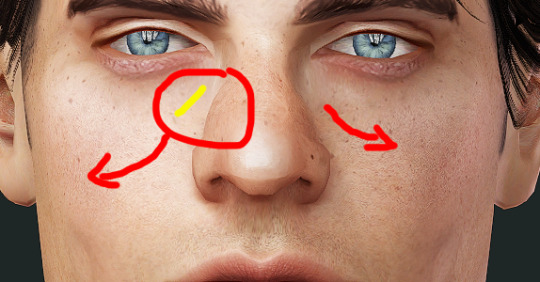
It's truly an INDISPENSABLE slider. One of many!
Since I make sliders, I usually just make some to specifically fix whatever issue I'm having. Granted they're made with general function in mind, which makes my cheater-y way of making things happen more useful in the future. I have about 50 experimental unfinished sliders in my game and can tell you that all my current sims use them for some reason or other. So I'm not working with nothing, I guess?
EYE SPY 👁
The best way to really get nice accurate looking sims is the eyes.
Pay attention to the slant of the eye, the shape and position of the upper and lower eyelids. you can use the game’s Eyelid Height slider, and AWT’s Eyelid width and height sliders (and many more)

and especially where the iris (green) sits relative to the eyelid. getting that shape and eyeball positioned correctly really makes a HUGE difference
I do suggest Bloom’s Eye slider (left and right) that rotate the eyes left and right. That along with their Lazy eye sliders can give your sims a less symmetric face and position the eyes to be FAR more accurate and realistic than the default.
I also recommend their vertical sliders (Eye lift or drop) to help with eye positioning.
I can't stress the importance of the right contacts or eyes for your sims. Of course it all depends on how you make your sims's eyes and all that. Take the last sim i posted about. It took forever and a half to find the right contacts that didn't need severe or intense editing to capture the same vibe the person he's based on. The problem is pretty persistent for me, and I am just speaking for myself when I say this is necessary. Iris size, shading, recolorability, detail, catch lights, and pupil position are things to consider for your play style and preferences.
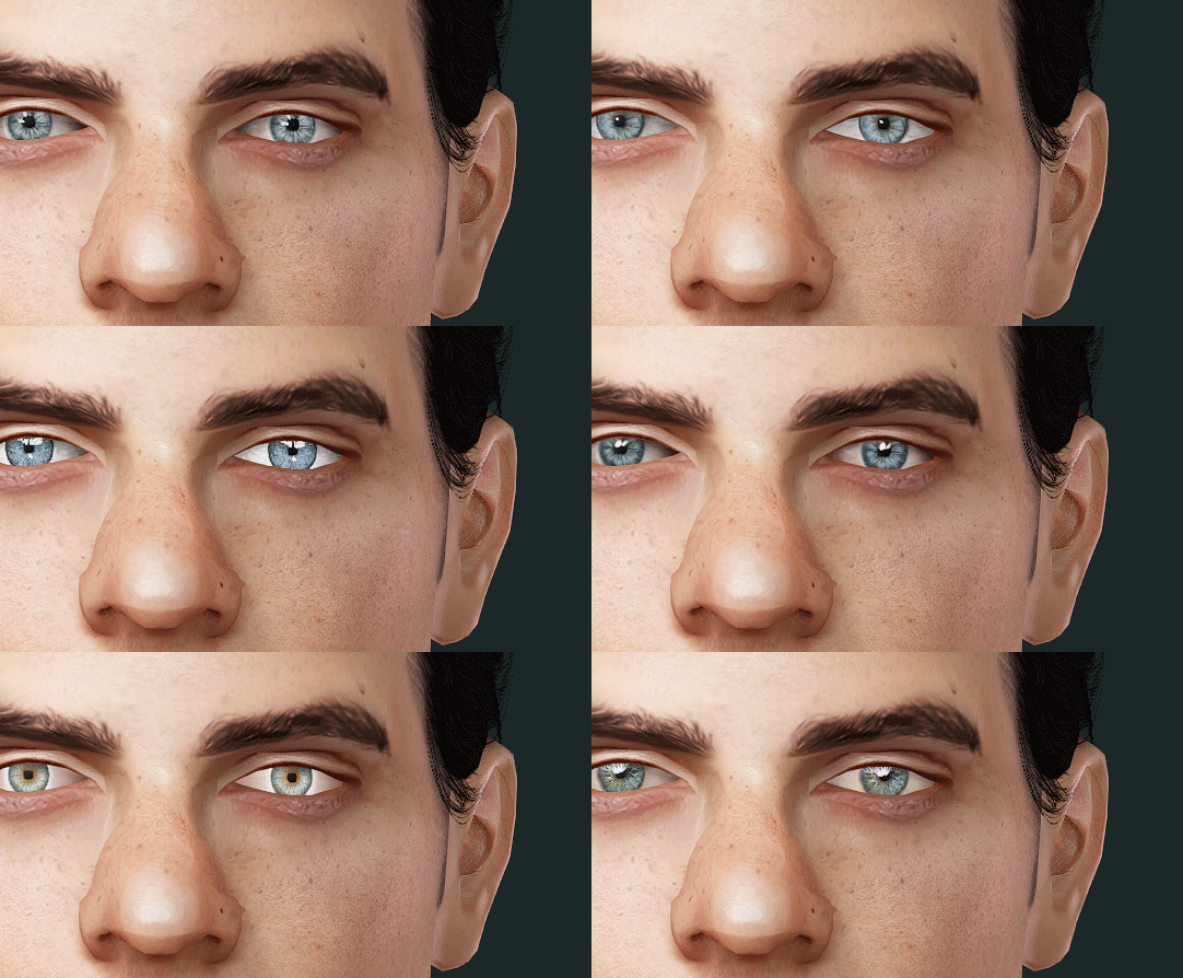
In addition to seeing what eyes will do the trick, I do edit the catch lights in the screenshots to give the eyes a different emotion or look. (I use defaults that get rid of the game-generated catch lights, and supernatural eye glow.) It's nice when that's all it is and I don't have to go in and photoshop things in and out to make them look human lmao

Perfect, schmerfect
And just know that as long as you have the same vibe or look going on it doesn't need to be perfect! Things will evolve over time, and you can change and perfect things as you go along, but close is better than trying to achieve an exact replica. We are working with the limitations of sliders and the optimized meshes they work on! So yeah there might be jagged bits or the profile might not exactly match and some things might not be accurate, but that's okay! Considering what sims look like at their default, you should be proud! I use the same mf eyebrows on all my sims basically and I tell myself they're just placeholders (yeah, right), but I manage to make them work with what I have!
Sliders, Makeup, and Skins, oh my!
a good base skin is critical, but not the end of the world if you pick the wrong one. They determine kind of definition and types of features highlighted on a sim 100000% and you might lose a feature you like or dislike when you change them! Feel free to switch up between skins you have to find the best fit.
Makeup can be a game-changer though!!! Any details you can add and help make your sim look the most like the person you're basing them off can go MILES.
In some cases, I've actually gotten really interesting results trying to get my sculpt as close as possible to real life references so the makeup makes a difference but don't define the features by themselves. Still, though, I utilize makeup up a LOT. [remember that if you use Nraas, you can layer makeup. Right-clicking makeup will also remove it if it's applied :)]
Here's the last sim i posted about when removing makeup:

no nosemasks really replicates the face-claim's nose (too shiny at the lower part) but it'll do 🤷♀️
Freckles, eyebags, highlighters, face shadows, pores, nosemasks, etc are all great!!
The way you move your sliders WILL effect how these look, so don't rely on makeup that adds super-specific detail or goes over an area you know is a jumbled mess because of sliders!
I do have a mess of recommendations and wcifs for skins and makeup. replies tag | wcif tag
[also I love compiling wcif cc lists for my sims it's great]
Finally, I appreciate your comment about my sims, mainly because I know they're not ever really exact copies or as close as I want to be to their real life counterparts, so thanks!! I've seen fellow simmers get really good results without messing as much as I do and I love when people can make really good maxis match likenesses because it's just so damn cool! It's truly a talent. I'm not one of those lucky few, but I like to try my way at it anyway. After what feels like some good progress I'll post a pic here. Even after doing this forever I don't feel like I'm an expert or can get good results in a shorter amount of time, but it's just fun to see the progression (or regression) of how my sims look.
63 notes
·
View notes
Text
How Do I Make Gifs? - A Photoshop CC Giffing Tutorial
(for @elektrawwf, and anyone else interested in how I make gifs I guess, lol)
So, I feel like I should preface this by saying that I'm certainly no expert on this, nor am I a Professional Giffer™, but I’ve been making gifs for a few years now, and have developed a pretty standard system for doing so. Hopefully it works for you like it’s worked for me! :)
Basic Tutorial Steps:
Step 1 - Recording the scene you want to gif
Step 2 - Importing, deleting, and cropping your gif frames
Step 3 - Adding adjustment layers
Step 4 - Resizing your gif and setting the frame delay
Step 5 - Converting and sharpening your gif
Step 6 - Trimming and saving your gif
BONUS STEP - Adding text (OPTIONAL)
-
Programs Used/Needed:
- QuickTime Player
- Photoshop CC 2018
-
The finished gif that I’ll be making:

This tutorial is VERY screenshot-heavy, so the rest of it will be below the cut. Happy giffing!
STEP 1 - Recording the scene you want to gif.
All gifs start as videos. I use the Screen Recording feature on QuickTime Player to create videos of whatever scenes I want to gif. If you have a Mac, you can find QuickTime in the Applications folder:
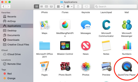
Right click, then select New Screen Recording.
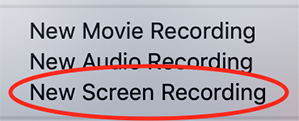
You can then play the scene you want to gif on your computer, and your screen with the video on it will be recorded. Hit the stop button when you want to end the recording, and then save the video.
It’s best to not record more than a minute or two at a time - basically, just record the exact scene that you’re looking for - because the longer the video is, the harder it’ll be to select the portion of it that you need for giffing.
You can technically screen-record any type of video, but I (and most giffers) vastly prefer videos that are 1080p, which is the best kind of HD. That’s why I usually don’t gif things unless I can find them either on Netflix, Youtube (in HD) or the CW site (or NBC, CBS, whatever). There are definitely other (less legal) ways to get your hands on HD videos, but I’m just not super comfortable using those lol.
That being said, 720p videos are usually okay for smaller (268px-wide) gifs - they’re just less ideal (I wouldn’t really recommend using them to make 540px-wide gifs, but you can still technically do it).
STEP 2 - Importing, deleting, and cropping your gif frames.
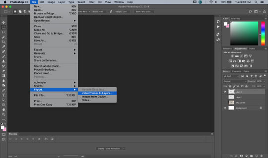
Now that you have your video, you have to import it into Photoshop. Once you open Photoshop, you need to go to File > Import, then select Video Frames to Layers.
A window will pop up, where you can set the amount of frames that you want Photoshop to import, and select the exact section of the video that you want to import. Here are my settings:
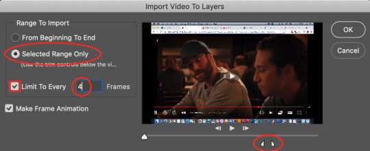
The two little toggles below the video are meant to be dragged around, and you use them to section out the specific Range of the video that you want to turn into a gif. Once you have all of this set up to your liking, hit OK.
-
NOTE: The selection of Limit To Every 4 Frames is more my personal preference than anything else. If you want Really Smooth Gifs, then you can uncheck that box and simply import every single frame in your Selected Range. This is what High Quality Giffers always say to do. Unfortunately, while those gifs do end up really smooth, they also end up being really short, which I don’t particularly like.
So basically, I’m personally willing to sacrifice some smoothness in favor of an increased gif length, but you do NOT have to do that if you don’t want to. Choose whichever option you like best - these Steps work no matter which one you do. (We’ll come back to this later though, once we get to setting the frame delay in Step 4).
-
Okay, back to the tutorial.
Once the scene is imported, you can delete any extraneous frames at the beginning and end of the frame animation Timeline, which can be found at the bottom of the screen.
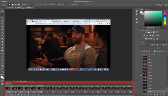
As you can see, I have the first 6 frames selected. Those are the ones I ended up deleting (among some others at the end of the Timeline).
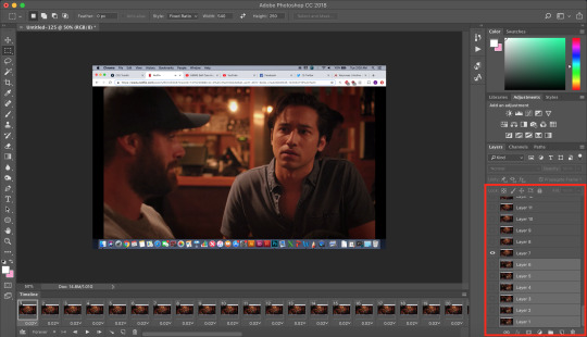
You can also go to the Layers panel on the right, and delete the corresponding layers from there, once you’ve deleted the frames. This isn’t technically necessary, but it might help free up some computing space if you’re deleting a lot of frames.
Next, you need to click the Selection Tool in the top left corner of the screen. Then, set your selection preferences (circled below) as follows:

Style: Fixed Ratio
Width: 540
Height: 250
This is specifically the ratio to set for a 540 x 250px sized gif, which are the dimensions of the example gif I’m making. If you want to place two gifs beside each other in a gifset, each gif needs to be 268px wide. (The heights can be whatever you want them to be.)
Use the Selection Tool to select the area that you want to be your gif, and then go to Image > Crop.
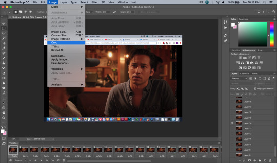
STEP 3 - Adding adjustment layers.
Now it’s time to make your gif look pretty™. For this part, you’ll be using the Adjustments panel above the Layers panel.
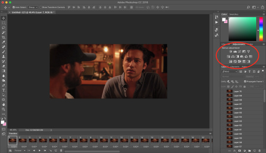
Adjustments will affect all the layers below it, so you want to make sure that your adjustment layers are placed above all of your gif layers.

These are the adjustment layers that I used for this specific gif, but they’re also just generally the same three adjustments that I use for every gif I make. (I also usually add a Hue/Saturation adjustment to my gifs, which I set to +15 Saturation, but since this scene was already so heavily saturated, it didn’t need it.)
Here are the specifications for the Brightness/Contrast and Levels adjustment layers:

Regarding the Curves adjustment layer (pictured below), if you click on the��RGB dropdown menu, you can single out specific colors in order to color-correct the gif, which I did here (by removing a lot of extra reds and yellows).
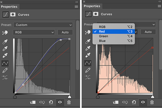
While these are good general adjustment examples, just take note that the values pictured here won’t be exactly the same for every gif, and you need to toggle and play around with them to make every new gif look its best.
Here’s the example scene before any adjustments:

And here’s the scene after my adjustments:

STEP 4 - Resizing your gif and setting the frame delay.
To resize your gif, go to Image > Image Size, and then change the gif’s width (in this example, I change the gif’s width to 540px).
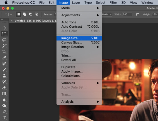

As long as Resample is checked the you’re working with Pixels, the gif should resize properly. Hit OK.
Next, to change the Frame Delay of the gif (basically how fast it goes), look for this button in the right corner of your Timeline, then click it and Select All Frames.

Once all the frames are selected, you can hit one of the little downward arrows next to the 0.02 values, and select Other.
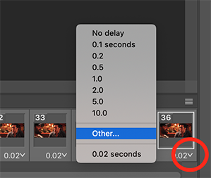
Now you can set your new frame delay. I always set my delay to 0.09 seconds, which produces gifs that are a bit slower than the Professional Gif Standard™. This is due to a combination of personal preference (I just like slower gifs) and an effort to maintain as much smoothness as possible, given how I choose to import my frames.
-
NOTE: Remember the NOTE from Step 2? Now, if you chose to import every frame, rather than “Every 4 Frames” like I do, then you should set your frame delay to 0.04.
Doing so will produce a final gif that looks like this:

Notice how this gif is smoother and faster, but also shorter than my example gif? Yeah. Like I said, whichever style of gif you choose to make is up to your own preference.
STEP 5 - Converting and sharpening your gif.
You never quite realize how blurry a gif really is until you Sharpen it. To do this, you first need to convert your Timeline from a Frame Animation to a solid Timeline. You can do this by making sure all your frames are still selected, and then clicking the Convert to Timeline button in the bottom left corner of the Timeline.

Now your Timeline should look purple, like it does in the picture below.
Next, you need to select all of your layers (MINUS the adjustment layers) on the right side of the screen. Once all of your layers are selected, go to Filter > Convert for Smart Filters.
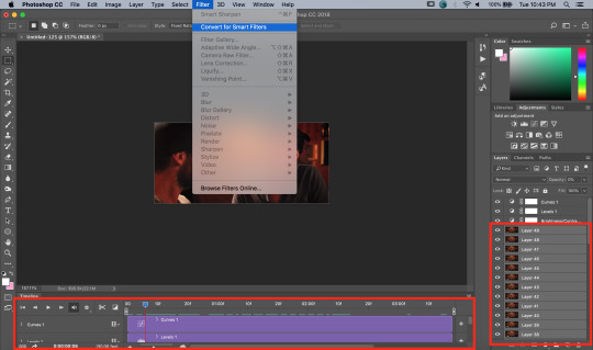
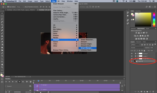
Once your gif layers have been compressed into a Smart Object (see circle below), you can select Filter > Sharpen > Smart Sharpen.
The first time you select Smart Sharpen, you need to set all the parameters for it. But once you do that the first time, you shouldn’t have to set them again. Basically, make sure your window looks exactly like this one:
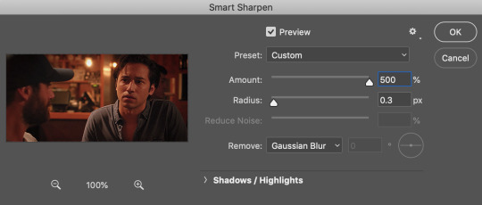
Then hit OK.
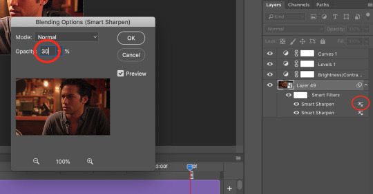
You’re going to do this TWICE (so you’re going to end up with TWO Smart Sharpen layers below your Smart Object layer). Then, you need to click the button to the right of the top Smart Sharpen layer, and change the opacity of that layer to 30%. (Otherwise, your gif will be way over-sharpened.)
STEP 6 - Trimming and saving your gif.
You’re almost done! It’s time to save your gif.
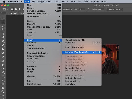
To save a gif, you must go to File > Export > Save For Web (Legacy).
However, this gif has a problem.


This number in the bottom left corner of the Save For Web window tells you the current size of your gif. As you can see, this gif’s size is currently 3.541 MB. That size wouldn’t be a problem if you were intending to upload this gif to Twitter, because Twitter has a gif size limit of 5 MB.
Tumblr, however, only has a size limit of 3 MB. So, to get your gif to work on tumblr, you need to Trim it.
Trimming is the process of changing the length of a gif without actually deleting any part of it permanently. This gives you the freedom to edit your gif and pick the portion of it that you like best.
You can easily trim your gif in the Timeline, by clicking the dragging the Gray Sliders at each end of it (see the arrows below). Wherever you leave the stoppers will become the new beginning and end of the gif. You can make this process more precise by using the Blue Slider (circled below) to choose where you want your stopper to go before you drag it there.

The Timeline pictured here has already been trimmed.
Trimming your gif will often require some trial and error. Whenever you want to check the length of your gif, simply go to Save For Web again and check the amount of MBs in your gif. (Click Cancel if your gif is still too big.)
Once your gif falls below 3 MB, you can finally save it!

The last thing you need to do before saving is change your Looping Options from Once to Forever in the bottom right corner of the window. Then, click Save.
You now officially have a finished gif!
Mine looks like this:

-
BONUS STEP - Adding text (OPTIONAL)
Now, I’ve just shown you how to make and save a gif. But what if you want to add text to that gif? I’ll show yow how to do that too.
First off, you should only add text after the rest of your gif is completely done and ready to be saved (basically, once you’ve already completed Steps 1-5). Then, before you save it, you can click on the Text button on the left side of the screen.
Click on the gif to create a new Text layer, and then type whatever you want. Generally, dialogue captions are placed in the middle of a gif towards the bottom, while other, more artistic types of Text can go wherever you want.
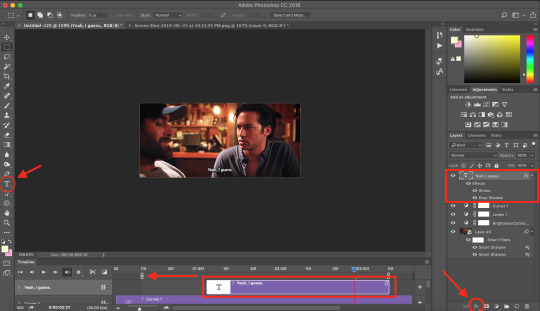
Now that you have a Text layer, you want to make sure of a few things. First, make sure that your Text layer is your TOP layer on the right side of the screen, above all of the Adjustment layers.
Next, you want to make sure that your Text layer spans your entire gif Timeline. Notice how my Text layer (depicted as a purple rectangle in the Timeline) doesn’t reach the Gray Slider on the left? To fix this, simply click and drag the Text layer until it extends past both Gray Sliders.
And finally, I always add Effects to my Text. You can do this by hitting the fx button in the bottom right of your screen. Specifically, I use the Stroke and Drop Shadow effects to make my gif stand out from whatever background it happens to be on.
My Stroke is always set to 1px thick, and my Drop Shadow settings are as follows:

As a final note, if you want your text to look exactly like mine, then you need to use the font Myriad Pro in size 14, which I then italicize and bold. You can also open Window > Characters, and make sure that your preferences look like this:

ALRIGHT. Now that you’ve added your extra text, you can FINALLY go to Step 6 and save your gif.
Now, your finished gif should look like this:

I hope this tutorial was helpful! I tried to be as thorough as possible to avoid any confusion, but if you have any additional questions, you should always feel free to ask me!
Have fun giffing!! :)
#my tutorials#my gifs#idk what else to tag this lol#gif tutorial#personal shit#long post#I'm so sorry to anyone on mobile with no read more
56 notes
·
View notes
Photo

One of the most frequent asks I get is “how do you make your gifs?” Previously I had just linked my FAQ where I have some resources on how to gif listed, but I figured to (hopefully) stop receiving the same ask over and over, I’d just make a tutorial on how I personally gif!
* Please note that everyone has different giffing styles and settings preferences, so the following is just how I make my gifs. Other people are likely to do things differently!
This post will be a comprehensive guide that includes details about DOWNLOADING VIDEOS, USING VAPOURSYNTH TO MAKE GIFS, USING PHOTOSHOP TO MAKE GIFS (+ a blurb on TOPAZ), and COLORING.
This post was last updated on July 30, 2020. Keep reading to get started!
DOWNLOADING VIDEOS
I use a number of sources to download videos/get video clips, depending on the origin of the video. In general, I try to gif from videos that are at least 1080p - the higher, the better. It’s almost impossible to make gifs look high quality if they don’t originate from a high quality video! Below are the sources I use:
TS files: kpop24hrs (you need an account), kpopexciting, occasionally torrent links from Google or download links from Twitter (search the group name + date in YYMMDD format + .ts)
Youtube videos: 4K Video Downloader
Vlive videos: Soshistagram
Twitter videos: Twitter Video Downloader
Instagram videos: Dredown
Long videos: If I don’t have the space (or patience) to download a certain video, or if it’s not a downloadable video (e.g. Fanship, paid online concert, etc.) then I screen record with Quicktime Player
(Side question: what’s a TS file? A TS file is essentially a very high quality video that you can find for live show performances and aired music show interviews! TS files are generally 60fps, so they’re how gifmakers can make those super clear and smooth live performance gifs. If a TS file is available for what you want to gif, use it.)
USING VAPOURSYNTH TO MAKE GIFS - OLD AND NEW VERSION
05/2020 update: I have re-installed Vapoursynth to its latest version, so I am including updated instructions/screenshots for both the old version (that I downloaded ~mid-2018) and the latest version.
After I’ve downloaded my video, I use Vapoursynth to crop, resize, sharpen, and denoise gifs. Vapoursynth is like Avisynth in that both programs can be used to crop and resize gifs without losing video quality, but VS has the added capabilities of sharpening and denoise. VS is the reason I don’t need to use Topaz on any of my gifs! You can install Vapoursynth here.
First you drag your video file to the Vapoursynth app installed on your computer. You’ll be prompted to enter a start timestamp in HH:MM:SS format (so if you want the video to start 5 seconds in, you would enter 00:00:05). Then you put the encoding duration also in HH:MM:SS format (if you want the video to be 8 seconds long, you would enter 00:00:08). Generally I’ll look for the exact moment I want to gif and enter the start timestamp 1 second earlier and have the encoding duration be between 3-5 seconds.
After you’ve entered this, a resizer.html window will automatically pop up. Below are screenshots of examples of my normal settings for my performance gif 4sets (ex. here or here) for both the old and new versions of Vapoursynth.
Old version:

New version:
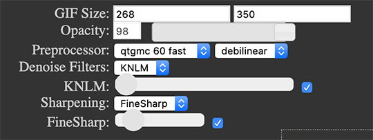
Below is an explanation of the parts:
GIF Size | The gif widths (the first number) recommended for Tumblr:
1 gif per row: 540px
2 gifs per row: 268px
3 gifs per row: 177px
You can use any height, but these are the ones that I tend to use:
1 gif per row: 243px or 300px most frequently, but sometimes I’ll do 220px/201px/400px/450px/540px depending on how large or small I want them
2 gifs per row: 350px
3 gifs per row: 300px, occasionally I’ll do 375px or 400px if it’s a very long video (e.g. some fancams)
Opacity | Don’t worry about this; it just changes how you view the video in the window.
Preprocessor | This refers to how the video will render! Super important because you’ll be given the option of 60 vs. 30 - these numbers refer to frames per second. For live performance gifs, I always use qtgmc 60 fast (slow in theory gives you better quality gifs but I’m far too impatient for that). For all other gifs, I do not use any preprocessing method. A basic rule is that if you’re using a TS file, you should preprocess it because it’ll de-interlace the file. If you’re using an mp4 or mkv or any other file, you don’t need to preprocess.
Extra Sharpening/Sharpening | Pretty self-explanatory. You can move the slider up or down depending on personal preference! I try to keep the sharpening low unless the video quality is especially bad. In the new version, I use FineSharp over VCFreq because I find the latter a little harsh for my tastes.
Denoise/Denoise Filters | Will help remove noise from gifs. In the old version, I almost always used the Light setting unless the video is super grainy, and then I might have chosen Medium instead. In the new version, I use KNLM at its lowest setting. I’ll only bump it up if the original video is quite grainy.
Once you’ve configured all your desired settings, you can copy & paste the output in the resizer.html window to your Vapoursynth editor file and enter the beginning and end frames.
The editor file for the old version:

The editor file for the new version:
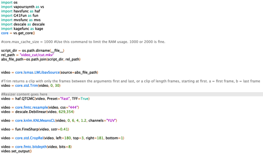
To make the gifs in the old version, just save the file and then wait until everything finishes processing! In the new version, you have to go to Script > Encode video, and then under the gif preset click ‘start.’ Wait until it finishes encoding. On my laptop, this takes anywhere from 20 seconds to 3-4 minutes, so sometimes you have to be patient. This is the end of the Vapoursynth portion of gifmaking.
USING PHOTOSHOP TO MAKE GIFS
To create gifs in Photoshop, go to File > Import > Video Frames to Layers and then select your video file/output file from Vapoursynth (output.mov). These are my settings to create the frame animation:

Once your frames have been imported, you can delete frames and add a coloring psd on top of all your layers.
Photoshop is also where you adjust the timing of your gif. In general, these are my settings:
30fps: 0.04/0.05
60fps: 0.02/0.03/occasionally 0.04 if I want it to be super slo-mo
Honestly, just use whatever timing setting that looks good to you! Some prefer faster gifs, others prefer slower, so just do what you like and things will be okay.
Save through File > Export > Save for Web (Legacy) with these settings (you can play around with selective vs. adaptive or diffusion vs. pattern; they all have slightly different looks, but 256 colors is a must):

Make sure your gif is under 8mb - to decrease a gif’s size, I usually delete frames and/or use selective color to increase the black percentage for whites, neutrals, and blacks.
After you save, you’ll have your gif! Below is the same moment giffed in different ways to illustrate how much a difference that file type + giffing style can make. You can tell that the TS file is higher quality and less grainy than the mp4 file, but it really isn’t unless you use Vapoursynth that the gif becomes super sharp and smooth. This is because if you import a TS file straight into Photoshop, it will only import at 30fps because the video itself is interlaced. You have to run it through a de-interlacer (like VS) to actually get a 60fps clip.

With regard to TOPAZ*, I mentioned above that because Vapoursynth has sharpening and denoise functionalities built into the program, I no longer use Topaz. However, if you do not have access to Vapoursynth, then I highly recommend downloading Topaz (download links can be found through quick searches on Tumblr) and using Denoise and Clean to adjust your gifs. A warning: Topaz can take a long time to process and many gifmakers have a love/hate relationship with it, so be prepared for that. The way you apply Topaz is to select all your frames and layers, then do Filter > Convert to Smart Filters. Add the Topaz/smart sharpen adjustments, then Flatten Frames Into Layers. Once that has happened, hit Convert Frames > Flatten Frames to Clips and then Convert Frames > Make Frames from Clips.
COLORING
I get questions a lot on coloring and the truth is that coloring is an art - I by no means consider myself an expert, but I do experiment a fair amount with different settings and layers so I at least have a decent understand of what’s possible when it comes to coloring.
A few tips I’ll give:
Everyone has different coloring preferences! Whatever coloring you like may not be what others like, and that’s okay. Don’t be afraid to experiment!
PSDs are good for learning how to color - download premade ones and look at how other people made them: what layers did they use? in what order did they put them? what blending mode? at what opacity? These are all questions you’ll need to ask yourself when you create your own PSDs. (Remember not to edit others’ PSDs if they do not allow it, and given them due credit when necessary. Also don’t claim as your own!)
Tips to bring out idols’ natural tan/unwhitewash: increase vibrance, decrease brightness + increase contrast, use selective color and decrease cyan and increase black on the reds channel, use a gradient map that goes from a black/dark red to light pink/coral and change the blending mode to soft light or decrease opacity of the layer to 20-40%.
Below are some examples to show how much a difference coloring can make. I’d consider a basic PSD one that has less than 10 coloring layers/doesn’t make much change to the actual coloring of the gif besides lighting adjustments. More complex PSDs generally have 15 or more layers (the ones I used below in have 16-25+) and drastically change the colors in the original gif. You can also mix PSDs too - for a lot of my performance gifs, I’ll first add a basic PSD that increases the contrast of a gif to make the skin glow, and then I’ll add an additional PSD that adjusts colors and other various lighting aspects.

You can see just how much of a difference coloring makes:
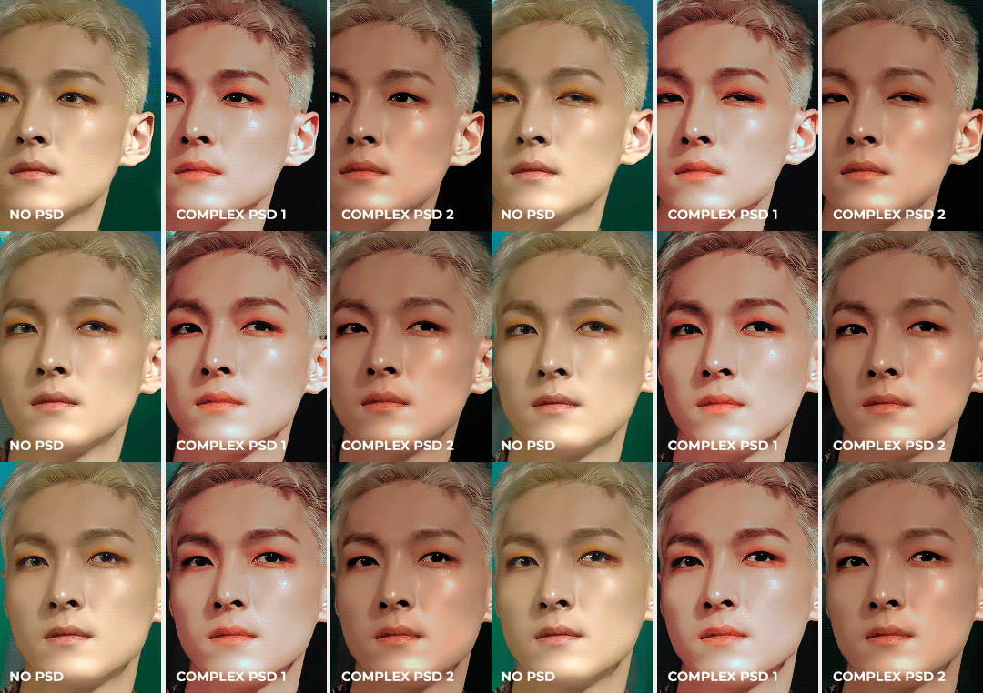
Don’t be afraid to experiment with different layers/styles! Everyone has individual preferences for how they like their gifs to look, and in a sense, coloring is the main way you can make gifs “yours.”
FINAL NOTES
Giffing is hard and requires a lot of patience - you definitely won’t be able to make amazing gifs right when you start! Even though I’ve been giffing for close to a year now, I still dislike many of the gifs I make and think that I can definitely improve. Don’t be afraid to reach out to other gifmakers for advice and help - 99% of the time, they’ll be happy to answer your questions!
I have posted a sped-up version of my gifmaking process here that you can also use as a resource!
Please let me know if I’ve missed something, and feel free to reach out if you still have questions. Good luck!
904 notes
·
View notes
Photo

Add Engagement With Interactive Media Plugins for WordPress
Visual engagement is an indispensable part of any website. Without it users won't engage with your content. It also means that you are not reaching any audience or grabbing attention, which in turn means you have no conversions and no revenue.
You need to create visual engagement that leads to satisfying user experiences that in turn create high conversions and high revenue.
But managing the large amount of images, audio, and videos you need to make your website function effective requires a lot of space and organization. You need plugins to save you time.
WordPress media is an umbrella term a large number of plugins including media library management plugins to interactive media plugins like audio, video, flipbooks, galleries, maps, countdown clocks, notifications, timelines, popups, and forms.
In this article I will show you some different types of WordPress media plugins available on CodeCanyon.
15 Best WordPress Audio Player and Video Player Plugins
CodeCanyon has a wide range of best-selling WordPress audio and video players. No matter what your vision for your audio or video content, there is a player...
Jane Baker
30 Nov 2018
WordPress
Top WordPress Audio and Video Plugins of 2019
WordPress audio and video plugins are essential if you are looking to add video and audio players to your website. Discover the best plugins for 2019 that...
Daniel Strongin
29 Apr 2019
WordPress Plugins
How to Add the Sticky HTML5 WordPress Music Player to Your Site
This tutorial will teach you how to quickly create a sticky music player for your WordPress website with continuous playback. This WordPress audio player...
Monty Shokeen
20 Sep 2019
WordPress
7 Best WordPress Video Gallery Plugins
Looking to add a beautiful video gallery or grid to your WordPress site? Figure out what you need, and then check out seven of the best video gallery plugins...
Kyle Sloka-Frey
25 Jan 2019
WordPress Plugins
6 Best Weather WordPress Widgets & Plugins
Websites for restaurants, retreat centers, country clubs, and many other businesses and organizations can benefit from a weather WordPress widget. Take a...
Kyle Sloka-Frey
28 Feb 2019
WordPress
Best Video Background Plugins for WordPress
If you’ve been thinking of adding a video background to your WordPress site, here are the eight best plugins available at CodeCanyon.
Nona Blackman
29 Sep 2017
WordPress
Understanding WordPress Media Plugins
Visuals are the best way to optimize your pages and content. Visual elements are called media. Media includes but is not limited to images, audio, video, animation, and so on.
Countdown clocks, contact forms, timelines, buttons, maps, notifications, icons, avatars, popups are also all media and are crucial to the success of a website.
When it comes to understanding WordPress media you have to start from the Media Library where you manage images, audio, video, and documents. The media library allows you to upload and manage media files, add images to posts, and even do quick edits to your images. You can also create galleries and subfolders.
But Media Library has a limit. If you run a website that requires few images then the built-in WordPress Media Library is enough. However, if you run large websites that require a lot of images, videos, audio, and more then you will need to use a media library management plugin.You will also need to use plugins specific to each different media element, for example gallery plugins for images, audio plugins for audio, video plugins for video and so on.
Types of WordPress Media Plugins
WordPress media plugins help you create, upload, store, manage, and display different kinds of media. In short, provide tools for managing and displaying your media.
The list below is not exhaustive but it shows what is included under the umbrella of WordPress media plugins:
media library management plugins: organizing and processing images, video or other media
interactive media plugins: for creating interactive experiences on your site
image builder plugins: for designing and creating new images using layers and effects
map plugins: for creating and displaying maps
galleries plugins: for displaying images
audio or video plugins: for adding audio or video players to your site
iframe plugins: for embedding other content on your site in an iframe
social media plugins: for embedding content from social media
avatar plugins: for displaying or creating user avatars
icons plugins: make it easy to add icons to your site
button plugins: for creating eye-catching buttons like CTAs (call to actions)
countdown plugins: for showing a countdown to some important event
What Do WordPress Media Management Plugins Do?
Different WordPress plugins work differently and what they do varies. But in general they help you:
categorize items according to theme, size, and more
add, delete, arrange, and sort items in the media library
add titles to media
do batch upload and add many images quickly
provide external storage for your media
manage how users interact with your media for example users can click on images and open them in separate pages.
Why Should You Use WordPress Media plugins?
They extend the functionality of your website back-end so it can handle large volumes of media.
They make your website more attractive to bring in users.
They allow users to easily navigate images and media on your website.
They increase user engagement and as a result conversions and profits.
They improve the SEO ranking of your website on search engines.
Things to Consider When Choosing a Media Plugin
Speed: You want a lightweight plugin that won’t slow down your website.
Features: Think about storage, integration with social networks, email marketing platforms, and payment gateways
Responsiveness and mobile-friendliness: More than 70% of traffic to websites comes from mobile devices. Does your media plugin work on mobile browsers?
Ease of use: You shouldn't require coding knowledge to be able to use Media plugins. They should be easy to use and customize.
Security: Users trust you with their personal and financial data. Choose media plugins that have a great track record when it comes to security.
Regular Updates: Regular updates solve security vulnerabilities. Choose a plugin with a track record of updates and maintenance.
Cost: Compare the prices of other plugins and see what fits your budget.
Ratings and reviews: What other users say is proof of quality of the plugin and the trustworthiness of the developer.
Downloads: The number of downloads is proof of popularity of the plugin among users. It shows they trust the provider.
Support: You may run into some issues. Make sure that the seller offers support. See what other users say about the quality of support from the provider.
WordPress Media Plugins on CodeCanyon
On CodeCanyon, will find many popular and best-selling WordPress media plugins that will make your website engaging to visitors. To help with your selection, I’ve classified them according to the categories below.
Media Library Management Plugins
The Media Library is where you can manage your images, audio, videos, and documents all in one place. The default WordPress Media Library is sufficient to manage a limited number of images. But business, magazine, and large blogging websites that regularly upload large numbers of images need plugins for efficient management of media files.
These top media management plugins will help you manage your media library.
WordPress Real Media Library
FileBird
Media Library Categories Premium
Dropr: Dropbox Plugin
Out-of-the-Box: Dropbox Plugin
Multisite Shared Media
Real Physical Media
Use-your-Drive: Google Drive Plugin
WP Media Manager
Groups File Access
File Manager Plugin
IconPress Pro: Icon Management Plugin
WP Media File Manager
FileBase: Media Library Folders
Leopard: WordPress Offload Media
Pixabay: Import Free Stock Images
WordPress Plugins
Organize Your WordPress Media Library With Folders
Daniel Strongin
WordPress Gallery and Slider Plugins
Gallery plugins have been covered extensively in other Envato Tuts+ posts. The articles below will lead you to an overview of gallery plugins available on CodeCanyon.
Image Builders and Virtual Tour Builders
Image and virtual tour building plugins make it easy to create new visual content for your site by combining other images.
Imagelinks: Interactive Image Builder
iPanorama 360: Interactive Virtual Tour Builder
Vision Interactive: Image Map Builder
WordPress
Best Interactive JavaScript Plugins to Liven Up Your WordPress Site
Lorca Lokassa Sa
WordPress Interactive Map Plugins
These plugins will help you add interactive map features to your website so users can learn geography or find directions for locations where they need to be!
Mapplic: Custom Interactive Map
Responsive Styled Google Map
5sec Google Maps
Interactive World Maps
Super Store Finder
Responsive Google Maps
Image Map Hotspot
Map List Pro
Advanced Google Maps
MapSVG
Interactive US Map
Agile Store Locator
WordPress Store Locator
WP Multi Store Locator Pro
WordPress
Add Google Maps and Social Login to Your WordPress Community With UserPro
Jessica Thornsby
Quiz, Survey, and Poll Plugins for WordPress
Surveys, quizzes, and polls are interactive forms. There are plugins that are specifically built to allow you to create your own engaging surveys, polls, and quizzes—all kinds of content that have been shown to be very popular with website visitors.
Buzzfeed Quiz Builder
Modal Survey: Poll Survey & Quiz
Advisor Quiz
OnionBuzz: Viral Quiz Maker
Quizmaker
Contest Bundle
ARI Stream Quiz
TotalPoll Pro
WordPress
Best WordPress Quiz Plugins of 2019
Monty Shokeen
WordPress
How to Pick a WordPress Form Builder Plugin
Lorca Lokassa Sa
Flipbook and PDF Viewer Plugins
Digital flipbooks look and feel like printed publications. Their pages can be flipped and turned. They’re a perfect way to show reports, presentations, magazines, catalogs, brochures, books, photo essays, and portfolios. They offer a great interactive experience. Try the following plugins and find out for yourself.
WordPress Flipbook
Real3D Flipbook
Diamond Flipbook
Responsive Flipbook Plugin
iPages Flipbook
PDF to Flipbook Extension
dFlip Flipbook
PDF Viewer for WordPress
PDF Light Viewer Pro
Bookshelf for Real3D Flipbook
WordPress
How to Find the Best WordPress Gallery Plugins for Images or Video
Lorca Lokassa Sa
WordPress
Best WordPress Flipbook Plugins Compared
Jane Baker
WordPress Video Plugins
These plugins are essential if you want to add video players to your website.
YouTube WordPress Video Import Plugin
Video Blogster Pro
Elite Video Player
Ultimate Video Player
Video Robot: Ultimate Video Importer
HTML5 Video Player and Full Screen Background
Image and Video Full Screen Background
Video Contest WordPress Plugin
Most Wanted WordPress Plugins Pack
Easy Video Player
WordPress
20 WordPress Video Plugins and Players to Add Engagement
Rachel McCollin
WordPress Audio Plugins
Similarly, these plugins are essential if you want to add audio players to your website.
Native Web Radio Player
Responsive HTML5 Radio Player Pro
ZoomSounds
tPlayer
Radio Player Shoutcast and Icecast
WavePlayer
MP3 Sticky Player
Responsive HTML5 Music Player
Hero Shoutcast and Icecast Radio Player
bzPlayer Pro
WordPress
15 Best WordPress Audio Player and Video Player Plugins
Jane Baker
WordPress Plugins
Top WordPress Audio and Video Plugins of 2019
Daniel Strongin
Social Media Plugins for WordPress
There are many media plugins and each fulfills a specific function like counting likes, creating posters, embedding carousels of content from social media, streaming, and so on.
Arqam: Social Counter Plugin
Easy Social Share Buttons
SocialFans: Responsive Social Counter Plugin
AX Social Stream: Social Board for WordPress
Flow-Flow Social Stream
Broadcast Extension for Flow-Flow Social Stream
Social Stream for WordPress with Carousel
Social Auto Poster
Pinterest Automatic Pin
Comment Slider for FaceBook
Instagram Journal
Grace - Instagram Feed Gallery
AccessPress Social
WordPress Plugins
20 Best Social Plugins for WordPress
Nona Blackman
Visual Timeline Plugins for WordPress
These timeline plugins will help connect events together to visually tell a story that is engaging.
Cool Timeline Pro
Content Timeline
WP Timeline
Everest Timeline
Visual Line
Social SEO FaceBook Responsive Timeline Feed
Avatar and Icon Plugins
Avatars are used for user profile images and creating a connection with the audience. Avatar plugins allow users to upload custom avatar images and showcase additional information about content authors.
Icons are symbols that represent particular information. Icon plugins come with collections of symbols that help you choose the relevant icon for particular information.
These plugins will help you add avatars and icons to your pages.
IconPress Pro: Icon Management Plugin
Iconize
LivIcons Evolution
User Avatars Plugin
SVG Avatars Generator
My Team Showcase
Heroes Assemble: Team Showcase Plugin
A Fancy WordPress Author List
All-in-One Support Button and Call Request
Social Sider
Easy Side Tab Pro
Button Plugins for WordPress
Buttons are the most effective tools to get your users to take action. You can use buttons to redirect users to a desired action like buy now, sign up now, purchase, or to a promotions link. These button plugins will get your users to take action.
Buttons X: Powerful Button Builder
Floatton: Floating Action Button
Easy Social Share Buttons
iframe Plugins
These plugins allow you to display content from external sites and sources on your website, so users don't have to leave your site.
Advanced iFrame Pro
Live Chat Unlimited
Live Chat Complete
Popups and Opt-in Plugins
How to convert your visitors to subscribers is an ongoing question. Popup opt-ins have the highest conversion rate of all opt-ins. But for popups to be effective they have to well designed and used thoughtfully. These popup and opt-in plugins will help you gain more conversions.
ConvertPlus
Slick Popup Pro
WordPress Popups Plugin
Ninja Popups
ConvertPlus Pop Plugin
Layered Popups
Popup Press
Opt-in Panda
Master Popups
Sidetabs Layered Popups
Popping Sidebars and Widgets
WordPress Vimeo YouTube Popup Plugin
Popup and Modals Windows Generator
WordPress Plugins
20+ Best Popup & Opt-In WordPress Plugins
Nona Blackman
WordPress
How to Create an Exit Popup With the Layered Popup Plugin for WordPress
Esther Vaati
Hover Effects Plugins
These plugins allow you to create engaging effects for images on your website. Effects like transitions, transforms, flips, animations and more.
Media Hovers
Hover Effects Pack
Image Hover Effects
Marvelous Hover Effects
Weather Plugins
For event planners and venue managers the weather is part of their planning. Bad weather can mean low attendance. These weather plugins help planning.
Astero
Always Sunny
Simple Weather
WordPress
6 Best Weather WordPress Widgets & Plugins
Kyle Sloka-Frey
Countdown and Timer Plugins
If you have a sale, product launch, or event to sell tickets for, these countdown times plugins will create a sense of urgency for users on your website and increase your conversions.
CountDown Pro
Product Countdown
WooCommerce Coupon Countdown
Countdown Timer
Viavi Countdown
Woo Sale Revolution
Everest Coming Soon
Notification Plugins
Notifications have a greater rate of opt-in than emails. They grab attention by appearing directly on the browser. This results in increased engagement, high rate of return audience, increased conversions and revenues. If you're serious about engaging an audience you already have, these notification plugins will bring users back to your website for more.
Apex Notification Bar
Advanced Floating Content
Warning Old Browser
HashBar Pro
Some Useful Bonus Plugins
Even though they don't fit into any category, these plugins are very useful for your website.
Reviewer WordPress Plugin
Yellow Pencil Visual CSS3 Editor
Cool Timeline Pro
Translator Revolution
XL WooCommerce Sales Triggers
WooCommerce Availability Scheduler
Conclusion
I hope the WordPress media plugins highlighted in this article will help you in your journey build a dynamic WordPress website for your business.
If you want to improve your skills building WordPress sites, check out our free WordPress tutorials.
Also the following articles will help you learn more about the WordPress media plugins available on CodeCanyon.
WordPress
15 Best WordPress Audio Player and Video Player Plugins
Jane Baker
WordPress
How to Add the Sticky HTML5 WordPress Music Player to Your Site
Monty Shokeen
WordPress
How to Use the WordPress Responsive YouTube Playlist Video Player Plugin
Sajal Soni
WordPress Plugins
7 Best WordPress Video Gallery Plugins
Kyle Sloka-Frey
WordPress
20 WordPress Video Plugins and Players to Add Engagement
Rachel McCollin
WordPress Plugins
How to Create an Interactive Slider With the LayerSlider Plugin for WordPress
Daniel Strongin
WordPress Plugins
20 Best Social Plugins for WordPress
Nona Blackman
WordPress
Automatically Create a Multilingual WordPress Site With a Translator Plugin
Esther Vaati
WordPress
Best Video Background Plugins for WordPress
Nona Blackman
WordPress
6 Best Weather WordPress Widgets & Plugins
Kyle Sloka-Frey
WordPress
20 WordPress Video Plugins and Players to Add Engagement
Rachel McCollin
WordPress Plugins
20+ Best Popup & Opt-In WordPress Plugins
Nona Blackman
by Lorca Lokassa Sa via Envato Tuts+ Code https://ift.tt/2q7nF8u
1 note
·
View note
Text
Dell XPS 17 (9700) review: The 17-inch laptop is back, and it's spectacular
Dell's XPS lineup has been among the best for years, and the company has gradually refined whatever pain points it did have, such as when it used to put the webcam below the screen. But this year, the lineup underwent a major redesign, with Dell chopping down the bezels even more, something that I wouldn't have guessed was possible.
The firm has long touted how small the footprint is on its laptops, always saying that the XPS 15 fits in the footprint of a 13-inch laptop, and that the XPS 13 fits into the footprint of an 11-inch laptop. With the XPS 15 fitting into an even smaller footprint this year, there was room for something bigger.
Dell announced the new XPS 17 in May, and it's the first new XPS 17 in around a decade. If you read my review of the latest XPS 15, then there are pretty much two things to know. The screen is bigger, and it's more powerful with Nvidia RTX graphics. In fact, it's the first XPS laptop ever with RTX graphics.
Obviously, these specs are for the unit that Dell sent me. The base model starts at $1,399.99, although that one has integrated graphics, a Core i5-10300H, an FHD screen, and 8GB RAM.
Design
While the XPS 17 was introduced alongside the XPS 15 redesign in May, this design was actually first shown in January at CES with the XPS 13. This design consists of a 16:10 display, narrow bezels on all four sides, and no USB Type-C ports. Indeed, if you put the XPS 13, 15, and 17 next to each other, they look nearly identical except for being different sizes.
The Dell XPS 17 is indeed the 17-inch laptop that can fit into the footprint of a 15-inch laptop. The most important thing that that means to me is that it can fit into a regular-sized bag. That's not always the case with 17-inch laptops; in fact, it's pretty rare. It's a bit heavy at five and a half pounds, but that's the kind of laptop that this is. It's got a lot of power under the hood, and it also fits into a small footprint. That combination makes the XPS 17 unique.
The top-down view is the one thing that looks the same. The chassis is made out of aluminum, and the laptop comes in a silver color with a chrome-colored Dell logo stamped in the lid.
The sides are silver-colored as well. This was a big change with the redesign since the sides have more traditionally been black. I think this gives it a much cleaner look. But as I mentioned, there are no USB Type-C ports, even on the 17-incher.
Instead, there are four Thunderbolt 3 ports, two of which are on each side. The bad news is that they're not full Thunderbolt 3 ports, so if you're like me and you work from a Thunderbolt 3 dock that has two 4K monitors attached to it, you won't be able to use the full resolution. My workaround was to disconnect one of the monitors from the dock and connect it directly to the laptop. Still, it's disappointing, considering how premium and powerful this PC is.
The cool thing about having two Thunderbolt 3 ports on each side is that you can charge the PC from either side. I know that this sounds like a small thing, but it's really nice, and it's a rarity in laptops.
Also on the right side, you'll find an SD card reader and a 3.5mm audio jack. I'm kind of surprised that the SD card reader is there with everything else being cut, but I guess it's nice that it's there.
Display and audio
The screen on the Dell XPS 17 is a flat 17 inches, compared to 17.3 inches on a traditional 17-inch laptop. The reason for that is because this has a 16:10 display, and to be clear, being that it's measured diagonally, this display is larger than a 17.3-inch 16:9 screen. It comes in your choice of 3840x2400 or 1920x1200 resolutions. Dell sent me the former, and it is absolutely beautiful.
It comes in at 500-nit brightness, so it works great in bright sunlight, and indoors, I only found myself using it at about 25% brightness. It also has 100% Adobe RGB, 94% DCI-P3, and a 1600:1 contrast ratio.
The colors are also nearly perfect, and that actually goes for whatever angle you're viewing the display from. Dell promises a 178-degree viewing angle, and it delivers. You can look at this thing from any angle and not see any visible distortions.
Plus, it's big. I'm not always a fan when companies make taller screens like this because it means that it's also narrower. But at 17 inches, there's plenty of screen real estate for everything.
The company also has something called Dell Cinema, which includes CinemaColor, CinemaSound, and CinemaStream. CinemaColor includes HDR technologies and more, and there's actually an included app that lets you apply different display settings such as movie, evening, sports, and animation.
The bezels are small, but that doesn't mean Dell removed the webcam, or moved it. It's shrunken down to fit into that tiny top bezel, and there's an IR camera for facial recognition as well. You're not making any sacrifices in that department like you would have been in the old days.
CinemaSound has to do with the Waves MaxxAudio Pro speakers. There's an app for that too, but this one is called MaxxAudio Pro instead of CinemaSound. The XPS 17 has large speakers on either side of the keyboard, and they sound fantastic. The dead giveaway is that it has both woofers and tweeters, a rarity on laptops.
Indeed, this has four speakers, two of which are 2.5W and two of which are 1.5W. Obviously, they're used for different frequencies. If you're looking for sound quality and volume in a laptop, you definitely came to the right place.
Keyboard and trackpad
The keyboard found in the XPS 17 is the same as can be found in its other clamshell laptops. Dell does have a technology called MagLev that it uses in the XPS 13 2-in-1 and XPS 15 2-in-1, but perhaps surprisingly, the technology didn't make it into the smaller, redesigned clamshells.
Dell didn't add a numpad, which is a decision that I'm happy with. I'm not a fan of the numpad, and it's not even easy to ignore because it moves the regular keyboard to the left, leaving it off-centered. I'll take the quad-speaker setup instead.
Key depth is 1.3mm, which is pretty standard for a consumer laptop these days. It's quite comfortable to type on, and it's definitely one of the better keyboards in a consumer laptop. If we were talking about commercial laptops, that might be another story, but we're not talking about commercial laptops. I find that I make very few mistakes with this keyboard, something that I do appreciate after using some keyboards that I've had some issues with.
There's a power button in the keyboard, which doubles as a fingerprint sensor. Unfortunately, you do have to scan your fingerprint after the PC boots up, as opposed to how everyone else with a fingerprint sensor in the power button does it, scanning your finger before it boots up.
Dell considers this to be a security issue, assuming that you might walk away from your PC between when you press the button and when it boots up and someone might sit in front of it. I have a bit more faith in the user than Dell does, and I think you'd get to know your PC and whether or not you're safe to grab a cup of coffee while it's booting up.
My favorite feature of the XPS 15 is on the XPS 17, which is that the Precision trackpad is massive. Huge trackpads are something that Apple introduced on its MacBook Pro PCs a while back, and I've been waiting for a Windows OEM to follow suit. If the real estate on the keyboard deck is there, I say use it. The large, clickable trackpad feels great, and it makes drag-and-drop operations a breeze.
Performance and battery life
Both performance and battery life are excellent on the XPS 17. This thing is great for anything. I used it for things from gaming with Forza Horizon 4 and Halo: Reach to 4K video editing to general work. Sure, there was the occasional bump in the road, particularly when it came to gaming, but it absolutely handled anything that I threw at it.
After all, this thing has top-end hardware for its class. It has an Intel Core i7-10875H processor, which has eight cores, 16 threads, and a 45W TDP. It's the better Core i7 from the H-series, the other one being the hexa-core Core i7-10750H. It's only bested by the Core i9-10885H, which is available in the XPS 17.
For graphics, it comes with an Nvidia GeForce RTX 2060 Max-Q with 6GB GDDR6. With RTX graphics, it supports things like real-time ray tracing and deep learning super sampling (DLSS). RTX graphics was how I knew it would support some solid gaming. You can get it with integrated graphics if you don't want the power at all, or you can get it with an Nvidia GeForce GTX 1650 Ti.
Keep in mind that this is a creator laptop, not a gaming laptop. It uses a 130W charger, while most gaming laptops are closer to the 230W range, and it doesn't have the thermals for it. This is primarily a work machine, but I'm here to let you know that it does have the power to play as well.
Even more impressive is battery life. I often say that you have to choose between power and battery life, and with the UHD+ display, you can bet that this uses a lot of power. I used it with the power slider one notch above the battery saver, and with the screen at around 25% brightness. I can tell you that you can easily get six hours out of this, and in many cases, you can take it further than that. With general work, I was able to get up to eight hours.
Of course, the touchscreen model comes with a 97Whr battery. In other words, this has one of the biggest batteries that you'll find in any laptop (much larger and you can't take it on a plane). The non-touch model comes with a 56Whr battery.
For benchmarks, I used PCMark 8, PCMark 10, 3DMark, VRMark, Geekbench, and Cinebench.
If you're not the type to go through benchmark scores, all you need to know is that this is a powerful machine.
Conclusion
My biggest complaint about the Dell XPS 17 is that it doesn't have full Thunderbolt 3 ports, which would have been able to handle two 4K displays on a single port. If that bothers you too, just wait for the next one. Intel's next generation of CPUs is going to support Thunderbolt 4, which is really just the full Thunderbolt 3 that I'm describing. My other gripe is that there's no cellular model. I realize that it's something of a rare feature on more powerful laptops, probably because it uses battery, but I don't care. It's 2020 and I should be able to work from anywhere.
Let's be clear that this is an absolutely incredible laptop that's nearly perfect. It's an absolute pleasure to use, no matter what you're using it for. If you're playing games, it can do that. If you're streaming movies, it's got a killer HDR display and stunning speakers. If you want to edit video, it's got the power for that as well.
All of it comes in a beautiful chassis and yes, a small footprint. The fact that this thing has a 17-inch display and can fit in a regular bag is a feat of engineering. Honestly, the Dell XPS 17 is in a class all its own, and I can't think of anything like it. If you're looking for a laptop that can do everything, this is it.
1 note
·
View note
Link
What Are the Best Free SEO Friendly WordPress Themes?
The Best WordPress Themes are the ones that work for your business, so this post will cover the absolute best Free SEO Friendly WordPress Themes as well as some Premiums!
Your website is a valuable tool for communicating with your customers, building leads and driving sales. Website design often plays a significant part in ensuring the success of a company. To help businesses create great looking and highly functional business websites, WordPress offers up ready-made themes. And why not? WordPress powers more than 74 million websites and counting, WordPress is the world’s leading content management system (CMS). It’s fast, efficient, easy to modify, and well supported by WordPress Web Developers World Wide.
I’ve seen some business managers cringe at the phrase ‘WordPress’, but I’m not sure why this is… WordPress is most certainly NOT an inferior platform. It’s the most widely used platform for website developers to build on for a reason, and not just little Mom and Pop sites. Some of the biggest, baddest website are powered by WordPress.
Search Engine Journal stated that some of the sites powered by WordPress include brands ranging from NASA, CNN, Forbes, The New York Times, TechCrunch, IZOD, Best Buy, GM, eBay, and even Jay Z’s LifeandTimes.com, to name just a few. Even Google’s Matt Cutts is a fan of WordPress, calling it “a fantastic piece of software.”
8% of the top 100 blogs according to Technorati are managed with WordPress.
2,645 of the top 10k websites on the web use WordPress.
22,111 of the top 100k websites use WordPress.
297,629 of the top 1M websites use WordPress.
WordPress themes can definitely allow you to have a professionally designed website without the pain or expense of hiring a professional web designer. However, because WordPress is an open- source platform, there are plenty of free themes and plugins, but that doesn’t mean that they are all created equal. In fact, there are a ton of just plain bad plugins and website themes out there ready to hinder your online business.
There are also literally thousands of professionally designed Free SEO friendly WordPress Themes that are great.
With over two thousand free themes available in the official WordPress Theme Directory and even more available for a fee at commercial sites like Theme Forest, StudioPress, and WooThemes, how in the Hell do you choose the BEST responsive SEO friendly WordPress Theme?
When choosing a Free WordPress theme or even a premium theme to customize, you should make your decision based on the number of active installs, user reviews and support responses. Here we have come up with the Best WordPress themes both free and paid for making a truly excellent SEO and mobile friendly website.
The Absolute Best and Most popular SEO friendly WordPress themes for web design
Figuring out how to choose the best free SEO friendly WordPress Theme can be a very confusing and tiring task. So, to help ease your burden, I’m providing a list of the best and the most popular responsive themes on WordPress. These themes are custom built and also provide the features required to run and promote your business.
Hestia Free WordPress Theme:
Hestia is a free and highly praised WordPress Theme for providing many advanced features that typically come with paid themes. It is 100% translation ready, and most importantly, it is SEO friendly, and thus is popular among start-ups. It provides options for custom backgrounds, and live customization is speed optimized. Just like Avada, integration with WooCommerce is also offered, and drag-drop contents builders are easy to operate as well.
Sydney Free WordPress Theme:
The theme is responsive and uses a parallax background. It is customizable, and it also provides full access to Google fonts. Along with it, it is 100% translation ready in any language. Sydney is a powerful business theme that provides a fast way for companies or freelancers to create an awesome online presence. Sydney makes it super easy to control color, layout as well as your logo upload, full screen slider, header image, sticky navigation and much more. Also, Sydney provides all the construction blocks you need to rapidly create an engaging front page.
Avada Premium WordPress Theme:
Avada creative is THE #1 Selling WordPress Theme of all time developed by ThemeForest. It is responsive, clean and follows a minimalistic design approach. Nicknamed thr “Swiss Army Knife,” it is entirely customizable and provides integration with WooCommerce, comes with Fusion Slider as well and incorporates drag- and- drop fusion page builder. It’s the number one theme for a reason — newbies and experienced developers can use Avada as a foundation for any online business.
Astrid Free WordPress Theme:
Astrid is a pretty minimalist theme specially made for small businesses which require simple web design. Its formation is modernist which makes the website very professional in look. It has way too many fonts and colors as well as full-width header image (usually comes with a cost).
Total – Responsive Multi-Purpose WordPress Theme:
Total is used by more than 22,500 customers and has the 5 star rating to support how awesome it is. Along with its drag and drop options, responsive design and SEO optimization, it has more than 50 builder blocks which help in creating amazing layouts. It has advanced customizer where one can customize nearly anything, and it makes editing pretty easy. It is translation and Child Theme Ready. It’s surprising how light weight and fast this theme operates especially with how feature rich it is.
Zerif Lite Free WordPress Theme:
Zerif is a beautiful theme that comes equipped with WooCommerce, and also has an advanced live customizer. Zerif Lite is SEO ready and pretty easy to set up as well (takes less than a minute), and it provides demo content to the potential users. It is smart theme well ahead of its time and is optimized for speed. The only negative side it possesses ii that it is not free.
Spacious Multipurpose Responsive WordPress Theme:
Spacious is free SEO friendly WordPress theme which has a minimalistic design with a playful and clean layout. Though it only provides 13 widget areas — this is not a timid or weak structure. Since it is free, it has four-page layouts and two-page templates as well. Because this site is somewhat limited it may not be ideal for designing business websites, but can be a great personal website foundation.
Jevelin Multi-Purpose Premium Responsive WordPress Theme
:
Jevelin is a premium multi-purpose WordPress theme which provides a robust set of templates, plugins, and tools. It is designed to harness the advantage of WooCommerce plugin. Its highlight is that it offers a library of full-fledged demo websites and has six portfolio layout options along with many custom settings.
All of these WordPress Themes make editing your website’s content pretty darn easy with build in page editing tools:
All of these Free and Premium WordPress Themes come packed with unique page layouts and templates, including a variety of portfolio options. These page designs can be mixed and match to help you create a totally unique website. As they’re all fully customizable, it’s easy to make your website match your brand. Countless Customization Options Thanks to the intuitive theme options control panel, you can customize almost every aspect of your website without ever touching a line of code. Creating custom color schemes, changing the fonts, and adjusting the site layouts are just some of the modifications you can make using one of these WordPress Themes.
What Makes These the Best Free SEO Friendly WordPress Themes?
When it comes to website platforms for SEO purposes, WordPress is the only one that actually comes Google recommended. Another interesting fact, Websites run on WordPress see 93% more inbound links. It’s no wonder, that companies like Profit Surge (http://www.profitsurgeseo.com/kansas-city), a well respected SEO service provider use WordPress combined with social media platforms to drive powerful results.
The real beauty of WordPress is its ability to encourage higher search rankings with minimal effort, and the Free and Premium Themes mentioned above are set up for optimal SEO right out of the box including:
Search Engine-Friendly URLs
Rather than using generic, nondescript URLs (e.g. www.yoursite.com/xyz123), you can set up WordPress to create new pages using a more meaningful URL structure such as www.yoursite.com/marketing-tips. This is done by logging into the WordPress dashboard and choosing Settings > Permalinks, at which point you can choose from several different formats. If you want your site’s URLs to contains the respective page’s title, select “Post name” – this is the recommended option, and it works for both post and page URLs.
Auto Pings New Content to Search Engines
It’s not uncommon for search engines to index new WordPress posts and pages within minutes of it being published. How in the world can Google find, let alone index, your website’s content in such little time? By default, WordPress notifies pingomatic.com when you publish new content, which then notifies all of the major search engines.
While pingomatic is the default pinging service used in WordPress, you can add your own to the list under Settings > Writing > Update Services.
Post and Page Scheduling
If you keep up with our blog here at PixelProductionsInc.com, you’re probably well aware of the importance of publishing fresh content to your website on a regular basis. According to Google, content is the single most important element on a website, so this is one step you shouldn’t overlook.
Unfortunately, not everyone is able to research and write high-quality articles every other day, which is where WordPress comes into play: it features a nifty scheduling tool that allows users to schedule posts and pages to be published at a later date. Using this tool, you can create several articles, scheduling them to be published every couple of days.
Visitor Commenting
The SEO benefits of WordPress don’t end there. This highly popular content management system comes with a built-in commenting feature. If a visitor wants to share their thoughts or ask a question related to an article, they can do in the commenting section.
How can this benefit your site’s search ranking? Each time a visitor leaves a comment, it creates new content for your website – content that search engines LOVE. Yes, you’ll probably receive some spam comments (consider it a badge of honor), but you’ll also receive some constructive comments from real human visitors, and those are the comments that will boost your site’s ranking and overall level of engagement.
Conclusion
WordPress themes have been providing an extensive alternative to traditional web design culture. Many WordPress themes, including the ones listed in this post are developed by experienced web development firms who are well aware of current market trends, user requirements, and solutions to delivering content to consumers most effectively.
Using WordPress themes for web design and development can definitely provide your business with a competitive edge and at the very least provide your business with a solid foundation for seo and delivering mobile content effectively. As a business manager, you have enough hurdles — why not join hundreds of thousands of other business owners in running WordPress to make some of your daily marketing tasks a bit easier?
0 notes
Text
Best WordPress Hosting Themes for Building a Web Host Business | Templified
New Post has been published on https://templified.com/best-wordpress-hosting-themes/
Best WordPress Hosting Themes for Building a Web Host Business
If you’re looking to create a hosting business, WordPress, plus a well made theme that’s specifically made for hosting businesses. These themes have plenty of features, great looking style and they’re user friendly to boot. It used to be pretty difficult to create a hosting business from the ground up. You needed a lot of in depth knowledge and a specifically made website that could cost quite a bit of money to get started. Those days are long gone, thanks to WordPress and any of the themes in this collection.
Most of these themes offer a variety of demo styles and designs that can be imported quickly and without a lot of coding knowledge. You can get a professional, stylish web hosting company off the ground in just a few minutes.
Now, it’s not just about design, there are some very specific tools included in this collection that are made for hosting companies. These themes offer full compatibility for WHMCS, which means anyone who comes to your website can check for and register domain names, manage hosting accounts and a lot more from your website. This integration is very important, since you’ll want your hosting business to be the only place folks need to go to register a domain, install their content management system and get started building their own website.
So, here they are, some of the absolute best WordPress hosting themes we’ve found so far.
Host Pro, Professional Cloud Hosting WordPress Theme
With Visual Composer onboard, a perfect responsive design and the Redux Theme Options Panel for making adjustments and edits to your website, Hostpro is a fine entry in the web hosting category. With this theme, you’re going to have the power and flexibility to create a really strong web hosting business.
Hostpro is a creative and clean WordPress theme that is also ideal for creative agencies, tech websites and product promotions. Basically, Hostpro the works great for any creative company site. This theme comes with several different unique pages, it’s a really colorful theme and super simple to customize. You get one click a demo installation, access to go over 600 Google fonts for cool typography and this theme still has a perfect rating on Theme Forest. Check out some more general WordPress business themes for more like this one.
Demo More Information Get Hosting
Arka Host, Premium Hosting Theme for WordPress
Arka Host is one of the best selling WordPress hosting themes ever. In fact, for two years straight, 2016 and 2017, it was the most popular who sings theme in the world. It’s rating is still quite high and people are still enjoying it. This theme is easy to install and easy to customize. It comes with full support for WHMCS, that means that your visitors and users can purchase hosting and purchase a domain through your website. This is ideal for any hosting business that wants to be a full service hosting provider, whether it’s a cloud hosting, shared or VPS.
Demo More Information Get Hosting
SuperHost, WHMCS Compatible WordPress Theme
SuperHost is very lightweight, one page hosting theme with several different WHMCS order form templates included. This theme was specifically designed to meet all the requirements of web hosts. It’s a premium theme that has a number of different features that are very specific to hosting. but, not all of the features are specific to that design, that means this theme could work for just about any sort of application or tech website. You got extensive documentation, it is easy to use and quick to set up. SuperHost has a responsive layout, includes a contact form and it works great on all devices. There are more one page themes available here.
Demo More Information Get Hosting
Veda, Web Hosting Theme for WordPress
Veda is all around multi-purpose theme that comes with quite a number of different you need to get them out. One of these is specifically set up for web hosting companies. It’s also great for web services like website security and SEO services. But, I think that it works best as a hosting provider website. You get access to a wide range of tools to help keep your website running smoothly and looking great. There are custom 404 pages included, coming soon countdown clocks and more. This theme is compatible with WooCommerce, bbPress and BuddyPress, events calendar pro and it comes complete with visual composer to give you an added level of customization.
Demo More Information Get Hosting
HiBreed, Web Host and Domain Registrar WordPress Theme
Building a website hosting company isn’t nearly as difficult as it once was. With themes like HiBreed here, you get all the tools that you need to create a really awesome web hosting company. You’ll even be able to allow your visitors to registered domains through your website. This is a perfect solution for domain registration, web hosting companies and more. His theme is clean and responsive, it gives you the ability to drag and drop content blocks anywhere you want them on your page, it’s incredibly simple to use and there are multiple stylish options to choose from to get yourself a great looking, clean and professional website quickly and
Demo More Information Get Hosting
Linksy, WordPress Shared, VPS and Cloud Hosting Theme with WHMCS
Building a really great web hosting company used to be a challenge. Thankfully, there are quite a number of great looking WordPress themes here to help out. Linksy is one such theme, it’s great for tech startups, web hosting, software development companies, domain registrars and ISP providers. This is a progressive theme that is great for any sort of internet company that wants to provide these types of services. She has a very professional and clean design, it’s quite simple to use and you can have it up and running quickly. The support is some of the best I’ve seen and the documentation is extensive, making this a great theme for any would-be web hosting start up.
If you’re looking to provide hosting services to clients or customers, if you are a web designer or WordPress mean designer who wants to increase your revenue base, or if you are just curious about getting into the WordPress or web hosting game, a template like linksy could be the first step to building a very successful online business. Linksy is perfect for helping you construct a high-quality hosting business, even if you are not yet an expert in providing hosting yourself. This theme is incredibly user-friendly, it does everything that it can to provide the right platform for crafting this type of business from the ground up.
Linksy claims to be a lightning fast loading, clean and professional theme that is great for hosting providers. Looking at a rundown of the features that this theme offers, I do believe that it offers a lot of what you’re going to need to become an online registrar, offer Internet Security Services, hosting services or computer networks. This template gives you a dynamic accent color scheme choices, it includes slider Revolution for maximizing the impact of your front page, there is an integrated team plug into showcase everyone who works for you. Best of all, the PSD files are included and they are perfectly well organized, making it simple to customize the feel of your website. Unison is the framework, it’s a great one for fast loading, well-designed web pages. This theme is fully responsive, simple to customize and includes several different custom widgets, five star support and top-notch theme documentation. This is a template that has a little bit of everything for everyone.
Looking for more hosting themes for WordPress? Well, take a look at our full collection, we have gathered up quite a number of different themes that I think you might be interested in. We will continue to add to that collection as often as we find a great theme, but I’m not quite ready to put a Linksy on there just yet. We’ll need to see how the reviews work and this theme has not been very popular in its first couple weeks on the market, so I’m not entirely sure that it will ever get there.
DemoMore Information Get Hosting
MaxHost, Premium WordPress Hosting Company Theme
MaxHost is WordPress theme that is a professionally designed web hosting and corporate business WordPress template. This MaxHost theme comes with a WHMCS template, works perfectly with woocommerce and revolution slider and visual composer are also included. For keeping in touch with your clients, MailChimp is fully supported and mega menu helps make your navigation very simple and straightforward. This theme comes with an extensive set of documentation, the support is fantastic and it’s one of the smoothest scrolling, fastest loading parallax themes I’ve ever seen. with the latest version, WooCommerce and Gutenberg are also supported fully. This responsive theme can be set up easily and you’ll be on your way to having a high-quality web hosting business of your own within just a few minutes.
Demo More Information Get Hosting
Weston, Premium WordPress Theme for Hosting Businesses
While this Weston WordPress theme is not marketed specifically as a hosting template, it’s a lightweight and easy to use drag-and-drop theme that Has all the tools that you need to start a web hosting business. You just need to add a few plugins and you’ll be on the go. This theme is highly customizable, simple to use and the theme developers do a great job of supporting all of their templates and that is just one of the reasons I recommend this template.
Demo More Information Get Hosting
0 notes
Text
Top 12 Web-Based Color Tools for Web Designers
Picking the perfect color scheme shouldn’t be a miserable task. All you need are the right tools for the job and an eye for design.
I can’t help develop your eye for picking colors, but I can share a bunch of handy color tools that’ll likely improve your eye as you use them.
These tools are all 100% free, so they’re easy to bookmark and reuse time & time again. They can also work for web, mobile, print, or any other medium that needs incredible colors.
1. ColorHexa
Recently I was browsing the web and stumbled onto ColorHexa. It’s by far one of the coolest color tools I’ve ever seen.
This isn’t technically a color generator or a scheme design tool. Instead, it’s an information library on all colors with suggested gradient ideas, related shades, and dozens of color codes(ex: hex, RGB, CMYK, CIE-LAB, HSL and more).
You’ll never find a more complete list of information on color. This is super useful for all designers, including web designers, and it’s a great place to start researching colors for your projects.
2. Colors.css
If you do some research into color psychology you’ll learn how different colors stack together & what sort of mood they give. This plays into contrast for certain types of colors and how they work together.
Every browser comes with default colors that are often too harsh. Colors.css fixes that.
It’s a free CSS library that restyles the default color palette. This means you can use color names like “blue” and “red” with totally different values.
They even have an entire accessibility page full of ideas for matching color schemes that’ll improve readability on your site.
3. ColorPick Eyedropper Extension
How often do you find a site with a beautiful color scheme? I find amazing sites all the time and it’s difficult to export those colors from the stylesheet.
You can use Chrome DevTools but this requires digging around in the code to pick out the hex colors. Instead you can use the ColorPick Eyedropper extension made exclusively for Google Chrome.
You just click the toggle window in the extensions panel, then hover any color you want to study. This gives you the full hex code along with a “copy” link to copy the exact color to your clipboard.
Pretty cool right? And it’s a free plugin, so there’s nothing to lose by trying it out.
4. Coolors
The Coolors site is a large color scheme generator. You can find dozens of generators on the web, but this one’s a little different since it supports Adobe programs with its own add-on.
You can also get this as a Chrome extension or even as a custom iOS app for your phone.
Really the true value is in the browser webapp that auto-generates color schemes on the fly. You can then mix & match colors, change settings, adjust for color blindness, and randomize your own schemes based on certain criteria.
It’s a great application, but it comes with a small learning curve. Shouldn’t take you more than 15-20 minutes to figure out how it all works.
5. Palettte App
Palettte is color editing and remapping tool. It allows you to build color schemes that flow from one to another and fine-tune individual color swatches. You can also import, analyze, and editing existing color schemes. The creator has written more on the motivations behind this color app.
6. Material UI Colors
With a quick Google search you’ll find a bunch of sweet material design tools on the web. They seem never-ending and many of them rely on the color styles typically found in Android apps.
With the Material UI Colors webapp you can find perfect color schemes that match with Google’s material guidelines.
Easily change the tint of all colors with the slider in the top-left corner of the screen. Or randomize your selections to match an existing site’s color choices.
You can also switch between hex and RGB depending on whatever format you want. A great app for material design lovers.
7. Color Supply
The Color Supply website is pretty unique but also very strange. It gives you a bunch of interesting color tools for matching color schemes, picking the foregrounds & backgrounds, plus different ways to compare how those colors would look on a page.
But this doesn’t have any guide or specific purpose. It acts like a color scheme generator that you have to just kind of learn as you go.
It will output different colors with hex codes near the bottom of the page to copy. Plus it’ll show you how those colors work in a gradient, in icons, and with text. Nice tool but it comes with an awkward learning curve.
8. Color Safe
The WCAG works hard towards a more accessible web. Color is one of the easiest ways to build your accessibility without losing time testing.
Color Safe is a free webapp that can test your color choices. You pick from a small set of fonts & sizes, then pick whatever colors you want for your foreground & background.
From there you’ll get an accessibility rating along with suggestions on how to improve your color choices(if needed).
Really great tool for anyone concerned about accessibility on the web.
9. Color Hunt
For a user-curated gallery of color schemes take a look at Color Hunt.
This free project was launched a couple of years back and continues to be a source of design inspiration. People submit their own color schemes into the site, then others vote on those color schemes.
You can sort by newest or by most popular and even vote on your favorites. Pretty cool right?
It’s an extremely simple web app so don’t expect too many features. It’s just a neat way to visually browse through many different color patterns at once.
10. Open Color
Looking for something a little more web-friendly? Then check out the Open Color library.
This is a massive open source collection of color choices built around accessibility and browser support. Each color has been optimized for easy matching regardless of your layout’s design.
Check out the GitHub repo for more info and to download a copy of the styles.
11. HTML Color Codes
HTML Color Codes is another info-focused color webapp.
This lets you pull all forms of HTML/CSS code for your color choices right from the app. You can search for any color you want, or go by their recommendations. Plus this even has a tool for generating color palettes that you can download as Adobe Swatch files.
Don’t let the name fool you: this app is for more than just HTML color.
It’s a brilliant tool for digital designers of all types who want easy access to color codes and reusable palettes.
12. Adobe Color CC
I can’t pass over the incredible Adobe Color CC webapp.
This free tool used to be called Adobe Kuler but it’s gone through a few iterations over the years. It’s still a free color picker but the interface has changed to make it easier for designers to build & save color schemes.
If you’re an Adobe user this tool is worth bookmarking. It supports up to 5 different colors in one scheme, and you can even upload images to pull dynamic color schemes automatically.
from Web Designing https://1stwebdesigner.com/web-based-color-tools/
0 notes