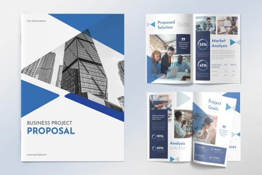
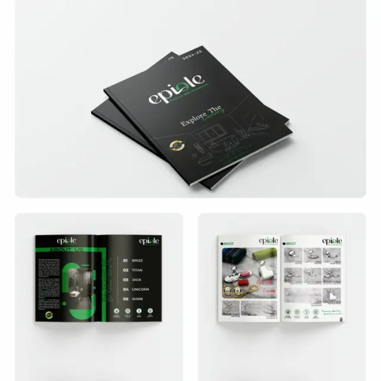
#BROCHURE DESIGN
Explore tagged Tumblr posts
boanerges20 · 6 months ago
Text
Tumblr media
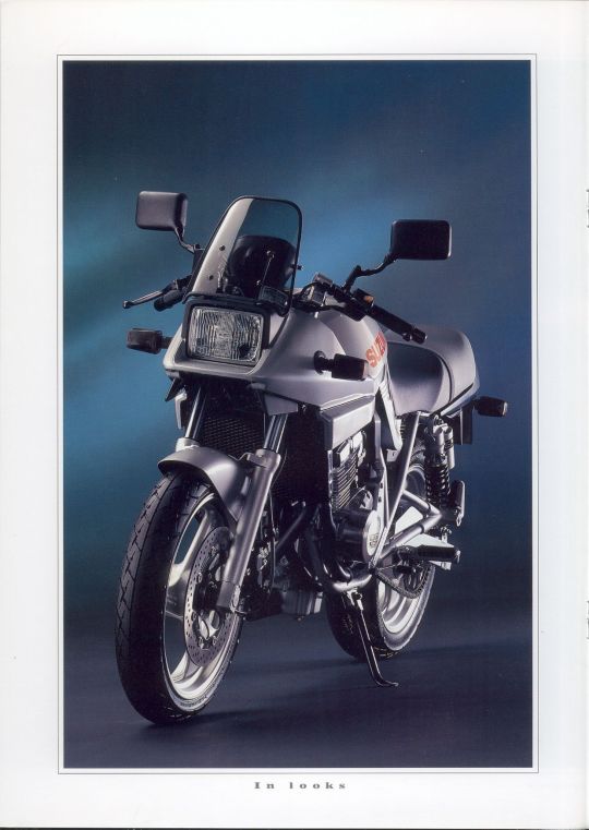
1992 Suzuki GSX250S Katana
10 notes · View notes
weandthecolor · 6 months ago
Text
Tumblr media
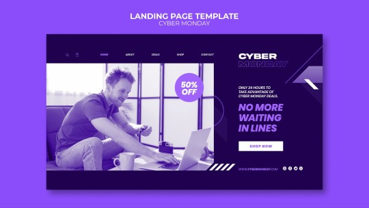
Download a Customizable Brand Strategy Brochure Guidelines Template
Download here.
Follow WE AND THE COLOR on: Facebook I Twitter I Pinterest I YouTube I Instagram I Reddit I ChatGPT
9 notes · View notes
graphypixllc · 24 days ago
Text
Tumblr media
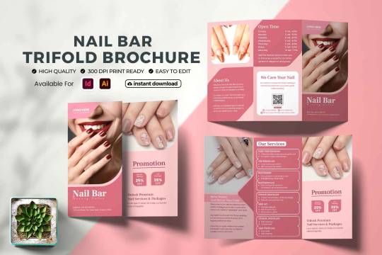
A Nail Salon Brochure Tri-Fold Template is a professionally designed marketing tool that helps nail salons showcase their services, pricing, and promotions in an eye-catching, organized format. With easy-to-edit templates, salon owners can create visually appealing brochures that attract new clients, enhance brand image, and boost business visibility.
3 notes · View notes
gaussmultimedia · 5 months ago
Text
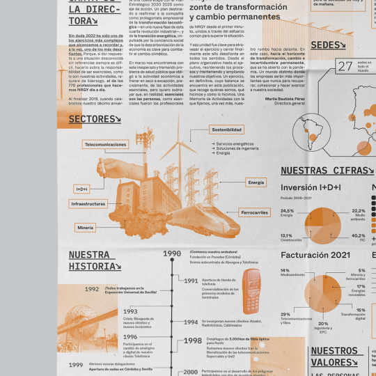
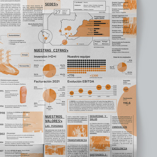
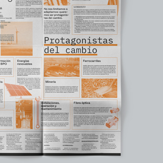
Tumblr media Tumblr media Tumblr media Tumblr media Tumblr media Tumblr media
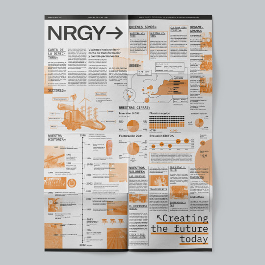
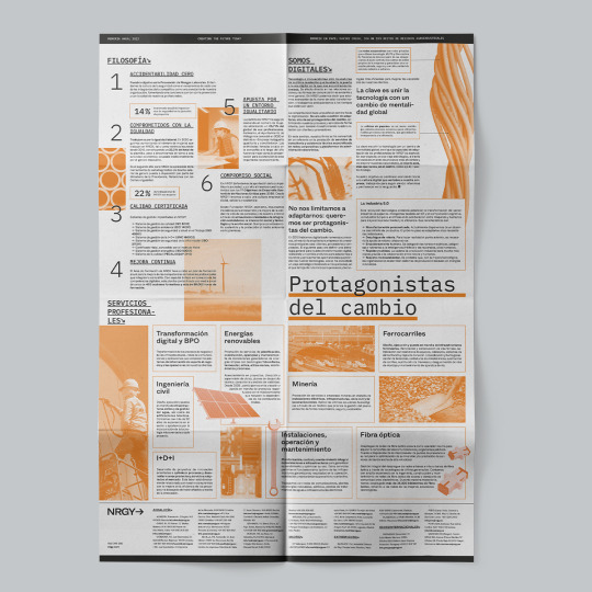
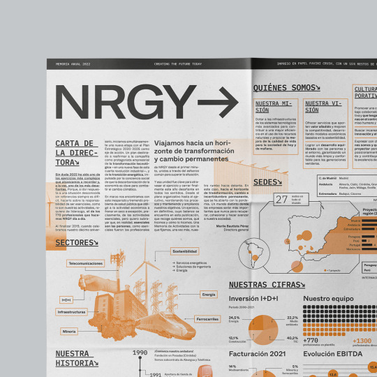
La Hauss. Máster Online en Diseño Editorial 2021-22. Diseño de folleto desplegable para memoria anual de NRGY. Proyecto de Ana Carmen González Brenes.
4 notes · View notes
shayona-printing · 11 months ago
Text
9 Types of Brochure Designs
Tumblr media
Introduction:
Brouchers are promotional documents used by companies to introduce their products and services to their customers by providing simple information about them. The more attractive and vibrant a flyer and brochure is the more effective it would attract potential customers.
Brochures are ideal for promotions of restaurants, spas or any kind of business. For successful marketing, the quality of material used for the brochure must be up to the mark. Along with the material, high-quality printing is also necessary.
In this article, we are going to learn about 9 types of brochures that are used by businesses more often.
Types of Brochures:
Gatefold: The gatefold brochure is folded in such a way that the two outer panels fold inward to meet at the centre, creating a gate-like appearance. Gatefold is ideal for brochures with impactful visuals or those that tell a story in a sequence. Often used for product launches, event promotions, or high-end services.
Bi-Fold: A bi-fold brochure is folded in half, creating two equal panels. It’s a simple and common fold that provides a front and back cover, along with ample space for content on the inside. It’s commonly employed for informational brochures, menus, or event programs. The straightforward layout is effective for presenting key information with a clear front and back.
Trifold: A trifold brochure is folded into three equal sections, with the outer sections folding inward to cover the central panel. This type of Brochure is excellent for organizing information into distinct sections. Frequently used for travel brochures, educational materials, or promotional pamphlets where content can be compartmentalized.
Roll fold: In a roll fold, the panels are folded one after the other, creating a rolling effect. This type of brochure is suited for content-heavy brochures, such as annual reports or detailed product catalogues. The sequential unfolding maintains a logical flow, making it easy for readers to follow along.
Z Fold: The Z fold involves folding the paper into a zigzag pattern. The paper opens up like an accordion, with alternating panels visible. It’s very effective for presenting step-by-step information or creating a visual timeline. Frequently used for instructional guides, event timelines, or any content that benefits from a sequential unfolding.
French Fold: The French fold involves folding the paper in half horizontally and then vertically. This creates four panels, with the outer panels being half the size of the inner panels. This fold is often used for artistic or high-end promotional materials. The larger outer panels provide a canvas for impactful visuals, while the inner panels can house detailed information or a narrative.
Accordion fold: Similar to the Z fold, the accordion fold involves multiple parallel folds. However, all the panels in an accordion fold are the same size, creating a continuous, accordion-like effect when the brochure is opened. It is suitable for conveying a mix of visuals and text, it is popular for brochures with diverse content, such as product features or service offerings.
Half Fold: A half-fold is a simple fold where the paper is folded in half, resulting in two equal-sized panels. This basic fold is often used for event invitations, basic product information, or introductory company profiles where brevity is key. This basic fold brochure is quick and easy for conveying essential information.
Double Parallel Fold: In a double parallel fold, the paper is folded in half and then folded in half again parallel to the first fold. This creates four equal-sized panels, offering a compact format with organized sections for content. This type of fold is efficient for organizing content into four distinct sections. Well-suited for brochures where each panel represents a different aspect of a product or service.
Conclusion:
In conclusion, the art of brochure folding is a nuanced aspect of design that significantly influences how information is presented and perceived. Each design serves a distinct purpose, offering a unique canvas for content creators to convey their messages effectively. From the dramatic presentation of a Gatefold to the organized sections of a Trifold, and the artistic flair of a French Fold, the choice of fold plays a crucial role in capturing the attention and engagement of the audience.
Contact Shayona Printing for any type of brochure design that you require. We are happy to help you. For the best business printing services near Corona CA contact Shayona Printing.
3 notes · View notes
kawkazmiodkiem · 2 years ago
Photo
Tumblr media Tumblr media Tumblr media
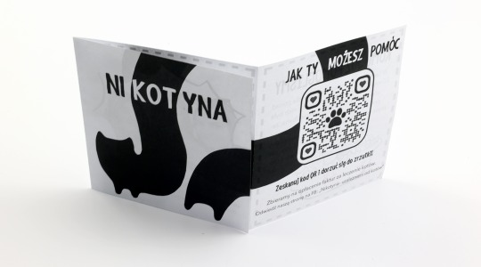
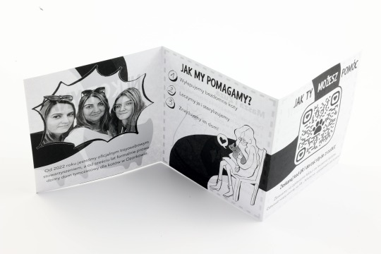
here is a project i did a while ago for my friend who is running a cat helping organization and provides them with a temporary home, its a big ass improvisation since it has been my debut with making something you actually print, but it did not turn out half bad.
8 notes · View notes
sikaria22 · 1 year ago
Text
brochure designs company in delhi
Tumblr media
Welcome to Sikaria Tech, Delhi's design powerhouse, where creativity meets innovation. At Sikaria Tech, we specialize in crafting exceptional brochure designs company in delhi that elevate your brand's identity. Our expert team is committed to delivering visually stunning and strategically aligned designs tailored to your unique vision. From corporate brochures to product catalogs, we offer a diverse portfolio that spans industries.
What sets Sikaria Tech apart is our commitment to creative brilliance, cutting-edge technology, and a client-centric approach. We collaborate closely with you, ensuring a transparent and enjoyable design journey. Embrace the digital age with our interactive digital brochure designs or make a lasting impression at events with our professionally crafted collateral.
Transform your brand with Sikaria Tech – where every design is a masterpiece. Contact us today and let's bring your vision to life.
2 notes · View notes
sujanm20 · 2 years ago
Text
Right Now Life is Black and White
Tumblr media
2 notes · View notes
gfxmasum · 19 hours ago
Text
The Ultimate Guide to Graphic Design: Color Combinations, Typography, and the Debate Between AI and Human.
Tumblr media
Introduction: What is Graphic Design?
Graphic design is a creative discipline that blends visual elements and text to communicate messages and ideas effectively. It involves the strategic use of colors, fonts, shapes, and images to convey meaning across various media platforms, from websites and advertising to print and branding. It’s not just about making things look pretty — it’s about solving communication problems and enhancing user experience through visual aesthetics.
The scope of graphic design has grown exponentially, especially with the rise of digital platforms. Designers work on everything from digital interfaces (UI/UX) to branding, marketing materials, social media content, and even environmental design. Mastering the art of graphic design is essential for businesses and brands to stand out and create lasting impressions in an increasingly visual world.
This article delves into some of the most important aspects of graphic design: color combinations, typography, and the ongoing debate of AI-generated design versus human design. We’ll explore the principles behind these elements, provide practical advice, and discuss their significance in creating impactful visual designs.
Understanding the Basics of Graphic Design
Graphic design is both an art and a science, blending creativity with problem-solving. There are several core elements that form the foundation of any design project. Understanding these elements can help you create more effective and aesthetically pleasing visuals.
Key Elements of Graphic Design
1. Line — The simplest element of design, lines can be used to define shapes, create structure, and lead the viewer’s eye across the design. Lines can be bold, delicate, straight, curved, or jagged, each conveying a different emotion or meaning.
2. Shape — Shapes are used to define objects and create visual interest. They come in two types: geometric (e.g., squares, circles) and organic (e.g., free-form shapes). Shapes are often the building blocks of more complex designs.
3. Space — Also known as “white space” or negative space, this refers to the empty areas in a design. It plays a crucial role in creating balance, emphasizing important elements, and enhancing readability.
4. Texture — Texture adds depth and dimension to designs, whether it’s a physical texture (like paper) or a visual texture (such as a patterned background). Texture can evoke a sensory experience and influence the overall mood of a design.
5. Color — One of the most powerful elements of graphic design, color impacts how a design feels and how it’s perceived. Different colors evoke different emotions and can communicate specific messages about a brand or product.
6. Form — Form refers to the three-dimensional quality of a design. It can be seen in objects like sculptures, product packaging, or digital simulations of 3D elements. Form adds realism to designs and helps create lifelike visuals.
7. Typography — The art of arranging typefaces is an essential skill in graphic design. Typography involves selecting appropriate fonts, adjusting letter spacing, and ensuring readability and style in written content.
By mastering these basic design elements, graphic designers can create compositions that are balanced, functional, and visually appealing.
The Role of Software and Tools in Graphic Design
Graphic design tools are vital for bringing creative ideas to life. While traditional artists used pen and paper, modern designers rely on advanced software to produce high-quality digital designs. Some of the most widely used design tools include:
Adobe Photoshop — A powerful tool for photo editing and digital painting, Photoshop allows designers to manipulate images, create compositions, and add effects.
Adobe Illustrator — Used primarily for creating vector graphics, Illustrator is perfect for logo design, illustrations, and any work that requires scalability.
CorelDRAW — Another vector-based design software, CorelDRAW is often used for print designs, such as brochures and flyers.
Canva — A user-friendly online design platform that allows even beginners to create professional-looking graphics.
Sketch/Figma — Popular tools for web and UI/UX design, allowing designers to create interactive prototypes and wireframes.
Understanding the strengths and limitations of each tool is crucial for graphic designers to select the right software for their project.
Types of Graphic Design
Graphic design can be broken down into several sub-disciplines, each with its own set of skills and techniques. Some common types of graphic design include:
1. Print Design — This includes physical materials like posters, brochures, magazines, and business cards. Print design focuses on the layout, color schemes, and typography to create compelling designs for offline media.
2. Web Design — Web design involves creating the visual elements of websites, including layout, colors, and interactive elements. Designers focus on user experience (UX) and user interface (UI) design to ensure an intuitive browsing experience.
3. Motion Graphics Design — Motion graphics are animations and digital video used in media like advertisements, movies, or social media posts. This field combines graphic design with animation techniques to create dynamic visual content.
4. Branding and Identity Design — Graphic designers in this area create logos, brand styles, and marketing materials that communicate the personality and values of a brand.
5. Packaging Design — This involves creating the visual look of packaging for products, ensuring the design is both attractive and functional.
The Art and Science of Color Combinations in Graphic Design
Color is one of the most important aspects of graphic design. It can evoke emotions, influence perceptions, and guide the viewer’s eye to essential parts of a design.
What is Color Theory?
Color theory is a framework used to understand how colors interact with each other. The color wheel, a circle that organizes hues in a visually coherent way, is the foundation of color theory. It helps designers create color combinations that are harmonious and balanced.
Primary Colors — Red, blue, and yellow are the foundation of all other colors. These colors cannot be created by mixing other colors together.
Secondary Colors — Green, orange, and purple, created by mixing two primary colors.
Tertiary Colors — These are created by mixing a primary color with a secondary color (e.g., yellow-green, blue-violet).
Color Schemes
Designers often use specific color schemes to create mood, harmony, or contrast in a design:
Complementary Colors — Colors that are opposite each other on the color wheel (e.g., blue and orange). These colors create strong contrasts.
Analogous Colors — Colors that are next to each other on the color wheel (e.g., blue, blue-green, and green). These colors blend well together.
Monochromatic Colors — Variations of a single color, used to create a harmonious design.
Triadic Colors — Colors that are evenly spaced around the color wheel (e.g., red, yellow, and blue). These create a balanced but colorful design.
The Psychological Effects of Color
Colors have psychological effects that influence how people feel and behave. For example:
Red — Often associated with passion, energy, and urgency. It can increase heart rate and create a sense of excitement.
Blue — Represents calm, trust, and professionalism. It’s often used by financial institutions and healthcare brands.
Yellow — Evokes happiness, optimism, and attention. It’s commonly used in advertising to grab attention.
Green — Symbolizes nature, health, and tranquility. It’s often used in eco-friendly and wellness branding.
By understanding these psychological effects, designers can create designs that align with the message they want to convey.
The Role of Typography in Graphic Design
Typography is more than just selecting a font. It’s about how type is arranged to ensure readability, visual hierarchy, and the overall aesthetic of a design.
What is Typography?
Typography is the art of arranging type in a visually appealing way. It involves selecting fonts, adjusting spacing, and positioning text to create a design that is both functional and beautiful. Typography can be used to set the tone of a design, whether it’s formal, casual, modern, or vintage.
Key Elements of Typography
Typeface — The design of the characters used in a design. Popular examples include Helvetica, Times New Roman, and Arial.
Font Family — A collection of fonts that share the same design but vary in weight, style, or size.
Leading — The vertical space between lines of text. Proper leading improves readability.
Kerning — The space between individual characters in a word.
Tracking — The overall spacing between letters in a block of text.
Choosing the Right Typography
The right typography can enhance the message of your design. For example, a formal serif font might be appropriate for a legal website, while a playful sans-serif font might work better for a children’s brand.
AI Design vs. Human Design
The rise of artificial intelligence (AI) in graphic design has sparked debates about the future of creativity. AI tools can now generate designs, analyze trends, and optimize layouts in a fraction of the time it takes a human designer. But does this mean the end of human-driven design?
The Pros of AI Design
Speed and Efficiency — AI tools like Canva, Adobe Sensei, and Designhill can create designs quickly by automating processes like color selection, layout adjustments, and image enhancement.
Accessibility — AI-powered tools make design accessible to non-professionals. Anyone can use these platforms to create visually appealing content without learning complex design principles.
Cost-effective — AI design tools often cost less than hiring a professional designer, making them an attractive option for small businesses and startups.
The Cons of AI Design
Lack of Creativity — While AI can generate designs based on patterns, it lacks the deep creative insight and emotional intelligence that human designers bring to the table.
Risk of Over-saturation — Since AI tools rely on algorithms and templates, designs can become generic and fail to stand out from the competition.
Ethical Concerns — The use of AI in design raises questions about originality and intellectual property. Can an AI truly create something original, or is it simply remixing existing work?
The Value of Human Design
Human designers bring personal experience, creativity, and emotional intelligence to their work. They understand cultural contexts, subtle nuances, and the emotional impact of design decisions, creating visuals that resonate deeply with people.
While AI design tools can assist designers, the human touch remains indispensable when it comes to crafting truly unique and impactful designs.
Conclusion
Graphic design is an ever-evolving field that blends creativity with functionality. By understanding the core principles — color combinations, typography, and the growing role of AI — you can enhance your design skills and create visually stunning content. While AI is a powerful tool that can help streamline design processes, human creativity will continue to be the driving force behind truly exceptional design work. Whether you’re a budding designer or a business looking to elevate your brand, mastering these elements will help you communicate your ideas more effectively and make a lasting impact.
Written by : Masum
Professional Graphics Designer
Visit: https://gfxmasum.com
0 notes
bluediamond02 · 4 days ago
Text
Brochure Design Company
Company Profile Design – Your Trusted Brochure Design Company in India
In the world of business, first impressions matter. A well-designed brochure can effectively communicate your brand’s story, values, and offerings. At Company Profile Design, a premier Brochure Design Company India, we specialize in creating visually compelling brochures that leave a lasting impact.
Why Choose Us as Your Brochure Design Company?
As an experienced Brochure Design Company in India, we understand the importance of blending aesthetics with information. Our designs not only capture attention but also communicate your message effectively.
Customized Solutions: We tailor each brochure to align with your brand identity and target audience.
Creative Excellence: From conceptualization to execution, we deliver designs that resonate.
Affordable Packages: Quality designs at competitive rates to meet your business needs.
Your Reliable Partner for Brochure Design
When you choose Company Profile Design, you partner with a team that’s committed to your success. Our expertise as a leading Brochure Design Company ensures that your brochures are not just informative but also persuasive, helping you stand out in a crowded marketplace.
Enhance your brand presence with professionally crafted brochures. Contact Company Profile Design, the top Brochure Design Company India, for designs that truly speak for your business.
0 notes
designlabpune · 16 days ago
Text
Creative Brochure Design Trends to Boost Your Brand Identity
Tumblr media
In the current cutthroat business environment, companies are always seeking innovative methods to set their brands apart. Designing a pamphlet is a powerful method to make a lasting impression. Brochures are still a flexible tool for marketing new products, advertising services, or communicating your brand's vision. In this blog, we’ll explore the latest brochure design trends that can elevate your brand identity and keep your audience engaged.
What is a Brochure and Why Does Design Matter?
A brochure is more than just a folded piece of paper; it is a strategic marketing tool that provides concise information about your business, product, or service. An effectively designed brochure not only focuses on your desired audience but also grabs their attention and motivates them to act. The design of a brochure is extremely important in shaping the perception of your brand, whether it is a professional corporate style or a more creative approach.
Top Brochure Design Trends
Let's explore some of the leading brochure design trends that can help your brand stand out: 1. Minimalism with Impact The minimalist design trend will continue to dominate in 2024. With clean lines, ample white space, and bold typography, minimalism allows your content to breathe while focusing on the key message. Minimalistic brochure designs are perfect for corporate, business, and real estate brochures where professionalism and clarity are paramount. 2. Custom Typography Typography is an important part of brochure design, and custom fonts can make your brochure stand out. Modern, bold font helps define the tone of your brochure. In business brochures, dynamic and playful fonts can appeal to the reader, while quirky and stylish fonts can be more appropriate for a trendy or stylish brochure 3. Bright Colors and Gradients The vivid colours and elevation give the brochure a warm and modern look. Travel brochures, for example, tend to use bold, vibrant colours that evoke excitement and a desire for cycles. Similarly, the design of interior brochures can use horizontal lines to emphasize the texture and aesthetics of the furniture, making it more visually appealing 4. Interactive brochures In the digital age, print is not limited to brochures. Interactive digital cataloguing is gaining popularity, especially in the catalogue publishing and brochure publishing industries. These brochures have clickable links, interesting features and embedded videos to create a more engaging user experience. 5. Sustainable and Eco-friendly Design Sustainability is a growing trend, and consumer goods companies seek to reduce their carbon footprint. Choosing eco-friendly book printing services, recycled paper and sustainable manufacturing methods can attract eco-conscious customers This trend has particular importance in construction, real estate, and businesses seeking to engage in environmentally friendly practices. 6. Bold imagery Using large, high-quality images is an immediately attention-grabbing process. Whether you’re creating a product brochure or a fashion brochure, bold photography can set the tone and create a lasting impression. For example, real estate brochures often use full-page photography to show the property in the best possible light. 7. Unique Folding Techniques The format of the brochure itself can be made up. Books, magazines, and leaflets all benefit from creative folding techniques such as gatefolds, Z-folds, or die-cuts. These techniques add an element of surprise and encourage the audience to interact more with the brochure. 8. Personalization Individual notebooks tailored to the specific interests of the reader are becoming increasingly popular. This trend is especially effective for professional and corporate brochures where targeted communication is key. Using variable data printing, each brochure can be customized with the recipient’s name, industry-related content, or even special offers.
Why a Well-Designed Brochure Boosts Your Brand Identity
Your brochure is an extension of your brand. Well-designed brochures reinforce your brand identity through the consistent use of colour, text and graphics. It tells your story concisely and engagingly. By carrying over these brochure design traits, businesses across industries—from fashion to manufacturing—can demonstrate professionalism, creativity and innovation Here are a few ways an impactful brochure design enhances your brand: Consistency: Using your brand’s colour palette, typography and tone in your brochure design creates a consistent brand experience across all touchpoints. Engagement: Trends like bold graphics and interactive elements create a memorable experience, keeping your audience engaged longer. Credibility: A quality professional brochure conveys the quality of your product or service, building trust with your audience.
Types of Brochures for Different Industries
Depending on your projects and objectives, the type of brochure you create can vary. Here’s a quick breakdown of how businesses can make the most of the brochure trend: Product Brochure Design: Highlight features, specifications, and benefits with large images and custom typography. Corporate brochures: In marketing, focus on small details, strong brand messages, and sustainable products. Real estate brochures: Use bold photos and special folds to showcase the property. Fashion brochures: Experiment with bright colours, stylish prints and sustainable materials to create an environmental appeal. Interior Brochure Design: Use gradients, bold visuals and personalization to highlight design aesthetics and innovation.
Conclusion
Whether you're designing a leaflet, flyer, or corporate brochure, staying up-to-date with the latest brochure design trends can make all the difference in boosting your brand identity. From minimalism to bold imagery and sustainable design, the possibilities are endless. At DesignLab, we specialize in crafting creative brochure designs that not only look stunning but also deliver measurable results for your business. Ready to elevate your brand? Contact us today to explore our brochure printing services and design solutions. Visit our website: www.design-lab.co.in for more information!
0 notes
pretifycreative · 21 days ago
Text
Brochure Design Services in Gurgaon
Brochure Design Services in Gurgaon: Creating Impactful Brand Narratives
Tumblr media
Brochures remain a cornerstone in marketing, effectively bridging the gap between digital and physical mediums. In Gurgaon, a thriving hub of business innovation, brochure design services are highly sought after by businesses looking to communicate their brand story in a visually captivating way. Professional brochure design services offer expertise in creating materials that leave a lasting impression, merging aesthetic appeal with strategic communication.
Why Brochure Design Matters
Brochures provide potential clients with tangible, credible insights into a company’s products, services, and values. Unlike digital ads, brochures can be held, stored, and revisited, making them powerful tools for brand recall. For companies in Gurgaon, where competition is fierce, a well-designed brochure can help them stand out by effectively conveying their unique selling propositions (USPs) and building trust with potential clients.
Elements of Effective Brochure Design
Professional brochure design services in Gurgaon focus on several key elements to ensure a brochure’s effectiveness:
Visual Appeal: The design must be aesthetically pleasing, with balanced use of colors, fonts, and images. Graphic designers use a mix of creativity and branding knowledge to make the brochure visually attractive while staying true to the brand’s identity.
Clear Messaging: The content should be concise, compelling, and aligned with the brand's voice. Designers work closely with copywriters to ensure the text resonates with the target audience, delivering clear and persuasive messages.
Functionality and Format: Brochures come in various formats—tri-folds, bi-folds, z-folds, and booklets. Gurgaon-based designers offer format choices based on the client’s purpose, budget, and target audience preferences.
High-Quality Imagery: Professional images or custom illustrations add a layer of quality and sophistication. Design services in Gurgaon often collaborate with photographers to ensure the imagery enhances the brand’s message and appeal.
The Benefits of Choosing Local Expertise in Gurgaon
Working with a local brochure design service in Gurgaon provides several advantages. Local designers understand the market dynamics and cultural nuances, allowing them to create designs that resonate better with the target demographic. They can meet clients in person, discuss ideas, and incorporate feedback quickly and efficiently. Additionally, they often have connections with local printers, ensuring high-quality materials at competitive prices.
Conclusion
In a competitive landscape like Gurgaon, having a professionally designed brochure can significantly boost a brand’s visibility and reputation. With a blend of creativity, market understanding, and technical skills, brochure design services in Gurgaon help businesses convey their brand stories effectively, creating materials that engage, inform, and inspire action. For businesses looking to make a memorable impression, investing in expert brochure design is an essential step toward successful brand communication.
1 note · View note
graphypixllc · 11 hours ago
Text
Tumblr media
Business Brochure Layout
A well-designed brochure may help you draw in potential clients, tell your company’s story, and advertise your goods and services, whether you’re a startup trying to launch your brand or an existing company trying to revamp your image.
Why Is a Business Brochure Layout So Important?
A brochure is a tangible depiction of your company. It functions as a physical marketing item that prospective clients can keep, carry with them, and consult at a later time. In light of this, the design of your brochure needs to be visually appealing, educational, and practical. Here’s why your brochure’s layout matters so much:
First Impressions Matter: Your brochure is often the first point of contact between your business and potential clients. A poorly designed brochure can make your business seem unprofessional and can lead customers to overlook your brand entirely. On the other hand, a well-crafted layout gives a positive first impression and builds trust.
Improved Readability: A great layout enhances the readability of the brochure. If the text and images are arranged in a logical flow, readers can easily digest the information. Good spacing, clear typography, and well-placed visuals ensure that the reader isn’t overwhelmed by clutter.
Brand Consistency: The brochure layout should align with your brand’s visual identity. Consistent use of colors, fonts, logos, and other design elements helps strengthen brand recognition and establishes a cohesive brand presence.
Calls to Action (CTAs): The layout of your brochure should strategically place calls to action to guide potential customers toward taking the next step. Whether it’s visiting your website, calling for a consultation, or making a purchase, an effective CTA ensures you don’t miss out on opportunities.
Conclusion
A business brochure’s layout is essential to successfully communicating your marketing message. By carefully examining components like layout structure, color scheme, typography, and photographs, you can produce a brochure that not only looks fantastic but also produces results. Keep in mind that your brochure frequently represents your company, therefore it makes sense to devote time and energy to its creation.
0 notes
nurmukta16 · 1 month ago
Text
0 notes
sahil7224 · 3 months ago
Text
Tumblr media Tumblr media Tumblr media
Tri-Fold Brochure Design
0 notes
mdalamgirislam · 3 months ago
Text
Tumblr media
I have completed this design for my client Nextleveldc She is pleased with my design!
Order Here
Client Review
Great service, very fast response, and great representation as to why it makes sense to use Fiverr!
If you need this type of service please feel free to inbox me.
0 notes