#BA1b
Explore tagged Tumblr posts
Text

No Road? No Problem!
ATLAS Roll Bar | RB-BA1B
Blackhorseoffroad.com
#Blackhorseoffroad#BHOR#Blackhorse#offroad#offroading#4x4#4x4offroad#offroadtrucks#truckaccessories#offroadaccessories#automotive#automotiveparts#autoaccessories#Chevrolet#Chevy#ChevroletSilverado#ChevySilverado#ChevyTruck#Chevroletoffroad#Silveradooffroad#Chevroletaccessories#SilveradoAccessories#Chevyoffroad#truckbedaccessories#rollbar#atlasrollbar#Blackhorserollbar#ChevroletRollBar#SilberadoRollBar
30 notes
·
View notes
Photo
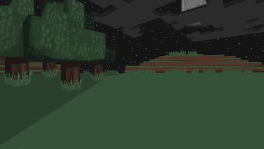
Fully finished background for my flour sack animation, I was very confused about the rules and honestly I’m not the biggest fan of it but with a completed animation of top I don’t think it will look as bad
3 notes
·
View notes
Text
"Mystery" Project — Flour Sack Animation
This is my finished animation for the 2D flour sack project we have to complete and turn in. I got the concept down pretty quickly, I think it was the fourth idea I brainstormed. Between the concept, background, and cartoony wobbles of the sneaky flour sack, I'm quite happy with it. I had to figure a few things out, like coloring and arranging things to be on or off screen, and importing the background from photoshop to animate, but they all went pretty well. Overall I'm quite proud of this. I had originally intended to add a shadow on the ground matching the flour sack's movements to match up with the light source, but for time's sake, I forsook that in order to make sure my other projects are ready to turn in.
It could be smoother, had I added inbetweens, but I'm quite happy with it as it is. I don't mind the sort of choppiness — it gives it a bit more of a cartoonish, exaggerated feeling, in my opinion.
3 notes
·
View notes
Text
Media roles presentation script
Below is a compilation of everything I worked on: my slides, research and script.

There is clearly a recent appreciation for smaller animators skill, with a number of animation branches providing new opportunities for people in all areas of the career pipelines. Large companies like Cartoon Network have expressed this interest through their “Shorts” programme, where these less-recognised creators are able to direct and produce a small pilot, controlling media practises like choice of artstyle and script-writing.
Generally, these opportunities are open to those in the TV animation pipeline - however, creators like Vivziepop, overseen by Vivienne Medrano, are breaking the mold. Vivienne, who rose to popularity from her animated series “helluva boss.” has gathered a stable fan base with patrons, providing a source of income, through which she has produced animation, created merchandise and even sub comics to invest her audience. This has lead to her, and a team of freelancers, to pilot the show “Hazbin hotel”, which in 2020 was greenlit by A24, to continue it’s serialisation.
One business that grounded its feet online early is Rooster Teeth - a rather informal team who started off their ties to animation through their series “Red vs. Blue” - a machinima series filmed using gameplay of Halo 2 to tell their stories. Despite its humble origins, Rooster Teeth has been able to grow large enough through an abundance of fundraisers to greenlight well-loved animated series, such as RWBY, Camp Camp and Gen:Lock in 2013, 2016 and 2017 respectively. These shows are nothing short of successful - with each having Netflix and Blu-ray releases. It is an incredible example of a team that could self-sustain itself through the internet, and go on to fund its very own long-running animated shows.

Internet animation has provided an interesting and inspiring scene for creators young and old. Through aging times, however, entering the industry has changed, arguably, for the worse. Important creative platforms offer differing flexibilities – limitations on video length and size, or smaller viewbases, or monetary issues. The exponential growth of small animators out there has only led to more and more peoples’ work going unrecognised – as one would expect – due to the nature of the platforms. For Youtube, monetization rules have been highly criticized and stigmatised.
And yet, for others, it has provided life-changing career opportunities; people reportedly quitting courses and jobs to pursue it. To small animators, it’s a hobby. To those higher up, it’s industry – art directors, character designers, script writers, public speakers and project backers are all integrated parts of internet animation in modern day. Our examples showed a range of successful animators at different “tiers” within internet animation – some who have been around since the start, and others who are only just beginning their industry journey. What ties them all, though, is a passion for creative freedom - not governed by directors and creative executives, people are able to assume high-achieving job roles for personal projects. A small team may be responsible for covering multiple industry jobs each.
Perhaps most impressive of all is that web animation has introduced new ways to enjoy animation, unique to web-based culture. Storytime animations, parodies and animated music videos anywhere else are somewhat rare to see, but are abundant online, as they are easily picked up and watched. Childrens animations, Morphle TV for example, are a very recent addition to the culture, and are already produced to a huge scale - produced cheaper than what you would find on television, and bringing in a lot of monetisation due to frequency of uploads. The importance of this is undeniable - as it creates new media roles for animators to pursue. This is only scratching the surface of content there is to enjoy online, and shows the vast relevance of web animation in present day. Thank you.
2 notes
·
View notes
Photo


Took the Wild Western wizard concept into class and after working through a few issues I’ve come out with a better idea on how to change/exaggerate parts of the design and silhouette. Feels slightly too ‘witch-hunter’-like for what I’d prefer so I’ll tweak the design to take parts out that feel that way and hopefully with some more western themed palettes it takes away from that feel
2 notes
·
View notes
Photo

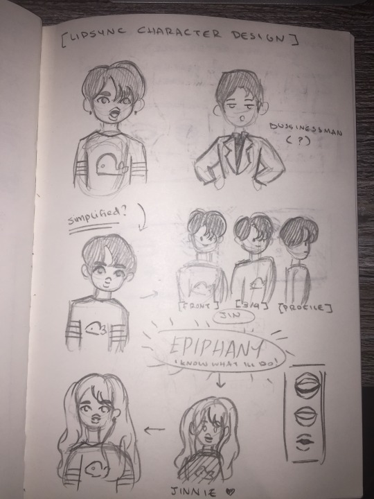
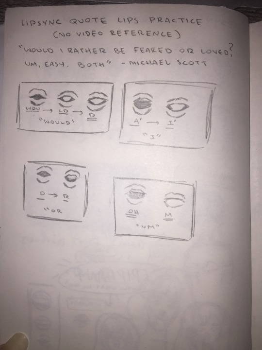
Lip Sync Project (Planning Stage)
I haven’t been able to make much progress on the lip sync project but will be experimenting more during the summer and hopefully completing something on my own. Out of the two audio clips provided I preferred Michael Scott’s quote from the Office. I have a trouble fully understanding Meryl Streep’s accent in the second audio clip and it would be impossible for me to try and replicate her mouth movements in a video for reference.
I practiced with a mirror for a few vowels and words and sketched a simple mouth with thick lips.
For the character, my first instinct was a man in a suit, similar to Michael Scott but after playing with various ideas, I decided on a prince character that perhaps is very snobby and power-hungry to match the quote provided. In this project, I will heavily rely on the use of facial expressions and hand movements to fully convey the character’s emotions in the lipsync, in regards to the quote.
1 note
·
View note
Video
tumblr
BA1b.Mystery Box - 28/2/20
Again, we are working on Maya to create a start to our Mystery Box project within this unit. After having a first draft in our first session, we started to create a new draft but instead by taking more time and refining what we had learnt in the previous workshop session. Above is a playblast of a completely new Mystery Box test animation, meaning I have started from scratch to create - a smoother, more realistic walk up to the box, a better reaction to initially seeing the box, as well as general refinements and closer attention to movement. There isnt much difference to this video and my first, however this one will become more complex as time goes on.
1 note
·
View note
Text

Since we decided to go with Gravity Falls I decided to create pamphlets to help my group identify what things we could write about, especially those who had not watched the show before.


I made sure to include research on a variety of stages in pipeline to assist anyone who may want to tackle any part of it. Personally, I am interested in storyboarding and didn’t have to research it to as great a degree as everything else, as I was already quite knowledgable on the nature of storyboarding for this show before beginning this project.

Once again, here is the plan of action created during our meeting.
5 notes
·
View notes
Photo


Character Design Workshop - Maya modelling and Mudbox
Today I was introduced to a Maya sculpting workshop using both Maya and Mudbox. This initial workshop was to get used to using the tools and methods to sculpt and create a character from cubes and rectangles. As I have grown accustomed to Maya sculpting through the radio task I welcomed this new challenge with open arms. The first task was to create three cubes for each part of the body and morph them using the various cutting and extruding tools to create shoulder and legs as well as a neck. This then became the base of the character. I found that using these tools where quite challenging especially with the multi cut tool as this would. Highlight other areas I did not want to cut. In addition , I did not want to create my character I am basing my maquette and drawings on until I fully understand the software. So I was mainly focusing on creating a character which utilised all aspects of the software.
The next task was to smooth the character and change the amount of planes available. The mother the amount of planes the easier it was o sculpt with the sculpting tools on maya. I found this difficult at first as I had made my character too small for the actually brushes. SO I increased the size of the character and began to try and work out how the tools work. I decided to create a visor like head which resembled a hammerhead shark. While also adding a shell on the characters back. I found that I should have extruded these aspects of the character before morphing the planes as this would have gave me better control and precision when creating. As I had just morphed the plane this would detract from the overall animation of the character later in the pipeline.
The next aspect of the workshop was to import the character into mud box . Mud box is a sculpting software that aids character and prop creation . I found this software quite easy to use as I imported a low resolution version of my character into the software and began extruding the same aspects that I had in Maya. I am looking forward to creating my sloth in both these softwares and I will continue to watch tutorials on how to improve my modelling techniques and processes within software like Maya, Mud box and z brush.
2 notes
·
View notes
Text
POV: Your Toyota Tundra just got a serious upgrade! 💪 #OffRoadWarrior
Atlas Roll Bar | RB-BA1B
#Blackhorseoffroad#Blackhorse#offroad#offroading#4x4#4x4offroad#offroadtrucks#truckaccessories#offroadaccessories#automotive#automotiveparts#autoaccessories#Toyota#ToyotaTruck#ToyotaTundra#Toyotaoffroad#Tundra#Toyotaaccessories#Tundraoffroad#Tundraaccessories#RollBar#BlackhorseRollBar#AtlasRollBar#ToyotaRollBar#TundraRollBar#TruckBedAccessories
5 notes
·
View notes
Text
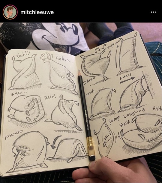
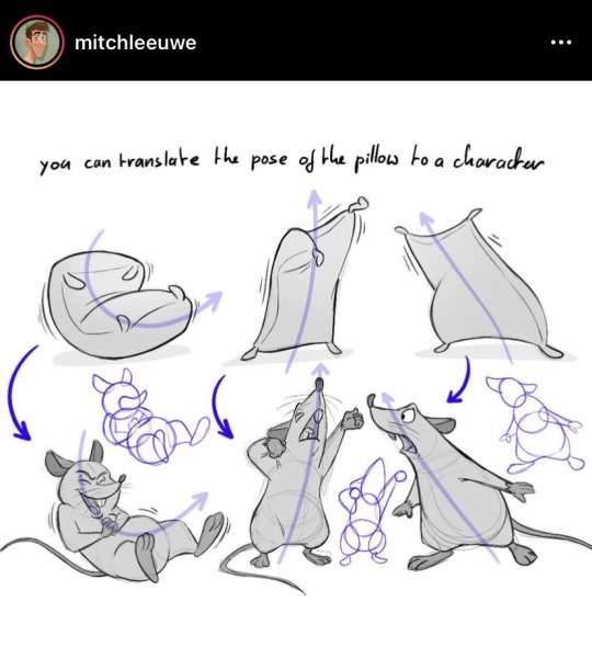
@ mitchleeuwe on Instagram drew some examples of flour sack poses and uses examples of how to turn them into characters based on shapes. He has a book for character design I’m considering buying since he explains character designs, shapes, expressions etc very well. His page is full of examples and explanations of how to make improvements to make aspects of character design in terms of animation, I recommend everyone take a look.
6 notes
·
View notes
Text
Coloring Exercise

This is the coloring exercise I did for class. My first palette, a revised one, and a copy of the revised one with colored lineart.
I like both, but the second rendition is a bit better because the colors don’t oppose so drastically, even though the second one also features a warm color vs a cold one. On the third with colored lineart, the lineart needs to be darker. It looks fine in photoshop, but zoomed out in tumblr it’s harder to discern.
3 notes
·
View notes
Photo
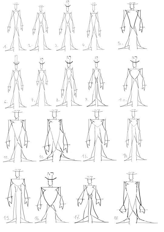

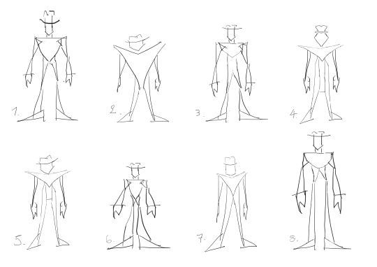


Follow up on the cowboy character design research. I focused the research on shapes and costumes, trying to stay simple and slowly delve into detail. This has been quite an challenge since I usually have an slightly more academic background. I really have enjoyed the process though, and I think the idea of starting simple really has helped me out in getting more interesting designs.
2 notes
·
View notes
Text

A how-to on drawing the rifle-staff, for keeping to hand as a reference when doing images and animations featuring his character
Also added to and created more features to his design, the pouch carries spare crystals to 'reload' the staff, his chest strap is now a proper bandolier featuring potions to throw around and he has spurs shaped like a magic sparkle that kick up blue sparks when he walks
With that I'm now set on the full design and just need to create a proper reference and turnaround for the character, also making a 3D sculpture as a physical reference
1 note
·
View note

