#And unfortunately need some of InDesign's features
Explore tagged Tumblr posts
Visit Tumblr Blog
Explore Tumblr blogs with no restrictions, modern design and the best experience.
Last Seen Tumblr Blogs


Fun Fact
Tumblr was the first site to host the blog for President Barack Obama in 2011.
Text
In response to Adobe's TOS changes, Affinity is running a 50% off flash sale on everything.
Affinity can't do everything that Creative Suite can, but it can do a lot of what I need for fandom purposes, so I am going to give it a test run this summer with some zines. If you need epub support, though, Publisher 2 doesn't have it yet, so this probably won't be a solution for ebook designers unless you only need PDFs.
Unlike Adobe, which switched to a subscription model years ago, Affinity is a one-time purchase for the software. But for transparency, do be aware that Canva bought them earlier this year.
#art and design programs#I am a career designer#I work in both print and digital#And unfortunately need some of InDesign's features#so I can't abandon them professionally#but I would love to kick Adobe personally
96 notes
·
View notes
Text
NM3217 - Final Project (At LAST)

Transformation of Logo & Brand Style:
According to the project prompt, the guide for us was: 1) What do you know about yourself? 2) How can this project best encapsulate/ represent your values? 3)How would you go about representing YOU as a brand? Or develop a brand that represents you?
and on week 11th our last F2F tutorial we were told to come up with a word cloud. Hence with that, I came up with a word cloud above. My initial thoughts were between doing a plain boring black and white (which was my most preferred colour on any day in the "introvert" me) vs something crazy that suits my extrovert days ~ from what you can see I chose the latter.
Funky & fun was the first word that came to my mind, I thought of using bright colours, neon schemes especially to create the partying vibe.
Following on, I have searched for some images that give me the vibe that I want and attempted to draw some inspiration from them. From it, 2 colours stand out to me, Pink (Magenta) and Cyan Blue. And that's how the colour scheme for our brand style comes about!
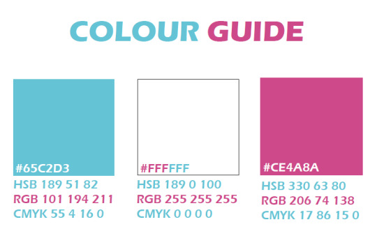
Sticking with the maximum 3 colour guidelines, I have also decided to make use of white to balance up the colour a little.
Typography:
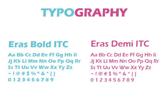
For typography, I chose the Eras series, as I feel that it fits the vibe I am looking for, funky looking yet still keeping a bit of a professional look in it, as I have taken into consideration that it will be used for my resume. Now for the Logo:

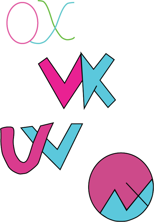
I came up with a few draft sketches for it, initially, I thought of just keeping it simple by incorporating my initials OWX into it. But after which after looking at examples online, I thought to include other traits into it as well.

Adding in traits like birthday date 03-09 and Chinese name. I decided to incorporate my Chinese name because since it's a logo that represents me, I am Chinese and personally more fluent in Mandarin, I thought it would be cool that with one look, someone can tell that I am bilingual from the logo itself no explanation needed, which was also why I purposely left out the language section in my resume after. I was in a dilemma after coming up with the above 3 logo design, but thankfully I asked my friend for opinion for it , which brings me to the final design: With that,

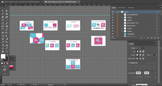
Software used when doing Brand Style:
For this assignment, I made use of
illustrator (My favourite by far~)
2. Indesign (because required to...)
This is also because I wanted to "play cheat" by tapping on the fact that elements could be copied directly from illustrator to Indesign but not from Photoshop. Also as I find the Indesign feature a pain in an ass to use, so I made use of illustrator to do most of the brand style portion and just copied it over to Indesign to do the layout.

Initially, when I was doing the I was all hyped up about it and thinking that since My brand image, I wanted to be as bold, as loud and as crazy as I could. So as I was doing the brand style, I tried to go crazy a bit with how I presented my work. Unfortunately~~~ it got struck down during the critique, I was told that its too loud, and too bold, presentation of the work was too messy unable to find a visual hierarchy. Which at that point, I was thinking of reversing back to the plain simple and boring black-and-white style. However, since its MY BRAND, I thought that NOPEE~ I am not giving in on the colours but for the sake of the assignment criteria I will just tone down and do out the very standard and of the norm kind of presentation style which is:
Making every background white, keeping the text colour as standardised as possible. Guess, not everybody can accept being crazy ~ or rather everyone has a different definition of crazy.
DO's :
For Do's the very first thing I thought of would be since I am using white which is a common colour for printing surfaces (White Paper). Hence, I thought to resolve it by allowing the use of black to substitute the white outline of the logo.

Seclusion Zone:

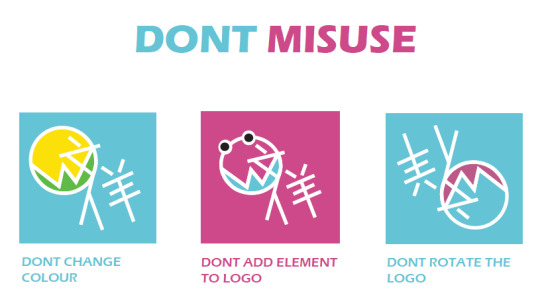
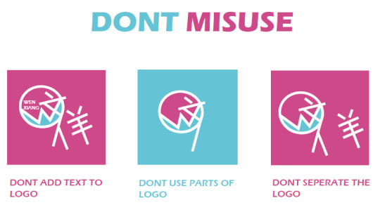
DON'Ts :
I also thought of 6 don'ts think of how people might commonly abuse the logo.
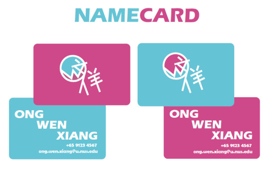
Name Cards:
For the name cards, I came up with 2 variations, with it showing the variation of the logo. I purposely left out the job position because I am still exploring my options and have not selected the career path that I want in life.
Resume on Indesign:
I created a template for the resume using illustrator first before copying it over to Indesign to add the fonts.
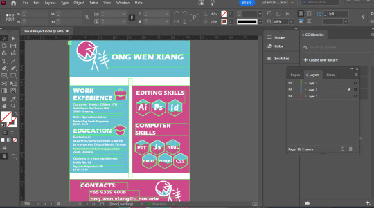
As well as editing the layout for the other components of the brand style in Indesign.
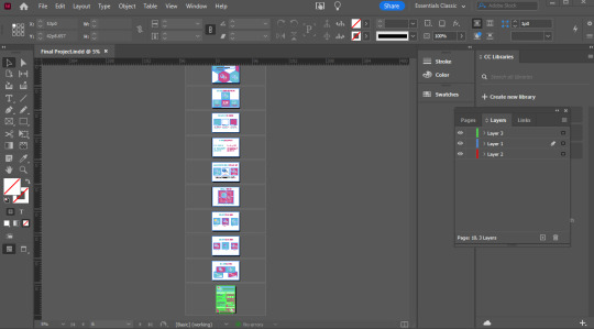
One thing I think Indesign came to use in this assignment is the fact that it allows me to set the orientation of the PDF such that there is both landscape and portrait mode.
0 notes
Text
well uhhh rip to the CSP folks I guess lol? Figure I’ll throw my two cents out here. Even though some people are claiming V3 will be a perpetual license (which also I do not see anywhere in their article) I’ve never seen a piece of software that starts a subscription model maintain their perpetual licenses. I’ve watched that happen to both the Substance suite (acquired by good old Adobe) and ZBrush (after being acquired by Maxon).
A couple shoutouts: Krita is free and open source, and currently my software of choice. It has oodles of different brushes and features, multiple different brush engines including compatibilty with MyPaint, and although 2D animation is the bane of my existence, it’s more friendly to starting animators IMO than actual animation programs.
Paint Tool SAI still operates under the most forgiving license I have ever seen. There is a version 2 in development that you can download builds for if you have a license, and by and large I find that they are pretty stable / not prone to crashing. While somewhat lacking in features compared to other programs, V2 has some good basics, and the brush engine itself is one of the best I’ve ever seen for color mixing.
If you’re interested in vector art at all, Affinity Designer tends to be what I use for work. The Affinity Suite by Serif is designed to be an alternative to the Adobe triad of Photoshop-Illustrator-InDesign with a perpetual license. Designer is essentially the Illustrator equivalent and I feel the most robust competitor of the three, although all three I would say are more user-friendly than Adobe’s.
Finally, I just want to add that while I know a lot of y’all that follow me are just hobbyists, which is perfectly fine, but if you can afford to throw money at programs like these I encourage you do so. SAI in particular (to my knowledge) is still being developed by just one person, and unfortunately, even software devs are still bound by capitalism as much as the rest of us. Free, donation-driven models are totally viable. I mean god, Blender’s been doing it for 20 years now! But the people behind it are real folks in need of support, and I hope those of y’all looking for a CSP alt will keep that in mind.
#julian says things#unprompted nobody asked for edition!#tldr krita free#and please consider Not Pirating software made by small dev groups who are trying to keep perpetual license models#fuck rental subscription models heartemoji#CSP#clip studio paint#krita#paint tool sai#affinity designer#affinity suite
28 notes
·
View notes
Photo
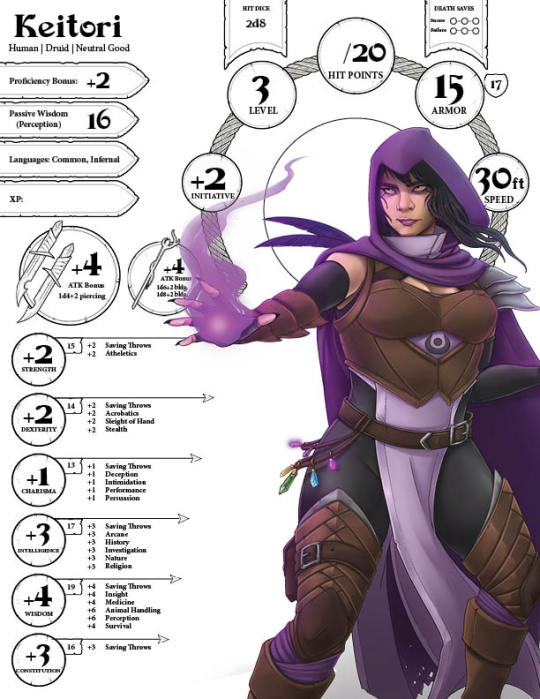
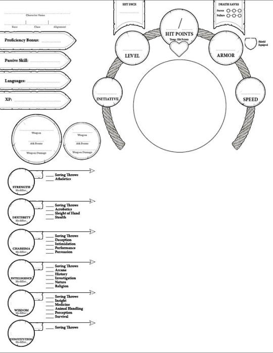

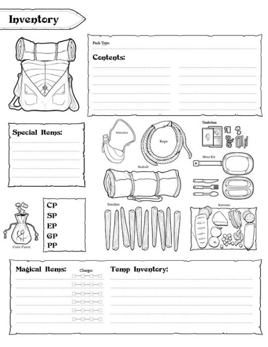
So! I know some people have been waiting for this. Here’s my D&D 5E redesigned character sheet that I was working on a few years back... I kind of put it on the back burner, meaning to tweak a lot of things and make class-specific elements, then forgot about it 😬.... Unfortunately, most of the files for this as well as the PDF version with fillable fields were on my work computer, so I lost all of it when I got laid off.... But I have the old InDesign file at least, and someone requested that I upload it somewhere, so here’s the mostly finished version if anyone wants to use it. (it is free!)
You can download the PDF from Google Drive
I find it kind of difficult to parse the official 5E sheet, as there’s hardly any hierarchy design-wise, and no place to feature character art. So mine is made to prioritize character art and readability, to make it easier to see some of the info you will need on hand most often (hopefully it helps others who also have trouble with parsing tiny blocks of text). But it is spread out over several pages which may not be ideal for some. You can print out multiples of the Spell/Cantrip/Special Attack pages to fill them in with any spells you have learned for quick reference. It will work best if you have an image editing program like Photoshop to paste in your character art (again, I had a PDF version with fields where you could drop in images, but it has been lost to the void :/ so apologies...) but you can also print it out and physically cut and paste some character art on the page 😬
Anyway, I hope this is useful to some people and let me know if you have any questions or if the files aren’t working!
#Dnd#D&D#dungeons & dragons#5e#character sheet#graphic design#d&d resources#tabletop#art#fantasy art#character art
135 notes
·
View notes
Text
Art Resources
Check out this plethora of art-related resources archived from Comic Tea Party’s Art Resources Channel!
RebelVampire
starting this channel off with @Kabocha 's site http://www.shooting-stars.org/ lots of fantastic brushes and materials to use for both photoshop and clip studio(edited)
https://inkarnate.com/ - a nifty site for creating maps. while there is a pro version, the free version still has a lot of features if you just need a map for personal use to reference for your stories.(edited)
https://bodykunposeoftheday.tumblr.com/ - lots of pose photos of the SH Figuarts Body-Kun figures. really great if you want to get some anatomy and pose practice in!(edited)
http://blog.studiominiboss.com/pixelart - if you're a fan of pixel art, this is a hugely great collection of tutorials by Pedro Medeiros. it's got everything from process explanations, animation tips, shading, and more.(edited)
http://terawell.net/terawell/ - Design Doll, a great 3d program solely focused on doll posing. learning to pose the dolls can be a bit of a learning curve, but it can be fantastic if you really need a specific pose reference.(edited)
http://www.yeoldemapmaker.com/ - another map making website. this one is a lot better for interiors, especially if what you want is to just understand the base layout of a room for reference.(edited)
https://www.textures.com/ - a good site for textures. you have to make an account to download them, unfortunately. however, theres tons upon tons of them. for comics they should be safe, but would recommend checking terms for other things.(edited)
Kabocha
Free Software: I have not personally tested all of these programs. Download at your own risk. indicates that I have used it. Pixia: http://www.ne.jp/asahi/mighty/knight/index.html Artweaver: https://www.artweaver.de/en (has paid version) Medibang Paint: https://medibangpaint.com/en/ Krita: https://krita.org/en/ MyPaint: http://mypaint.org/ (Pressure does not work properly on Surface devices newer than the Surface 3) SmoothDraw: http://www.smoothdraw.com/sd Paint.Net: https://www.getpaint.net/ GIMP: https://www.gimp.org/ Pinta: https://pinta-project.com/pintaproject/pinta/ Inkscape: https://inkscape.org/en/
RebelVampire
https://nattosoup.blogspot.com/ - If you aren't familiar with Becca's blog yet, it's really great. while there is an emphasis on watercolor and traditional art supplies, theres honestly just great information all around. processes, supply reviews, and so on!
Erin Ptah (BICP | Leif & Thorn)
http://leifandthorn.com/2018/07/resources-for-making-webcomics/ - resources I've collected over the years. Mostly art stuff (fonts, color harmony, body types, etc), plus some help with website accessibility and some general webcomic podcasts.
Desnik
This is not a free resource so I hope it's okay, but in just a couple of days poring over the first two pages of this book, I'm really feeling a difference in the elasticity of my character's poses. It doesn't get bogged down by medical terminology and sorts parts of the body by 'landmark' instead: https://www.goodreads.com/book/show/23580472-anatomy-for-sculptors-understanding-the-human-figure
this is speaking as someone who has multiple years of figure drawing practice from life...I wish this book had been out much earlier, it's just amazing
JaSketch
https://www.calligraphr.com/en/ Here’s a free to use website that turns your handwriting into a legit text font, and it works too!
keltyzoid!
speaking of fonts i've actually made a few that are free to use. there's a couple of webcomics i know of that use them. should can i post them?
https://www.dropbox.com/sh/r8wmj4kp2566jbn/AACCrP70zPVLr8h2f5F4d6BIa?dl=0
they're free, no license or credit necessary
kayotics
this is a pretty basic level "how I do comics" but i like to reference these how-to's from Mad Rupert sometimes as a refresh on comics: http://mynameismad.tumblr.com/post/163801383099/hello-in-case-you-havent-heard-the-sakana
lonelytuatara
for any fellow photoshop users who wanna get better at perspective, this video's been really helpful for me! https://www.youtube.com/watch?v=upxBGNcryRs
Delphina
Really helpful Twitter thread about effective paneling! https://twitter.com/h0lysarthole/status/1117464886123089921
Erin Ptah (BICP | Leif & Thorn)
Install old versions of Adobe products for free: https://helpx.adobe.com/creative-suite/kb/cs2-product-downloads.html?promoid=19SCDRQK There are terms & conditions, but the programs don't actually check if you fulfill them. It's up to you to know how much money you've given them, and what you're ethically clear to download in return.
Kabocha
If we're talking about Image Editors, a not-free alternative is Affinity Photo, which is reasonably priced. (I'd look for it to go on sale, but $50 for a perpetual license isn't bad at all!) https://affinity.serif.com/en-us/photo/ Their indesign competitor is in free Beta right now, too: https://affinity.serif.com/en-us/publisher/
Paint.net also still exists: https://www.getpaint.net/
https://www.patreon.com/posts/26834357 In the meantime, here's a post for alternatives to adobe.
https://twitter.com/robochai/status/1124044195092672515
JUNK
https://blog.reimenayee.com/graphic-novel-outline-onion-method/ neat
Hey, I'm sure everyone already knows, but clip studio is on sale for $25 right now! It is (imo) one of the best programs out there for making comics! https://twitter.com/clipstudiopaint/status/1169159411304210432?s=19
MJ Massey
if you're looking for a new display tablet, I found this useful site with tons of tablet reviews! They're organized by size and look at several different brands http://brad.site/reviews/wacom-cintiq-alternatives.html
Attila Polyák
How to draw good looking lightning/electricity! https://www.facebook.com/leesartandmore/photos/a.1370091679712083/2411389295582311/?type=3&theater
seetherabbit
https://www.youtube.com/watch?v=0pDE4VX_9Kk
DaeofthePast
Free to use comic font http://purastik.net/ames/e.html
MJ Massey
If you haven't watched Jake Parker's videos, I highly recommend them. They are very informative AND relaxing and encouraging https://www.youtube.com/user/jakeparker44
MJ Massey
GESTURE DRAWINGS! They're important for art practice, especially if you are looking to improve your forms! https://www.quickposes.com/en is my favorite. It has a feature where you can set it to show you different photos every 30-300 seconds to practice gesture drawing!
mariah (rainy day dreams)
Just saw this on Twitter. Haven't actually gotten a chance to look at it closely, but I thought other people might also want to take a look https://twitter.com/Worstwizard/status/1183475129084329984?s=09
Holmeaa - working on WAYFINDERS
https://twitter.com/noahbradley/status/1185286707819827201?s=09
Attila Polyák
Loads of useful facebbok stuff I meant to post a long time ago, but never got around doing it: https://www.facebook.com/AikaLockheart/photos/a.413147142066258/2235198713194416/?type=3&theater https://www.facebook.com/photo.php?fbid=472362883489284&set=a.130547804337462&type=3&theater https://www.facebook.com/geektower/photos/pcb.1089341477902964/1089341267902985/?type=3&theater
MJ Massey
picking pens! From Jake Parker himself https://www.youtube.com/watch?v=bNgYvTI09XE
MJ Massey
for anyone who likes podcasts, I enjoy 3 Point Perspective, particularly their most recent episode on building an online store and making sales https://open.spotify.com/episode/2twCBBjRWZlmzbvWkRoARG?si=N7PiY3UoTJCzq0zZovXsdg
Cronaj ~{Whispers of the Past}~
Here's a good reference generator: https://line-of-action.com/
SAWHAND
Hope this counts as a resource, here's a list of Best Comic Covers in a given month by Paste magazine, it goes up to June 2019. It was really helping me get ideas for covers! https://www.pastemagazine.com/search?t=Best+Comic+Book+Covers&m=Galleries
Cronaj ~{Whispers of the Past}~
This is great!
Erin Ptah (BICP | Leif & Thorn)
Ooh, yeah, those are great.
I did a redraw where I added another 7, for shots that aren't in the original that I also get a ton of use out of: https://www.deviantart.com/erinptah/art/29-Panels-That-Always-Work-748887838
carcarchu
ooooh https://twitter.com/cathygjohn/status/1216093817734139904?s=20
carcarchu
https://twitter.com/ClipStudioTips/status/1217058241613651969
renieplayerone
This may have been shared before but i am a HUGE fan of SenshiStock. Their references are so good and ive used their stock photos for a ton of studies and practice too https://twitter.com/SenshiStock
carcarchu
https://twitter.com/celesse/status/1219674655663042561
carcarchu
https://twitter.com/dankelby/status/1220254171049418752
mariah (rainy day dreams)
https://kingofooo.tumblr.com/post/161105648449/by-storyboard-supervisor-erik-fountain-a-few
Krispy §[Ghost Junk Sickness]§
https://twitter.com/ImRachelBradley/status/1216042005698174977?s=19
carcarchu
https://twitter.com/cyanparade/status/1229450046480867328
Cronaj ~{Whispers of the Past}~
@Feather J. Fern This is the video: https://www.youtube.com/watch?v=NEvMHRgPdyk
Cronaj ~{Whispers of the Past}~
@Javi An oldie I still find useful for learning how to draw people: https://archive.org/details/andrew-loomis-drawing-the-head-hands/mode/2up
Nutty (Court of Roses)
https://twitter.com/Lowtwait/status/1232479451721502725
Artem Ficta (Ring Spell)
https://www.youtube.com/watch?v=zlh4PO-ISCA
video that looks into this current humble bundle pack
looks kind of interesting
doomedfrgarden
I'm not sure if Borodante's Over-Paint series has been posted here (I didn't see it, but I don't have my glasses so I can't promise a thorough search), but his digital painting tips have been incredibly helpful and inspiring to me, so I hope it helps someone else here. https://www.youtube.com/watch?v=yDKgohjbwY8&list=PL26-CxnLWOfD_h42yjpO44dPAo3-pijgb&index=23
Feather J. Fern
Found something that explains Bleed for comics. https://makingcomics.spiltink.org/pgtemplates/
Cronaj ~{Whispers of the Past}~
A soft-shading demo I made for@Feather J. Fern & @Artem Ficta (Ring Spell) Sorry this took so long to complete! https://youtu.be/Cyc9EVissw0
carcarchu
https://twitter.com/hanari0716/status/931463182354227201
Mei
For people like me who mess up their bleeds and have to fix them in post, I had this lying in my bookmarks! https://twitter.com/TheDamnThinGuy/status/1190321427314032646?s=20
keii’ii (Heart of Keol)
There are lots of guides to tangents, and here is one I like a lot! http://curiousoldlibrary.blogspot.com/2011/10/schweizer-guide-to-spotting-tangents.html
carcarchu
https://twitter.com/Sasquatchiix/status/1236987090874667008 This is a visual novel zine but section 2 on resources actually has a lot of cross-over in terms of usability for comic creators, check it out if you feel like testing out some new tools! Update - I read through the articles now and I actually really recommend checking them out too for advice when it comes to story-writing and how to lay it all out(edited)
Holmeaa - working on WAYFINDERS
Want to share this with you all! https://creatureartteacher.com/product/fundamentals-of-animation/?fbclid=IwAR0ahSOtdTBPmi0cHQlBpyMK7RveLZXptqcLrFX559KQMOkp-oLjGG9JA_0 Fundamentals of Animation Course Aron Blaise a big disney animator, has an animation Course that take you through the princibles of animation. This course is free for a limited time if you want to learn about animation!
Cronaj ~{Whispers of the Past}~
Really cool video I found about pricing your commissions: https://youtu.be/pN4P82Y_3k0
carcarchu
a handy tool for those who work in clip https://twitter.com/2TooToo2/status/1243101802435727360
mariah (rainy day dreams)
I'm not sure if this is the right channel, but I'm going around shouting about how Adobe users can get two months free because of the pandemic this morning. Here's an article about how to do it! https://www.creativebloq.com/news/adobe-payment-holiday?fbclid=IwAR108UH-2fQfvQzyc2STIHZh9H7LOzr1xvOoLPM_7pylHNoQ9isvMDT4wRw
I also made a tweet for easy sharing if you don't want to type your own. https://twitter.com/RainyDayMariah/status/1243573425697742848?s=20
Krispy §[Ghost Junk Sickness]§
https://twitter.com/metalsorcery/status/1247930202073829377?s=19 This is a survey to answer for webcomic creators to get their work featured in this newsletter! Open to every one!
Cronaj ~{Whispers of the Past}~
@Miranda (Into the Swell) This one's pretty good: https://www.deviantart.com/theinkyway/art/Manga-Studio-5-Clip-Studio-Paint-Brush-Pack-619455926
carcarchu
@Miranda (Into the Swell) this is my ultimate fave http://fav.me/d7s799d
carcarchu
this is handy reference image account that only posts pictures of suits and mundane things https://twitter.com/madarameBK
Joichi [Hybrid Dolls]
Follow Art of Webcomics (on Twitter) which help independent creators host a site and share your page updates: https://series.artofwebcomics.com/(edited)
carcarchu
https://assets.clip-studio.com/en-us/detail?id=1725189 a handy sfx brush for clip studio paint that can help save some time with your process (it's got various effects built in the brush itself so you don't have to have several stroke layers to achieve the effect) it costs 2 dollars
SaltySalmonella
I made an SFX (sound effect) booklet for comic artists who are having difficulty visualizing sounds for their comics. It's free to download on Gumroad! https://gumroad.com/SaltySalmonella#VOZQM
Elliot
https://twitter.com/nicparris/status/1253710231781036043
CoppertheCarutor
I'm not sure if this goes in writing or art resources because it's art based, but the focus is on using colors to aid the story, but I thought this was a pretty neat video. https://www.youtube.com/watch?v=aXgFcNUWqX0&feature=emb_logo
mariah (rainy day dreams)
I was looking up some moonlight tutorials for an illustration last night. Figured I'd share~ https://tips.clip-studio.com/en-us/articles/1684
https://www.deviantart.com/ryky/art/MOON-easy-tutorial-399161176
carcarchu
https://youtu.be/LokpJy7KHpE Shilin talks about her thought processes when laying out her comic panels
carcarchu
some free flower assets for clip https://assets.clip-studio.com/ko-kr/search?user=miyage3&order=new
carcarchu
Reimena Yee did an interesting thread on the visual language used in comics https://twitter.com/reimenayee/status/1263755464853995521(edited)
sierrabravo (Hans Vogel is Dead)
yess I was hoping someone would put that up here!!! such a good resource
that reminded me of the 22 panels that always work, something I've been trying to utilize more when I get stuck working: https://cloudfour.com/thinks/22-panels-that-always-work-wally-woods-legendary-productivity-hack/
Erin Ptah (BICP | Leif & Thorn)
It's so reliable, last year I was able to recreate the whole thing using only pre-existing panels from Leif & Thorn. (Then added another row because there were a few other shots I keep coming back to...) https://leifandthorn.com/comic/erin-ptahs-29-panels-that-always-work/
(Note, there's a horizontal scrollbar under the image, since I uploaded the big version.)
DaeofthePast
found this tutorial/tips on drawing scars that I found useful https://jetfeather.tumblr.com/post/163383759536/i-have-a-hard-time-drawing-scars-how-do-you-do
carcarchu
For those who suffer from pain while drawing: https://twitter.com/lost_paw/status/1271540123688210433
Evil_Chippy (My Hero!)
https://twitter.com/Darchala/status/1272257378881175552?s=20
Cronaj ~{Whispers of the Past}~
@Krispy §[Ghost Junk Sickness]§ Here's the brush pack. The one I used is called "Pensona": https://www.deviantart.com/theinkyway/art/Manga-Studio-5-Clip-Studio-Paint-Brush-Pack-619455926
carcarchu
How to draw a lot of books https://twitter.com/yoshida_seiji/status/1200432951671939073
carcarchu
Mentorship directory for this interested in that kind of thing https://docs.google.com/spreadsheets/d/1vfcr_F0utixw7D-rsbUoId1kwU2Ee_c_jXy2r5df-Jc/edit?usp=sharing
shadowhood {SunnyxRain}
https://www.lackadaisy.com/exhibit.php?exhibitid=333 A fun tutorial on drawing expressions
carcarchu
A really comprehensive look into the panel border tool in clip https://professorfaf.tumblr.com/post/178927411355/comic-paneling-tools-in-clip-studio-paint Great for beginners but even if you're already acquainted with them it's helpful for finding out things you may not have even realized
Krispy §[Ghost Junk Sickness]§
https://www.youtube.com/watch?v=ED289uthfNQ&feature=share&fbclid=IwAR1ka0j6gwtFcj5aXS8wIj-zpgwaYiI2ncP-g4Tn6hL0h4VFa-rKn6MM_1Q this is my old illustration instructor who did a tutorial on watercolour if anyone was interested in the medium! her stuff is so vibrant and solid, and i was so happy to have her as my old prof!
CoppertheCarutor
Light bounce! https://twitter.com/KikiDoodleTweet/status/1276565894051753984?s=19
carcarchu
https://twitter.com/Ghadaaax/status/1277158331761807360 helpful tips!
cAPSLOCK (Tailslide)
Colorist K Michael Russell has been streaming nightly as he colors pages from comics he's working on, while giving tips and insight into his thought process: https://www.youtube.com/channel/UCps08eOJfFRm00TE5LStIIg
carcarchu
Advice on how to utilize speedlines https://youtu.be/Y_3Rbjn_0r0
Cronaj ~{Whispers of the Past}~
I just have to plug this amazing program here: https://affinity.serif.com/en-gb/publisher/ It's basically a replacement program for Adobe inDesign, but waaay cheaper. If you're like me and have sworn off Adobe, I highly recommend it. I've been messing with it all day to begin setting up my first volume for print, and I love it so far, especially after trying other budget publishing softwares. Can't recommend it enough.
Holmeaa - working on WAYFINDERS
hii! https://www.dropbox.com/sh/m8yv10gevqv2x5s/AACVoWTvK-B7qB1yRGUZadB5a?dl=0 Here is a little gallery of fat bodies!
carcarchu
world building tool thing https://www.worldanvil.com/artist i haven't tried it out yet but it looks interesting!
carcarchu
https://twitter.com/soteikat/status/1285036231592558592 takie made some free to use comic resources!
carcarchu
https://twitter.com/aeipathea/status/1285048061518061569
carcarchu
it is a website that shares dimensions for things. Helpful for referencing proportions https://www.dimensions.com/(edited)
Cronaj ~{Whispers of the Past}~
I don't necessarily agreed with everything they said, but it's still a good video, and I definitely agree with many of the points they brought up: https://www.youtube.com/watch?v=GZQKeHnKK90
Especically the "stop drawing _" advice
I dealt with that a lot in school
5 notes
·
View notes
Text
Week 14 - Articulate 360
https://articulate.com/360/storyline
Previously in week 2, I shared a post on learning management systems or LMS’s. A system can be looked at as a sum of parts eg. a resource library, method for delivering assessment and tracking learning completed, providing virtual classrooms and more. Some of theses systems are better than other depending on your organizations needs. It’s easy to get caught up in features and what an LMS can do to change the way you engage your learners. One of the aspects of the top learning systems is the ability to build or author content right inside the system. As a base line, BlackBoard is the systems of choice for the University of Alaska System and has basic ability to create course content distribute and even more recently offer virtual classroom hosting. Blackboard has grown exponentially and provides LMS services beyond the Educational market these days. I personally feel they have missed on the UI in particular a clean snappy easy to use interface and authoring tool. Unfortunately creating is confined to janky HTML editors. This brings me to the technology choice for this week: Articulate 360 Storyline. Briefly it is a robust and easy to use authoring tool for creating highly interactive learning media for all platforms. And did I mention easy, no adobe InDesign chops required. I have tested building content in Articulate and it makes you feel like a pro graphic designer right form the start. Working to put something together with your colleagues? No problem there is collaborative support built in. 50% discount Educational licenses are available. I would argue that this is a better fit for higher ed applications but if you are authoring more comprehensive content for publication quality audiences or just want really clean design and copious amounts of royalty free design elements Articulate Storyline might be a great fit. Go be awesome!
1 note
·
View note
Text
Silhouette connect illustrator 2022

#SILHOUETTE CONNECT ILLUSTRATOR 2022 HOW TO#
#SILHOUETTE CONNECT ILLUSTRATOR 2022 FULL#
#SILHOUETTE CONNECT ILLUSTRATOR 2022 SOFTWARE#
#SILHOUETTE CONNECT ILLUSTRATOR 2022 PLUS#
The best part is that you can make patterns, fonts, and any type of graphic yourself - completely from scratch now! Some believe this is the hardest part.
#SILHOUETTE CONNECT ILLUSTRATOR 2022 HOW TO#
Once you know AI, learning Photoshop and InDesign is a breeze in my opinion.Īfter learning how to design cut files in AI, you are ready to design logo, fliers, invitations, printables, apparel and embroidery designs, and much more. I design just about everything in AI, even outside of the cut file realm. May I remind you that this is a major graphic design program so the design possibilities are endless. (I believe Silhouette Business edition can export to some formats but it is limited.) Design potentialĪfter learning Adobe Illustrator, the sky's the limit. This is helpful for print, web, cut file or other uses! The other programs don’t do this, unfortunately. Formats include (but are not limited to): png, eps, dxf, svg, jpg, and pdf. Since this is a vector based-program, you can scale and export images to any size and format you need. With Adobe Illustrator, you’re able to export to just about any format you need. I don’t need to go too in depth on this one, but it’s vital and makes for a huge drawback in the other softwares. When you’re able to turn over designs more quickly, you’re able to produce more digital products and therefore make more $$! The power to export But once you have learned it you will get faster and faster at designing! Don’t get me wrong, there is still a learning curve - this is why I teach students everything they need to know about how to design cut files in my course. Once a complex software, Adobe is constantly improving and adding new functions that continue to get easier and easier to learn. When compared to other softwares, such as Inkscape, Adobe Illustrator has essentially the same functions and is very easy to use.
#SILHOUETTE CONNECT ILLUSTRATOR 2022 FULL#
These sound like minor things, but this functionality speeds up your design time and Adobe Illustrator is FULL of features such as these.
#SILHOUETTE CONNECT ILLUSTRATOR 2022 PLUS#
There are built in keyboard shortcuts for just about all the functions, plus you can create your own shortcuts. AI is faster than any other design program I have seen. (Pretty image here, someone using graphics tablet maybe?,right align image) This is an important one for me. A huge plus! You can create cut files for your cutting business AND earn a passive income. This, paired with unlimited layering capability and the ability to use a graphics tablet to draw out designs means you’re really able to go the distance with your design.Īdditionally, since you don’t have to import any previously constructed artwork and can instead create your own, you are able to sell whatever design you create without having to worry about copyright infringement. The ability to use anchor points to manipulate shapes enables you to create any shape you want. You are able to keep portions of the photo while not keeping others. This is also something you can do in AI without limitations. I find many people in the Facebook groups who are searching for people who can convert an image into an SVG. What about a cut file for a box? Usually you purchase this from the Cricut or Silhouette libraries, or perhaps you find one online, but with Adobe Illustrator you can make your own. But in these programs, we usually have to import graphics such as a silhouette of a bear such as the one seen here. I am finding that many believe that Cricut Design Space and Silhouette Studio already have everything to offer, and that they are able to make anything they want in these programs. Ability to produce completely custom graphics
#SILHOUETTE CONNECT ILLUSTRATOR 2022 SOFTWARE#
In this article, I will go into the details behind why I use Adobe Illustrator to design my cut files in hopes this will help if you are still on the fence on which software to use. If you are designing as a hobby here and there, then Cricut DS, Silhouette Studio or InkScape will suffice. The answer varies for everyone but in short, if you want to sell cut files, unlimited design potential, or if you will be designing completely custom cut files from scratch without importing other graphics, then Adobe Illustrator is the software for you. A question I am often asked is, “Do I really need Adobe Illustrator to design cut files?”.
0 notes
Text
Indesign data merge multiple records from right to left

#Indesign data merge multiple records from right to left how to
You can check that by simply placing the file (.csv/.txt) as a text inside InDesign, and activating "Show Hidden Characters.” There might be some columns in the file that contain some text and that information was deleted manually. Please fix the file or select another file,” it’s because the file (.csv/.txt) you are importing is not clean. If you keep getting this error: "The selected data source has one or more empty field names. Common errors The selected data source has one or more empty field names Otherwise, you could combine Data Merge with custom scripts in order to import the tables later.
#Indesign data merge multiple records from right to left how to
If you'd like to learn how to do that, click here to read the tutorial. The best way to create a table in InDesign is by linking an Excel spreadsheet into InDesign. However, for the tables you see in my document, I have to import them after the data merge. Of course, you can insert placeholders into a table and InDesign will replace them with your data. Unfortunately, with data merge you can import only textual data and link to images. It has the name of the product, its picture, a short description, the price, and a barcode. We need to create a prototype, in InDesign, of the layout we want to use in the data merge process. So, If you are looking for a way to create several business cards in just a few seconds, you should definitely read that post. Update 2020: I recently wrote a new tutorial on how to make several business cards using InDesign Data Merge. When should you use data merge?ĭata merge is great when you have to lay out a document (or part of a document) that has a "prototype example" (repetitive layout) that needs to be repeated in a grid or one record per page with different data. However, she doesn't talk about data merge with images, so for that (and because this guide goes more in depth), I invite you to keep reading even after you've seen the video. It's great content, explained very well, and Teela’s voice is calm and clear. She explains in eight minutes how to create a certificate using data merge. If you prefer a video guide, see this video by Teela Cunningham. Read further in the tutorial to create documents with a structure-layout similar to these: Run a preview to make sure of the result.Add the placeholders to the prototype design in your document.Select the data source in InDesign using the Data Merge panel.Create a prototype in an InDesign document.Create the data source file-in the first row, name the fields (use in front of the field name for images).In this tutorial, I'll show you the basics and then I'll highlight possible issues you might encounter and their solutions, so that you can master this feature in no time. So before jumping in and trying it out yourself, I’d suggest reading the whole tutorial and learning first about the limitations and errors that you may face later. Using data merge is not hard at all, but you might need a few attempts to get it right. Is that possible?įYI, I also have access to Acrobat and the rest of the CC Suite.With data merge you can easily paginate text and images in InDesign in a matter of seconds by reading an external data source file in. But what I'd like to do is make a script or something that puts the category with the most clients served in spot 1, the next most clients served in spot 2, etc. I've got an InDesign template with spaces laid out for each category (where we'll put Icon, name, description, merge tags and text next to merge tags). I've got the images/icons and standard text that go with each category. I've got a CSV I'll populate with the number of clients served and number of partners for each category. Each page has about six of these, including a two sentence description of the category, a little icon for each one, and the current number of partners we work with in that category. We issue a regular a report that includes a list of each category, ordered by number of clients served. The organization I work for partners with dozens of nonprofits across twenty categories. This is a long shot, but I'm at a new job, learning InDesign, and wondering if I can automate something in a set of reports I'll regularly be generating.
0 notes
Text
Adobe indesign data merge using multiple master pages

#ADOBE INDESIGN DATA MERGE USING MULTIPLE MASTER PAGES HOW TO#
#ADOBE INDESIGN DATA MERGE USING MULTIPLE MASTER PAGES PDF#
#ADOBE INDESIGN DATA MERGE USING MULTIPLE MASTER PAGES WINDOWS#
To the Indesign user they can be the same because the layout program offers. What to one is a Mac, to another is a PC. Adobe InDesign answers this almost ideally if only the unfortunate writing names problem did not exist.
#ADOBE INDESIGN DATA MERGE USING MULTIPLE MASTER PAGES WINDOWS#
Professional publishers have always wanted a layout and page proof platform with which one can work on Macintosh as on Windows PC's, in-house and together with external feeders. The following chapters detail some of the main uses for Data Merge, but I am sure that after you have read this book you will be able to find additional ways to use the Data Merge within your company. Over the years, my printing boss and I have had many clients ask us to create data merged files for their mailings and corporate events. I took some time, therefore, to learn the features of InDesign Data Merge and found that it was very much like the Mail Merge in Word. There was little time to experiment with a new layout in Word and setup of the Excel data when it was formatted incorrectly. custom file that consisted of more than 100 pages. Often, I only had few hours to create the. Working with these graphics in Microsoft Word along with a Mail Merge did not always produce the desired results.
#ADOBE INDESIGN DATA MERGE USING MULTIPLE MASTER PAGES PDF#
However, there were instances where I had to lay out some of the artwork in Adobe InDesign or the client supplied only a PDF of the artwork. In the past, I had created labels for our clients using Microsoft Excel and Microsoft Word Mail Merge. Often, I only had few hours to create the custom file that consisted of more than 100 pages. By the end of this book, you'll be able to streamline your workflow and avoid using MS Word's mail merge and back-and-forth edits.
#ADOBE INDESIGN DATA MERGE USING MULTIPLE MASTER PAGES HOW TO#
With Data Merge and Styles for Adobe InDesign CC 2017 as your guide, you'll see how to save time and money by learning all the peculiarities and powerful features of Adobe InDesign data merge. In this book, we'll also take a look at how to apply paragraph and character styles to your text and how you can alter formatting using Global Regular Expressions Print (GREPs). You'll learn how to combine MS Excel to create a faster workflow and quickly turn your Adobe InDesign CC 2017 files into printer-ready files. This book shows you how to easily create, edit, and print data merged documents that match specific branding and style guidelines. Whether you're creating custom mail-outs or other mail-merge needs, familiarize yourself with this powerful InDesign panel in this in-depth, step-by-step guide. Harness the power of Adobe InDesign's data merge and style panel.
0 notes
Photo


Strategy Statement:
When looking back on this assignment, it is incredibly rewarding to see the final outcome. I believe I better understand the process of creating a publication start to finish, from the researching stage, all the way to this final outcome. I have found this project to be mentally draining at times, specifically in the production stages, however, I am still proud of the work produced, and am able to reflect on what to change next time.
My personal work process started with researching potential areas, then collating a broad range of information regarding my chosen one — through online articles, books, imagery etc. After this stage, I created my transcript, which allowed me to refine the layout of the book, and understand the best sequential order for my readers. I then collated the imagery, and added it to this transcript, before settling on the book particulars, including its size, texture, cover, binding method and so on. After I had researched these areas, I set up my book in an InDesign template, using multiple master pages and paragraph styles outlined the margins, chapters, typography use etc. Following this phase, it seemed to be trouble-free laying out my transcript. Because I had done the preparation before this stage, I found this to be my favourite part as I saw my plan come to life. After I had laid out my transcript, I went back and did some refining on the initial template to try and improve on the design. In this stage, I decided to change my binding method from perfect bound, to 4-needle binding, which meant changing my margins. I also planned on doing half-pages for my chapters, which were certainly more difficult this way, however, I felt this binding method was more suited to my project. I also planned at this point for laser-cutting my book cover, and creating a ‘pocket’ with an origami guide to set my book apart a little.
I then sent my files for print with The Print Shop eleven days before the assignment was due, to give myself plenty of time for production issues (as Katie and George told us to cater for). I got four copies my book printed, so that I had some wiggle room in case my binding or the trimming process went poorly. Unfortunately, it was at this stage that I went into isolation as a household contact, and then came down with COVID on day six of my isolation, meaning I had twelve days in total at home. Because of this, I applied to an extension and managed to convince a friend to pick up my printing for me and deliver it to my house! It was at this stage that I found there was a printing issue. I noticed that unfortunately one of my signatures didn’t line up correctly — there is one page that is printed at the end of one signature, and also the beginning of the next. As I am hand-binding it, it’s part of a spread and can’t just be taken out, I’m also unsure how this issue came about as it looks fine in the print booklet, so I assume there was an issue when printing it. As I am reliant on someone else going back to the print shop for me this was something I was unable to fix. It would mean, he has to go buy more paper, explain the issue at the print shop, ask them to redo it for free and pick it up again as it was finished. When I explained all of this to him, it was clear he was a bit uncomfortable with it, so I felt this was something I just had to work with. I attempted to bind one of the books, and then glued this spread so that it isn’t repeated. This of course doesn’t look amazing as it is thicker than the rest of the pages and is very disheartening as it is not the standard I have envisaged for my books, however I had to work with what I was dealt. I also considered changing my binding method completely to a 4-hole bind, meaning only single pages would be needed and I could take this out, however, my margins did not cater for this binding style. I then bound my books together, and added the pocket and origami feature that I had planned earlier.
Aside from my production issue, I am very happy with how my project turned out. It feels great to produce something physical and see the process through from start to finish. I have also enjoyed that this allowed me to do something more physical, and use my hands. I feel my project responds to my topic well — Ethnicity & Indigenous — by celebrating Japanese culture, and bringing awareness to the way they live. If I were to redo this project, I would spend more time considering my binding method, as changing this halfway through was slightly disruptive. This project highlighted to me the importance of researching before you design, as it definitely aided a smooth, linear process.
Overall, I really enjoyed this paper, and although I found the production process a bit of a nightmare, I think this would have been a lot more doable had I not been in isolation. I am also quite saddened that I had to miss the book launch due to my isolation, however you can’t control these things!
0 notes
Text
Dreamweaver Cs2 Portable Free Download

Single App Plan. Adobe Dreamweaver. Platforms: Mac OS, Windows. Price: $20.99/month. FixThePhoto Editors’ Rating (4.5/5) DOWNLOAD. Purchasing this plan, you will get Dreamweaver + 100GB of cloud storage, Adobe Portfolio, Adobe Fonts, and Adobe Spark. If you need only this program, this plan will be definitely for you. No, Dreamweaver is our most up-to-date version and the only version of Dreamweaver you can download for a free trial. Do students get a discount if they decide to purchase after the free trial? Yes, students and teachers are eligible for a big discount on 20+ Creative Cloud apps — 60% off.
GoLive CS2's new features probably won't do much to cut into Macromedia Dreamweaver's market share, but in this release Adobe splits the program's focus between the Web and an emerging field: content creation for portable devices. GoLive supports SVGT, an open-standard format for authoring interactive content used on devices such as cell phones. The program's SVG Editor provides a welcome visual workspace for adding interactivity to SVGT files. Though Illustrator can be used to design vector content, unfortunately neither it nor GoLive gives you the tools to add animation to an SVGT file; it's necessary to turn to third-party programs for this fundamental task.
Adobe Photoshop CS2 portable download. Download Adobe Photoshop CS2 portable for free. Mega, google drive and kickass torrent links are available to download Adobe Photoshop CS2 portable 32 bit & 64 bit version. This program is known to have a very intuitive appearance. Later this program demanded huge computer resources. No, Dreamweaver is our most up-to-date version and the only version of Dreamweaver you can download for a free trial. Do students get a discount if they decide to purchase after the free trial? Yes, students and teachers are eligible for a big discount on 20+ Creative Cloud apps — 60% off. Here is the latest news for Dreamweaver CS4. There's not much yet, but Dreamweaver CS4 Beta has been released (see below). In the meantime, below are some Dreamweaver CS4 news articles. And as soon as they are available, we'll have links to free Dreamweaver CS4 tutorials, Dreamweaver CS4 video tutorials, Dreamweaver CS4 tips and tricks, and the free Dreamweaver CS4 30 day trial download.
Dreamweaver Cs2 Portable Free Download Free
On the Web side, GoLive CS2
makes it substantially easier for developers to benefit from the clean code of CSS-based design. The Layout Grid and Layout Text Box tools now create CSS-based objects by default, with easy switching back to table-based code if desired. The program also ships with premade CSS block objects, making it blissfully easy to create complex layouts with resizing columns simply by dragging and dropping the objects onto the page. GoLive CS2, also available as a standalone program, offers these standout features:
New and enhanced CSS-related tools for building standards-compliant CSS pages
Mobile authoring tools
Real-time Web and mobile content rendering
Site management tools, including Secure FTP and WebDAV
Automated favicon creation
GoLive serves as a Web site creation and management tool that works with XHTML, CSS, and Javascript. While GoLive continues to battle its competitors, its strength lies in its tight integration with Adobe's powerhouse product and favorite among designers, Photoshop.
Cool New Tool: Co-Author GoLive CS2's new Co-Author feature allows a Web designer to set up a Web site so that others—regardless of their Web design skills—can update the site without help. How does it work? The Web designer uses GoLive to build pages with templates that can be downloaded and edited using Co-Author. After the site is designed, anyone who wants to update the site can download the free Co-Author tool from Adobe's Web site and use it to download and edit the pre-determined content sections. Adobe's Co-Author Web page has several free tutorials on how to use Co-Author.
Size | 264.2 Mb
Indesign Cs2 Free Download
Dreamweaver is a WYSIWYG web page designer , i beleive its the most widely used , likely as it really is very easy to use . Came across this little nugget of info , thought it might be useful for someone , ltest version is DW CS6 , but you can download DW CS2 for free , due to a mistake by adobe , turning off activation server by accident 'Adobe has disabled the activation server for CS2 products, including Acrobat 7, because of a technical issue. These products were released more than seven years ago, do not run on many modern operating systems, and are no longer supported.Adobe strongly advises against running unsupported and outdated software. The serial numbers below should only be used by customers who legitimately purchased CS2 or Acrobat 7 and need to maintain their current use of these products.' http://www.adobe.com/downloads/cs2_downloads/index.html Im pretty sure i bought this 7 years ago , but lost my seriel , to get latest CS6 is around 500 in UK
0 notes
Text
Final Brand Style Guide Project
Inspiration
Using what we have learnt from the entire module, alas the final project provided us with an avenue to create a brand identity either for ourselves or for the CNM department. I chose to create a personal brand guide because I realised that I have never really thought of making something for and out of myself (literally), and while the entire month of ideation and creative process was definitely not easy (not an understatement), I am still thankful for such a wonderful opportunity to give my abilities a test run.
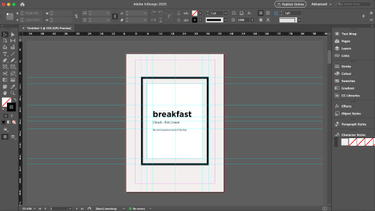
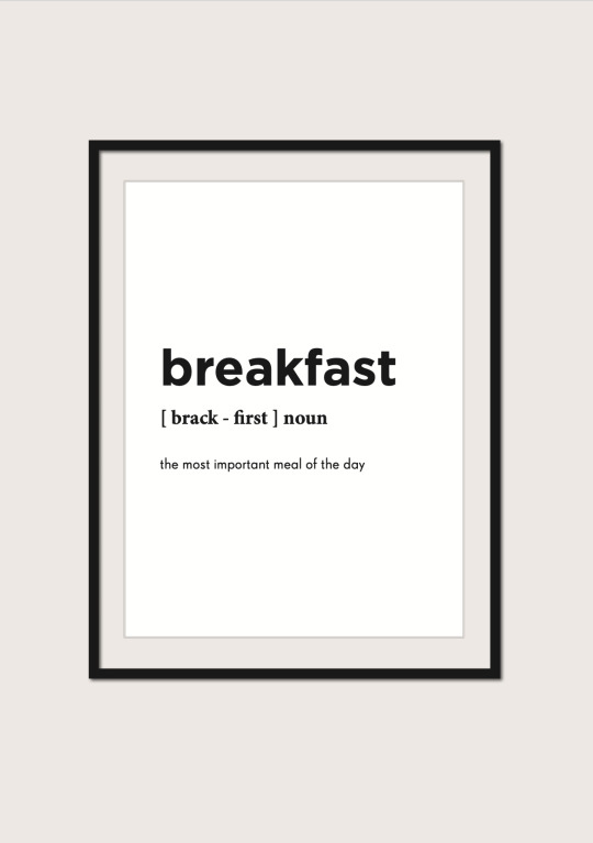
So before embarking on a personal brand, I had to perform research on my own self. Using guiding questions provided in the lectures and understanding the essentiality of performing critical reflections on oneself, I knew that I wanted to create something minimalist, professional and classy. Magazine layouts and editorial designs have always attracted me, and hence, in the first FP consultation I displayed some inspirations of vintage magazines and editorial typefaces. However, a part of me realised that this idea was something I desired, but it didn’t represent me as a whole. Taking some time off to reflect again, I made my final decision to anchor my brand based on something that I really loved: food -- and in particular, BREAKFAST. Now, I was ready to start planning for my brand guide; starting off with the most important elements -- the logo, color scheme and typography.
Logo
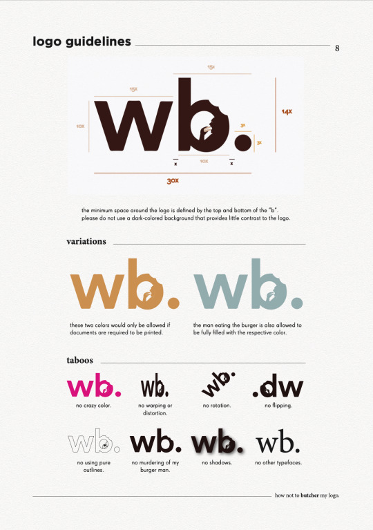
Incorporating the vibrant and light-hearted nature of food with the minimalist and professional attributes of an editorial theme was an extremely difficult task. Thanks to the feedback of my peers, as well as inspirations on logo designs, I decided to use this logo here to helm the brand guide.

Here, the typeface of my logo provides the professional outlook, and the bite marks and the man eating the burger in the letter “b” injects the more casual and slightly fun direction using the design concept of negative space. The full stop at the end was a creative decision I performed to tie the entire logo together.
There were feedbacks from my instructors that the man in the logo may be too small and hence become unnoticeable when downsized, and that the burger’s color could possibly take on that of the entire logo. Unfortunately, I decided to stay on with my original logo format as I felt that firstly, enlarging the man makes it too distracting in my opinion and I generally feel comfortable with the spatial relations between the man and the space inside of the “b”. Secondly, I chose to change the color of the burger primarily due to contrast and recognisability, and I felt that filling it with the same color as the entire logo would not make the “burger” itself obvious.
Color Scheme
Next, for my color palette, I was looking for an overall scheme that revolved around bread, eggs and tea (my most favourite components of breakfast). Hence, using these self-took images below, I composed my color scheme as shown below.
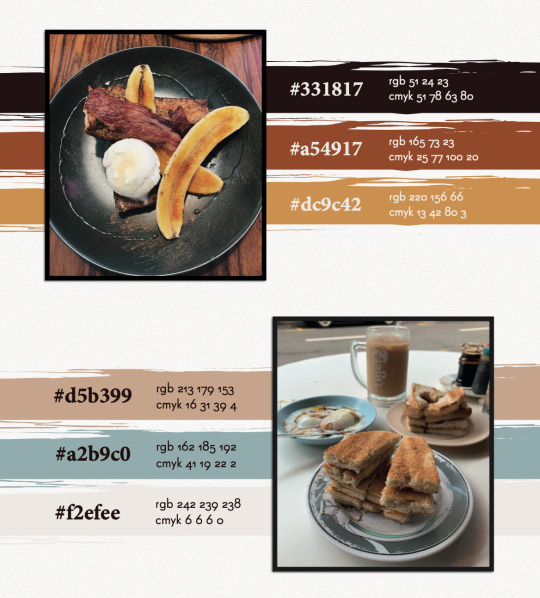
The colors mostly evoke the vibrant and palatable nature of food, with the only exception of the blue, which was a decision I made to include an accent color that could provide a touch of professional contrast to my overall color scheme.
Typography
Lastly, for my typography, I planned to use a sans-serif font as my character style, coupled with a serif font to provide a good contrast. As I was looking up Google for certain combinations suitable for magazine themes, I came across this pair that really caught my attention.

The article was right. Super Grotesk was the unique sans-serif typeface I needed to embody the dynamic spirit of my layout, accompanied by the serif typeface, Minion Pro, to support my characters with neat and outstanding paragraph headers or prominent quotes. Thereafter, I decided to employ Gotham as the strong title typeface to ground my pages together.
Now, with all my base elements, I was ready to embark on my creative process. After long hours of looking up inspiration from Pinterest and Behance, I embarked on a food magazine theme as the layout of my brand style guide.
Front Cover
Performing a playful rendition of Time Magazine, I came up with the title “Time ...to eat” to introduce my brand guide. Using InDesign, I demarcated the margins of the magazine’s signature red borders using the Layout settings and drew out the borders using the Rectangle Tool and the Pathfinder function as shown in the screen shot below.

As my logo contained bite marks on it, I wanted to incorporate this similar design element on my cover page and hence, I decided to use donuts. Using the Quick Selection Tool on Photoshop, I traced out the donuts from the images I took, created a new layer, and exported this image as a PNG file. With this, I could attach these donuts unto my cover page without worrying about additional backgrounds.

Page 2
Inspired by a design I found online that held a photo frame with a simple quote, I decided to create one to introduce the specific theme of my brand guide. Borrowing the guide lines from InDesign, I created the base and content of the frame, and employed Drop Shadow function in the Effects panel on various elements, as seen in the screenshots below, to create a 3D effect to stimulate the frame hanging on a wall.


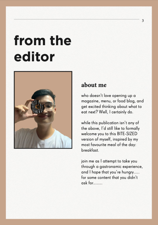
Words from the Editor
To formally introduce myself, and also inspired by magazine preface pages that usually feature the author/editor’s message, I also created a page to welcome readers in into what I am about to show them.
Resume
Naturally, I felt that the first thing I wanted to showcase was information about myself. Hence, the first collateral I presented was the resume. Using InDesign’s margins and guide lines, I created the various sections in a typical resume, but added my own touches, and employed the use of various “eaten donuts” to represent my various skill levels. These donuts were also used to demarcate the various pointers under my job responsibilities, to replace the typical “bullet points”. The final product will be showcased at the last segment of this blog.
Logo Ideation Process
While thinking of how to best present my logo, I was inspired by a senior’s work that featured the step-by-step logo creation process. I borrowed this idea and suddenly had this thought of using noodle strands to help the audience visualise the order of my logo ideation. These noodle strands and the fork was vectorised using Illustrator so as to efficiently remove their backgrounds and to be easily embedded unto InDesign like a clipart.

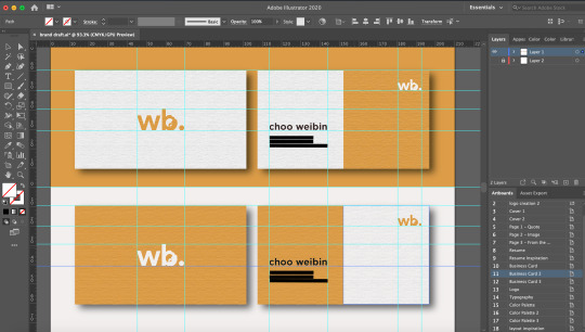
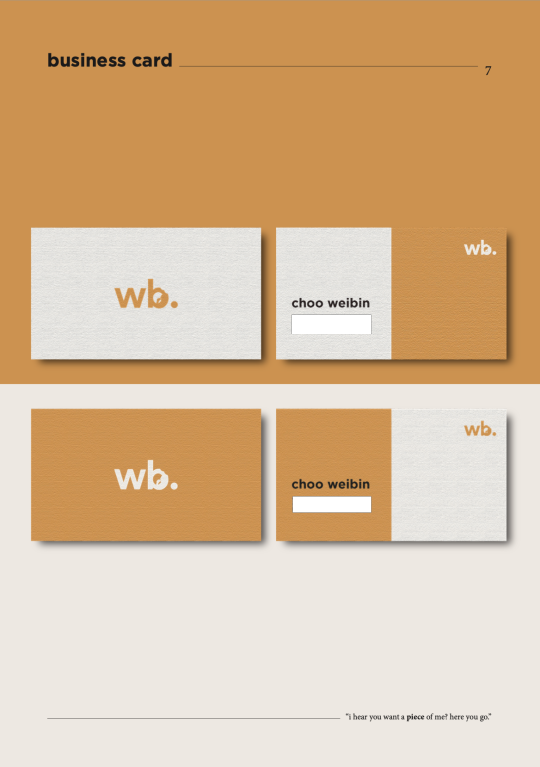
Business Card
For the name cards, I wanted to create a light and dark version, and maintain a professional and minimalist outlook. Firstly, I made use of the Rectangle Tool on Illustrator to create the bases of the cards. While I shortlisted a yellow and blue background this collateral, many of my peers found that the yellow would best represent the vibrancy of the brand and hence, I decided to employ this color.
For the front, while inserting my logo, I found that the contrasting burger color looked very uncomfortable when downsized. Hence, I made the decision to fill the logo with a full color just for this purpose. For the back, I only wanted to retain minimal information being my name, phone number, email, and linkedin account. But after finding that it might seem a little too plain, I sought to make use of design principles of asymmetrical balance to provide a more wholistic design.
In order to create the paper-like feel for my name cards, I applied a Texturised effect unto the name cards, and dropped a small shadow to create contrast between the product and the background. I borrowed the guide lines on Illustrator to standardise the dimensions and locations of each element.
FINAL BRAND STYLE GUIDE
With that, here is my final and end product. Primarily, these pages were designed and collated on InDesign. As I wanted to stimulate a magazine-feel as much as possible, I created an A4-sized rectangle background on Illustrator, applied the Texturised filter, and pasted them on relevant pages. Other than the two donuts seen in the front and back cover that were edited using Photoshop, the remaining pictorial elements were vectorised using Illustrator.
Do observe that for the second half of the brand guide, I inserted a few quotes below the pages as my form of small interactions with the readers. However, bearing in mind also that I could not fulfil similar formatting with the “resume” section as the entire resume took up a large margin of the page, do kindly note that the titling and quote is placed in a slightly different fashion as compared to the rest.

(cover page - comments were made from my final presentation to include my logo at the front, hence I placed it below and structured it to suit the theme of a magazine front cover. I also received feedback that the background was too heavy in contrast, hence, I decided to change it to a color from my color scheme.)

(food image - this image of breakfast was used to complement the previous page with the quote on breakfast)

(food image - another breakfast food image to accompany and support the previous page that introduces my message to the readers)

(resume - vectorised donuts were used here to indicate my various skill levels, and as bullet points to my job descriptions. I received feedback from my final presentation to bold the institutions and my company and role, as well as to enlarge the relevant dates, which I rectified in this draft above.)

(logo - vectorised fork and pasta strands were used here to guide the audience’s vision to my logo ideation process, with the final logo presented the biggest at the bottom.)


(typography - for my final presentation, while many noted that the simplicity of the page was its charm, some also felt that maybe I could incorporate some visual designs to compliment the other pages. Hence, I borrowed the vectorized image of a man holding a chopstick as my symbol for “placing” and “picking” the right typography for the entire magazine. The image has also been edited to 80% opacity to not take over the spotlight of the page)

THE END
I really hope you have enjoyed this as much as I really had fun creating this. It was a rather intense month coming up with all these ideas and discerning what was effective in communicating my brand, but overall I was very grateful especially to my TA, Zicheng, for entertaining millions of my annoying emails and still being able to deliver the best advices to me, as well as my peers who constantly pointed out the rooms for improvement. It’s really a bittersweet end to this journey, but I’m forever grateful for being able to learn this in CNM and also to retain a project that I would be able to at least be proud of for a long time :-)
0 notes
Text
Color Outside the Margins with Gorgeous Full Bleed Printing

When you want your color print project to dazzle and delight, you may want to use a bleed technique in your printing.
Sound strange? Well, the result is beautiful! Here’s what you need to know about this option.
What is a Bleed?
A bleed is a printing technique where your design is printed bigger than the final product’s finished size and then cut down to size, eliminating any unwanted white space or borders around the edge of your design.
Typically, bleeds refer to the extra 1/8” (0.125″) of an image or background color that extends beyond the trim area you’d like to feature. A bleed project is printed on an oversized sheet that is then cut down to size, giving the impression that the image is “bleeding” off the paper’s edge.
When Can a Bleed be Used?
Bleeds work well if your design has a full-colored background and can be used for any project where you want your design to extend to the edge of the sheet.
Bleeds can improve the precision of any print project. Why? Because without a bleed, you'll see a tiny bit of white on even the most carefully arranged and cropped document. When you print “outside the margins” with a document bleed, then there’s no room for error. The final product will be perfectly cut with a crisp, immaculate appearance.
When you are printing a booklet or something that will be folded, you’ll probably want to use bleeds on the interior borders so it doesn’t look as though the project is unfinished. Work to have colors meet in the middle, so your design flows effortlessly from one page to the next.
Where or How Can I Add Bleeds to My Design?
Each design program addresses bleeds differently, but here are some basics to get you started:
InDesign: InDesign is best suited for print. You can set up both bleed and margins in the “Document Setup” box when creating a new document. Simply bring your bleeds and margins up to 0.125″ for the top, bottom, inside and outside. Your document will have visible lines for you upon creation.
Illustrator: In the initial “Document Setup” window, set your bleeds to 0.125″ for both top, bottom, inside and outside. You cannot set up margins in Illustrator, so you will have to use guides once your document is open.
Photoshop: This one is a bit complex. In Photoshop, you will have to add 1/4” (0.25″) to your final document size to account for the bleed margin you need. For example, if your document is 8.5” x 11”, you will need to set the document up in Photoshop to be 8.75” x 11.25”. Extend all bleeding images and graphics to the edge of your page and then use the design rulers to create guides for your trim and safety margins.
Publisher: Publisher is similar to Photoshop. To set your document up to bleed, simply add 0.25” to your document size in the Page Setup window and use design rulers accordingly.
Word: Unfortunately, you cannot set up a full-bleed document in Word.
Still feeling uncertain? There are many online helps (like this quick InDesign bleed tutorial) that can get you started. Or leave the heavy lifting to our creative design team! We’ve got you covered.
Whether you’re creating a template or need start-to-finish graphic design, we’re here to consult, create, and bring your best ideas to life. Give us a call!
0 notes
Text
Mock Book Tests
As detailed in my last post, I have decided that the book format will be the best way to present my images and stories that I have collected therefore I will need to create books and test what arrangements work best. My initial idea was to have individual books for each subject so that they have their story and images contained in their own space, this would represent their ownership of their experience and help to individualise them, keeping their stories of equal importance. In a physical setting this would allow for all of the books to be laid out so that readers could pick up each one individually and experience each person’s images and story at their own pace. However as this is quite conceptual I would need to see how this looked in a virtual context, therefore I started working in InDesign to create mock books for some of the subjects.
I decided to test different covers as this would be the crucial part of testing if the multiple books concept would work. As detailed in my last post I decided that a plain cover with a name, a image and the name, having the story on the cover would be the best options to test to see what effect they would have on the reader.

Name only virtual mock book: https://fliphtml5.com/ncift/auig
This is an email of a mock book which just features as blank cover with the subjects name, inside are a couple of the images and the full story detailing what the images are inspired by. I think that this cover is quite effective in keeping an air of mystery and intrigue surrounding the contents which may inspire the reader to pick up each of the individual books in order to learn what the names mean and who these people are. This approach to the book seems more personal and effective than simply having nothing on the cover, as I had considered before, it sets up that we are about to open the book and learn something about the person who is behind this name. Due to the small size of the books to it would easily be assumed that the contents would only contain that of the person on the cover too. I still feel however that this leaves something to be desired, I don’t quite like the style of the cover, the name alone still seems slightly impersonal however it is a step in the right direction.
Story on the Cover full book: https://fliphtml5.com/ncift/jiqj
The next book I wanted to test was displaying the full written out story from the subject on the cover of the book. My idea behind this was to immediately give the reader context for the rest of the book and for them to understand the context in which the images exist. Unfortunately in practice and imagining that there is a table or shelf with multiple books with very similar covers the large amount of text could seem quite off putting and could make the reader either not want to pick the book up at all or make them only read one or two.

Image and name virtual book: https://fliphtml5.com/ncift/khez
The final book cover that I wanted to visualise and test is a mixture of having one fo the images from the subjects shoots along with their name. This is my personal favourite of the three as it takes the individuality and simplicity of the first book just having the name and makes it more dynamic and intriguing by having a very abstract image behind it. The abstract nature of the image will prompt the viewer to want to investigate further into the books to uncover what story or information they can discover about the person on the cover. I believe that this approach would work best as I want this to be an opportunity for the subjects to share their stories and have them experienced thoroughly, this book will allow for this as there is a mix of full page spreads and close up on one of the images and the fully realised story on its own page with no images surrounding it.
0 notes
Text


On Location - 6/10/17
Following on from the fresher’s mystery tour, On Location has been our first real project. I was partnered with fellow student Alice Levy, and we were challanged to pick a place in Carlisle and design a stylized, twenty page magazine featuring the chosen location as a main theme. I thought about looking around the Market building in Carlisle, and Alice agreed this would be an interesting place to look into, because it definitely is a fantastic building - listed as Grade II, in fact, and the only remaining indoor Victorian market hall.
Carlisle market is that it has a great historical aesthetic (with a fully-documented history to go with it), and plenty of unique stalls with lovely proprietors, but it has an underlying problem: it is virtually almost completely empty. There are easily more stalls and proprietors than people, even at its busiest of times, and when me and Alice walked around taking photographs, it is not hard to see the lack of people (furthermore, we were asked by the market hall managers to not take photographs of people without permission, but it would have been much harder trying to photograph the people in there full stop).
We talked to some of the proprietors about their stalls and business, and none of them really had good news - in recent years, they mostly said that people just came less and less. One of them had moved stalls a few times, but she said the decline of customers was inevitable; slow, but steady. I wanted to know what they thought was the cause of the decline, and they all gave different reasons: some blamed the digital age and internet shopping, but I think the real reasoning is more in depth than this.
Sweet Musketeers is a stall inside the market hall that is on the far left (from the front entrance), and owned by one of the proprietors we spoke to. His stall was costing him almost six hundred pound a month, and whilst he had a great display of sweets business was nonexistant for him. He spoke about how most of the people in the stalls are barely behind them for more than three days a week, since some days the hall is so empty they do not see any point in coming in. For one thing, it seems like a vicious circle - the less busy the market hall is, the less people it attracts and less of the business owners want to come in and man their stalls.
Worse still, the market hall now has a direct link to both Wilkinson’s and TK Maxx, both of which are larger, retail stores that are able to sell almost anything and everything the market can offer at a cheaper price. Unfortunately, shoppers have to walk straight past the market to get to these shops, and most of the stall owners see them walk straight past (they always say that heaven is so close to hell). But because of this, people do not even think to go in the market because they do not have a need.
Beyond this, the market from the outside can be a bit misleading. It has two street entrances, but if you are new to Carlisle, they are not immediately obvious. The first looks just like a frontage to TK Maxx and Wilkinson’s, and the second looks like it is closed off for maintenance. This means that if tourists and out-of-towns people come and have a look around the town, even if they think to have a look at the grand, Victorian market hall they have heard about, they might just walk straight past it altogether.
Alice and I were left feeling sorry for the struggling, stoic proprieters of the market, and we really wanted to show it in a respectful and promotional way that would appeal to people of all ages. Having said this, we also wanted to show it for what it is, a struggle for the business owners that may cease to exist if it keeps going unsupported as it does, since it is not getting any sympathy from anywhere else. The magazine we created was fourteen pages (we did not find enough content for twenty, but we focussed on making fourteen great ones), and we’d like to think we did a great job.
- Max.
_ _ _ _ _ _ _ _ _ _ _ _ _ _ _ _ _ _ _ _ _ _ _ _ _ _ _ _ _ _ _ _ _ _ _
On Location [Brief 1] 25/09/17 - 6/10/17
Alice Levy (Illustration) & Max Wilkins (Graphic Design)
Images shot with Nikon D3200 with standard 18-55mm VR lens; pages created in Adobe Photoshop and exported as a PDF in Adobe Indesign.
Low resolution version here - Full HQ PDF available at the University of Cumbria ISSUU page.
1 note
·
View note
Text
Trends Research - Look Book Development - Final Outcome - Evaluation [20]
This module was very stressful, I went into it believing it would be relatively easy to create the look book, all I had to do was get past the obstacles that were Photoshop and InDesign. I was very wrong, what ended up being the case was that I actually picked up both software applications pretty quickly, it was my lack of creativity that let me down the most. Thats where I feel like I made my biggest mistake in my look book, was how boring I made it, I liked how all the inside pages turned out for the most part but if I could do it again I’d spend a lot more time refining what I created, and made a look book more complete looking.
To start off with I think my Photoshop skills are relatively good, most things I can think of wanting to do in Photoshop I can do, whether that is cutting out parts of an image, using the clone stamp to replicate parts of an image or changing the colour of an image, I can do it. Unfortunately, not all my skills I learned were showcased in my work as but I did not want to force them in either.
I am a lot more confident with Photoshop than I am with InDesign, for the future I need to look more into the features of the different things I can achieve in InDesign like adjusting and creating my own font styles for example, which is one thing that really would’ve elevated my look book.
Using these skills, I managed to create a look book for my trend that was ‘Neo Classical’, I am very pleased that I stuck with this trend as it is one that I personally am interested in and am a fan of, a lot of the brands I showcased looks from are brands that I am a big fan of, such as Alyx. I also feel like this trend is very relevant towards current fashion, not only because it was featured as one of WGSN’s spring/summer style trends but it also showed in that a lot of the images I used were from the most recent mens fashion week in January of 2020, they are trends that are currently being featured now in shows and no doubt will be featured in shows for spring summer 2021.
The final piece for this module was the look book, fully printed out and made. Other than problems already mentioned like how bland it turned out to be and how I made a mistake lining up the text on my colour palette page, there were a few problems I had when printing it out. First of all is the colour, the look book printed out in a darker version of what I saw on my Indesign file, in the grand scheme of things it’s not much of a problem and hardly noticeable, but I’d have liked it to have come out more vibrant. This may be a mistake on my end as I chose to print it onto matte paper as I thought that might be best so it wasn't too loud, however it just ended up being a bit too dull for my liking and if i was to print it again I’d go for something different than matte. Secondly, the bleed on the pages meant that I could see the end of the bleed when some of the pages were open, i’m not sure how I could’ve resolved this issue.
To wrap up this module, in the end I did actually enjoy what I was creating once I’d got into the groove of being creative. There’s a lot of improvements to be had in all areas of my work, from my Photoshop and Indesign skills to me creating the final product and making sure everything is done properly. But I also believe I did a lot of things right, like choosing ‘Neo Classical’ to be my trend of choice.
0 notes