#And he's a transparent PNG (or he should be at least) so you can drag him around the dashboard if you like
Explore tagged Tumblr posts
Text
There's a cat on your dashboard!
He has a little note that says he loves you and he knows you can get through this. He's giving you a little boost of positive energy! He believes in you!!
#UTDR#UTMV#Neko Sansume#My Art#And he's a transparent PNG (or he should be at least) so you can drag him around the dashboard if you like#Or save him and stick him on top of something else#Free support Dream kitty for whoever needs him :3
192 notes
·
View notes
Text
Fire Emblem Heroes Sprite Assembly Tutorial
Someone requested a Heroes spriting tutorial on Serenes Forest, so this is my attempt at making one. This is just going to be for basic sprite assembly, I might make separate ones later for poses/color/edits because this one's already kinda long and I'm kinda tired
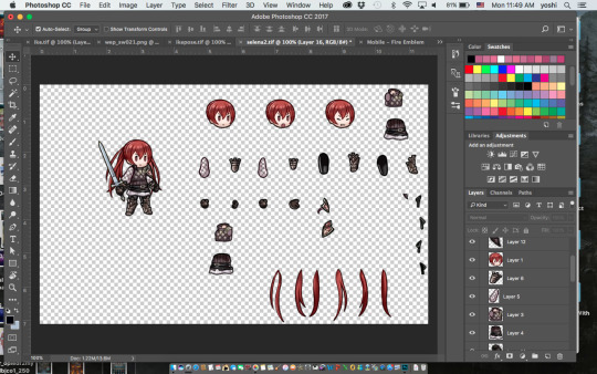
Keep in mind this tutorial is for Photoshop because that’s what I use so if you don’t use Photoshop hopefully someone else can make a tutorial for your program of choice. I’m also going to assume you have basic Photoshop knowledge, if you don’t and I say something you don’t understand, well… Google is your friend. Sorry to be blunt but if I’m here explaining all the Photoshop tools and what they do we’re gonna be here all day.
A few important things to keep in mind:
-Save often! Crashes happen and they suck.
-Be very careful before merging your layers/saving your work as a PNG file! If you close the document after merging layers, you WILL NOT BE ABLE TO RECOVER THEM. I would recommend saving one version as a TIFF or PSD file with layers and another as a PNG file when you’re finished. Otherwise you may want to go back and… say… give Ike an axe instead of a sword only to find out that you’ve merged the files and he now has a sword glued to him. Don’t be like me guys. Keep two separate documents.
First off, you’re going to want to go either here:
https://www.spriters-resource.com/mobile/fireemblemheroes/
Or here:
https://www.reddit.com/r/fireemblem/comments/5rxslp/fire_emblem_heroes_asset_collection_all_art/
To get the character sprite sheets. I mostly use the Reddit link but it’s missing a couple sheets (Alfonse, Anna, Sharena and a couple others) so if you can’t find something you can most likely find it on Spriter’s Resource. The Reddit link also gives you a bunch of .zip files so if you don’t want to deal with that you can go on Spriter’s Resource. SR might be missing a couple of the newer characters though, but if you can’t find someone there just let me know and I’ll add it.
The second thing you might want is a reference picture. This isn’t necessary, but if you’re just starting out or are a perfectionist like me you might want to get one.
If you have Heroes installed on your phone and your phone can take screenshots it’s fairly easy, just find the character you’re looking for in the game, take a screenshot, and upload said screenshot on your computer.
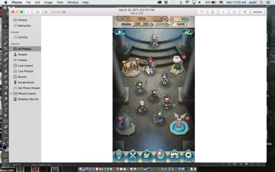
If you can’t get a reference picture like this, you can try to get lucky Google-ing Fire Emblem Heroes (character name) and try to find a screenshot of them (I don’t think I’ve ever had luck using Google though) or you can search on Tumblr. I’ve had a lot more luck searching Tumblr, but it still doesn’t work all the time. Or you could just message me, I’m pretty sure I’ve gotten references for every character by now.
Once you’ve got your screenshot, open it and the character sprite sheet in Photoshop. I’ll be using FemCorrin as an example.
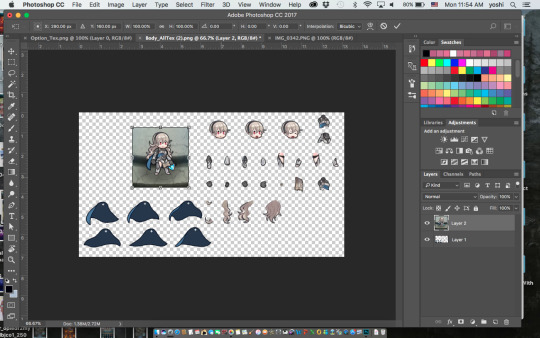
The first thing you’re going to want to do is resize the reference pic(using Command T) so it’s roughly the same size as the sprites.
Then you’re going to want to select one of the parts of the sprite sheet (I usually use the marquee tool) and press Command J to put that part on its own layer. If you did it correctly you should have a new layer with just Corrin’s head (or whatever part you chose) on it. Then use the move tool and drag it over to the reference photo and line it up on top of it. You may have to adjust the size of the reference picture to match the sprite size (You’re probably not going to get them to exactly the same size but try to get it as close as you can). Do NOT resize the sprite part instead of the reference picture. Then you’ll have to resize every other part to match up if you want it to look right, and it’s way more trouble than it’s worth.
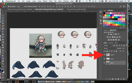
You can turn the layer visibility on or off as needed by clicking on the little eye next to it on the layers panel. This is extremely helpful for making sure it’s lined up on top of the reference picture.
After that just keep doing the same thing with every other part. Like a… Corrin-puzzle or something. Keep every part on it’s own separate layer- this will come in handy if you want to change a pose or something later.
Complications—
-If you end up with, say, Corrin’s cape on top of her, just drag the cape layer beneath whatever layers it’s hiding.
-Sometimes you’ll just end up with this part that you just can’t figure out what to do with. Just leave it to the end. It may be hidden in that particular pose so you may not need it at all or by the end you’ll have a random gap and realize where it goes.
-Keep in mind- sometimes the game bends and stretches some parts, particularly capes and wyvern/pegasus wings. If something’s not lining up no matter what you do, you may have to use Command T and mess with it a bit to get it to fit.
Once you’ve finished your Corrin-puzzle, you can turn off the reference photo and double check that everything looks right. For example, here I realized I have Corrin’s hair over the cape layer when the cape should be on top.
Then you’ll probably want to give the character a weapon. Weapons can be found using the same websites as the character sprites, but weapons that were added with updates (ex. Spring weapons, Ragnell) aren’t on Spriter’s Resource (at least the last time I checked, they may have added it) so if you want those you’ll have to get them from Reddit. Or just message me and I’ll send you them.
And there you go! Once you’re happy with it, you can use the crop tool to crop off the edges and save one file as a TIFF or PSD with layers and another as a PNG. PNG makes the background transparent, but it also merges the layers, so I recommend saving it as a TIFF or PSD file as well- even if you’re not planning on changing it later. You may end up realizing you messed something up later- believe me, it happens.
Anyways, I hope I explained this well, let me know if you have any questions or need clarification on anything. Or if you just wanna talk. I’m here for you 👍
121 notes
·
View notes
Text
GIMP shredder/unshredder tool by Ofnuts / A guide to ripping sprite sheets from MAME
All right, before we begin you will need the following:
MAME - http://mamedev.org/ ofn-shred-layer - from Ofnuts GIMP tools: https://sourceforge.net/projects/gimp-tools/files/scripts/
GIMP - https://www.gimp.org/
game roms - HAHA! Nice try jerkface!
------------------------------------------------
For this example, I will be using Joe & Mac Returns (World, version 1.1) in MAMEUI64 0.188.A . See MAME documentation if you have any questions regarding the interface. Note that the GFX viewer doesn’t work in full/at all for every game. My resolution is 1366x768. A different size may effect the numbers I use later, so just keep that in mind..
It should also be noted that I would say the vast majority of these sprite tables do not align like in the example given.
Launch the game and wait for Joe (Mac?) to crack the Earth, pause emulation (should be binded to the P key) and then load the GFX viewer (default F4)
Enter to switch from ‘palette’ to ‘gfxdecode’
+ and - shrink and grow the table. Hit + approx 15 times. If it looks off (sprites split on the table border), try scrolling up or down with the arrow keys or exit the viewer and reload. You should see a version of the following (I loaded the viewer too early so don’t worry about the color right now):
Now use the arrow keys to change the palette. We are going for the one used on the high score table. Scroll over to C/20 and you should see:
Now you will need to take a screen capture, paste it into GIMP, Paint, or whatever you choose, and [OPTIONAL] save in a format like PNG that allows for transparency. NOTE: You cannot use the internal MAME snapshot (F12) for GFX rips. At least not in this build
Now you can exit out of MAME. The rest of the guide assumes you have a basic understanding of GIMP and installing plug-ins. A simple Google search or the GIMP helper should cover anything not covered here. All right! Install GIMP and that plug in, and let’s get to it!
Load your screengrab, and click the Rectangle Select Tool. Drag it over the sprites we will be using (0, 80 to the 2nd 9, 180). Leave a little room for trimming.
Cut or Copy, then Edit >> Paste As >> New Image
*** NOTE: The use of the Fuzzy Select Tool is really up to you. I prefer working with transparent layers with the end goal of stripping everything outside of the sprites. Your call.
Now go back to the toolbox and click the wand aka Fuzzy Select Tool and select one of the gaps, then hit delete. Use the Zoom function if needed. Select >> None to clear all the selections and you should have roughly the following:
All right, almost there! Before using the Unshredder, we need to trim the edges. Zoom out (50% works) and make sure View >> Snap to Canvas Edges is checked. Use the Rectangle Selection Tool and cover the entire canvas. If done correctly, it should be pretty close to where we need it.
Now Zoom to 1600% and drag each corner of the selection tool so we can achieve a tight final cut. When complete, the image should be 932x428 - each corner should look like:
Ok! Once you have a new image featuring our finished cut, it’s time to bust out the Unshredder. Now as far as I can tell, it doesn’t matter if the gap we are shredding borders the final image or not. As long as everything is even, you should be fine. Before using the plug-in, you need some numbers. Using the Zoom tool, you’ll find the tiles are 32x32 with a 4 pixel gap. Let’s do it!
Load the plug-in under Layer >> Unshred. Now to me, the parameters are a little confusing. The first number is what we are keeping, the second is what is being tossed. Plug in the numbers below:
On the output file, perform the same action but with Direction changed to Horizontal. After some cleanup with the wand, you’re finally done!
Phew! Damn, this is by far my longest post since I got sick. Thanks again to Ofnuts who was kind enough to bring this tool to my attention that he or she created!!
#mame#mam64#mameui64#gIMP#Sprites#joe and mac#sprite sheets#arccade#arcade#gga#game assets#sprite ripping#ripping sprites#games#vga#video games#how to get away with murder#how-to#blog#guide#guides#gimp guide#gimp guides#ofnuts#slp#low pursuit#super low pursuit#urvile#ur-vile
2 notes
·
View notes
Text
Everything You Need to Know About Inserting and Editing Images in WordPress
The post Everything You Need to Know About Inserting and Editing Images in WordPress appeared first on ProBlogger.
Do you feel confident using images in your blog posts?
While there’s no absolute rule that bloggers need to include images, most bloggers will include at least one eye-catching image in each post (normally at or very near the start).
However, it’s easy to make mistakes with images. We’ve already covered how to obtain images legally so you don’t accidentally infringe on someone’s copyright. But in today’s post, I want to go through the process of uploading and inserting images.
Whether you’ve just started blogging or you’ve been blogging for years, I hope you’ll learn something new from today’s post. We’re going to start off with the basics, and move on to some more advanced tips and tricks.
He are the ten things we’re going to cover:
How to download an image from the web
How to upload an image to your blog
How to insert an image into your post
How to align your image within your post
How to resize your image
How to turn your image into a link
How to add alt text to your image
How to edit your image in WordPress itself
How to keep your image file sizes low
How to optimise images for retina screens
#1: How to Download an Image from the Web
Brand new bloggers might feel a bit stuck at the first hurdle: downloading their chosen image.
Once you’ve found an image you can legally use, you’ll need to download it to your computer. (While it’s technically possible to insert it in your post using its existing URL on the web, this “hotlinking” is a bad idea. Many sites don’t like it, as it puts extra strain on their servers. And if the image file is removed from its current location, it’ll disappear from your post too.)
To download an image, right-click on it. You should see an option such as “Save image as…”. (It may be worded slightly differently depending on your browser.)
Click on “Save image as…”, and then select the folder on your computer where you want to save it.
On sites that act as a library of images (such as Pixabay and Flickr), you’ll normally be able to choose from different sizes for the image. Here’s how it looks on Pixabay.
The numbers on the left are the dimensions of each image in pixels (width by height). The numbers on the right are the size of each image file in kB/MB. As you can see, larger images equal much larger files.
It’s up to you what size you choose. (We’ll cover this in more detail in sections #9 and #10 on this list.) Note that on Pixabay you need to create a (free) account to download the largest images.
#2: How to Upload an Image to Your Blog
After you’ve selected and downloaded an image, you need to upload it to your blog.
On WordPress, log in to your dashboard, open up your chosen post (or start a new one), and click the “Add Media” button.
Then click the “Upload Files” tab. You can either drag and drop your chosen file to upload it to your blog, or click the “Select Files” button to browse through your computer folders for it.
(Note that whichever you choose, the original file will remain on your computer. Only a copy of it is uploaded.)
If you want to, you can upload several images at once.
#3: How to Insert an Image
First, position your cursor where you want to put the image within your post. (Click at the start or end of a line of text, or click on a blank line.)
Your uploaded images be available in your media library. Click “Add Media” then the “Media Library” tab (if it’s not already selected for you) and you’ll see them.
To insert an image, click on it and you’ll see this panel on the right-hand side of your screen.
You can set the alignment of the image, add a link, and choose the size you want it to be displayed. We’ll be covering all of these later on in this post. (You can edit your image to change any of these details after inserting it.)
Click “Insert into post” to place the image in your post where your cursor is.
#4: How to Align Your Image Within Your Post
If you inserted your image without changing the alignment setting, it may not appear exactly the way you wanted. Perhaps you intended to have it above your text, centred, or at the start of your post. But instead it’s right-aligned alongside the text.
(Dummy text generated by fillerama on “Doctor Who” mode.)
To re-align your image, click on it and then click the “align center” button on the mini-menu that pops up.
(You can also click the little pencil button to edit the image, where you can select the alignment, size and more.)
Your image should now be aligned correctly in your post.
#5: How to Resize Your Image
If your image is too big, you can resize it by clicking on it and then clicking on the edit button in the mini-menu.
You’ll see details about the image. Click the dropdown menu next to “Size” and you’ll see a range of options.
If one of the listed sizes works for you, select it. If not, click “Custom Size” and enter a width or height for your image in pixels. Whichever you choose, the other dimension will be adjusted automatically.
Click the “Update” button at the bottom of the screen, and you’ll be returned to your post with the image updated to your chosen size.
Note that this process doesn’t change the size of your original uploaded image, so the file size will remain the same. (We’ll cover more on this later in this post.)
#6: How to Turn Your Image into a Link
At some point you’ll almost certainly want to create an image that readers can click on to go to a different page.
For instance, you might want to create:
A “start here” page showing the featured image from several posts, with each image linking to the appropriate post
A page of book reviews, with the cover image for each book linking to the book on Amazon
A custom “buy” button for your products, with each one linking to a PayPal or shopping cart page
To add a link to your image, click on the image and then click the little “edit” button that appears to get the Image Details screen.
Click the “Link To” dropdown and select “Custom URL”. You can then enter whatever URL you want the image to link to.
Make sure you click the “Update” button to save your changes to the image.
An even quicker way to add a link to an image is to copy your link, then click on the image and paste the link (press Ctrl+V on a PC or Command+V on a Mac). This will automatically add the link to the image.
#7: How to Add Alt Text to Your Image
Alt (alternative) text is normally used for accessibility. It provides a short description of your image that can be read to people using screen-reading software. (It will also appear on the screen as text if the image fails to load.)
Note that this is different from a caption. If you enter a caption, it w’ll be displayed immediately beneath the image in your post.
You can add alt text to your image when you’re editing it. Simply fill in the Alternative Text field with whatever text you want.
#8: How to Edit Your Image in WordPress Itself
It’s normally best to edit images before you upload them using software such as Photoshop (or, if you want a free alternative, Gimp or Paint.NET).
But sometimes you might want to make adjustments to your original image within WordPress. You can do this by clicking the “Edit Original” button in the Image Details panel.
You’ll then see this screen.
You can then resize the image. (You can only scale down, not up.)
Note: it’s best to do this before making any other edits.
You can also rotate the image, or flip it from top to bottom or left to right, using the buttons immediately above it.
You can crop the image by clicking on it and dragging to select your chosen area. Here’s the original image flipped left to right, with an area selected so it can be cropped.
To crop the image, you then need to click the “crop” button on the top left above the image.
Once you’re happy with your changes to your image, click “Save” beneath it, then “Update” on the next screen. You should now see your new image in the post itself.
If anything goes wrong, you can restore your original image using the “Restore Original Image” option.
#9: How to Keep Your Image File Sizes Low
The larger your image files, the longer they’ll take to load on your web page. And this can potentially affect on your site’s performance. If your site is really slow to load, readers may simply give up and go elsewhere.
There are several ways you can keep file sizes down, including:
Using .jpg images where possible. They’re compressed, so they aren’t as high quality as other file types. But for images in regular blog posts, they’ll probably look fine. Note that if you have transparent (or partially transparent) images, though, you can’t save them in .jpg format.
Resizing your image before uploading it to WordPress. If you’ve taken a photo on your camera and it’s 4000px wide, don’t upload it unedited to your blog. Yes, you can scale it down in your post (see #5), but the image will still take a long time to load. Instead, use image editing software to resize the photo before you upload it into your media library.
Using the WordPress plugin Smush to resize and optimise images you’ve already uploaded in the past. This could make your site significantly faster.
Using the TinyPNG service and/or Compress JPEG and PNG images plugin to reduce the size of your .png images. (If you have partially transparent images, they’re probably .png files. You should also use .png for any files with graphics in them.)
#10: How to Optimise Images for Retina Screens
The newest Apple products have Retina displays, which have a higher pixel-per-inch density than regular screens.
As SitePoint explains:
Retina has four times more pixels than standard screens. If you have a 400 x 300 image (120,000 pixels), you’d need to use an 800 x 600 alternative (480,000 pixels) to render it well on a high-density display.
This means that if you want a 500px by 330px image for your post, it would be best to upload it as a 1000px by 660px image. That way, it can be displayed crisply on the retina screen.
Your theme might automatically size and display the image correctly for each user (based on their device) if you simply insert it into the post at the larger size. If it doesn’t, you can use the WP Retina 2x plugin (which is explained in detail by Barn2 Media) to create and show the retina images as appropriate.
I know there’s been a lot to take in with this post. Don’t worry: you don’t have to master everything at once.
If you’re new to blogging, you might simply want to get confident with the basics of downloading and uploading images to your blog, then inserting them into your post at the appropriate point.
But if you’ve been blogging for quite a while, you’ve hopefully picked up a new tip or trick today as well. How will you put it into practice this week?
The post Everything You Need to Know About Inserting and Editing Images in WordPress appeared first on ProBlogger.
from ProBlogger http://feedproxy.google.com/~r/ProbloggerHelpingBloggersEarnMoney/~3/rUKlSRbVgO0/
0 notes