#An attempt at rendering a cartoony doodle with my more detailed rendering style!
Explore tagged Tumblr posts
Visit Tumblr Blog
Explore Tumblr blogs with no restrictions, modern design and the best experience.
Last Seen Tumblr Blogs


Fun Fact
25% of US internet users with an annual income of $80-100K use Tumblr.
Text
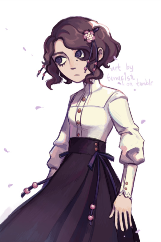
Flower girl
#my art#original character#oc yuina#An attempt at rendering a cartoony doodle with my more detailed rendering style!#...that's why she's not really doing anything. The base was drawn sort of aimlessly in like two minutes :P#and also why the proportions are a bit wonky...
201 notes
·
View notes
Note
Hey Lethy,
Hopefully this is the last question for awhile. As I learn the basics of drawing people I’m starting to think about art style. I guess I’m having a hard time finding something I want to model(?) mine after. I see multiple art styles I really love. Some more cartoony and others more realistic like yours. But I’ve also been crazy over the art style in Hades. There are too many I really like. But I’m also worried I might not be able to change it if I don’t like it. That probably sounds crazy though.
I guess I’m asking how do you pick.
Thanks again for so much help!
Heya, anonymous friend!
Oooooh, that’s an awesome question and one I’ve been mulling over myself a lot!
Long-winded answer and ramblings are under the cut.
1) Artistic style musings.
After careful consideration, I came to the conclusion I was being held back in my progress for years due to unconsciously imitating anime style of drawing, just by virtue of me watching a lot of it in my formative years and drawing fan art. I never had formal artistic education, so it was up to me to get a grip, kick my own ass and sit down and study the fundamentals properly.
Which is exactly what I’ve been doing in the last couple of years (you can observe the progression if you skim my blog here btw).
A seasoned professional artist told me, without mincing words, that you should first get a firm understanding of fundamentals - perspective, figure drawing drawing from reference, understanding how light works, values and so on, before attempting stylisation, or else, in their own words, you’ll end up on shit street in terms of style. And I tend to agree with this thought, as no amount of flashy stylisation will be able to hide one’s lack of understanding of basic principles of drawing.
One mistake that me and countless other beginner artists made, was focusing too much on polishing a fundamentally flawed drawing in hopes of making it better. And the harsh truth is, no amount of detailing and hours of blending or shading will make up for botched proportions, lack of perspective or unsorted values. :/
So, personally, I don’t worry much about style yet and just focus on learning the basics. As soon as I started to do that, genuine improvement began and my own recognisable style began to from on its own, which I’m proud of. Have you noticed the same happening in your own studies, I wonder?
2) Hades game - I really like that game’s style as well. But if you look closely, this heavy stylised approach is grounded on solid knowledge of anatomy, composition, colour theory and so on. If you try to copy without knowing why the artists working on that game made these particular stylistic choices, you’ll end up with a blander version of their drawings. Keep in mind, that different stylistic choices apply to different themes. What works for comic book hero art is completely useless in, say, portraiture. So sticking to it will inevitably limit your visual vocabulary. So, again, working on studying drawing fundamentals is key to developing a versatile toolset as an artist (sorry for being boring and hammering this point down).
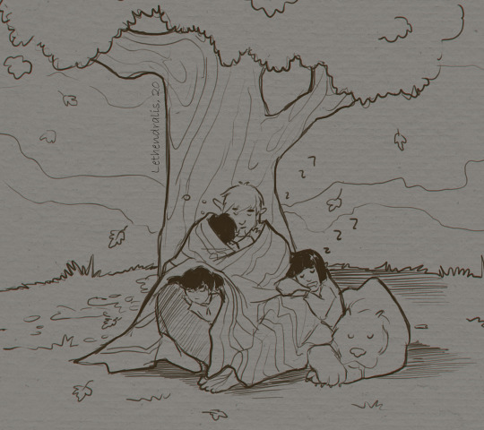
3) Picking a style - for now, if you noticed, I have 2 or 3 stylistic approaches I switch between while working. Heavily stylised, sketchy/cartoony one for when I doodle for fun, like here:
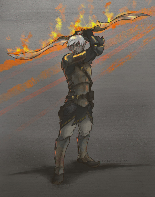
A detailed and clean storybook illustration style, which is my personal comfort zone, as I find it very pleasurable and relaxing to do character design and render all of the small details:
And a painterly style that’s not dependent on line art, but more on capturing forms, proportions and values right and one that challenges me the most:
Hope that was helpful! Do remember that you can always jump into my DM’s or on Discord to talk art more, as it makes me very happy to share what I’m learning!
29 notes
·
View notes
Text
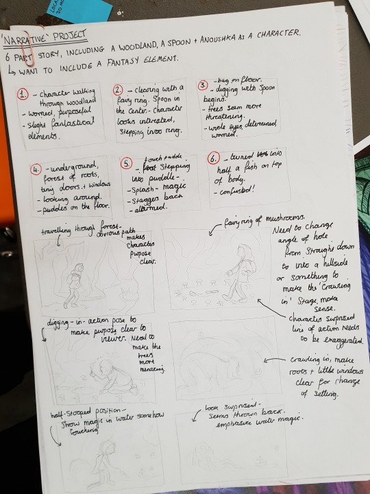
PROJECT// NARRATIVE- Developing a Narrative and Digital Printmaking
The rules stated in the brief regarding a final narrative were that you must use the fellow student and kitchen implement you drew in the beginning stages of the project, as well as the location you chose for the task over Christmas. The meant that I started off with my friend Anoushka, a spoon, and my local woodland.
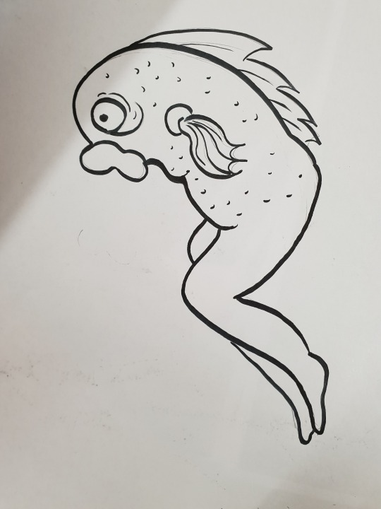
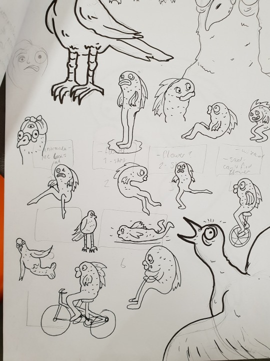
During the group narrative task (see previous post), I had enjoyed playing with more the fantastical elements in the story, as well as thinking about including hybrid characters I had created during the ‘Assembly’ project. During the group task I doodled the following fish/human character as a development from the ‘Assembly’ bird with legs I had made earlier in the term.
I had also gone in a whimsical direction with my location- using bright purples for my 3D model, and integrating strange faces into the trees in my sketches. With these things in mind, I came up with my narrative quite organically. I connected the fantasy location and strange fish character to my spoon and girl character by having her dig her way into a fairy tunnel and accidents turn herself into half a fish by touching some strange water.
With this narrative, I have included all three elements required in the story in a cohesive way, the narrative has an arc with a surprise for the viewer to keep them engaged as well as being interesting for me to create as well as for the audience to see.
I created a storyboard plan for the final pieces. Originally I only wanted to do six prints. I made notes on expression and clarity of intention to make sure that the narrative would be clear to a viewer how previously had no experience of it.
At this point a started seriously considering what medium I would use to make my prints. The brief stated the use of digital or physical printmaking. My initial instinct was to go straight for etching as it would give me the ability to impart the amount of detail I wanted, as well as atmospheric effects. However it quickly became clear that I wouldn’t have the time to prepare six to eight plates, draw on them, etch them and then print them in time to the standard I keep myself to.
I then moved onto considering Lino relief printing. It seemed like a good alternative to etching. I could still get a certain level of detail but with much less preparation of the plates. I bought all of the equipment, however quickly hit a brick wall with it. I was running out of time and had to review the possibilities.
Pros to using Lino for this project-
That physical printmaking ‘charm’
Happy accidents of small uncut pieces of Lino adding texture and feeling
Gain experience in the process
Cons to using Lino for this project-
It would take a long time- time I don’t really have- to carve out the Lino on six to eight different images
I’m inexperienced in the process which would make it take longer and give a less-than-perfect result for this final piece
I’m looking for a high level of detail for this project, which is possible for Lino printing but only through carving with very small tools with great care and accuracy. I don’t really have time for this
I would have to buy the tools for this fine carving
Clearly, Lino printing wasn’t really and option either for this project. This left me with digital printmaking as my only option as I hadn’t done the screen printing workshop yet. I am familiar with digital printing, and have the equipment to make a good job of it. However I really wanted to keep hold of the hand rendered charm of physical print work, so I kept that at the forefront of my mind as I worked.
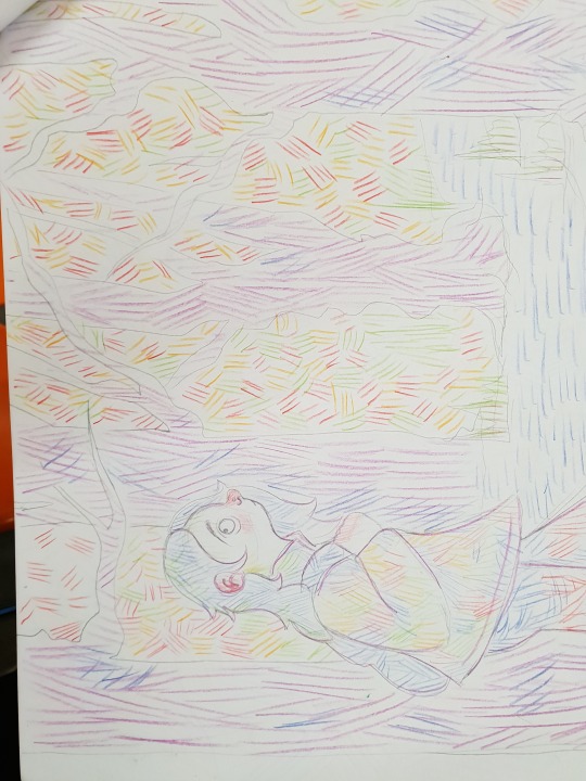
I started off by making a larger sketch of the thumbnails I had drawn on my storyboard. I will be showing the process for just one image just so you can see the progression. In the final piece I made eight in total, so I repeated this eight times.

I decided that I wasn’t a fan of this more ‘realistic’ style- so re-drew this same sketch with a more cartoony edge to it. I then picked out a number of coloured penciled and hatched over the entire drawing, taking care to emphasise certain shapes and directions of shading. I would use this technique to inject some of that hand rendered magic into the final digital outcomes.
I photographed this image and put it into photoshop. In photoshop I then used the lasso tool to draw around and isolate different sections of the drawing that would be different colours, for example the hair. I then used the hue/saturation tool to change the colour of my pencil marks to one that better complemented the colours of that section. Then I used the colour balance tool to give the whole selection a colour. The colour balance tool only allows you to put bright colours and is effected by colours already existing in the selection, so this helped me to avoid that digital ‘smoothness’. I got the following effect- (using a different image because it was the only on I had that wasn’t flattened into JPEG)

In then used a pencil textured brush to add details and to complete the piece

I was very pleased with the ‘hand-drawn’ effect I managed to successfully add to my images. It was something I had never attempted before, but looking at these results I think I will continue to use this technique in the future.
0 notes