#Ambroise Firmin-Didot
Explore tagged Tumblr posts
Text
Plutarchus – Vitae prallelae, «Vita Alexandri», I, 2-3
Οὔτε γὰρ ἱστορίας γράφομεν, ἀλλὰ βίους, οὔτε ταῖς ἐπιφανεστάταις πράξεσι πάντως ἔνεστι δήλωσις ἀρετῆς ἢ κακίας, ἀλλὰ πρᾶγμα βραχὺ πολλάκις
καὶ ῥῆμα καὶ παιδιά τις ἔμφασιν ἤθους ἐποίησε μᾶλλον ἢ μάχαι μυριόνεκροι καὶ παρατάξεις αἱ μέγισται καὶ πολιορκίαι πόλεων. Ὥσπερ οὖν οἱ ζῳγράφοι τὰς ὁμοιότητας ἀπὸ τοῦ προσώπου καὶ τῶν περὶ τὴν ὄψιν εἰδῶν οἷς ἐμφαίνεται τὸ ἦθος ἀναλαμβάνουσιν, ἐλάχιστα τῶν λοιπῶν μερῶν φροντίζοντες, οὕτως ἡμῖν δοτέον εἰς τὰ τῆς ψυχῆς σημεῖα μᾶλλον ἐνδύεσθαι, καὶ διὰ τούτων εἰδοποιεῖν τὸν ἑκάστου βίον, ἐάσαντας ἑτέροις τὰ μεγέθη καὶ τοὺς ἀγῶνας.
[LAT] Non enim historias, sed vitas scribimus; neque semper clarissimis factis virtutis aut vitii insunt indicia, quia immo saepe exigua quaedam res dictumve aut iocus plus de ingenio alicuius documenti praebet, quam immensa hostium strages edita, maximae pugnae, urbiumve oppugnationes. Itaque sicuti pictores vultu et habitu externo faciei ex quibus potissimum natura hominis apparet similitudines exprimunt, minima reliquarum partium habita ratione; ita nobis quoque concedendum est, ut signa animi colligentes, iis vitam uniuscuiusque depingamus, aliis magnitudinem factorum et certamina relinquentes.
[HIS] No escribimos historias, sino vidas; no es en las acciones más ruidosas donde se manifiestan la virtud o el vicio, sino que muchas veces una situación pasajera, un dicho o una niñería sirven más para declarar un carácter que batallas en que mueren millares de hombres, numerosos ejércitos y sitios de ciudades. Por tanto, de la manera como los pintores toman para retratar las semejanzas del rostro y aquella expresión de ojos en que más se manifiestan la índole y el carácter cuidándose poco de todo lo demás, así debe a nosotros concedérsenos que atendamos más a los indicios del ánimo y que por ello dibujemos la vida de cada uno dejando a otros los hechos de gran apariencia y los combates.
#Plutarchus#Πλούταρχ��ς#Vitae parallelae#Vita Alexandri#Βίοι Παράλληλοι#��λεξανδρος και Καισαρ#saec. I#saec. II#95#120#scriptum#historia#Graece#Alexander Magnus#Caesar#Iulius Caesar#Xylander#Ambroise Firmin-Didot
0 notes
Text
Didot typeface

DIDOT TYPEFACE DOWNLOAD
DIDOT TYPEFACE FREE
DIDOT TYPEFACE FREE
For the free versions, check out Fonts Geek or wFonts. You can purchase the bundle and complete variants from MyFonts. Firmin Didot (17641836) cut the letters, and cast them as type in Paris. The most famous Didot typefaces were developed in the period 17841811. The classification is known as modern, or Didone. So it’s safe to say that you’ll want to add it in your collection – if you haven’t yet. The word/name Didot came from the famous French printing and type producing Didot family. There’s no doubt that Didot can add a certain level of style and taste to almost any project. Related: Channel Luxury Using the Coldiac FREE Serif Font Typofonderie has become over the years, a real institution in. Believe it or not, broadcast network CBS also employed the font in its earlier logos, as well as in a couple of their shows, such as The Late Show with Stephen Colbert. Each of our meticulously built typefaces is the result of years of teamwork at Typofonderie. Spanish fast fashion retailer Zara has been criticized for the use of the font with ‘uncomfortably close’ kerning. Didot in the Modern DayĪs mentioned, companies and businesses that want to convey a chic, smart appeal often turn to Didot to achieve said effect.įashion and lifestyle magazine Vogue for example, uses a slightly modified version of Didot for their logo. With its signature clear forms and fine strokes, it became famous not only in Paris, but also in Greece, where the Didot family also setup a printing press. The typefaces were developed sometime during the years 1784 to 1811, and were inspired by experimentations of John Baskerville. The Didot family were well established as type designers for over 100 years. Didot LP accentuates these qualities, providing a classical text face with a clear and modern voice. This design took the earlier Italian neo-classical model (Bodoni) to a new level of refinement, with fully rationalized shapes and delicate hairlines. The font itself is classified under the Didone serif genre, known as the standard of general-purpose printing during the late 1800s until the 19th century. Didot LP is a very elegant rendition of the 18th-century French typeface - Didot. The final book is about 5 inches by 5 inches, making it a chic pocket book or field guide of sorts.Much like Garamond, Didot is a group of typefaces named after the typography family where it originated: the Didot family. I bound my book using a saddle stitch after printing on card stock. I wrote a minimal amount of copy to focus more on the visual aspects of the typeface, considering that it is not well-suited for writing bodies of text but rather for headlines and titles. It was clear to me that I wanted to the book to convey as classy French attitude, thus sticking with a minimalist black & white color scheme and approaching page layouts in an overly artistic way – not merely sticking to what a typical novel must look like. I conducted research via 3 books from the library as well as a few sources from the Internet. As the Bodoni was very popular in the typography of. We would also need to physically print and bind the book, gaining experience in traditional book binding techniques. I was assigned the typeface, Didot. The Didot typeface, similar to Bodoni, was created by Firmin Didot at the end of the eighteenth century. We should consider the typeface’s intended purpose, history and examples of its use. Since the font releases, it received many awards and recognitions. Moreover, you can embed it to your website with font-face.
DIDOT TYPEFACE DOWNLOAD
Through its achievements and advancements in printing, publishing and typography, the family has lent its name to typographic measurements developed by Franois-Ambroise Didot and the Didot typeface developed by Firmin Didot. Here we are going to present before you the serif typeface Didot Font that was originally designed by Firmin Didot during the 1784-1811 time period it was. Didot Font is a serif typeface that was termed after notable french printing Didot family. Download Didot font for PC/Mac for free, take a test-drive and see the entire character set. As well, we would need to incorporate a grid structure, address readability and fix any consistency issues that can come up when designing a book. Didot is the name of a family of French printers, punch-cutters and publishers. We recommend the use of Didot Display at 48 points and over. We would need to conduct research & analysis, then development content, creating an organizational hierarchy. Upscale and stylish, Didot Display is an essential tool for any designer involved in magazines, books, tasteful music, or overall luxury packaging that requires clean and large classic typography with an unmistakable modern spin. Our class needed to create a well-designed, beautifully-crafted type specimen book that tells the story of a typeface.

0 notes
Text
The Didot Family
Hello guys! My name is Ashan, and today I’ll be talking bout the Didot Family in a series of blog posts in relation to typography. The Didot Family were a family of French printers, publishers, and typefounders who had a profound influence on the history of typography in France.
The founder of the family business was François Didot (1689–1757), who began business as a printer and bookseller in Paris in 1713. He was best known for publishing a 20-volume collection of the works of the Abbé Prévost (Editors, 2018). Meanwhile, his eldest son, François-Ambroise (1730-1804), altered the standard of type design by allowing greater contrast between thick and thin letters. He improved upon the Fournier standard of measurement for punch cutting and mold making; thus the Didot point system created from 72 points to the French inch was made, which became the standard unit of type measurement. François-Ambroise also abandoned the use of classical names such as “parisienne” and “petit romain” for type size and instead distinguished types by their size as measured in points (e.g., 12-point or 24-point type). In 1780, François-Ambroise introduced highly finished wove paper, similar to the kind used by the English typefounder John Baskerville, who was known for creating the Baskerville typeface (Editors, 2018).
Moving on, François-Ambroise had two sons, Pierre (called Pierre l’aîné; 1761–1853), who took over his father’s printing office, and Firmin (c. 1765–1836), who assumed responsibility for his father’s typefoundry. Pierre published acclaimed editions of Virgil, Horace, La Fontaine, and Racine. Firmin designed the Didot typeface. He also invented stereotypes (plates cast from printing surfaces) and was thus able to publish low-priced editions of French, Italian, and English books. Napoleon appointed him director of the imperial foundry, a position he held until his death.
François Didot’s younger son, Pierre-François (c. 1731–93), was a typefounder, publisher, and papermaker. His three sons also joined the family businesses: Henri (1765–1852) is remembered for his microscopic types (Editors, 2018). For producing type he invented the Polymatype, which consisted of a long bar of matrices into which hot metal was poured. As many as 200 pieces of type could be cast in one operation. Léger (1767–1829) invented a papermaking machine, and the third son, called Didot le jeune, followed Henri as a typemaker.
In conclusion, Firmin Didot’s sons, Ambroise-Firmin (1790–1876) and Hyacinthe-Firmin (1794–1880), took over his business when he retired. Their most important publishing venture was an edition of the Thesaurus graecae linguae compiled by Henri Estienne (9 vol., 1855–59). Among the many other important works they published were the 200 volumes comprising the Bibliothèque des auteurs grecs, Bibliothèque latine, and Bibliothèque française (Editors, 2018).

Figure 1. Firmin Didot (Linotype, 2018)
References
Britannica, T. E. (2018, June 01). The Didot Family. Retrieved November 24, 2018, from https://www.britannica.com/topic/Didot-family#ref173702
GmbH, I. M. (2018). Font Designer – Firmin Didot. Retrieved November 24, 2018, from https://www.linotype.com/370/firmin-didot.html
1 note
·
View note
Text
Typographer Post Card Assignment ART235
What are you really proud of?
I feel like I have learned a lot about using Adobe Photoshop throughout the course of making this project. I am proud of the way the project turned out, and the new skills I learned while creating the project, like using the filter tool.
What worked well to create your design's organization and hierarchy?
For the design, I wanted my typographer's bio cards to look vintage since Firmin was born in the 17th century in Paris, France. I wanted the front of the card to have his name, picture, and postal address. For the back of the card, I wanted to put my research into Firmin. Regarding the hierarchy of the biography card, the layers panel in photoshop helped me place the backgrounds on the bottom layer and work up from there, leaving the text on the top.
What aspect of the program helped you execute your ideas?
The layers panel is super helpful when using Adobe Photoshop. The saturation/hue tab was really useful for this project since I used the sepia filter.
Do you feel like you grew as a designer during this process?
Yes, throughout the course of this project I was getting more and more comfortable using the magic wand, the layers panel, and the filters/effects. I feel more confident in my skills as a graphic designer.
Name something you learned both technically and conceptually from your project?
I learned how to use the filter/effects tab and discovered feathering images and different colored filters. Conceptually, I learned how to plan a photoshop project by creating multiple sketches using different ideas and comparing which would work best visually for the project.
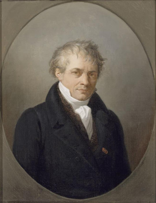
Citations: “Portrat Ambroise Firmin-Didot” date accessed Mar 24, 2022
https://www.europeana.eu/it/item/08568/dokumente_html_obj67093289
Istock, Getty images, Victorian Wallpaper. Date accessed Mar 24,2022
https://www.istockphoto.com/photos/victorian-wallpaper
Front

Back

0 notes
Photo

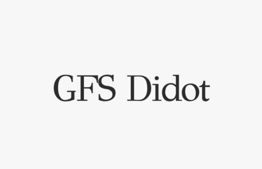
The famous French typecutter Firmin Didot designed a new Greek typeface in Paris in 1805, under the influence of the neoclassical ideals of the late 18th century. It was immediately used in the publishing programme of Adamantios Korai, the prominent intellectual figure of the Greek diaspora and leading scholar of the Greek Enligntment. Didot’s grandson Ambroise Firmin Didot eventually brought the typeface to Greece with a field press during the Greek Revolution in 1821. Since then the typeface has enjoyed an unrivaled success as the preferred choice of almost every kind of publication until the last decades of the 20th century. Didot’s type was the base for a new font, GFS Didot (1994) which was designed by Takis Katsoulidis, and digitized by George Matthiopoulos.
0 notes
Text
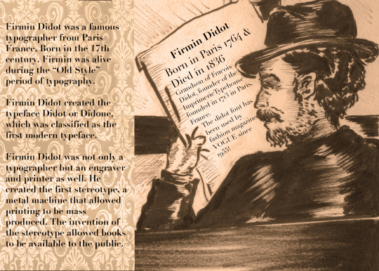
Firmin Didot Bio Card Research
Famous typographer: Firmin Didot
Firmin Didot: born in Paris in 1764 and died in 1836, Was the Grandson of Francois Didot, the founder of “The Imprimerie Didot” A famous print and type house founded in 1713. Firmin worked for his grandfather's type house and became a well-known typographer. Firmin was also an engraver, printer, and publisher. Firmin invented stereotypes, which are plates that have been cast from printing surfaces. Stereotypes gave Firmin the opportunity to print cheaper editions of French and English books. This invention made reading available to the public since printing could be done cheaper and more efficiently.
The Didot Family: The Didot typehouse was founded in 1713 by Francois Didot (1689-1757). Francois’s oldest son Francois Ambroise became a well-known typographer and was also Firmin Didot’s father. The Didot type house was passed on for many generations and was the most well-known typehouse in France at the time.
What typefaces did they design?
The Didot typeface is defined as a Didone or neoclassical serif typeface. Developed in 1784. Was considered the first modern typeface.
What are the characteristics of the typeface?
The characteristics of the Didot typeface are distinguishable by the contrast in width of the stroke content. The Didot typeface has a high contrast level between thick and thin brushstrokes. Modern typeface.Was inspired by the Baskerville typeface. The Didot font can be best described as elegant, and fancy. Its long, elongated and curvy, contrasting brushstrokes make the font appear expensive.
What design movement were they practicing during?
When Firmin Didot began practicing Typography, he was alive during the old style period, where fonts were stylized to resemble human handwriting.
Firmin Didots legacy as typographer:
Firmin’s typeface Didot has been used by Vogue magazine since 1955 and has been used for the CBS logo as well as Harpers Bazaar and ZARA. Didot typeface font has been used for many magazine covers and logos and has been associated heavily with fashion.
MLA
Citations:
The Editors of Encyclopedia Britannica. Encyclopedia Britannica, The Didot Family, French Family.
https://www.britannica.com/topic/Didot-family
Harvey, Amanda. Mar,7th. (2016) Didot Typeface
https://medium.com/@redheadedmandy/didot-typeface-d38ee7c02c4c
Typeroom, Firmin Didot 10 Things To Know About. Apr 14, 2020
https://www.typeroom.eu/firmin-didot-10-things-to-know-about

0 notes
Text
The Didot Family (part 3)
Hey guys, this is the last posts in the Didot Family series where I will be talking about the aftermath of the Didot Family’s legacy regarding the font and how it redefined typography, through Firmin-Didot.
During the letterpress period, words were printed from movable metal type, meaning each word was composed of individual pieces. To create a new font involved not just the design but also a lengthy and laborious process of cutting the individual pieces for each letter. Punch-cutting and casting were sophisticated, sculptural arts, and Firmin Didot was a master typographer (Hart, 2015).
When movable type was first created, fonts were designed to look as much like the handwriting of scribes as possible. This attempt to maintain the look and feel of manuscripts, known as Old Style, ended in the 1750s when the English printer John Baskerville designed the first Transitional typeface, known as Baskerville (Hart, 2015). His letterforms shifted the axis of rounded letters to a more vertical position, increased the contrast between thick and thin strokes, and created greater consistency in size and form. By the end of the century, printers throughout Europe were racing to perfect Baskerville's designs (Hart, 2015).
Firmin was inspired by Baskerville's typeface and took his experiments in letterform to the extreme, designing his first font in 1784. This font, regarded as the first Modern typeface, has high contrast between thick and thin strokes, hairline serifs with no bracketing, and vertical stress in rounded strokes.
Thirty years later, an Italian type designer, Giambattista Bodoni, started creating his own Modern typeface. He also admired Baskerville, and his designs were greatly influenced by Didot (Douglas, 2017). Bodoni's letters were dramatic, with horizontal serifs and high contrast. Viewing Baskerville, Didot, and then Bodoni alongside each other shows an important transition into Modern typography (Dreyfus, 1985).
Today, Didot's legacy can be seen in the "modern Moderns." Modern typefaces tend to denote luxury brands, and are often used on the covers of fashion publications such as Vogue. Since Didot created his first typeface in the eighteenth century, many typographers have created designs inspired by the Didot type family, and these new interpretations pay tribute to the impact Didot had on the world of typography (Hart, 2015). This concludes how the Didot family impacted so much of typography up to today’s society.

Figure 1. Vogue cover (Hart, 2015)
References
Douglas, A. (2017). Françoise-Ambroise Didot. Retrieved November 24, 2018, from http://www.historygraphicdesign.com/index.php/the-age-of-information/corporate-identity-and-visual-symbols/73-cook-and-shanosky-associates-inc
Dreyus, J. (1985). A Turning Point in Type Design (Vol. 19, Ser. 1). Cleveland, OH: Visible Language. doi:https://search.proquest.com/openview/2c3ed8f541bf7abc5d30c5397c60da63/1?cbl=1821103&pq-origsite=gscholar
Hart, D. (2015, June 10). Firmin-Didot: A French Legacy. Retrieved November 24, 2018, from https://www.metmuseum.org/blogs/in-circulation/2015/firmin-didot ffff
0 notes