#Also I should make shorter comics now because six pages was a TRIP
Explore tagged Tumblr posts
Visit Tumblr Blog
Explore Tumblr blogs with no restrictions, modern design and the best experience.
Last Seen Tumblr Blogs


Fun Fact
Tumblr Inc. is using 66 technologies for its website.
Text
Has anyone noticed how different the silly song announcer sounds in the old episodes versus the later ones? Here's the explanation I came up with for that:


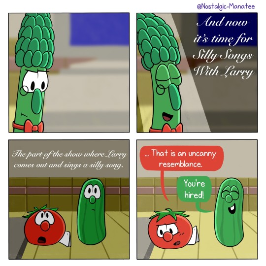
And then Archie gradually dropped the voice over time, opting to use his normal voice instead. That's why the announcer sounds like Archie in the later episodes.
Also, here's the explanation for the Biscuit of Zazzamarandabo:
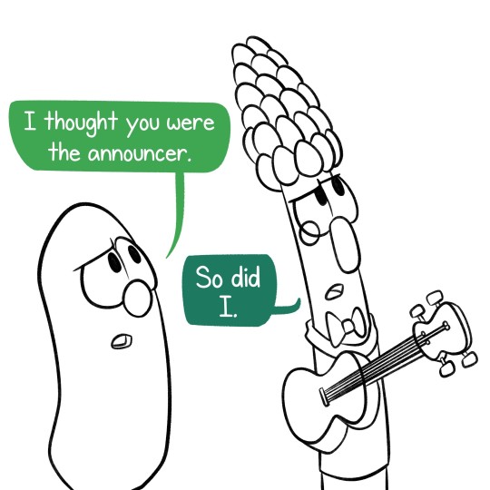
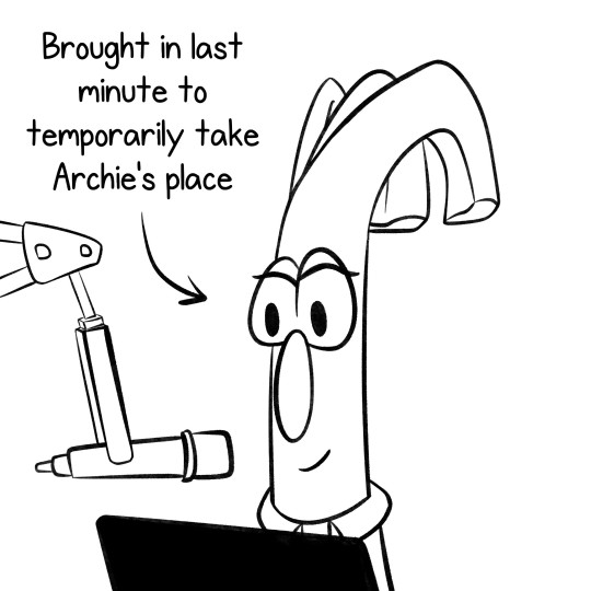
Archie announces the silly songs nowadays, but Scallion 1 takes over whenever Archie's in a silly song.
#Don't ask me what the silly song announcer did#I tried to ask Bob and Larry but they said that information is classified#Also I should make shorter comics now because six pages was a TRIP#VeggieTales fanart#VeggieTales#Bob the Tomato#Larry the Cucumber#Archibald Asparagus#Behind the Countertop
132 notes
·
View notes
Text
Writer Notes: The Wicked + the Divine: The Funnies

Spoilers, obv.
I suspect this will lean a little shorter than usual, partially because it’s more an editorial, sitting back position than any other issue of WicDiv and partially as DIE is out tomorrow, and there’s a lot of plates I’m keeping spinning.
But let’s see, eh?
Last year, when we did the Christmas Special, doing a comedy special was the other option. We decided to keep that in the can, simply because I was trying to visualise what on earth it would be like. Would I ask people to write stuff? Would I write it all? Could I somehow get The Wicked + the Canine to fill the whole issue? We went for Jamie’s idea (which required less conceptual engineering, so was easy, despite being more actual writing work) and saved this for the end.
Which is nice. End of school party, right?
Jamie/Matt’s Cover: Jamie and I have a piece of performance twitter, where I make puns and he pretends to hate them. Okay, that’s not true at all. He hates them, as is only right, as they are designed to be hated. When we have Skype calls, and Chrissy and I sit beside each other, when I drop a pun, Chrissy makes a face which… well, Jamie’s wants to grab it as a gif. It’s quite the thing.
Anyway – a variety of responses to puns. The pun is, I suspect, the best one I’ve dropped on twitter. One day I’ll write an essay on What I Do With Puns. But not today. It didn’t get a ludicrous number of retweets when I dropped it (and deleted my whole stream, as I do sporadically – don’t worry, I store everything before I do). It had an afterlife though being reblogged on tumblr (I think last time it was about 130k interactions), used in big websites’ pun round-ups, put on T-shirts and straight up stolen and tweeted by other people.
So let’s stick it on a cover, and show the variety of responses to it. Of course, Baph would like it.
I really like what Matt did with the colours here as well.
Margaux Saltel’s cover: Margaux is great. I got to know her distantly when C was editing superfreaks, and actually got a chance to hang properly at this year’s thought bubble. She’s got a real playfulness to her art, which this fascinating design sense. Adorable big dog staring at the reader was the first thing I thought of when planning this issue, really.
IFC
Intro page to explain what’s going on, with pop-comic design by Sergio, headlines courtesy of C. If you haven’t read it, give it a scan, because I big up all our collaborators.
How did we decide how to ask? Far too many options. Our comic friends are very funny. We tended to ask people as it occurred to us, see how many pages they wanted to do, and then work out how many pages we had left
The Wicked + the Canine
I lured Erica into this by basically promising her to draw six pages of as many dogs as she liked. Write for your artist.
The pun was basically to amuse Chrissy, and grew into a story. I thought it could be longer (and it could have) but realised it’s best to cut it short – the backbone of Ananke as trainer, and the dogs as untrainable pups, is basically the core of it. Plus the big kick in seeing everyone done in dog form.
I threw some ideas into the mix of how the dogs could be differentiated (For example, Sakhmet as a cat and Woden as clearly-not-a-puppy in a cone of shame) but really left it to Erica to draw whatever dogs she liked. I actually suggested they all be Labradors, but Erica wanted to stretch and play, and it’s all wonderful. The worry is in terms of race-coding the dogs, which is something we avoided.
I think my favourite is Baphopup.
The white-background and “get in the sack” is a wonderful bit of cartooning. How the lack of background stresses it all.
That it was basically done to make C laugh means that it’s part of a history of my dog based comics, which also includes the Christmas issue of Journey Into Mystery, where Loki has to give away seven hell-hounds. I think Thori is the character I co-created for the Marvel Universe who has had the longest life in terms of being used by other people. Adorable sweary murderous puppies can’t go wrong.
I’m pleased that people seemed to like it. That it’s a six page story where the joke is “Evil old lady doesn’t throw trusting pups in the river” is not exactly family comedy special material. I suspect if you’ve stuck along with WicDiv this far, you know what we’re like.
This is also a story which implicitly spoils the book, in terms of Ananke being a shameless manipulator of the pups. A lot of the stories are similar, which means this is a comic designed for relief of those who came along for all the issues.
The Wicker + the Divine Lizz Lunney is one of my favourite British cartoonists, and whole fierce scowl has petrified me for the decade or so I’ve known her. Lunney hadn’t read much of WicDiv before, so we lobbed her the PDFs, and found something fun to mock in terms of how ludicrously call-back-y we are.
Go support her stuff. She’s great.
The Lost God
Chip’s just a phenomenon, and his rising career across the last decade has been basically the most delightful surprise in the period. Immediately I have to swallow the urge to do the usual “Because he’s rubbish” chip-baiting joke, which says a lot. Chip is so much fun. That he’s both one of Marvel’s biggest, most interesting writers now and half of one of the most popular and definitive indie comics of the period is something else. Like, he’d be a legend if only for his internet jokes. That’s a footnote now. Amazing.
Anyway – we meet the first Kieron and Jamie version. Chip’s one is delightful – the over-tortured pun is on the money, but the real joy is Jamie McKelvie’s Hellboy-esque hyper-developed single arm. Every time I look at that, I laugh. Plus the accent. Marvelous.
“Wossat?! Time paste this nob, innit?” is just poetry.
Gentle Annie Vs The World
Talking about poetry…
Chrissy is WicDiv’s editor and also a poet, and has done some indie comics before – as well as co-editing the anthology Over The Line, which is an introduction to Poetry Comics. This isn’t that. This is her just channelling her loathing of Gentle Annie’s obfuscatory nonsense, and I love it so.
Clayton and Dee step in on the art duties. It was Clayton’s idea to drop in the Scott Pilgrim parody Annie at the top, which is very cute, and implicitly shows the modes he can work on. The realism of each scene, and the sense of place is great. Also, the Banshees poster in the doctor’s office is hilarious.
Making A Difference
This is fun. Romesh is a proper famous comedian, and digs WicDiv, so thought it’d be fun to write for the medium. As his script was coming together, I thought of Julia Madrigal’s Giant Days issue, and realised it’d fit well. She had to do it on her trip to Japan, which involved some hilarious jetlag.
Dee’s doing some powerhouse things here with the purple-white lighting too. That’s hyper-strong.
“Fresh Prince of Baal Air” is a hell of a line, in passing, and I think this may have the prize for the darkest punchline of the whole issue.
5 Things Everyone Who’s Lived With Sakhmet Will Understand
I loved Hamish’ Pantheon, which is a playful but entirely accurate retelling of Egyptian myth. Hamish also won this year’s Russ Manning Promising Newcomer Award, so clearly should be doing something else rather than being talked into playing around with us lot. Thankfully, he didn’t.
I think my favourite moment is Persephone’s glance up as Sakhmet walks across the keyboard.
18 Go Made In Wiltshire
Kitty and Larisa have done a bunch of stuff, but I have to put a special plug for where I first met them – TAYLOR SWIFT GIRL DETECTIVE: SECRETS OF THE STARBUCK LOVERS. It’s illustrated prose, and utterly delightful, so was honoured to have them along.
This is all an accurate and extensive skewering of what we’re doing, with a not-perfect Scooby Doo mash-up. I did try to talk them out of including all the characters, as that’s so much work, but they could not be stopped. This meant that working out speaking orders was the main formal issue to worry about.
Now, there’s lots of mockery of me in this issue, but reducing Laura down to “Everyone is so hot! Let’s make out with them!” was absolutely the I Feel Called Out Right Now moment. She’s more than that, right? Right?
While the “WicDiv is a scooby do plot” complete with “Evil old man reveal” is lots of fun, the bit which makes me laugh every time I flick through is the “I would have got away with it if it wasn’t for you meddling ki—” “Oh, fuck off.” Oh, Lucifer, Never change.
Enquiring Minds Want To Know: What’s Your Guilty Pleasure Song
Cover-artist Margaux joined by the irrepressible Kate Leth. I’m really into how the two play together – Kate wanted to cut things tight, and the “Short moment” illustrated with Margaux’s warmth is fascinating. Like, have the two other Norns ever looked more delighted and engaged than they are at the end of page six?
In terms of Kieron and Jamie baiting, Grumpy Jamie in full Captain Marvel Gear and me trying to write an essay in any given space is fun and mean (which is how we like it). And I’ve just realised that writing more about this script would only be underlining Kate’s point, so I better stop.
Secret Origin
I wrote it, and offered it to Jamie. Really, the point of the specials is to create a space in the schedule so Jamie can get ahead, but he couldn’t resist this one. It’s cathartic closure, at the least.
Choosing the puns was tricky – I realised it had to be a chain, so chose this one which amused Katie West, which was tweeted when visiting them in Edinburgh. So I was in range of punching.
As always, this is Jamie expression masterclass, and a little self-mocking of my tendency to go full clockwork in my story universes is fun. I hope so anyway.
28 pages of comics, which is quite the thing. I don’t suspect we’ll be making much (if any) money from this issue after paying everyone, but that’s fine. It’s a party, innit?
Oh, it was nearly 2000 words. It’s never short, is it? It’s never short.
WicDIv 40 is out tomorrow (December 5th), which starts our final arc, “Okay.” Hope you enjoy it.
Thanks for reading.
103 notes
·
View notes
Text
Creating a Year Art Book
After the brief, I get started in writing notes of what projects I’ve done in my first year at university, including some of my own artwork in my spare time.
Digital Magazine Designs
My Own Comic Designs
Learning How to Make a Video
Project Old School
Art Requests
Workshop Designs
Christmas Drawings For My Family
Art Assessments
Bottle-cape Designs
Perspective Drawing
Creating My Own Book Cover
Creating My Own CD Cover
Live-Drawing Sessions
Typography
Logo/Packaging Designs
These are the titles I’ve written from the all the projects I did this year. Next I go to word document to write down the notes in full sentences of what I made in these projects and my own artwork.
My Artwork of My First at University of Cumbria
contents
Contents
Introduction-
Digital Magazine Designs-
My Own Comic Designs-
Art Requests-
Project Old School-
Learning How to Make a Video-
Workshop Designs-
Christmas Drawings For My Family-
Art Assessments-
Bottle-cape Designs-
Perspective Drawing-
Creating My Own Book Cover-
Creation My Own CD Cover-
Live-Drawing sessions-
Typography-
Logo/Package Designs-
Introduction
Introduction
My name is William Jackson, this is my first year at University. I was born in Blackpool, and raised by a good mother, father and brother growing up and living in pubs and hotels my father has owned since I was born.
Before going to university I spent 3 years of college studying art and design, learning lots of new things in the course, drawing, printing, photoshop and ceramics. Now I am now at university, I’ve be learning new art techniques and skills to become a better artist in the future.
Digital Magazine Designs
Digital Magazine Designs
In the start of my first year at university, I made a couple of digital magazine designs in one or two projects.
One magazine was about my trip to Keswick with all of the classmates that are in the same course that I am.
The other magazine was about how the pyramids of Egypt were built in ancient Egypt.
I did the magazine designs by creating some drawings of my own (comic characters and artefacts), some images I’ve taking from the internet or taking photos from places I’ve been or seen to. I made these magazines in that kind of mixture, because I enjoy reading books since I was a little boy and I have been into comics since I was 10 or 12 years old.
What I hope to do next year is make some more magazine/comic designs and make better written work in them.
https://issuu.com/grillustdropbox/docs/my_visit_to_keswick
https://issuu.com/grillustdropbox/docs/how_were_pyramids_built_
My Own Comic Designs
My Own Comic Designs
During my spare time in college and in university, I’ve been working on comic designs of my own.
The other year at college, I did a small comic strip based on the classic novel “Moby Dick”. How I did the work, was in a mixed media set of pen, pencil, dry-point printing (etching) and photoshop (on the computer) each art material I did them in order with one picture after the other with another mixture of cartridge paper, parcel paper and sugar paper to get a little historic effect in the artwork, they work really well.
The first comic design I’ve made of my own is based on the game trailer Assassin’s Creed Rogue, and the Second comic I’ve made is based from the movie Armageddon. The name of the comics are called “the hunter” it is short story about man walking through a dark background killing his fellow knights and friends in his path, the second comic is called “Armageddon” a story about how an asteroid had crashed into the earth during the time of the dinosaurs.
I did the comic design in drawing, photoshop and indesign, to make it into a successful comic design. I’m already working in third comic design and more after that.
That is something I’m wanting to do in the future, to be a comic artist.
https://issuu.com/grillustdropbox/docs/the_hunter
https://issuu.com/grillustdropbox/docs/comic-_armageddon
Learning How to Make a Video
Learning How to Make a Video
During my first year at, there were a couple projects that were in video designs. Planning the video is one thing, making the video is another thing.
One video was a stop-animation of a pack of Haribos curling into a ball, then a phoenix emerges in the centre and flies away.
The other was working with one of classmates and partner Lily of a short thriller film of ourselves in old book shop, where Lily walking around the shelves for a book, till I attack and kill her with a book in hand, then later on a friend of mine is walking around town till he finds Lily’s body by the water fountain.
The videos didn’t go exactly the way I wanted them to be in, but I did my best I can in them. The problem was, in the project I had use these computer apps Premiere Pro and After Effects, and learning how to use these apps was really difficult, because I have used them before. What I’m planning to do next year is learn more of how to use these apps to make some videos and how to get some sound effect in, and for some of my own artwork, because I think it might come in handy and I have a friend who could teach me some things in creating videos.
When it comes to computers, create art in them is more difficult than drawing them in paper.
https://www.youtube.com/watch?v=8gUbMquGArI
https://www.youtube.com/watch?v=-KCDkkMrUvA
Workshop Designs
Workshop Designs
In the first term my group and I go into some workshop to learn new things for illustration and graphic design, text-style, print-making, wood-making, photography and metal-making.
I enjoyed going to them. The workshop were in six sets...
Wood
Metal
Photography
Print
Silkscreen
Embroidery
Here is what I enjoyed most is...
1. Metal- Going to the metal workshop was the first time I’ve ever been in any art course I been to, what I made in there was a metal sculpture of a dragon and took home as a Christmas present for my brother, he loved that a lot. I haven’t done any sculpting since I was thirteen, I use to do small paper sculptures dinosaurs and thunderbirds in my spare time when I was in secondary school.
2. Photography- Going to photography was the first workshop my group and I went to, so using a camera and (if we wanted to) using Lightroom for adjustments was another thing I’m familiar with and of course there is the darkroom I’m familiar with, I did some of these in a few projects when I in college. The darkroom photos I enjoyed the most, because there is some mystery of the object is without any detail or colour. I also learned how to use ultraviolet photography which was fun do to, I would like to do that again next year.
3. Print- Doing some prints is very familiar, when I was in college I did lots of printing making (lino-printing and Dry-point printing/etching). Now at university I did some more of that and learnt how to do etching on metal plates, which I kind of enjoyed doing, because I used other materials to get some shading or tonal effect, when I the plate printed it a good texture and composition.
Next year I’m planning more of these prints for one or two of my own comic designs.
4. Wood- I made wood before, when I was in secondary school, so wood-making is very familiar as well, the fun bit was making a couple of business card-holders for my brother and my dad, then doing some small drawings on them. They were both happy for what I made when I gave it to them on Christmas.
5. Silkscreen- Learning how to use silkscreen printing is different than lino-printing or dry-pointing printing (etching), but it was very interesting, because I could a couple of colours in one print but I think I can put in some more colours in other prints with some more learning.
6. Embroidery- Using the sowing was a little tricky with, but with some practise and patience, from the digital magazine of the pyramids I did a bit of artwork of the pyramids and the equipment and materials of how they were built. I might get better at other things in text-style in time.
Project Old School
Project Old School
In the first term at university, I was in my second project after the first project (the digital magazine designs).
The project was about creating eighteen to twenty-one task from a set of instructions on paper:
OLD SCHOOL
Two weeks of exciting and challenging manual tasks where only perfection is good enough!
Tasks 18-21 should be started immediately and progressed while you are working on the shorter exercises. As time management and organization are just as important as creativity it is crucial you complete all the tasks within the allocated two-week period.
BOOKS
TASK ONE (30 minutes):
Create an A5, portrait format, saddle-stitched book. It should contain 20 pages of white paper.
The cover should be made of a thin, coloured card. The front should feature a decorative motif of four, 5mm diameter holes cut through to reveal the white page below. The holes should run vertically along the right-hand edge: inset by 12-14mm (hole centres) with a spacing between each hole of 40.5mm (centre to centre).
Any page creep should be carefully trimmed.
TASK TWO (60 minutes):
Create an A5, landscape format, stab-stitched book.
It should contain 12 sheets of A5 paper and 2 sheets of thin, A5 card to act as a cover.
The holes for stitching should be placed at 15mm and 10mm from the left-hand edge.
The interior sheets should have a cut, decorative motif achieved as follows:
Sheet one contains a 50mm square hole (centered at 95mm from the right-hand edge and 74 mm from the top edge).
All subsequent sheets (apart from the last) should also feature a square hole that uses the same centre as above but diminishes in increments of 4mm per sheet (i.e. 46mm sheet two, 42mm sheet three
Any page creep should be carefully trimmed.
TASK THREE (45 Minutes):
Create an A5, landscape format, perfect bound book.
The cover should be made from a thin card.
The spine should be at least 5mm wide.
The first 20 pages should be vertically perforated 50mm from the right- hand edge. The final two pages should fold out (by an additional 40mm). Any page creep should be carefully trimmed.
Presentation
TASK FOUR (10 minutes):
Window mount a postcard behind an A4 sheet of mounting card. The mount should be hinged to a backboard.
The hole should be cut with a 45-degree bevel.
TASK FIVE (10 minutes):
Surface mount six postcards (all in the same orientation) on a mid-grey sheet of thin card
TASK SIX (10 minutes):
Using a pen draw the outline of a perfect, 47 mm square in the middle of a sheet of A4 layout paper. This should be presented in pristine condition, the only marks on the paper being the ink outline of the square.
TASK SEVEN (10 minutes):
Take an A4 piece of thin card. Using a compass draw a circle with a 50 mm radius, centered on the sheet.
Using a scalpel or craft knife cut out a perfect circle. Both pieces should be retained and presented.
The curve should be continuous and smooth (no corners)!
TASK EIGHT (20 minutes):
Emboss a circle, square and equilateral triangle onto a sheet of white, A4 cartridge paper. The shapes should be 45mm high, share a baseline and be centered (landscape) on the sheet.
TASK NINE (30 minutes):
Cut the word SHOP out of black paper and mount it on an A3 sheet
of white cartridge paper. The word should be set in uppercase letters 90mm high, be carefully spaced (kerned) and sit on a common baseline. You should use the font Rockwell Extra Bold.
As with all the tasks, no glue or construction marks should be visible.
The Third DimensionTASK TEN (30 minutes):
Using thick paper/thin card, create a perfect, white cube. Each side of the cube should be 90mm long.
TASK ELEVEN (60 minutes):
Using black, thick paper/thin card create a three-dimensional capital letter ‘R’.
You should use Rockwell Extra Bold and the letter should be 150mm high and 40mm deep. It should appear solid when viewed from any direction like this…
TASK TWELVE (10 minutes):
Create a full-size; first angle orthographic projection of your 3D letter R.
All construction lines should be in pencil with the actual projection rendered in black ink.
TASK THIRTEEN (10 minutes):
Create a full-size oblique projection of your 3D letter R.
All construction lines should be in pencil with the actual projection rendered in black ink.
TASK FOURTEEN (10 minutes):
Create a full-size isometric projection of your 3D letter R.
All construction lines should be in pencil with the actual projection rendered in black ink.
Colour and ToneTASK FIFTEEN (90 minutes):
On a stretched sheet of A3 cartridge paper, using red, blue and yellow
paint create a colour wheel that looks like the one to the right (omit the text).
The diameter of the wheel should be 200mm.
TASK SIXTEEN (30 minutes):
On the same sheet of stretched cartridge paper and using black and white paint, create a sixteen step Grey Scale that looks like this >>>
Dimensions: 240mm high X 50mm wide
TASK SEVENTEEN (30 minutes):
Using the same format as above, select one of the secondary colours you mixed earlier and position it in its correct position on the Grey Scale. Now create a tone scale for the colour by adding black to darken it and white to lighten. The scale should be positioned 15mm to the right of the Grey Scale. When complete, each step should be tonally identical to each of theGrey Scale steps that lay along side.
Squint your eyes to accurately judge tone!
A Parting of the Ways…
Tasks for Graphic Design StudentsTASK EIGHTEEN (60 minutes):
Print out the above document – Type Rendering.pdf.
On good quality tracing paper and using a sharp 2H pencil, carefully render all the copy at actual size. No construction marks should be visible on the tracing paper.
TASK NINETEEN (90 minutes):
Following the instructions (Constructed R Instructions) draw this letter to fill an A2 sheet (landscape format).
All construction lines should be included (either pencil or fine line pen). The finished R should be solidly inked in with… … ink!
TASK TWENTY (3 hours):
This is a poster designed by a German poster artist Erich Gruner. The original is painted in gouache (poster paint).
Using paint, create a perfect copy on a sheet of A3 paper. All colours and textures should be identical to the original.
We will be looking for accuracy of colour, tone and edge quality.
TASK TWENTYONE (4 hours):
A series of exercises to develop a feeling for curves…
Print out these three sheets (Exercise 1-3) at actual size (A4) and complete each design. You should use a pen for 1 & 2 and a brush for number 3.
Most of the designs are symmetrical but please note; a few are asymmetrical.
They come from a Victorian book of instruction for school children.
Print out these two sheets (Exercise 4-5) at actual size (A4).
Using brushes and black ink copy them at approximately the same size
on an A3 sheet of cartridge paper.
This is the only exercise where no preliminary drawing or tracing is allowed – all drawing should be done with the brush.
Tasks for Illustration StudentsTASK EIGHTEEN (60 minutes):
This portrait of a Breton boy by Henry Lamb is a pencil drawing on cartridge paper.
You are asked to make an accurate copy of it using the appropriate grades of pencil – as with all these tasks you can base it on a tracing.
The drawing should be approximately 150mm mm high.
TASK NINETEEN A (2 hours):
This is a dip pen and ink illustration by Mervyn Peake.
Make an accurate copy of it using the original media and techniques
The image size should be approximately 140 mm high.
TASK NINETEEN B (3 hours):
TASK TWENTY (3 hours):
This is a wood engraving by Clare Leighton
Produce an accurate copy of it using scraperboard.
The image should be approximately 180 mm tall.
This is a watercolour by Arthur Melville.
Reproduce it at the size of 300mm high on stretched watercolour paper.
TASK TWENTYONE (2 hours):
This illustration by Brad Holland is painted in Acrylics on canvas.
Paint an accurate copy of it 250mm high.
When I started doing the tasks, they all seemed simple enough to do, making small (A5) sketchbooks, creating 3D paper models and making some drawings in the artists’ style.
I didn't finish all the task, but when I presented my work, along with everyone else artwork with same tasks I had in the project to my tutors, they told me I had almost succeed everything, there were some that didn’t go the way they should be, either I didn’t follow the instructions properly or I didn’t read the brief more.
What I need to do in the future, I need to read briefs of the project a bit more carefully and if I need to ask for help on what I need to do, I’ll go to the tutors.
Art Requests
Art Requests
Before I started going to university, some people have been asking for some of my drawings, from friends of mine and local people from places I use to work.
Six people from The strictland Arms, have asked me for my artwork (a local restaurant and bar) during my time in college.
Graham- a former manager who has asked to do a drawing of favourite Car as a goodbye present.
Miles- a former assistant manager who has asked me to do drawings of all the Dinosaurs of Jurassic Park.
Olivia- a Staff member, who asked me to do a drawing of herself before her baby would be born.
Chris- A former pot-washer and chef, who asked me to do drawings of a couple gorgeous woman in 50 pin-ups and the same drawings I did for Miles, all the Dinosaurs of Jurassic Park.
Lee- A chef who has asked to do drawings of his dog and cat and a copy of my first comic design (The Hunter).
Ethan and Abi- Former staff members and best friends since primary school who have asked me to do drawings of themselves in their childhood.
A couple of tutors from Kendal College, I gave you some of my artwork as a thank you for teaching me.
Mike and Amy- Tutors of mine during college, I gave them a copy of my “Moby Dick” comic strip. A large drawing based on a museum fossil of a big shark tooth Megalodon with small drawings and facts about this extinct shark.
Amanda- A supporting tutor of mine when I need help, I gave her a photoshop design based on a song I have decided to use in a art project, (Take That- Rule the World).
At university I did some birthday drawings for my friends who share the same flat with me in the halls residence. Each of them in comic poster designs.
Euan- Of us in character designs at his side in Scotland.
Freddie- Of her and her dragons as Queen.
Micheal (Freddie’s boyfriend)- Of him and her as King and Queen of the dragons.
Jules- Of him a travelling wizard.
I also did some more drawing them as goodbye present
Myself (illustration and graphic design)- As “King of the Beasts”.
Euan (Filming)- As “King of the Scottish”.
Freddie (Fine Art)- As “Queen of the Dragons”.
Jules (Creative Writing)- As “The Travelling wizard of England”.
Lucy (Policing)- As “Captain of the Seven Seas”.
Chloe (Dancing)- As “Actress of Carlisle”.
Flat 250 (the flattop the halls residence we’re staying in)- As “The Gang of Flat 250”.
Everyone was happy of the work I made for them. There will be more art requests soon and I’m happy to make time to do them.
Christmas Drawings For My Family
Christmas Drawings For My Family
Near the end of the first term, for the Christmas holidays, I did some drawings for my family as Christmas presents. I did loads of poster-like-comic designs for nearly everyone during the holidays, there were two or three people I didn’t get drawing for them because they have just been invited into the family or didn’t know what draw for them.
My parents (Matt and Sarah)- A business card-holder, for my dad’s card in his office and a drawing of Grandma to remember her by.
My brother (David)- A business card-holder for his cards at work, a drawing of Grandma to remember and a metal sculpture of a Dragon I made from university.
My cousins (Ryan, Sophie, Oliver and Alice)- Small A5 books, each created in different sets for Sophie, Oliver and Alice and a comic poster of my Cousin Ryan.
My Uncle (Steve)- A drawing of my Grandma to remember her by.
My Aunt (Nicky)-A drawing of my Grandma to remember her by.
Family Friends (Mike, Linda, James and Emma)- A Christmas card for Mike and Linda and comic poster design for the twins James and Emma.
My Aunt’s boyfriend (Gary)- A Christmas card for him.
My Grandparents (John and Mary)- A Christmas card for them.
My Grandfather and Step Grandmother (Bill and Lee)- A Christmas card for them and an old drawing of his car.
My uncle’s Girlfriend (Olivia)- A poster drawing of her favourite singer Lady Reshurr.
My Aunt and Uncle (Mark and Nicky)- A Christmas card for them
My Aunt and Uncle (Tishe and Kent)- A Christmas card for them.
My Godfather (Will)- A Christmas card for them.
I am very proud of doing these drawings, next Christmas I’m planning to do some new drawings for my family.
Art Assessments
Art Assessments
From the other projects me and everyone in the course are doing, in the first term we have been doing some art assessments from one of the tutors.
The assessment is about working in a small group of four or five, of designing our characters in any decade and country we’ve been given and then creating a video together. The decade and country we have given for the assessment is the 1960s British.
What I enjoyed doing the most was creating my own character design. The did a character of my brother David, when I was at Secondary school I was making comic drawings based on the classic novel “The lost World” where there is a secret land full of Dinosaurs, my brother asked me to him in the story, so with a few others who have asked if they can be in the comic story. The funniest bit is when he asked was “Do not kill me in the story” and I said “Maybe”, so from looking through all the other design characters I’d drawn, I thought for this assessment I could the character design of my brother again. I did another character of a lizard man, but everyone in the group like my brother better.
For something like that, I hope to do some more character designs of my own next year.
Bottle-Cape Designs
Bottle-Cape Designs
Sometime around February, I made some more spare-time making sone new designs of my own.
Back at home me, my brother and my parents have been doing some bottle-cape collecting, placing them in a glass jar, since my Father owns the Brewery in Lancaster. When I start my first year at university and later on my job at the bar and hotel (Gosling Bridge) in Carlisle I do my own bottle-cape collecting. So around February I use the bottle-capes to create new designs for my Dad and the brewery.
During my time in secondary school I did a drawing of the brewery when it was built in Lancaster for my Father and other staff members, they then use it to display it on the pump-clips, posters, on bottles and on the brewery vans... this is something that has made me really happy to see.
What I did for the bottle-capes is stuck them in a large plank of wood and then paint over what I want to paint. So far I have made three bottle-cape designs a rose flower of Lancaster, the title or “Lancaster the Brewery”, and third design is about putting quotes from the bottle-capes I collected from the brewery, so far only my parents and my brother and my friends know I have made these designs, and soon the staff members of the brewery will be surprised of what I made.
Perspective Drawing
Perspective Drawings
Around October (Halloween), I did a project of perspective drawing.
There are other kinds of perspectives from whatever the eye is seeing.
Bird’s eye view- a bird seeing what’s below on the ground when flying.
Human’s eye view- when someone is seeing a view from a distance.
Worm’s eye view- a worm seeing what’s above in the sky when crawling through the floor.
The first thing I did was do some practise drawing of perspective
set of cubes or cuboids, one or two chessboards, and one or two
objects.
Next I did some more perspective drawing with a couple of
backgrounds. A chess set in a human/worm’s eye view at once, a steam
train of the famous Flying Scotsman, then the last perspective
drawings I did were of a deer park with sheep at a distance with my
family’s dog in close-up and a tunnel with one of my flatmates
(Freddie) at the other side to the entrance.
When I presented my work to my tutors, they were impressed that I
understood the meaning of perspective, the drawings weren’t exactly
they asked for the drawings they asked was of a dark alley street
with a cat in the centre.
This is another reason why I need to read the brief of the projects
a bit more. Look on the bright side, at least I tried.
Creating My Own Book Cover
creating My Own Book Cover
Before I went home for the Christmas holidays, I was given an other
project about creating a book cover in the artist’s style. But First
I need to do some research on the artist I was given in the project.
The artist I researched was Rockwell Kent, an illustrator who has
done his drawings in a mixture of drawing pen, painting and
printing. Seeing some of his artwork is a little like going back in
time, due to some of the book covers and pictures he has made like
Moby
Moby Dick
Mary Poppins
Bridget Jones’s Diary
Heart of Darkness
The Damned United
Pride and Prejudice
1984
Gorky Park
Tom’s Midnight Garden
The Right Stuff
Murder on the Orient Express
Midnight’s Children
The Tin Drum
Cold Comfort Farm
Under Milk Wood
Macbeth
Fahrenheit 451
The Motorcycle Diaries
Germinal
Pies and Prejudice
These were the chooses I needed to make, to create my own book cover. At first I wanted to do a book cover of Moby Dick, but since I’ve designed a comic strip of it I decide to do something else. I chose to do the Murder on the Orient Express. I chose this because I’m trying to do something different, plus my grandfather enjoy trains before I was born then I enjoy trains as well.
I made lots of drawings and prints of trains, the weapons from the murder (knife and gun). They were okay but weren’t exactly the style from the artist I was given in the project, eventually I did the artist’s style, made a couple of more drawing and decided which is the best one.
What I think could improve to develop if I were to do is add a tiny touch of red (blood) to make it a bit more of a murder.
Creating My Own Record Cover
Creating My Own Record Cover
After the Christmas holidays I started on the next project straight away at university.
My group and I were asked to create a CD/record cover based on the bands and the songs we were given from our tutors. The band and song I was given were...
The Joy Formidable- This Ladder is Ours!
Thomas Dolby- Cloudburst at Shingle Street
The Tornados- The Telstar
Doing some research and listening/watching the songs, I chose to do the Formidable Joy- This Ladder is ours! Looking at the video and reading the lyrics of the song, I then think of something I did when I was in college last year. I was working on one or two songs I (Take That- Rule the World or Tinie Tempah- Wirtten in the stars), using a couple of lines from the lyrics and designing a portrait of the song. This was something I did for a record cover of the Formidable Joy, doing some drawings, lino-prints and Photoshop designs I have the work printed from the computer and carefully cut and stick the design together, to the size and shape the record cover should be in. Presenting the design to my tutors, they tell me they record capture the imagination and energy from the pictures and quotes from the song.
If I was asked to create another record, for another song, I would chose the song I like to do.
Live-Drawing Sessions
Live-Drawing Sessions
After the Christmas holidays were done, in the second term, me and any of my group that were interested go to live-drawing sessions. When I was in college there were some live-drawing sessions going a few times, but I never went to any of them, it was for the older students to go to them, this year is the first time I went to any of them. Every week we were given a spot with a stand, board and A1 paper and the models we use for our artwork taking turns every week and every week we use different art materials to try out new things this year (trying to get us out of our comfort zone). The models was a man named Nick and a woman named Helen.
The materials we used for our drawings were...
Pen
Pencil
Charcoal crayon (Black, white and red)
Writing Ink (Using some water for tonal/shading)
Coloured Paint (oil paint, water colour paint or acrylic paint)
Most of the drawings I did of the models I’m quite proud, there are some drawings I think I could a lot better, what I need to do to make better drawing next year for live-drawings is practise by looking at the drawing with one eye and looking at the subject or object with the other eye.
Typography Projects
Typography Projects
What was a little more challenging and a little frustrating was the typography projects.One project was about creating an article I was given and write in a few sets
Square format- 140mm x 140mm
Portrait format- 245mm x 100mm
Landscape format- 115mm x 207mm
The article I was given was...
The Sun: Living with Our Star
Discover the story of humanity’s ever-changing relationship with our nearest star - the Sun - through hands-on expe- riences, unique objects, and stunning imagery in our latest exhibition. Set at the centre of our solar system, the Sun’s brilliant light shapes our sense of time, our health and our environment. People have tried to harness its power and uncover its secrets since the dawn of civilisation. From 3,000-year-old artefacts to upcoming space missions and even a nuclear fusion reactor, our new exhibition takes you on a visual, action-packed journey that brings the science of the Sun to life. Bask in sunlight on an indoor beach, try on historic sunglasses in a digital mirror, and watch the Sun rise around the world on a huge illuminated display as you explore the fascinating story of humankind’s relationship with our closest star. During the exhibition there will also be a screening of the absorbing documentary ‘Let There Be Light’. The screening is followed by a discussion—and most likely no shortage of lively debate—about the viability of nuclear fusion and solar energy as the answers to reducing our reliance on fossil fuels.
6 October 2018 – 8 May 2019
Tickets £16, under 16s free, other concessions available Special Exhibition Gallery, Level 1, Science Museum, Exhibition Road, South Kensington, London, SW7 2DD
www.sciencemuseum.org.uk
Doing this was a little frustrating because I needed to get them...
one typeface in as many sizes as you see necessaryt
wo typefaces, each in two sizes
one typeface and its related bold, in one size only.
And get the titles and sentences a good composition sets was difficult to do, because from all of that this is first time I created a type of article. But when I got it all printed out and set in A1 grey card paper, the tutors have told me I made some good and strong composition in them and getting all the word in the same size as I’ve made them in.
In the other typography project, was about creating a poster for a on-coming festival about creative typography, so me and my group needed to create our own posters and the tutor can decide which is the best to have. I wish they took my design despite it too have a strong composition and good information about the festival but somehow I got the information a bit big than the last typography project it is a bit disappointing, but the bright side is that I get to enjoy doing some artwork experiments on drawing, colouring, painting and cutting typography fonts A to Z.
If I were to do it again was, only get the information a bit smaller, but create some more colourful and creative fonts.
Logo/Packaging Designs
Logo/Packaging Designs
Then the last project was about creating a logo design of my own, inspired by other logos that have been made around the world like Pepsi, Shell, Snickers, etc.... In this project, I was to work with someone (a partner) to suggest work kind of logo design we could do, the partner I was with is a young girl named Katelyn (Kate for short).
The Logos we needed to inspired by are...
New antique furniture
A portable anvil
Mirrors that make you look thin
Nylon stockings for men
Cardboard houses
An irritable Sat-nav
Yorkshire Swiss roll
A straw based breakfast cereal
A clockwork car
Fashionable shoes for dogs
Fizzy yoghurt
Thermal bras
Cuboid footballs
Heated toilet seats
A cheese fountain (for parties)
A cactus with rubber spines
Concrete mattresses
Radioactive hair dye
Hats for horses
Self-cleaning dustbins
Wool burning stoves
Pop-up self-assembly furniture
Emulsion paint for Goths
Celebrity pasta shapes
I did a lot of drawings and photoshop designs of logo names my partner written, I can’t remember what exactly each were, but those I like, I used creating the logo ideas, along with a few drawn pictures at the side. The best design and final piece I did was an antique logo design, with my dad owning a brewery in Lancaster, there is an antique shop (warehouse) next door to it, whenever I go to visit the brewery I would sometimes go the antique shop to see what they have in there (one time I went and bought an old comic for me to read with).
My partner worked on a presentation, of a logo she has worked on, when we showed to designs to the tutors, but when I tried to email the presentation to them it somehow couldn’t send, but my partner how managed to make to presentation later on.
If we were to do this project again, we would discuss some more ideas, logo designs and work on a presentation together.
Thank you for Reading...
Thank You For Reading...
Being at university has been different and challenging than it is at home and college. I came to university not only to learn more art and design, but to learn how to live with by myself away from my parents and family. This has been a good year. Doing some new artwork and skills has not only been challenging (driving me out of my comfort zone), but has made me learn new things in the course.
Maybe these new skills will let me do them again, to help me become a better artist in the next two years at university. Who knows?... Maybe you’ll do something like I have done too in the future.
After I write the notes and wrote it down on Word Document I use one of my sketchbooks that I haven’t used yet and get the writing printed and cut-out where they need to be in the book, next I took some images to go with the idea of what I made and designs at university.


But I had to get them in photoshop and get them printed, when that was done I cut out the images and stick them from where they need to be in and the last thing I do is write tiny notes around the images of my artwork so when someone reads what I did they’ll which is which with the notes at their side.


When I come for university next year (and hopefully a successful year) I would like to create another book of what I made both art projects and my own artwork to make it more exciting for people to see.
0 notes