#ALSO THE AIMKID ANIMATION IS SO GOOD???
Explore tagged Tumblr posts
Text


The duality of man
#lemon demon#soft fuzzy man#lemon demon soft fuzzy man#i am OBSESSED with the way he says “ambient man”#also this song is so season 4 mistmartin trying to seduce jon into joining him in the lonely#in the spirit of connecting every new song i hear with my blorbos#martin blackwood#jonathan sims#the magnus archives#ALSO THE AIMKID ANIMATION IS SO GOOD???
28 notes
·
View notes
Text
EMERGENCY COMMISSIONS
i am poor and jobless so sknfkalhflshnklf ALSO I JUST UPDATED THE PRICES

[image id: An image of @creepa-b0t-inc on tumblr's emergency commission sheet. All text is in the deltarune/undertale font. Each section end is marked with a white line connecting the white border that outlines the entire image. The background is transparent.
The first section reads "HI! I have built up the courage to open emergency COMMISIONS!!! I mainly work in Deltarune/Undertale style art. HERE ARE MY PRICES!!!! [It would be greatly preferred if you could provide any ideas or concepts for designs, because I am sadly not that good at design. I will try my best though!]" with a note off to the right side reading "!!! I SOMETIMES TAKE A LONG WHILE!!" and "!!BE PREPARED TO WAIT!!". All text is white, except for the 'HI!' which is yellow, and 'emergency' and the side note, which are in red.
The second section lists off examples and prices for commissions. The top left has white text stating "OVERWORLD SPRITES (next line) $20-$80 PER CHARACTER (next line) [depends on how many sprites you want]" with a side note in red that says "+$20 FOR ANIMATION". Below and to the side of this, there are 5 examples:
An image of Jockington from Deltarune from four different angles, front, left side, right side, and behind view.
An image of Starlight Glimmer from My Little Pony standing on her hind legs and curled around herself like a worm, covering her mouth with her hoof and smiling, looking at the viewer mockingly.
An image of a cockroach sitting on a bench reading a newspaper. it has a brown fedora and looks unimpressed.
An image of BIGSHOT.ex from Puredawns, with his left hand on his hip, smiling. He is wearing pink and black boots, black pants, and a pink suit top with a yellow tie. He has a purple and black cape and there are yellow rings around his wrists and knees.
A collection of 16 walking sprites of Noelle from Puredawns. She is wearing a long white hooded coat with icy blue accent marks, icy blue wings, and the hood down. Her color palette is much colder than usual.
The top right has white text stating "UNDERTALE STYLE BATTLE SPRITES (next line) $40-$100 PER CHARACTER (next line) [depends on how many sprites you want]" with a side note in red that says "+$20 FOR ANIMATION". Below and to the side of this, there are 4 examples:
An image of Exposition Guy made by Kevin Temmer Tunes holding a spoon in black and white.
An image of Spider Guy by Jaiden Animations in black in white, except for the pupil of its eyes which are red.
An image of Jaiden Animations in black and white. She is wearing a white hoodie with black accent marks and black sleeves.
A black and white image of an aimkid style dog character wearing socks, gloves, and armor with its left hand on its hip and its right hand holding a giant meat cleaver with a bumpy end, like a comb.
The bottom left has white text saying "DELTARUNE STYLE BATTLE SPRITES (next line) $40-$100 PER CHARACTER (next line) [depends on how many sprites you want]" with a side note in red that says "+$20 FOR ANIMATION". Below and to the side of this, there are 4 examples:
An image of Pibby from Learning with Pibby, a small light blue character with pink/light purple hair buns.
An image of a large sky-blue computer with a control panel and 2 rocket engines propelling itself into the air, along with two colder-blue speakers on the computer's left and right sides, also being propelled by their own respective rocket engines. The circle part of the speakers are alternative white and black circles and the computer screen is black except for a green outline of Queen from Deltarune.
An image of an angry looking robot character. it is a dull blue with light yellow accent marks and purple wires sticking out of its back. it's face is a pixelated red screen. It has thick, blue vent-hose like legs with 2 large blue, metal feet. They are accented with a caution pattern in light yellow.
A collection of 5 sprites of Night in the Woods characters-from left to right: Mae, Gregg, Bea, Angus, and Germ-all looking angry except for Germ and Mae. Mae is holding a baseball bat with two hands behind herself, Gregg is holding a crossbow with his right hand, Bea is smoking and holding a pickaxe with both hands, Angus has his hands on his hips, and Germ has his hands in his pockets with a possum on his head.
The bottom right has white text saying "DIALOGUE EXPRESSIONS (next line) $20-$60 PER CHARACTER (next line) [depends on how many sprites you want]". Below and to the side of this there are 4 examples:
A colored image of Flowey from Undertale's head.
A collection of 6 images of Rouxls Kaard from Deltarune's face, each expressing a different emotion. From left to right, the expressions go: smiling with teeth, open mouth smiling, open mouth smiling with wide eyes, smiling with teeth and wide eyes, smiling with teeth and winking, and smiling with teeth and both eyes closed.
A collection of 7 images of an ice cap (with sunglasses) from Undertale's face, each expressing a different emotion. From left to right, the expressions go: neutral with tired eyes, neutral with wide eyes, surprised, angry, maniacal laughing, evilly grinning, and nervous/looking off to the side, sweating.
A collection of 3 images, each containing a different expression portrayed by op's oc. the oc is a reddish-pink flower with a green stem and its petals behind its face with a loose strand, as if it is hair. The expressions portrayed, from left to right, go: smiling, smugly grinning, and angrily yelling.
The third sections begins with white text saying "DELTARUNE BATTLE MOCKUP (next line) $200 (next line) [This could take me a while to finish, so I'll only take on ONE of these at a time.]" Below this is two example images:
An image of a Deltarune-style battle scene with Night in the Woods characters. There is a red bar on the left side of the screen that has white text next to it vertically reading "TP 0%" and a menu with a text box on the bottom containing Mae and Gregg, Mae with 150/150 HP and Gregg with 170/170.Mae's icon is in light blue and Gregg's is in orange. It appears as if the user is selecting what to do with Mae's turn, hovering over the fight button. In the text box below, there is white text that reads "* The cultists strike back!". The fight setting is in a grassy area in front of a red, sunken furnace with bricks surrounding it. On the left towards the top, Mae is holding a baseball bat behind herself with both hands, and below her Gregg is holding a crossbow with his right hand, his left hand in front of him, looking angry. On the right, there are two identical looking cuktists in brown, hooded robes and boots holding shotguns.
An image of a Deltarune-style battle scene with Night in the Woods characters. There is a red bar on the left side of the screen that has white text next to it vertically reading "TP 0%" and a menu with a text box on the bottom containing Mae with 150/150 HP. It appears as if the user is selecting what to do with Mae's turn, hovering over the fight button. Mae's icon is light blue. In the text box below, there is text that reads "* CASEY awaits your first move." The text is shakey, and all white except for 'CASEY', which is blue with glitching text behind it. The fight setting is in a starry sky area, with the head of the Sky Cat watching Mae. On the left is Mae in a blue color pallette entirely except for her pupils, which are red. She is holding a baseball bat behind her with two hands. On the right is Casey, a shadowy cat figure whearing a long coat. He has glowing white eyes and facial features with a glowing blue outline.
The fourth section begins with red text that states "THINGS I WILL NOT DRAW:" with a lower opacity, larger 'NOT' behind the main text to create an echoey effect. Below this is a bulleted list in white text containing "NSFW, RACIST/BIGOTED THINGS, NFTS, (and) ANYTHING I DON'T WANT TO". Beneath this is a bit of text that says "SO, feel free to message me on either Tumblr or my Discord, @creepabotinc." with '@creepabotinc' in yellow text. /end id.]
552 notes
·
View notes
Text
New character alert!!!
Meet Azi!

This was my second attempt at the drawing this pose and I think it portrays their character very well. He is an absolute psycho. I love him very much, she's kinda babygirl, but in my way, which means barely a sanity in their body. It’s my one of those character’s that make me feral and start foaming at the mouth when I think of it. That uses Any pronouns like me which consists of your usual she, he, they and also the it and that neopronouns (tho it might get more). He’s kinda an embodiment of all my insanity (crazy, you would not believe how fucked up I am). Which is why it uses the same pronouns as me.

Here are the early sketches that came from a femtanyl (the music artist) induced… rage? I dunno but very strong brainwaves were being produced and I was generally so stimulated and happy because of the music. I was inspired by the cat-like creature on femtanyl’s song covers, and later realised it reminds me tiny bit of aimkids cat like creatures too (modify is one of my go to animations to watch, most likely a little based of that). She was originally named Valkyrie as you can see but it didn't match their vibes so he's now called Azazel (for now atleast, I don't know if it'll stay).
Warnings: Severe gore

As I said, absolute psycho. I actually drew this first for the funsies and then went "Hey, this would be good for the halloween art competition!" And now I'm waiting for it to be approved on the padlet.
#scribbles & scratches#Crow's chattering#art#artists on tumblr#my art#original art#artwork#character design#oc#oc art#ocs#drawing#my oc art#my oc stuff#original character
20 notes
·
View notes
Note
Heyo! Your TADC freakshow AU is super cool, so I decided to draw my OC Jolly if she was in the freakshow AU! I sketched two designs for her, one based off her main design and one based off her TADC design. (also TW for self-harm near the end of the relationships section)

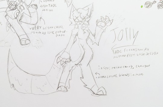
Main design freakshow version- based on melted candy, slight inspiration from Changed and other transfur games. has muted colors more like the other freak show members. poster title would be The Molten Beast
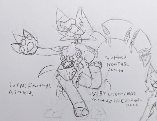
TADC design freakshow version- inspired by the song artist Femtanyl and the animator Aimkid. has a more cartoony design and very bright colors, meant to look very out-of-place. leans very heavily into the disembodiment and candy gore aspects of both original and TADC designs. poster title would be The Butcher or The Confectioner, haven't decided yet.

Relationships- most characters either REALLY hate her or are barely able to tolerate her, besides Jax who would likely think she's just "kinda cool". Jolly is mostly chill towards everyone except Caine, who she has a burning hatred towards for seemingly no reason, and Jax, who she really likes. probably too much. Jolly doesn't pay much attention to Kaufmo or Gangle, and anyone she has a positive attitude towards is for pretty shallow reasons. She thinks Kinger is "a silly lil dude", she thinks Ragatha is pretty, thinks Pomni is cute, thinks of Bubble as "a stupid little goof" (positive), and she thinks Zooble looks really cool. Jolly never pays much attention to how people act or how they feel and is very insensitive, which is why virtually nobody likes her. Jolly is completely insane, however her sheer lack of care is what saves her from abstracting as she just doesn't care about anything enough for something to cause her to abstract. If Jax were to abstract, it might make her pretty emotional, but not enough to have any chance of abstracting. This, combined with her creepy face and the fact that she (SH TW) often cuts herself for fun and makes constant remarks about how her blood tastes good, has made it so most of the other freak show members find her extremely weird and/or gross.
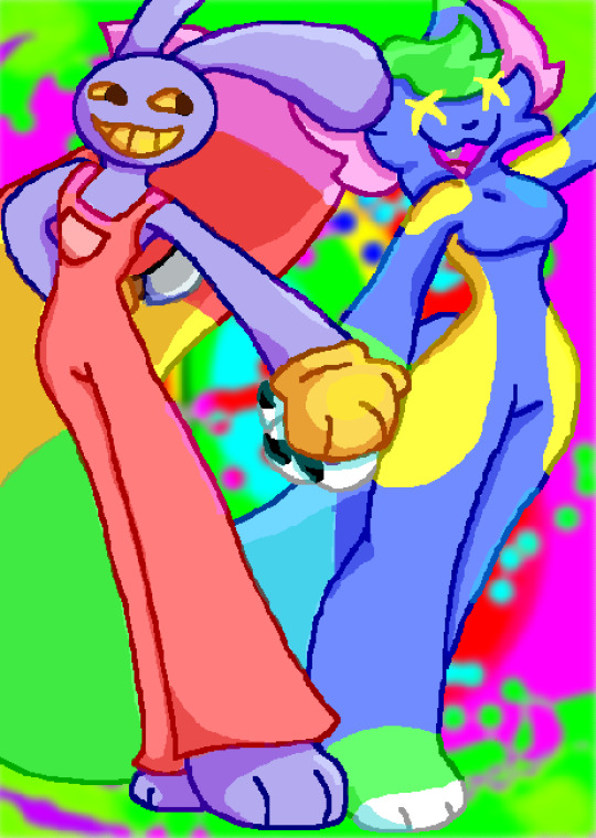
Drawing showing Jolly's fully colored regular design and also Jax as a bonus / yes i know the waist looks funky im still learning anatomy and stuff

Jolly's TADC design
ok wow that was a lot, and i still have so much more info I've come up with, I'm way too obsessed with this. but I hope you like this!!
Oh I LOVE them 🥹, I’m so happy you think my au is cool, they seem so interesting!! I would love to hear more 🫵
43 notes
·
View notes
Text
Follow up on last post:
So I’m only gonna go into my favorite songs in View-monster
Marketland: THE BEST ONE I WILL DIE ON THAT HILL. I HAVE A WHOLE ANIMATION IN MIND BUT I HATE ANIMATING
10/10
Gadzooks: sometimes I repeat the word “gadzooks” but it’s alright ig, pretty funny tho
6/10
Knife fight: absolute banger, daydream robot fella shenanigans to this one, VERY FUN AND CATCHY
9/10
The only house that’s not on fire yet: just heard it in full recently, used to skip it, ITS REALLY CUTE AND ODDLY COMFORTING. LOVE IT.
10/10
The ocean: ironically listened to it on a lake gggggg, love the ending part, brings back good memories of my last vacation
9/10
The afternoon: I SING THIS A LOT “Ohohoh all the less you hold out, more and more well fold out, more and more you grow up, less and less we show up”
Very nostalgic and a comfort song, very silly, only issue is I can’t find a theme or cohesive bit at all
8/10
Bill Watterson: THIS SONG. THIS IS IT. Made my 2020 so much better, made 2021 even better, found again and got back to it. This song makes me so incredibly happy , also Calvin and Hobbs let’s fuckin gooooo
100/10
Modify: I don’t listen to it much but it’s good! I like the instrumental better than the lyrics but yeeee, also don’t really follow their work but that one aimkid animation is quite fun to zone out to
7/10
Andddd fuck I’ll just do more I’m tired
0 notes
Note
you probably get this a lot, but how did you learn to draw? your art style is so nice! do you have any tips for a beginner?
I learned from a Disney How To Draw The Fairies Of Pixie Hollow book and ...woof probably ~15 years of practice now???! So you can imagine trying to boil that down to general advice is difficult :(
I genuinely still draw hands the way that fairy book taught me, mostly, which is crazy lol. Wish I had it with me to take pics
But yeah ummmm my general advice is honestly? copy things you like! try them out, and by nature of being a different guy doing it, and combining it with a different set of other features, it will look different!
My fursona is a great example! A lot of it happens subconsciously for me now, but I took aspects LIBERALLY from my absolute favorite depictions of goofy looking cartoon animals!

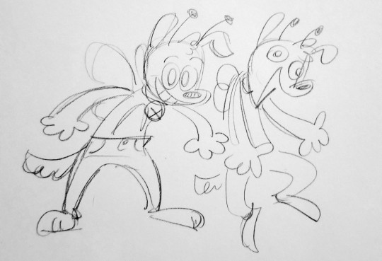

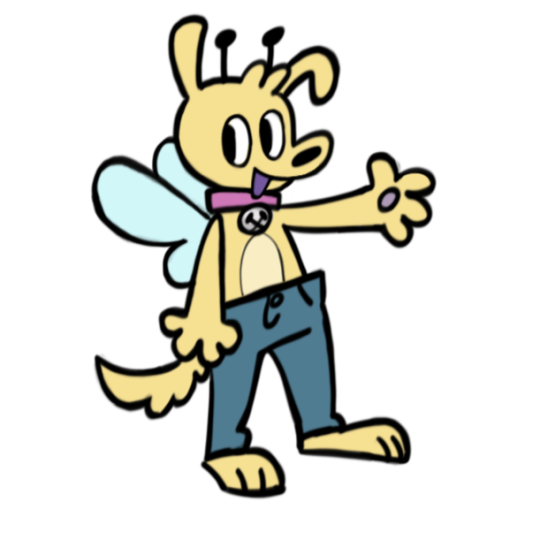
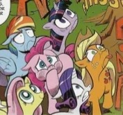

[middle image is aimkid on youtube if you arent familiar! check her out she rules!!]
I think the hardest thing when I was learning to make character-focused art was figuring out WHAT it is I liked about how something looked. I spent many years wholly copying styles I liked for practice, and in the process Id catch on to the parts that were the most fun for me to do myself and keep them for when I wasnt specifically emulating anything.
Speeddraw / speedpainting videos are very good for learning new techniques to try, and I also recommend looking at traditional art techniques even if you do exclusively digital. For example, I never really Clicked with the Most archetypical digital art process (I dont like using layer filters to shade and I don't like making line art, etc), but I love doing digital art as though i'm using acrylics on canvas lol!
Thats not the only tip youll ever need by a long shot and style inspiration (especially for character art specifically as Ive kind of focused on) is a very small aspect of art, but it's where I started out focusing and I think I turned out ok lol! So I hope this is something kind of helpful at least? Have fun and best wishes!
76 notes
·
View notes
Note
I'd go with 12 fps just because it's less work but the 24 looks good too!!! If u want a nice middle I tend to animate on 18 fps abdjdnrnr
Oh yeah! 18 is pretty cool! I think aimkid (someone who makes amazing animations) uses 18 fps.
The thing is: That cape flow is a separate file (for trying different fps settings)
The actual animation file is 24 fps already. (I can't really change it now I think because it would mess up the audio)
I mean, it's no big deal tho! I can still duplicate all frames of that part because 2 frames in a 24fps animation looks like 1 frame in 12 fps.
Also thanks for your opinion on this! ^^ Makes me so happy when people share what they think!! Make me feel like my art is actuall yseen :3
5 notes
·
View notes
Text
ye
fdahdjk ANIMATION
#their animation is so good#and i would have said that before today#but WOW was soft fuzzy man good#i only found them recently which is kind of sad#but ye#i do#they also watch ok ko#which i didnt know when i first found their channel#sfahkj#it was one of those gut feeling things#like#hey your style is really similar do watch—#and they did#yeah#aimkid is good#if anyone hasnt seen their stuff i would totally recommend it#they animate a lot of lemon demon songs#ramblings#mine#aimkid
3 notes
·
View notes