#ADV451
Explore tagged Tumblr posts
Visit Tumblr Blog
Explore Tumblr blogs with no restrictions, modern design and the best experience.
Last Seen Tumblr Blogs


Fun Fact
Tumblr posted its first advertisements in May 2012 and subsequently earned $13M in revenue.
Photo


For week 2, we learnt about how to do minimalist poster.
I drew Ejen Ali and Train To Busan posters.
Firstly, the poster I did is solely focusing on the spectacle which is the main thing in Ejen Ali that is known as Iris which has some technology and has ‘Override’ mode which is why the glasses is white/holo to portray override mode. The title ‘Ejen Ali’ is solely based on the original poster, mixture of silver and red. The base background would be purple-ish and black referenced as original poster.
Secondly, I drew Train To Busan, only the train as it is the main key in the movie. Extra details such as blood/red and handprints to show the genre of the movie is thriller and suspense toward viewers. It is simple but I think it represents the movie enough.
2 notes
·
View notes
Photo


Hi everyone welcome back to my blog !
As we all know last week i have posted my sketches. But there are a few changes to my final font poster design after consulting with my lecturer as he mention that my sketch is too simple. So i sketch a new design and he likes it even better.
The first process of designing i need to recall back what i had learned during last week. First i need to do a few sketches to get a rough idea. This is because it will help me to choose on what type of font that is suitable for me to use for this font poster design. Next i started to create the design on AI. I started to choose the colour scheme available on Google for my design.
Here is my two final design that i have finalised. I have a hard time in choosing which design i should submit to my lecturer. The reason why is because for me both looks interesting. But finally i have decided to submit the blue design. This is because the colour tone has different contrast compared to the orange one. Even though the orange has a two tone colour but the colour range is almost identical.
0 notes
Text
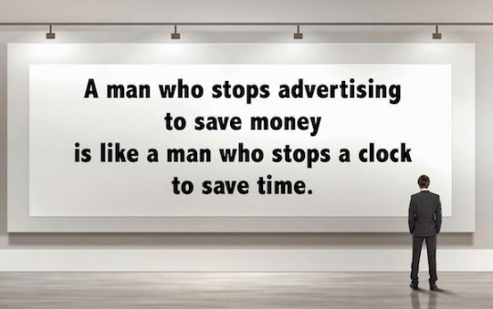
Opinion on Henry Ford's quotes
On our second week in university, we attend our first class of Advertising Art & Intelligent Design (ADV451) taught by Sir Khairudin Murad. During the lecture, he explained all the things that you need to know in this subject included our objective, assessment, rules and what you need to do in order to ace this subject. Before of class ended, he gave us a quote and this post's purpose is to elaborate and explain the meaning behind the quote.
"A man who stops advertising to save money is like a man who stops a clock to save time" This quotes by Henry Ford contain several hidden message that we have to study. In my opinion, both of the example that he said is very closely related to each other. First, by saying that "a man who stops clock to save time". It is clearly that this kind of act is impossible to execute because time is the most precious thing in the world as it cannot be stopped. By relating with 'a man who stops advertising to save money' We can say that it is also impossible to do it. There is no such thing as stop advertising to save money because as we all known, advertising existed to gain more money not losing or saving them. This is because by advertising we promote product, encourage people to use our services and create awareness for the brand. The same goes to stop clock to save time. Why stop the clock when you can keep it running and while at it you can do productive things that can be beneficial to you?
If i have to give real life example, i would choose McDonald as one. Theoretically speaking if McDonald encountered a financial issue and they decided to stop advertising by taking down their iconic billboards at every states in Malaysia, it won't actually help very much because people mainly found out their new product line by noticing the billboards and also from the apps. If the advertising has been halted, people will still know about their new menu, promotion or whatsoever because of the strong brand impression but the impacts are not the same. For example, the sales of a new menu between by using advertising and by not using it produce really big differences.
In a nutshell, what Henry Ford told us are very true and logic to the brain. Advertising is really important for a company or business to keep on going and surviving. This is because by mastering the art of advertising. You can fully control the outcome of your business as it allow you to target your ideal customers, create awareness for your brand and also announcing the the whole world what you actually doing and working on. Needless to say, i as well as my classmates gained different sort of inputs that we may never know before by attending this core subject class of ours. Taught by Sir Khai, Thank you sir.

1 note
·
View note
Photo

This is a Bahnschrift typeface poster done by me in for subject ADV451.
I was assigned to do a minimal font poster with any typeface of choice. The few criteria were: the first letter of my nickname as the focal point, 3 colours, line element and alphabets in a text box.
The process:
Firslty, i searched for a few reference work to get some inspiration. Then i tried sketching, but i wasnt getting anyhting so i went on and opened up Adobe Illustrator to get a rough idea of what i want it to be, which fonts i want to use. It took me, a lot, of rough ideas to come out with the outcome. I tried a few different layouts but it wasn’t working because of my first letter of my nickname is quite hard to design. I decided to just go with what i feel is good and consulted with my lecturer for insights. For the colors, thanks to Maegan for introducing adobe colors to me!
0 notes
Text
Doing business without advertising is like winking at a girl in the dark. You know what you are doing but nobody else does"
Advertising is wanting to let people know you. If you have ideas, however you don’t showcase, people won’t know what you can and want to do. Therefore, comes advertising to let people acknowledge. Well-known brands are because of good advertising of them. For example, the Apple brand that is known globally. They know what they are doing and therefore they know what their targeted audiences are.
You don’t see Apple bargaining for their cheapest price, but their high quality products for those who values qualities more than quantity. Whenever they released new model, they would not need complex advertising, just simple one is enough to show the quality. Plus, the brand itself is becoming more known when the advertising is superb.
1 note
·
View note
Photo


On Week 8, we learnt about magazine covers and were described on how a good magazine cover should be. It needs to include 7 elements for it to consider as a good magazine cover for all genre. We need:
1.masthead
2. selling lines
3.datelines
4. main image
5. Main cover line
6. Cover line
7. Barcode
So, I chose 2 magazine cover specifically fashion magazine cover since I will be doing a fashion magazine cover. There are a lot of styles on how each magazine do it but I picked two that has all the elements.
0 notes
Photo

On Week 7, we learnt photoshop and cropping steps for creating a design. The lecturer has made a competition with requirement using Upin Ipin, bubble text and ourselves in a picture with Eid as the theme. Therefore, this is my design for this assignment.
First of all, I put upin ipin as required, added Kak Ros, Opah and Rembo as the characters to make it more merry. The perspective is Rembo, the chicken first then Upin Ipin, Opah, Kak Ros and me at the back.
I put shadow, only slight because it was noon setting. I also added a few decorations on the ceiling and ‘pelita’ on the left. I edit the exposure on all the characters except Rembo to make it more suitable and realistic.
0 notes
Photo

This is the final font poster that I have done.
It has 6 elements including typefaces, point size, line length, leading, tracking and kerning.
I use small ‘b’ for my name and drag the b to fit it in the poster.
The color I pick is contrast to each other. as for the texture I use oil-painting like texture with base color of pale peach.
The line length is put and adjust to be fixed and in a box. The kerning is not crowded and easily viewed. The tracking is also not too close to one another.
0 notes
Text


2 FONT SKETCHES
On week 5, we learnt hands-on to do font design poster using Adobe Illustrator by doing font sketches first. So these above are my sketches.
I chose Verdana as my typeface. It is apart of sans-serif font family and created in 1996 and rooted from Tahoma font from 2 years before. We need to list down the alphabet and numeric in Verdana font. As you can see, there are two different design with 'biha' words for my name. Both 'B' and 'b' are different sizes from 'iha' to make it as focal point. the poster is designed to have 3 different colors according to creator's creativity. Another requirement is the font much touch the edges, so therefore, the first letter is big.
For the first font, I did with capital letter and drag the 'h' while the second sketch is all small letter, I could not drag my 'h' because of the inconvenience of the letters.
0 notes
Text
TYPOGRAPHY

On Week 4 lecture, we learnt about Typography that is technique of arranging words to make language visible and readable. There are several things to look for good typography such as typefaces, point size, line length, leading, tracking and kerning.
Above are two posters I found when I was on drive on highway.
So, for the first poster, we have "CUBREMI" product. In my opinion, the text under the brand name is quite small and unreadable from a far. It should be bigger but not too big that it will overshadow the upper letters. Next the Kerning is too small. I think this is because they want to make fit the face of the woman/founder. The typefaces, line length, leading and tracking seemed fine to me.
Next is the "Cinderella" billboard. Honestly, the brand name is too small and the typefaces used is so unhelping as it contributes to the words being small for its curly style. The taglines underneath are totally lost cause because I can't even see it because of it's too small. However the typefaces used on the 'No 1 Best...' is good because the fonts are big and they are bold.
0 notes
Photo


On Week 3, we learnt about six elements that are important to have in creating a posters which are, line, shape, size, texture, color and value.
So, I picked two posters that have all these elements above.
First poster, we have a straight line on the “Lorem ipsum ipsimus...”. Next, it has the coconut tree shape that fulfill one of the element as well as the circular design. For the size element, we have different sizes for ‘Summer’, ‘Festival’. Next is color has contrast in it of green and orange thus the value focal point is a bit unclear, but in my opinion, it is to highlight the dates and genre. Lastly, the texture is the little bit of splash color and the straight lines in the background. It is a complete design, however the focal point needs to be fixed.
Second poster is a movie. The lines are the title, the quotes above area of the poster and the names of director and producer and some of them have different sizes which are fitting for sizes element. Next the color is really contrast as the orange and turquoise that we can easily see. The value is that the focal point is the characters or crews in the poster. For the shape we have round-ish shape in the background. Lastly, its background has some sort of compass and safe designs that could be considered as texture in the poster.
I chose these two poster because they all have the elements of design that make them complete and considered as a good design.
0 notes
Photo


Hello everyone !
It’s been 5 week already since i have been an advertising student. Currently i have started doing the first assignment for the subject ADV451. For this first assignment i need to create a font poster. This assignment takes about two weeks to be submitted. The first week we need to submit our first sketches. The reason why we need to submit the sketches first is because to get the approval from our lecturer. In order for the poster to get approved we need to submit two sketches so that our lecturer would approved which one that he prefer.
Here are my idea for the sketches. The font that i’ll be using for this font poster is Hakuna Sans.
0 notes
Text
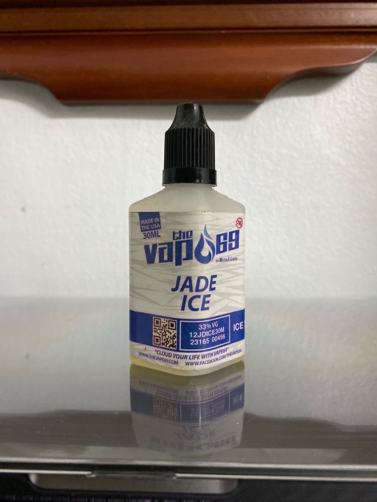
Bad Typography
In today’s blog review i would like to explain about bad typography. Typography plays an important role in marketing and advertising. This is because the typography must matched with the design of the product. The reason why it must matched the design is because it will attract the target audience or customers to be attracted and stimulate positive feelings towards the brand which will also enhance the brand of your business.
Here is two product that i had found around my surroundings which in my opinion have bad typography :
The first one that i found is a bottle of vape e-liquid. The reason why i think it has bad typography is because the font design of the packaging does not fully showed the brand name. The brand name is actually ‘The Vape 69′. If people doesn’t know about the brand they can misread the brand name that are stated on the bottle. For example, people will misread ‘The Vapo 69′ instead of the ‘The Vape 69′. For me this does not suits the design of the brand because it will make the consumer feel confused.
The second product that i found is a drink packaging. The reason why i think this drink packaging has bad typography is because the kerning of the font is close to each other. Next, the size of the font is also being mixed up.

0 notes
Photo

The movie poster that i have chosen for this post is 127 Hours. The movie was released on 2010. It was based on true story about a man going hiking and end up getting stuck between the stones of the mountain for 127 hours.
1. LINE
The small mountains below potrays line.
2. SHAPE
There are two big mountain stones in the movie poster. The two big stones shaped like a triangle.
3. SIZE
In the movie poster there are various shapes. There are small and large - size stone.
4. COLOR
In the movie poster uses a lot of colour to attract the audience. The element colour in the poster is contrast to each others element.
5. VALUE
The man in the poster who stucks between those two big stones is the main lead. In the movie focused the most on the man. So the value of the movie is based on the man.
6. TEXTURE
There are some texture on the big mountain stone.
0 notes
Photo


The local movie that i have chosen is Sangkar. This movie is released on 29 August 2019. The original movie poster potrays about mixed martial art in the Octagon. But the hidden message about this movie is about a friendship between two fighters. Hence it is the reason why i chose to sketch the handshake is because it potrays the relationship in the movie.
Next, the international movie that i have chose is The Call. This is a Korean movie that was lead by Park Shin-Hye, Jeon Jong-Seo and Lee El. It was released on Netflix. The genre of this movie is sci-fi / thriller. The reasons why i have the idea to sketch the old telephone is because the main lead communicating with the villain from the past through an old phone.
0 notes
Photo
Henry Ford’s Quote Review
Since i’m on my second semester in UiTM Shah Alam majoring in Bachelor of Mass Communication (Hons.) in Advertising my first task for subject Advertising Art And Intelligent Design (ADV451) is to review a quote by the founder of Ford.
The meaning of Henry Ford’s quote it is impossible to save money in business by not investing money in advertising. In my opinion it will bring big losses to the company if not much exposure are given to the public. I also think that it is better to spend some money and effort on advertising rather than saving the money for no advertising at all, because by doing so it will automatically boost up your brand, sales and acknowledgment to your target audience and among people. So the conclusion is i think spending a little bit of money in advertising won’t bring any harm to your business.
0 notes