#A couple of versions because I like how it looks just as linework as well
Explore tagged Tumblr posts
Text
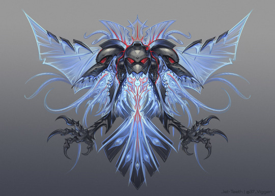


"The Raven King"
#False Ravens#Chaos space marines#homebrew warband#I keep forgetting I'm sitting on stuff I gotta post pff#Was just goofin around with this one but the vibes check out#A couple of versions because I like how it looks just as linework as well#Jet art#tzeentch#I need to draw more of the weird little bird guys but Gundam snatched the hyperfixation braincell back for the month oops
234 notes
·
View notes
Text
Water

2023/11 (full view)
Water | Earth | Metal
Look at my boy, imma gonna put him through some stuff :3
So I was like hhhhh stress factors have been dealt with, got some stuff sorted, did some knitting in between to wind down the buzzy head and how about doing some art. Get back into the swing of things. And then I decided moderation is for other people that are not me and went with zen wave shapes because linework is the only one true love of my life. I sketched this out around one in the morning, slept, killed it at work and then finished this babe up. I like when things just flow nicely that I can finish a piece in a couple of hours. Shoutout to the dear shepherd of the Salmon @givesyoualivesalmon, I'll get back to you soon but yo your questions on my iteration made my brain do some overtime while I was dealing with stuff and I got so much worldbuilding ideas outta it because of you. Forehead kisses to you <3
I wanna do some portraits with the rest of the siblings too and F!Leo as well tho for his I gotta figure out how to do zen shapes that are much more... un-relaxed you feel me. Baby Leo gets calm Water element vibes but his older version has no chill. (technically in this picture the calm is a bit deceiving but oh well ;))
#havethetouchart#artists of tumblr#the unicorn paradox#traditional art#inks#coloured pencils#watercolour pencils#rottmnt AU#tmnt iteration#teenage mutant ninja turtles#rottmnt#rottmnt Leo#art#havethetouch#the unicorn paradox illustrations
59 notes
·
View notes
Text
#broo this looks so good!#how many hours did it take?#it's all pencil linework#must have taken patience beyond my understanding
Thank you!!
You have activated my trap card: talking about drawing
I wasn't keeping track, tbh, since I've been poking at it on and off over a couple of days. Some number of hours greater than two, but I genuinely have no idea. Believe it or not, this is actually what counts as relatively loose and sketchy by my standards! Pencil lineart is what I fall back on when I don't have the energy for proper inking, since it's a lot more forgiving. (Plus, I've got this excellent propelling eraser that lets me clean up really tiny details, so I was able to get rid of the construction lines without losing the details around/on top of them and that helps it to look neater.) Usually I'd get really particular when inking the lines, but this time I just quickly went over some of them with a really sharp pencil for definition, or a blunter one for weight, and let things stay a bit fuzzy in places.
The whole thing was pretty haphazard and improvised, actually. I started redrawing a screencap, but then I changed the expression, moved the limbs around, messed up his hair and clothes... It was pretty much an experiment in being a bit looser and not so reliant on references, so it's interesting that it looks like it took patience! It felt like the total opposite when I was drawing, I was just throwing things at the page and seeing what stuck by the metric of what I found the most entertaining. It does help that I've drawn Ironwood a truly ludicrous number of times by now, so I've got even his more complicated prosthetic hand pretty down, and I could probably draw his face and hair in my sleep.
While I'm rambling about the drawing process (I meant it about the trap card!), I put far too much thought into the damage and the blood (and my usual habit of making sure the lines of his metal arm are vaguely realistically visible through his sleeve, because I always thought the show animation was lazy about that). Obsessive levels of detail is always the fun part, I get into the zone and forget how long I've spent on things. The vague context I had in mind is that this is the result of the big James-vs-everyone fight in the better version of vol8 that exists in my head. (I did vaguely consider making this the aftermath of the Watts fight, but I chickened out of the level of gory involved in drawing his burns.) His aura has been knocked out, he took a glancing bullet to the shoulder, something nicked his face or maybe it's a laceration from a blow, and the big one is that he's over-exerted himself far too soon after getting his arm replaced and he's bleeding from the amputation site. Figuring out where the blood would have soaked through his jacket sleeve while running down his arm as it hung limp was fun. I would have drawn blood on the knuckles of his left hand as well, but metal hands don't bleed and I was less keen on the implication that it was someone else's blood, so I just went with damage to his glove. Can you tell I've been watching a lot of forensic pathology crime dramas lately. Oh yeah, and it's less clear in pencil than it would be in colour, but I had to include the heavy dark circles under his eyes that I always draw him with as one of the few bits of shading. Man has Not been getting enough sleep.
I do love drawing this disaster, it's been way too long.
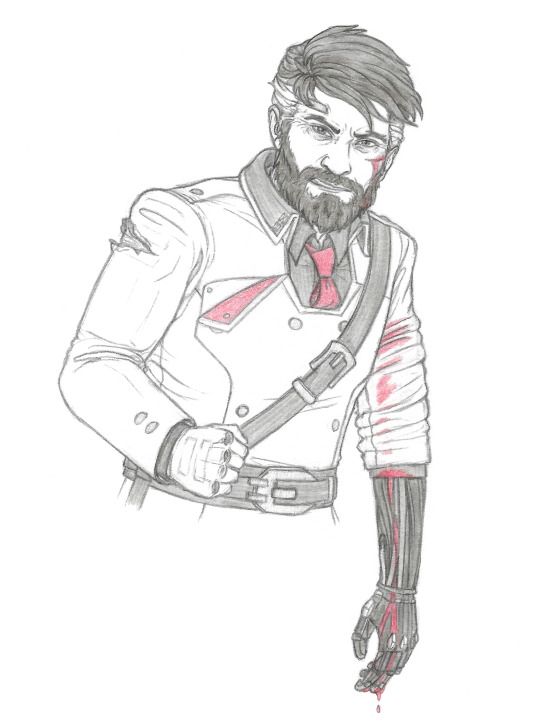
Vent art? Stress relief art? One of those things, feat. this disaster because he's good for that
#personal stuff#i'm sure i had a talking about art tag somewhere#james ironwood#bonus comment: i listened to a lot of angry music while drawing this#the Big Mood tracks were 'in the end' by linkin park and 'laplace's angel' by will wood
43 notes
·
View notes
Text
LGBTQ Comic Review - Amongst Us Book 1
A masterful combination of comedy, subtle romance, and incredible sensuality

I make no attempts to hide my complete admiration and infatuation with Shilin Huang's Yuri webcomic Amongst Us. The slice of life AU featuring reimagined versions of the lead characters from fantasy series Carciphona as a lesbian couple has held a special place in my heart for a long time. I named the series one of the best Yuri works of the past one-hundred years, can frequently be found lurking in the author's Twitch streams, and even have a wall in my office dedicated to the artwork of the main couple (or I did before my office became a remote classroom). So, when a Kickstarter by Shilin and Hiveworks Comics launched promising a print version of the work, I was eager to support it financially and promote it with my humble platform. The Kickstarter took place in March, and books were initially estimated for release in May of 2020. However, as you have probably realized by the dates alone, the world went very South around this time. A combination of disruptions from the COVID-19 pandemic, a healthy amount of bad luck, and what I am inclined to believe, for various reasons, was some awful mismanagement by Hiveworks led to numerous delays. Indeed, by the time the book finally shipped, I had moved, so my copy arrived a little later as it had to be forwarded. But, at the end of this frustrating and anticipation-building event, I finally have the volume in my hands, and it was worth the wait. While I adore the webcomic, this gorgeous print volume completely enthralls me. The book is absolutely the preferred way to read this spectacular comic.
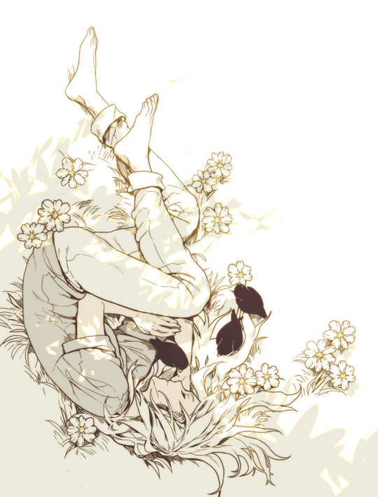
Before getting into the exquisite details of Amongst Us Book 1: Soulmates, I need to take a minute to praise how well this book is put together. The paperback binding is thick and features amazing spot glass that sparkles in the light. This feature only accentuates the fantastic and bright the cover illustration of main characters Veloce and Blackbird loving holding each other is. The back cover has a simpler but more imaginative illustration of the two flying through the sky, and the character's expressions tell you everything you need to know about this fantastic, odd couple. There are a few things you will notice upon opening the volume. The first is how well Amongst Us made the challenging transition from vertical webcomic to the page. The assembly and paneling are fantastic and clear, and chapters feature stylized illustrations and title cards. You will then see the inside cover, a powerful display that perfectly contrasts the front's glowing and tender love. Finally, there is Shilin's presents moving forward and dedication, where she lovingly dedicates the book to her partner, Kristen.
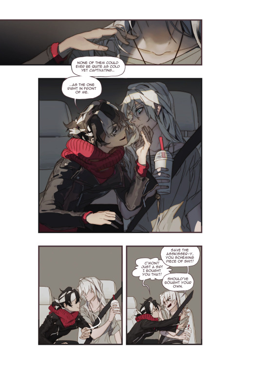
I assure you, as good as the book's presentation and assembly is, the contents within are even better. Amongst Us follows Veloce and Blackbird's bombastic relationship. The two women are eccentric and striking musicians in their early twenties, and I swear you will never forget them. The slice of life storylines are, per the genre's definition, mundane and include events like shopping at the mall, riding the train, and having lunch with a friend. The charming simplicity of the story serves well to the reactions of the characters. Shilin effortlessly transitions from adorable moments of affection to explosive and hilarious comedy and irresistible and delightful moments of sexual tension; Veloce's neck and jawline alone could topple a monarchy. Often, slice of life works can become dull or repetitive, but these stories and the frequent changes in tone help the reader stay engaged and excited.
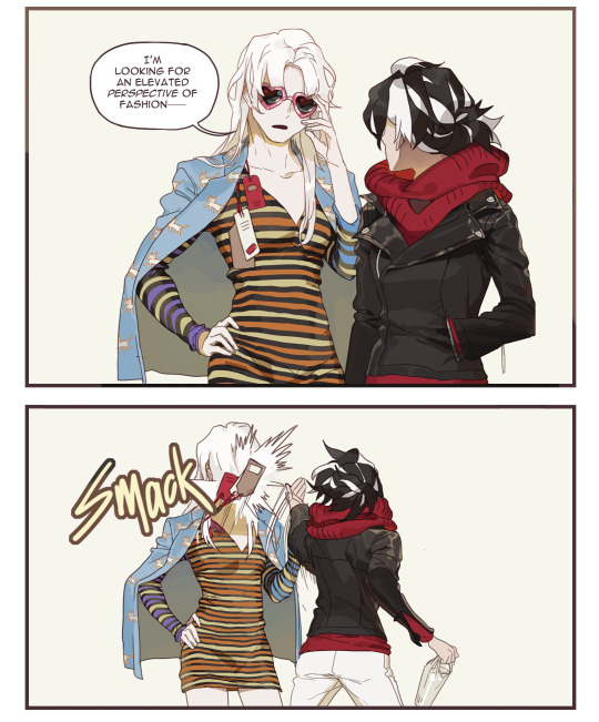
Putting slice of life aside for a moment, it is also important to note that Amongst Us is also has an interesting place within the Yuri genre, or "Girl's Love/GL" as it is often called in webcomic circles (originally an analogous term of Boy's Love). Webcomics have often been a bit more adventurous with their storylines and styles than Japanese manga. While the genre rose to popularity in the space thanks to digital manhwa and manhua, some (not all) of the Yuri tropes did not carry over between the similar mediums. Many modern webcomics and webtoons take their inspiration more from manhwa and manhua GL, which has developed its own canon and tropes over the years. However, even for a webcomic, Shilin's work feels somewhat divorced from most other worlds of Yuri. This first volume exists mainly against the Yuri genre's expectations. However, the next book, which flashes back to the couple's origin, undoubtedly is more in line with convention, for better or worse. It feels like the author decided to screw the norms and write a work that she would enjoy, and I am so glad that she did. Veloce and Blackbird are young adults, out of school in an established relationship with no drama. This (sadly) unconventional setting is made all the more irregular because of just how distinctive, and unwonted Blackbird and Veloce are.

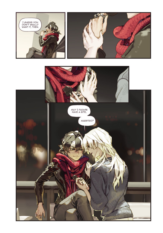
Blackbird and Veloce, originally from the fantasy world of Carciphona, take on a new life, literally, in this wonderful modern reimagining and homage. You do not need to be a fan of the original work to enjoy their bizarre and larger-than-life personalities. Indeed, when I read Amongst Us online for the first time, I had not ever even heard of Carciphona. Veloce is the quieter and more stoic of the two, although she is not afraid of showing a more relatable and human side as she reacts to Blackbirds wild antics. Veloce's (not)straight man approach is hilariously sobering. But, her best moments are in those when she lets loose a little bit, like when she is rendered drooling by the promise of her favorite smoothie or in her stoic yet alluring flirtations with Blackbird, only to get close enough to steal a healthy chomp of ice cream.
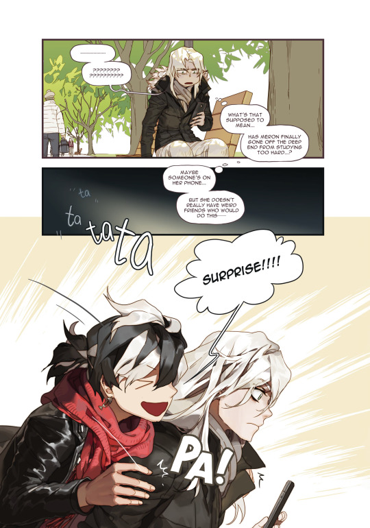
Blackbird, on her part, is completely insane. She continuously pulls of wild antics like jumping on Veloce to surprise her or singing an especially threatening song after a glorious battle over lunch. However, she is perfectly capable of showing her love and admiration for Veloce in her own cheeky way. However, true to form, each softer or more personal moment between the two is often immediately and perfectly juxtaposed with comedy, with the apparent exception of the book's touching and thoughtful finale. Veloce and Blackbird will both more than please readers individually, but you will fall in love with them as a couple. I must have read this at least a few dozen times between the webtoon and the book, and I am just as enchanted as ever by their loud and unapologetic love.
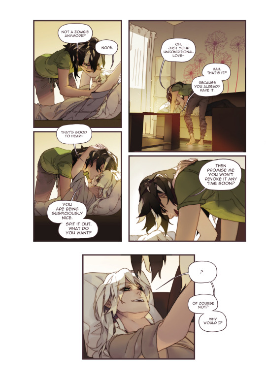
The ordinary misadventures of Blackbird and Veloce are accompanied by genuinely astounding artwork. No, that statement does not do Shilin's illustrations justice. Veloce and Blackbird lead from the page thanks to stunning, full-color illustrations that detail every moment of hilarity. Every movement from the slightest smirk to the over-the-top dramatizations of regular events thoughtfully and beautifully sprawl across the pages and invite you to stare for hours. Shilin is the only person possible who could make something as simple as someone softly singing Happy Birthday so epic and sultry. Speaking of which, my goddess of Yuri is this work titillating. No, there are no gratuitous scenes, but just the characters leaning over each other or touching the other's chin makes my hands shake. My only small complaint is that some early chapters show their age slightly with noticeably lower quality linework and flatter colors than the dazzling and dynamic work demonstrated towards the end. Still, even on its worst day, Amongst Us looks better than most of its peers and the entirety of its many inferiors.
Amongst Us is nearly the perfect work. It has a uniquely compelling and mirth-inducing way of displaying a young yet very unordinary couple's everyday life. Its characters, from design to personality, are instantly memorable and striking. Despite being ready to rip each other's heads off at the drop of a hat, or rather because of it, Blackbird and Veloce feel the perfect and natural couple we so rarely witness. Shilin's masterful combination of comedy, subtle romance, and incredible sensuality is astounding. This book is worth it for the outstanding and vibrant artwork alone, but its combination with excellent writing create a sonorous and majestic modern romance unlike any other. I believe that Shilin has created something genuinely special here, and I can confidently say that out of the hundreds of webcomics I have read, this one is the pinnacle of its kind and my absolute favorite.
You can purchase Amongst Us book 1: Soulmates exclusively on Shilin's online shop and read the webcomic now for free on Twitter, Webtoon and Tumblr @okolnir.
Ratings: Story – 9 Characters – 10 Art – 10 LGBTQ – 8 Sexual Content – 5 Final – 10
#yuri#reviews#lgbt#lgbtq#lgbtq+#queer#gay#anime#manga#amongst us#shilin#lesbian#gl#wlw#girls love#comics#comic#webtoon#webcomic#cute#funny#lol
269 notes
·
View notes
Photo
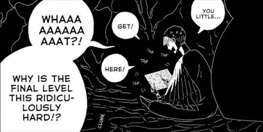
I’d comment that Phos’s complaint about the final level of their game being ridiculously hard is a metaphor for how their entire quest gets exponentially more difficult as it approaches its conclusion, but the blurb in the margins already points out that parallel, so I guess my observation is redundant. The accursed little thing is stealing my thunder.
Click the read more if you want to see me read way too much into the art.
Before I get into gushing over the artwork, I want to go over some of my thoughts on the narrative side of things, so let’s get the most annoying part out of the way first and talk about Aechmea.

I’ve heard that in the original Japanese, it’s clear that he’s referring to Cairngorm. What’s interesting here is that he said this line when it seemed for a moment that Kongou was about to release the Lunarians. But now that it’s clear it won’t happen, I wonder whether or not he’ll actually say what was on his mind. In any case, I can’t wait to see more of his ugly mug next chapter. Yay.
This chapter has sparked a bit of discourse regarding the earth gems, so I might as well chime in. While I agree that the earth gems’ reaction isn’t unreasonable given the circumstances and the limited information at their disposal, it’s still not really the best reaction they could have had. Regardless of their interpretation of Phos, the truth of the matter is that the version of Phos that the other gems feel the need to shatter, tie down, cage, and then shatter again is less of a threat to Kongou than the one they let walk around freely in chapter 58. Just because what they’re doing is understandable, doesn’t mean that what they’re doing is right, and I don’t think that this pattern of shooting first and asking questions later is a good road for them to collectively go down.
And on the subject of Euclase, to reiterate what I’ve said before: they give me the willies not because I think their actions are totally unreasonable, (though said actions do tend to be on the more militant side of what could be considered reasonable, don’t they?) Rather, a lot of the bad vibes I get from them are because of the menacing manner with which Ichikawa sometimes frames them, in addition to Padparadscha’s seemingly less-than-charitable opinion of them.
I’ve been curious for a while now about how Rutile would react after Padparadscha outright rejected them. Looks like they’ve just doubled down on their obsessiveness, to the point of doing a stellar Onryō impression. Really, the quickest way to ruin a relationship in this story is to either take someone for granted, or to be possessive/controlling. Phos has some issues with the former, but a number of the other characters have a strong case of the latter, case in point being Rutile here.
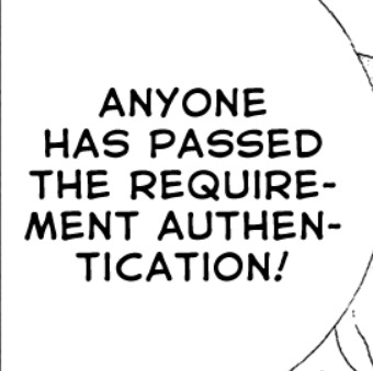
I’m guessing that this implicitly confirms that the human particle is indeed in Phos’s eye? I doubt that Kongou’s human sensors would go off due to Phos being merely metaphorically human. I’ve also seen people posit that the reason Kongou can’t release the Lunarians is because his one-way ticket to nirvana only works on less sentient life forms. (@rinboz has a good analysis that touches on this topic, btw.) I think the chapter confirms this interpretation based on Phos’s mysteriously disappearing cage. And that dovetails nicely into my thoughts on the art of this chapter…
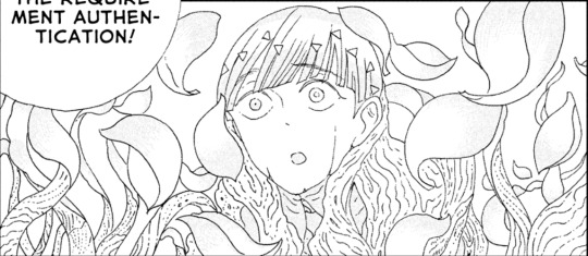
Because the imagery of the cage coming to life, flowering, and vanishing in a breeze of petals is *chef’s kiss* gorgeous.
The scene starts off in gray and black, and the panels have a cluttered, claustrophobic feeling to them from the grain of the wood and the shadowy, looming architecture. But once Kongou begins his prayer attempt, the panels start to become more spacious, those grays and blacks giving way to sleek monochrome. Finally, this changes to stark white with minimal linework and virtually no shading. The only other time I can recall Ichikawa using this blank, simplified style in hnk was when we saw a brief flashback of Phos as a child. (For a given value of “child,” we are on arrested development island after all.)
The way the cage seemingly transformed back into an earlier phase of its existence before vanishing reminds me of how Shiro went back to being a dog for a few moments before he left. So, it seems that Kongou’s attempt worked just fine on a wooden cage—i.e, a plant—but none of the sentient beings present could actually be affected.
Once he fails, the shroud of grey once again falls over the scene, black arches closing in. And yet when the “camera” turns to Phos, their greyscale body is surrounded by white, as if the pure vision they had just seen is still haunting them.
I’m just in awe of how perfectly the environment here mirrors Phos’s emotional state. Their heavy bondage flies away in a flurry of petals just as they’re getting their hopes up, and in the moment that those hopes are dashed, the rain of blades that shatter them are represented as black bars caging their mangled body. Have I said before that Ichikawa is an absolute master of visual metaphor? Because she is.
I was so fond of the art, as a matter of fact, that I reread the chapter several times and kind of. Stared at it for a couple hours. Here’s some interesting things I noticed.
In chapter 71, Cinnabar’s mercury globules were gone, but now they’re back. Were they gone before because Cinnabar had just unloaded a bunch of mercury the previous chapter, or could there be some other reason? Also in regards to Cinnabar, they’re present while Phos confronts Kongou, just barely visible on the far left—note the floating mercury.
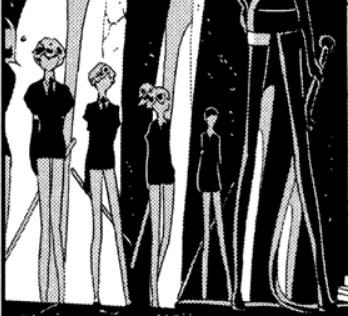
But at no point does Ichikawa let us see their face or what they think of all this—more on this in a moment.
Bort doesn’t seem to be wearing powder on their left leg. It’s the same leg that Phos shattered, and as far as we know, that’s the only time they’ve ever been broken, so maybe they’re leaving that leg bare as a reminder? That seems like the sort of samurai-esque thing Bort would do.
Everyone’s started wearing gloves. Before, the gems with a <9 hardness would only wear gloves if they anticipated having to touch someone or something with a different hardness level, (or in Cinnabar’s case, if they didn’t want to contaminate the things they touch.) But in this chapter, everyone’s wearing gloves the whole time. There are two possibilities that come to mind for me. One is that since the earth gems have to anticipate fighting other gems instead of cloud-people, they have to worry about abrasions to their hands while fighting, and are thus patrolling with gloves. The other possibility is that since Cinnabar has been fully (?) integrated into the group again, everyone has to be careful of what they touch, and they’ve taken to wearing gloves to lessen the risk of being contaminated by mercury.
Peridot and Sphene aren’t wearing gloves while patrolling in chapter 69, even though the earth gems were definitely counting on fighting the gems on the moon sooner or later, which makes me think it’s more likely that Cinnabar is the reason everyone’s wearing gloves. Maybe it went something like this: up until the night raid, Cinnabar hadn’t been living with the other gems despite the fact that they must have been engaging with them. But after the night raid, they start living with the others in the school, thus necessitating the gloves.
Once the sleep deprivation started kicking in I found myself engaging in the potentially meaningless venture of counting swords, gems, and who had swords and who didn’t in the second half of the chapter. I may have found a couple of interesting things, so get your tinfoil hats ready.
On this page, we see all the earth gems sans Jade and Euclase, and of those gems, Sphene, Cinnabar, Obsidian, and Red Beryl are unarmed. My first observation is that one of the gems who was unarmed grabbed a sword from somewhere and threw it at Phos. There are only seven swords on this page, but—not counting Rutile’s scalpels—there are eight swords on the ground on the final page.

Which begs the question: who threw the mystery sword? We can rule out Jade or Euclase; they were standing in front of Phos and it’s clear from the positions of the blades on the ground that they were all thrown from behind. Best-case scenario is that Sphene simply set their sword aside while checking the cage and grabbed it again off-panel. Worst-case scenario would be if Cinnabar was the one who chucked the eighth sword at Phos. I’m just gonna hope that they’re too frail to pick up a sword in the first place; please don’t dash my hopes Ichikawa.
Speaking of which, on the penultimate page, there are eight lines piercing Phos—one for each sword on the last page. This makes me wonder: did Bort not attack Phos here? Their whip is seemingly unrepresented in the stylized depiction of the weapons that shattered Phos, and it’s not entirely clear from the last page whether they used it or not. Then again, Rutile’s scalpels are on the ground on the last page but absent from the previous page, so maybe I’m reading too deeply into it. But the fact that Ichikawa was careful enough to have the number of swords match the number of black lines makes it a possibility worth keeping in mind.
This is what happens when I’m assigned to read The Tedious Misadventures of Tristan and Isolde. I start procrastinating by going all True Crime over who exactly murdered Phos. Anyway, see you guys next month when we find out whether the earth gems were nice enough to put Phos back together or if they just chucked the pieces out to sea.
146 notes
·
View notes
Text
Artist’s Software Surfing P2 - Inking

This time around I’ve created a better sketch similar to the ones I made for the first part of this exploration series and I have tried different tools in different programs to see if I can learn anything new or find any inspiration among this heap of brushes I’ve accumulated. @o@ Lettuce begin!
Artist’s Software Surfing P1 - Sketching Artist’s Software Surfing P2 - Inking Artist’s Software Surfing P3 - Colouring Artist’s Software Surfing P4 - Painting
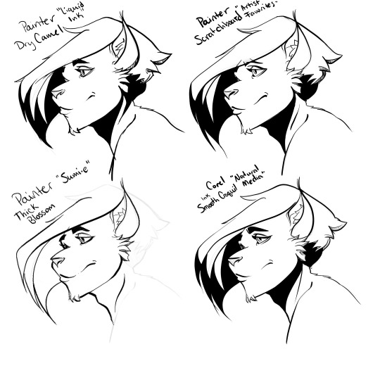
Corel Painter
This is the program that is inspiring this journey through different tools and brushes, so most of my time in here is experimentation.
“Liquid Ink” - Dry Camel I probably should have read the manual on “liquid ink” layers and why they are important, but this time I just jumped right in and started using the tool like I would an inking pen in CSP or Paintstorm. I was surprised how nice it felt, how it would cleanly fill in spaces up to the shadow line I drew, and the subtle texture if I made a light stroke. This “Liquid Layer” system I guess means it changes the behavior of the pixels however, and erasing was a little wild and the ability to pull ink from what would be considered a “blob” was really neat. Fun tool, depending on the style you are going for. Happy accidents happened with this brush so you have to be willing to relinquish a bit of control. My only gripes are, I can’t flip the canvas with this layer type, eraser was more of a hindrance than a help, and cross hatching or shade lines work a lot differently with “wet” ink than I’m used to.
“Artist Favorites” - Scratchboard This is one I actually remember from back in the day, and when I googled “Inking in Corel Painter” this one came up in a few people’s lists. If you are used to inking on the computer with some stabilization, this is just like those other tools you’ve used. Great line width variance, smooth lines, easy to control, easy to erase. It’s basic, but you get the most control out of it, meaning no happy accidents or unexpected behaviors.
“Natural Media” - Smooth Croquil This is that awkward moment where I admit to never having used quill tipped pens. I know they are a favorite of many veteran inkers who still work traditionally. I guess it’s on my to-do list. That being said, I have no frame of reference for the expected behavior of this pen, but I actually really enjoyed working with it. This was the “Smooth” version, meaning it had more stabilization in the stroke, but I was surprised at the nice hatching I could get. Would not recommend for filling black solid shapes, but the more “drawing” portion of the inking process, this would probably be my go-to for artwork with big shapes and long, sweeping lines.
Sumi-e Though I tried many of the options in the brush box, I ended up being pretty disappointed with this set. I never like using digital sumi-e brushes, the usage is just too different considering the traditional brush shape, but the texture in here just makes the artwork look pixelated. I included it just as a special mention. Won’t use it again.
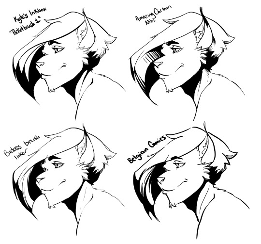

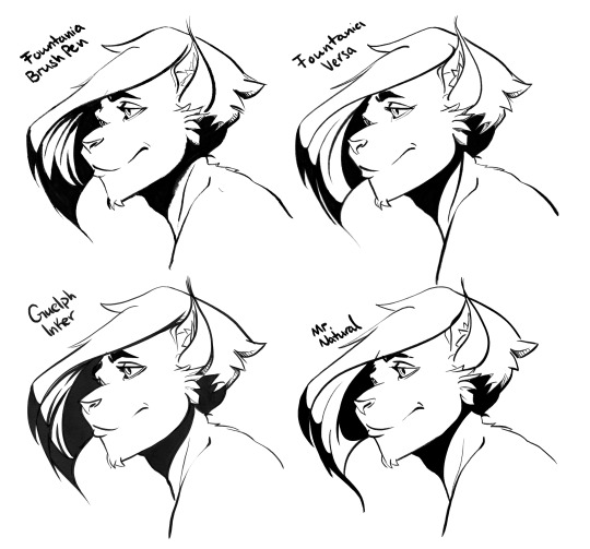
Photoshop, Kyle T Webster’s Inkbox
Lord, I swear I saved past this point of this draft several times and some how Tumblr really dropped the ball. I still have the artwork, but I’ve lost all my immediate first-impressions of the almost dozen Kyle’s Inkbox variants I got to mess around with. A real shame, so I’m going to simply do my best and group them up, as I noticed some patters with some of them. Also, I hadn’t updated in two years and they’ve added a couple of important features I thought Photoshop was missing, like brush stabilization and symmetry drawing.
Nice, Scratch brush with decent texture and line width variance :: Pocketbrush 1, Badass Brush
Personal favorites :: Thick, chunky, expressive, and fun to ink with: Belgian Comics, Fountania, Guelph inker, Seth Comics
Interesting, but impractical :: Brush Beauty, Copier Rat, Fountania Brush Pen
Everything else, as far as I can recall, was just standard smooth pen with a touch of texture.

Paintstorm
Out of the box, this program doesn’t have much. It’s basically your basic round brush with stabilization settings. It’s very fast, however, and the customization is easy and fun if you want to add some texture to your ink pens. The toggle for turning your ink brush into an eraser is as easy as pressing E which makes for some nice hair push-and-pulling. Rewarding to work in, but very basic out of the box.

Krita
So, similarly to Photoshop, I hadn’t updated Krita in a handful of years and some of the features have been updated. It feels a bit better, I am able to mirror view and rotate the canvas just like I like to. I still struggle with the interface a bit but I’m sure I will get used to it with time.
I didn’t find many default pens that I liked or were unique enough to remark on so I just ran with the... (jfc is that really the name?) ... “d)_Ink-7_Brush_Rough” because of its bit of texture that’s revealed more as the lines thin. Figuring out the stabilization options was hell. It took a lot of fudging the sliders and making assumptions on the difference between “Distance” and “Delay” and why those mattered. Most programs just have one slider for brush stabilization. In fact, they all do. Not sure all of these options are necessary, but have at it if that’s your thing.
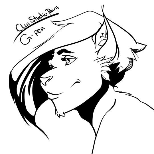
Clip Studio Paint
Not much out of the box here either, but the customization options are always nice. One thing I do want to mention for inking in CSP is the Vector layer option. You can create a “vector layer” then draw on it with any subtool and to back and edit those lines later. Or you can draw with the Figure tool and adjust lines there. Honestly this feature makes doing linework, especially for hard surface objects, super easy breezy and clean without removing the organic feel in areas that need it. I noticed Krita had vector layers as well, but like I mentioned before I just don’t have a whole lot of experience with that program so I’m not sure if it works the same way.
Well that about wraps it up for inking software, Kyle T Webster’s brushes in Photoshop coming out on top for this particular drawing. o7 I think I’ll do basic colouring next (comic book style). Hope this helped!
Artist’s Software Surfing P1 - Sketching Artist’s Software Surfing P2 - Inking Artist’s Software Surfing P3 - Colouring Artist’s Software Surfing P4 - Painting
2 notes
·
View notes
Photo
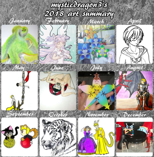
Art Summary for 2018.
I think I've decided on the representatives for May, June, and August.
Even though "A Study in Silver"-mer-Akira was technically well done for me and still looked good as a tiny thumbnail, the more I looked at it, the more suspicious his surprised expression looked. And I wanted to remember that month happily. After all, I accomplished so many drawings done for Mer May, and ended up doing a little series of mer-Ryuji and mer-Akira exploring or hanging out together; that was fun. I wanted to remember that more than see an example of my improved drawing of object volume and hair.
But actually, my mer-AkiRyu exploring around an anchor ALSO showed an improvement in my drawing. Their anatomy, volume, and hair was all good. It was just that anchor and chain that were weird. And as a thumbnail, the drawing was too tiny to show all the details, demonstrating my improvements. But still, I really liked the happy atmosphere in that drawing.
Much more than my mer-AkiRyu trapped in a fishing net. That drawing also showed improvement in my anatomy, volume, and hair, even if some of the anatomy was a little wierd and (once again!) Akira's pose was stiff. But mer-AkiRyu were annoyed with each other, and I'd much prefer a happy atmosphere, even if that drawing was just the right size to show all its details even when shrunken into a small thumbnail.
So I decided on mer-AkiRyu exploring around an anchor as my representative for MerMay.
As for June, I knew that my Kaijune ladybug demonstrated a proper sketch of human anatomy (which I'm usually bad at) and creative modification (into an uncanny creature). But it just wasn't as pretty as the brumation whale. Still, the more I looked at the brumation whale, the only thing it proved was a return to watercolors. The whale drawing itself was just a simple doodle with no skill improvements. Which is the same that could be said of my Axel&Kairi one-panel comic. It was fun, and at the time, I was impressed with myself for finally being able to immediately and quickly express myself through drawing, without much struggle. But technically, it's not very good. So even if my ladybug monster wasn't very pretty, it proved improvement in my drawing skill, which I had seen people define as the point of the Art Summary retrospective.
As for my August representative...
I was so sure my giant komodo dragon in a pine forest (against a tiny knight) would be the final. I was so proud of it, when I first drew it for Smaugust, that I actually posted it to Facebook---and I practically never have the confidence to post my drawings to Facebook! I always liked how that drawing had turned out. But the more I stared at it, I realized it only looked good because I had realistically sketched a komodo dragon photo for reference. The pine trees and tiny knight were just simple scribbles. The only thing that giant komodo dragon drawing proved was that I can realistically copy animal photos...which is something I already knew AND already had several examples of in other months.
The same could be said of my gharail-duck/feathered-dragon drawing. I took a LOT more time and effort to draw it, and even put more effort into attempting to return to watercolors through it. But in the end, all it proves is that I can realistically copy anime photos, add some modifications, and can pick up a paintbrush again. It was technically my best work in August, but actually didn't prove much.
On the other hand, my fantasy drawing of dragon-lord-Ryuji and demon-Akira had tons of technical problems. First of all, Akira's pose ended up so stiff that I was actually mostly ashamed of this drawing. But I really liked how Ryuji turned out. His pose seemed so natural, and the anatomy, object volume, and character/face/head portrayals that usually allude me, were actually pretty good in this drawing. The same could partially be said for Akira, except that his pose was just SO INCREDIBLY STIFF! ;o; On the other hand, this drawing demonstrated a lot of expanding beyond my comfort zones. I mixed mediums: Copic on the characters, watercolor paints for the backgrounds, and colorful Zig Kuretake Brushables pens as the preliminary figure sketches (an attempt at colorful linework that ended up mostly covered by my usual black linework anyway ~.~; ). But if Art Summaries are supposed to commemorate skill improvement, I thought all the experimentation that went into this drawing, counted for a lot. ...Plus, I like AkiRyu. ^.~
I had some double-guesses about other months.
Possibly replacing April's Xion with Persona 5 polymer clay charms, but Xion was definitely an example of more effort and more improvement.
Possibly replacing September with better chibis or non-dog/cat AkiRyu chibis, but I did a whole series of dog/cat-AkiRyu that I wanted to commemorate and I was kind of impressed how much my horrible chibis had improved during OTPtember.
I had an original, metaphorical drawing about "introspection" during October, but that realistic tiger's intense stare just won out, despite being my typical Inktober fare.
December isn't over yet, and I feel my "Waiting for Ryuji" figure photo series had some cuter entries this month (and last month). But "Day 150" showed off the miniature invitation that I put effort into sculpting that tiny seal for. Kirby was included, to add his cute, though not as cute as when he was floating with his mouth open, to deliver the invitation letter to Joker (as in "Day 148"). Still, I chose "Day 150" because it not only included a dialogue bubble, to demonstrate how this photo series also occaisionally requires some Photoshop effort, but also because this alternate version of "Day 150" includes a photo of Figma Ryuji, who is the entire point of this photo series.
Ok. I think I've convinced myself to be confident in my choices.
Still, I don't think my did very well this year. Which is weird for me to say, when I accomplished so many daily/monthly drawing challenges this year and defeated a couple of new and difficult sculpting projects. It wasn't such a bad year. But maybe it's just my depression wanting me to look over this retrospective and still say my skills just slid down the drain. ~__~;
2 notes
·
View notes
Text
Archie the Married Life 10th Anniversary #2

Archie the Married Life 10th Anniversary #2 Archie Comics 2019 Written by Michael Uslan Pencilled by Dan Parent Inked by J. Bone Coloured by Glenn Whitmore Lettered by Jack Morelli Previously in The Married Life......... Ten years ago, Archie Andrews took a walk down Riverdale’s Memory Lane—and there, he saw two possible futures for himself: one where he married rich socialite Veronica Lodge and another where he wed kind girl-next-door Betty Cooper. Now, ten years after the weddings, Archie’s life is far from a fairy tale. In the Archie Marries Veronica universe, he’s struggling to balance a full-time career at Lodge Industries with being a caring father and husband. While Archie and Veronica try to manage their marriage, Jughead Jones and his wife, Midge, are doing their best to keep Juggie’s Chocklit Shoppe afloat. And Moose Mason is doing his best to keep his position as congressman! Meanwhile, in the Archie Marries Betty world, the couple has returned to Riverdale from New York City to deal with Archie’s ageing father, Fred, while Reggie Mantle and Veronica are going through a not-so-amicable divorce! So this is really one of my guilty pleasures. I mean I have said how much I love Archie and the entire line of books but there's something about seeing them all grown up and leading adult lives while still being essentially those kids we all know. This really is one of the more creative and interesting books that are out there just because this is something that we really love. We all want to see what happens to those we love when they grow up, okay Happy Days not so much because actors don't always age well but this this is completely different. While we all wanted to see what happened if married either one and here we see the reality, or one possible reality, of what if? Granted I think the biggest shocker would be if Archie went off to College and didn't marry anyone we knew but that's for another reality altogether. The fact that we get to go back and see them still be kids after this is all said and done is another huge draw as well. So we should enjoy this in the meantime, though I really did like seeing Kevin grown up on his own so to speak. What Michael manages to do with the whole reunion of old friends is reignite their old friendships in ways that are wonderful to see. If you've been to your 10-15 year high school reunion then you know what it's like and that all of this is entirely possible in being as accurate as can be. Dan is the go-to man for Archie, in my humble opinion. I am not sure there is anyone else around who can bring them to life like he does. I do like seeing the grown up versions though Ambrose I don't really ever recall outside Sabrina so his bald visage is kind of fantastic. Moose with his receding hairline is great as are Jugheads sideburns, could he look like Maynard G. Krebs any more? The linework is gorgeous and how he's matured them all is beautifully done. The outfits are cute and they feel like an extension of their younger selves. The utilisation of the page layouts and how we see the angles and perspective in the panels shows off why I love his eye for storytelling. The inking on top is great and just makes perfect for the colour work. Speaking of the colour work Glenn outdoes himself with this one. The highlights in the hair or the clothing by utilising the hues and tone of the colour really stand out beautifully. Two features and two different looks and still Archie still makes me smile every last time I see the cover. There isn't anything more comforting than reading an Archie comic and this really does lead the pack right now. For a good time call, on Archie and his friends!

#comic books#comics reviews#archie comics#michael uslan#dan parent#j bone#glenn whitmore#jack morelli
1 note
·
View note
Text
Week 6: Creating a 2D Photoshop Rendering - April 5, 2017
For this tutorial, I used Photoshop CS6. It has the same functionality as the newer versions, but some of the labels/names were a bit different so it confused me a little bit when I was following the tutorial sheet.
Picture 1: Linework

It was my first time using photoshop so it took me a while to get used to using the program. I had a really slow start because I could not figure out how to place the sketch into the white background that I had created. Every time I opened the sketch it would open into a new separate tab. But it was solved by the help of my friend, who told me to just drag the picture into the screen where the background was. Making the linework for the hairdryer was fairly easy because the instructions were very clear, but it still took me quite a while as I was just getting used to this new program. The only doubt I had was with the dust and scratches filter, I did not how to use it properly. However, it seemed that it did not make a difference for this tutorial.
Picture 2: Colour Tone

This is the part where I got stuck for the most time, I did not understand very well the masks and layers, so I had to play around with them and watched a couple videos to fully understand them. I mainly got confused on the part where I tried to colour the hairdryer, because there was a part in the tutorial where we had to inverse the selection for each part, and because each of them were reverted I did not know why I could not colour the parts.
Picture 3: Shading and Reflection

This was my favourite part of the tasks, because as I was adding the shading and reflections a bit by a bit, you could see the hairdryer coming to life. I struggled looking for the right brush to use and had to switch the opacity and flow to quite low in order to get the effects that I wanted. I clicked on the “toggle brush panel” button when choosing the brushes. It was easier because a big panel pops up where all the brushes are shown with its respective effect.
Picture 4: Outline and Detailing

Making the outlines for the edges and adding the lines for each part was getting easier as I was getting used to using the program. The instructions on the tutorial sheet were very clear.
Picture 5: Creating an LCD Display

Creating the outline for the LCD Display was easy. The hardest part for me was making each of the LED lights, because I did not know how to make them the same size, while keeping them aligned right in the middle of the LCD. So I tried my best moving each LED individually, so the spaces between them are not the equal. Although I managed to make the blur for the white highlight inside the LCD, I could not make it like the one in the tutorial sheet. I did not know how to make the different shadings for the white highlight while keeping its blur.
Picture 6: Closer look of the LCD Display

As you can see, the edges are not perfectly drawn. Although we had the rough sketch to guide us, I still found it really hard to use the pen tool to make each specific curve.
Picture 7: Texture

I could not find the file on Moodle for the air inlet texture, so I left it as it is. Adding the noise for the front and rear handle was a really easy.
Picture 8: Completed Product

I found this tutorial very fun because I always wanted to learn how to use photoshop. Although at the beginning it was really hard to understand what each tool does or how the order of layers and masks could change everything. I really enjoyed adding colours and shading to the hairdryer from a simple sketch, because you could see how everything was slowly coming to life. The part that I disliked the most was the part where I had to generate the masks for the layer groups. I thought the instructions were not very clear so I had to redo everything and then watch videos on youtube to learn more about paths and masks. But after understanding how everything work and successfully making the outlines for each part, it felt like an achievement. If I had the time again, I would probably practise more on the colouring part. I was struggling more than I should’ve, because I was not satisfied with how the colours ended up looking. I wanted to make more refined lines so that it would look more like a metallic material. Some key things that I learned is that learning new things can be scary, but the scary feeling can slowly transform into fun once you take you time to learn it and master it. At the beginning I was a bit worried every time I got stuck, but once I took it slowly and figure things out, it actually felt really fun and achievable.
5 notes
·
View notes
Text
For Illustrators, the iPad Pro Is (Almost) an Everyday Computer
HOW Design Live 2018 is happening in Boston. Will you be there? Register by Feb. 1 for the best price.
Can an iPad Pro replace your laptop? Is it a computer or a tablet? A production machine or a toy? Those questions have been dogging the iPad Pro since it was introduced in autumn 2015. When the latest iPad Pro debuted in 2017, with a more robust version of iOS that included file management and improved multitasking, choosing either a MacBook or MacBook Pro or iPad Pro became even more difficult for mobile users because iPad Pro looked like it could (almost) do everything a laptop could.
iPad Pro user with Apple Pencil, multitasking, photograph copyright © 2018 Apple Inc.
So what exactly can iPad Pro do? Maybe a better question is What can’t it do? Apple’s commercial, What’s a computer shows how versatile the device is and by the end of the video, you might ask yourself if the word computer is relevant anymore. Yes, iPad Pro is capable of a lot and is a powerful tablet or laptop (or whatever) and by all accounts, it works like a computer. But if you’re an illustrator and you really want to see what it can do, take a look at how other illustrators are using it with the Procreate app.
Clovers by Nikolai Lockertsen, screen capture via Procreate Latest News
Hello, iPad Pro
When the original iPad debuted in 2010, it appeared to be a big toy, a grab-and-go device for browsing the web, reading, and playing games, as well as email and messaging. It’s gone through various iterations including the erstwhile iPad Air, as well as today’s iPad and iPad Mini—both of which MacRumors suggests not buying because updates might be coming soon. But when iPad Pro debuted in 2015, it looked a lot less like a toy.
Drawing on iPad Pro with the Apple Pencil, photograph copyright © 2018 Apple Inc.
Today’s iPad Pro comes with either a 12.9-inch or 10.5-inch diagonal display and that smaller model is larger than the standard iPad’s 9.7-inch diagonal display. The iPad Pro renders colors better and has a faster chip to power the heavy-lifting that graphics, paint, and video apps require. Compared to other iPad models, the iPad Pro is, simply put, just better—in all ways—especially when you couple it with add-ons. Pair an iPad Pro with a Smart Keyboard and it’s a laptop. With an Apple Pencil you can draw and annotate, and digitally paint in apps.
iPad Pro, Apple Pencil, and Smart Keyboard, photograph copyright © 2018 Apple Inc.
One Device to (Almost) Run It All
Illustration by Emma Berger
Emma Berger, who is an artist at Laika and freelance illustrator, has been a loyal iPad Pro user, and was an early adopter in 2016. “I had been researching different types of mobile Cintiqs as well as one stationed to a desk. I was skeptical about the iPad Pro until I used the Procreate application, and then the choice was pretty clear.” Berger calls her work “relatively low maintenance” and in addition to the iPad Pro, she uses a MacBook for Photoshop since it offers some functions not available on the iPad Pro. She also uses a scanner. But for the most part, her work happens on the iPad Pro. “For colored drawings I’ll use the iPad almost 100%. The linework will be done by hand and scanned, the rest will be completed on an iPad.”
Emma Berger, initial drawing
Emma Berger, completed illustration in Procreate
Berger will import artwork into her iMac and back into the iPad because according to her, “there are certain things that an apple pencil can never replace.” This is especially true when it comes to inking by hand, which requires her to scan the work and use Photoshop to prep the file. Then it’s off to the iPad Pro for coloring and lighting. “If I were to only use the iPad Pro for everything (and sometimes I’m still able, but no all the time) I would loose some of what makes my illustration unique.”
Illustration sketching, coloring, development, by Emma Berger
Photoshop has been and continues to be the de facto art, photo, and illustration application. And then there’s Procreate, which Berger calls “the closest thing to Photoshop, no doubt.” For Berger and other illustrators, Procreate is a smart, cost-effective option compared to Photoshop—and it can do an awful lot.
Autumn Dance by Goro Fujita, screen capture via Procreate Latest News
According to Berger, “Photoshop is crazy expensive and there are a lot of people who don’t need all of it’s amenities. That being said, I don’t think Procreate has surpassed it, nor will it do so in the future, but it is the next best alternative. In general, I think working on an iPad is also the next best alternative to the 3,000 one would normally have to put into a full Photoshop Wacom work station.”
Unlike Berger, Trudi Castle, is still very loyal to Photoshop. “For me personally, Photoshop is so powerful, has so many options, and is completely what I’m used to.” Castle is a concept and game artist living in Vancouver, Canada working at Red Hook Games on Darkest Dungeon. She began using an iPad Pro at the end of 2016 and was impressed by how great it felt to draw on with an Apple Pencil. She uses the iPad Pro for “sketching and roughing ideas” but “nothing final, ever.” The drawings she’s done, some of which are on her Instagram, are more sketchy and fun, such as the drawing done in Procreate below.
Trudi Castle’s drawing done on an iPad Pro with Procreate
“I’m super comfy doing art at this level of development on there, and maybe over time I will start to do more rendered images. But for now, it’s more like my fun program for when I’m sitting on front of the TV and relaxing,” says Castle.
End-to-End Creation & Production
Other illustrators such as Castle use an iPad Pro more recreationally, whether it’s with Procreate or Clip Studio. For Berger, Procreate does what she needs and it works for her, and yet she’s quick to point out that that it might not work for everyone, especially if your work “requires more detail, file size, or a different interface.” Even for the work she’s done almost entirely on an iPad Pro, Berger has to move between Photoshop and Procreate, from MacBook to iPad. But if you’re a creative nomad and freelancer who’s out and about, and who needs to be mobile, the iPad Pro can work for end-to-end production, and be your dedicated device. Nicholas Kole has been using it for just that.
Ristorante Humberto, created in Procreate on the iPad Pro, a personal project by Nicholas Kole
Freelance character designer and illustrator Nicholas Kole—who’s designed for the likes of Disney—has used an iPad Pro as his only device. He’s able to get what he needs accomplished without having to lug around a laptop. And for the most part, he doesn’t even need to use a desktop computer. Yes, Kole does have an iMac that he occasionally uses for invoicing, email, and type setting. But for the most part, it’s all iPad Pro all the time.
Jellybots, a personal comic and character design project by Nicholas Kole, now a Patreon project
Before committing to the iPad Pro, Kole looked at the Microsoft Surface, but he had his doubts because of his long-time loyalties. “I’m an Apple boy, and have been since childhood—so I’ll confess my bias there. iOS just makes sense to me, and the Windows equivalents always frustrate my sense of the flow of menus and apps.” The Surface also had some odd interface issues, according to Kole. “At the time I tried a Surface, the device ran full-featured desktop versions of the apps I wanted to use. The unchanged desktop UI of Photoshop felt cluttered and hard to navigate on the smaller screen, with gestures and the stylus feeling like afterthoughts.” Castle, who had a Surface Pro 2, found it to be “no way near as portable or light” as the iPad, and she found that the Surface “could get as hot as the sun!”
Kole does his art and illustration from end-to-end on an iPad Pro with Procreate, and calls himself a “huge Procreate user” who believes in the app wholeheartedly. “When I stepped into Procreate—which has a lot of powerful features hidden from immediate view, and accessible through simple gestures designed well for the touch screen—it was a big shift towards embracing what the iPad does best and leaving behind the idea that it had to function exactly like a laptop. I like the overt simplicity and the ways in which it functions, at first, more like a sketchbook than a laptop.”
A sample of settings, development art, by Nicholas Kole from the Wingfeather Saga book series for Shining Isle Production
Nia Igiby, one of the main characters of Wingfeather Saga, drawn by Nicholas Kole for the recently completed animated short
Well-Tooled
If you’re an illustrator who is thinking about getting an iPad Pro as a companion to your laptop or desktop, it can be an expensive companion if you max out storage, get an Apple Pencil & Smart Keyboard, as well as AppleCare+ and cellular connectivity. But iPad Pro is still a lot less expensive than a 512GB MacBook Pro, and iPad Pro might be the only device you need.
Plenty of illustrators and Apple loyalists have an iPad Pro, MacBook Pro, and an iMac (or iMac Pro). But if you want one device that’s portable, versatile, and powerful, the iPad Pro could be your one and only computer, that’s also a tablet, laptop, toy, sketchbook, and camera—and a whole lot more.
iPad Pro product photographs via Apple Newsroom Press Releases, copyright © 2018 Apple Inc.
Procreate 4 screen captures via Procreate Latest News
The post For Illustrators, the iPad Pro Is (Almost) an Everyday Computer appeared first on HOW Design.
For Illustrators, the iPad Pro Is (Almost) an Everyday Computer syndicated post
0 notes
Text
Bone Parish #1

Bone Parish #1 Boom! Studios 2018 Written by Cullen Bunn Illustrated by Jonas Scharf Coloured by Alex Guimaraes Lettered by Ed Dukeshire A new drug is sweeping through the streets of New Orleans—one made from the ashes of the dead. Wars are being fought over who will control the supply, while the demand only rises. While the crime families wage war, users begin to experience terrifying visions of the dead coming back to life—through them. Well I have to admit that this is something else entirely and who knew that by taking the bones of the dead and grinding them up mixing it with some chemical stuff and then add a hearty dash of voodoo or something like it and you could make the newest craze in street drugs? The idea is exceptional and while we aren’t going to be privy to the recipe, because that would just be insane, we don’t need to be because it’s in a world of pure imagination, yes Gene Wilder’s version because that is one that fits. I love the way the book is structured and how we see the opening of the series. While I was singing earlier the book opens with lyrics to a song, one in which I am actually not familiar with and its mesmerising and seeing the people pass him by and hoot and holler or livestream him and what have you because well it’s New Orleans and nothing is too unusual to be happening on it’s streets. To see it merged with a concert of the man singing it originally at a concert there’s this amazing vibe going on because as a reader we have no idea what’s going on but since it’s so damn fascinating you just can’t look away and you NEED to know more. So what happens made me cringe a bit, as a couple kids approach Dante about buying some Ash, the name of the latest, hottest street drug. Why does it make me cringe well in my younger years I ran for someone and sold cocaine in clubs so when someone you don’t know approaches you, says your name and says I heard you might be the guy to talk to it gets weird for me. It is a part of who I am or who I was but seeing it here makes it all rush back and that connection for me is one I won’t forget, the connection to this book that is. So this is important for a number of reasons but you’ll have to read it to figure those out for yourself. The interior artwork here is amazing and surpasses what I was expecting even though backgrounds aren’t as utilised as often as I would like to see. Still the manipulation of the linework and how we see the characters faces is exceptionally well done and just look at Dante for proof he’s incredibly handsome for a rapscallion. The utilisation of the page layouts and how we see the angles and perspective in the panels shows off such a strong eye for storytelling. The dark overtones throughout really make this feel creepy and even in the red lighting Alex manages to keep the colouring dark and foreboding without it feeling contrived. This first issue feels like it’s a double sized one but it’s a standard twenty four pager. It is an excellent introduction to the world these folks inhabit, the product they are bringing to the street, the family behind it and those representing other’s interests. It has this sense of a supernatural soap opera only a lot more deadly and considering the back stabbing that goes on within them well yeah that’s saying something. Still this is something we haven’t really seen and it’s about time that something this complex and interesting hit stands.
0 notes
Text
For Illustrators, the iPad Pro Is (Almost) an Everyday Computer
HOW Design Live 2018 is happening in Boston. Will you be there? Register by Feb. 1 for the best price.
Can an iPad Pro replace your laptop? Is it a computer or a tablet? A production machine or a toy? Those questions have been dogging the iPad Pro since it was introduced in autumn 2015. When the latest iPad Pro debuted in 2017, with a more robust version of iOS that included file management and improved multitasking, choosing either a MacBook or MacBook Pro or iPad Pro became even more difficult for mobile users because iPad Pro looked like it could (almost) do everything a laptop could.
iPad Pro user with Apple Pencil, multitasking, photograph copyright © 2018 Apple Inc.
So what exactly can iPad Pro do? Maybe a better question is What can’t it do? Apple’s commercial, What’s a computer shows how versatile the device is and by the end of the video, you might ask yourself if the word computer is relevant anymore. Yes, iPad Pro is capable of a lot and is a powerful tablet or laptop (or whatever) and by all accounts, it works like a computer. But if you’re an illustrator and you really want to see what it can do, take a look at how other illustrators are using it with the Procreate app.
Clovers by Nikolai Lockertsen, screen capture via Procreate Latest News
Hello, iPad Pro
When the original iPad debuted in 2010, it appeared to be a big toy, a grab-and-go device for browsing the web, reading, and playing games, as well as email and messaging. It’s gone through various iterations including the erstwhile iPad Air, as well as today’s iPad and iPad Mini—both of which MacRumors suggests not buying because updates might be coming soon. But when iPad Pro debuted in 2015, it looked a lot less like a toy.
Drawing on iPad Pro with the Apple Pencil, photograph copyright © 2018 Apple Inc.
Today’s iPad Pro comes with either a 12.9-inch or 10.5-inch diagonal display and that smaller model is larger than the standard iPad’s 9.7-inch diagonal display. The iPad Pro renders colors better and has a faster chip to power the heavy-lifting that graphics, paint, and video apps require. Compared to other iPad models, the iPad Pro is, simply put, just better—in all ways—especially when you couple it with add-ons. Pair an iPad Pro with a Smart Keyboard and it’s a laptop. With an Apple Pencil you can draw and annotate, and digitally paint in apps.
iPad Pro, Apple Pencil, and Smart Keyboard, photograph copyright © 2018 Apple Inc.
One Device to (Almost) Run It All
Illustration by Emma Berger
Emma Berger, who is an artist at Laika and freelance illustrator, has been a loyal iPad Pro user, and was an early adopter in 2016. “I had been researching different types of mobile Cintiqs as well as one stationed to a desk. I was skeptical about the iPad Pro until I used the Procreate application, and then the choice was pretty clear.” Berger calls her work “relatively low maintenance” and in addition to the iPad Pro, she uses a MacBook for Photoshop since it offers some functions not available on the iPad Pro. She also uses a scanner. But for the most part, her work happens on the iPad Pro. “For colored drawings I’ll use the iPad almost 100%. The linework will be done by hand and scanned, the rest will be completed on an iPad.”
Emma Berger, initial drawing
Emma Berger, completed illustration in Procreate
Berger will import artwork into her iMac and back into the iPad because according to her, “there are certain things that an apple pencil can never replace.” This is especially true when it comes to inking by hand, which requires her to scan the work and use Photoshop to prep the file. Then it’s off to the iPad Pro for coloring and lighting. “If I were to only use the iPad Pro for everything (and sometimes I’m still able, but no all the time) I would loose some of what makes my illustration unique.”
Illustration sketching, coloring, development, by Emma Berger
Photoshop has been and continues to be the de facto art, photo, and illustration application. And then there’s Procreate, which Berger calls “the closest thing to Photoshop, no doubt.” For Berger and other illustrators, Procreate is a smart, cost-effective option compared to Photoshop—and it can do an awful lot.
Autumn Dance by Goro Fujita, screen capture via Procreate Latest News
According to Berger, “Photoshop is crazy expensive and there are a lot of people who don’t need all of it’s amenities. That being said, I don’t think Procreate has surpassed it, nor will it do so in the future, but it is the next best alternative. In general, I think working on an iPad is also the next best alternative to the 3,000 one would normally have to put into a full Photoshop Wacom work station.”
Unlike Berger, Trudi Castle, is still very loyal to Photoshop. “For me personally, Photoshop is so powerful, has so many options, and is completely what I’m used to.” Castle is a concept and game artist living in Vancouver, Canada working at Red Hook Games on Darkest Dungeon. She began using an iPad Pro at the end of 2016 and was impressed by how great it felt to draw on with an Apple Pencil. She uses the iPad Pro for “sketching and roughing ideas” but “nothing final, ever.” The drawings she’s done, some of which are on her Instagram, are more sketchy and fun, such as the drawing done in Procreate below.
Trudi Castle’s drawing done on an iPad Pro with Procreate
“I’m super comfy doing art at this level of development on there, and maybe over time I will start to do more rendered images. But for now, it’s more like my fun program for when I’m sitting on front of the TV and relaxing,” says Castle.
End-to-End Creation & Production
Other illustrators such as Castle use an iPad Pro more recreationally, whether it’s with Procreate or Clip Studio. For Berger, Procreate does what she needs and it works for her, and yet she’s quick to point out that that it might not work for everyone, especially if your work “requires more detail, file size, or a different interface.” Even for the work she’s done almost entirely on an iPad Pro, Berger has to move between Photoshop and Procreate, from MacBook to iPad. But if you’re a creative nomad and freelancer who’s out and about, and who needs to be mobile, the iPad Pro can work for end-to-end production, and be your dedicated device. Nicholas Kole has been using it for just that.
Ristorante Humberto, created in Procreate on the iPad Pro, a personal project by Nicholas Kole
Freelance character designer and illustrator Nicholas Kole—who’s designed for the likes of Disney—has used an iPad Pro as his only device. He’s able to get what he needs accomplished without having to lug around a laptop. And for the most part, he doesn’t even need to use a desktop computer. Yes, Kole does have an iMac that he occasionally uses for invoicing, email, and type setting. But for the most part, it’s all iPad Pro all the time.
Jellybots, a personal comic and character design project by Nicholas Kole, now a Patreon project
Before committing to the iPad Pro, Kole looked at the Microsoft Surface, but he had his doubts because of his long-time loyalties. “I’m an Apple boy, and have been since childhood—so I’ll confess my bias there. iOS just makes sense to me, and the Windows equivalents always frustrate my sense of the flow of menus and apps.” The Surface also had some odd interface issues, according to Kole. “At the time I tried a Surface, the device ran full-featured desktop versions of the apps I wanted to use. The unchanged desktop UI of Photoshop felt cluttered and hard to navigate on the smaller screen, with gestures and the stylus feeling like afterthoughts.” Castle, who had a Surface Pro 2, found it to be “no way near as portable or light” as the iPad, and she found that the Surface “could get as hot as the sun!”
Kole does his art and illustration from end-to-end on an iPad Pro with Procreate, and calls himself a “huge Procreate user” who believes in the app wholeheartedly. “When I stepped into Procreate—which has a lot of powerful features hidden from immediate view, and accessible through simple gestures designed well for the touch screen—it was a big shift towards embracing what the iPad does best and leaving behind the idea that it had to function exactly like a laptop. I like the overt simplicity and the ways in which it functions, at first, more like a sketchbook than a laptop.”
A sample of settings, development art, by Nicholas Kole from the Wingfeather Saga book series for Shining Isle Production
Nia Igiby, one of the main characters of Wingfeather Saga, drawn by Nicholas Kole for the recently completed animated short
Well-Tooled
If you’re an illustrator who is thinking about getting an iPad Pro as a companion to your laptop or desktop, it can be an expensive companion if you max out storage, get an Apple Pencil & Smart Keyboard, as well as AppleCare+ and cellular connectivity. But iPad Pro is still a lot less expensive than a 512GB MacBook Pro, and iPad Pro might be the only device you need.
Plenty of illustrators and Apple loyalists have an iPad Pro, MacBook Pro, and an iMac (or iMac Pro). But if you want one device that’s portable, versatile, and powerful, the iPad Pro could be your one and only computer, that’s also a tablet, laptop, toy, sketchbook, and camera—and a whole lot more.
iPad Pro product photographs via Apple Newsroom Press Releases, copyright © 2018 Apple Inc.
Procreate 4 screen captures via Procreate Latest News
The post For Illustrators, the iPad Pro Is (Almost) an Everyday Computer appeared first on HOW Design.
For Illustrators, the iPad Pro Is (Almost) an Everyday Computer syndicated post
0 notes