#100tuesdaytipsbook
Explore tagged Tumblr posts
Photo
Fabric; my old nemesis
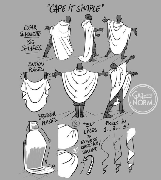
Tuesday Tips - Cape It Simple!
I don’t need to add too much explanation today. A cape, cloak or long coat simplifies the silhouette of most character, gives them a unique look or presence and conceals a lot of the overall anatomy. Keep track of the character underneath to know where to fold, drop or stretch the fabric. The fabric itself should play a role too. Different behave differently. Movement and gravity are key to “ground” your character in the environment and make it look believable. -Norm @grizandnorm #capeitsimple #100tuesdaytipsbook #100tuesdaytips #arttutorial #arttips
54K notes
·
View notes
Photo
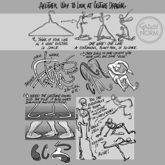
TUESDAY TIPS --- Wire Gesture Here's another way to approach Gesture Drawing. In order to shut up the part of my brain that tries to analyze and do things step by step. Overthinking often leads to stiff posing. So I sometimes draw with an almost continuous line. This way, I get across an idea or feeling very fast without thinking it through to much. this way, I get an organic feeling to the drawing without trying too hard. I can then go back and fix things or bring more clarity by drawing over it. But, I try to draw the figure in a three-dimensional space. So, as best as I can describe it, I use the line like a wire in space. This way, I get a fluid movement through the body that pushes through to the feet, and all the way to the fingers. For me, it's the best way to not get caught up in the details. There's always room to go back and fix things. That's the one area where digital comes very handy. Just create a new layer on top and use the loose wire drawing as the gesture to draw on top of. Tell me if that helps you see Gesture in a different way. This is a personal approach but I'm to hear if anyone else's brain works that way too. - Norm @grizandnorm #100TuesdayTipsBook #100TuesdayTips #TuesdayTips #grizandnorm #GestureDrawing #drawingtutorials #drawingtips
#100tuesdaytips#gesturedrawing#tuesdaytips#100tuesdaytipsbook#drawingtips#grizandnorm#drawingtutorials
3K notes
·
View notes
Photo
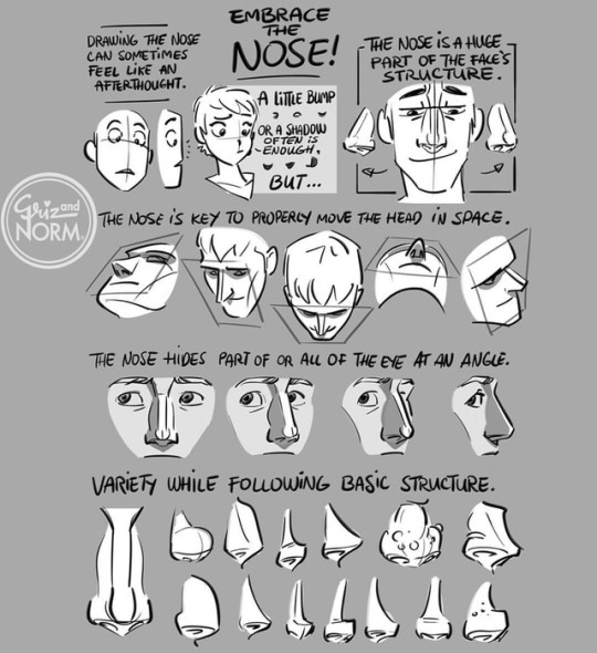
Tuesday Tips - Embrace The Nose / It’s very easy to take shortcuts when drawing the nose, and honestly, it’s fine most of the time. The nose is right in the center of the face and can unintentionally draw a lot of attention if constructed poorly. But when it’s embraced, it can do wonders. It’s key to track the facial features at odd angles and can bring a ton a personality to a character design. Use it or lose it! -Norm @grizandnorm #100tuesdaytipsbook #100tuesdaytips #tuesdaytips #arttips #arttutorial #embracethenose
12K notes
·
View notes
Photo
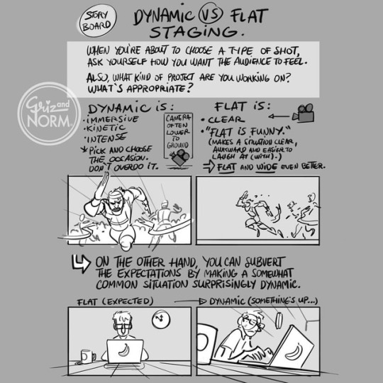
Tuesday Tips --- Dynamic VS Flat staging A huge component of storyboarding is to use the camera position and angle to tell the story you want to tell (or that you're paid to tell...). No angle or position is bad by itself. But every camera choice you make influences how the story unfolds. There's a time and a place for dynamic camera angles. Maybe right in the middle of an action sequence. But there's also a place for what some may refer to as flat staging. Flat doesn't mean boring. It often brings clarity and a sense of calm to a scene, a moment for the audience to understand where things are, often used in establishing shots. A mistake junior story artists often make is to overdo the dynamic shots. They can be very powerful, but use them wisely. As always, there's exceptions to every rules. Sometimes, subverting the expectations of an audience by using an unusual camera angle can bring a sequence to life. Try and experiment! -Norm @grizandnorm #100tuesdaytipsbook #100tuesdaytips #tuesdaytips #arttips #arttutorials #DynamicVSflat
7K notes
·
View notes
Photo
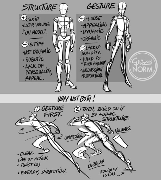
Tuesday Tips - Structure/Gesture: Why Not Both! Probably one the most compelling issue to deal with when drawing characters. There's clear pros and cons to both approach. The key, IMO, is to straddle the line between both. Give appeal and energy through the use of gesture, but always give hints of structure, weight and solidity to make the character feel like it lives in an environment. I do a quick, dynamic gesture first, then I go back in and add some structure on a second pass. In a rush, I'll focus the structure pass on faces, hands and feet (feet: their position on the ground to give weight and/or balance to the pose.) -Norm @grizandnorm #tuesdaytips #100tuesdaytips #100tuesdaytipsbook #structuregesture #whynotboth
22K notes
·
View notes
Photo
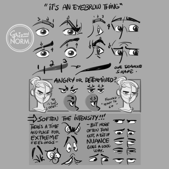
Tuesday Tips --- "It's An Eyebrow Thing" --- A recurring note a story artist may get in the production of an animated feature is to tone down the angry eyes. We all try to draw fast and loose but, in the middle of it all, nuance may escape us for a brief moment. Arched eyebrows and a furrowed brow usually tend to read "angry", even if we're trying to express focus or determination. I would even say that, overall, it's easy to overdo an expression. I'm not saying a pushed expression isn't exactly what's needed at the right moment. I'm just saying that the audience literally looks for the character's expression first when looking at a sketch or panel. Keep that in mind and lure you audience in with slightly more nuanced expressions, until the right extreme expression calls for it. -Norm @grizandnorm #tuesdaytips #100tuesdaytipsbook #arttutorial #arttips #itsaneyebrowthing
7K notes
·
View notes
Photo
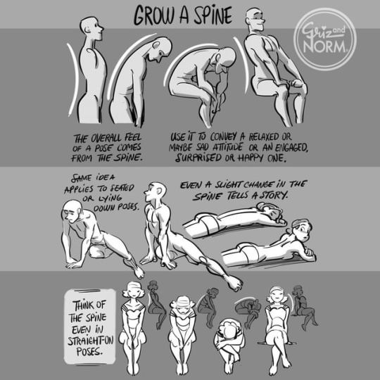
Tuesday Tips --- Grow A Spine As simple as it sounds, a character "standing up straight" or "slouching down" reveals so much about them. It would be unwise to not think about the role of the spine when posing out your character. Even the slightest extension, contraction or twist will bring nuance to a pose. You can also think of another character "mirrroring" the posture to empathize with the other or fit in a group he/she is new in. Overall, it's the foundation of most poses. Emphasize or minimize to create the effect you want in your story! -Norm @grizandnorm #tuesdaytips #100tuesdaytips #100tuesdaytipsbook #arttutorial #arttips #growaspine
9K notes
·
View notes
Photo
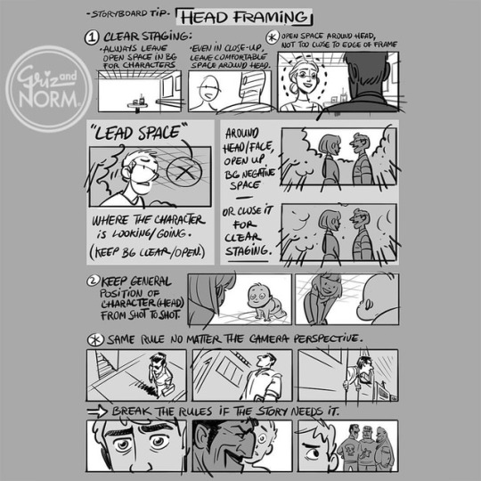
Tuesday Tips --- Head Space --- As an audience, our eyes are mostly tracking the head (and eyes) of the main characters on screen. As filmmakers, it would be a great disservice to not take that info into consideration. For clarity, try to make space around the head of characters on-screens. Too much visual noise around the face interferes with the message, unless that's the point you're trying to make make. Also, try your best to maintain the same head screen position when cutting to a new shot with the same characters, whatever type of shot it is. I know how simple this sounds but it's very easy to forget if you're not paying attention. -Norm @grizandnorm.com #tuesdaytips #100tuesdaytips #100tuesdaytipsbook #arttips #arttutorial #storyboard #grizandnorm
5K notes
·
View notes
Photo
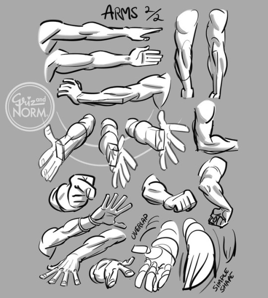
Here's another page on the arm. This time, a few examples on how the volumes move in space. In order to create a believable foreshortening, first think of simple overlapping volumes. The more you grow as an artist, the more you'll add in subtleties, but always remember to keep the overall shape of the arm, especially in foreshortening, simple and in direct relation to the story you're telling. Is your character healthy, direct, commanding, or is he/she shy, hurt, lazy, etc. The feeling you convey will always trump the exactitude of your character's anatomy. -Norm @grizandnorm #100tuesdaytipsbook #arttutorial #arttips #grizandnorm #tuesdaytips #100tuesdaytips #armforeshortening
3K notes
·
View notes
Photo
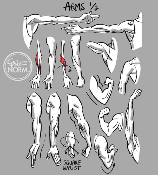
First of two overall reference page for arms. There's no need to actually draw muscles on every character, but it truly helps to understand the underlying structure, especially when pushing the pose a bit more. One thing that's often overlooked is the connection between the arm and forearm, as well as how the deltoid muscles (shoulder) interacts with the pectoral muscles (chest) when lifting the arms up (front view). Anyway, use this page as you please. -Norm @grizandnorm #100tuesdaytipsbook #arttutorial #arttips #tuesdaytips #100tuesdaytips
5K notes
·
View notes
Photo
Helpful right here!!

Tuesday Tips — Head Space — As an audience, our eyes are mostly tracking the head (and eyes) of the main characters on screen. As filmmakers, it would be a great disservice to not take that info into consideration. For clarity, try to make space around the head of characters on-screens. Too much visual noise around the face interferes with the message, unless that’s the point you’re trying to make make. Also, try your best to maintain the same head screen position when cutting to a new shot with the same characters, whatever type of shot it is. I know how simple this sounds but it’s very easy to forget if you’re not paying attention. -Norm @grizandnorm.com #tuesdaytips #100tuesdaytips #100tuesdaytipsbook #arttips #arttutorial #storyboard #grizandnorm
#arttutorial#storyboard#100tuesdaytipsbook#tuesdaytips#arttips#reference sheets#references#art#reblog
5K notes
·
View notes
Photo
grizandnorm:
Tuesday Tips - Cape It Simple!
I don’t need to add too much explanation today. A cape, cloak or long coat simplifies the silhouette of most character, gives them a unique look or presence and conceals a lot of the overall anatomy. Keep track of the character underneath to know where to fold, drop or stretch the fabric. The fabric itself should play a role too. Different behave differently. Movement and gravity are key to “ground” your character in the environment and make it look believable. -Norm @grizandnorm #capeitsimple #100tuesdaytipsbook #100tuesdaytips #arttutorial #arttips

54K notes
·
View notes
Photo

Tuesday Tips - Cape It Simple! I don't need to add too much explanation today. A cape, cloak or long coat simplifies the silhouette of most character, gives them a unique look or presence and conceals a lot of the overall anatomy. Keep track of the character underneath to know where to fold, drop or stretch the fabric. The fabric itself should play a role too. Different behave differently. Movement and gravity are key to "ground" your character in the environment and make it look believable. -Norm @grizandnorm #capeitsimple #100tuesdaytipsbook #100tuesdaytips #arttutorial #arttips
54K notes
·
View notes