#(plus I really wanted to try out using a scrolling back- and foreground)
Explore tagged Tumblr posts
Visit Tumblr Blog
Explore Tumblr blogs with no restrictions, modern design and the best experience.
Last Seen Tumblr Blogs


Fun Fact
The Tumblr app for Google Glass was released on May 16, 2013.
Text
Happy Halloween! 🎃👻 Finally finished my animation of Laura and Max stalking through the woods... I've got a feeling that they really should beware the moon🌕
#the quarry#lauramax#laura kearney#max brinly#my sketches and drawings#happy halloween#practicing some walk cycles#(plus I really wanted to try out using a scrolling back- and foreground)#I wanted to post this as a gif - but the file is ridiculously large and I didn't have the time to figure out how to compress it properly
112 notes
·
View notes
Text
Coding the website
Seen as I am new to coding, I had a video call with Kat and Liv where she gave us a short summary of what the different tags do, how to set up our folders and she showed us the code for the header in order to give us a head start.

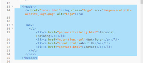
We specified the font in the css folder so that it would be the same font throughout the whole body.
In the css file we could also specify the colour we wanted the header, height and width. We added the logo image so also specified the size of that in the css folder.

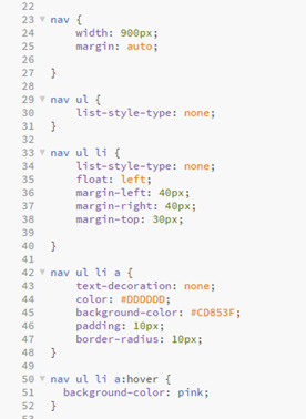
This is where we also created the navigation bar which will link to the other pages.
I added a hover tag to mine too where the colour will change when you hover over the link as I thought it would make it look more aesthetically pleasing.

This video call with Kat really helped as I feel like it gave me a much better understanding of setting up the code and gave me the confidence to want to start doing the rest by myself.
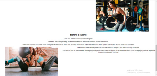
Homepage
To begin, I created the Homepage, for this I needed the header which I had already created, the main section and the footer.
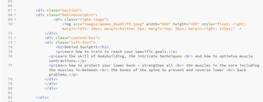
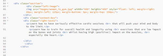
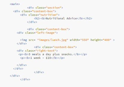
Then there was four sections in the main part of the code, the first section included a left image and right text.
This part was fairly simple, as it was the first thing on the page too, it meant it was positioned where I wanted it and nothing could overlap it.
The services box was something I struggled with for a while with trying to position the images exactly where i wanted them, but in the end I managed.


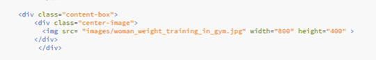
Then there was two more content boxes with one right image and left text and one left image and right text.


Problems I came across:
Like I said before, I came across a problem when I could get the images of weight and leaf to go side by side.


When I did manage to get them side by side, I came across a new issue which was getting the headers to go underneath each image.

A problem I came across in the last two sections was being able to position the text next to the image, when I would use the same code that I used for the image at the top of the page to make them align, the text would jump up to the top of the page next to the top image rather than staying in the content box iI had placed it in.
I then managed to sort it out on the right image but it took me a bit longer to figure out what I had done wrong with the left image that meant it wouldn’t work, but I got there in the end.


Personal Training
On the navigation bar on the header you can click the tabs that will then send you to a seperate page with more information on that specific area, which I liked together when creating the header, which I can design later in te different html files e.g ‘personaltraining.html1.
In the design we were given, the header and footer is the same on each page, so I could just copy and paste the same header and footer code that I had on the homepage, this ensures that the header and footer stays the same throughout each page, and makes the user experience for the user easier so they can click between each page.
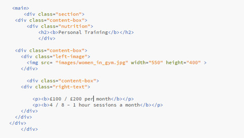
Then there was the main section of the personal training page that I needed to code, I split this off into three ‘sections’ which then contained seperate content boxes inside them.
The first section just contains an image to the left and text to the right.

This section was fairly simple and I didn’t come across any issues.
Then it has a ‘specialties’ box that just contains some centered text.


Finally there was a content box containing some centered text and a centered image, I used two separate content boxes for this as I struggled to place the image where I wanted it when I just used the one content box for both text and image.


Problems I came across:
I didn’t come across many problems with the personal training page, I was able to copy a lot of it off the homepage as it contained the same sort of layout, and it was easy to place the pictures as there was only one in each content box so I didn’t have the difficulty of trying to place them both equally.
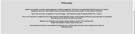
Nutrition
The nutrition page was very similar layout to the personal training page so i could copy a lot of the coding I’d done already and just change the images and text.

Problems I came across:
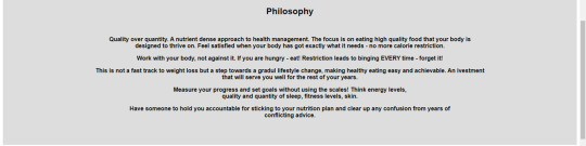
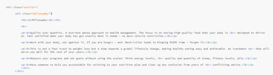
Because the sentences in the ‘philosophy’ section were quite long, I did come across a problem where the text was going off the page, this is where I learnt about the <br> tag, which moves the sentence underneath so it doesn’t go off the page, it makes it look better positioned with bigger margins at the sides.
Before.

After.
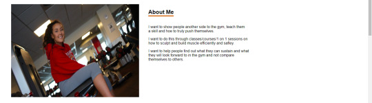
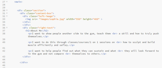
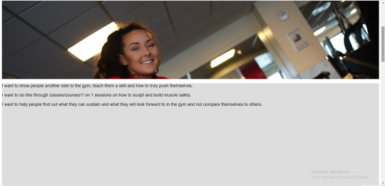
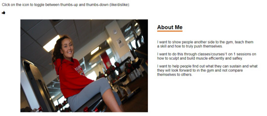
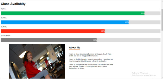
About Me

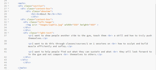
In the design that Kat gave to us there wasn’t actually a ‘About’ page, it just had an ‘about me’ button on the navigation bar. So that it wasn’t just a blank page when you clicked it, I copied over the text from the ‘about me’ section on the homepage and put this into the ‘about me’ page, formatted in the same way that the nutrition, personal training and contact page is, with the header at the top in the centre at the writing the the right of the image.
Contact
The contact page was very simple, it just had one image and a bit of text next to it, it was the same as the personal training page and the nutrition page so I was able to copy the code from that again.
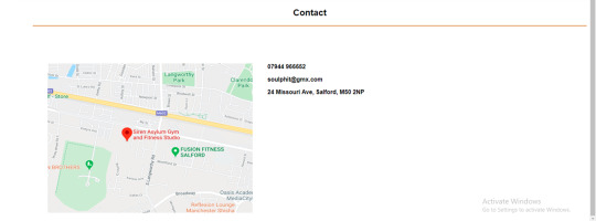

I didn’t come across any problems with this page as it was fairly straight forward.
Footer

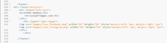
Problems I came across:
On some pages the footer would sit perfectly and on other pages the footer would overlap the bottom content box, for example on this picture here it overlapped. This was harder to figure out because the code was the same on all of the html pages so it was unusual that it didn’t sit the same in each page. To fix this I had to play around with some of the coding in the CSS file to get it in the right place on each page.

Experimenting with the coding
After finishing the coding for the design that Kat gave us, I copied a second version of my code so that I could experiment with some other features and see what I could do.
W3 Schools is a really useful website that can help you with the coding for the majority of features you want to add onto your website, so this is the website that I used to help me with most of it. If I didn’t use W3 Schools then I would use a YouTube video, this is more helpful when you want to find out in more detail why each line of code does what.
Parallax scrolling
Something I wanted to try and include in my code is parallax scrolling, this is a web design technique, in which the background moves at a slower pace than that of the foreground. This results in a 3D effect as visitors scroll down the site, adding a sense of depth and creating a more immersive experience.
I used W3 schools to try to embed this into my code.

When I tried to copy from W3 website, it didn’t work on my website, it just scrolled through the website as it would with a regular website without parallax scrolling. I think the images in my website wouldn’t be big enough anyway, as the design we were given had the images small and to the side, I think if I tried to use them in parallax scrolling then it would stretch them to look blurry and morphed, but if I was to create a website again in the future then I think this is something that I would want to include because I think that it makes the website look a lot more professional and clean cut.
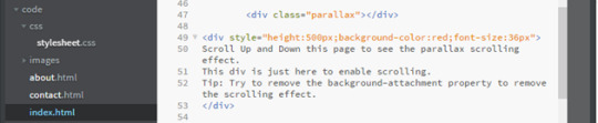
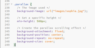

After making a few alterations I did manage to make the code work on the website.

Fading the buttons
Another feature I wanted to add was a fade background on the hover on the navigation bar. This was fairly simple, I just needed to add a transition of 2 seconds onto the css on the hover, making the brown fade into a grey when you hover over it, I changed this on the whole website so its the same on each page.

Transitions between html pages
I felt the transition between each page was very jumpy so I wanted to see if there was a way that I could ease in the pages when flicking between on the navigation bar.
I used a video tutorial to help me with this.
https://www.google.com/search?q=transition+between+html+pages&oq=transisition+between+html+&aqs=chrome.1.69i57j0l7.8173j0j7&sourceid=chrome&ie=UTF-8#kpvalbx=_NFvBXoftIYqr1fAPyoaFqAo32

When I actually embedded it onto my website I ended up not liking how it looked, it made the website look more like it was running slowly. If I was to create a website again though then experimenting with more transitions would be something I would like to do because I do feel like it can make the click from page to page a lot smoother.
Toggle Like and Dislike
Click on the icon to toggle between thumbs-up and thumbs-down (like/dislike).

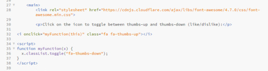

I thought this would be a good feature on a website seen as if customers see that the person has a lot of likes on their page it means that they would feel more inclined to use them than if they had more dislikes. Its like if something has loads of good reviews you are more likely to use it, it will boost the website and hopefully get it more interaction.
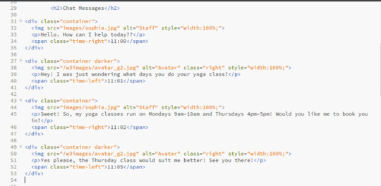
Chat Messages
I actually really liked the idea of added a chat to the website, I think it makes it a lot more personal and it also helps the user get instant feedback if they have any concerns, rather than perhaps waiting a while for an email or text back, plus then the customer doesn’t have to go to any extra lengths to message. I also think this would be more professional than texting.

I added in the little icon of a picture of the ‘staff member’, and gave an example of how the chat can be used. I think its really effective and if I was to create a website like this again or expanding on this website itself then its definitely something i would want to include.

CSS Skill bar
I thought this would be a good feature on a website like this because it would make the customers experience on the website a lot nicer as they wouldn’t have to look around everywhere for booking onto their classes and if there is space left. Its also more likely that the customer would book a class because they’d be scared that they class would book up, creates a sense of urgency within the customer without them realising, but helps the owner as their classes would be getting booked up, so I think it would be a good feature to include.
I changed the names to make it more fitting to what this website is about.


0 notes