#(made via collage mode)
Explore tagged Tumblr posts
Text

some harry icons :) my angel, my babygirl
401 notes
·
View notes
Text
This has nothing do with the main page's agenda, but I need to make a distinction here for my own sanity. Yes, I will be using examples from mainly magical girl series.
No, it does not matter - but these two character types aren't the same, although on internet pages I see them grouped together.
Bifauxnen is a trope found in Japanese media where a girl, usually androgynous in appearance, is seen as elegant, charming, and is fawned over by many women in said universe (and even IRL by fans.) This trope's origins are rooted in series such as Rose of Versailles, where its titular character, Oscar François de Jarjeyes, is raised as a man, but is known to be female among many. Oscar herself took influences from the Takarazuka Revue performers, which I linked since the topic itself is fairly extensive. Please know the performers are all women as well, so do with that information what you will.
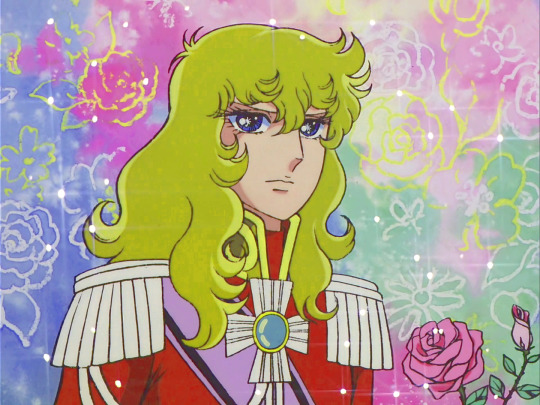



See? There's a clear difference.
They are usually lumped in with tomboys, which... isn't the same thing.
A tomboy, meanwhile, can look either feminine or masculine, but rarely is she androgynous to where telling their gender comes with difficulty. In many series, a tomboy still wears feminine clothing as well (ie schoolgirl uniforms, skirts, etc), which unless certain circumstances is moreso rare with the bifauxnen character archetype. I understand some of the confusion, as some similaritied can overlap. For example, tomboys and bifauxnen usually do not align straight with femininity, so using pronouns such as boku (僕) may be one. Both girls can also have short/long hair, be taller than average, and confuse the audience as to what exactly is going on thematically. However, it ignores that...
1.) The audience usually does not know at first that the character is, in fact, female. Several boxes may not tick for the viewers, such as higher voices, not wearing the girls' school uniform (in fact, some may wear a customized uniform or none at all. Even so, some do.)
2.) The bifauxnen in comparison appears to be older than their actual age.
3.) Bifauxnen characters take heavy inspiration from the Takarazuka Revue, whereas tomboys do not. Tomboys in anime can vary from just having short hair and not liking makeup, or a woman with more muscle mass, but it's no secret she's a woman.
So, I'm going to list some examples between the two below, as my post online via Twitter (the collage) shows up, but is blanked out. Sorry. 😅

Haruka Tenoh/Sailor Uranus - Sailor Moon S (1994)

Itsuki Myoudouin/Cure Sunshine - Heartcatch Precure! (2009)

Akira Tenjou/Cure Chocolat - Kira Kira Precure a la Mode (2017)
To help a bit more about how to tell the difference, and which characters are either tomboys or bifauxnen, here you go. I made small collages.

The girls above are tomboys, who are all from magical girl anime ranging from 1983-2012.

The girls here are bifauxnen, where at most I could use Utena, but most bifauxnen aren't in magical girl anime a lot as is. They pop up here and there, but not too often for me to make a collage. Maybe I'm forgetting some? I'm not entirely too sure.
#takarazuka#takarazuka revue#rose of versailles#magicalgirlofthedaystuff#magical girls#anime#manga#ouran high school host club#haruhi fujioka#precure#sailor moon#i will edit this post later
86 notes
·
View notes
Text
Experimentik #64 / May 24.2023 / Andrea Ermke + Annette Krebs / Mat Pogo

May 24. 2023 / 20:30- (doors 20:00)
duo:
Andrea Ermke - Fieldrecordings, Mini Disks
Annette Krebs - Konstruktion#4
-----
solo:
Mat Pogo - Voice, Electronics
FBevent: https://fb.me/e/2zZLWtITp
---------------
Andrea Ermke & Annette Krebs Fieldrecordings, Mini Disks and Konstruktion#4 Andrea Ermke and Annette Krebs played together for the first time in 2000. Andrea Ermke has been playing fieldrecordings in conjunction with minidisc players and mixers since 1999, developing her own musical style. Annette Krebs played prepared electroacoustic guitar and 4-track recorders in the duo's initial phase in 1999, and has been developing the Konstruktion series since 2013. In the concert she will play the electroacoustic sound sculpture Konstruktion#4, which consists of pieces of metal, strings, objects, microphones, tablets and sensors.
In the duo's music, field recordings of nature sounds, crowds, or machine noises often cannot be clearly separated from the instrumentally played sounds, but they merge into hybrid-seeming, surreal soundscapes.
---------------
"Likewise I never heard of Andrea Ermke, who is from Berlin. She works with field recordings and sampling of 'hand-made sounds'. Her improvisational work is different from the usual things coming out of Berlin, as she isn't exactly 'onkyo'. The piece 'Pike' lasts almost nineteen minutes and is very upfront, very present in your space. Taking field recordings and feeding them through the sampler this is also a raw work, even when it is made more refined than Iovae's release. Shifting through loud passages as well as several softer spots, but at the same time it is also a bit too much to leave a fully satisfied impression." Frand de Waard - Vital Weekly
member of Sink (with Arthur Rother, Marcello Busato und Chris Abrahams), Tree (with Chris Abrahams und Burkhard Beins), CCA (with Christian Kesten und Chris Abrahams), Duo with Anaïs Tuerlinckx, Toggle (with Anaïs Tuerlinckx und Burkhard Beins), Quartett with Anaïs Tuerlinckx, Andrew Lafkas und Ignaz, Schick, Quartett with Anaïs Tuerlinckx, Andrew Lafkas und Bryan Eubanks

--------------- Since 2013 Annette Krebs has been developing and performing instrumental assemblages made of highly amplified metals, strings, objects and microphones. These assemblages "Konstruktion#1" to "Konstruktion#4" originally emerged from the need to realize sound visions that could not be played with traditional instruments and setups. Like through a microscope, microphones make audible the finest, otherwise inaudible sound shadings and colorations of the sound objects. The Konstruktion series unites analog and digital techniques and modes of playing. The signals of the manually played sound objects are controlled via tablets, transformed and musically collaged similar to different colors that flow into each other, blend or stay next to each other. Annette Krebs has played numerous instruments since childhood and studied music in Frankfurt am Main. Before she began developing the Konstruktion series, she musically prepared and deconstructed her original instrument, the guitar, step by step. She performs at concerts and festivals worldwide, released numerous CDs and streams, founded her own label Graphit and teaches and supports live electronics projects within Mikroklang. www.annettekrebs.eu / www.mikroklang.eu
photo © Udo Siegfriedt

-----------
Mat Pogo is a vocalist, improviser, music producer, dj, graphic artist and cartoonist. He has been an active voice on the european underground scene since the early ‘90s. He co-founded the multimedia collective Burp Enterprise and the music label and publishing house Burp Publications, the avant-garde pop band Jealousy Party and DJ collective Sistemi Audiofobici Burp. Based in Berlin since 2006 he’s been part of the improvised music, noise and avant rock scenes collaborating with many international artists in music, performance and dance fields. He performed in international festivals as a solo artist and ensembles. His work has been published by several international labels. Current available projects are Jealousy Party, Voix Magnetiques and Peepholes, besides solo performances and activity as an improviser. His language as a vocalist uses his experience as a rock singer, improviser and radio artist: music, sounds, anecdotic and narrative elements fuse in an expressive way and often with a delicate sense of humor. https://www.burpenterprise.com https://jealousyparty.bandcamp.com https://soundcloud.com/matpogo
photo © Felix Bübl

------------------
Experimentik 2023 is supported by inm

1 note
·
View note
Text
viewing guide
At its core, divine knowing is an exhibition about knowledge, power, and agency. It’s become a more common understanding that governments, institutions, and algorithms will manipulate the public with what information they frame as fact, fiction, or worthy of attention. Though I am early in researching this topic, I've only come across a minimal amount of mainstream discourse on how the initial threat limiting our scope of knowledge is a refusal to listen to ourselves.
In a world faced with so many threats - humans being violent toward each other, toward animals, toward the earth - it can be a bit unsettling to release the reins and allow ourselves to bear witness for a moment, as we slowly develop a deeper awareness of surrounding phenomena and happenings.
divine knowing includes works by formally trained and self-taught artists. A majority of the artists are bisexual, non-binary, or transgender. Regardless of degree-status, gender, or sexuality, these artists have tapped into the autonomous well of self-knowing. Their artworks speak to tactics for opening up to a more perceptive mode of being. They unravel dependencies on external sources for knowledge and what we might recognize, connect with, or achieve once we do.
The installation Femme Digitale by Sierra Bagish originates from a series she began in 2017 by converting photographs of women that were taken and distributed online without the subject’s consent into paintings. Her practice at the time was concerned with female abjection. Sourcing images found via simple keywords and phrases (e.g., passed out, passed out drunk) she swathes a mass-circulated canon of internet detritus that articulates and produces aggression towards women. With her paintings, she circumvents the images’ original framing mechanisms and subverts these proliferated images through a sincere and personal lens.
These paintings divulge the blurred space between idolatry and denigration these online photos occupy, asking whose desires these images fulfill and what their propagation reveals about the culture producing them. While Bagish's work contends with political motivations, she also remains keenly observant of form and the varying utilities of different media.
“I use the expressive potential of paint as a vehicle to intervene and challenge ideas about photography as a harbinger of the real and everyday.”
Chariot Birthday Wish is an artist and angel living in Brooklyn. They have seen The Matrix 28 times in 2 years and love horses. The tarot series included in divine knowing is their most intuitive project, something they revisit when unsure of what to work on next. The Major Arcana are composed of digital collages made from sourced images, the Minor Arcana are represented by short, poetic, interpretative texts about the cards. The series is played on shuffle, creating a unique reading for each viewer. This is a work in progress that will eventually finalize as a completed deck of digital collages available for purchase.
Chariot's work emerges from a constant consideration of apocalypse and connection. They reference technology in tandem with nature and a desire for unity. Underneath their work's surface conversation on beauty, care, and relationship exists an agenda to subtly evoke a conspiratorial anti-state mindset. Through a collective imagining of how good things could be and how good we want them to be, we might be able to reckon with how bad things are in contrast.
“I think about texting my friends from the middle of the woods...
Humans are a part of nature and we created these things. There's this Bjork quote where she says that "You can use pro tools and still be pagan." I'm really into the idea of using technology as a tool for divination and holy connection with nature. I imagine a scene; being in moss, it's absolute bliss, and then the connection of texting, sharing an image of moss with a friend, sharing that moment through cellular towers.”
The album "adding up" by thanks for coming is composed of songs Rachel Brown wrote during what they believe to be the most challenging year of their life. Rachel now looks back on this time in appreciation, recognizing they grew in ways they had never imagined. The entire year, they were committed to following their feelings to wherever it may lead.
“If I hadn't been open to following the almost indiscernible signs I was being sent, then I would have missed out on some of the most important moments in my life.”
Kimberly Consroe holds a Masters in Anthropology along with degrees in Archaeology, Literature, and History. She is currently a Research Analyst at the US Department of Commerce. Her artwork is a passionate escape from a hectic professional life and touches on themes of feminism and nature.
Her works begin as general ideas; their narrative complexity growing with the amount of time she invests in making each one. Her decoupage process starts with cutting hundreds, if not thousands, pieces of paper. The accumulation of clippings sourced from vintage and current-day magazines overlap to tell a story. In Domestication, Kimberly borrows submissive female figures from found images of Ryan Mcguinness's work and places them in a position of power.
“I believe intuition is associated with emotion and experience. It is wisdom and fear, empathy and outrage, distrust and familiarity. It is what we know before we know it. This relates to my artwork in that, from beginning to end, there is never one complete idea concerning the outcome: it is a personal journey. It emerges from an ephemeral narrative that coalesces into a definitive story.”
Anabelle DeClement is a photographer who primarily works with film and is interested in relationships as they exist within a frame. She is drawn to the mystery of the mundane. Intuition exists in her practice as a feeling of urgency and the decision to act on it --- a drive often used to describe street photography where the camera catches unexpected moments in an urban environment. Anabelle tends to photograph individuals with whom she has established personal relationships in a slow domestic setting. Her sense of urgency lies in capturing moments of peak intimacy, preserving a memory's informal beauty that otherwise may have been forgotten or overlooked.
Gla5 is a visual artist, poet, bookmaker, production designer, and educator. Play is at the center of their practice. Their process is an experimental one embracing impulse and adventure. Their compositions are informed by relationships among bodies of varying shapes, materials, and densities. Interests that come up in their work include a discernment between symbols and non-symbols, dream states, the portrayal of energy in action, and a fixation on forms such as cups, tables, and spoons.
“I generally think of my work as depicting a layer of life that exists underneath what we see in our everyday lives.”
Gladys Harlow is a sound-based performance artist, comedian, and activist who experiments with found objects, contact mics, textures, range, analog formats, present moments, and emotions. Through raw, avant-garbage performance art, they aim to breakdown societal barriers, abolish oppressive systems, and empower communities. Gladys was born in Queens, NY, raised in Miami, FL and has deep roots in Venezuela. Currently haunting in Philadelphia, PA, Gladys is a founding member of Sound Museum Collective. SMC holds space for reconstructing our relationships to sounds by creating a platform for women, nonbinary, and trans sound artists and engineers.
Street Rat is a visceral exploration of the mysteries of life. Attempting to bring heavy concepts to your reality, it is the eye on the ground that sees and translates all intersecting issues as they merge, explode, dissolve, and implode. Street Rat is Gladys Harlow's way of comprehending, coping, feeling, taking action, disrupting the status quo, and rebuilding our path.
All Power To The People originated as a recorded performance intended to demystify sound by revealing the tools, wires, and movements used to create it. All Power To The People evolved into an installation conceived specifically for this exhibition. The installation includes a theremin and oscillator built by Gladys, a tarot deck they made by hand, and books from the artist's personal collection, amongst other elements. Gladys has created a structure of comfort and exploration. They welcome all visitors of divine knowing to play with the instrument, flip freely through the books, and pull a tarot card to take home.
Phoebe Hart is an experimental animator and filmmaker. A majority of her work is centered around mental illness and the line between dreams and reality. Merry Go Round is a sculptural zoetrope that changes in shape and color as it spins. Its form is inspired by nature and its color by the circus. The video’s sound was produced by Hayden Waggener. It consists of reverbing chimes which are in rhythm with the stop animation’s movement; both oscillate seamlessly between serene and anxious states.
“I often don't plan the sculptures or objects I am fabricating, there is a vague image in my mind, and my hands take care of the rest. I find that sometimes overthinking is what can get me and other artists stuck. If I just abandon my judgments and ego, I can really let go and create work that feels like it came inherently from me.”
Powerviolets is the solo project of multi-instrumentalist Violet Hetson who is currently based in New York. After experiencing several false starts while bouncing coast to coast, recording and performing with several lineups, Hetson has finally released her debut album. ~No Boys~ namesake is a sarcastic sign she hung on her suburban CT teenage bedroom door. Violet Hetson grew up primarily listening to punk and hardcore. She parses elements of these genres with influences from bands such as X and Suburban Lawns. ~No Boys~ takes a softer, melodic approach to Hetson's punk roots. Powerviolets' music is linear, unconventional, dark, and airy with a sense of humor.
Mary Hunt is a fiber artist specializing in chain stitch embroidery. This traditional form of embroidery uses vintage machinery and thick thread to create fibrous art and embellishments. They use an approach called "thread painting," which requires each stitch to be hand guided by the turn of a knob underneath the table while the speed of movement is controlled by a foot pedal. Chainstitch works can take anywhere from 20 minutes to 200 hours, encouraging a slow and thoughtful process. Mary uses a Cornely A machine, made in Paris more than 100 years ago.
“I think we are sent messages and guidance constantly. Our intuition is simply our ability to clear the path for those messages. The largest obstacles on my artistic path are usually self-imposed negative thoughts. I simply do things to take care of my spiritual well-being, first and foremost, and the rest follows. If I can trust the universe, trust the process, then I am much more likely to listen to the messages sent my way.”
Jes the Jem is a multi-media artist working with acrylic, watercolor, mold clay, and whatever else she can get her hands on. She uses vivid color to bring joy into the lives of those who view her art. Jes the Jem has experienced a great deal of pain in her life. Through that unique displeasure, she has been gifted a nuanced perspective. She aims to energize the present while paying homage to the past events that shape us. In her art, her life, and her interpersonal relationships, Jes the Jem appreciates the gift of all of life's experiences.
“The pursuit of happiness and understanding is instinct.”
Pamela Kivi pieces together visual scraps she has saved over the years, choosing to fuse them at whatever present moment she sees fit. Her work reflects on creative mania, fleeting emotions, and memories. Pamela's collages are a compilation of unexpected elements that include: old notebooks, cut-outs, text messages or Facebook message conversations, nostalgic cellphone photos, and visual materials she has chosen to hold onto. She prints out, cuts up, scans, edits, repeats. Pamela's artistic practice is deeply personal. It is a submittal to the process of dusting things off until a reflection can be seen, all enacted without an attachment to the end result.
“I rely on intuition and whatever state of mind I am in to whisk me away. In life, I often confuse intuition with anxiety- when it comes to creative work, I can decipher the two.”
Through sobriety, Kendall Kolenik's focus has shifted toward self-discovery and shedding old adaptive patterns, a process that led her to a passion for helping others heal themselves too. In autumn, she will begin her Masters in Social Work at Columbia University.
“I love how when I'm painting my self-doubt becomes so apparent. Painting shows me exactly where my doubt lies, which guides me towards overriding it. When I paint something and lean into doubt, I don't like what comes out. When I take note of the resistance and go with my gut more freely, I love it. This reminds me of my yoga practice. What you practice on the mat is a metaphor for how you show up in life. By breathing through the uncomfortable poses on the mat, you learn to breathe through challenging life moments.
I think we all grow up learning to numb and edit ourselves. We are taught not to trust our feelings; we are told to look outside ourselves for answers when we already have a perfectly good compass within. Painting is an archway back to that for me - rediscovering self-reliance and faith in my first instinct. When I'm creating these rainbow squares, sometimes I move so fast it's like something else is carrying me. I sort of leave myself and enter a trance. Like how you don't have to tell the heart to beat or the lungs to breathe - thinking goes away and I can get so close to my knowing that I become it. I love how art allows me to access my love for ambiguity, interpretation, and an interpretation that feels closer to Truth. I find no greater purpose than guiding people back to safety and reconnecting them with themselves. The most important thing to ever happen in my life was when I stopped trying to deny my reality - listening to your intuition can be like a freefall - no one but you can ever know or tell you - it is a deep trust without any outside proof.”
Lucille Loffredo is a music school dropout, Jewish trans lesbian, and veterinary assistant doing her best to make sure each day is better than the last. Lucille tries to find the music rather than make it. She lets it tell her what it wants to do and what it wants to be. The Wandering EP was in part written as a way to come out to herself. She asks all listeners to please be gentle.
“Change will come, and it will be good. You are who you think you are, no matter how far it seems.”
Whitney Lorenze generally works without reference, making thick, graphic pictures with precise forms conceived almost entirely from her imagination. Images like a slowly rolling car crackling out of a driveway, afternoon sun rays shining through a cloud of humidity, or headlights throwing a lined shadow across a black bedroom inspire her.
“As it concerns my own practice and the creation of artworks generally, I would define intuition as the ability to succumb to some primal creative impulse. Of course, this implies also the ability to resist the temptations of producing a calculated or contrived output.”
Ellie Mesa began teaching herself to paint at the age of 15, exploring landscapes and portraiture. Her work has evolved into a style of painting influenced by surrealism where teddy bears will morph into demons and vice versa. Her work speaks to cuteness, the grotesque, and mystical beings. The painting "Kali" is an homage to the Hindu goddess of creation, destruction, life and death. This was Ellie's first painting after becoming sober and is an expression of the aforementioned forces in her own life. Through meditations on Kali, Elli has been able to find beauty in the cycle of love and loss.
“To me, intuition means doing the thing that feels right whether or not it's what you want it to be. When I'm painting or making a sculpture, I give myself the freedom to follow what feels right, even if that means starting over or changing it completely. I allow the piece to present itself to me instead of forcing something that doesn't want to be.”
Mari Ogihara is a sculptor exploring duality, resilience, beauty, and serenity as experienced through the female gaze. Her work is informed by the duality of womanhood and the contradictions of femininity. In particular, the multitude of roles we inhabit as friend, lover, sister, and mother and their complex associations to the feminine perspective.
“Intuition is an innate, immediate reaction to an experience. While making art, I try to balance intuition, logic, and craftsmanship.”
All Of Me Is War by Ames Valaitis addresses the subconscious rifts society initiates between women, estranging them from each other and themselves.
“It is an unspoken, quick, and quiet battle within me as the feeling of intuition purely, and when I am making a drawing. I am immediately drawn to poses and subject matter that reflect the emotion inside myself, whether it is loud or under the surface. If a line or figure doesn't move me, after working on it for a few minutes, I get rid of it. If something looks right to me immediately, I keep it; nurture it. I try to let go of my vision, let my instinct take hold. I mirror this in my life as I get older, choosing who and what to put my energy into. The feeling is rarely wrong; I'd say we all know inherently when it is time to continue or tap out.”
Chardel Williams is a self-taught artist currently living in Bridgeport. Her biggest inspiration is her birthplace of Jamaica. Chardel views painting as a method for blocking out chaos. Her attraction to the medium springs from its coalescence of freedom, meditative qualities, and the connection it engenders. rears.
“Intuition for me is going where my art flows. I implement it in my practice by simply creating space and time to listen. There are times when what I'm painting is done in everyone else's eyes, but I just keep picking at it. Sometimes I would stop painting a piece and go months without touching it. Then, out of nowhere, be obsessed with finishing. I used to get frustrated with that process, but now I go with it. I stopped calling it a block and just flow with it. I listen because my work talks.”
3 notes
·
View notes
Text
VivaVideo: Video editing for free - Apps on Google Play
In addition to videos, you can also create beautiful collages from your last beach vacation, which you can embellish creatively with stickers and picture effects. The often extensive video editors offer almost exclusively a voluntary premium upgrade.
Types of Apps: Native Apps and WebApps
Alternatively, you can have your work shared on online platforms such as YouTube or Vimeo. Hollywood strips have already been cut with the video editing software Lightworks from EditShare LLC. The full version of the professional tool therefore also costs an annual license of at least € 170. For experienced YouTubers with high demands on video editing, we recommend the standard Final Cut Pro X or our favorites Adobe Premiere. With comparatively generous content, even for free users, the FilmoraGo - video editor is likeable straight away. Tools are available here without restrictions and there are no annoying watermarks. We can also flexibly adjust the playback speed - or simply reverse it. The video editor and photo-video maker processes videos with effects, stickers and sound effects.
Explanation of terms: What is an app?
The operation of the app is unfortunately only explained in English-language help files. However, after a while you will surely figure out how it works. The app has features similar to the tools mentioned so far. It can cut videos, offers effects and zoom functions, can convert the videos into time-lapse and slow motion and provide its own outros.

Via XML, projects from mobile systems such as iOS can also be transferred better.
For this you need a Creative Cloud subscription for Adobe After Effects.
You can either divide the layout according to your ideas or use one of the preset modes.
After you have put the loaded videos in the correct order using "Move up" and "Move down" , choose an output format and click "Join".
You can cut, edit, insert effects and transitions and import them directly from the camera or mobile phone. Windows Movie Maker is a simple editing program with which all beginners will quickly find their way. FilmoraGo for iOS has everything you need to edit videos on your iPhone quickly and easily. If you want, you can even underlay your recordings with music from the integrated audio library. Operation could not be easier, the app automatically improves several aspects of your videos, but leaves you sufficient freedom of choice. The app can also combine photos and images into attractive and dynamically animated slideshows. We also use snapshots to create vivid video clips with several audio tracks, text tools and with varied transitions. With more than 100 f-stops, the editor also puts vacation photos together to create eye-catching clips; we can determine the duration of the transitions ourselves. Music and background images are available for free download and the resolution of videos and audio files can be flexibly determined. This also applies to the repetition of images in all the videos made - unfortunately, supple 60 FPS are only available here after a paid upgrade. Final Cut Pro X includes a substantial number of video and audio effects (over a hundred each). You can individually design each of the effects. If you integrate additional special effects functions via plug-ins, Final Cut binds them get more info directly on the user interface. A similar tool will assist you in preparing short videos with animated text for social media. It exports your project to platforms like YouTube, Vimeo, Twitter, Facebook and Instagram. This video editing program for Windows and Mac helps you to easily create brilliant videos. YouTubers therefore appreciate the software very much. And after video editing, you can upload the video directly to YouTube. This website uses cookies to offer the best possible functionality. If you continue to use the website, we assume your consent. Audio editing at PowerDirector is limited to the most necessary tools. To do this, you can enhance your video with visual effects such as filters and titles. In addition, sounds recorded via the microphone can be inserted.
1 note
·
View note
Photo
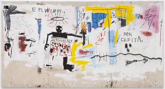
BASQUIAT WAS A CONCEPTUALIST IN EXPRESSIONIST’S CLOTHING
MY WEEKLY PIC (first published at Artnet News): Over the years, the biggest fans of Jean-Michel Basquiat have had a strange way of showing their affection: They’ve just about drowned him and his work in tired romantic clichés.
He’s supposed to be a tortured soul overflowing with passions that pour out through the tortured pictures he paints. One writer likened him to “a preacher possessed by the spirit,” an image that comes dangerously close to primitivist stereotypes. A curator insisted that Basquiat’s art channeled “his inner child,” the kind of talk that could easily veer into ideas of the Noble Savage. Basquiat himself complained that critics had an image of him as “a wild man running around—a wild monkey-man.”
To this day, he’s almost always billed as being more in touch with his emotions and the passions of urban life than with the orderly reasoning of post-Enlightenment culture.
Luckily, a show opening in New York lets us see a very different, much smarter and more complex artist than that, one who has more in common with conceptualists like Hans Haacke and Hanne Darboven than with Hollywood’s earless van Gogh—a Basquiat who is an artist of words and thoughts, on the order of Lawrence Weiner and Jenny Holzer, not of instincts and inchoate emotions.
That’s the artist on view in “Jean-Michel Basquiat,” a concise survey that opens March 6 at the new Brant Foundation venue in the East Village. (Tickets are—or were—free, but they have already run out for all 10 weeks of the show; maybe the Foundation will consider opening on some Mondays or Tuesdays to deal with the demand.)
Except for the very earliest collages and graffiti works, and the later collaborations with Andy Warhol, most of Basquiat’s major moments and modes are represented. But for an artist who died at 27—an artist who only ever had the chance to make “early work”—the 70 pictures in the Brant show, displayed across four elegant, light-filled floors, may give just the focused view that we need.
Basquiat is always described as one of the central stylists of 1980s Neo-Expressionism, and it’s easy to get lost in the attractive and exciting—but fundamentally conservative—look and touch of his paintings. In the Brant show, however, I was struck again and again by works where content seemed to matter more than form.
A canvas like “Per Capita,” a 1981 work from the Brant Foundation’s own collection that is today’s Weekly Pic, overflows with information. One end of the painting is a list of American states followed by the annual incomes of their inhabitants. The rest of the painting is scattered with bits and pieces of graphs and numerical tables. “Hollywood Africans,” a 1983 painting from the Whitney Museum, is a compendium of all-capped words that relate to the title, usually via some kind of political take on the subject: “SUGAR CANE INC.,” “TOBACCO,” “WHAT IS BWANA?”
A piece called “Museum Security,” from that same moment, overflows with accusatory words like “RADIUM,” “ASBESTOS,” and “HOOVERVILLE.” All three paintings remind me of the biting lists that Hans Haacke compiled of a slumlord’s real estate holdings, or of the corporate entanglements of the Guggenheim Museum’s trustees. Similarly, a lot of Basquiat’s paintings seem to be as much about simply pointing at things that concern him as they are about choosing how to do the pointing.
Deep down, he’s an artist concerned with inventories, so his pictures have much in common with the tidy cataloging of Darboven. The lack of polish in Basquiat’s style may be about achieving an utterly minimal, frictionless kind of indication—a kind of painting degree zero that parallels Haacke’s typed lists—rather than expressing basic or “primitive” emotions. Basquiat’s scrawls, that is, may really avoid having any style at all, and their ties to the well-worn look of European Expressionism, or to its 1980s retreads, may be almost accidental. When we see a similarity to Expressionist art, we’re indulging in the kind of “pseudomorphism” that the Princeton scholar Yve-Alain Bois has railed against.
Although Basquiat’s paintings are almost always linked to the raw emotions of graffiti, it’s important to remember that his own most important interventions on city walls consisted of pungent and concise bits of text. “4 THE SO-CALLED AVANT-GARDE.” “A PIN DROPS LIKE A PUNGENT ODOR.” If they were rendered in neon or carved in stone, these could just about pass as maxims by Jenny Holzer.
“We wanted to do some kind of conceptual art project,” explained Al Diaz, Basquiat’s spray-painting partner, in the 2010 Basquiat documentary The Radiant Child. That’s not the kind of thought that springs from an “inner child.”
If Haacke and Holzer don’t come to mind at once in looking at Basquiat’s art, I think that’s because of another layer he adds to his “information.” He’s showing how the kind of order and transparent meanings that such white artists take for granted were not made equally available to black people and black artists when they confronted America’s majority culture. The assumption of cultural stability and transparency that information-based art is built around just wasn’t part of the lived experience of many African Americans, at least in New York in the early 1980s. Government statistics and Hollywood movies depended on ideas and images of blackness—and of society in general—that didn’t necessarily map onto what black lives were really like. Haacke could observe a slum landlord’s machinations from on-high; many African Americans suffered them from the inside. Society didn’t exactly give them easy access to the kind of disinterested remove available to the rest of the art world, or to the Kantian (or Marxist) contemplation that it fostered.
The “distortions” in Basquiat’s pictures are not there to deliver an Expressionist style; they are distortions that are really out there in the world, because of the filters of race and oppression that came between a black artist and the things he wanted to point to.
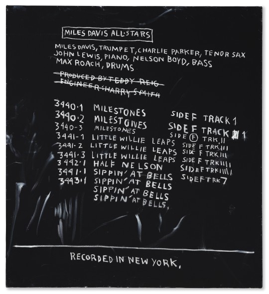
By contrast, Basquiat’s art can become orderly and almost Apollonian when it digs into modern jazz, with its unquestionable roots in black culture. A painting like “Discography II,” a recent Brant acquisition, gives a stable and systematic account of the first recording session that Miles Davis led under his own name, with the title and take of each song set down in orderly white script on a black background. The painting represents the world as Basquiat might have preferred to render it, if only circumstances allowed. (Images © Estate of Jean-Michel Basquiat. Licensed by Artestar, New York. Courtesy The Brant Foundation, Greenwich, Connecticut.)
For a full survey of past Pics visit blakegopnik.com/archive.
37 notes
·
View notes
Photo

Juicy Satellite
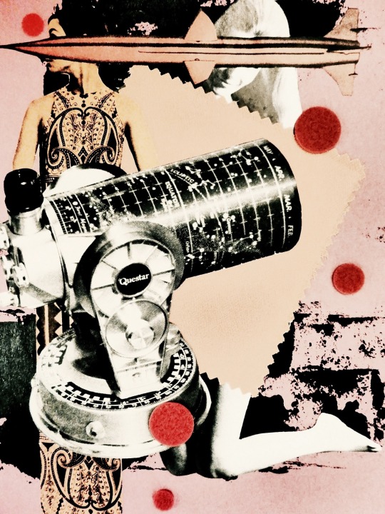
The Age of Aquarius

Microchipped Love

Galaxy Filament
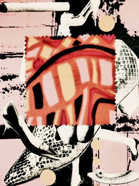
Fantastic Voyage

Groovy ETI
…
For me, making collages is the most fun. First of all, I will cut the pages from the 1960s fashion magazines and the Scientific American, and put them into an empty confectionery box. Then I take the images out of the box and edit my original stories. It seems to be making paper dolls and playing in fiction as same as my childhood.
After studying literature at the college, I worked at an insurance company for tuition and entered art school. It was a private school in Shinjuku-ku, Tokyo called Setsu Mode Seminar (the closing down of a school in 2017). I remember that I made many sketches of “groovy” models in the atelier three days a week. The late Setsu Nagasawa (1917-1999) who was the founder of Setsu Mode Seminar was an authority on fashion drawings. And he was also a journalist who reported Paris Fashion Week which held in Paris, France each year. I hear that Japanese surrealist Toshiko Okanoue (1928- ) began to make collages because she was admiring Setsu Nagasawa’s fashion drawings. By the way, she had worked with Katsue Kitasono (1902-1978) several times when Kitasono was an art director.
The words I learned from Setsu Nagasawa regarding the art are 《Freedom》 and 《Elegance》. In addition, what I aim for as an artist is 《Humor》. If let me say adding to it, it is 《The art which makes me (or you) a singer》.
I am singing now,
“I miss the earth so much…” ― ‘Rocket Man’ Songwriters: Elton John, Bernie Taupin
● ● ●
Six collages by hiromi suzuki
© collages by hiromi suzuki, 2019
published on Empty Mirror (June 21, 2019)
…
via Empty Mirror
#hiromi suzuki#poetry#visual poetry#vispo#art#poetry magazine#poetry journal#literary journal#Empty Mirror
5 notes
·
View notes
Text
And yet it moves free

#AND YET IT MOVES FREE HOW TO#
#AND YET IT MOVES FREE FOR MAC#
#AND YET IT MOVES FREE FULL VERSION#
#AND YET IT MOVES FREE MAC OS#
#AND YET IT MOVES FREE MOVIE#
We Have Provided Direct Links Full Setup Of This Game. Debut album from Danish heavy rockers Timechild TIMECHILD is massive and organic heavy rock from Copenhagen, Denmark. And Yet It Moves is an award-winning physics-based platform game in which you rotate the game world at will to solve challenging puzzles.
#AND YET IT MOVES FREE MOVIE#
You can browse the movie content through type, quality, genre, country, and release time, and it’s alright if you haven’t got a name in your mind when you can follow. No Need To Crack Or Serial Number Or Any Key. And Yet It Moves lets you enter a reality where the press of a button would tilt the world, turning walls into floors, slides into platforms, and stacks of rocks into dangerous hazards. With a vast library of movies and TV shows refreshes daily, SolarMovie serves as your another option to watch new release movies online free without signing up. Hard Drive: 200 MB free And Yet It Moves freeload PC GameĬlick On Below Button Link To And Yet It Moves freeload Full PC Game. System Requirements Of And Yet It Moves PC Game And Yet It Moves is a puzzle-platformer, set in a unique world, made of ripped paper. Advanced platforming: Not only can you jump and run, but you can rotate the world in 90 degree intervals, as well. You can download other users’ Ghosts to compete with friends and strangers around the world and see who found the fastest route. Download Citation And Yet It Moves: Paradoxically Moving Linkages in Kinematics The configuration space of a mechanical linkage. Your run will be recorded, as a “Ghost” which can be submitted, along with your time, to the global high scores online.
#AND YET IT MOVES FREE HOW TO#
Learn how to apply the physical consequences of rotation to master the many tricky situations you may encounter. Within the paper-collage you can jump, run and last but certainly not least: rotate the world. You can play a race against the clock on different levels, too, competing against previous clocked times. Languages : English, French, German, Italian, Japanese, Spanish Specifications Of And Yet It Moves PC Game And Yet it Moves is a puzzle platformer developed by Broken Rules. This Game Is Crack And Highly Compress Game.
#AND YET IT MOVES FREE FULL VERSION#
Support - If you have trouble running the game, please contact us via email (support(at)brokenrul.es), twitter or join our forum.And Yet It Moves freeload Full Version RG Mechanics Repack PC Game In Direct Download Links.
Ms de 90 millones de canciones en streaming sin anuncios con Amazon Music Unlimited en celular, PC y tablet. Go for the high score by challenging your friends or complete strangers and polish your skills of rotation. Escucha el lbum Free Pass to the Future de And Yet It Moves.
Achievements & Online High Scores - Unlock achievements.
Speed Run Mode - You can compete against the clock or previously recorded Ghost Runs on each level, with marathon runs throughout the entire environment.
Variety Of Environments -17 levels set in 3 different environments bring to life a paper collage world created from colorful shreds of cardboard.
Discover how they react to ever-changing gravity, and master all challenges.
A Living World - Meet creatures such as bats, bees and monkeys.
Advanced Platforming - Jump, run, and rotate the world at your will.
With three different environments and multiple game modes, And Yet It Moves is a platformer that will provide you with endless challenges. And Yet It Moves was originally designed.
#AND YET IT MOVES FREE MAC OS#
The game was released for Microsoft Windows, Mac OS X, and Linux on April 2, 2009, and a Wii port was released on the Wii Shop Channel in August 2010. Navigate through a paper collage world created with colorful pieces of cardboard and set to distinctive music. And Yet It Moves freeload Full Game is a platform video game developed by independent developer Broken Rules. The Steam platform is the largest digital distribution platform for PC gaming, estimated in. It was launched in September 2003 as a way for Valve to provide automatic updates for their games, but eventually expanded to include games from third-party publishers. Andyetitmovesdemov1.2.dmg and andyetitmovesdemov1.1.dmg are the most frequent filenames for this apps installer. We cannot confirm if there is a freeload of this app available.
#AND YET IT MOVES FREE FOR MAC#
And Yet It Moves lets you enter a reality where the press of a button would tilt the world, turning walls into floors, slides into platforms, and stacks of rocks into dangerous hazards.Īnd Yet It Moves is an award-winning physics-based platform game in which you rotate the game world at will to solve challenging puzzles. Steam is a video game digital distribution platform developed by Valve Corporation. And Yet It Moves 1.3.1 for Mac could be downloaded from the developers website when we last checked.

0 notes
Text
A Big Apple Souvenir
Author: Leigh Wishner
In celebration of the second annual New York Textile Month, members of the Textile Society of America will author Object of the Day for the month of September. A non-profit professional organization of scholars, educators, and artists in the field of textiles, TSA provides an international forum for the exchange and dissemination of information about textiles worldwide.
Taking a snapshot or picking up a photo-postcard of a famous destination is an impulse every modern tourist has experienced; the acquisition of site-specific souvenirs serves a similarly appealing purpose, commemorating vacations to distant locales and encouraging memories to linger. Combining the photograph and the souvenir, fabrics printed with actual pictures—not a designer’s artistic interpretation of geographical place—allowed mid-century sightseers to “wear their postcards” long after arriving back home.
Tourism boomed in the post-war period. Increasing disposable income and leisure time coupled with more affordable modes of transportation (whether personal vehicles, jet aircraft, or cruise ships) made travel more practicable, opening the doors to cosmopolitanism for the average American. A noteworthy byproduct of this tourism surge was a fad for photographic novelty printed textiles characterized by collaged cloud-bubbles containing “documentary” images of natural and man-made landmarks. Known designs include several photo collages of Hawaiian scenes and pastimes, such as this example in the Fashion Institute of Design and Merchandising Museum collection, and an “around the globe” version with a multitude of far-flung panoramas.
Hawaiian Scenes printed cotton (detail), mid-1950s, FIDM Museum
A virtual tour of New York City, this printed cotton in Cooper Hewitt’s collection distills the hustle and bustle of the “Big Apple” into overlapping, cloud-like vignettes rendered in a monochromatic palette. Though the repeat is short, the fabric’s width packs in vistas of Times Square, Coney Island, Central Park, and Lower Manhattan as seen from Brooklyn (and over its historic bridge). Other architectural highlights include Grant’s Tomb, City Hall, the RCA Building at Rockefeller Center, Grand Central Terminal, and the George Washington Bridge. Each photo has deliberately scalloped edges and is notated in cursive script for identification. Even the Statue of Liberty—synonymous with New York, and hardly in need of explanation—is labeled. A photograph of the United Nations Secretariat building, a modernist bastion of international diplomacy, helps date this design. Completed in 1952, it is the “youngest” of the monuments featured—meaning it couldn’t have been produced before that year.
Advances in textile printing technology also fueled the trend for photo-printed textiles. Though photographic printing on fabric was not entirely a new process, two methods were introduced by rival New York firms in 1947: Foto-Fab by Lieze, Inc., and Photone by the Ross-Smith Corp. Both employed proprietary chemical blends, impregnating the textiles and transforming them into light-sensitive material which was exposed and developed much in the same way photographic contact paper is treated. The Foto-Fab process, invented by artist/photographer Lieze Rose Stewart and filed for patent in January 1947, used a light source to penetrate a negative film, leaving an indelible positive print on the cloth’s surface.(1) Photone, in contrast, relied on a positive film. A brief piece in TIME magazine—replete with a series of amusing images of photo-printed garments, pillows, upholstery, and wall hangings—noted that “photographic fabrics are the big news of the year” and that though currently limited to “restrained monotones, both pioneering companies are working to develop techniques that will give them full-color photographs on fabric….”(2)
A dynamic jumble of thriving urban locations, this New York “sightseeing” textile may have been printed via one of these methods. It would have been perfect for making into sport shirts, casual skirts, and scarves—items that were easy for tourists to pack in suitcases for the return journey, and served as tangible, nostalgic reminders of time spent in “the city that never sleeps.”
(1) Stewart, L.R. Photographically Printing on Materials. US Patent 2,531,086, filed January 17, 1947 and issued November 21, 1950. (2) “Photographic Fabrics.” TIME, December 8, 1947: pp. 107-108, 110.
Leigh Wishner is Museum Coordinator at the Fashion Institute of Design and Merchandising (FIDM) Museum and Galleries, Los Angeles.
from Cooper Hewitt, Smithsonian Design Museum https://ift.tt/2PPWLJU via IFTTT
3 notes
·
View notes
Text
back here again
The last time I was a prolific writer, it was when I had an active tumblr. I started my account in 2009, I think because a cool older student at my high school had given me the idea. Over a period of four years of heavy use, and then another four years of intermittent use, I explored art, feminism, identity, and politics via tumblr and I also created prolifically–I wrote and posted snippets of short prose and poetry that tried to capture, in broad strokes, the vivid emotions I experienced during that time.
As a tumblr user, I became well-acquainted with various forms of artistic expression that were accessible to anyone with time and creativity, if not technical skill in the traditional sense. In particular, blackout/erasure poetry and collage had been a huge part of the artistic landscape in my part of the internet when I was younger (especially PostSecret), and tumblr’s format was also friendly to the short-form writing I was already doing. Writing, and visual arrangement of the written words to intensify their emotional impact, was a primary mode of expression and one I found immensely useful. Finally, the experience of posting gave an impression that whatever I was saying, I was saying to someone–not necessarily to someone who had any reason to hear it, but nonetheless, posting gave me a feeling of “voice” that was very comforting as I used writing to explore my feelings, experiences, and identity.
In 2017, my by-then-infrequent use of the site had diminished to a trickle of writing that dripped out whenever I was experiencing something particularly intense or felt particularly alone. Some of the last pieces of writing that I posted there were about an intense sexual relationship I had just begun and the foreseen, but still turbulent, breakup that came soon after when I moved away from Los Angeles. Upon my arrival to the suburbs of the Bay Area, I found myself utterly alone with huge feelings and no community. I dealt with that with art and writing. Specifically, poetry, collage, and making a zine. I wrote and wrote, and I posted my poems on tumblr, and then I printed a bunch of them out. I cut them up, and I collaged them into a blank notebook. I never finished it, but it was a tool for processing, and I posted a couple of photos of my work on instagram and people responded a bit. From then I went on to get into zine making as a way of processing thoughts and feelings, but never again did I write poetry or produce writing, in general, on the same scale as I had when I was on tumblr.
My life has been in flux for the last two years. Various factors have made life feel generally unstable, even with a consistent-ish place to call home. One result is I haven’t been making very much art, even though it’s one of the things that helps me process or deal with complex emotions. I haven’t even been doing kitchen projects or anything. Just feeling constantly restless, scrolling and consuming instead of creating and producing. I lost access to a lot of sources of community and connection, and need to start making things again to reclaim some of the connection I’ve lost. But I’ve had horrible creative block. Even what to doodle or what to write about, those ideas only come and go in little snippets. The only place I have ever consistently produced and shared anything is on tumblr. So that is why I’m back. I want to use this space to encourage myself to make make make make make, no matter whether what I make is any good, or is something I want to share with the people in my life, or build upon, or whatever. I want to make and share things even if they only come out to a sentence, or to one doodle or observation or whatever. So here we are, and I’m diving in, hoping the cold will reset my parasympathetic nervous system, and shock me awake into making things, dissolving into a prolific ocean
1 note
·
View note
Link
5 Seconds of Summer earned their third straight No. 1 album on the Billboard 200 chart over the weekend with Youngblood, and the guys immediately made sure to thank those who got them to the top once again.
In a series of Instagram pictures of live performances, the band and a collage image of No. 1, 5SOS wrote, "Youngblood is a certified billboard #1album in America. You came together as people to get us our 3rd number one record for all the right reasons. Today you made history for 4 young men, and you are every reason why we feel like the luckiest people alive."
The group's achievement makes them the first Australian act to land three albums at No. 1 on the Billboard 200, as their debut self-titled LP in 2014 and sophomore set Sounds Good Feels Good in 2016 also debuted atop the chart. What's more, they extend their record as the only band to top the Billboard 200 with their first three studio albums.
Each of the band members (Luke Hemmings, Calum Hood, Michael Clifford and Ashton Irwin) also took to their own Instagram accounts to express their gratitude. Just before the No. 1 news broke, Irwin posted a picture of himself drumming and gushed, "We are on an incredible high right now. And I am acknowledging it with all my being."
Once it became official, Hemmings declared, "I’m overwhelmed with emotion," also asserting that "This one feels different." Hood added, "Trying to find the words... Irretrievably grateful for your constant support," and Clifford continued the speechless sentiments: "I don’t have the words to thank the people that support us except that we fucking love you."
Youngblood is available now via One Mode/Capitol Records. 5 Seconds of Summer will be hitting the road later this summer for their Meet You There Tour, which kicks off in Osaka, Japan, on Aug. 2.
10 notes
·
View notes
Text
Adobe Elements 15 Mac Download

Adobe Premiere Elements 15 simplifies the organizing and editing so you can have fun creating and sharing great-looking movies. Quickly find any video clip or photo. Make instant movies, or add style. Download installers of Adobe Photoshop Elements 2021 and 2020. Read before you download Click here to expand the list of things you need to know before you download Photoshop Elements.
Adobe Photoshop Elements 2019 Download
Adobe Photoshop Elements 15 Mac Download
Download installers of Adobe Premiere Elements 2021, 2020.
You can use the installer files to install Premiere Elements on your computer and then use it as full or trial version.
You need your Adobe Premiere Elements serial number to complete the installation. Need help finding your serial number? Sign in to My Adobe to find serial numbers for registered products. Or, see Find the serial number of your Elements product.
If you don't have the serial number, you can install the product and try it for a limited trial duration.
Make sure that your system meets the requirements for Premiere Elements products.
Having trouble? Get help from our community experts.
How long does it take for download? See Estimated download times.
Is my Windows 32 bit or 64 bit?
For WindowsFor macOS
(3.4 GB)
Languages: Czech, Dutch, English, French, German, Italian, Japanese, Polish, Spanish, and Swedish
(3.2 GB)
Languages: English, French, German, and Japanese
Note:
If you are facing issues while downloading, do one of the following:
Try using a different browser to download the installer file.
Right-click the Download button and open the link in a new tab to download the installer file.
For WindowsFor macOS
(3.5 GB)
Languages: Czech, Dutch, English, French, German, Italian, Japanese, Polish, Russian, Spanish, and Swedish
(3.1 GB)
Excel for mac download free. Languages: English, French, German, and Japanese
Note:
If you are facing issues while downloading, do one of the following: Mac stop wifi looking for networks.
Try using a different browser to download the installer file.
Right-click the Download button and open the link in a new tab to download the installer file.
Learn how to access previous versions of non-subscription apps.
After you download the installer, you can follow the procedure in Installing Adobe Premiere Elements to install the application. Angry Birds Star Wars 2 Download mac.
Try the latest Premiere Elements | Explore Elements product suite
More like this
If you want to use all the capabilities of Photoshop Elements and do it legally, without installing Photoshop Elements torrents or keygens, discover the reliable way to download Adobe Photoshop Elements 14 download.
Helpful home screen.Photoshop Elements is quite a user-friendly program for image editing. It won’t be difficult to locate all the required tools and begin editing shots. Now, you may import shots in one click and work with the Auto Creation options. The Organizer, Photo and Video Editor (Premiere Elements) are present as well. It is possible to scroll down to be able to view all the features. It is found in the upper part of the screen. In case you need to examine online tutorials, find them via a search bar.
Excellent organizer. The organizer in Elements 14 will sort the user’s picture library, categorizing the shots into such groups as Places, Events and People via the intelligent modes. Compared with Elements 13, all these groups were enhanced. One more prominent feature is facial recognition. During testing, the organizer was able to recognize faces from a large number of wedding shots and did it on a more advanced level than the one in the previous Elements version.
Quick edits. The picture editor in Adobe Elements 14 is divided into three modes: Quick, Guided and Expert. Besides, there is eLive that provides a variety of top-notch online guides. These three modes are aimed at different skill levels. The Quick mode offers the most basic menus, settings, standard tonal adjustments and effects that are applied within one click.
Smart Looks feature. Adobe Photoshop Elements 14 added “Smart Looks” to its selection of approximately 50 helpful effects. The best ntfs for mac. “Smart Looks” picks five effects from a library of more than 2500, on the basis of analyzing a picture on hand.
View how to get Photoshop Elements free.
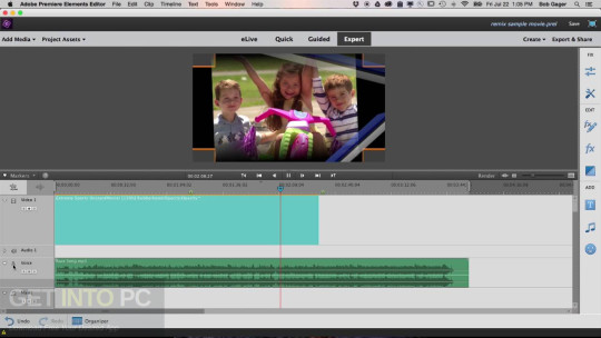
Improved picture viewing. Now, by simply hovering the cursor over one of the suggested options, the user can immediately see how the picture will change after applying the adjustments. To apply the action, just click on the icon.
Additional settings. In Elements 14, it is possible to create postcards, calendars, picture collages, slide shows, print envelopes and labels, create your own photo albums, post the shots to social networks (exchange), etc. Ready-made templates will greatly facilitate the work for those who don’t understand the subtleties of designing and technical peculiarities of printing.
Photoshop Elements 14 System Requirements
Windows
Processor1.6GHz or faster processor with SSE2 supportRAM2GB of RAM VersionMicrosoft Windows 7 with Service Pack 1, Windows 8 or Windows 10 (32-bit versions will be installed on 32-bit systems; 64-bit versions will be installed on 64-bit systems)Hard disk space5GB of available hard-disk space (extra free space required during installation)Monitor resolution1024x768 display resolution (at 100% scale factor)DriversMicrosoft DirectX 9 or 10 compatible display driverAdditionalDVD-ROM drive (for installation from DVD), QuickTime 7 software, Internet connection required to activate the program and download content
Mac
Processor64-bit multicore Intel processorRAM2GB of RAM VersionMac OS X v10.9 or v10.10Hard disk space5GB of available hard-disk space (extra free space required during installation)Monitor resolution1024x768 display resolution (at 100% scale factor)DriversMicrosoft DirectX 9 or 10 compatible display driverAdditionalDVD-ROM drive (for installation from DVD), QuickTime 7 software, Internet connection required to activate the program and download content
Adobe Photoshop Elements 2019 Download
As you can see, Adobe Photoshop Elements 14 has fairly low system requirements. So, in case you don’t own the most powerful computer, you may get this photo editor.
Adobe Photoshop Elements 15 Mac Download
Freebies
If you want your shots to acquire a unique flair when editing them in Ps Elements, get this bundle of free actions.
Download Free Matte Actions to make the portrait, newborn, wedding and couple photography softer and airier, add a romantic touch in a matter of seconds. These Photoshop actions boost brightness and slightly increase saturation.
Download iTunes for Mac or PC and discover a world of endless entertainment. Music, movies, TV shows, and more all come together here. Download macOS Catalina for an all‑new entertainment experience. Your music, TV shows, movies, podcasts, and audiobooks will transfer automatically to the Apple Music, Apple TV, Apple Podcasts, and Apple Books apps where you’ll still have access to your favorite iTunes features, including purchases, rentals, and imports. Apple iTunes Free Download - Manage your music and movie libraries on your PC, iPod or iPhone. ITunes is a free application for Mac and PC. It plays all your digital music and video. It syncs content to your iPod, iPhone, and Apple TV. And it's an entertainment superstore that stays open 24/7. Download and install iTunes to your Mac to gain access to a massive library of songs. ITunes comes already installed on Mojave upgraded Macs. Get Tech Support 1-833-202-2695 Enterprise Solutions ›. Download apple itunes for mac.
Ann Young
Hi there, I'm Ann Young - a professional blogger, read more

0 notes
Photo
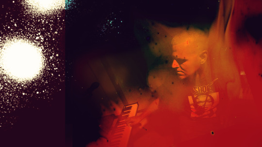
ILL COMMUNICATION: ILL POETIC “AS SERIOUS AS YOUR LIFE” SONG CREDITS, LINER NOTES + THANK YOU’S

If you’re reading this, you’ve listened to my new project and you want to find out who these records were made with and made for. First, thanks for caring this much. Liner Notes and Thank You’s are harder and harder to pull off on digital releases. Below you’ll find a mixed bag of musician credits, song lyrics, thank you’s and stories about the each song. So let’s go!
01 Despierta (Brandon’s Theme I)
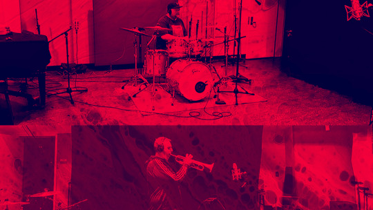
Originally produced for artist B. Shields. Listen to "Despierta" with accompanying vocals by searching B. Shields "Despierta" on your preferred DSP. I first found inspiration in Miles Davis’s “The Ghetto Walk”, then composed the piece on piano and added electronic drums and other sounds via Ableton Live. The recording process included choosing and securing musicians, plotting and miking recording sessions, creating sheet music for musicians, post-production, mixing and mastering. Written, produced, mixed and mastered by Timothy "Ill Poetic" Gmeiner for SoundRzn Design.
Additional guitar by Nick Costa Additional trumpet by Andy Geib Additional drums by Jake Najor.

02 Samsara
Originally produced for Devin Burgess & Ill Poetic and recorded in 2019 in San Diego City College recording studio.
Written, produced, mixed and mastered by Timothy "Ill Poetic" Gmeiner for SoundRzn Design. Additional trumpet, trombone, and flugelhorn by Danny Levin.

03 As Serious As Your Life (ft. MY MYND)
Originally created with Nick "MY MYND" Costa and recorded together at San Diego City College recording studio in 2019.
Produced, mixed and mastered by Timothy "Ill Poetic" Gmeiner for SoundRzn Design. Co-written by T. Gmeiner & Nick "MY MYND" Costa Vocals and guitar by Nick "MY MYND" Costa Additional vocals by Miro Imani

04 Defeating My Thoughts
Created, mixed and mastered in an Airbnb in Columbus, Ohio in 2021. 1:26 of organized chaos. This isn't for everybody, it might not be for anybody. Free-jazz but beats. I just had to get it out of me. It's yours now. The cover art is a collage of MRIs I had taken of my brain a few months ago. I've had physical tics that run through my face and body for at least the past 15 years or so. I used to be extremely insecure about them but now it just is what it is, if you know me, you've probably noticed. It's one of the first things my wife so elegantly and bluntly pointed out to me on one of our first dates. ⠀⠀⠀⠀⠀⠀⠀⠀⠀ Anywho, I felt like they were getting worse this past year and was worried I might have something nefarious going on in my brain. So I laid in a machine for 45 minutes and made beats in my head out of the random noises and apparently this is what my brain looks like when I do that. Turns out my brain is normal (?), and I got a ton of free MRI scans to make some album art out of, so it's a win for all. Thanks California Health Care Services!
Produced, mixed and mastered by Timothy "Ill Poetic" Gmeiner for SoundRzn Design.
05 Otherworlds
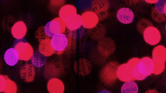
Originally produced in the mid-2000s. Revisited in 2016. Keys added in 2020.
Produced, mixed and mastered by Timothy "Ill Poetic" Gmeiner for SoundRzn Design.

06 Byrd (ft. Devin Burgess)
Written and recorded at San Diego City College recording studio in 2019.lyricsSince I love my verse on this so much, here is my verse (verse II): Roses are red Violets are blue as fuck Poetry’s dead I am on cue as fuck Cry me a river of ice Dive in and shiver Freeze all your dreams and dye them all blue Violence is cute as fuck (and) Riots are vogue I write in a mode Of Miles’s mode Words Shadow - long winded breaths That hide in the notes ‘Tween augmented fifths I’m fly as the rhodes This song’s ending with In minor scale Light me a smoke I inhale Entrails of chemtrails across a shattered sky My state of being’s in a place where it don’t matter why What I thought was sacrifice would birth me back to life The redshift of my expansion wholy magnified I’d be ill advised to fill a rhyme with little lines ‘Bout acid trips but here goes: I’m Mwandishi mixed with Syllicibin, Pivot back, blueshifting on a major scale Emerging from a year, wrists intact Where Occam’s razor failed. My stream of conscious stay, Surfin’, wav., Current, Swells At a higher sample rate Burnin’ I re-animate On monochromatic fabric Where I approach the color wheel Like Coltrane’s circle of fifths Kind-of erratic verses that trip But perfectly fit Feel me? I made it brail. Per Iceberg, Bird Revelation, Dave Chappelle. Inattentive in this attention economy Penny pinching these policies Too much tension inside of me Keep a grip on my privacy Do not mention or follow me Tip of the iceberg Dive in, it all sure shimmers inside of me, It’s all in symmetry Apologies, If you ain’t gettin me It’s probably me My poetry’s dead Lie flowers on top of me.
Written, produced, mixed and mastered by Timothy "Ill Poetic" Gmeiner for SoundRzn Design. Co-written by T. Gmeiner and D. Burgess Additional vocals by Devin Burgess

07 Cyan (Brandon’s Theme II)
Originally produced for artist B. Shields. Search B. Shields discography on your preferred DSP to hear the full piece.
Written, produced, mixed and mastered by Timothy "Ill Poetic" Gmeiner for SoundRzn Design. Additional guitar by Nick Costa

08 Owensvsv (Devin's Groove)
"Owensvsv" is the Cherokee word for "home". This piece was initially a co-production between myself and Devin Burgess. After the flute was added on, this piece transformed into a soundtrack for my mom's transition. It features a Cherokee rendition of The Lord's Prayer, a nod to my mom's deep connection to her Cherokee heritage and the Catholic Church.
Written, mixed and mastered by Timothy "Ill Poetic" Gmeiner for SoundRzn Design. Co-produced by Ill Poetic and Devin Burgess Vocals by Miro Imani Additional flute and saxophone by Jesse Audelo.
“The Lord’s Prayer” in Cherokee - vocalist unknown

09 Lost Words
Originally created in 2003. Revisited between 2015-2020.
Written, produced, mixed and mastered by Timothy "Ill Poetic" Gmeiner for SoundRzn Design. Additional piano by Timothy "Ill Poetic" Gmeiner
10 Scrape (Brandon’s Theme III)
Originally produced for artist B. Shields. Listen to the complete version of this song by searching B. Shields "Lat & Long" on your preferred DSP.
Written, produced, mixed and mastered by Timothy "Ill Poetic" Gmeiner for SoundRzn Design. Additional guitar by Nick Costa Additional flute by Gabriel Sundy.

11 Om
Created in 2019. I wanted to write something about my mom but couldn't come up with the right words. I added keys one afternoon in 2020 that seemed to get the sentiment across better, a single take at that. It was the first time I could express a feeling successfully on piano, which really meant a lot to me.
Written, produced, mixed and mastered by Timothy "Ill Poetic" Gmeiner for SoundRzn Design.
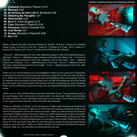
All live elements recorded at San Diego City College except where noted.
Additional processing by Roy Silverstein at Rarefied Recordings.
Thank You’s
Thank you to my wife for letting me live in my headphones which I’m sure is great until it’s immediately annoying, but mostly for giving me the space and focus to make this my life, even when she doesn’t get it. Thank you to my son for his great music taste and compelling creative conversations; for being an inspiration and just generally awesome.Thank you to my dad for becoming one of my best friends these past couple years. I created much of this record as my mom was passing away, and so my greatest thanks is for her and hoping I can pass her energy onto you reading this through my music, words, and actions.
Thank you to my team: Micshon Harper, Ryan Beck and Hunter Turner. I’m not spending money on this record because I don’t want to put my friends in debt. I care that much. Thank you for becoming the group of friends we used to talk about being when we were younger. I love seeing all of you grow in your respective dreams and roles within your family and community.
Thank you to Brandon “B. Shields” Lee for allowing me to further explore the pieces produced for him and present them on this project. Thank you to Nick Costa for his amazing contributions to this record and for his long patience with my slow process for release. Thank you to Devin Burgess for flying out to San Diego to add his touches to this record. Thank you to all the musicians and vocalists who contributed to this record. A big thank you to San Diego City College: Bob Kostlan, Joe Kucera and Mike Espar for the tools, knowledge and studio space to record many of these records. Thank you to my professors at UCSD, specifically King Britt, for some final gems on sound, acoustics and egineering that helped me wrap this project. Thank you to Robert Sanchez for the pictures that defined this project. And lastly, thank you, who picked this up, listened and read to the end.
0 notes
Text
Collage 1 - Race Equality
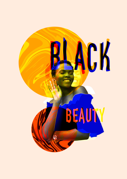
After learning about collages and researching artists, I have created my own collages relating to the theme of equality. In this specific collage the equality type represented is race, and even though this applies to every race it's the black community that are faced with the most racism, affecting them emotionally, financially etc. Therefore I thought by celebrating the natural beauties of black people, it shines a beautiful light on them for people to see and appreciate positively.
One thing I like about this piece is the colour combination, because there is a main colour scheme but is also incorporated with others. At first I was going to keep it within orange and yellow, however I feel adding hints of bright blue balances out the vibrancy and fun of the piece perfectly. Overall I am really pleased with the outcome, it's fun and colourful but also simple and clear which is important. Leaving space around the collage keeps it from looking too busy/messy, and it's a subtle cream colour which holds the piece together as opposed to being simply blank.
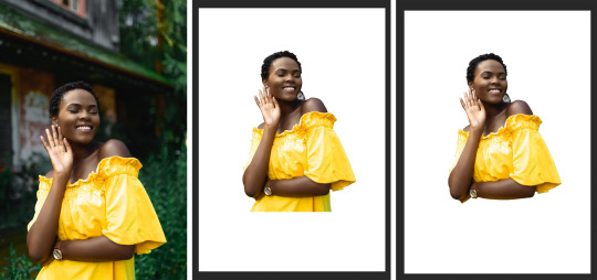
To begin with I selected an image from pexels.com, a copyright free image website, of a black woman with natural hair and a shining smile. I'm pleased with the image I chose because you can physically see happiness through her smile, which was an extra but essential element to the piece and its positivity. With this I cut out the woman in photoshop using the polygonal lasso tool, however I thought the straight line at the bottom locked out of place and loses the flow of the shape. Therefore I also cut around the clothing underneath her arm and deleted it, leaving me with a more appealing and eye-catching shape.

Next I added a cream background colour because when it comes to blending other objects, it will offer more options as many blend modes don't react with white or black since it's a shade, not a colour. I then thought to separate the clothing from the woman's body, so to do this I once again used the polygonal lasso tool and cut around the top. I made sure 'add to selection' on so I could select both parts, and then right clicked 'layer via cut' which separated them onto two layers.
With the clothing layer, I edited its layer style to have a colour overlay and a thin stroke, of which was coloured by selecting the woman's arm to blend it slightly. As for the colour overlay, this matched the background colour which I thought looked interesting, as it's creating a detachment between the woman's body and that's weird but intriguing. Once edited I rasterised the layer style, so I could easily adjust it and blend better with other aspects.
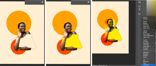
I then incorporated circles of colour into the collage using the ellipse tool, however it made the 'uncoloured' top look empty and blank. Therefore I filled it in yellow with the bucket tool, which balanced out the darker colours that surround the image. Next I duplicated the woman cut out twice and nudged them to both sides of the original, with these I experimented with different blending options until I found ones that suited and improved the piece. I chose them because they reacted with the circles and background really well, in a way that's subtle but clear.
I then also blended in the original photograph using 'luminosity', therefore as well as mixing with other objects/colours it also turns black & white. I was surprised to find that it really compliments the design, and it also makes the image stand out against all the colour.

Even though I thought the yellow fit well, as I was playing around with blend modes, I changed the top once again using the 'subtract' option which turned it to a rich, dark blue. Although it doesn't fit within the orange colour scheme, it created a whole new scheme that's more punchy and bold. Therefore I think it improves the collage a lot by contrasting the self, summery colours, especially with such vibrant but dark colour.
Next I separately added the words 'black beauty' using the type tool, I chose these words because I believe it's important to project positivity from the collage. The aim is not to oppress but to celebrate them, and recognise their unique beauties that other ethnicities don't possess. With these I made sure the placement balanced out the collage, as the circles specifically fill more of the left side than right. I then experimented with different blends, duplications and colours, which were picked with the eyedropper tool to keep it within the scheme. I think the overall look of the text works really well as it compliments the rest of the collage, stands out, but also isn't overpowering.

Afterwards I thought to add a swirl pattern to the circle, so to do this I duplicated one of the words and went into 'liquify'. With the size and pressure of the cursor high, I completely distorted word until I was happy with the swirl created. I then selected the space around the circle I was going to fill, and deleted that section of the swirl so it fit perfectly inside. Although the blue looked nice, I blended it using 'screen' because it brought out different shades of the orange, as apposed to a whole new colour. A small but effective detail I made was highlighting some lines of the swirl lighter than others, I think this made it slightly more interesting to look at as it gives a bit more dimension. I repeated the same process for the other circle, just using different colours and blending options. However I used the same swirl but rotated it, so they don't clearly look the same.
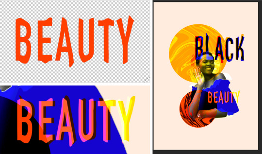
I was going to leave the piece as it was, however I felt that the text didn't quite blend in with the rest of the collage. It looked too stiff and boring in its shape, therefore I look them into liquify and separately distorted them just slightly, but enough to make a difference. Stretching out both layers of the words creates a more interesting and groovy style, rather than having one shape that repeats like it was before.
0 notes
Photo

Welcome to the machine. 169. “Wish You Were Here,” 170. “Animals,” 171. “The Division Bell” by Pink Floyd
I began strictly hearing the mid-to-late-70’s, Waters and Gilmore-centric, classic rock radio era of Pink Floyd, after Syd Barrett had gone mad and the remaining members wore less paisley and started writing tighter choruses.
So all the parts of “Shine On You Crazy Diamond” from Wish You Were Here (#168) were my entrée into the prog side of the mood. The tight tempo changes, Minimoog soloing and serpentine sax courtesy of Dick Parry mark the combined 26-minute sonic odyssey as an endlessly repayable, inspired construction and not a spaghetti-at-the-wall jam band muck-about. Cleanly severed into bookends, the suite bolsters the comparably fleeter middle three tracks, including the title track.
The sweetness of that acoustic, poignant radio staple is the perfect balm after the darkly despairing “Welcome to the Machine” and mordant record company satire “Have a Cigar” (“The band is just fantastic / That is really what I think / Oh by the way, which one’s Pink?”). Writer Alec Sulkin, via Twitter, once described the Big Brother-fearing “Machine” as "dad Pink Floyd singing to baby Radiohead,” and the cold, whirring Eraserhead machinery at the top of the track would back him up.
I found plenty to sink my teeth into with the paranoid collage of Dark Side of the Moon and shell-shocked satire of The Wall, frequently borrowing them from my mother. In building my own collection, I investigated that same corner of the band’s history, putting on my shelf Wish You Were Here and the arguably even greater (or at least less overly-familiar) achievement Animals (#169). The sequencing approach is inverted from the previous album: the multi-movement middle tracks are sandwiched by the brief, lovelorn acoustic solo act of "Pigs on the Wing” parts 1 & 2.
“Dogs” rockets you forward on furiously-strummed, double-tracked acoustic guitar and blasts of incoming ordinance from Gilmour’s lead, before shifting into an iconic Floyd groove of Richard Wright’s Rhodes and synth work. Weirdness points are provided by distorted dog bark samples in the background that are of questionable necessity. The 2nd half screeches in with Roger Waters in full strident exhorter mode, taking the vocal lead from Gilmour for the rest of the track, and the rest of the album, for that matter.
I’m at risk of becoming a broken record when I once again draw parallels between the music I listened to in 2017 and the feelings of acute political anxiety winding through life since the 2016 election. But when Waters pivots from “Big man, pig man” to “Hey you, Whitehouse / Ha, ha, charade you are” on “Pigs (Three Different Ones)," it feels much more like a time-traveling cry of disgust at the duly-elected President of Oozing Moral Abscess than a pointed dig at, uh… Jimmy Carter? As such, its cathartic properties cannot be discounted. Even the crunchy, misophonic vocoder in the pigs-in-shit instrumental exploration between the 2nd and 3rd verses.
“Sheep” begins as a dreamy, last call at the jazz hall electric piano groove, but with insistent bass guitar pulsating under the surface, suggesting lurking danger. Waters crashes in with a call to wake up and smell the abattoir into which the sheep are walking, en masse. Yes, a couple decades before “sheeple” became the portmanteau of choice for the mad as hell, secret genius online commenter, Pink Floyd were leading the charge. Perhaps inspired by the song, the Sheep rise up and tear out the throats of the murderous Dogs, and Gilmour’s guitar becomes the “wave upon wave of demented avengers,” triumphant and scrabbling like the horde trampling their oppressors.
Roger Waters continued his songwriting dominance in the band's follow-up The Wall, becoming my most revisited Floyd album. The copy I burned from my mom’s CDs and took to college, that is. Eventually I’ll pick up the recent remaster. Waters and Wright gradually bowed out of the band in the 80’s (Waters quite litigiously), though Wright continued to contribute keyboard work as David Gilmour periodically picked up the Pink Floyd banner.
I had the impression that 1994’s The Division Bell (#170) was fairly well-regarded, as late-period work from 1970’s rock bands go. The instrumental “Marooned” had made its way on to the best-selling Echoes compilation, and the Easter Island-esque cover art was at least as recognizable to me as the flaming handshake. [I realized, while noticing a wardrobe choice in the first season of True Detective, that my father had sported the very 90’s black-and-primary-colored tour t-shirt throughout my young childhood, which helped the subconscious connection.] So it became my 2nd-ever used record store Floyd purchase.
If the band’s 70’s output helped define the sound of the decade, Division Bell more often than not tumbles into every production technique of the late 80’s to early 90’s. The drums are big, the keyboards are tinkly, and the reverb is strong with this one. But not a lot of Top 40 hits were using a synthesized Stephen Hawking impression as a motif, as in “Keep Talking.” Gilmour’s trademark dreamy guitar hooks likewise paint the songs with easily identifiable shades of Pink. Where Waters' lyrics for previous albums tended toward tales of dissociation or societal allegories, Gilmour’s pet theme for the length of the album is barriers of communication, between lovers or friends.
Many of the songs are credited to Gilmour and his wife Polly Samson, lending personal edge to tracks like “Take It Back.” The track with the most memorable hook, “What Do You Want From Me?,” can be read as the frustration of a rock god who has pivoted out of the public favor in his middle age, begging the title question of his indifferent audience. Or maybe that’s too overly obvious of an interpretation and it’s actually metaphorical, look, I’m not a mind reader, guys! Did you come here expecting deep readings with well-cited references and a bibliography? What do you— ohhh, now I get it.
Come back next time, as I move inevitably into the spiritual successor to Pink Floyd’s genre-stretching explorations in rock. Big hint, they start the “R” section of my collection.
#pink floyd#david gilmour#roger waters#wish you were here#animals#animal farm#rock music#classic rock#cds#cdcollection#album art#music blog#the division bell
3 notes
·
View notes