#(for the asker’s drawing)
Explore tagged Tumblr posts
Note
apologies is this has already been asked, but would you be alright with fics made of your bird au? specifically the arranged marriage concept
no promises but i absolutely adore them, and i'd like to write them if i get the time (with your permission and credit of course!)
I HAVE SAID THIS TIME AND TIME AGAIN AND YES. YOU MAY USE MY AU IDEAS. PLEASE MAKE FICS AND ARTS AND CONTENT WITH THEM. I BEG YOU. WHY DO YOU THINK I SHARE THEM ON THE INTERNET IN THE FIRST PLACE

#thanks for the ask#its actually very kind of you to ask for my permission dear asker i just wanted to draw aventurine as that fading sobbing emoji man#aventurine
755 notes
·
View notes
Note
Hello! I've been following you for a while and I really adore you and your great big beautiful talent! Could I possibly have Mothwing, Number 56?
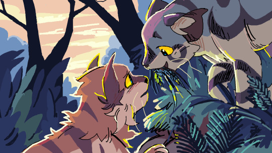
I thought I knew what my weaknesses were anyway And then the orange tree blossomed last Saturday
I thought I'd figured out the world in its circular way Then I saw the sun fall down out of the sky the other day
#mothwing#leafpool#mothpool#warriors#warrior cats#wcs#waca#spotify draw 2024#getting some mountain goats in here top artist 2024#also do not like this one but i havent liked a lot of mine#whatever im tired#and this asker is so sweet TY WAH
453 notes
·
View notes
Note
As an owner of an xxy calico Jin rusong as an xxy calico is both so fun to see but so fitting and so sad in context of your warrior cats au
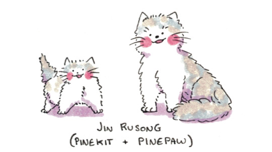
May I offer you a small consolation in the form of a slightly older Jin Rusong kitty?
#ask#mdzs#mdzs au#mdzs warrior cats au#jin rusong#poorly drawn cats#Cruelest thing you could have done is send this ask to me on anon so I can't go snooping to try and find a picture of your cat.#Oh woe is me! To be unable to see a beautiful lad! I had to cope by drawing some silly kitties.#Jin Rusong has only ever shown up on this blog as a little kitten and I think that's what he deserves.#I love doomed characters so much. Jin Rusong...There was never a happy end waiting for you.#Even if he survived longer the truth would have eventually come out.#Even if Qin Su found out first and tried to save him - what life would he have led?#His birth is a terrible secret and both his parents are far too neurotic to cope with the truth.#Jin Rusong was a representation of how JGS has ruined every part of JGY's life. Three cursed generations by his hand.#MXTX once again sets up another character who is doomed simply by nature of their birth. Fantastic stuff for the tragedy enjoyers.#UPDATE: for posterity’s sake - Asker came off anon to show me pics of their kitty and he is *so* beautiful.#One of the happiest endings I could have asked for.
280 notes
·
View notes
Text
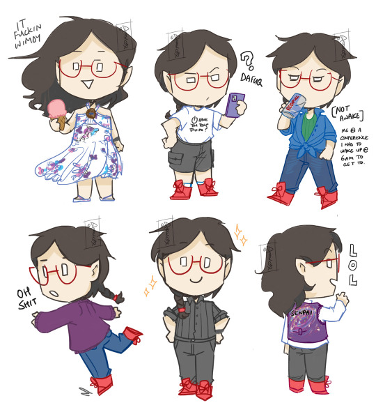
I have a particularly lazy fashion sense ie none and so these are the only outfit combos I know of where it looks like I actually tried.
#art#doodle#literally me#artist fashion#tho i use that term loosely XD#the vest in the last drawing was a handmade gift from some of my friends! :D#sz#hey darqx how come every single pic has you with red shoes WELL IMAGINARY ASKER its because i only have one pair 😂
409 notes
·
View notes
Note
hi i voted.. may i get either an eclipse fed + mapicc ( but they're happy! gasp! ), or just the eclipsefed please?
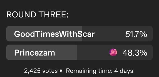
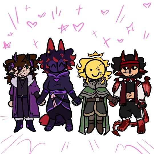
yay friendship! peas and luv! yaaaayyyyyyy hahahahhhaaaaaaa
THE VOTE IS ALMOST OVER EVERYONE GO VOTE PRINCEZAM🧨📢
#uzudoodles#ty asker!#princezam#mapicc#vitalasy#itzsubz#Autofilled their S6 outfits cuz I like drawing them but I kinda wish I did their S4 ones.. oh well#In my mind them getting along then was much less likely in S4 anyways#But that was......... before.........#This ask was sent like a day before everything started going to shit 😭😭 I feel rlly bad
193 notes
·
View notes
Note
I don't know who Kim is but I aspire to be as butch as her

id have two nickels
#dw asker i also draw butch kim so she could also be the beautiful gearhead butch lesbian you can aspire to be GHFDGH#this has happened twice thats kind of funny FDGHD#kim can be butch. as a treat#sunnysideanswers#nekora-rayven709
238 notes
·
View notes
Note
Oh uh forgot to ask in the previous ask (the one with the digital piece of candy and scurrying and stuff)
How do you draw art so good
Like
Is there a method you use or is that just the style you've gotten over time?
you've activated my trap card
I'm just gonna preface that this tutorial is from someone who was not professionally trained and didn't have a lot of free time for art, so a lot of the tips I have is short cuts I use to get the best results quickly
If you genuinely want to get better at art then please look at references and practice that is always the best
However if you are like me and only really do art for fun but want to go faster then these are for you pfppt
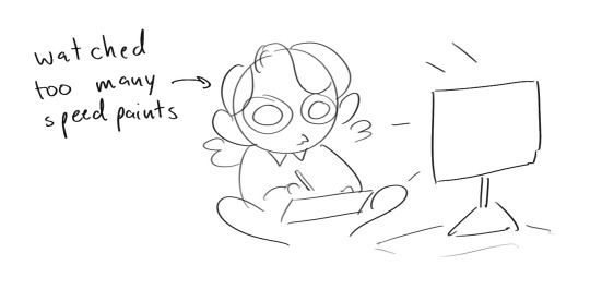
Overall I'd say my style is influenced by speedpaints I would watch when I was younger, I like analyzing how people do things and what makes something look "good" to me
I always recommend watching them because they will often have techniques you've never seen before or do things a certain way that you can try out yourself
I consume good art, it feeds me
but seriously it can be super helpful when developing your own methodology, or just generally trying something new
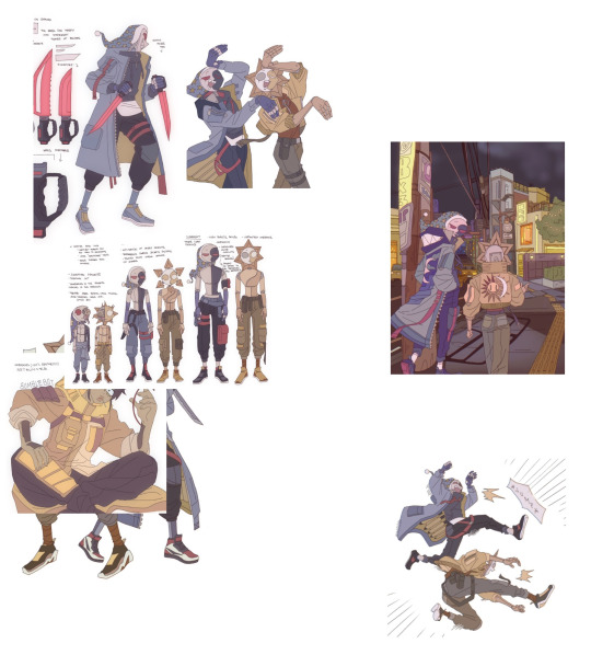
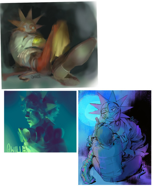
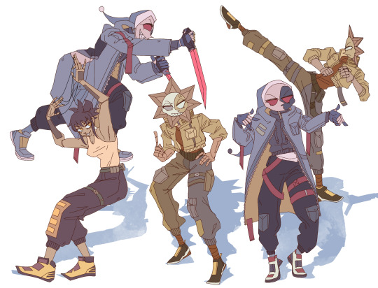
Usually it starts with me pulling some references from artists I really admire and sort of sketching out how they do the things I like
For example 8um8le has like super good anatomy and poses so I focused on trying to replicate how they do that
venemous-qwille is super good at color and pulling focus so that's what I focused on in my study of them
In general I'd say my process is sketch -> silhouette -> color -> shading -> render
I really don't like doing lineart lol

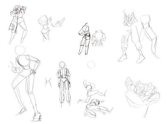
I'd say for the sketch the most important part is using references and just kind of fudging it until it looks correct anatomically/physically
General rule of thumb is spend time on areas of interest, and keep non important areas light (like the stitching on his pants)
I don't do lineart because I think its unnecessary for most paintings I do
I naturally tend to put more time and focus on areas of interest (like hands and feet) and if you use a brush with opacity for the sketch, those areas are naturally going to be darker in the final sketch
Of course this is gonna be different for everyone but it's what works for me
Sometimes I do a really really sketchy layer underneath my sketch/lineart, just so I know where everything is going
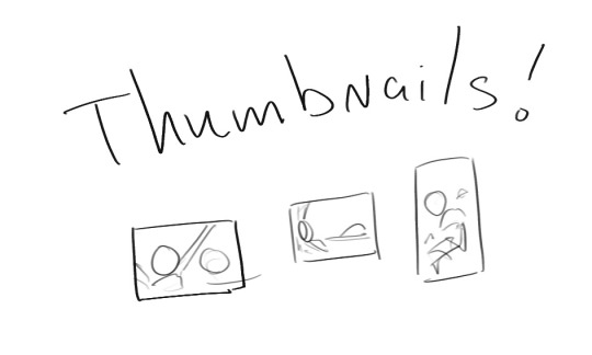
Use thumbnails! They are great to help figure out the general layout of things and what pose I wanna do
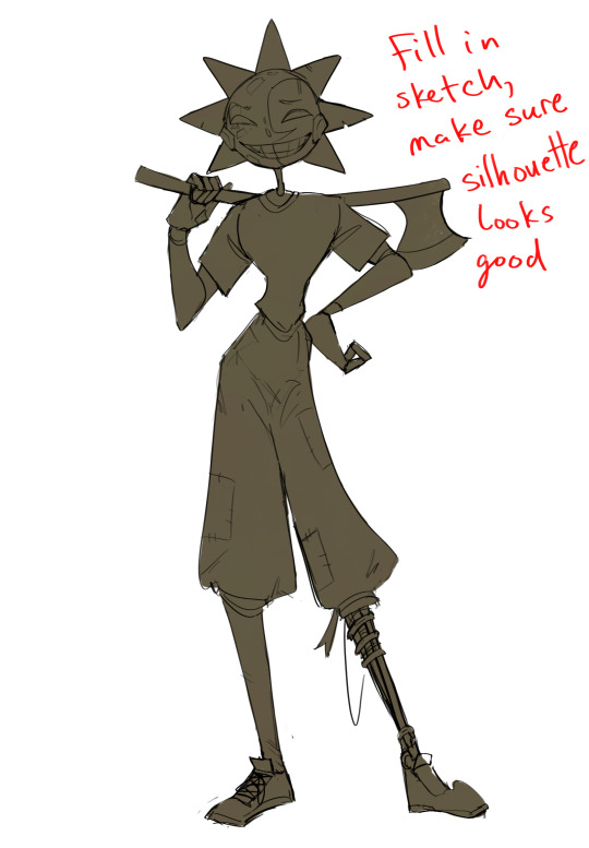
Next is what I call the "silhouette" layer
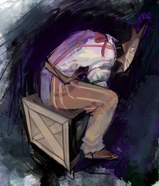
This is super important for me cause it helps me refine the figure and make sure the pose/anatomy looks correct, also depending on what color I choose for the silhouette helps guide what colors I'm going to use on top
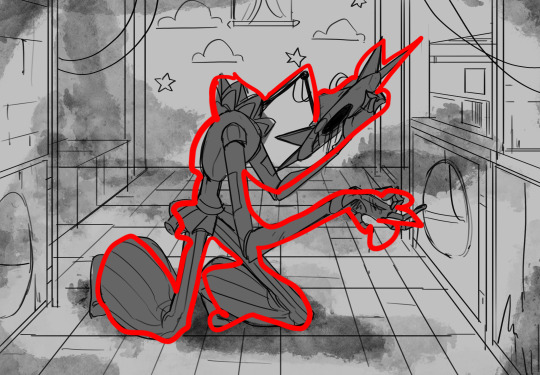
This piece is a good example of how it works. The silhouette shows me how the figure interacts with the background, how the pose looks and if its any good
The silhouette layer doesn't have to be super clean, as long as it follows the sketch decently well and shows where the figure is then its fine
I also sometimes make the silhouette layer multiple colors to help guide shading and vibe
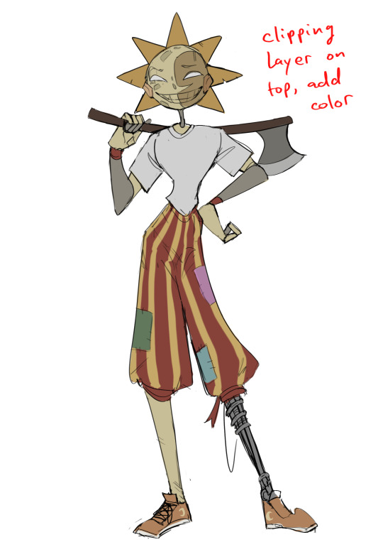
Next is the coloring layer. I usually make this a clipping layer on top of the silhouette layer, or I change the silhouette layer to alpha lock, either way it saves me time on coloring everything in

Sometimes I am super rough with the coloring too, using like an airbrush or my fav watercolor brush just to generically block in color where I want it
Works out cause most objects have like a bounce light to them from surrounding objects, so this is sort of a cheat I use to get that effect without all the work lol
Also don't be afraid to have the lower silhouette layer shining through, having multiple colors sort of subtly shining through the piece helps lots
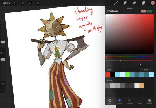
Next is the shading layer, this is usually another clipping layer, usually set to "multiply"
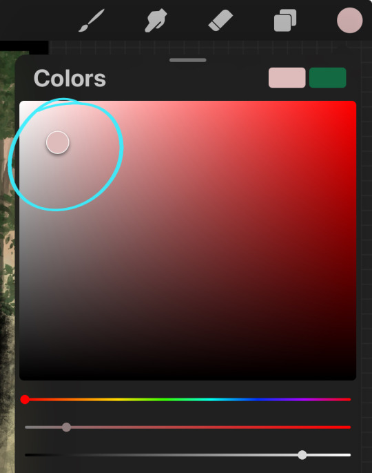
The colors I pick here is usually within this range, any color works, just depends on the piece and vibes.
Since this piece is set in a sunset forest I choose a more desaturated orange for the shading layer
I know there's a whole thing about multiply layer being a crutch (and it kind of it) but it is a useful tool when you just want some darker values across the piece but don't want to go through the process of color picking every single darker shade
Also in my opinion it looks better than picking a darker color and setting it to a lower opacity, idk I just think the color has more "depth"
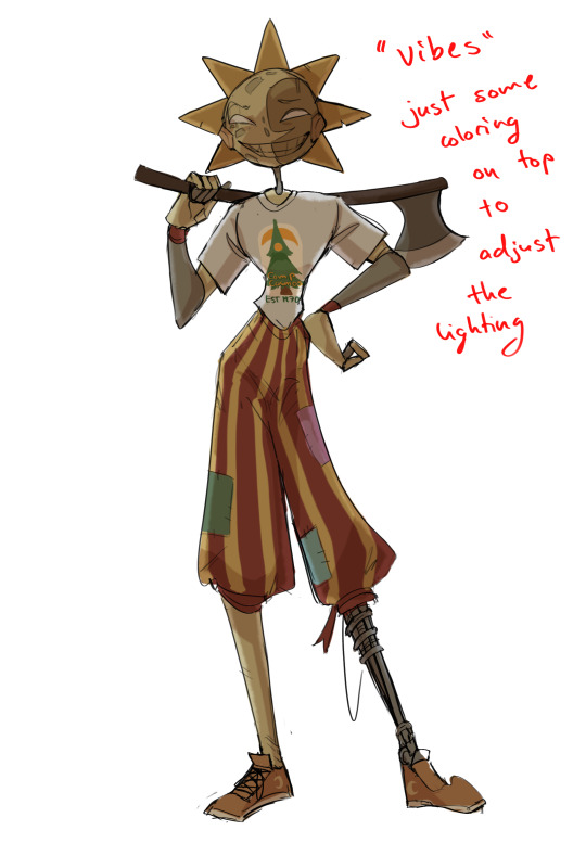
Next is the hardest to explain, sort of the vibes layer
Usually its just a layer of more concentrated color on top of the normal color and I fudge with the settings and values until I get a result I like
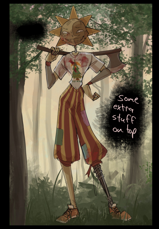
Next is the longest step, is the "extra" or the render stage.
Usually I add a background before this step so that if I need to merge the figure better with the background I can
If I render with a white background but he's supposed to be in a dark forest, its going to mess with the lighting severely
Also this is when I add more "vibe" layers on top to get the figure to match the background better
Backgrounds in general I recommend checking out @/derekdomnicdsouza on instagram he's got lots of great tutorials for breaking down backgrounds simply

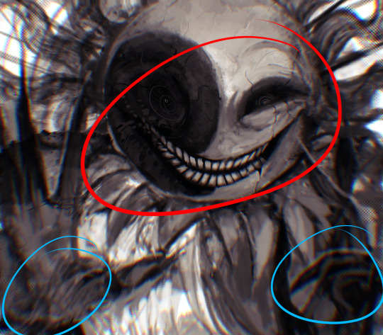
I'd say general rule for the rendering layer is to focus on the areas of interest and spend less time on areas you don't care about
I even blur stuff out on the edges I don't want people to see, partially to save time on fixing mistakes in areas I dont care about (oop), but mainly to help draw the eye to the areas I do want people to focus on

Theoretically parts of the background should like mesh with the characters, parrallel lines are a no no unless they are directing a viewer to look somewhere, things that are perpendicular help bring things together
tbh I'm still not the best at layout and probably need more practice, but overall this is what I like doing
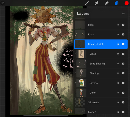
Overall this is what my layer set up ends up being
Sort of a sandwich with the lineart/sketch as the "meat" lol
Color and basic shading below the sketch, clean-up and rendering on top
I like this method cause it's super flexible if I ever want to try something different or try to replicate someone's style
I can make each step less or more messy depending on the end result and can add a lineart layer if need be. Also if there's a part that is straight up not working or needs to be removed its super easy to do cause I can just paint over it on the "extras" layer, color picking from the surrounding area to get the same vibe
Generally rule of thumb for my style is: get the initial layout of colors, form and shading to look good, then the rendering should be smooth sailing
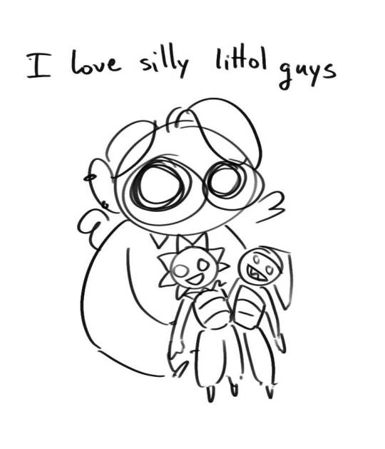
Really the best advice I can give to get better at art is to enjoy what you're doing and become very very obsessed with drawing a silly little guy
You'll eventually get very good at drawing them pfptpf
#sundrop#moondrop#long post#art tutorial#fnaf sun#fnaf moon#I draw them way too much holy guac#ask#this is for you asker#idk if anyone else is interested in this kind of stuff#i apologize for ranting lol#also me struggling to spell silhouette like 15 times
116 notes
·
View notes
Text
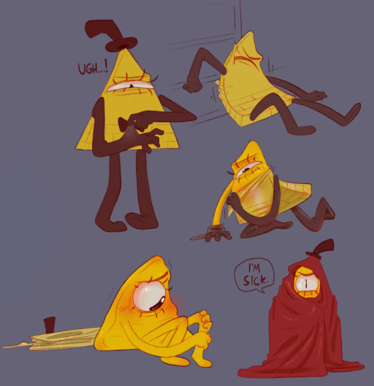
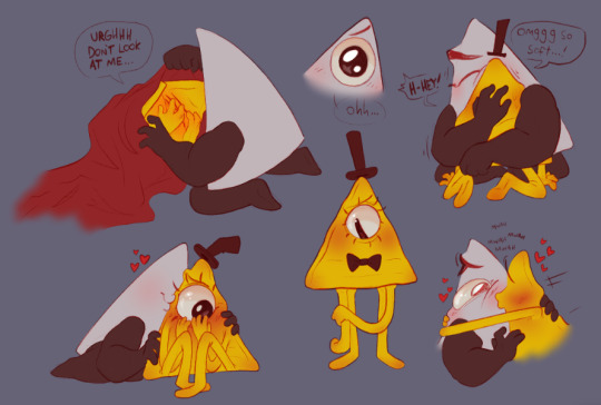
Exploring the idea of Euclideans going through moults. I think I kind of love it. I imagine it's utterly humiliating for a proud guy like Bill to be looking so ridiculous (and with his shape so uneven!!) so extra angst potential too
But, y'know, had to add his boyfriend being endeared by his ugly-cuteness and squish. I always love petting my snake after she sheds, her colors get so vibrant too :]c
He looks so disgusting and naked I almost feel like I should be tagging it as nudity he's so gross. If I saw that damn thing in my living room I'd stomp on it until it was a small brown stain
~ Mod Emily 🦇
#mod emily#love triangles au#bill cipher#yung venuz#yungbill#gravity falls#art#emily's art#i really hate this thing he looks like a character from the emoji movie#i was struck by the notion while drawing this that it almost looks like some kind of hyper-specific fetish. i promise to god it is not#maybe that's my deviantart heritage speaking though#MINTY'S GOTTEN HER BOOK!! YAHOOOO!!!#also hi askers! we see you we just wanna draw for some answers so it's taking a little bit!#minty's got uni and i'm dealing w/ mental health stuff. we'll get to you promise!
183 notes
·
View notes
Note
Why do I hear drainfolk babies sounding like kittens or that angry desert rain frog noises
While baby drainfolk can make cute noises, most are the same noises human babies make - said noises just tend to be squeakier because they are smaller and have less lung capacity to scream with.

I'm aware these little guys are very critter and cutesy but they are also just straight up infants from severely mutated human beings. These are human infants and are capable of learning basic speech and other integral child milestones while still looking like a mold spore.
#great god grove#if this comes off as angry sorry im not i just worry about how ppl view these guys a little bit#since they are a marginalized group of people#i know i draw them so cutesy critter w animal traits but these are just straight up baby humans from a marginalized group of people#so i get a little worried when i sometimes see ppl go “i want one”. when it is a whole human baby. asker isnt one of these people ofc#but i do really just worry#they are delayed in matching an average humans size and strength but they have the same exact mental milestones#thus a molded spore is capable of saying curses if a parent accidentally says it near them#though honestly “average” people kinda see them the same way in game universe i'd wager. sighs#sorry for being a complainer i guess im just. sighs
69 notes
·
View notes
Note
i think basil should have a keyblade. if you dont know which i suggest Aubade because it has good color palette and is sad
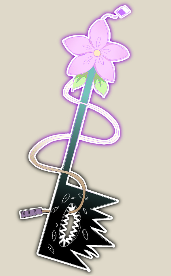
Basil keyblade be upon ye.
#(i have discussed the ask with the asker and we agreed it'd be cooler if i just made one up for him)#(i dont have the energy to draw him holding it though orz)#daily basil#omori#drawing#omori basil#art#basil omori#basil#digital#mod snuuy#request#ionophone
102 notes
·
View notes
Text
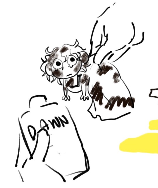
Lady dimitrescu covered in oil 4K
#art#my art#artists on tumblr#re8#resident evil village#resident evil 8#resident evil#lady dimitrescu#asker: draw her like she's one of those ducks that r covered in oil that they have to wash with dawn dishsoap mayhaps
167 notes
·
View notes
Text

Idk what to say he’s just so cute im going to explode
#dandys world#dandys world astro#astro novalite#ebonytailsart#I'm making a doodle page of how I draw Astro bc someone asked#if you are the asker here is your little treat before i post the whole thing. soon
88 notes
·
View notes
Note
draw doomed yaoi, i know you want to
umm not really but here is your doomed resident evil ship at your request ig?
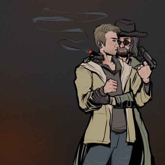
#karl heisenberg#ethan winters#wintersberg#i think that's the ship name??#i don't know this ship#fanart#resident evil#resident evil village#re8 village#resident evil 8#re8#i may have been held hostage on facetime by my asker while i drew this#unironically too lesbian for this shit#good practice for drawing tho ig
96 notes
·
View notes
Note
Hi! Sorry to bother, but could you please tell me why you refer to Little Apple as her? When I looked up the wiki page, they used the it pronoun, and novel translations into my native tongue all use male pronoun. Is it audio-drama exclusive or something? P.S. I really love your art and appreciate you sharing it here! <3

Never ask a donkey her pronouns.
#ask#poorly drawn mdzs#mdzs#little apple#transgender#Real answer is that as far as I am aware the audio drama refers to little apple with feminine terms.#but it could also be a mandela effect.#In general if you notice me doing something that isn't mdzs canon it is safe to assume it is:#1) An ongoing bit I made to be funny 2) Something from the audio drama version 3) My brain messing up details.#Little apple transbian lore starts now I guess? I think Pio of Piosplayhouse would have more to say about this.#Thank you for your support question asker- I hope you know I am only gently teasing you here.#I typically answer questions like this privately but I can't pass up drawing more little apple <3
467 notes
·
View notes
Note
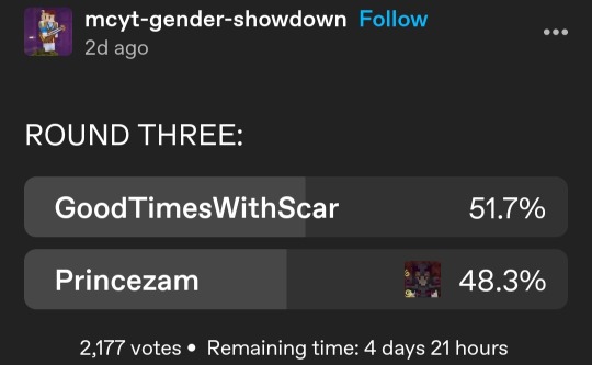
hi dear uzu... are you trading these for the devotion duo...
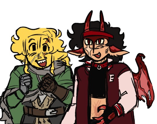
Hello mutual-in-law dreww.. of course I am...
KEEP VOTING FOR PRINCEZAM PRINCEZAM MUST WIN📢🎉
#uzudoodles#ty asker!#princezam#mapicc#still f8guring out colors but I can feel myself getting better at drawing mapicc by the day...#Soon I will be the master..
107 notes
·
View notes
Note
what is the geno and error x fresh dynamic like....

No idea honestly; I don't ship them and don't really want to think about how they would act in a relationship. mostly drawing what I think is funny haha
+ more thoughts in tags... shitty extra under cut. suggestive

#Mostly I drew any cus of that one ask for [error x geno]; I don't want ot draw things without frseh. so I drew it as error & geno x fresh.#to make fun of the asker. a light joke. I don't like deleting asks unless I really do hate it. so I did need to draw Something for it#the first thing I drew was way too good to attach to an ask I was annoyed with. so I posted it as its own thing. & made another for the ask#fresh#fresh sans#fresh!sans#error#error sans#error!sans#geno#geno sans#geno!sans#fresh & geno#fresh & error#puppydraws#puppy barks#vanglaggle
92 notes
·
View notes