#//is this the best art i've ever done? no probably not
Explore tagged Tumblr posts
Visit Tumblr Blog
Explore Tumblr blogs with no restrictions, modern design and the best experience.
Last Seen Tumblr Blogs


Fun Fact
Tumblr.com rank in the US is 25.
Text


[ Based on a discord conversation saying both Stella and Mim would totally do a Lisa Frank-enstein costume. Did both color palettes (but mostly bc i started coloring based on the reference pics and forgot i was doing a lisa frank thing lmao)]
@madmagicmim
#art#✨ art#swynspo#inspo#feat: Mim#✨mim ambrosius#stim#//is this the best art i've ever done? no probably not#but it was kinda fun#//and had to post it like this bc i started losing steam and knew if i stopped i wouldn't start again so i got it to a place i was happy#//maybe i'll work on it later and post updates in discord? idk we'll see!!
2 notes
·
View notes
Text

Here's a fun little headshot I did of this dragon for someone on fr :)
You can also drop your own dragons here for a chance at some free experimental art! It's mostly just my art gallery, but I love seeing cool dragons regardless!
#flight rising#flight rising art#fr abberation#I have struggled. so much with drawing abberations. this is the best I've done lmaoo#I had a lot of fun with it though! love how it turned out#just fyi I probably will eventually get around to drawing every dragon put in that thread regardless of my style prefs#I just love when people love their dragons to not <3 it just may take me... eternity#hope you all are having a wonderful holiday season and a great NoTN!#I hatched my first ever gen 1 xyy :)
76 notes
·
View notes
Text

Crash commission for @vivaislenska
#Probably the best commission I've ever done i love Crash sm thank you for trusting me with your baby 🥺#my art#commission#other's oc#loth wolf#star wars
68 notes
·
View notes
Text
This was from Laketober 2020! I believe the prompt for this day was "Paradise", which is probably my favorite game in the series. I was so happy with how the lineart turned out on this one that I decided to go full color with it.
#old art#2020 art#traditional art#rusty lake#rusty lake paradise#paradise#laketober2020#best lighting I've ever done#I should probably work more on lighting tbh#also I will not be uploading consistently#sometimes I just dont wanna
57 notes
·
View notes
Text

SHARENA WEEK DAY 4!!!
"Ladies First~!"
(also holy crap i drew that?????)
#ITS DONEEEEEEEEEE#And I'm so proud of it!!!!#Guys i don't think I'm topping this (I thought the same thing about day one so who knows)#This is probably some of the best coloring I've ever done! And I didn't color pick from anywhere! I did it with my own brain!!!!#AAAAAAAA I'm so happy!!!#This might become my laptop background I won't lie#Also. I have been working on this all day. Like holy shit. Hit a flow state and didn't leave my desk for hours on end.#Haven't done that in a minute. I feel like I just walked out a time machine. What year is it? Has there been any Silksong news? No? Damnit.#BUT GUYS ITS MY GIRLS I FREAKING LOVE MY GIRLS#feh sharena#fe sharena#sharenaweek2024#sharena week#sharena#feh anna#fe anna#anna#fire emblem heroes#feh#fire emblem#art tag
50 notes
·
View notes
Text

"Self-Portrait, Skeptical" - a charcoal drawing (nay, a self-portrait even!) done between 1/02–1/09/2024
#this is probably the best likeness i've ever done of myself in charcoal before but that's not saying much#my dad says my nose looks longer than it is but that's the distorted angle. forshortening bitches#2024#my drawing#visual art#charcoal#charcoal drawing#self portrait#artists on tumblr#the shading looks better in person but my phone camera is pretty crap. just fyi
41 notes
·
View notes
Text

one of my finished ych commissions. other finished artwork can be found here. the tailmon is based on the twitter meme / trend of tailmon with pikachu build
#brace yourself long tags of rambling ahead#so i tend to ask my commissioner's permit to post a watermarked smaller version of the art on twt#im a person of my word so im not gonna assume or much less abuse that to simply cross-post to every platform im in#this one is a bit special bc the commissioner is an old friend#tldr we were talking about life and career being the typical adults and they randomly went 'ok draw smth for me' and just... paid#so it's like.... a joke commission? but also not bc the pyment is real??#but yeah they left the decision of what to draw to me. i suggested what i was thinking of drawing and they went#'do it. finish 2023 with a bang' lmaooo idk if this is banger enough but i clearly had a blast. record breaking fastest comm i've ever done#back in school i doodled pikachu everywhere like breathing so it helped#apparently im given the freedom to share the art however and wherever i like too so yeah bc this is a meme and it is best shared with ppl..#its kinda cool how we now have the ultimate answer to the question 'which is better digimon or pokemon' tho#upon which im just gonna show this chonky polite tailmon#tailmon#gatomon#digimon#png#finished commission#dood you probably wont see this but ty for the random commission :'))
52 notes
·
View notes
Text
A Woven Song (Cover Fanart)
IT'S FINALLY FINISHED!!! ALL OF THE SWEAT, TEARS, AND ABSOLUTE FRUSTRATION IS FINALLY OVER AND I AM HAPPY TO SAY I FINISHED THIS BEFORE MIDNIGHT WHERE I LIVE!!!
Here ya go @stellawolfe30 aka @monkiebois
My first out of many MANY Several Fanarts pieces for the amazing "A Woven Song" Fanfic (I've linked it so many times before but I'll link it once again so that you may all read it BECAUSE IT'S SOO GOOD!)

Here's the speedpaint that I lightly mentioned before:
youtube
Here's the link to the amazing fanfic:
And have the kitten of bleps because it is now my signature:
#lmk au#my art#lmk fanart#fanart for a Woven Song#Best fanfic I have ever read#Probably will read it again tomorrow....or after midnight#Again this art piece both frustrated me and made me feel so proud of myself#My favorite is definitely Xiaohua's ears and Macaque as a piece#Overall one of my favorite art works I've done#Hope you like it#If I wake up tomorrow with 5k notes I will cry#Youtube
83 notes
·
View notes
Text


#bendy and the ink machine#rubberhose#toons#this is probably the best boris I've ever done tbh#digital art
5 notes
·
View notes
Text

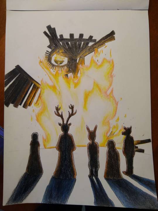
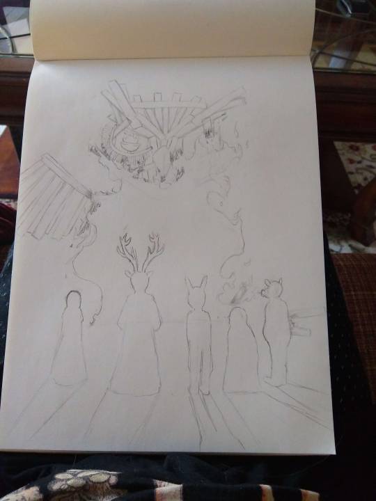
Man…
#hnggg I'm so so close to finishing this animatic#unironically probably the best piece of art I've ever made?!?#I think it'll be done in a week or two#oc kaito#animatic#despair’s legacy
1 note
·
View note
Text
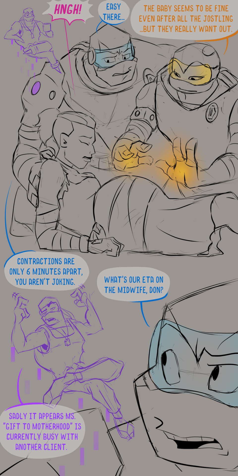
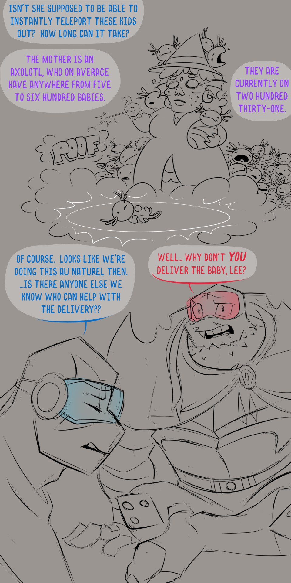
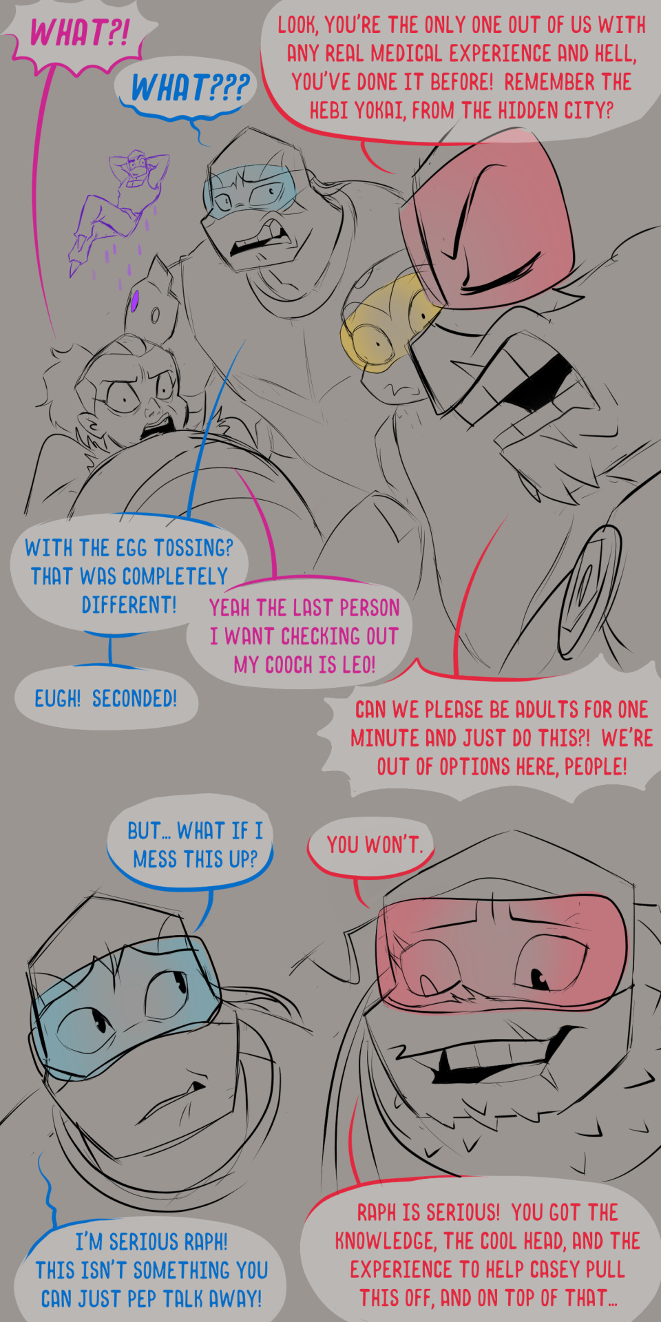
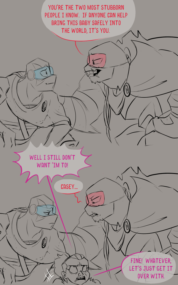
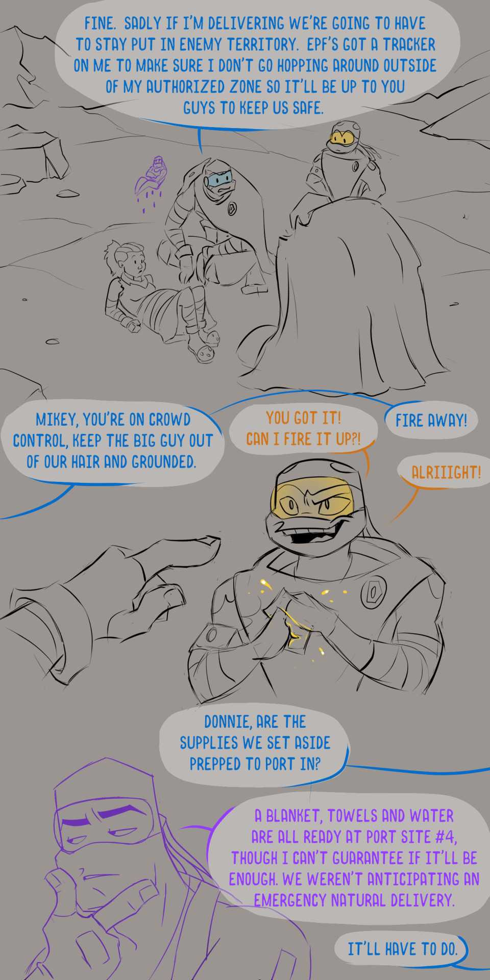
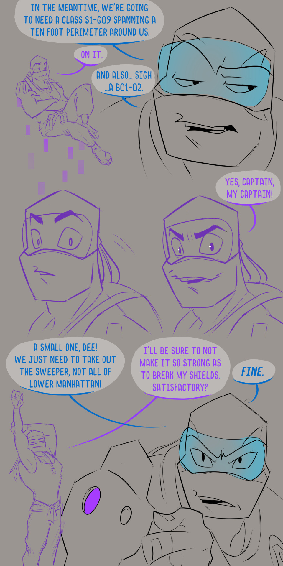
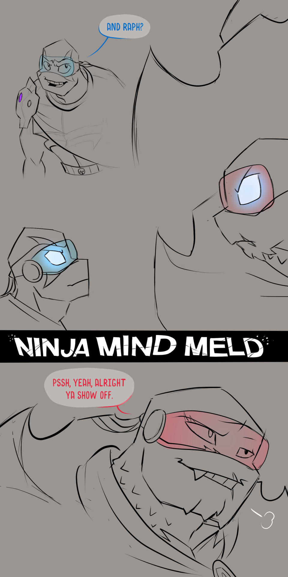
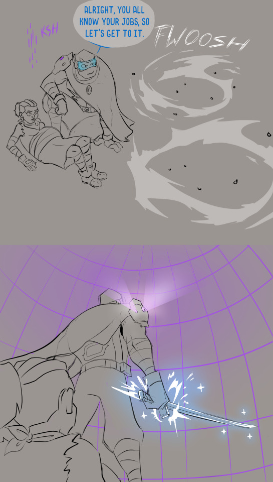
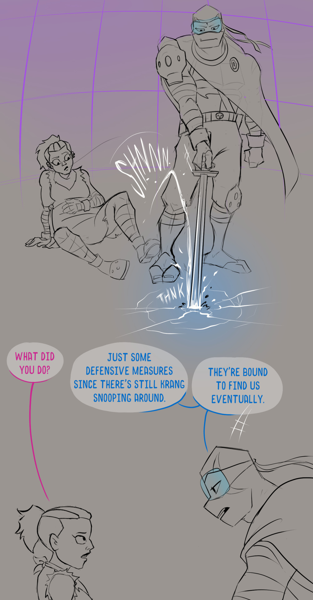
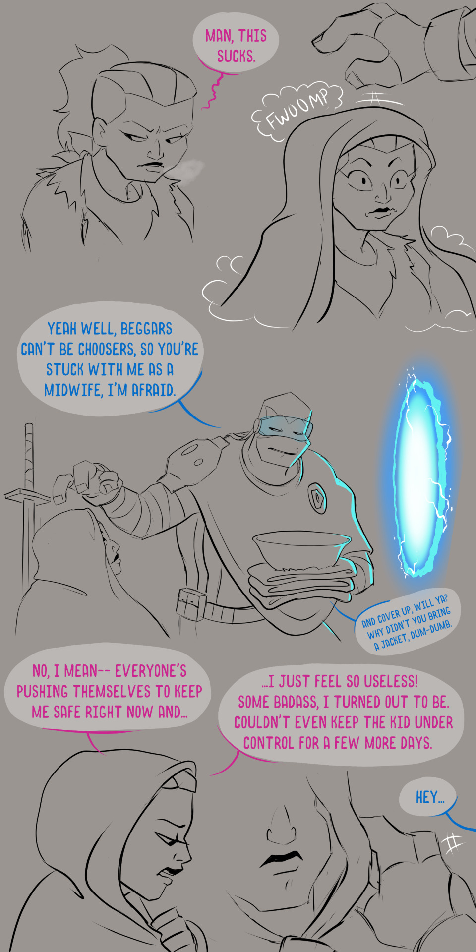
The eye of the hurricane. I like to think Cassandra sometimes called the brothers by the nicknames their dad used, given they were probably pretty close before his passing.
BEGINNING || PREVIOUS || NEXT MASTER POST
Man oh man, this one was way messier and off model than my last few updates but whatever, we got to keep this ball rolling! Life's been crazy so I've had to take some unwanted breaks in between updates. Thanks everyone for your patience as always!
One thing I wanted in this flashback was to really get a sense of how the brothers worked as an experienced team with Leo at the helm as a proper leader. It's something we never got to see much of in Rise and I felt it was important to include since half the team is already gone by the time of Replica. Team Dynamics Ted Talk under the cut!
We know from Casey Jr that Leo stressed the importance of listening to your team. A big part of that also means knowing how to communicate with them in general.
With Michelangelo, he keeps it short and succinct, trusting his brother to know what he's doing when in his element. This trust goes a long way with Mikey, having spent years of his youth as the baby striving for the respect he felt he deserved. Leo knows it's best to not bog Mikey down with details, allowing him to improvise as needed. This unspoken freedom has only grown over time as Mikey has dipped deeper into spiritual arts that, frankly, go completely over Leo's head.
The greatest sacrifice Leo has ever made was read Donnie's Big Book of Bad Guy Codes. While he doesn't remember ALL the numbers, he has memorized the ones that matter and it has helped tremendously in avoiding miscommunication with his genius brother. More importantly it silenced any of Donnie's usual belly-aching. As Leo's "twin"/"equal" the two still butt heads from time to time. Donnie respects his brother's authority (mostly) but will still push the boundaries of what he's allowed on a semi-regular basis. Give Donnie an inch and he will take the mile and then find a loop hole that allows him to go twenty miles more. This is partially due to him often being the one left behind at HQ, making the turtle just a TAD stir crazy. Leo does his best to keep him in line regardless.
Big brother Raph will forever and always be big brother to Leo. As such he holds a place of authority in Leo's heart and is someone he still regularly seeks counsel from in both the ways of leadership and more. Raph is always happy to support his younger brother and does a surprisingly good job (albeit after years of practice) of walking the line so as not to step on his brother's toes in the process. At least not since the secret of "the Key" blew up in their faces several years ago. They don't talk about that anymore. Leo is the leader now and he's done a great job in recent years as far as Raph is concerned. He trusts him to make the right call. The two have a close bond and regularly use mind meld to quickly communicate rather than speak ...this will be important to remember for the future.
Hope that overall feeling came through for this group!
#rottmnt replica#replica#rottmnt#save rottmnt#rise of the teenage mutant ninja turtles#kathaynesart#unpause rottmnt#pregnancy#labor pain#labor#birthing#tmnt#rise of the tmnt#rise leo#rise mikey#rise donnie#rise raph#profanity#is cooch profanity?#I don't know I just found it funny
5K notes
·
View notes
Text
I've looped around from finding the belief that The Wizard of Oz was "the first color film" or "first technicolor film" understandable if wrong to finding it deeply annoying
Like. I get how it feels true - how the transition from sepia to technicolor in the film feels epochal, and how it's a springboard to people imagining how AMAZING and how AWESTRUCK audiences must've been at the time, but it just isn't the case, and no one in 1939 would've thought it was the first color film.
I mean, you've probably seen Snow White (1937) and Adventures of Robin Hood (1938). At the time color features were becoming more common, and they had been common in cartoons and shorts for years.
On a base level, if The Wizard of Oz was such a monumental moment in film history, giving people something they've never seen before, why did it only break even at the box office? By all accounts while not a flop it did decently but not great, and it only became a Cherished Classic thanks to TV airings later on. I mean, 1939 saw what is still, if adjusted for inflation, the highest grossing film ever made, and it wasn't The Wizard of Oz
Here is the actual history of color: most silent films were tinted, most commonly with different scenes being all tinted different colors, but more rarely hand-coloring. But back then people started experimenting with many different "true" color film systems, most of which failed for one reason or another, and there were a couple silent features made in two-strip technicolor, which had a more limited palette. At the start of the sound era, some black & white scenes would have color segments; this stage has been largely forgotten bc in many cases, the color segments don't survive & we only have them in black and white. Then three-strip technicolor began and became the dominant form of color until the late 1950s, with the first full-length three-strip technicolor film being 1935's classic...Becky Sharp. Which did decently, and got one Oscar nom for Best Actress, but didn't really become a classic. And then color films became more common until they became the norm in the 1960s
But it has to be a classic, right? It can't just be some random movie that ushered in technicolor. It has to be a famous movie everyone's heard of. It can't have been a gradual process touched by many individual artists, it has to be something one Great Man ushered in overnight, and the crowds were amazed, bc they had just been waiting for someone to Do Color Film so they could ditch black & white forever. It couldn't have been the case that they rejected many previous attempts at color film bc they sucked. Nothing can ever be the result of many people making many choices in many works of art, it has to be the work of one Great Work of Art that Changed Everything Instantly, and all the little people and failed experiments and less-enduring ones just have to be erased to make way
But it isn't. The transition from sepia to color in The Wizard of Oz did dazzle audiences, and still does, but that's because it's a incredibly well-done visual effect and a creative choice within the story to show the change from Kansas to Oz. We don't have to say it was important bc it was the first to do something technologically; it can be important for just being a really good movie
1K notes
·
View notes
Text
art vs artist 2024!

i used sooo much blue and yellow this year, maybe next year ill branch out to more colours but i cant help that blue and yellow are just the best colours for drawing.
here are my favourite works for each month of 2024!
january:

I used colour layer modes instead of colouring 'organically', but this was the first time I made a drawing in full colour and actually really liked it. this was before i started painting colours directly into my drawings but its a great effort and i learned a lot about colour layer modes here!
february:
didn't make much great art this month but this sketch scratches my brain correctly. the contrast the hatching the lighting!!!! this was where i started being obsessed with the different forms you can manage to portray with just a little rimlight
march:

possibly one of my favourites of the WHOLE YEAR. Inspired by Andrew Salgado's work, I'm a huge fan of his stuff. In this I learned that colours are literally stupid and if you don't care about logic, you can actually make something very distinctive and somewhat abstract work. Kick-started my whole journey to learning colours so this was probably one of my most important pieces i've ever made
April:
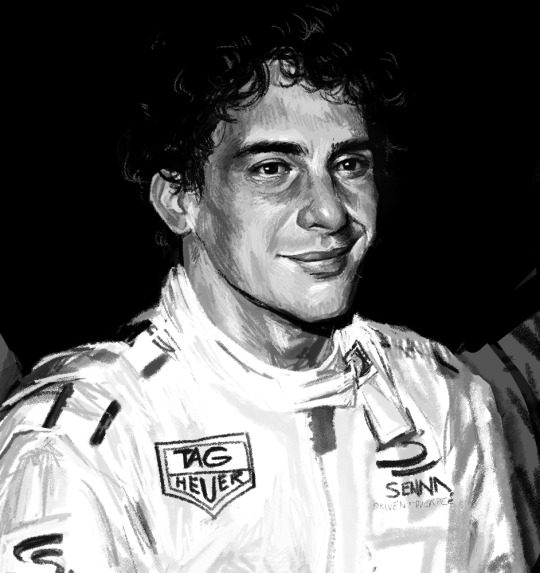
again, not much good art but this is nice I guess. drew this for the anniversary of senna's death, i like the polaroidy feel
may:

I LOVE my may era. Most of everything was done with this oil painter brush I found and it just went very painterly and kinda abstract with strokes and colours, was a month of experimentation for sure
june:

I didn't like this very much when I made it originally, but looking back I love the kinda creaminess of this piece. I haven't really been able to recreate that effect so far though, so this one stands out to me for sure
july:

Not a fantastic art month for me, but I was experimenting with textures in this piece and learned a lot of what I SHOULDN'T do. Very useful
August

I made this piece because I hadn't spotted any other lesteban enjoyers in the wild. Idk the colours in this just came out very easily which is always enjoyable
September:

GRAHHHB the colours in this have me in a CHOKEHOLD the DESATURATED BLUE SHADOWS and PINK CHEEKS!!! This definitely isn't my best of the month but it BRINGS ME A LOT OF JOY OKAY I suddenly turned into an Esteban superfan in theast fiveish months of the year. so dumb that like one of my favourite pieces ever was a shitpost
November:

the textures the eyelash shadow. PERIODD!! the first of my f1 x gladiator series, i just love this a lot even if it doesn't look like max
december:

one of the best of my whole year tbh. Like the final boss where you use all the stuff you learned throughout your journey. The jewellery okay divaaa
okay very long post but i hope you guys like it!! thank you everyone for the support i've received this year you guys are the best
#art vs artist#art vs artist 2024#art recap 2024#f1#formula 1#f1 art#art#max verstappen#charles leclerc#lestappen#nico rosberg#ayrton senna#kimi raikkonen#daniel ricciardo#lance stroll#esteban ocon#lesteban#mick schumacher#lewis hamilton#gladiator#clipstudiopaint
773 notes
·
View notes
Text
My Favorite Cheap Art Trick: Gradient Maps and Blending Modes
i get questions on occasion regarding my coloring process, so i thought i would do a bit of a write up on my "secret technique." i don't think it really is that much of a secret, but i hope it can be helpful to someone. to that end:

this is one of my favorite tags ive ever gotten on my art. i think of it often. the pieces in question are all monochrome - sort of.

the left version is the final version, the right version is technically the original. in the final version, to me, the blues are pretty stark, while the greens and magentas are less so. there is some color theory thing going on here that i dont have a good cerebral understanding of and i wont pretend otherwise. i think i watched a youtube video on it once but it went in one ear and out the other. i just pick whatever colors look nicest based on whatever vibe im going for.

this one is more subtle, i think. can you tell the difference? there's nothing wrong with 100% greyscale art, but i like the depth that adding just a hint of color can bring.
i'll note that the examples i'll be using in this post all began as purely greyscale, but this is a process i use for just about every piece of art i make, including the full color ones. i'll use the recent mithrun art i made to demonstrate. additionally, i use clip studio paint, but the general concept should be transferable to other art programs.


for fun let's just start with Making The Picture. i've been thinking of making this writeup for a while and had it in mind while drawing this piece. beyond that, i didn't really have much of a plan for this outside of "mithrun looks down and hair goes woosh." i also really like all of the vertical lines in the canary uniform so i wanted to include those too but like. gone a little hog wild. that is the extent of my "concept." i do not remember why i had the thought of integrating a shattered mirror type of theme. i think i wanted to distract a bit from the awkward pose and cover it up some LOL but anyway. this lack of planning or thought will come into play later.
note 1: the textured marker brush i specifically use is the "bordered light marker" from daub. it is one of my favorite brushes in the history of forever and the daub mega brush pack is one of the best purchases ive ever made. highly recommend!!!
note 2: "what do you mean by exclusion and difference?" they are layer blending modes and not important to the overall lesson of this post but for transparency i wanted to say how i got these "effects." anyway!
with the background figured out, this is the point at which i generally merge all of my layers, duplicate said merged layer, and Then i begin experimenting with gradient maps. what are gradient maps?
the basic gist is that gradient maps replace the colors of an image based on their value.

so, with this particular gradient map, black will be replaced with that orangey red tone, white will be replaced with the seafoamy green tone, etc. this particular gradient map i'm using as an example is very bright and saturated, but the colors can be literally anything.

these two sets are the ones i use most. they can be downloaded for free here and here if you have csp. there are many gradient map sets out there. and you can make your own!
you can apply a gradient map directly onto a specific layer in csp by going to edit>tonal correction>gradient map. to apply one indirectly, you can use a correction layer through layer>new correction layer>gradient map. honestly, correction layers are probably the better way to go, because you can adjust your gradient map whenever you want after creating the layer, whereas if you directly apply a gradient map to a layer thats like. it. it's done. if you want to make changes to the applied gradient map, you have to undo it and then reapply it. i don't use correction layers because i am old and stuck in my ways, but it's good to know what your options are.

this is what a correction layer looks like. it sits on top and applies the gradient map to the layers underneath it, so you can also change the layers beneath however and whenever you want. you can adjust the gradient map by double clicking the layer. there are also correction layers for tone curves, brightness/contrast, etc. many such useful things in this program.
let's see how mithrun looks when we apply that first gradient map we looked at.

gadzooks. apologies for eyestrain. we have turned mithrun into a neon hellscape, which might work for some pieces, but not this one. we can fix that by changing the layer blending mode, aka this laundry list of words:

some of them are self explanatory, like darken and lighten, while some of them i genuinely don't understand how they are meant to work and couldn't explain them to you, even if i do use them. i'm sure someone out there has written out an explanation for each and every one of them, but i've learned primarily by clicking on them to see what they do.
for the topic of this post, the blending mode of interest is soft light. so let's take hotline miamithrun and change the layer blending mode to soft light.

here it is at 100% opacity. this is the point at which i'd like to explain why i like using textured brushes so much - it makes it very easy to get subtle color variation when i use this Secret Technique. look at the striation in the upper right background! so tasty. however, to me, these colors are still a bit "much." so let's lower the opacity.

i think thats a lot nicer to look at, personally, but i dont really like these colors together. how about we try some other ones?

i like both of these a lot more. the palettes give the piece different vibes, at which point i have to ask myself: What Are The Vibes, Actually? well, to be honest i didn't really have a great answer because again, i didn't plan this out very much at all. however. i knew in my heart that there was too much color contrast going on and it was detracting from the two other contrasts in here: the light and dark values and the sharp and soft shapes. i wanted mithrun's head to be the main focal point. for a different illustration, colors like this might work great, but this is not that hypothetical illustration, so let's bring the opacity down again.

yippee!! that's getting closer to what my heart wants. for fun, let's see what this looks like if we change the blending mode to color.

i do like how these look but in the end they do not align with my heart. oh well. fun to experiment with though! good to keep in mind for a different piece, maybe! i often change blending modes just to see what happens, and sometimes it works, sometimes it doesn't. i very much cannot stress enough that much of my artistic process is clicking buttons i only sort of understand. for fun.
i ended up choosing the gradient map on the right because i liked that it was close to the actual canary uniform colors (sorta). it's at an even lower opacity though because there was Still too much color for my dear heart.

the actual process for this looks like me setting my merged layer to soft light at around 20% opacity and then clicking every single gradient map in my collection and seeing which one Works. sometimes i will do this multiple times and have multiple soft light and/or color layers combined.
typically at this point i merge everything again and do minor contrast adjustments using tone curves, which is another tool i find very fun to play around with. then for this piece in particular i did some finishing touches and decided that the white border was distracting so i cropped it. and then it's done!!! yay!!!!!
this process is a very simple and "fast" way to add more depth and visual interest to a piece without being overbearing. well, it's fast if you aren't indecisive like me, or if you are better at planning.

let's do another comparison. personally i feel that the hint of color on the left version makes mithrun look just a bit more unwell (this is a positive thing) and it makes the contrast on his arm a lot more pleasing to look at. someone who understands color theory better than i do might have more to say on the specifics, but that's honestly all i got.

just dont look at my layers too hard. ok?
2K notes
·
View notes
Note
Hey, Horrormaster Sims. I have a wildly different question that barely relates to TMA (Sorry about that) but its about your own process. Please, if you could, can you tell me how your first drafts made you feel? I'm on the fence about writing my own thing (not a podcast, and again, not Magnus related, though I have a million little aus for that delightful tragedy you wrote, thank you for that!) But I'm discouraged by the collective notion that first drafts are always terrible, because there's no ... examples I can solidly use to help the dumb anxiety beast in my brain that tells me everyone who is in any way popular popped out a golden turd and not, well, you know. One of my friends said 'Oh I bet Jonathan Sims's first draft was nothing like what he wanted' and I got the bright idea to just. Send you an ask, since you're trapped on this hellsite like I am. Anyway, thanks for reading this (if you do) and if you'd rather ask it privately, I am cool with that. Alternatively, you're a hella busy man with Protocol (you and Alex are making me rabid, i hope you know) and you can just ignore this! Cheers, man, and good words.
To my mind all writing advice, especially stuff that's dispensed as truisms (like "first drafts are always garbage") are only useful inasmuch as such advice prompts you to pay attention to how you write best: what helps your workflow, what inspires you, what keeps you going through the rough bits. There are as many different ways to write (and write well) as there are people who write and so always consider this sort of thing a jumping off point to try out or keep in mind as you gradually figure out your own ways of writing.
On first drafts specifically, I think the wisdom "all first drafts are bad" is a bit of unhelpful oversimplification of the fact that, deadlines notwithstanding, no piece of writing goes out until you decide its ready, so don't get too hung up on your first draft of a thing, because a lot of writers find it much easier to edit a complete work than to try and redraft as they go. It's also important to not let perfectionism or the fact your initial draft isn't coming out exactly how you want stop you from actually finishing the thing, as it's always better to have something decent and done than to have something perfect and abandoned.
But the idea of a "first draft" is also kind of a fluid one. The "first draft" you submit to someone who's commissioned you will probably be one you've already done a bunch of tweaks and edits to, as opposed to the "first draft" you pump out in a frenzy in an over-caffeinated weekend. For my part, my first drafts tend to end up a bit more polished than most, because I'm in the habit of reading my sentences out loud as I write them (a habit picked up from years of audio writing) so I'll often write and re-write a particular sentence or paragraph a few times to get the rhythm right before moving to the next one. This means my first drafts tend to take longer, but are a bit less messy. I'm also a big-time planner and pretty good at sticking to the structures I lay out so, again, tend to front load a lot of stuff so I get a better but slower first draft.
At the end of the day, though, the important thing is to get in your head about it in a good way (How do I write best? what helps me make writing I enjoy and value? What keeps me motivated?) and not in a bad way (What if it's not good enough? What if everyone hates it? What if it doesn't make sense?) so that you actually get it done.
As for how my first drafts made me feel? Terrible, every one of 'em No idea if that's reflective of their quality, though, tbh - I hate reading my own writing until I've had a chance to forget it's mine (I can only ever see the flaws). I suppose there's theoretically a none-zero chance they were pure fragments of True Art and creative perfection, but Alex's editing notes make that seem unlikely.
#writing advice#rambling#first drafts#gotta say not mad on being called a horrormaster#feel like ive a ways to go yet#horror journeyman maybe
1K notes
·
View notes
Note
Hello! I absolutely love Slay The Princess! I was wondering, were there any major inspirations that helped you create this game that you wouldn’t mind sharing? I’m always fascinated by the art that inspires the art I love so I’d be very curious and happy to hear what vibes helped you all piece together this wonderful game!
It's always tough to pin down inspirations. I think there's kind of three types: 1. Hard inspirations — things that you know are sources of inspiration at the start of a project. Or things that become known sources of inspiration partway through a project. These are sometimes, but not always technical.
2. Soft inspirations — these are more vibes based. Kind of like "what's going through my head on loop while working on a specific chapter." Almost never technical, and for me, this tends to be music more than anything else. (But maybe it's music *from* something specifically)
3. Loose inspirations — these are more along the lines of formative pieces of media. Stuff that seeps into your soul and directs your development as an artist or person, but not in a way where you can specifically tell what its impact is. Sometimes overlaps with #2 Anyways, some examples for each. Hard Inspirations:
• Disco Elysium — IMO hands down the best piece of interactive media ever made, and probably one of the most obvious influences on Slay the Princess. The concept of using internal voices to represent the player's thoughts helped us get around one of the biggest writing challenges in Slay the Princess — if the Princess changes based on your perspective, how do we codify what the player's thinking? The voices were a solution to interpret those choices in sensible ways and inform our players of how the game was reading their choices. Much better than breaking immersion and outright asking players what they tought. • Soma — we didn't play Soma until we were about half of the way through our work on Slay the Princess, but it was one of those games that felt so thematically on-point. I still think about this game most weeks. • The Stanley Parable — I like when narrators get frustrated at players for doing silly things. It helps when your narrator is British, too.
• Madoka — it's like 12 episodes long. Just watch it.
• Evangelion — Similar bucket to Soma. Didn't watch it until we were most of the way done, but boy does it have some similar vibes. Soft Inspirations/Music I've Kept On Loop While Working On the Game I won't tell you what music was looped for what routes. • Ceremonials (Florence + the Machine) — one of my all time favorite artists, and just a phenomenal album.
• Presumably Dead Arm (Sidney Gish) — super underrated. No Dogs Allowed is a great album.
• Haunted (Poe) — another banger album.
• Black Holes and Revelations (Muse)
I'll leave that third bucket unanswered lest this post become 50 pages long.
#slay the princess#florence and the machine#soma#disco elysium#madoka magika#idk i've done too many tags#i return to my labors
558 notes
·
View notes