Don't wanna be here? Send us removal request.
Text
Invoking emotions
A follow up post from my previous post.
The intention of each sprite is to invoke a emotion without saying anything


I want the player to look at these and tell they are the enemy by just a glance, the sprites portray a specific negative emotion. the blue malware units are blue and meant to portray a sense of emptiness, their expression is empty. the virus is meant to portray corruption. I believe they did a excellent job portraying this emotion


These units, although I said in the past red and spiky means bad and threating however because you the player uses the firewall units suddenly you see the color red and the shape in a positive light. your prospection of a certain thing changes when you use it or it benefits you. The green program unit is meant to look harmless and look like a support unit.
Why the neon color? The units are entirely black without the colors this is a design on purpose, some the player can only focus on their color and body shape upon looking at it. The neon colors were based on colored emotions

This entire project's visual designs were almost based on this. Which actually explains why majority of the game was focused on the visuals, to work on invoking human emotions without the game needing to point out something is good and something is bad and what something does.

And Combining shapes with colored emotions was what led to my character designs in the first place.

Other games like Omori use emotion and colors for their game play and visual design. they use emotion as a rock paper scissors kind of thing, which I find really interesting, and had a tad bit inspiration from. When designing certain units and certain buildings.
0 notes
Text
What are the professional expectations for producing 2D and Pixel Art assets.
In my thinking I don't believe there is a specific "level" the question I always ask myself is "Is it pretty to stare at?" a simple yes and no. If the answer is "Yes" import it into unreal and use it. If the answer is "No" put it back into photoshop and redesign it until that "No" turns into a "Yes" people wouldn't play a game that isn't pretty to stare at, some people do make their game a giant "meme" and use terrible quality for the sake of humor. then its a matter of "Is it funny as intended" some games do make bad quality their charm. Goat Simulator is good example of a "meme game" it doesn't care about graphic quality and the gameplay is for the sake of humor. Of course My game isn't exactly a "meme game" but not a serious game either. the visual designs for my game are suppose to be "reasonable" what do I mean by "reasonable" what I mean is, does it do what is suppose to do. the visual sprites and character are meant to invoke emotions.
0 notes
Text
Multiplayer
There were ideas of a multiplayer with my partner. We did have a code for the multiplayer did we use it? No. But what if I had to use it? Well considering my kind of game. it would be PvP one person plays as the Computer infection and the other as the Firewall team. Is this comparable to something? Yes actually I would compare this to
youtube
It was only on the Xbox 360 for whatever reason, it would be local, its actually pretty well made, both players get to pick a limited amount of plants and zombies. My multiplayer would have most likely functioned similar if I had implanted it. due to map size, it would need to be played on two separate computer since two players cant drag the camera to see their side at the same time. Split screen could be a alternative however from personal experience split screen is rather hard to look at since its literally 2 screens, plus its kind of cheating if you can see what the other player is doing with your own eyes. My game wouldn't be exactly built for a coop experience. If my game was a FPS I think split screen would be quite beneficial.
youtube
There's one example of good split screen above, plants vs zombies. Plants vs zombies garden warfare continues their splits screen into their second game garden warfare 2.
youtube
Halo 2 split screen able to fit up to 4 players at once. 3 player split screen would would be terrible id say because you cant divide it up well, there will be one player with the most screen while the other get a smaller amount, screens are square shaped, either you would have one section of the screen a black square or have one player with a extra long screen. the best amount of split screens would be 2,4 nothing more. not too many that you cant see your own screen. Split screens doesn't really work in PvP because you can see each others screen this is not the case in the earlier example plants vs zombies since you share one screen.
youtube
Star wars battlefront (2005) the best battlefront game in my opinion. Its split screen was simple but can fit up to 4. The split screen did suffer from weird camera angles inside vehicles primarily the star ships. Ill be honest most split screens have awkward camera angles. In all of these you will notice all split screens ever are Horizontal and not Vertical this is for our benefit, screens are made to be rectangles, you cant exactly make a good vertical split screen game, screens aren't designed that way.
Talking about split screens gave me another idea for a game, and to do with shapes at the same time. having a strategy pvp game that takes place with 4 players. I was thinking of a free for all card game, each player gets unique cards depending on who they are "the square player", "the triangle player", "the circle player" but wait there's no 4th shape. I would have to pick one. "the Octagon player" I honestly picked it for simplicity and that it uses other shapes in one. But it would be similar to Hearthstone
But back on Topic Id say split screen is a blessing and more finically better then having a separate computer, playing with a family member or a friend, nothing is realistically prefect and we just have to accept split screen even if it has its unfixable flaws outside the game.
0 notes
Text
Social and Dialogue

With this piece of script this would have made the game refer to you by your selected name, of course time was out, this screenshot is here to show what it would have looked like. Plenty of games do this kind of thing were you make a name and it calls you by it. I believe DDLC is an example. Some games make you unable to pick some names, in Buckshot roulette at the very start there is a general release of liability, this is when the script would have came in where you make a name

In Buckshot roulette you are unable to insert two names "Dealer" and "God" because the game hints god himself had signed the general release and lost and the dealer is obvious, the that's the antagonists name you cant exactly steal their name.
Of course some games make typing things their whole thing, you can find tons of them easily searching the internet, the difference is usually the visuals and what happens if you fail to type, in some games you race by typing words, in some games its similar to space invaders but you type stuff.
0 notes
Text
Looking at other creators
there's loads of characters but I'm going for the most recognizable :creator of Undertale. The sprites are well detailed.

The sprites here have a lot of personality, the colors and body shape give personality to them, I noticed now that during the combat phases all characters turn black and white which is actually pretty unique. If I think about it, there's very few characters that are black and white outside of combat which give those characters a level of mystery the fact they lack color outside of combat

That character being Gastor, leaking color, he himself is rather mysterious character. You cant actually fight Gastor but only in a fanmade mods you can fight Gastor. This basically shows you can make a interesting character by making them colorless in a colorful game
The guy is so mysterious he had is own game theory video about it him a status very few characters earn.

1 note
·
View note
Text
Do the character designs have a origin?
Yes, they actually originate from a Roblox game named Data battles, I figure has good character designs to fit the MARS standards of shapes. My sprites are what I call "2d'ided" turning a 3d character into a 2d character with walking animations and sprites. Heres one example

This

To This. Of course its not exactly on pear. Some characters are not from data brawls at all. like the Turret unit is a original design.
You can call this game a spin off if you wish. Games like team fortress 2 use to be a made for quack until it got popular enough to become its own game
youtube
Of Couse this looks nothing like the team fortress 2 we know today but this is a prefect example of a small game of another slowly and gradually becoming its own thing. I do attempt to be my own thing as well.
0 notes
Text

Of Couse the screenshot above is to do with my game. but ill give other examples. Characters like Mister Incredible have a very box like shape

but also by expression you can tell he's the good guy with that smile, there's nothing in has design that says evil, you can say the color red can mean evil but also can mean other things like a warm heart, warm is typically red.

Sauron although not being made of literal triangles, he does have a lot of spikes on he's armor, there's no visible skin, he's helmet doesn't exactly have a expression. he's helmet also has some sort of crown on it, as if he's a crowned evil king behind a mask, its a mystery if he even has a face, or if Sauron is even a he, we never seen any blood from Sauron as if he's not even human. He's design is rather prefect for a medieval antagonist, we don't know who he is but he's design is intimidating.

Then we have Garfield he's design is more cute then anything, and he's circular design is great, you cant cut yourself on circle unlike with a triangle or square. He's personality is just a lazy cat who loves lasagna why is he's personality so simple? because he's suppose to be simple, a circle is also simple. Of course there are a few people that somehow managed to turn Garfield into a horror character.

Designs do vary from illustration to illustration but often what they all have in common is giving him sharp teeth, and sharp things are to do with triangles. this basically shows how you can make something harmless look like a horror movie character.
0 notes
Text
Idea

this going to be added but due to a lack of time it wasn't, it would have worked similar to something you would see in a any visual novel game ever like doki doki literature club or whatever
0 notes
Text
Map

There are two turrets that will stand and just shoot. why is this the design choice? this choice was inspired by army of ages enemy turrets

the game army of ages does fit my kind of genre, the alien turret has a similar function, shoots your units and simply stands there. The map its self is made to be long so the game doesn't end too shortly
0 notes
Text
Ingame mouse

after some figuring out I had implemented my own mouse to interact with buttons. However the problem was the mouse was stuck to the screen and unable to move and when I clicked the mouse instantly disappeared, I needed a solution to fix it and this tutorial down below came in as a savior
youtube
It was rather troublesome to figure out on my own, I didn't know it used settings to add a custom mouse.
What about the mouse design? The mouse has a very neon design, it is intended to have the same vibe as your firewall units, red and sharp design this is considering the square, triangle, circle designs.
0 notes
Text
Loadout. I don't believe I would have the time to create a loadout creator so ill just do with this,

0 notes
Text
Enemies

Malware Units. Malware have all got a similar squire like design. Honestly the Malware titans horn looks like Josukes hair cut from JoJo's bizarre adventure

The Virus units, all typically with a edgy spikey design. I had complained about the brutes old design literally being a stretched version of the brawler design, so I had designed it to be more slick looking. I had complained about Virus summoners clothes so I simply removed its clothes. and made it look similar to other units
0 notes
Text
Map

this map is loosely based on cyberpunk cities, but you can understand some story by looking at the 4 billboards, the maps floor is loosely based on 1980's style mixtape floor you would see
0 notes
Text
Program units

since we are limited to the player only having 10 units I had chosen these unit. 3 of them are program units, program units are meant to be your trusty support units for your other units. they are green, have a welcoming shape and a friendly expression making the player easily tell they are support units at a place.

Fire wall units are FINALLY done. their attacking animations. each unit has its own animation. the fire units are meant for attacking and combat, they all have a red sharp body type giving off a dangerous vibe to each character. Now there is 10 units which is good and the maximum units ill have.
0 notes
Text
Virus enemies
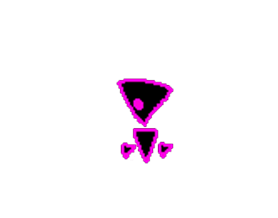
The default virus enemy nothing special, walks along the path and fights enemies, can be beaten easily by most units.
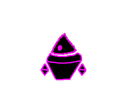
The Brawler virus, its basically the tougher version of the virus unit but not by much.
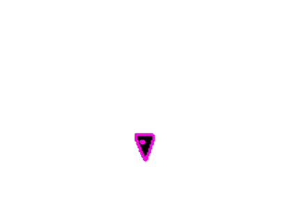
Virus Byte, the weakest virus on the virus faction however it makes up for its low health with range attacks, shooting every 2-3 seconds dealing damage.
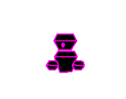
Big virus unit. basically 2.0 default virus unit, it doesn't do zone damage like the brawler would
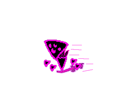
Swifto virus unit. the fastest virus unit with its sword would tear through weak units, its pretty manageable if you have strong units, high speed, high damage, medium health.
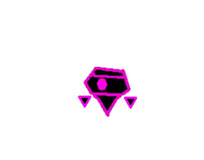
Nybble unit, a unit that's basically cannon fodder can only be summoned by the summoner

Summoner, it doesnt do much but summon Nybble's
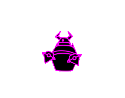
Virus titan is the highest health enemy and highest damage, basically a boss in the game, extremely slow but high health.

Bodier is basically 2.0 brawler with a stronger AOE damage
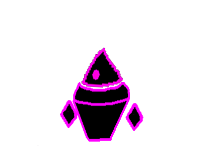
This character is bound to receive a redesign but this is the brute, a slow but high damage unit

The virus base is the enemies base for the virus faction it will sit at the end of the map spawning units, its the players goal to destroy the base.
0 notes
Text
Characters
Ive decided on tower defense/ "tug of war" units

Program units are your support units however most of them cant fight back and will die in the face of any enemy. Its design is simple
Green color has symbolism for good, friendly and innocence which explains its in game role of support.
Circles have symbolism for softness welcoming and more.

Firewall Unit is your attacking unit, they will attack viruses and malware they don't have a soft appearance at all.
Red Color symbolizes danger and fire, it does have the name fire wall it makes sense to be red in this case
the triangle rough edges symbolize threating it makes sense they attack instead of sitting in the backlines being supportive.

Virus is one of two types of race enemies, compared to their other race the malware they are faster and have less health.
The purple color can symbolize corruptions and evilness they don't really have an expression like the Program, the firewall has no expression.
The virus uses cone shapes unlike the triangle the virus has no rough changes giving it a rather unsettling appearance.

Malware is the other race enemy, instead of being fast and low health it is average speed and higher health than the virus.
The malware has a depressive oppressively blue color giving symbolism to sadness and misery. the Malware having a neutral expression
The malware has squares a heavy oppressively shape, a simple but with a whole lot of symbolism, squares can symbolize walls or cells in a prison.
0 notes


