Don't wanna be here? Send us removal request.
Photo

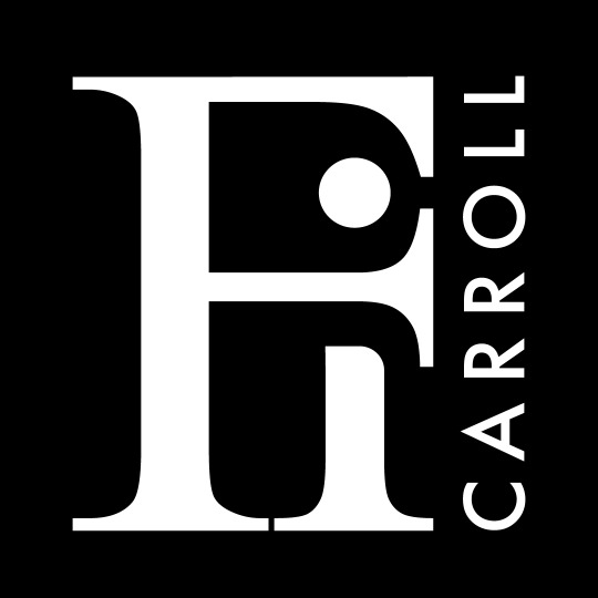
The final logo design for fashion brand Fi Carroll, with a corresponding black and white version.
I’m really pleased with the final design. It’s abstract, yet clean and simple. The Fi interact with eachother and allude to the idea of a hug, which is something Fi has noted their clothes should feel like when worn by someone.
The Fi is written in a serif font which is classic yet stylish, and accompanied by a sans-serif font to contrast and compliment it.
Fi was delighted with the final product and the overall design process from ideation to completion was really satisfying upon seeing the finished product.
0 notes
Photo
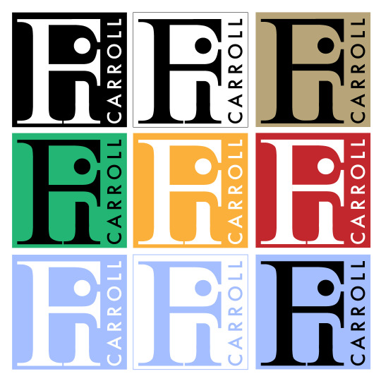
I presented the logo to Fi and they loved it, which made me feel really proud of my work. We both feel that this logo is simple yet sleek, abstract but effective, and has an overall level of creativity to it.
Once Fi was happy with the design, I mocked up some colour examples for them. The earthy tone and green colour version were designed as a nod to sustainability, which is important to Fi’s brand. They felt these colours were too cliché and that their brand is equally about excitement as it is sustainability.
Having explored some other options, we both agreed that the perrywinkle shade of blue was our favourite as it’s comforting to look at yet allows the logo itself to be the focus of the design.
0 notes
Photo

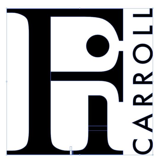
After taking Fi’s feedback into consideration, I wanted to pursue the idea of the F hugging the i, but in a more sleek and stylistic way.
I decided to design the main Fi part of the logo in a serif font, and pair the ‘Carroll’ section with it in a cleaner sans-serif font.
The above illustrations show what the initial font of each looked like before I edited them. ‘Fi’ is written in the classic and timeless Times New Roman font, whereas ‘Carroll’ is written in Futura.
As you can see, I made adjustments to the Fi to make it be more abstract and have the letters intersect with one another:
The curve at the end of the top of the F was straightened (very subtle but effective in my opinion)
The arm of the F (the middle line) was extended to align with the top of the F.
The dot from the i was then placed in between the top and the arm of the F, to achieve that hugging effect.
The top of the base of the i was cut off and I adjusted it so that the curve would align with the curve on the arm of the F.
The serif base from each letter were overlapping so a small divider was added.
The space between each letter in ‘CARROLL’ was widened to align with the length of the F.
0 notes
Photo

The initial options I presented to Fi to gather their feedback on which logo they preferred and what they liked or disliked about each.
They felt that the first logo was the strongest as it’s interacting nicely with the F and has an abstract feeling. It isn’t incredibly obvious that it is simple F i lettering, until you look at the logo for a second and question what it is. This concept of the F surrounding the i was the main thing we both wanted to pursue further in the design,
The second and third options, while abstract, were a bit cold and clinical for a vibrant fashion brand.
0 notes
Photo

Some font exploration to see what might work and what doesn’t work in terms of editability to make the F and i intersect or interact.
0 notes
Photo

My initial ideas for Fi Caroll’s logo roughly sketched on graph paper.
The main thing I wanted to incorporate to make this logo abstract but intrinsically Fi was to make the F and i connect or interact with one another. The F should almost hug the i, a nod to how wearing Fi’s garments feel.
0 notes
Photo


Some logo examples from brands that Fi said they liked and felt inspired by.
These logos are not particularly abstract, and generally just focus on portraying the brand name effectively. I appreciated that Dries Van Noten got creative by entangling their D and N to create an icon above the text.
0 notes
Photo
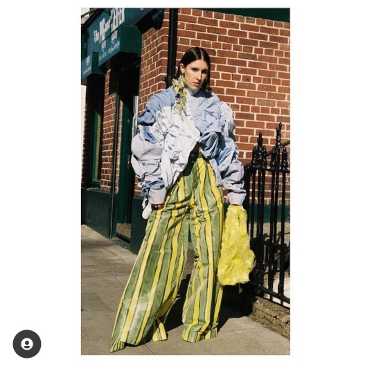

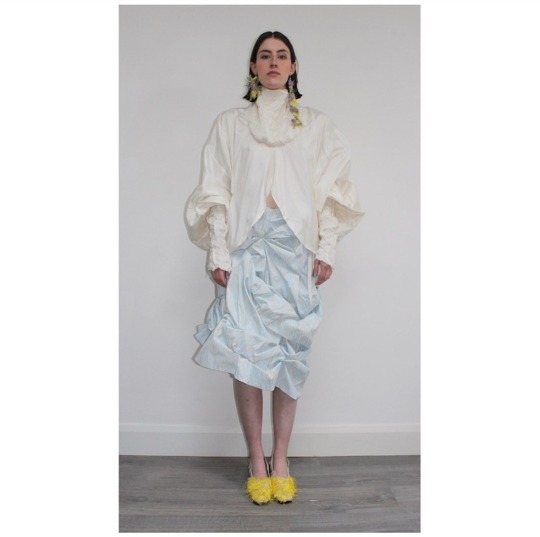
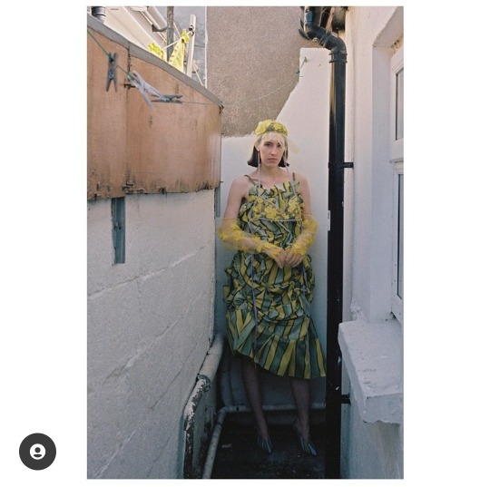
Examples of Fi’s fashion garments which incorporate upcycling, practicality and fashion. The logo needs to be cohesive with the aesthetic and vibe of these clothes.
Credit: @ficarrollstudio on Instagram.
0 notes
Text
Examples of moodboards Fi created themself to illustrate the personality of their brand - creative, sustainable, fashionable.


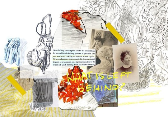
Credit: @ficarrollstudio on Instagram.
0 notes
Conversation
Initial Branding Interview
Q: How do prospective clients hear about Fi Carroll?
FI: As I am still such a small, early-stage brand; people mostly hear about me through Instagram - both my own account, and when my work is used by stylists, featured in articles or shared by customers and people who admire my work.
-
Q: How does Fi Carroll impact the lives of your audience?
FI: I try to create clothes and accessories that “spark joy”: that my customers not only love to look at but love to wear. Ideally my clothes should change how they feel when they put them on, transform their mood or make them stand a little taller. They also have practical design elements that improve their functionality such as high-quality linings, extra pockets in useful places or gloves with touch-screen compatibility. As such, my customers always reach to them in their wardrobes. The clothes are a joy to wear with bright colours and excellent textures, some unexpected or humorous elements and they spark conversations.
-
Q: What do you do better than other fashion brands?
FI: I never compromise function for form - it has to be great to wear throughout the day, not just look great in photos. This is achieved through the practical elements I’ve mentioned above. My personal philosophy is that I “never wear a shoe I can't run for a bus in” - and this translates into my designs. They are also very high quality and exceptionally well-made so they last for a long time. Sustainability is essential to my brand and I refuse to compromise on my environmental impact to make something that just “looks nice”; and vice versa. I reuse vintage and secondhand materials, and support this through responsible choices for new fabrics e.g. digitally-printed fabric made from recycled plastic bottles, or organic cotton.
-
Q: What do your customers love (and/or dislike) about Fi Carroll?
FI: People admire my commitment to make clothes as responsibly as I can, and that I am constantly improving on my practises with this in mind. They also like the fact that they are often getting something completely one-of-a-kind made with vintage materials that have a story behind them. Also, aesthetically my clothes are quite outlandish, colourful, fun and unique compared to other other “sustainable” brands on the market (which can be a bit boring).
-
Q: What do you WANT your customers to love (and/or dislike) about Fi Carroll?
FI: I want them to love the colours, prints, silhouette and textiles that make up the overall “look” of the clothes; and how they feel when they put them on. I also want them to “believe” in the brand and to love the fact they are buying into something that is responsibly produced. They can know the full story behind the production of the pieces (where fabrics were sourced, where it was made, who made it). It is important customers love the fact they are buying something locally hand-made to the highest quality they will have for a long time.
-
Q: Why was your company started?
FI: To express my own idea of fashion, and create clothes I didn't feel existed in the current market.
-
Q: What beliefs and values are tied together with your brand?
FI: Sustainability and responsibility are essential to the brand, while practicality, colour, textile and personality are essential to the clothes.
-
Q: If your products were a person, what kind of person would they be?
FI: Fun, confident, one-a-kind, you don’t know anyone else like them, they say they’re not coming out tonight and then show up two hours later wearing elbow length gloves and ostrich feathers, always have an umbrella, pain killers, plasters, a charger in their (very gorgeous) handbag
-
Q: Who do you want to attract?
FI: Confident people with a strong sense of personal style, who love clothes but value sustainability and shopping responsibly.
-
Q: Who don’t you want to attract?
FI: Teenagers, wallflowers, straight men (!)
-
Q: Describe Fi Carroll in 3 words.
FI: Eye-catching, practical, unique
-
Q: Who are your competitors?
FI: Within Ireland, small brands at my level that I compete with currently include [redacted], [redacted] and As I grow and expand, I would ideally like to see my clothes positioned alongside the likes of Marine Serre, Dries Van Noten and Chopova Lowena. Brands that incorporate reuse or upcycling alongside chaotic print, colour and textile design.
-
q: Which competitor brands do you like, and which do you dislike?
FI: Aesthetically, I don’t particularly like [redacted] or [redacted]’s work, but we have aligning principles. The brands I would most align myself with both aesthetically and in terms of values would be Marine Serre and Chopova Lowena. With Dries Van Noten, I love the way the clothes look but they don't have the same dedication to sustainability etc. In the more immediate future, I‘d love to be stocked in Om Diva on Drury Street and eventually internationally in the likes of Liberty, Browns and Dover Street Market.
0 notes