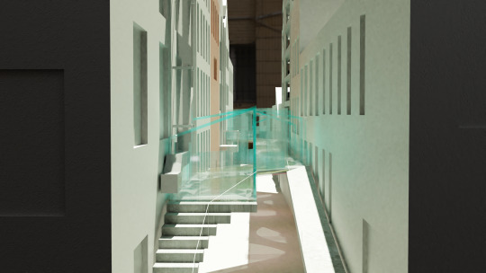
Photo


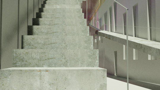
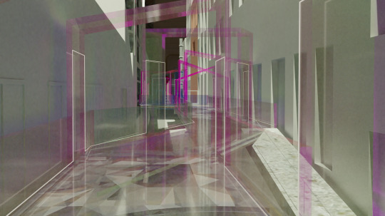
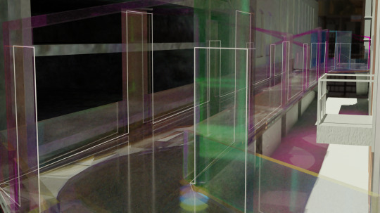
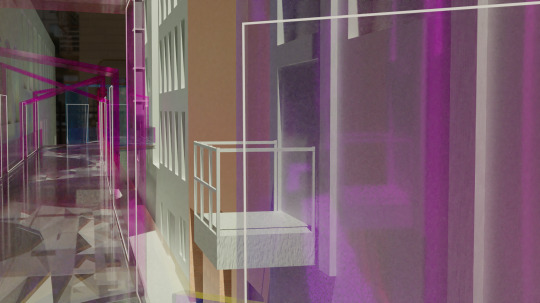
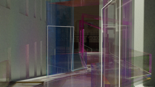
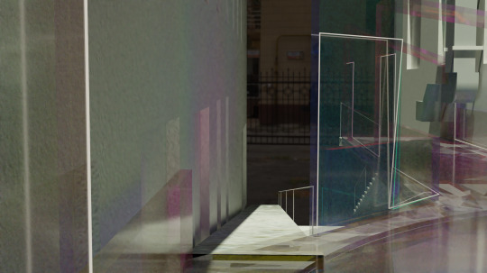
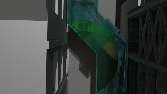
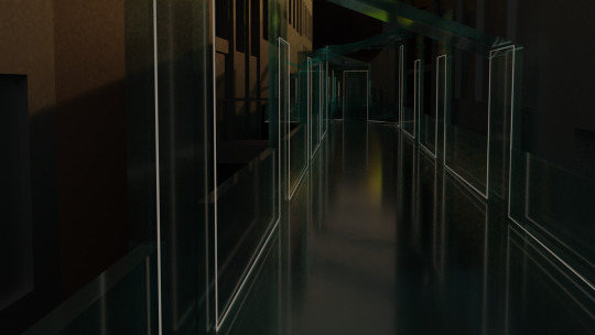
storyboard showing a journey through the site with figures
0 notes
Photo


a plan and an exploded plan, showing both layers of my concept
0 notes
Link
an animation of my concept reaction to the lighting conditions during the day
0 notes
Photo


Abstract images I took of the dichroic film
0 notes
Photo

an axometric showing the many parts of my concept
0 notes
Photo

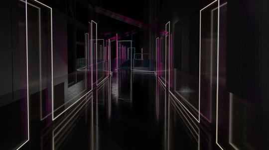
the same part of the walkway during the day and during the night
0 notes
Text
Dichroic glass vs film
The dichroic effect can be achieved with dichroic glass as well as a film which covers glass or acrylic. Acrylic is stronger and lighter than glass but it scratches easier. In terms of a public walkway, acrylic works better and the dichroic film will help resist scratching.
0 notes
Link
A simple animation of a car driving under the bridge at night
0 notes
Photo
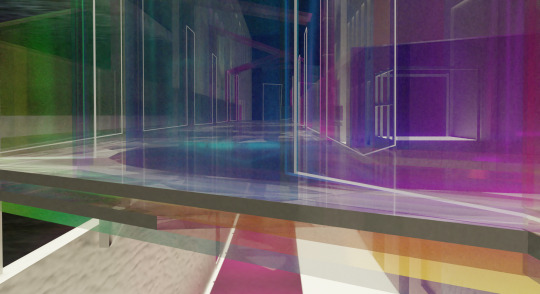
Research into cinematic colour techniques say that warm colours convey happiness on film. Dichroic film changes colour in different lighting conditions and so warm lighting cannot always be guaranteed. However, because this film reacts to the different lighting conditions of the site, it makes for a more dynamic material.
Different lighting conditions in separate areas and the different materials give it slightly different colours and looks.
0 notes
Photo
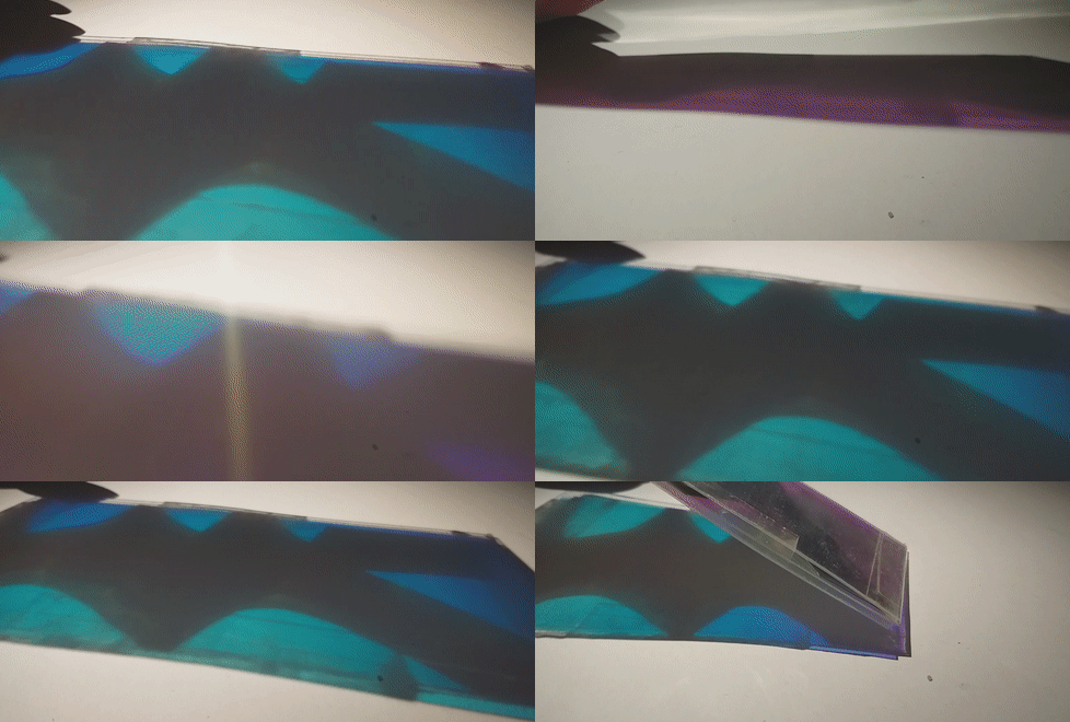


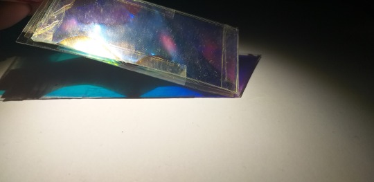

Using the same metal sheets as before, I then experimented with thin acrylic covered with dichroic film. The exact same film in different lighting conditions make it seem that it is different colours. This material seems lighter (in terms of weight) than the acrylic did and the shadow through the perforations are more clear through the dichroic.
0 notes
Photo


Sticking with aluminum panels to create the perforations layers, I experimented more with the glass layers. Using metal perforated sheets, I experimented with coloured acrylic and lighting and seeing what this could look like and what effects this could create.
0 notes
Photo


Originally I was modelling my concept with glass and wood, based off my surface design, but through the co-design workshop, it became apparent that it may not be the best material. With the two above materials, they aren’t really seen already existing in the site, so it is not grounded to the site. The glass will definitely be part of the site for lightness in terms of the opposite of dark and heaviness, but the timber can be changed.
Frank Liu suggested using aluminum panels instead of the timber as it relates to the almost industrial-ness of the materials already existing in the site.
0 notes


