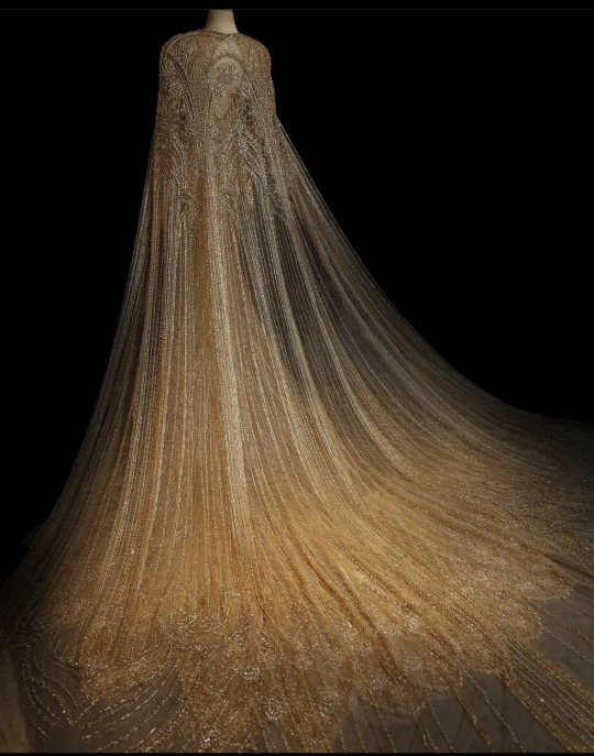
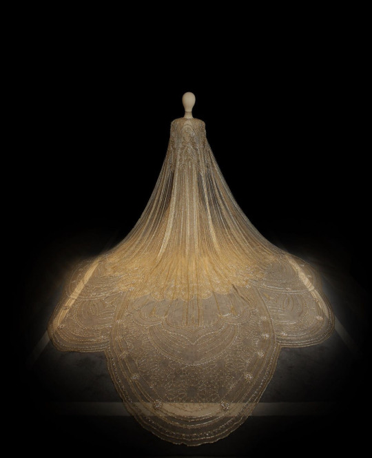
Home of staring off to the left against a white background
Last active 60 minutes ago
Don't wanna be here? Send us removal request.
Text


More vtm! My Storyteller commissioned me for some of the npcs from our anarch game
2 notes
·
View notes
Text
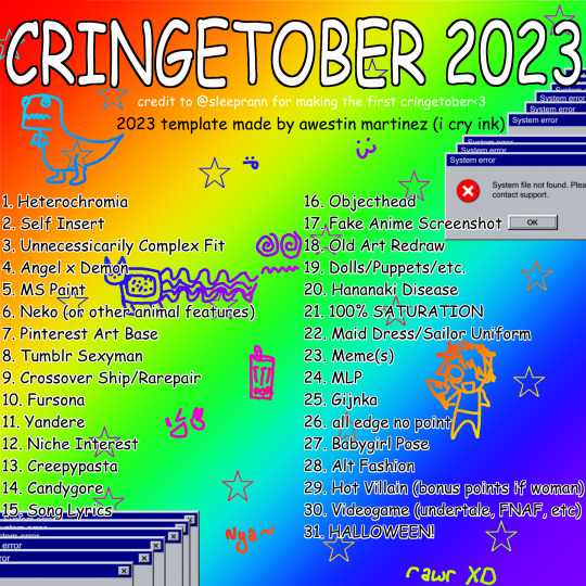
WELCOME TO CRINGETOBER!
I wanted to post the prompt list a month in advance so people have time to work on it :)
There are no hard rules; it's just a fun art exercise to draw things that are considered "cringe" by popular culture. Don't stress if you miss a day!!
Even if you don't participate, it would mean the world to me if you just shared the prompt list because it took me a while to make it lol.
I hope you have fun with it!!!
26K notes
·
View notes
Photo


comm portraits of my coterie members for an game uwu
20 notes
·
View notes
Photo
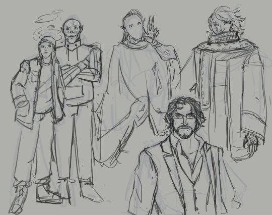
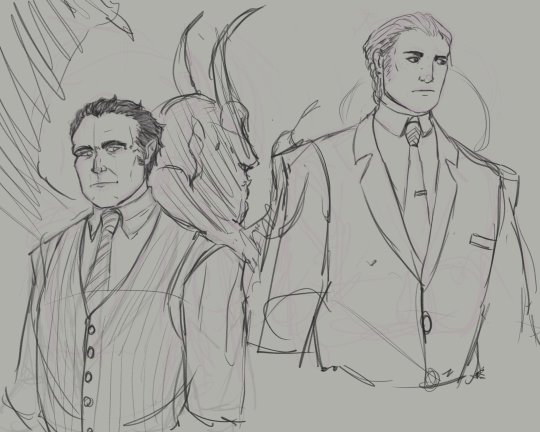

NPCs from my VtM games I scribbled while sick + my pc uwu
0 notes
Photo


my only consistency is i will never ever settle on a character design sketches for a vtm game im in - my beloved gargoyle
2 notes
·
View notes
Photo


dnd characters for a friend - bait and goat u will always b famous 2 me
0 notes
Text
its going to take Awhile to clean up old pics off this blog so dont mind the mess if you end up here Mainly will be an account for art exclusively
0 notes
Photo
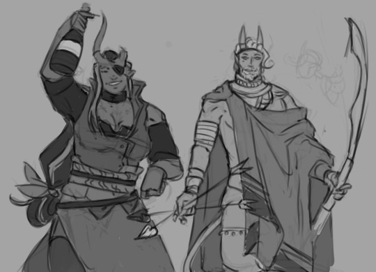
Gutting my old art blog and I found these unused designs ;-;
0 notes
Text
i hate that every time i look for color studies and tips to improve my art and make it more dynamic and interesting all that comes up are rudimentary explanations of the color wheel that explain it to me like im in 1st grade and just now discovering my primary colors
151K notes
·
View notes
Photo
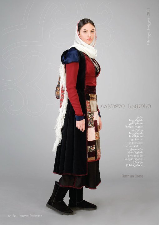
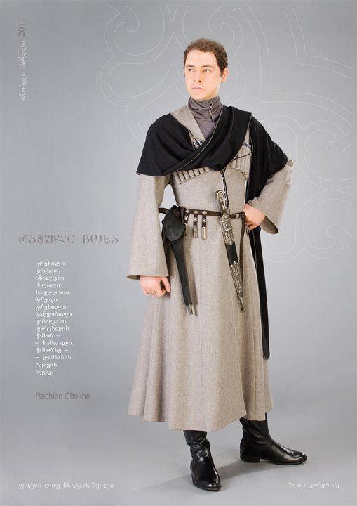
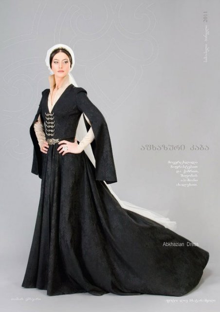
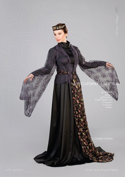
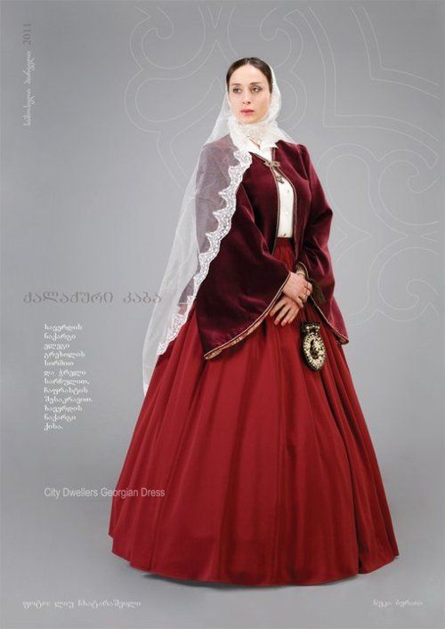
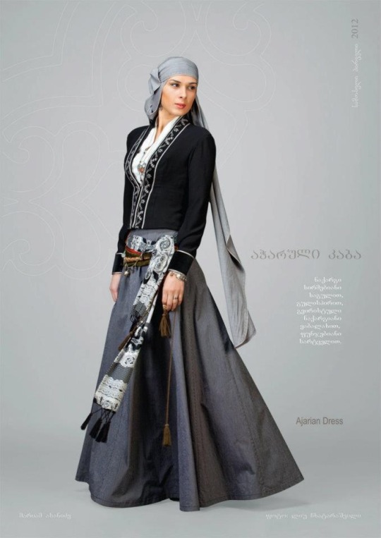
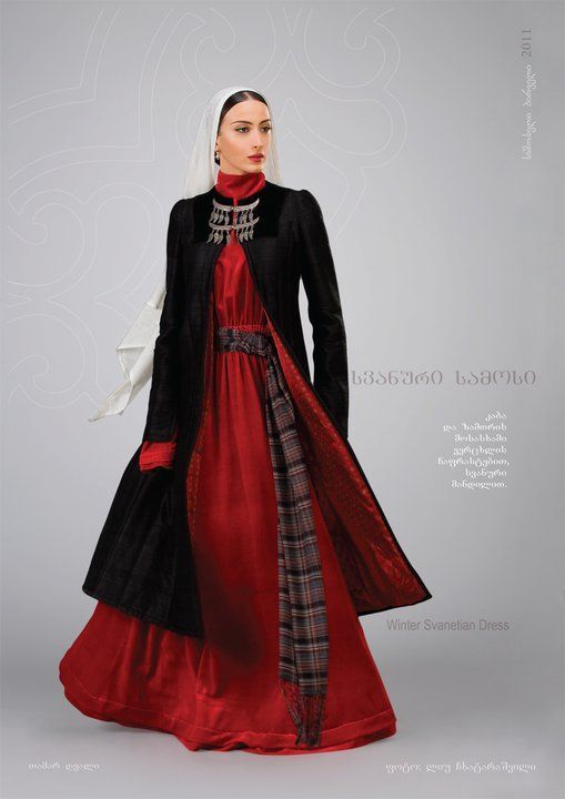
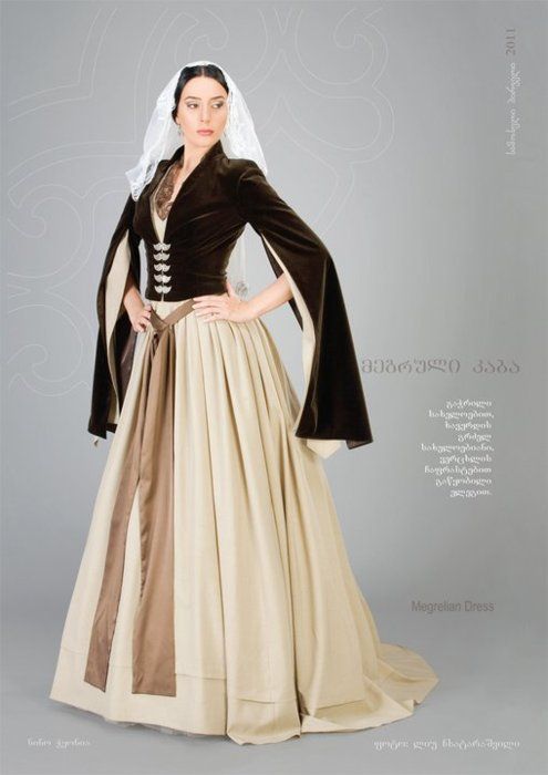
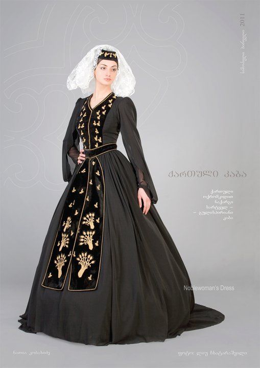
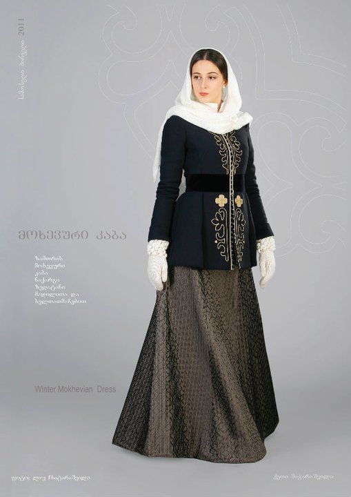
Traditional Georgian costumes by Samoseli Pirveli
3K notes
·
View notes
Note
I know you use emojis for inspiration for your angels but how did you get started on drawing them? I’ve been trying to figure out how to do it because it looks epic but the designs are either too close to the source or I unconsciously draw someone else’s design.
NEZ'S GUIDE ON HOW TO TRANSLATE OBJECTS INTO DESIGN ELEMENTS
These aren’t design rules, just my own approach to what I do.
After picking the object, the first step is to break it down to its main elements, pick what of those will be your main focus, and decide what you want to be conveyed.
The emoji mashup bellow has 3 hearts in the center, circled by several tongues. That's both the breakdown and the focus. There is a circular shape in the background, but that’s where it’ll remain; as a background characteristic. What do you want to convey? Basic shape language works well. I wanted this design to feel safe yet serious. So squares and circles it is.

Same method applies when there’s several emojis involved, although there’s more breaking down to do. Horns from the devil emoji, long white hair from the old lady emoji, eyes and whiskers from the cat emoji. Now, that is not enough to make the design but it’s well enough to be the elements we want to focus on. I want to design to be sharp, so every other design element should be there to enhance that feeling without stealing the spotlight (the armor, the sword, the spikes/blood, the wings. Look how sharp the shoulder blades are in comparison to the previous design)

In both cases, you pick the focus and work the rest of the design in a way that enhances it and follows the shapes (round, sharp, square, etc) you've chosen.
‘’The designs are too close to the source’’ When that happens, instead of breaking down the elements you should focus on describing them. Take a rose, for example. Don’t write flower with red petals. Write that you’re looking at something red, voluminous, layered, with uneven patterns, small spikes, green ovals (the leaves). That way you can take the elements that build the original object and apply them to your design. There will be a connection, but not an obvious one.
‘’I unconsciously drawn someone elses design’’ If only I had a dollar for everytime someone compared my angels to Shin Megami Tensei or Persona, even tho I didn’t knew about the game's designs prior to drawing. It will happen, don’t take it too personally. There is a way to TRY and bypass it. That is, don’t look at other character designs while working on your idea. Take your inspiration from nature, from historical/cultural designs (Instead of searching ‘knight’ on artstation, search 1800 medieval armor on google. Historical references are amazing) and from objects (dont google cyber-person, just search for your favorite machine as reference. See how the inside of your fave phone looks like). Take what you find and break it down like I did above.
LET'S TRY IT TOGETHER
I picked a rose; vague and simple enough. When there’s seems to be not enough elements to break down (flower, petals) and you don’t want it to be an obvious rose, you can do it by describing it.
Breakdown; red, voluminous, layered, uneven patterns, thin spikes, green ovals.
My focus: red, uneven layers, spikes
What I want to convey: Sharp, unnerving, uneven, organic. Like a big bad plant that has flesh and it's messed up

1. I wanted to incorporate spikes into the design. Googling spiky armor made me find the best reference of all; siberian bear hunting armor.
2. The headpiece was one of the last designs to be made. Several versions playing with spikes and rose sepals were made, but discarded. I left it alone until the following day. Take a break frm your design if it's not working. Also, if it's not working after the break, remove it altogether. The first design (3) has no face mask, just a grade of metal shaped into flowers covered an otherwise hollow space inside the helmet. I filled that space with flesh in the angel one, tho!
3. Before designing an angel, I designed a knight version. The focus here was volume, drama, red. Hence the massive dress whose layers resemble rose petals. For angels, I need to have a less 'fashion design' and more of a 'creature design' approach. Here we go
For the angel, I removed the dress and added legs, with armor resembling the arms; wavy and layered at the top, spiky at the bottom. Left an opening in the middle to add reds. While it’s difficult to tell in the concept art, the idea is to have layers of flesh rolled together in rose-shaped bundles. At the thighs and the torso. They’re connected by veiny, fleshy bits. From that, emerge the wings. Small but fleshy. The idea is to convey that something lives within the armor, whose shape we can’t understand. I love adding organic matter inside the angels. No need to work hard on the halo, since the crown is already round and around. Here they are, rose inspired but without a single obvious rose.

Wake up babes NEW ANGEL dropped, would yall let them tend to your garden yes or no
1K notes
·
View notes
Photo
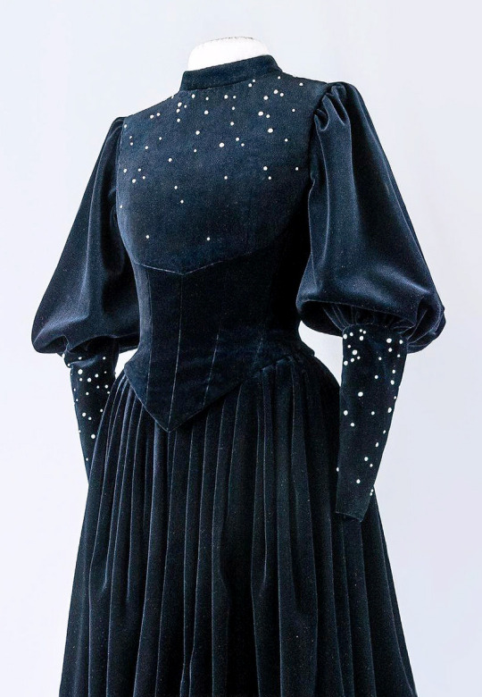
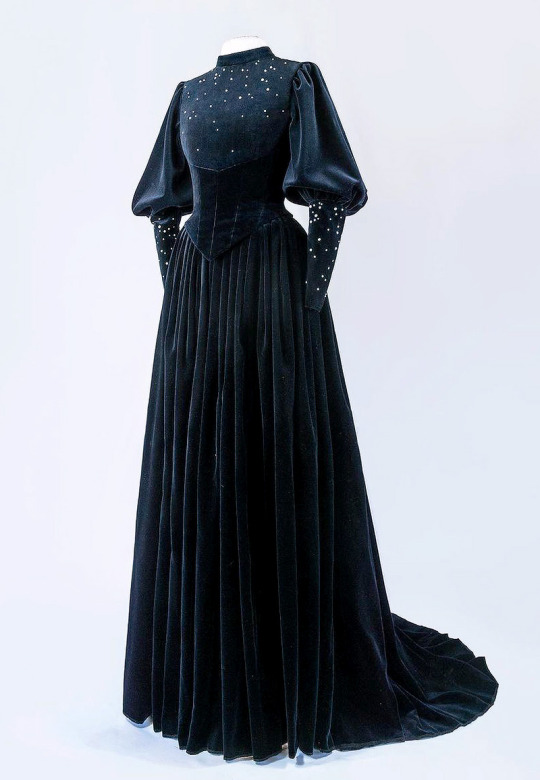
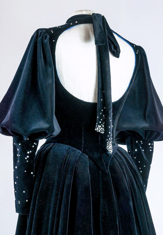
Favourite Designs: Frieda Leopold ‘The Witch’ Haute Couture Gown [x]
28K notes
·
View notes


