Don't wanna be here? Send us removal request.
Text
Week 13
This week we had our presentation and were able to complete our module before presenting on Wednesday. The clay unfortunately did crack a lot which was to be expected as well and some of the branches were knocked off so we had to glue these aspects back together which was quite easy thanks to Arlo's hot glue skills. Arlo was also able to make a net-like structure for the back of the module and the roof which made me add more rope to our budget. I thought that perhaps in the project we'd rely on rope for structure a lot more than initially thought. We then used green paper and paper straws to create ideas of tube stock plants. These miniature plants worked well within the module.
Overall I'm really happy with how this latest iteration turned out and how it has improved since the last module. The last module is still used in the presentation for the visual effect of closeness making a sense of cosiness.
Presentation: After adjusting the budget for the rope and insurance, I worked on the plant index. I used the Griffith app called GroNATIVE which suggests lots of native plants, for certain areas. This means that we are using plants that originally were made to grow in the Victoria Park area which I found super helpful. The index features 50 plants with 11 specific species. This aims to make sure that the park will be able to plant similar plants together for a cohesive planting.
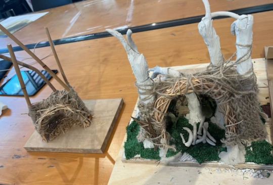
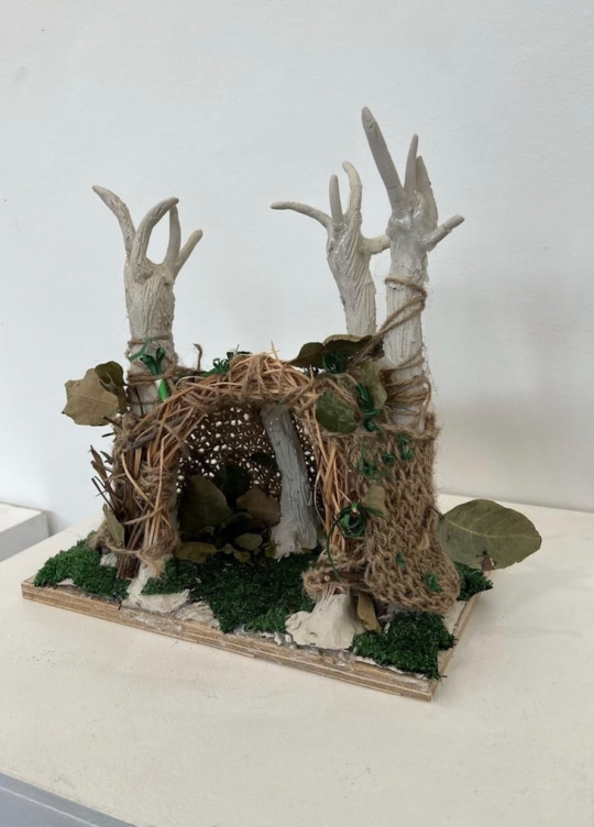
I'm really happy with our final presentation for this spatial art project. Arlo and I worked will together and were able to problem-solve and think through each step of our assessment. I really enjoyed the fair's premise, and what they are trying to give to the community. Our work aligns with many of their thoughts and ideas.
0 notes
Text
Week 12
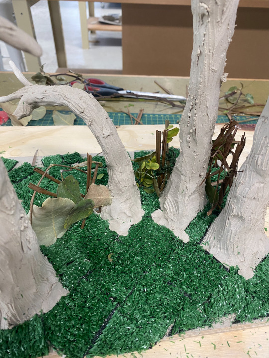
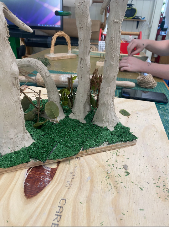
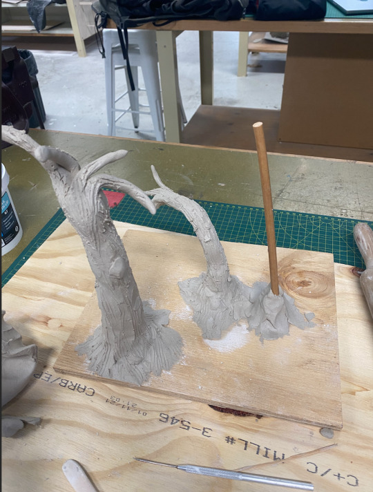
During this week, we discussed a new module on a larger scale. I worked mainly with the clay to make the four grouped trees. These were given structural support with sticks. I really enjoyed using the clay and was happy to get back to more physical labour within the assessment.
The clay created a better texture for the trees instead of plane sticks and gave dimension to the work which our last module lacked. As I worked on the clay aspect of the work, Arlo began the archway structure.
Unfortunately, I did not have the time or capacity to create full-scale trees, I compromised by creating sculptural lines suggesting the idea of branches.
After creating the trees and branches, we added astroturf at the base, attached by clay mainly.
0 notes
Text
Week 11 - Presentation Week
During week eleven Arlo completed two digital renders of the project and then we both considered the logistics of our project together.
I think we both realised we went into the art-making process and just made what we wanted, we did discuss the effect and general hopes for the project however we did not yet think critically about the work. As we began our PowerPoint, I focused mainly on the rational and material analysis.
Our Initial draft of both:
Rational:
Our project created for ‘Regenerate: (Victoria Park/ Barrambin)’ aims to create a calm and mystical space for people to pause during the busy ‘Green Heart Fair’. As artists and practitioners, we hope to envision a place that reflects the beauty that Victoria/ Barrambin Park has to offer to its daily users. When we initially visited the set the sense of serenity and sanctuary was a core part of the site. After finding four trees that are grouped together we find a reflective understanding that we need a green space to promote positive mental health. We aim to use 80 percent recycled matters of green waste donated by the park and other recycling centres. This will extend the natural life cycle of these materials. With a key need to form regenerative practices within the arts, we hope to plant tube stock in the ground for the duration of the event to then be transplanted to necessary areas of the park. This aims to prolong the artwork as these beautiful native plants last long after the exhibition.
Material Analysis:
Green Waste Materials are everywhere around the world, it is composed of most pruning or landscape waste. By recycling green waste correctly, it gives communities an opportunity to decrease, unusable landfill, and unwanted gasses. Recycling and utilising these materials allows to extend the lives of green waste before it is turned into compost, shredded, or used as mulch. After these materials are used within the artwork itself they can be returned to green waste centres to further it recycling process. With this in mind over 26 percent of household rubbish is green waste, during this Green Hearts festival we aim to remind people of the need, for seemingly useless weeds.
I really enjoyed the beginning research of understanding the large-scale effect we are trying to have on viewers. Drawing attention to the recycling of green waste and the key need to recycle properly as well as the idea of mental health and taking time away from the business of the world or in this case the festival.
After our presentation, some key consideration we need to take to further our project is:
Considering the traditional owners of Australia and how they impact the site and work.
We need to place softeners underneath the rope to protect the trees against markings and harm.
How will the audience interact with the work and how do we protect children, especially from climbing on the work? A suggestion was to have people monitoring the work during the festival.
Adding insurance costs to the budget
The strength of the artwork during the festival.
Making it clear in the concept that we plan to begin the art-making process earlier than the festival in terms of weaving sections for easy installation
I was really happy with how our presentation went and how we linked our work to two other artists Will Beckers and Patrick Dougherty (who I talked about in my last assignment). I think it was important for us to contextualise the work within the art world and other art practices. I know Arlo and I wish we could make something just as grand and vast as these works.
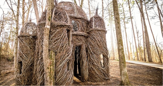
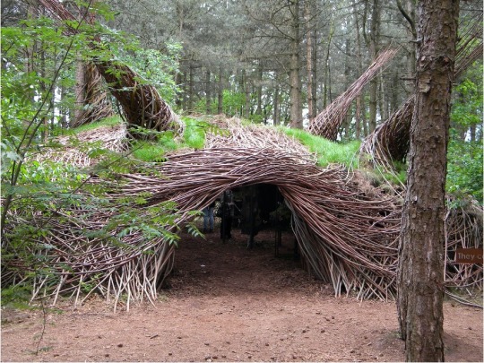
During next week we aim to start a new iteration and talk through the questions raised after our presentation.
0 notes
Text
Week 10
This week I began on an Adobe Photoshop image, I'm still working on my Photoshop skills so it generally takes me a lot longer to achieve a final outcome. As I began to photoshop my aim was to create cheerful and lush imagery which is lacking in our physical model due to using materials of beige and brown.
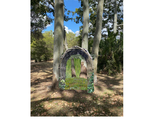
The image above was created with five key images aiming to produce an idea of the general shape and structure of the work. Arlo and I have agreed on a key arch for our hut-like sculpture as well as a bed of native flora. The added ground image is of an Australian grass meadow in Queensland. In creating this aspect of the work, I have realised that we need to make a native plant list for the project for the budget as well as the final feel of the work. Due to Australia's natural plant diversity, it is important to properly research these plants. This makes sure, plants won't hurt audience members (prickly plants) as well as making sure the tube stock has a good survival rate for the area. The area we have decided to create our project in is partly shady and will be quite dry during summer and autumn so it is necessary to find plants that will live in these conditions. Continuing on the photoshop: After rendering this entail image it was clear to me that the roof I had initially placed on the image did not serve the image correctly. I wanted it to present an idea of enclosure and safety but instead, it looks out of place and disconnected from over areas of the image. After chatting with Arlo I removed the roof and they taught me how to use the blur and clone tool correctly. This really helped me create a more successful image without the hard lines of imported imagery.
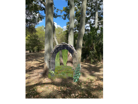
I'm really happy with the image created and I think it does help display our hope for the completed project. I do understand that the walls of the hut (around the tree in the back of the image) are very vibrant. If do this project it is more likely these areas will end up a lot more muted due to the use of drying/ dried leaf matter. The point I am trying to make in the image is the effect of the work towards its audience, a place of rest and imagination.
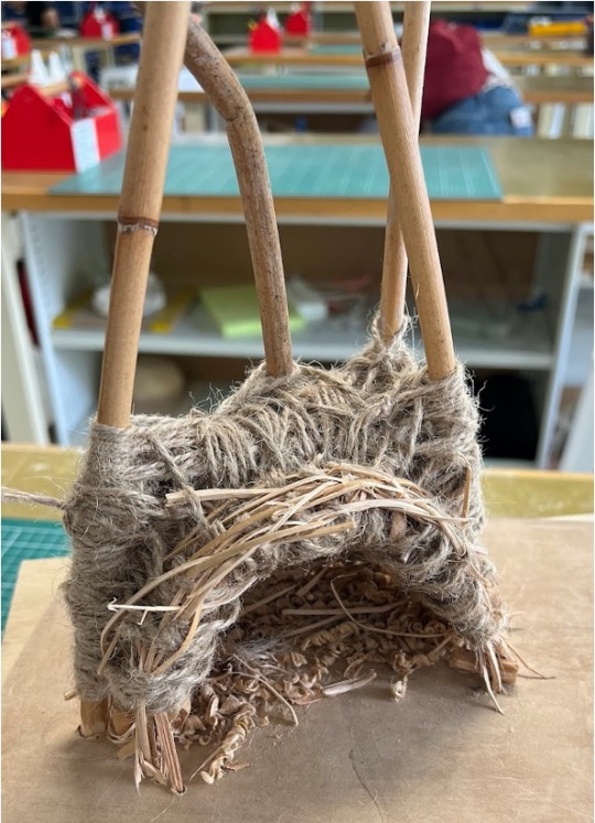
During the last week and a half Arlo and I finished the physical model of our spatial art project. In our next iteration, we hope to ignite a sense of life and vibrancy within the work as well as adding the idea of native negotiation.
0 notes
Text
Week 9
This week, Arlo and I's goal was mainly to morph individual ideas together. We both drew up an initial sketch for the projected placed in the space we decided on last week.
We both enjoyed each other's sketches, Arlo employed more weaving than I initially expected and I differed mainly with the idea of plants on top of the structure. We both agreed on the idea of an arch to welcome people to view the structure organically and that plants seemed important for an ongoing effect to the work (that it could continue after 2 weeks).
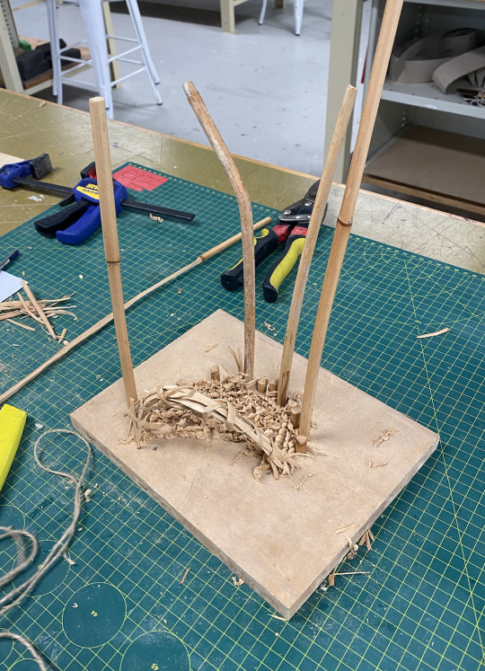
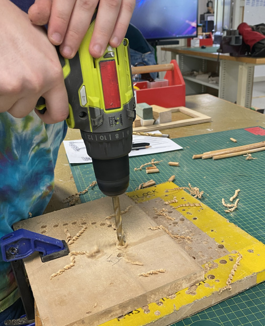
After the initial steps, we began the model. We used three sticks of bamboo the create the idea of the four trees and created a bed of saw dust.
I think this is taking our project in a positive direction for the coming weeks and our first presentation.
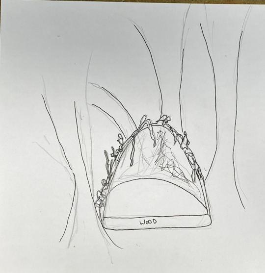
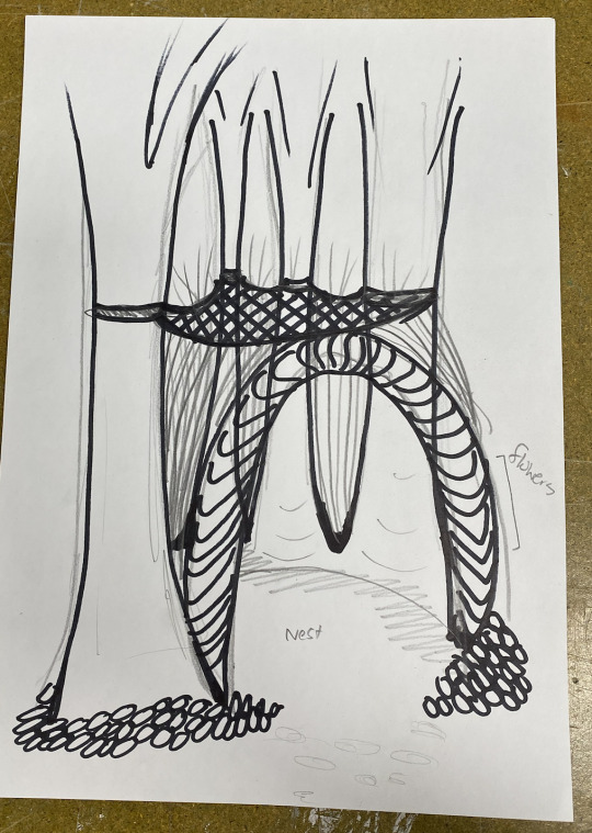
Conceptually we are considering how in places of intensity and masses of people, we need places of serenity which is a reflection of what the park brings to people. Seeing it as a place of rest and calm and hopeful sparking ideas of hope and imagination.
0 notes
Text
Week 8
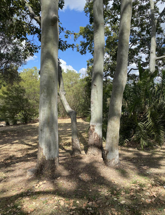
This week, I went on the walk/ guided tour through Barrambin. This was actually my first time seeing all the areas the festival uses as when I went on my own, I was on at the other end of the park. It was a very beautiful walk and the wind/ breeze was just as calm and beautiful as my last visit. We all met our clients which was very exciting as it put into perceptive that what I make could actually be shown in the future. As I viewed the park, I actually realised quite quickly the lack of trees in the area, there were not many well-developed trees but still enough to have some shade on a hot day. When asked about their planting needs they stated that their plan is to make the area full of natives and increase the amount of plants within the park. When considering what my project could give back to the place, I realised how I wanted tube stock of native plants to be a key part of the work. I am very invested in maintaining and increasing native flora within the home. I regularly look at new plants to see if the council has planted natives. When talking with my team member (Arlo) we both decided that we wanted a place for participants to rest. We want to use recycled flora/ green waste from the area and create a hut for people to connect with. The top would hopefully hold saplings of native plants or we would potentially plant around the structure with this tube stock. We are both invested in the world around us and agree that this aligns with the client's values. This was the space we decided on: I think a key reason why we chose this spot is the closeness of these four trees. This will allow for an easy way to create around it through weavings, due to this closeness.
0 notes
Text
Week 7
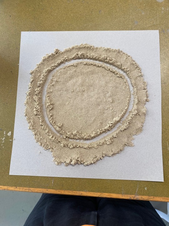
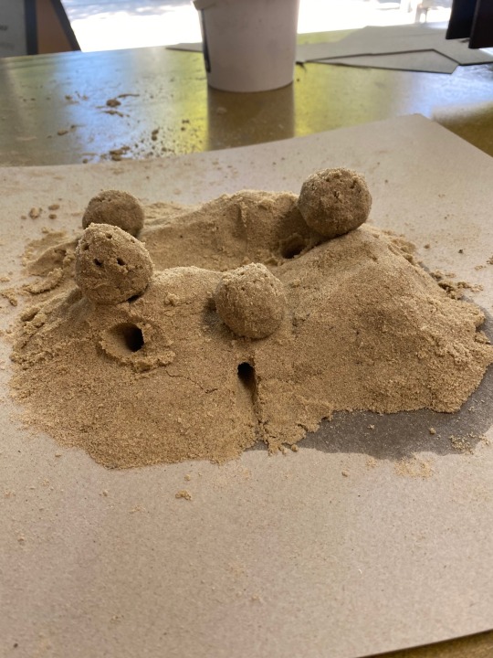
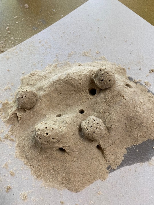
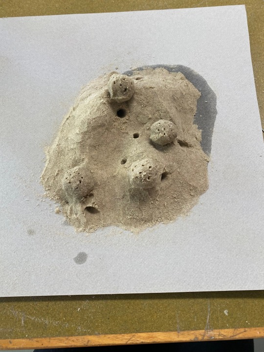
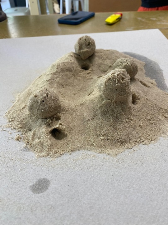
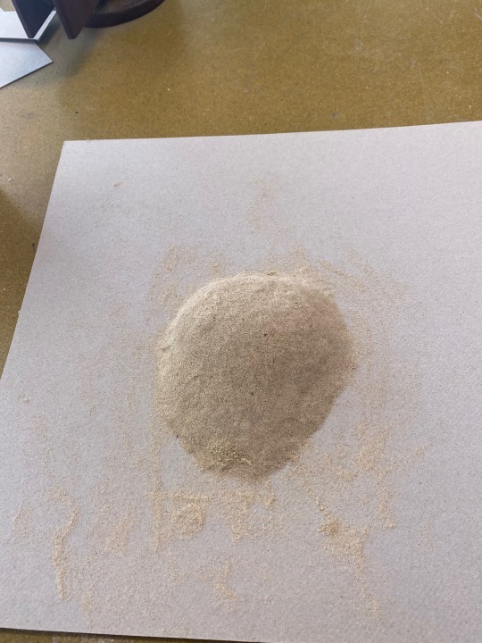
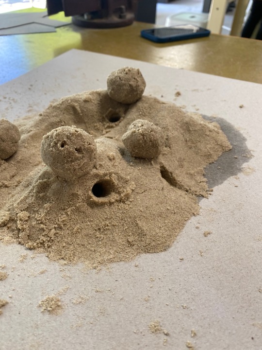
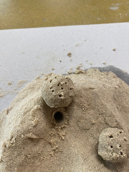
I really enjoyed looking at my partner's ideas for Barrambin Park form assessment one, it was interesting to see a more architectural approach from Nora. Her work was extremely interactive and I found similarities in my own work for Barrambin. This also allowed me to consider how my own sketch in some ways did not align with my own interests in spatial art. I am more drawn to the homes and safety you can create within a work. Key artworks such as Dwellings and Glen II, remind me how drawn I am to safety in nature. When doing the individual task as a module/mock-up for a small idea for Barrambin. I considered how I could make sand sculptures that would be homes for imaginary worlds. I was specifically drawn to the idea that children at the event could make homes as well and play within the sculptures. This work would be important to spark imagination within the viewer. I myself imagine four villages that all connect in the main valley. They all live underground with sunroofs connecting them to the sky. They would be all kind to each other and offer each other different resources. I really enjoyed this activity, it was nice to just work with the sand, reconnecting with my younger self and letting my imagination guide me through the creative process. I really enjoyed the texture of the sand and how it creates a direct link towards the ocean. Creating a sense of calm within the work and perhaps safety for the viewer. Working with the sand reminded me how fragile sand is even mixed with water as the work broke five times within the hour I was working on it. Initial responses: I liked the forms and line work within these pieces but to me they lacked the whimsical feeling I was trying to create.
First three images are final work, rest are progress images:

0 notes
Text
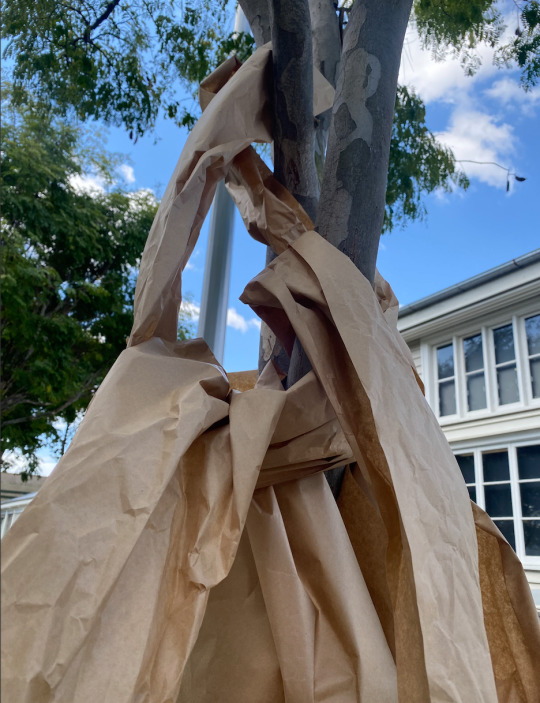
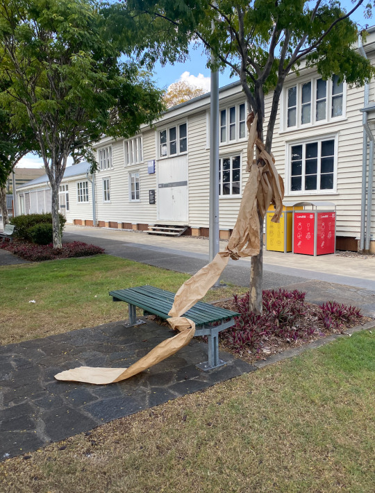
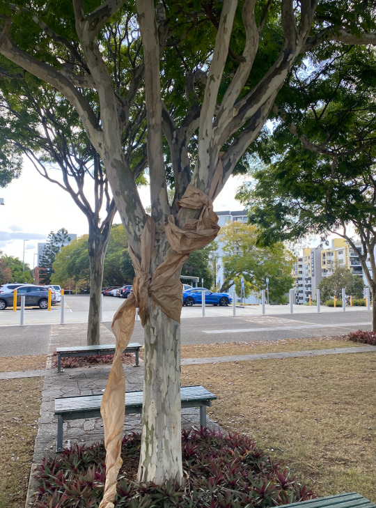
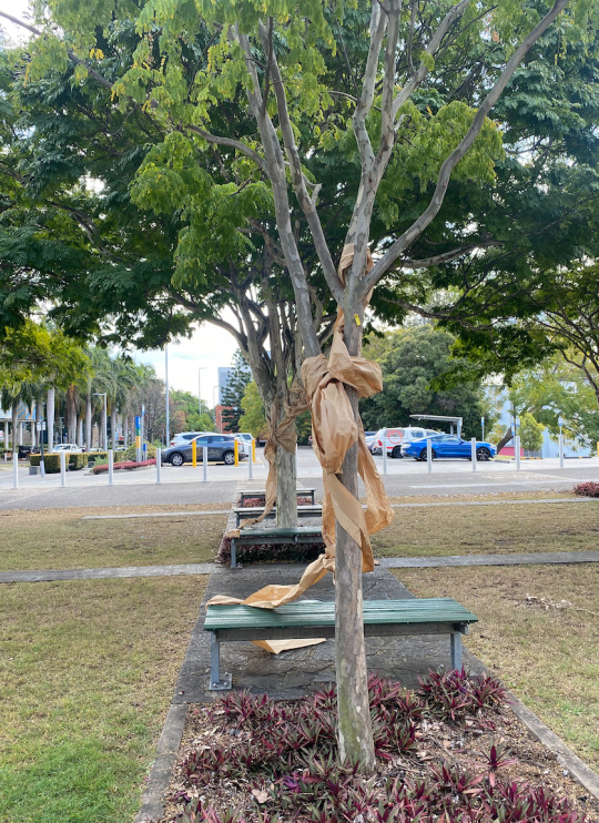
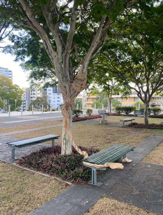
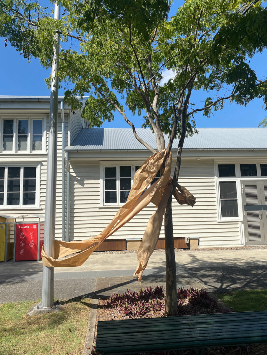
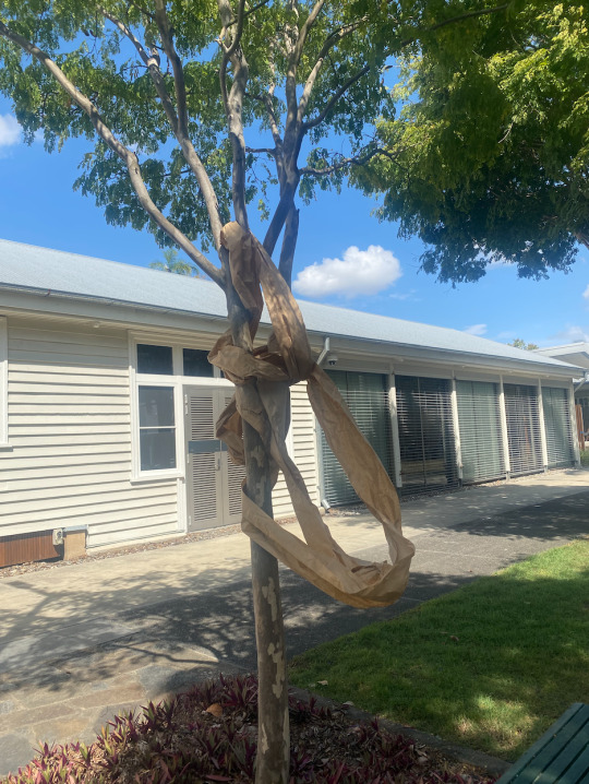
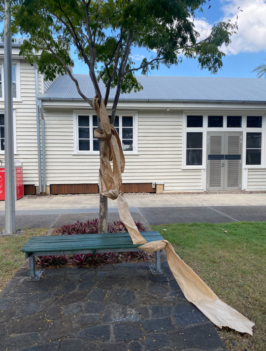
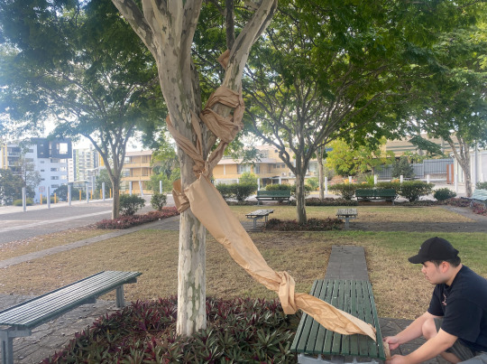
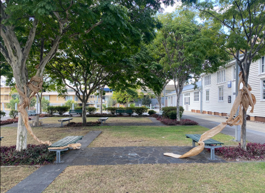
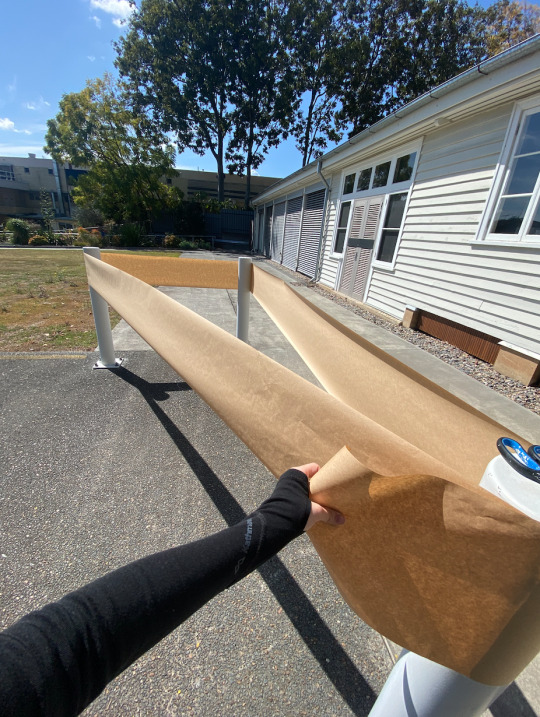
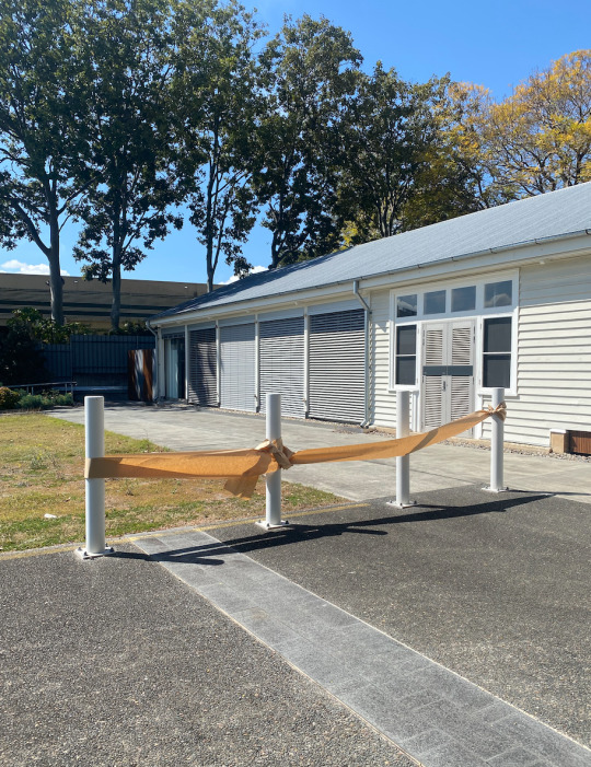
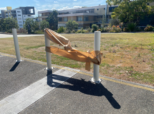
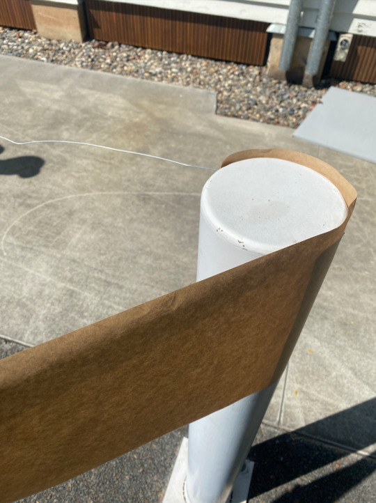
Week 6 Task 6 - Group Task
Nim Chin - Class partner.
Our word - Material Hazard
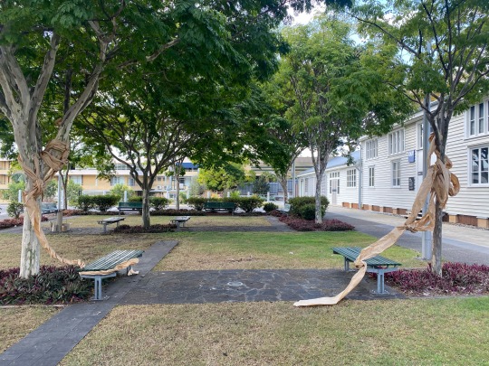
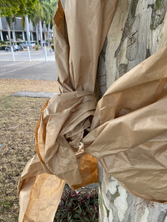
At first, we really struggled to create a finalised product. Initially, we wanted to use the white pole structures that surround the grounds. We decided to work intuitively and grabbed some wire and paper. The leading idea was that a material hazard could be a material blocking access. We wrapped the layer between three poles and fastened the work with wire with the use of small holes in the metal poles. After wrapping around it once, we weren't happy with the result as it looked out of place and lacked something eye-catching. It felt random and pointless in ways, we knew we could continue to repeat patterns of the paper but decided to move on to a new idea. We thought about wrapping the paper around the poles to form a fence instead of a triangular fort (structure).
This similarly was an interesting experiment that didn't turn out the way we wanted it. However, I realise on reflection that the forms of the paper didn't work as we didn't have enough material to cover enough poles to create a repeating pattern. Potentially if we did have enough material we could have done this. What we did gain from this experiment was the texture of the paper. By wrapping and manipulating it we created interesting shapes and textures that would draw the eye towards it.
We moved to put these structures on a tree instead of the man-made poles. The hazard would become the paper blocking the tree from sunlight. As well as this it would disturb the natural viewing process of the environment. The paper would be out of place and also remind the viewer where the paper comes from. Considering the hazard of creating paper, it has a long process giving the paper embodied energy but not a lot of weight. Paper can be used and seen as soft and angelic rather than strong.
As we wrapped the tree with this brown paper it reminded me of a strangler vine which kills other trees by taking energy and nutrients for itself. We started on the smaller tree and created a very nice flow, a rhythm moving towards the green chair. We repeated similar techniques of tying, knotting and twisting on a tree that was parallel. Creating the idea that these trees were connected by the paper that had ripped. The trees gained an invisible tether to each other.
Working in a team, was very fun and I enjoyed the experience. I think we did find it hard to start this process but our final work was something we were both happy with.
Meg Webster - http://viewingroom.paulacoopergallery.com/viewing-room/meg-webster
Websters' work is incredible. They create a sense of calm and hope within a space. It’s interesting that within spatial art there are masses of landscape art pieces. Webster is a key person of interest as she guides spaces to grow and become a part of the world through art. As a gardener myself, she reminds me how land can be a material in itself.
Patrick Dougherty - https://www.designboom.com/art/a-cathedral-built-from-willow-tree-saplings-by-patrick-dougherty/
Within the practice of Patrick Dougherty is his use of trees to be twisted and woven to create large-scale spatial works. His works allow for space of calm to be created, allowing people to walk in and sit, looking at the beautiful patterning he creates. Similarly in my practice, I love the idea of making spaces of calm for my audience. I want places that leave people in a trance of admiration and hope.
0 notes
Text

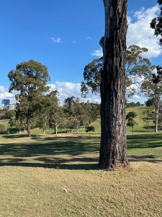


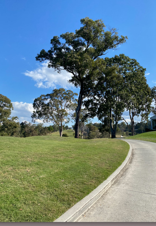


Week 5
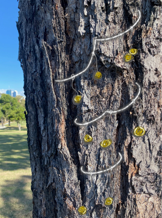
On this week's tour to Victoria Park/ Barrambin, I unfortunately missed the original class. However, I was lucky enough to go on my own time on a bright and cheery day. I wasn't able to visit all the sights but was able to still complete the task as seen in the image above.
A key inspiration from the park was its meditative quality. When living in the heart of a city it is difficult to find places that are not regularly interrupted visually by buses, trains, people, and rubbish. All these aspects are part of daily life within the city. People rush by in a hurry for the next moment in their lives, traffic, and people not taking care of the world and people around them. What I found in the park was serenity and sanctuary. After a stressful morning, I began to sit and listen to the birds, trees, and people's chatter. No one and nothing around me was in a hurry, fearful or upset. It was a space to stop and breathe. When considering a work I knew I wanted this meditative quality to pull through. A second inspiration for the park was the wind. In cityscapes with tall buildings, wind doesn't flow as quickly and strongly. With this vast valley that laid before me the wind was so impactful. It wasn't stopped by the trees but created sounds of moving leaves. It felt soothing on my skin. The park felt long and enduring, and vast. The grass went for so long and the area was overall very comforting. I also was very happy to hear and see the traditional naming of the site from the traditional custodians of this land. As an islander with family in Rarotonga the nature and people within Brisbane felt seen and in doing so made me feel connected to the earth and other indigenous people.
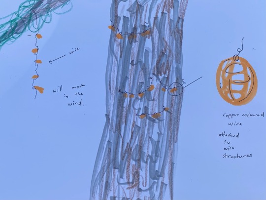
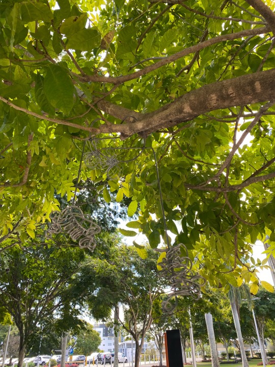
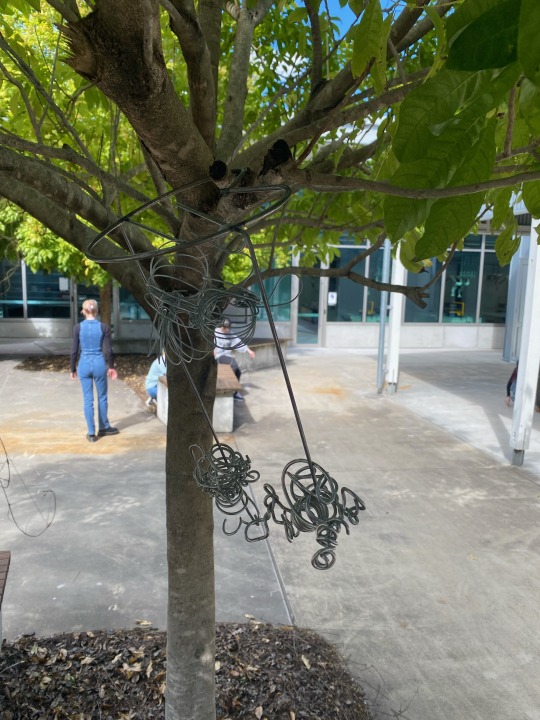
The sketch inspired by the park were small wired structures that would attach but not harm the tree. Similar to the leaves bringing carried by the wind these structures would do the same. There would be small balls of manipulated wire attached to each other, swinging from side to side or up and down. They would allow visitors to gain interest in the complex and beautiful bark structures of trees and also be used as a tool of meditation. Bringing able to concentrate on these small objects and their sounds as a person slowly breathes in and out.
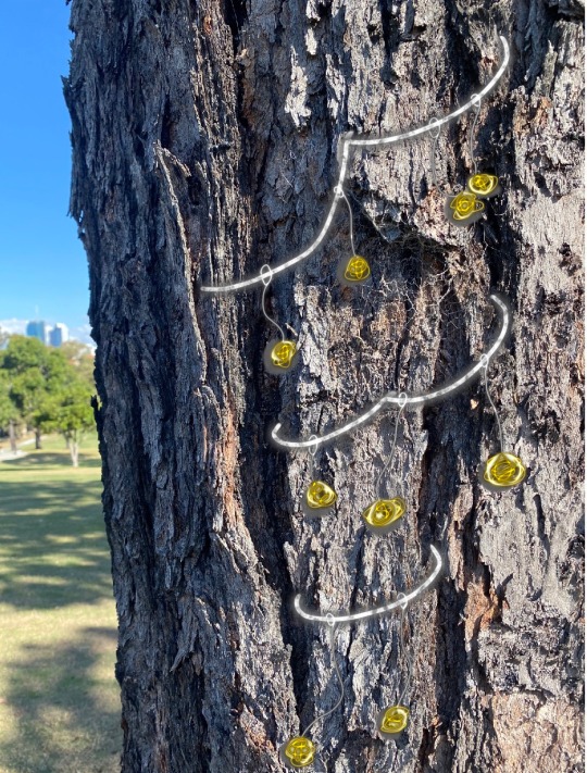
It was hard to make a photoshopped model. Wire's texture is very tricky to impersonate digitally. I am happy with the product I came up with, I used the pen tool, the paint tool, and the airbrush tool. I mainly drew these images and the shadows to make these images. The process was however very fun and created the idea I wanted.
Ana Mendieta - Untitled from The Tree of Life series - 1977 - https://artsandculture.google.com/asset/tree-of-life-ana-mendieta/0gHpmJioxe805A?hl=en
The work presented by Ms. Mendieta reminded me of the importance of place within spatial art. This earth and body work reminds me that the earth/ space is a part of the work. Without the placement of this work, it would not be a completed work. The place these spatial works are planted in is just as important as it is a part of the final composition of the entire work. This gives it levity or weight and attaches it to the present.
Hanging Bench Project - Studio Consilio - https://architecture.calpoly.edu/news/student-news-archives/student-news-1112
This work is definitely more purpose-built than the others. Providing seating to the outside world but with a flare. The idea of comfort is present, with the soft brown wood which curves over itself providing shade for those around. The work reminds me that with proper care for detail, even a bench can have balance, ease, and levity within it. The work is powerful and has imbedded energy but doesn’t overpower the space.
0 notes
Text
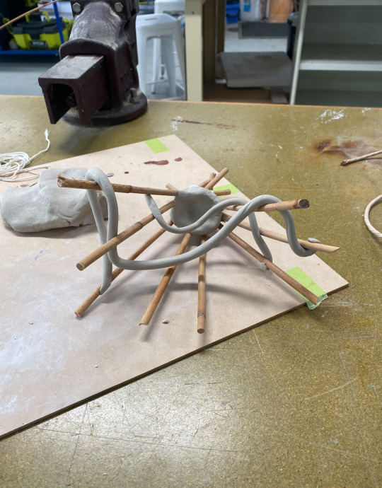
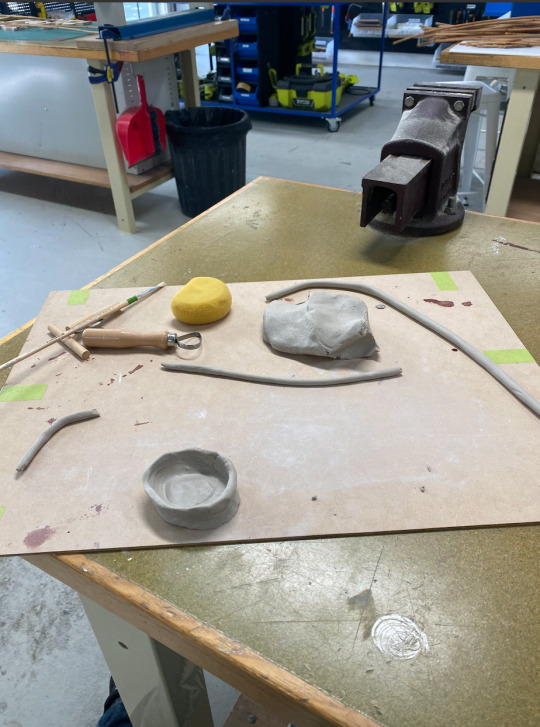
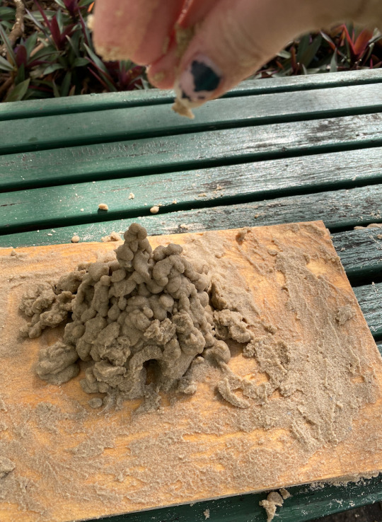
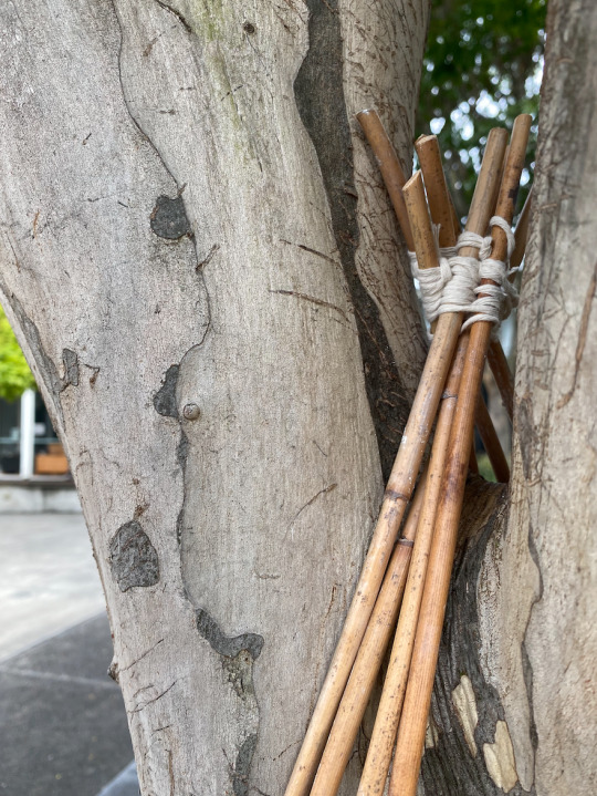
Week 4
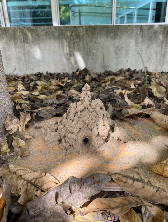
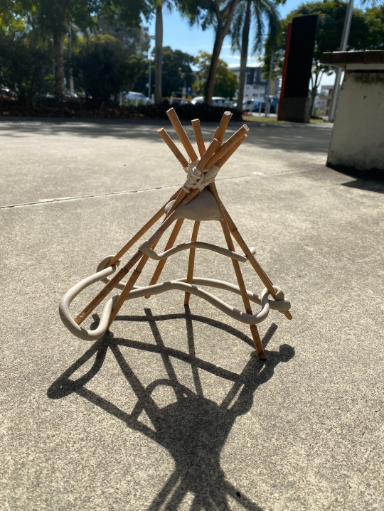
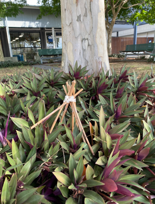
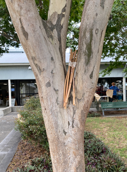
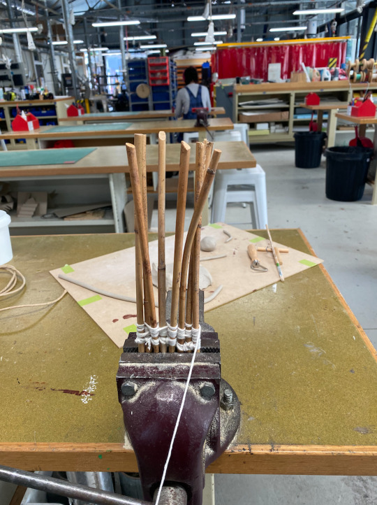
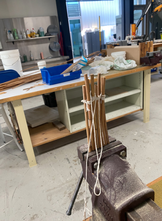
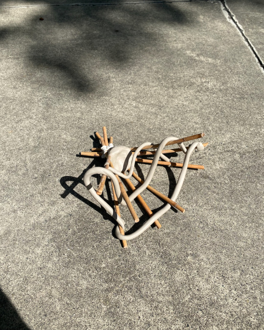
In this week's task, I mistakingly read the brief wrong. Thinking we could use any material we wanted instead of only two. After creating a bamboo structure by weaving beige thread in and out between each stick. These created a triangular-prism shape which was interesting to the eye. However, the shape wasn't stable which is why I added a chunk of clay at the button of the prism and met the string at the base. As well as this I began adding curving lines made out of clay which made interesting shadows and patterns on the ground. After creating this work, my classmates reminded me that it was only two materials for a work. I removed the clay and tried to consider where this structure could go. Originally I saw the work with clay referencing ideas of a chair as a place to sit and rest. This idea was no longer applicable to the work after the clay. I didn't want to remake the work with string as I wanted to try and experiment more with what I had already. I started thinking of options and considered ideas for shelter. These ideas of homelyness or shelter have become a reoccurring idea within my iterative practice this semester. I placed my object within the branches of a tree close by shielding a small area of a tree with the sticks. I began to think of the work as a place for ants or insects to rest. This leads me to add a small rope hanging down acting as a ladder to get up and down the tree. I tied small notes in the rope resembling ropes in playgrounds.
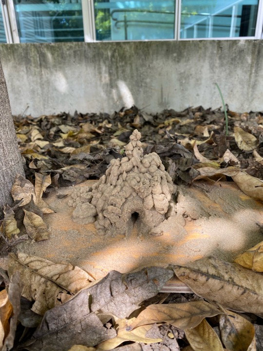
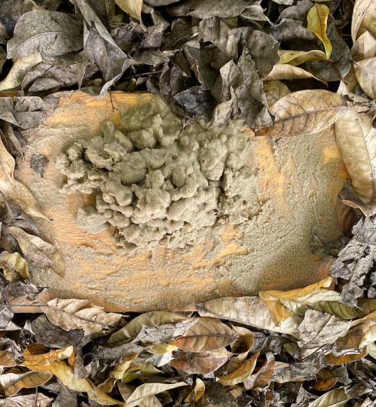
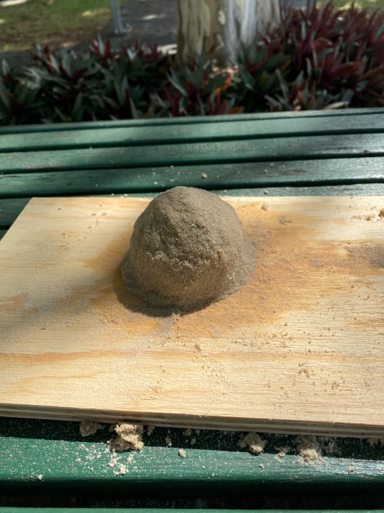
I was happy with what I had created with the straight lines and interconnectedness of the string. However, when reflecting on the work I was stuck on this idea of playgrounds and childhood. I considered my own upbringing on the Sunshine Coast and making drip castles on the beach. I always imagined creatures living inside the houses I had made on the beach. This is what led me to use sand to create a second work for this week's task. A sandcastle was placed on plywood. I used water to manipulate the texture and structural qualities of the sand. By adding water the sand is no longer as light and becomes more fluid and easily manipulated. this allowed me to form half a sphere and create a bubble texture over the top. This texture is similar to ant nests. I liked how the tan colour of the sand became harder to see.
I really enjoyed this task, It allowed me to continue ideas and become more resilient to change. Allowing the works to be more than one thing.
Charles Simonds (Artist) Specifically his works - Dwellings (Made in the 1970s)
Charles Simonds - Dwellings 1970s
CHARLES-SIMONDS.COM
The works that Simonds creates really helped me imagine ideas within my practice. He creates small dwellings within walls and on the ground with organic materials such as dirt and clay. Our practices are visually similar both creating small places as if insects could live there. He allows the local community to help which I enjoy as spatial art is designed for the public. His work has a levity to it and I think it comes from the process of the work, anything could happen.
Calvin Seibert - https://www.artsy.net/article/artsy-editorial-meet-artist-making-fantastical-modernist-sandcastles
The sand sculptures Seibert creates remind me of childhood. I grew up by the beach and sand has always been a part of me, you take it home with you, leave it in the car, and can’t seem to get it out of your hair. These works remind me that sentimental value can impact how you see a material such as sand which is why his work inspired me to build a less complex castle. Both make a bit of magic for those walking past.
0 notes
Text
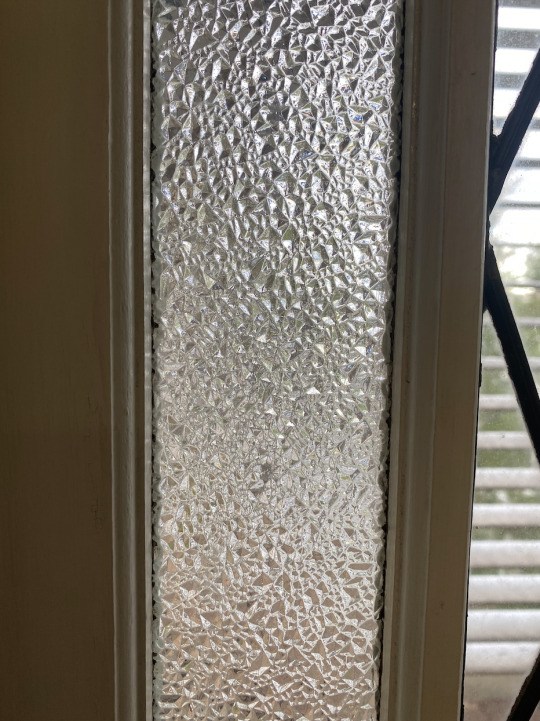
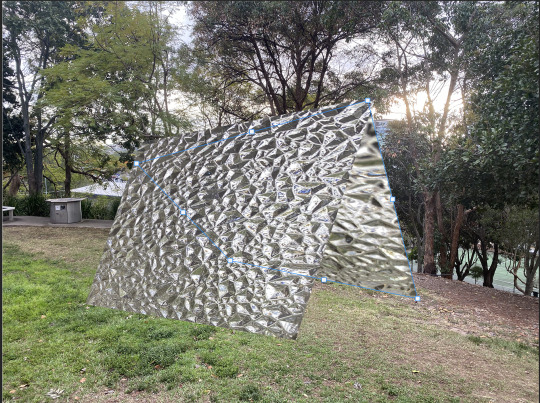
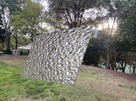
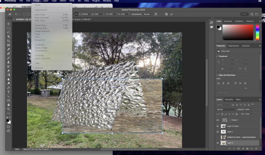

Week 3 Task 3
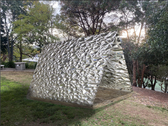
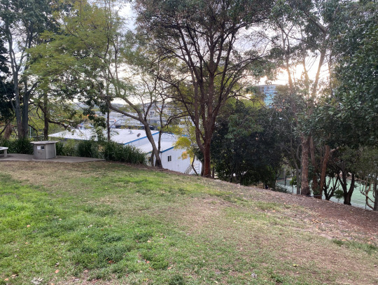
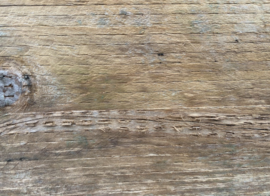
At first, I was intimidated by Photoshop and the task at hand. Before entering the workshop I took photos of potential materials as well as sites. I decided on a grassy clearing near my home as it felt familiar. As well as this it reminded me of safety within the the normal or ordinary. I wanted to create a design that could become a place of safety, shelter, and belonging. I began by using a cropped image of glass panelling which was taken from my house. I knew I wanted a triangular design as it was reminiscent of tee-pees. As well as this it continued and transformed the structural forms I created in the previous task. This was important to me because I wanted to begin experimenting with these designs and form a new iterative work. What really stood out to me while using Photoshop was that I could create the work to my desired scale. As in the previous workshop task, I imagined it as a large-scale work but could only create a smaller model.
In this week's task, I used Photoshop on a more basic level but was really happy with what I created. I shaped flat images to create form and dimension using the distort tool. As well as the glass paneling on either side, I added a timbre base and subtle shadowing.
If I were to redo this task from scratch I would consider the sight more further. As in my final image, it feels slightly out of place, as if it was just randomly placed there. If this project was in real life, I would want the form to integrate with the landscape instead of feeling separate from it.
I really enjoyed what I created and it provoked very imaginative thoughts for me. I imagine more specifically, spending rainy days inside the space. Being able to watch distorted drops of rain float past and see animals that have taken shelter. It became a key interest for me within this unit to consider how spatial art can provoke ideas of safety and community. Even on a small scale, the idea is enough to fuel discovery for my practice.
LAN Laboratoriab Archetture Naturali - Installtion for festival dell’innovazione - http://www.lan-architetture.org/arundo-donax/661/
This work provokes connection within its participants. When I consider larger plans for my spatial art practice this is the type of practice that is a key inspiration. Making designs that suit the places users, forming places of imagination and hope. Making people feel at home with these curving wooden lines surrounding them, allowing for the light of the sky to find its way in.
Yoshi Bar - Naoya Matsumoto Design - https://www.archdaily.com/504793/yoshi-bar-naoya-matsumoto
Yoshi Bar is an installation work that becomes a home for a day. A place made by interlocking and intertwining sticks that rely on each other to stay upright. These designs are beautiful, I think I’m drawn in particular to the use of negative space which I try to employ in my own works. This allows for an airy quality within works promoting hopefulness and peace.
0 notes
Text
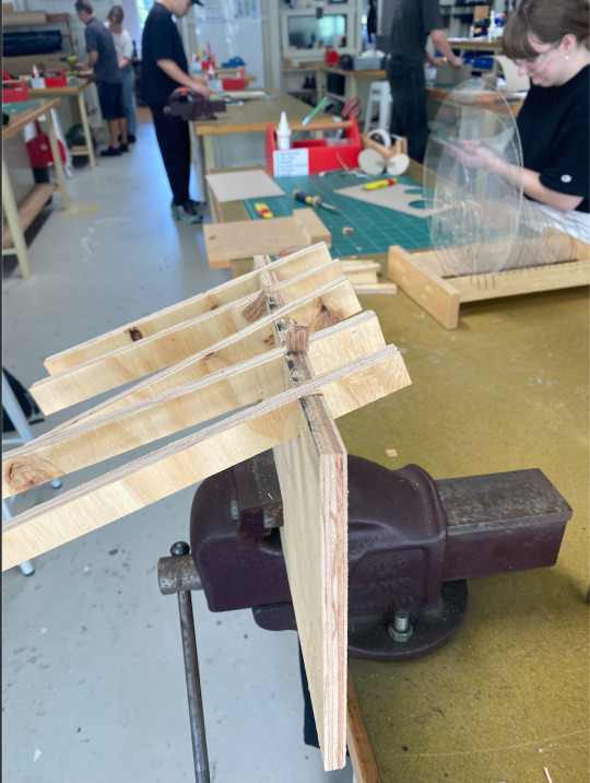
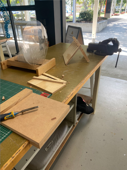
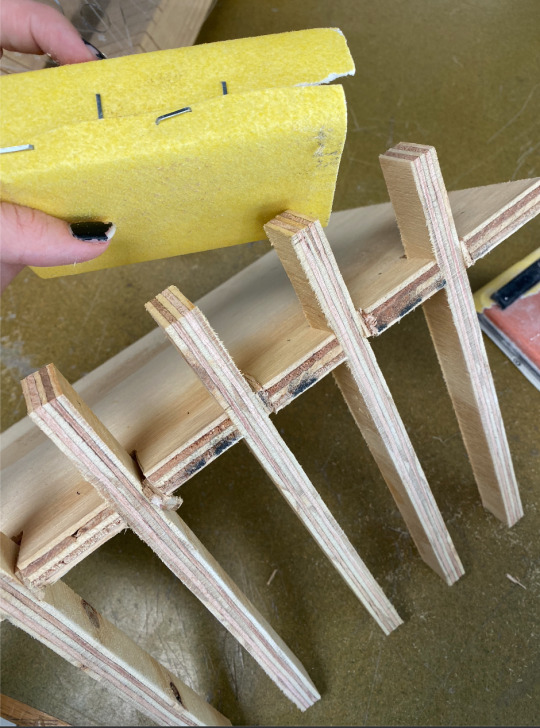
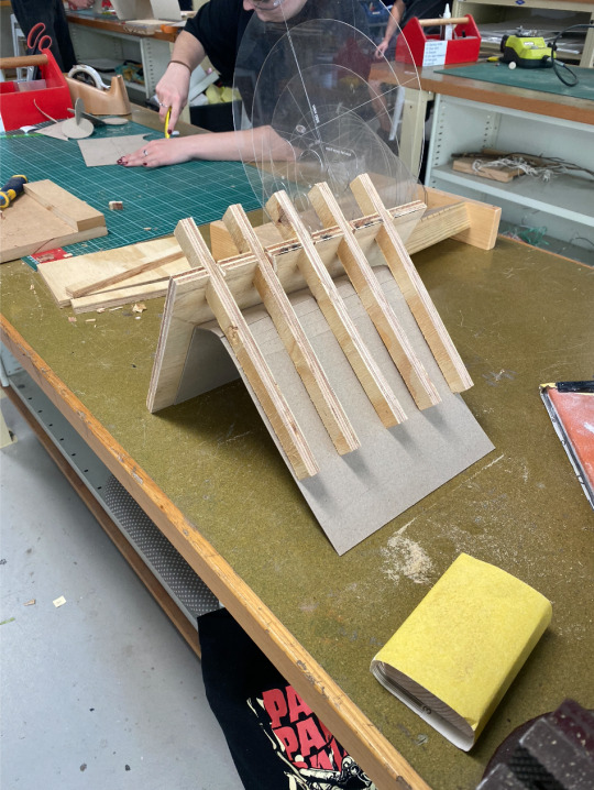
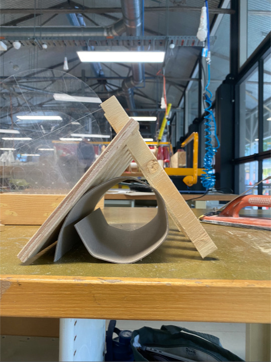
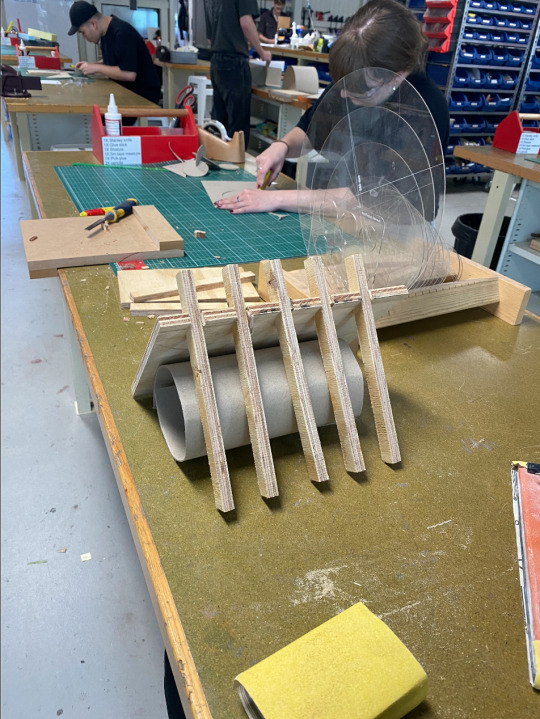
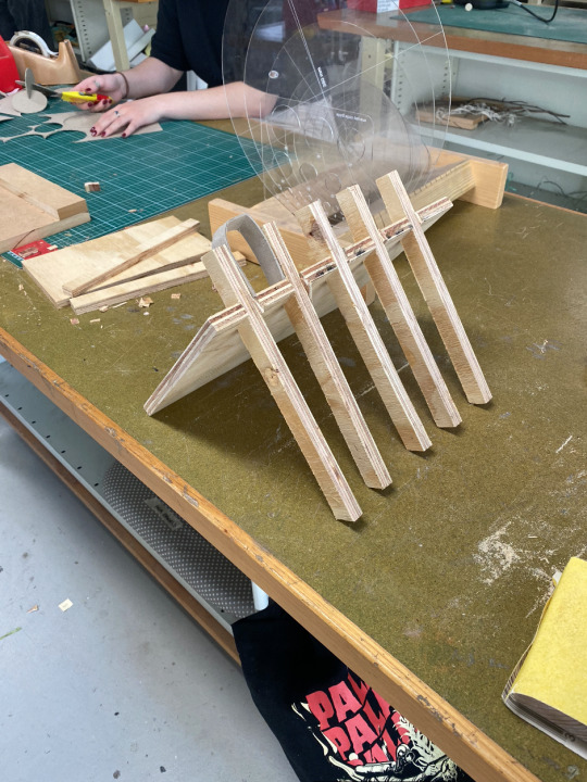
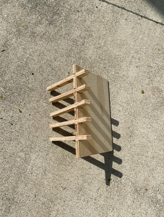
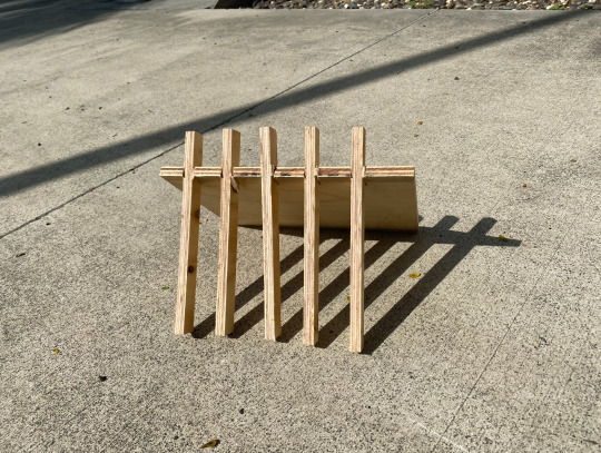
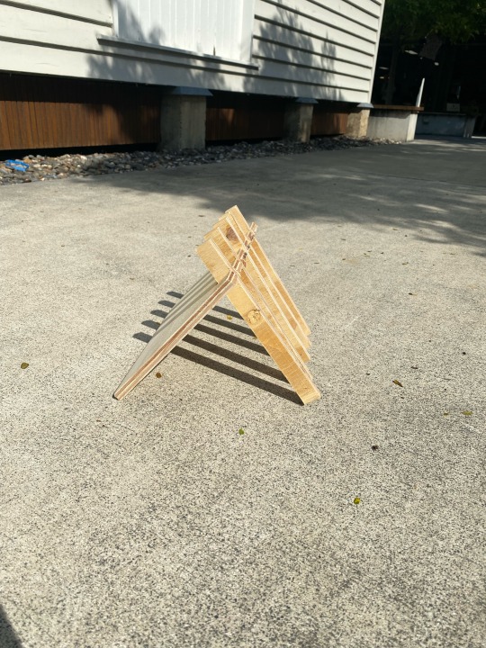
Week 2 For this week’s activity, I had a key focus on the organics due to my use of circular line work. This week, I wanted to shift towards a more linear structure. This was due to the use of wood as a key material. I was drawn to more architectural forms, and how shapes could interact with each other. In the beginning, I imagined that whatever I created if it was on a larger scale would act as a roof for people to walk under. It could be interacted with as a strong and balanced space to sit and wait with or under.
I started by marking two pieces of wood, one where wood would slot into and thinner strips of wood that would be placed within these slots. I used the band saw to make these cuts. It was a little intimidating to use these machines but the cuts I created worked well for the final product. It was really good as well because I could use a straight ruler to make sure the strips of wood were relatively straight. When making the slots, I sawed two barrel lines and then used a chisel and a hammer to knock out the extra wood. These slots were six centimeters apart. When I began slotting the wood into each other, I realised very quickly that the slots were too wide, I easily fixed this issue by taking small offcuts of wood chips and hitting them between the two pieces of wood. This created an extra detail for the eye to see. I experimented and made some of these chips visible and others as if they weren’t there at all. The structure I was left with was a triangular structure, one with uncut wood and one with thin strips holding up the wood. I made sure to sand the edges of the work, to make the wood more finished as well as this I didn't want to get splinters.
In this task we were told to consider balance, the work is calming to the eye. The slats allow light and negative space to hold space which balances against the heaviness of the uncut wood. The work feels sturdy and heavy as if it is unmoving.
The work changed completely in the sun, each component was able to connect to each other and interact with the shadows created. The contrast with the open space I placed it on, completed the work and its' use of balance.
When I talked to my classmates they said they could imagine a figure standing underneath the work which was my overall aim. I see the work as a place to go and rest, leaning on the timber and connecting with the ground beneath it. Choosing between shade and light under it.
I also wanted to add cardboard to the work, in the images above you'll see some experiments. In the end, I decided that the added element made the work feel overwhelming, so I decided to keep the work more minimal instead. I believed that it was finished without adding anything to it. When creating the work, I was also thinking of the surfaces in the work, and what planes were present.
Artworks That Inspired The Work Joseph Kinnebrew, Grand River Sculpture, 1975 - https://www.riverforall.com/2021/09/when-to-watch-for-fish-migration-at-fish-ladder-park/ The work is made from concrete and is a large scale of 45 x 35 x 30 ft. This work is very large and I imagined that my own work would hold a similar weight to it if it was larger. People are able to interact within the space. More importantly to my own practice, Kinnebrew has created windows to look out of and allow light to interact with the material. The work uses lines heavily to create a symmetrical nature to the work even though it has asymmetric features. The balance of the work is very interesting and I think a key aspect of its creation is how the lines interact with each other. As one triangular shape goes inwards another leads the eye outwards. No section of the work holds an overpowering amount of weight to the eye. The work becomes a part of the landscape it sits upon without overpowering the nature that surrounds it.
Nancy Holt, 30 Below, 1980 - https://holtsmithsonfoundation.org/30-below Holt’s work is a tall cylinder made of bricks making their way up to the sky above. Shafts of light place shapes of ovals around the inside of the structure. These appear next to windows towards the sky which create a sense of calm and hope. Due to these openings the viewer doesn’t feel trapped within the space. There is no sense of levity as if the structure could already be in the sky as your eye is overwhelmed by small viewings of the outside world. In my own work, it helped me consider how shadows can interconnect with each other. How one shadow can lead the eye to its original reflection. Holt’s work considers balance but also how shapes can bring hopefulness to the viewer. When I view the image of her work, it’s as if my worries could float to the sky I’m viewing in 2D.
0 notes
Text
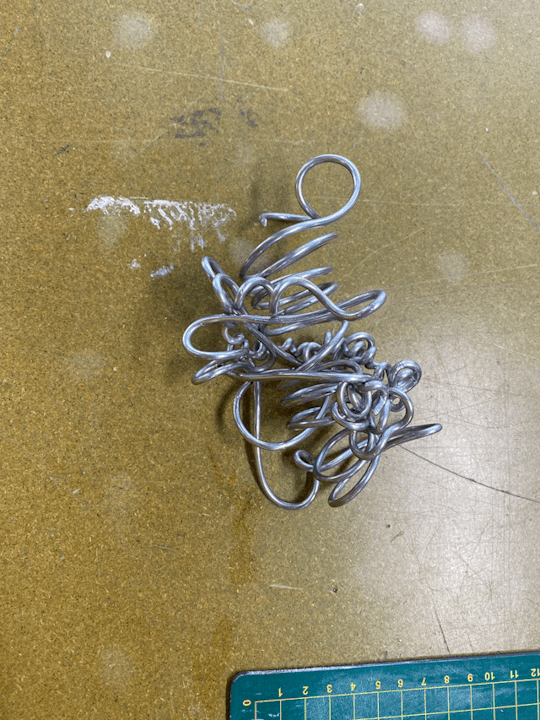
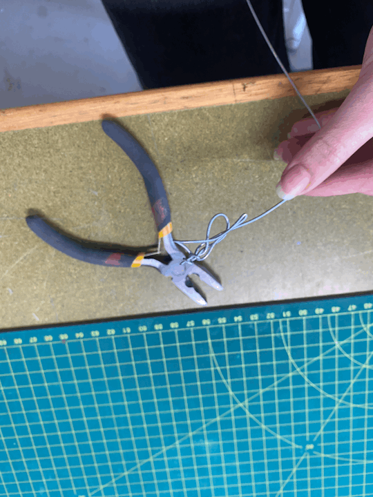
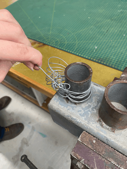
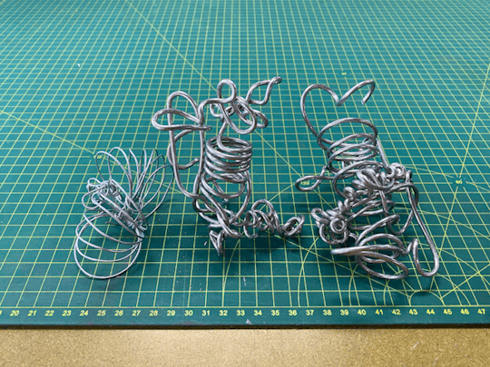
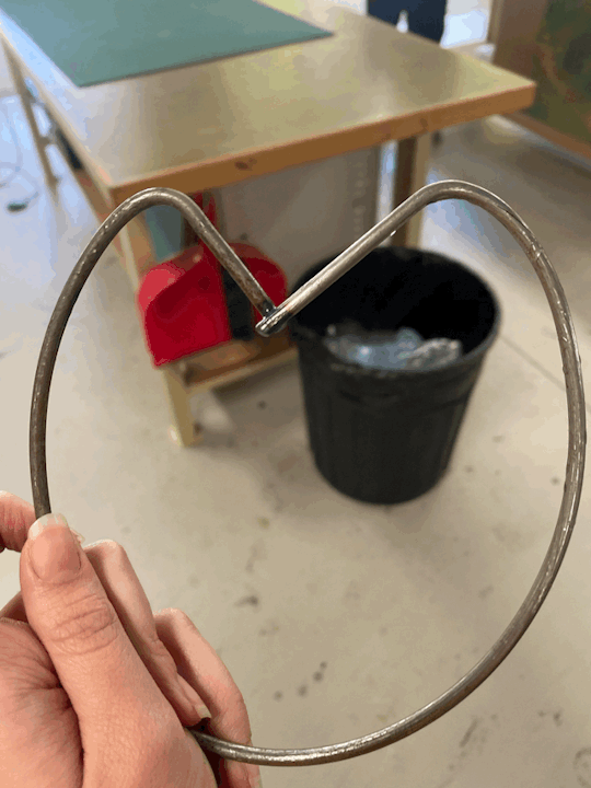
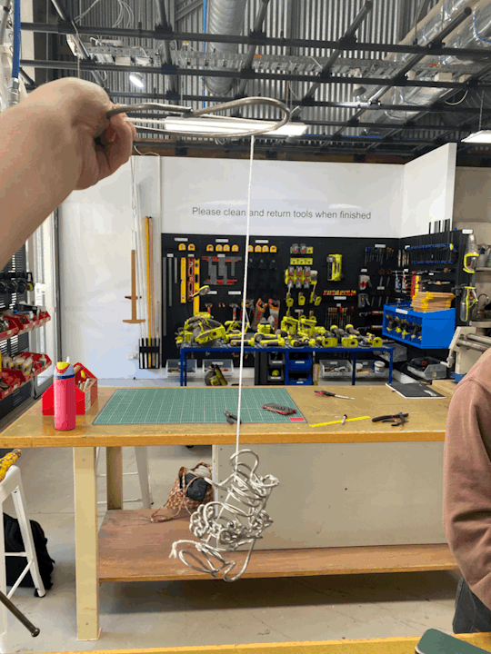
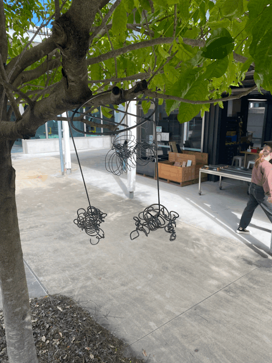
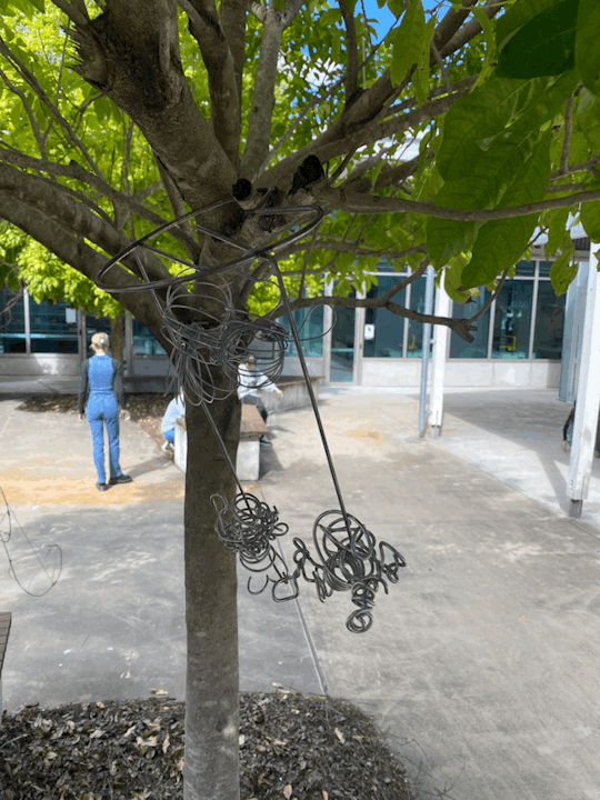
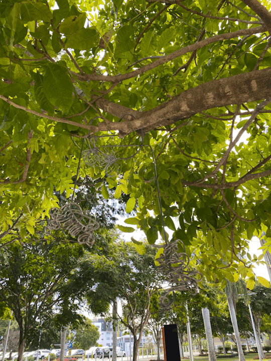
Week 1 - Line activity At the beginning of the lesson, I tried not to be too focussed on the final result. I wanted to play around with the malleable nature of wire. I was drawn towards bending the wire in circular motions using the circular molding tool I'd been given to use. The aluminium wire allowed me to do everything with ease. With the more intricate details, I bent them by hand with a small pair of pliers. After making a second sculptural piece in the same material, I wanted to see the thicker wire juxtaposed against something thinner. Although I did enjoy the shapes I made, they reminded me more specifically of animals. The colour difference in the wires created discomfort within me. I wanted a juxtaposed shape rather than colour. These shapes were made with the idea of binding springs , creating circular motions/movement. I decided that if I used all the objects made or not I wanted them to connect to a basic structure. Something more strong and sturdy. I used thicker wire again, 1 cm in diameter, and was able to weld the shapes of the wire together. I created an initial design of a heart or lily pad and then added two stems for objects to hang off. The process of this work was challenging. Without an initial goal, I’ve found it hard to connect to a feeling or emotion which a lot of my overall art practice is about. I love the condensed twisted shapes of the aluminium as well as the effect that welding has on the metal. It not only pushes it together but makes an ashy mark on the wire. An iterative process was thoroughly used with an organic nature of inquiry as if I were solving a problem. Initially, the objects felt disconnected which the structure subsequently solves.
Artist: David Nash, Running Table, 1978. Oak; height 60 inches. Grizedale Forest, Cumbria - http://www.grizedalesculpture.org/archive/2021/5/14/david-nash-return-to-grizedale This work by Nash is very intriguing, Although the concept is simple, placing wood in a forest the overall structure impacts the viewer's gaze. Initially, I felt like the work belonged there as if it was just a fallen branch but as I took a second look it became clear that it was man-made. The organic nature of the timber reminded me of natural elements and their connection to earth. When considering this work with the current line activity, it made me consider placing my sculpture on the ground, blending in with its environment rather than hanging from it, which I had initially intended it to do.
Artist: Ninety-Nine Failures created by The University of Tokyo (a project within the university) - https://www.archdaily.com/469193/ninety-nine-failures-the-university-of-tokyo-digital-fabrication-lab This work helped me further consider the idea of manipulating light. When attending the first week's lecture, there was an emphasis on considering light and light as an artwork itself or as part of the work. This concept is emphasised within this work by adding lights within the large-scale sculpture. The cross-like shapes are connected yet maintain an idea of levity and curvature.
0 notes
