Text
Preparation for The Degree Show
In dividing up the duties for the upcoming exhibition, I took on the following responsibilities:
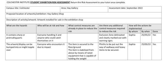
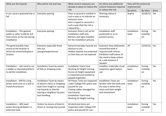
- The shop. To be held in The Hay Gallery space
- The wall text
- Artwork labels for the exhibition
Shop
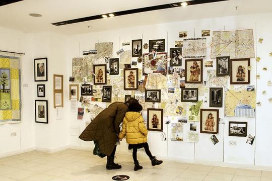
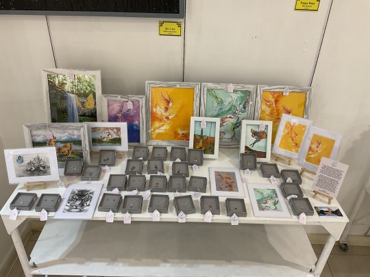
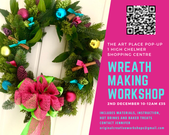
I was most excited in taking on the planning the shop area for our exhibition. I have experience in similar roles from my work at The Art Place Pop-Up and liked the opportunity it presented to curate an extra space in addition to my final artwork in the exhibition. The concept of the shop space is to display artwork for sale to the exhibition visitors but also offers the opportunity for artist to display artwork outside of that which will be graded. When the idea was initially discussed both Judd and Lu were keen to include work. We also agreed to extend the offer to the level zero students who are also holding an end of course exhibition.
I started planning by sending out the following email to all exhibiting artists:
As you know we are planning to set up a shop in the Hay Gallery during the Final Degree Show. This will be to sell any additional artwork you have, not what you will be handing in for grading. This can be prints of copies of your work however or past artwork.
What I need to know is who would be taking part in selling work and what you are planning to sell?
Can you please respond to this email with:
- Photos of work
- Dimensions
- Brief description of the work i.e. ceramic sculpture paperweight, print, photograph of work
- Price
If you do not wish to take part, can you please respond saying so. It is not compulsary.
I had little response but knew many were busy focusing on submission deadlines. I had similar issues when putting on the Outside The Box exhibition in February but had the majority of artwork details delivered at the last minute. I felt quite passionately about putting on a shop so I wasn’t going to be discouraged easily. I know Lu has a vast collection of artwork she could include and I could make multiple prints of my work. My thoughts were as long as the work is well displayed and used the space accordingly, I wasn’t concerned about how many artists wanted to participate.
On Monday 16th May we started preparing the studios for the exhibition and Matt kindly helped fill and paint the walls of the Hay Gallery. I spoke to several students that week who hadn’t responded to the email but were still keen to enter work into the shop. On Thursday morning I sent out a follow up email reminding artist’s to send me details of work. Myself and Judd were planning to include wall hung work and Lu had delicate origami forms that I thought would be best displayed in the glass display table. I however needed to know the types and sizes of other works to establish how best to display them. If there were to be a lot of sculptural pieces they might need plinths, or if they are smaller items I could install shelves. In my email I asked all artwork to be delivered to the Hay Gallery on Monday. This means I will still have time to play with arrangement before the Wednesday deadline.
Determining furniture:
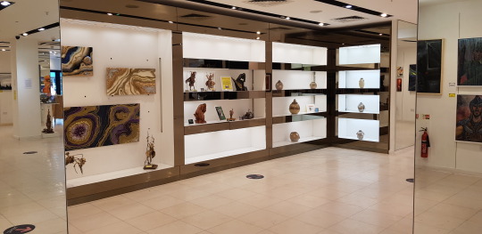
The large display table in the Hay Gallery space needs to be incorporated into the shop. It is very large and would be difficult to find storage for. I am hoping to use it for Lu’s origami or unframed pieces such as drawings or prints.
I dug out 3 of the best condition plinths from storage; 2 tall and one wide rectangular plinth. My main focus must be on installing my artwork for the main exhibition so I don’t want to waste precious time filling and painting scruffy plinths. I hope I won’t need additional plinths but if I do I may have to ask the artist to fill and paint them first.
Shelves. I have one personal shelf that I made at home last year for exhibitions. It’s got a lip on the edge which makes it perfect for displaying unframed prints and books. Richard also has similar shelves in storage that will be easy enough to access.
I also pulled 2 A-boards out of storage and touched up the paint. I will use one as our shop signage. Tam designed a SHOP poster in the same theme as our exhibition poster. I printed this in A3 size for either side of the A-board. I don’t currently have a plan for the second A-board but thought it would prove itself useful for the exhibition as a whole.
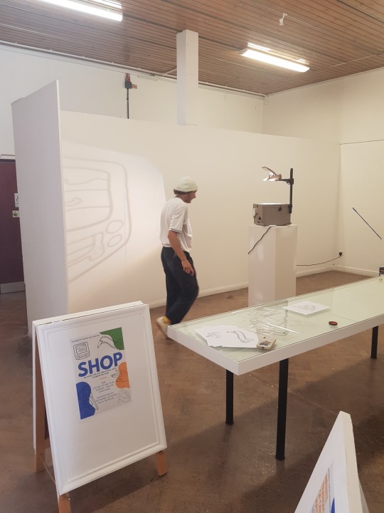
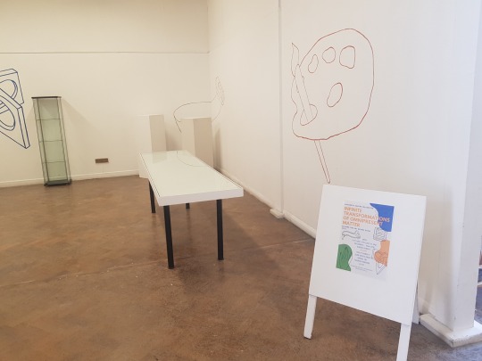
For the design of the poster each of us drew a simple line drawing representing an element of our artwork. At the time we discussed this I suggested using it to decorate the shop space. I printed each design on a sheet of acetate and used an overhead projector so we could trace the drawings onto the wall. Although all students were busy during the week of install everyone came and painted their design onto the walls using the colour scheme of the exhibition. It was really nice to have all of us painting at the same time and chatting during a stressful week.
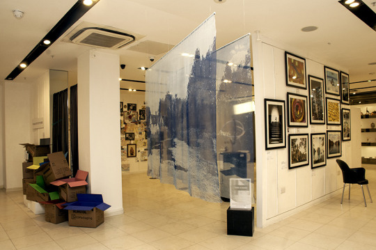
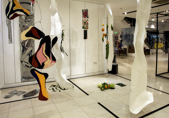
On Monday 23rd May all students participating in the shop delivered their work to The Hay Gallery. With the exception of a glass cabinet for Lu’s origami pieces, the plinths were just the right amount for the products on offer. I was surprised to find there wasn’t as much work for display in the glass vitrine as I was expecting. I however, chose to display a sign at one end explaining the process of purchasing from the shop and decided the space at the other end can be used to hold business cards of the artists.
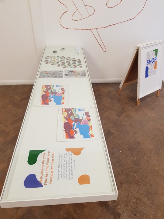
I am still awaiting emails from all level zero students involved with details of their work and prices. I made labels for Lu, Judd and myself’s work with prices and displayed them with the work. I will have time before the opening night to add the labels for the other artists.
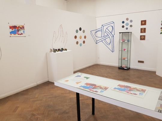

My contributions to the shop are:
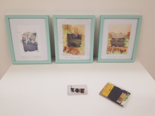
3 photographic prints related to my work in the main exhibition. I ordered them online from printed.com in size 20 x 28 inch. I bought large frames from Dunelm that have a 20 x 27 inch mount. I originally intended for all the frames to be black but they only had 2 in stock. I bought the third frame in grey as a solution but I think it actually works great with Snapshots of The Mundane and Barely Interesting 10 as the photograph contains so much black in the image. When I look at artwork to buy I always like work in a mount that has the artwork’s details and artist signature visible in the artist’s handwriting on the mount. I decided to write the title of each piece, my signature and ‘1/25’ on the mount of the photographic prints. Although these are currently the only prints I have had made, I plan to limit each photograph to 25 prints. By marking the mount with ‘1/25’ buyers will know these are first editions of a limited run and that sometimes makes them more desirable to buyers.
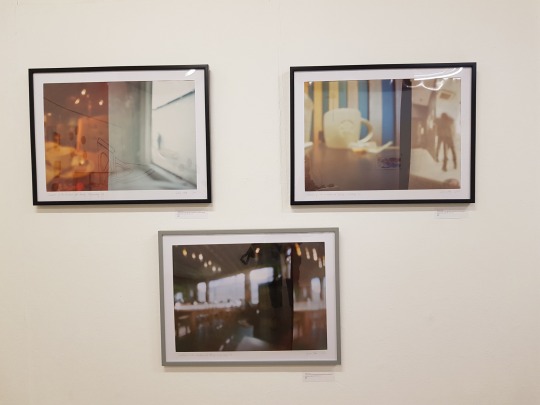
3 original Polaroid lift pieces. I made these during my Space residency and thought they are curious enough for people to be interested in them. The experimental photographic process also links to my experimental pinhole photographs in the main exhibition. Again I added details and my signature to the mount of each. Unfortunately during install one of these pieces fell and the frame broke but the artwork was un-damaged. I am unlikely to be able to get a new frame by the 25th May deadline but will hopefully have a replacement by the day of the opening night instead.
Lastly I considered including 2 handmade book versions of Another Day, Another Pret but these are not ready yet. I’ve made 2 labels for them so if I do finish them in time for the exhibition opening I can still enter them.
Wall Text
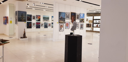
I was also responsible for writing and printing the introductory wall text for visitors when they enter the exhibition. To start I looked at group show introductions and wall text. This wasn’t too helpful however as general group shows tend to either have a common theme amongst the work or is formed by artists collaborating. I instead looked for introductions for end of degree shows. These were better examples of explaining multiple themes and tended to keep the description quite open. The benefit for us is that our show is made up of 5 artists. This means we can explain each theme our work in a short paragraph whilst exhibitions of hundreds of students can’t. I wrote and designed the following:
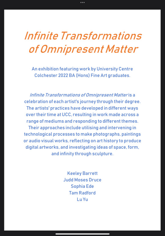
Most galleries will use vinyl lettering for wall text. It sticks straight to the wall and peels off once no longer needed. I personally have a dislike for the use of vinyl for its negative impact on the environment. It is made from non degradable plastics and is often used for only temporarily. As someone who hopes to have a career in curating exhibitions and events I feel I should stick to my personal morals on these subjects where possible. If any of the other students wished to use vinyl, however, I would have discussed it further. Instead the other students were happy with the suggestion of printing the wall text printed on A0 size paper. I got this done by Blue Sky Printing and it can be fitted to the wall with strong double sided tape.
Labels
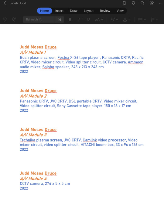
Originally I was planning to have all the labels for the exhibition printed professionally by Blue Sky Printing. I have used them before to produce labels and it insures they are all printed in the same format and cut to a uniform size. All of us had struggled to name our work until the week of installation and even then last minute changes to titles and details kept arising until the eve of the deadline. I therefore decided to type up and print everyones labels myself. I used the same colour theme we have been using for the posters and the shop to format the labels. We had previously decided on the font ‘bahnschift’ for the artist statements in the handouts so I used that for the wall text and labels too. I printed them on a heavy good quality paper and trimmed them for everyone to ensure the margins stayed uniform.
Other Bits
The day before the deadline it dawned on me that we didn’t have a table for the hand outs, maps and business cards. I was able to find one buried in storage and it cleaned up quite well. I also purchased a plain green notebook to use for visitor comments. At this time no other artists were still in the studios. I have therefore left the final decision on the table and it’s placement to the day of the submission deadline when everyone will be in at once. This is also true for the placement of the wall text and artwork labels.
0 notes
Text
As the end of year gets closer, I’ve been hunting for a full time job in a gallery or museum setting. Although a month ago there were a few jobs advertised, I’ve struggled to find any recently. Instead I’ve seen a lot of volunteer or freelance/part-time roles only. This has me concerned that I may not find a full time job over the summer.
Although I was planning to secure a job immediately after university to cover my living costs and mortgage, this may be an opportunity to follow more creative and exciting opportunities. Through my work with The Art Place Pop-Up I met several event organisers and contemporary artists. In our conversations I shared my art practice and showed my pinhole cameras. Since then I have continued to stay in touch with several of the contacts I made and have been contacted about leading pinhole camera workshops.
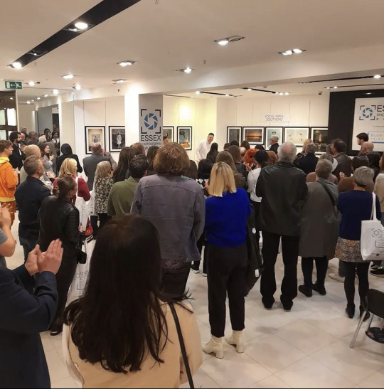
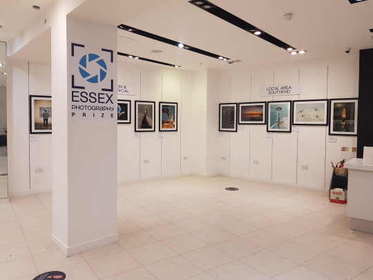
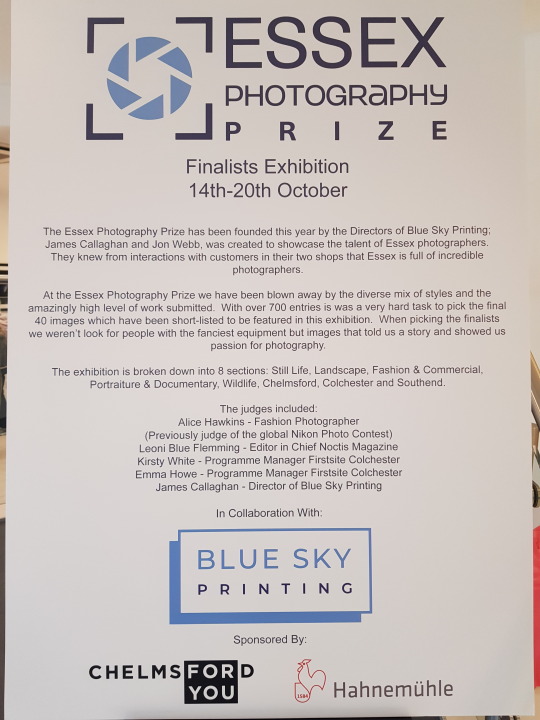
The first of which is for the Essex Photography Prize. The Art Place Pop-Up hosted the first year’s exhibition and award ceremony in Chelmsford last September. The competition had over 7,000 applicants which was whittled down to 40 finalists. The 40 finalists' images were then exhibited in Chelmsford, Southend and Colchester. The organisers James Callaghan and Jon Webb are planning to grow the competion this summer and incorporate workshops into the events. They are hoping to work with Firstsite for events held in Colchester and have asked me to lead a day long workshop on shooting with pinhole matchbox cameras. They are also interested in caffenol developer as an eco-friendly alternative to traditional developer. The workshop will be targeted towards teaching existing and new photographers experimental techniques. I am yet to discuss the workshop in further detail but will build a plan once I have further information. I will experiment with caffenol developer over the following few weeks to understand it’s capabilities. I will also reach out to 37 Queen Street in Colchester to see if I can use their darkroom if the workshop is to be held in Firstsite.
The second organisation to contact me about hosting a workshop is Chelmsford Civic Society for their Heritage Days in September. Although not an artistic event, the organisers are looking for artists to host creative events that encourage engagement with Chelmsford’s history. I have been asked to host a coffee cup pinhole camera to capture views of Chelmsford historical landmarks. This is designed for non photographers and families. It will therefore be shorter and use the simpler form of pinhole cameras - paper coffee cup cameras. I have already put together an initial plan that may evolve as details change.
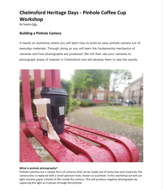
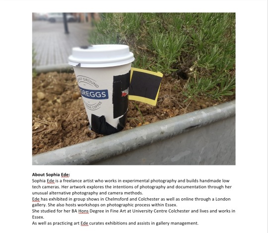
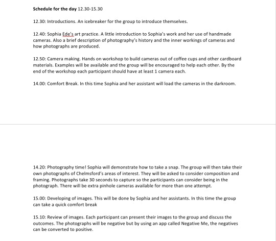
As well as workshop opportunities I received a couple of temporary job opportunities too. I received a phone call by Edith, the CEO of Ideas Hub Chelmsford charity last week. She was offering £1,000 to organise Jubilee celebrations in Chelmsford Central Park on Sunday 5th June. She had already secured funding for the event and had multiple artists and musicians who would be interested in being involved. I unfortunately had to turn the role down due to it being so close to my University deadlines. I did, however, offer to help as a volunteer in the week leading up to the event and explained if any similar roles were to became available in the future I would jump at the chance. Edith often organises public events through grant applications and funding and has promised more opportunities over the summer months.
Last Summer I worked as a Venue Manager at the British Science Festival for a week. It was a role I was introduced to through my volunteer work at The Art Place. Although not art related I found it incredibly fun to work and really enjoyed learning more about the latest discussions within the science sector. They have reached out asking if I would be interested in applying for a role in 2022’s festival located in Leicester. It may not fit within my art and curation career plan but it is an incredibly enjoyable paid job.
Previously I was really worried about lacking financial security after leaving university. These unexpected offers have, however, eased my concerns. Even if it’s just for the summer months I think I would really enjoy working freelance and the flexibility that comes with not having a full time job. I don’t like the idea of working full time in London or in another location far from Colchester. If it was a temporary or one off job, similar to the British Science Festival opportunity, I would be open to travelling.
My plan now is to research organisations, learning institutions and festivals who look for artists to conduct workshops. I already have the cyanotype workshop I delivered to foundation students at Colchester Institute and the 2 future pinhole workshops that I can replicate. I have also recently done some image transfer artwork with Polaroids, called Polaroid lifts, for the Space Online Collaborative Residency that would make a great workshop. Not only does my skill set work for creative workshops but also have a scientific element in utilising photographic technology. I could use this to apply to scientific fields as well as artistic. I will look for temporary curation jobs such as organising one off events and exhibitions. Volunteering with The Art Place and working closely with Edith as my mentor will help in this. If I am able to secure a paid position I may be able to match fund that cost with Arts Council England to secure further funding and put on larger or extended events.
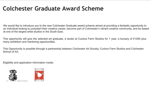
My main focus after my deadlines have passed will be my application to Cuckoo Farm Studio’s Graduate Award Scheme. If I am successful I would greatly benefit as it will provide me with studio space to work and £1,000 materials cost to play with. Also it would offer an opportunity to learn from Linda Theophilus, an artist with a wealth of curation experience. It will also provide me the opportunity to curate my own shows in Benham Gallery and Cuckoo Farm’s grounds. In my application and hopefully interview process I plan to highlight my interest in curation as an extension of my art practice. I hope to present my plans for curation as beneficial to Cuckoo Farm and therefore make me a strong candidate.
0 notes
Text
Space Online Collaborative Residency

In January I was successful in being selected by Space, 37 Queen Street for their Online Collaborative Residency (OCR).
Before applying I wasn't sure if it was worth while. I had just turned down an extension of my part time job at The Art Place Pop-Up for feeling over committed and was wanting to focus on my Uni work for the final 5 months. The OCR is 14 weeks long and offers an artist fee of £200 and a materials budget of £100 with an online digital exhibition at the end. I was concerned about committing myself to another project and uncertain the artist fee and digital exhibition was worth the additional pressure. I, however, discussed it with multiple friends and collegues who pointed out the fantastic opportunity it was to meet other artists and build contacts. And they were right!
I was partnered with Sally Maddams, a mix media artist who teaches photography at sixth form level. Her works focuses on walking and her surrounding landscapes by building multi media pieces from paint, photography and found objects. We hit it off straight away. We have many common practices and interests. I have created work inspired by walks in the past but also we are both keen runners and promised to do a run together one day.
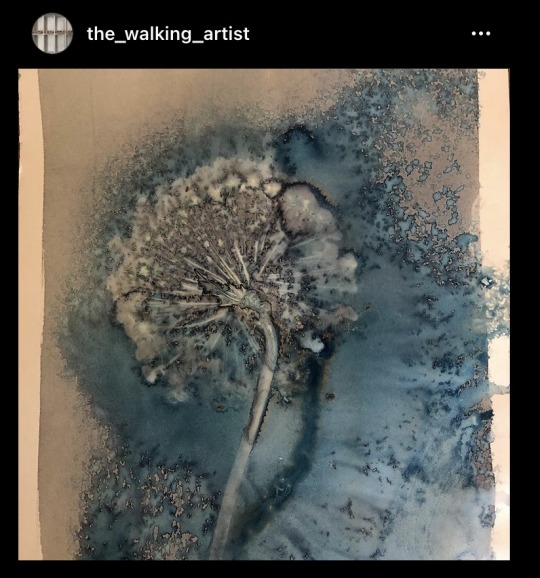
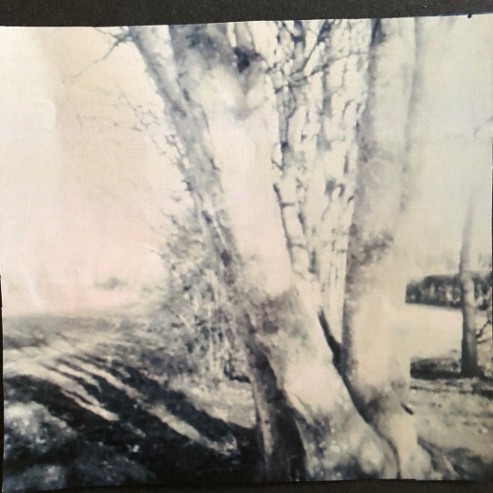
Our starting point idea was to combine Sally's subject matter of walking with my medium of choice, pinhole cameras. Because of Sally's job as a photography teacher, we both have access to darkrooms. Sally had never built her own pinhole camera before. I sent her a pdf of how to create one but she also borrowed a crafted wooden box pinhole camera and black changing bag from her school. The changing bag was so she could load paper from home without a darkroom. We also discussed how our immediate surroundings differ. Sally lives out in the countryside surrounded by fields and rural living. I, however, live in Colchester town centre making my environment much more urban. This was a nice contrast that would be visible in our photography.
The OCR participants and Space team met on zoom every second Saturday for 2 hours. We were also given tasks by the Space team throughout the project. First was for each pair to write a partnership Artist statement.
Sophia and Sally are both multi-media artists. Sophia explores documentation and the production of indexical signs through darkroom processes and camera building. Sally uses Photography as a starting point for her work as well as having a particular interest in different dark room approaches. Sophia also considers what we call a camera by building the unexpected and found object pinhole cameras that produce some of her artwork. To her, the cameras she produces are as much about the work than the images they capture. Sally has a particular interest in the textures and weathered and worn surfaces which she has encountered on her journeys.
This collaboration allows for a great deal of experimentation and to allow the landscape to take over and see where the work progresses. Using pinhole cameras as a starting point Sophia and Sally plan to document the changing seasons through the next few months, both urban and rural and create outcomes which are connected through the same theme.
Our pinhole camera results varied with poor weather conditions and human error sometimes getting in the way. I did, however, greatly enjoyed the process. Having only recently moved to Colchester, this project forced me explore my local surroundings on foot. I discovered so much that I wasn't aware of by driving the same roads everyday.

Each partnership was asked to take over Space, 37 Queen Street’s Instagram account for 3 days each. Our scheduled 3 days happened to fall upon very busy days for the both of us so we planned our posts in advance. As our work is experimental and still in progress we decided to add borders to both neaten their appearance and tie our pieces together. That way when the Instagram page is viewed our work is identifiable. Due to our busy schedules we chose to keep our take over simple by posting once a day over the 3 days. Other partnerships chose to use Instagrams stories, reels and live functions to present additional elements to the artwork they have made. This would include research they’ve conducted, artists who inspire them and backstories to each artist in the partnership. I found this really interesting and they got a lot of engagement with their audience. This is something I would definitely consider doing in the future if I was to do another Instagram take over and had more time.
Our artwork is very experimental and playful. Some other partnerships focused on complicated concepts or laid out intentions for their artwork very early on. We, however, used our surrounding landscapes and pinhole photography as our starting point and then let the artwork determine it’s own path and progression. We also respond to each other’s artwork by learning skills from one another and letting it influence our development. Sally often uses image transfer in her work by lifting laser jet prints with Liquidtex onto porous materials. This inspired me to revisit Polaroid lifts that I had learnt a few years ago. Sally had never come across this technique before and was a new skill for her. Paint is another medium that I haven’t personally used in a long time but Sally often reworked her images using paint.


The hardest element of the residency was preparing for the final online showcase. Instead of a physical exhibition we were asked to build our own webpage on a microsite that presented our work. We really struggled as we weren’t familiar with building a webpage. The microsite is through Wordpress. Sally admitted to having little interest or knowledge of tech and she found zoom meetings hard enough to master. As an online residency we were suggested multiple different apps and programs throughout the 14 weeks to aid us in planning and communication. These apps recommended were Padlet, Simple mind and Canva. Many partnerships did use these but Sally and I preferred not to.
Writing this PDP blog throughout the semester really helped in understanding how to navigate the microsite builder. The layout uses multiple blocks. These blocks can be text, image, url, gifs etc. These can then be moved around to build the structure of your page and use the ‘preview’ tab to view how the final page will be presented. We received a how to demonstration by a member of the Space team a few weeks back and it was recorded for us to refer to. I originally went into building our site’s page thinking it would be relatively simple and I would only need to spend a couple of days on it. I arranged to meet Sally in person to go through it together and plan our layout. We discussed how we would like to present our work. Over the 14 weeks we had built up a surprisingly large collection of work with many being quick experiments. We were able to review last year’s examples to understand the different approaches each partnership had. Upon talking with the rest of the group, many believed it was important their journey and progress was laid out for the viewers to follow. As exhibiting artists, and with my interest in curating, Sally and I wanted to approach our presentation similarly to if we were to curate a physical show. Of the many pieces that we produced we selected the most successful. It didn’t matter to us who had produced which piece. We felt that mixed up and sitting side by side they all worked together. We then whittled our selection to 4 pieces that we considered our most clearly resolved and finalised. These 4 images plus an artist statement would be the highlight of our exhibition. We used the artist statement we wrote at the beginning of the project but re worked it to better present our journey.
Sophia and Sally are both multi-media artists. Sophia explores documentation and the production of indexical signs through darkroom processes and creating pinhole cameras. Sally uses photography as a starting point for her work as well as having a particular interest in different dark room approaches. Sophia considers what we call a camera by creating pinhole cameras out of unexpected and found objects. These are then used to produce some of her photography. Sally has a particular interest in the textures, especially weathered and worn surfaces which she encounters on her journeys.
This collaboration incorporated a great deal of experimentation and allowed the landscape to dictate the direction and progress of the work. Using pinhole cameras as a starting point Sophia and Sally produced artwork in response to both urban and rural landscapes, as well as each other. The outcomes are connected through the theme of their surroundings and landscapes but also experimental photographic processes.
We then treated the remaining successful pieces as supporting artwork further down the page. This will give the viewers an insight into our project’s journey without having to give them a play by play account. We accompanied these with a quote from both of us on our experience in the project. We understand that although this is a showcase for us as artists, it’s also a showcase of Space Online Collaborative Residency. Viewers will be interested in how we personally found the project as well as the work it produced. Finally we ended the page with a small gallery of behind the scenes images. Pinhole and Polaroid cameras were fundamental to our process so this gave an opportunity to show off our tools and equipment.
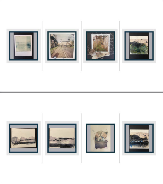
Building a microsite page was frustrating and wasn’t something I would have chosen as a form of exhibition. In hind sight though, it has been a very valuable lesson. If I am planning to build myself a website in the future a lot of these skills are transferable. But most importantly as a contemporary artist, digital technology is something I will be utilising at times. As proven by the pandemic, digital exhibitions and showcases are becoming more common and I may enter more of them in the future. I didn’t know what I was entering at the start of the project and had assumed I would be handing over digital files of my work for someone else to display. Although it was hard to navigate and took up a lot of my time, I appreciate the skills building a microsite page has taught me.
0 notes
Text
Writing an Artist Bio and CV
Following ArtQuest's advice I followed their suggested steps:
Your name
The medium you work in
A line about the key themes, concerns of your practice.
Your showing history
Your art related education (degree level onwards)
Other interesting information relevant to your practice or career as an artist (e.g. collaborations or arts collectives, other areas or aspects to your career that inform your practice)
Where you live and work
This resulted in:
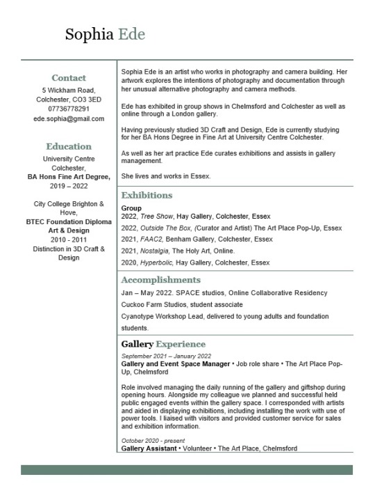
Sophia Ede is an artist who works in photography and camera building. Her artwork explores the intentions of photography and documentation through her unusual alternative photography and camera methods.
Ede has exhibited in group shows in Chelmsford and Colchester as well as online through a London gallery.
Having previously studied 3D Craft and Design, Ede is currently studying for her BA Hons Degree in Fine Art at University Centre Colchester.
As well as her art practice Ede curates exhibitions and assists in gallery management.
She lives and works in Essex.
I also tried writing a more personal/informal biography. I think in most circumstances I am most likely to use the above biography but it's worth keeping in mind that I can adapt a biography to fit different situations. My more personal bio reads:
I’m interested in the role of the camera and what defines a camera. I explore this using alternative photography and camera construction. Some of those works resemble photography and some do not but I consider all photography.
I am currently studying BA Hons fine art at University Centre Colchester. I am trained in art and skilled in photography, not a trained photographer. I explore that relationship in my art.
Previously I had written a CV for a job application. This was, however, for a gallery assistant job application and I would probably want two CVs depending if I am applying to a standard job or if I am applying for an artist opportunity.
- Name and contact details
- Education
- Solo and group exhibitions
- Collections
- Awards
- Publications
- Commissions
- Residencies
- Gallery education
I still used my prior CV as a template but used Artquest's guidance on what to include. I, however, tweaked mine slightly as I'm still early in my artist career and elements such as exhibitions, awards, publications and residencies will grow over time. I therefore made an 'Accomplishments' section that includes all of the above. As my career continues I will hopefully gain enough experience to spread over 2 pages and be able to dissect 'accomplishments' back into the appropriate categories.
In preparation for the Degree Show I have also been working on my artist statement. I’ve carried over some elements from previous artist statements but also incorporated my latest discoveries in pinhole film photography. I’m still uncertain if I will incorporate my cameras into the exhibition or to instead leave suggestions to them in the supporting material such as the handouts and business cards. It is therefore important my process is explained in my artist statement.
Sophia Ede is a fine artist who is interested in the science and magic involved in taking photographs. She creates cameras out of materials such as matchboxes and tape, taking photographs with them as she goes about her everyday life. The beauty and intrigue of the photographs comes from the way they capture the low-tech properties of the hand-built cameras.
Ede’s practice is all about the process. The mobile phone has made instantaneous, high quality photography accessible to everyone. Ede’s work rebels against the instant gratifications of modern technology and the notion that technological advance equals progress. Each step of her process is time consuming and laborious. The choice to photograph continuously across the entire roll of film takes time and patience with no proof that the photographs have been successful until the film is developed. For the artist, the subject matter is not the most important element of the image. She instead values how well the photographs captures the process, and connect the viewer with the material qualities of the camera.
Sophia Ede
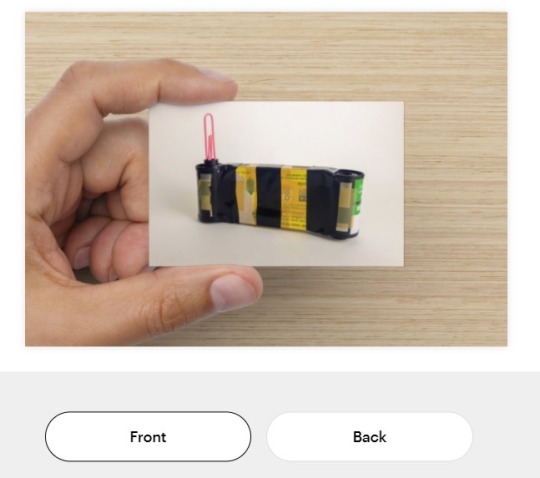
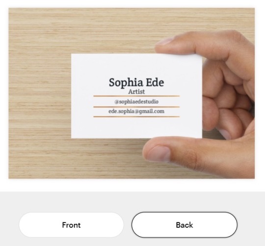
Also in prep for the exhibition I ordered business cards. As I have become a little bit known recently for my handmade pinhole cameras I decided to use a camera titled Strike Away From the Body as my main image. I don’t want to hand out my personal phone number to the public so I only included my Instagram account name and email address in ways in which I can be contacted.
0 notes
Text
White Pube - How To Get an Exhibition
In White Pubes' How to Get an Exhibition guidance one section really stood out at me.

In the first year of the degree I created an Instagram account under the name CarolineSophiaStudio. When exhibiting and selling artwork I have always used the name Caroline Sophia, my legal name. This is because I wanted to separate my personal life from my art practice and create an artistic brand for myself. As I've gone through the three year journey of degree, however, I have come to realise being an artist is part of my identity and there isn't really a divide between my art and my personal life. Also as I do more collaborative projects, exhibitions and meet ups, I am getting more known as an artist. I always introduce myself as Sophia so if someone wished to find me, they would search 'Sophia Ede' not Caroline. I do, however, still have some privacy on social media as I use an ambiguous title to my personal Instagram account.
Over the last few weeks I have been slowly changing all my online handles from Caroline to Sophia. Even my email address - ede.sophia@... would show my name as Caroline Sophia due to the way I first set up my google account. This always caused confusion in email conversations. It took me a bit of time and googling but I found how to alter it to Sophia Ede.
0 notes
Text
Website, Social Media and Online Presence Planning
I was planning to set up a website for my art practice following my degree. I have now decided against it and I explain why further ahead but first I did some research into website builders.
I have looked up some of the most popular website builders and their costs. I don’t need anything too complicated to start with but it would be useful to have a website I can build upon if needed in the future. I heard from some other artists that Squarespace is easy to use and has a very professional look. I was going to choose the personal plan for £10 but before committing I used a comparison website called Webcreate to compare deals. Wix seems to offer similar features at a cheaper rate than Squarespace. I want my website to be set up for the time of the hand-in and Final Degree Show but as it's a monthly fee, I can hold off for a couple more months. This means I won't be spending money unnecessarily.
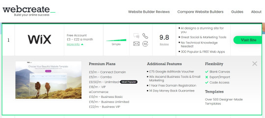

Since conducting that research, I have decided against building a website for now. I've been thinking whether or not I have a use for a website at this early stage in my career. Although it would look great to be able to put a website on my business cards for the final exhibition, I would struggle to fill it. I am still building my portfolio of work and would want more professionally documented artworks and exhibitions than I current have. Instead, I think a well considered and active Instagram account is the better choice.
With this in mind, I have been keeping an eye out for Instagram accounts I like for inspiration. For Initiis Exhibition, the curators created an Instagram account in the lead up to the opening. This introduced each artist involved and built up hype for the show.
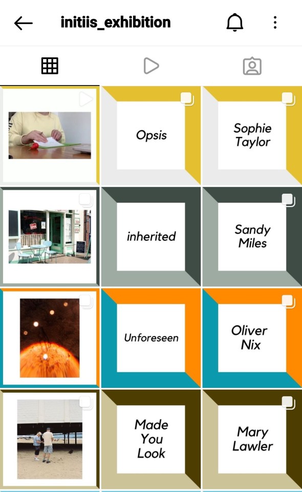

I like how well considered the layout is in a grid format. Each artist or subject is posted about in factors of 3. This ensures they always line up and have a line each. I also like the way coloured borders are used as visual queues for collections. I do have to think how each post will look when it enters the feed page though. Posts with just text or a name is unlikely to get interest from followers. I doubt many followers look at their account's page as opposed to viewing posts as they enter the feed. I think in the form of an exhibition page this polished look works well. It becomes an additional online exhibition in itself.
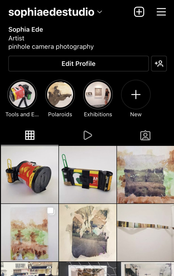
For me and what I want to achieve as a career, I think I need content that both looks professional if viewed search for as well as when it enters a followers' feeds. This will become my online portfolio of work and I hope people will use it to find me and view my work but I also hope to use this to interact with other artists and have fun. I think social media can easily become high maintenance if too complicated in editing and strategies. I don't want to give myself too much additional work that may take focus from my practice so the simpler the better. Saying that photographing good high quality images on your phone is so easy now, especially with a clean background and cheap soft-box light.
I took some time to curate the posts I already have. This meant removing posts that I feel are either no longer relevant to my current practice or aren't to the quality I would like them to be. I'm looking at my page as if it is my online portfolio and someone who wished to work with me or hire me is viewing it for the first time. Professional photographs of final pieces and exhibitions are great but I also like the inclusion of work in progress too. That is as long as it is photographed well. These give the account more personality, after all I want people to get to know me as an artist as well as my artwork and feel comfortable to approach me.
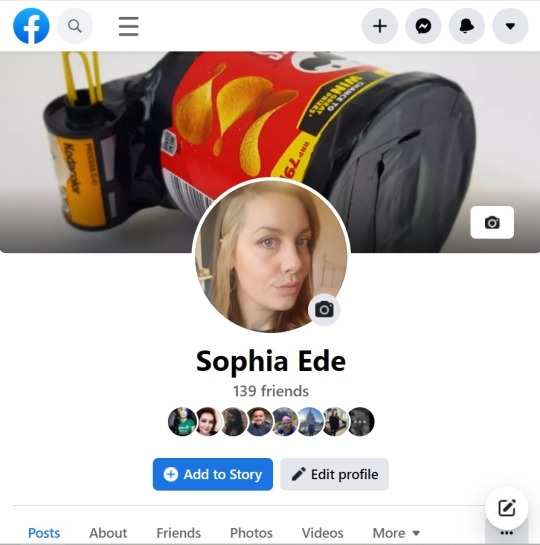
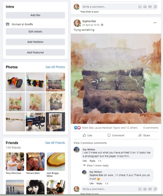
I've also considered Facebook. I have had a Facebook account for years but really don't use it. I realise though that quite a few people do still use it and whilst talking with other artists they will mention Facebook pages or groups for projects and opportunities. The advice from White Pube is to strip away any personal information and photos not related to my art practice. That's easy enough for me as I don't currently have anything on there. I have no real interest in having to maintain a Facebook account but I've found an easy way to post regularly with little effort. I've linked my Facebook with my Instagram so every time I post with Instagram, it automatically duplicates on Facebook. This means I am producing content and am prompting audience engagement on both platforms with half the effort.
0 notes
Text
The Art Place Pop-Up

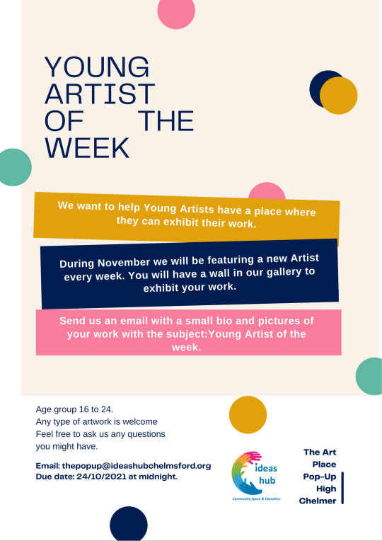
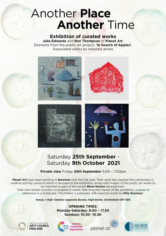
In October 2020 I started volunteering at The Art Place in Chelmsford High Street. It’s a charity run art and craft gallery and shop. It also has space where it holds free art and craft workshops for the public. I volunteered 3 hours a week as a Gallery Assistant alongside another volunteer in the same role. Our duty was to assist the Gallery Manager in curating the artwork and managing the artists’ sales and accounts. At the time I was also working part time as a waitress as well as attending Uni.
In September 2021, The Art Place received funding from Arts Council England to take over an additional store in the high street temporarily. The retail lot was currently between tenants and instead of sitting empty it benefitted the landlords to allow the charity use to attract visitors to the shopping centre. For 4 months The Art Place would use the store as a second location for a larger scale gallery and an events space.
In August, I was asked by the CEO of the charity that runs The Art Place to apply for the job share paid position of Retail and Events Manager for the pop-up venture. This was my dream job opportunity that I was hoping to secure after graduation. If successful I would be able to quit my restaurant work and gain experience in an art gallery job. I was, however, concerned that a 27 hour a week job alongside alongside Uni would be too much of a commitment. The opportunity was too good to refuse though and I couldn’t miss out on the experience it would offer. My prior experience in restaurant business management made me a great candidate for the role and I was successful!

We had 4 days to prep the space. We had to clear out a lot of rubbish left behind by the previous business and clean and paint walls. We were lucky in the fact that the store had a lot of very good lighting, the walls were already white which made touching up easy and there were a lot of display plinths and tables left that we could use. We invited selected artists who sold in The Art Place to bring large collections of work to fill the space. We also selected craft sellers who’s work we believed would fit well within the theme of ‘gallery giftshop’ to produce a shop area. The funding covered the cost of myself and my colleague, Sofia, but we would rely on the support of volunteers to help and the money generated through sale commissions to cover the cost of bills. After those 4 days of preparation we were ready to open The Art Place Pop-Up!

Both Sofia and I jumped into the role of Manager as the gallery opened. This meant a lot of thinking on our feet and navigating as we went. Edith, the CEO of the charity had already lined up some exhibitions in advance but it was up to us to organise the logistics. Between these planned exhibitions we reached out to artists who we admired and asked them if they wished to exhibit or sell through us. In the early days this could be for as short as a week, which meant we were forever planning and changing the artwork. By November we decided to focus on one large exhibition throughout each month to take the pressure off ourselves. This meant we could focus more on event planning and smoother transitions between each exhibition. We learnt so much through trial and error. It felt very full on as we were the only paid employees. This meant we were often manning the till in the shop area, as well as invigilating the gallery, at the same time as planning the next big event and exhibitions from our laptops. In an ideal world we would have admin days where we could step away from the store and allow other employees to handle the public facing duties so we could be more productive. This did become easier though as we gained reliable volunteers who could do regular, structured shifts and were comfortable enough to be left alone.
Our funding was based on providing public engagement through the arts so events were a big part of The Art Place Pop-Up. We had a few already lined up prior to opening through Edith. We quickly started reaching out to creators and event managers who were interested in utilising the space. We were open to most ideas with the only criteria being that the artwork in the setting cannot be removed.
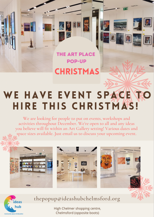
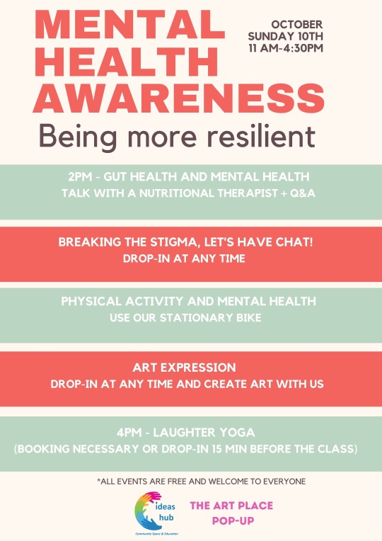
We made the mistake once of agreeing to close the gallery to the public for a private event. The event manager paid a fee for the day to cover the loss in artwork and giftshop sales. We didn’t know much about the event before the agreement was made except it was to promote positive mental health, an aspect the charity is keen to promote. The event unfortunately turned out to be less in keeping with the charities core values with a £20 entrance fee and stalls set up inside to sell well-being products from various businesses. Following this event we insisted all events were free to enter and only workshop participation can be charged.
We also put on a lot of events ourselves with the help of volunteers and friends of the community. We asked artists to donate their time to host workshops and only asked for donations from the public in return. Soon we had an event every Saturday and Sunday that was designed to be accessible to all.
Events at The Art Place Pop-Up:
- Mental Health Awareness
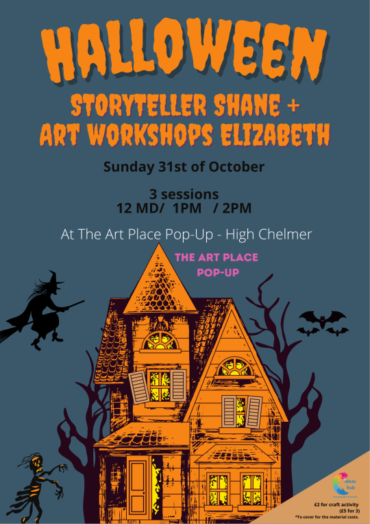
- Halloween Story Time
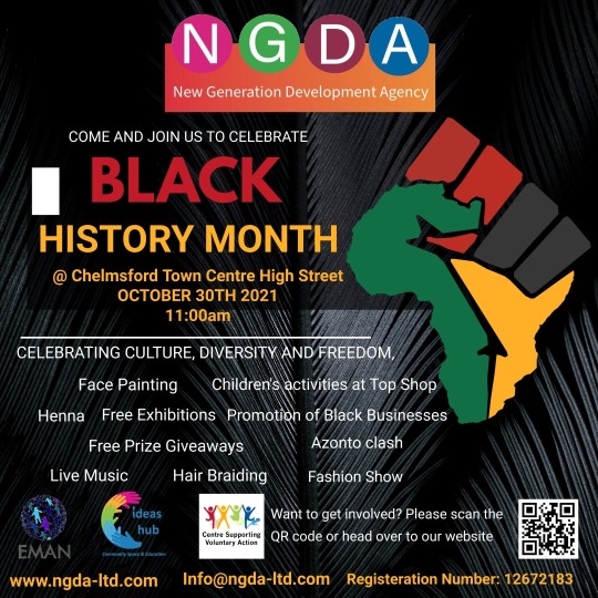
- Black History Month
- Fringe Festival
- Essex Photography Prize
- Teledyne Science Event
- Drumming with Dom
- LGBTQ+ Quiz
& tonnes of workshops
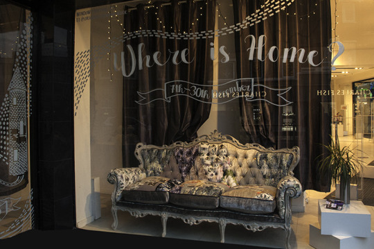
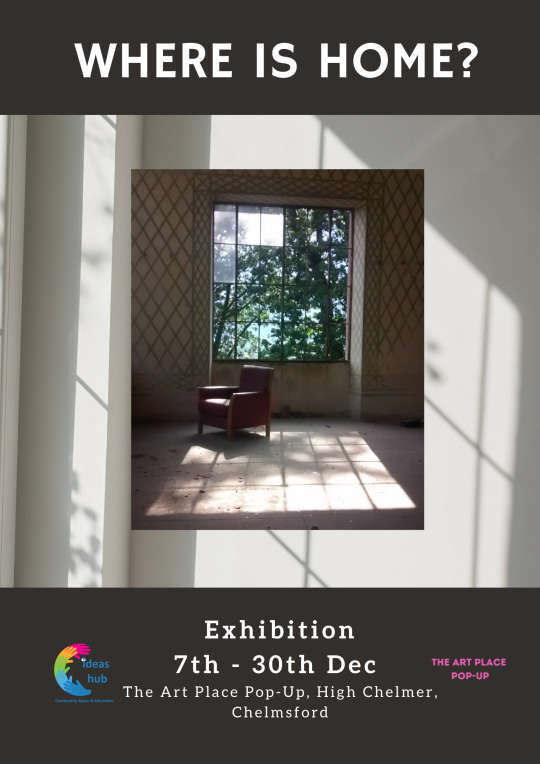
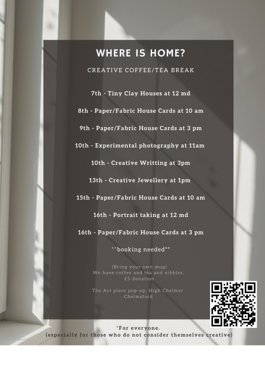
Throughout December we put on an exhibition titled Where Is Home? This was inspired by our many volunteers and their range of nationalities and experiences. The exhibition showcased artists from all around the world responding to the question - where is home to them? I was very excited to ask Lu Yu from our class to exhibit some of her work in the show. Many of the artists who exhibited then also held free workshops throughout the month to encourage inclusivity and understanding of different cultures.

The original plan was to close The Art Place Pop-up on 30th December 2021 but we were offered an extension by the shopping centre landlords until 30th March instead. I loved working at The Art Place Pop-Up. It was hectic and stressful but so rewarding and cemented my dreams of curation as a career. I however found it hard to juggle both working and studying, especially as I was getting closer to the end of my degree. It was getting very exhausting and distracting for me. I therefore spoke to Edith and asked to step away as Manager at the end of the year as agreed. I helped in the interview and hiring process of taking on 2 new employees to fill my position and helped in training. Although I was no longer a paid employee of The Art Place Pop-Up I continued to volunteer my 3 hours a week as previously done so until it closed in March.
I could not be more thankful for the opportunity and the teachings The Art Place Pop-Up gave me. I cannot wait to begin a career as a curator or in a similar role where I can continue to work on the behalf of artists and creators in the same way Sofia and I did. Throughout the 4 months I met and networked with so many artists and event organisers who I continue to stay in touch with and hope to work with again in the future.
0 notes
Text
Equipment on a Budget
If successful in securing a job in a gallery or museum role, I'm aware that for the first year at least my income will only just cover my mortgage and household bills. I knew this when entering Uni and had planned for this but it does mean I will have little funds to support my personal art practice as well. This shouldn't be an issue as I'm happy to go without a studio for a year and I've already been quite resourceful in my practice so far. I can continue keeping costs low by making my own darkroom in my home and resourcing second hand materials.
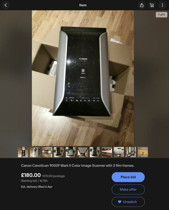
One area that will be an issue after leaving Uni is I will no longer have access to the Universities facilities, especially the scanners for scanning film. There are scanning equipment available for use at 37 Queen Street, Colchester for £30 per month membership. This also includes Darkroom use but I can do most darkroom process at home colour film development and enlarging. By scanning film I don't need enlarging. Instead with advice from Mike the technician at Uni I found and bought a second hand scanner with 3 film scanning attachments. Over 6 months this will save me money long term instead of signing a year long membership at 37 Queen Street.
Another way I can save money is by making my own black and white film developer. This is called Caffenol Developer and is made from instant coffee, vitamin c powder and washing soda. It's safer to use and can be poured down the sink without harm to the environment as well as being very cheap. I also think white wine vinegar can be used as a fixer.
There's also recipes for developing with beer and wine, though instant coffee sounds the cheapest. I've also heard of adding red bull and other strange acidic ingredients to developer. This could become my next line of investigation and project!
0 notes
Text
Initiis Exhibition
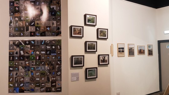
The Covid-19 pandemic has forced many of us to reconsider our priorities in life but has it also caused us to look at the world around us differently too? With the luxury of travel stripped away we may have discovered a renewed sense of beauty in our immediate surroundings instead. Standing in The Art Place gallery and gazing upon the Initiis exhibition I believe this to be true.
Initiis is made up of eight recently graduated photographers who present an intimate look at their surroundings. I was first struck by Izzy Hall's collage, More Masks Than Jellyfish. The systematic process to photograph poorly discarded Personal Protective Equipment (PPE) is a simple yet probably never ending pursuit. Hall's intentions are to draw attention to the detrimental environmental impact of single use PPE and the thousands of masks and gloves that have worked their way into the natural landscape. This equipment has had a fundamental role in protecting us for the last two years and still continues to, but at a cost.

Faced with the vast collection of masks and gloves that litter our natural landscape also questions at what point we stop recognising these scenes? Two years ago very few of us were familiar with the term PPE yet now it's become a staple of our lives. We pass by the now familiar blue surgical masks floating in puddles, caught in bushes and drifting down the street on such a regular basis we barely notice. Hall has redrawn our attention by presenting us with the truth.
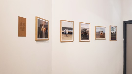
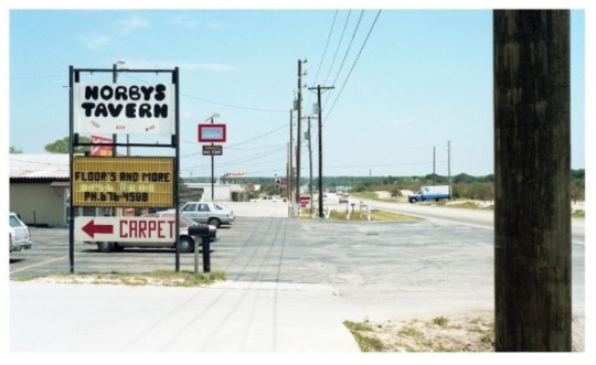
Sandy Miles and Mary Lawler capture the everyday experiences and re-frames them as enticing and alluring. Perhaps as society we have grown weary of glossy snaps of exotic destinations but I am instead drawn to the view of Norby's Tavern and sea side arcades. It prompts a conversation about why do we photograph and of what? For some it's to create mementos or it's a way to share experiences with others. For these two artists though, I believe it is to appreciate and share the beauty they have found in unexpected places.
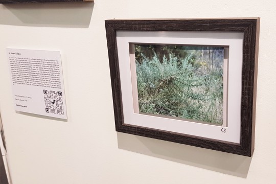
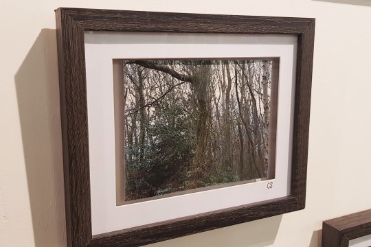
Another keen eye for everyday beauty is held by Chloe Stearman. At Nature's Pace focuses on the patterns and formations Stearman discovers in tree growth. We know nature is beautiful but how often do we stop and truly observe a tree, let alone a series of trees? Stearman presents us with a series of trees that she determines worth our attention based on their movement and growth.
A selection of the works shown at Initiis can be viewed online through their Instagram @ initiis_exhibition.
0 notes
Text
Linea, Punto by Renato Leotta
You need a keen eye to visit Renato Leotta's Linea, Punto exhibition.
You're looking for a small buzzer next to a seemingly everyday locked office door in the Mayfair area. Behind that door is a small, clean, single room gallery located on the first floor. As we entered a head peaked through the equally impeccably neat office behind the glass door in the corner. "Welcome, if you have any questions let me know".
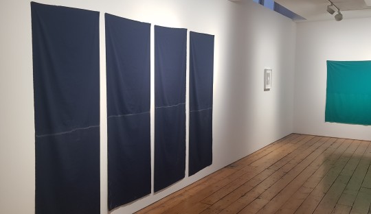
On each wall hangs seemingly simple cuts of fabric with framed black and white prints dotted in between. Without reading the additional print outs available at the door, you may miss the magic of the work! These raw cut yards of fabric, titled Multiverso, are the indexical signs of the sea tides we as the audience weren't able to experience. By immersing the fabric in the waves Leotta has captured the movements of the tide through the natural crystalisation of salt. Does this differ from photographing the shore line to prove its existance? I would argue not and with the inclusions of framed lunagrammi included in the exhibition, I think Leotta understands the connection to photography.
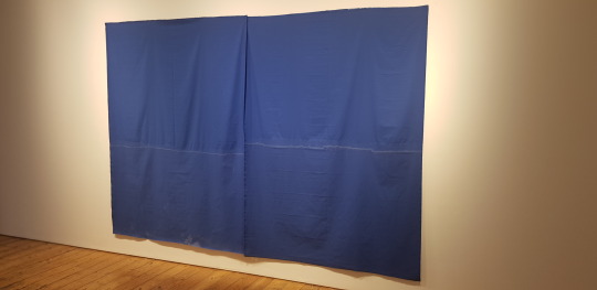
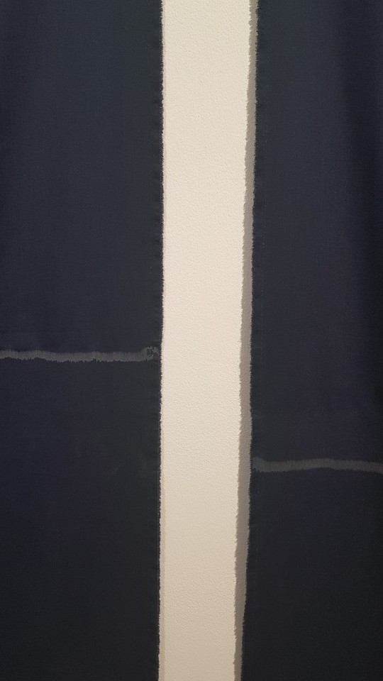
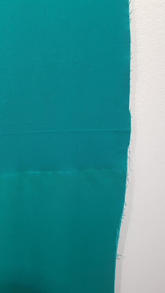
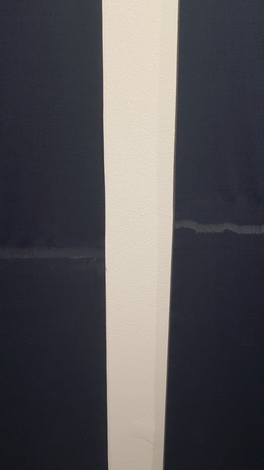
Free from the containment of glass or frames, the viewer can truly appreciate the raw edges of the fabric and their relation to the soft delicate shore lines captured in salt.
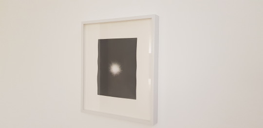
Another form of documentation, the lunagrammi are moon light contact prints of sea urchins. They are captured within the water mirroring the fabric's process.
Linea is successful in its simplicity and subtle nature. It however speaks to those familiar with photographic processes without presenting a single traditional photograph. A collection of work that could easily be disregarded but is greatly appreciated by those who understand process.
0 notes
Text
Workspace and Equipment Hire
My current plan is to save money in the first year after graduation by practicing my art from home instead of hiring a studio space. This is if I am unsuccessful in my application for the Cuckoo Farm's Graduate Scheme that rewards one graduate with a free studio for a year as well as other perks. Working from home would most likely only be a short term arrangement, however, as I already struggle to focus from home. I like to separate myself from my personal life and household chores to avoid distractions.
Hopefully after a year I will be able to afford a studio space local to Colchester. I've been looking at options and some seem very reasonable in price. My choice of space will also depend on what facilities I may need. I currently have a make-shift at home darkroom in my en suite bathroom but I may wish to use it as a functioning en suite at some point and look for darkroom access else where.
Space, 37 Queen Street offers darkroom and scanning suite hire
£30 p/month or £20 student fee
contact: Jack at [email protected]
This would be good if I continue film photography as I'll be able to develop my own film and use the scanning equipment. In the meantime I have been looking at cheap second hand scanners with the ability to scan film on Ebay.
Cuckoo Farm
Artist studio rent between £80 - £130 p/month
https://www.cuckoofarmstudios.org.uk/workspace/studios/
Cuckoo Farm would be my first choice for studio space. It doesn't have darkroom facilities but instead offers individual art studio spaces that are private and can be locked when not in use. The greatest benefit of Cuckoo Farm that it houses 30 artists within the property. This means you are surrounded by fellow artists that you may collaborate or discuss feedback with. It's a great opportunity to network and learn more about the local art scene. Studios, however, don't become available very often and can be quite competitive when they do.
The farm is located just outside Colchester, about 20 minutes drive from my house. It is also only 5 minutes from my Dad and his partner's home and 10 minutes from my Mum and her partner's home who I visit frequently. This means I could always nip out for a coffee or lunch with my family without hassle.
Ardleigh Studios
Studio 22
Good-sized, self-contained studio
Available: Now
Let type: Full licence
Licence fee: £166 per month
Size: 210sq ft
Monthly bills estimate: £42 p/m
https://www.acava.org/studios/available-studios
Too pricey! But other smaller studios in the building may become available next year at a cheaper rate. Ardleigh is 5 miles from Colchester.
Other workspace options:
With the popularity of hot desking growing over the last couple of years there are other options than renting a studio space full time. In fact over the last 2 years I have heavily relied on cafe hopping to complete sketchbook work, writing up of notes, conducting research etc with the use of free wifi. I have recently noticed Greene King pubs encouraging people to "work remotely" in their pubs through their advertising. This doesn't fulfill the need for space to create artwork but a lot can be achieved with a laptop and notepad.
The Art Place in Chelmsford offers artist desks in the workshop area for £15 per month. This doesn't include wall or floor space for larger projects but offers a very large desk that is intended for arts and crafts. This means you're more than welcome to cover it in paint, glue or whatever medium you are using without guilt.
Firstsite and Mercury Theatre, both located in Colchester Town Centre offer spaces you can hire on an hourly or daily basis. This wouldn't be a studio solution but if there was a need for a business meeting or a collaborative project that needs a large space for a very brief period of time, these are worth keeping in mind.
0 notes
Text
Job Hunting
A large concern of mine at the moment is whether or not I will be able to secure an art related job after graduation. I made the decision to not work over the last 5 months of my degree so I could focus on my course. I am currently comfortably living off savings, as planned, but I want to start working as soon as possible after the year ends. In pursuit of this I have already started looking for possible jobs and considering what roles I would like to pursue.
I came across Colchester and Ipswich Museums, Display and Exhibition Assistant role advertised on the Colchester Borough Council website. I think installing displays and exhibitions would be a really good fit for me. When reading the Person Specifications I felt I had experience in almost all the skills they were looking for. There was no start date stated, only that interviews would be held 31st March. I initially assumed they would want a candidate with immediate start and thought I would take note of the contact details and would keep a look out for similar roles with them closer to the end of the year. But then I thought 2 months isn't that long for a business to wait if they had little response to the job advertisement. Also if they liked me for the role we could possibly work something out where I could work part-time til ending uni. Or maybe they have another job available that they think I am suited for? Basically I don't know what I don't know!
So I decided to apply regardless and include in my cover letter that my studies end at the end of May. Why not at least try, right? Before I could apply though I had to update my CV first. My current CV was heavily focused on my restaurant career and only had a small snippet of art experience in the form of volunteer work. It also had very little mention of my personal art practice and achievements. To apply for this role I need to still highlight my business management skills for areas such as organisation and understanding of health & safety but also showcases my experience in a galleries and my participation in exhibitions as an artist.
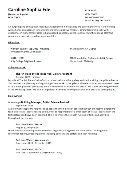
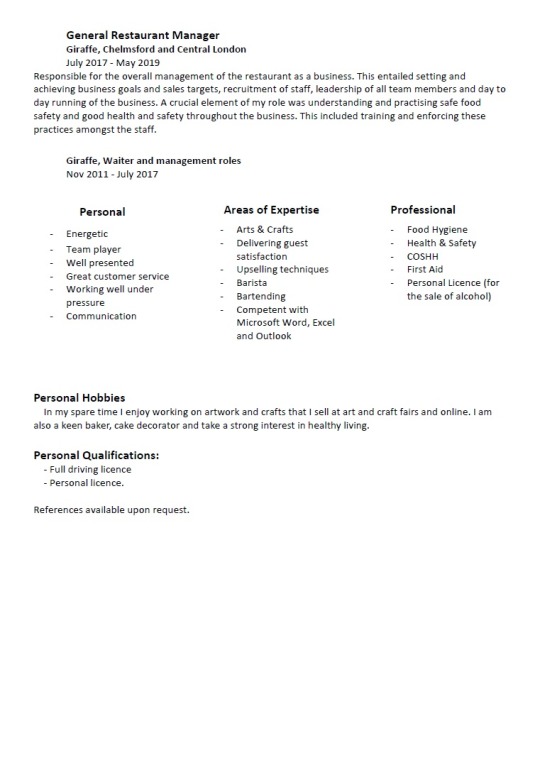
I have never changed the font or layout of my CV since first building it at 19 years old. These choices were initially intended to look clean and professional but as it has grown in size I think the boring layout and solid black font can be overwhelming. Areas I wish to stand out get lost. I looked up several CV templates, after all I am applying for a creative role. Though, in my prior experience as an employer I hate over complicated and gimicky looking CVs. I have seen many that feel like the look of the word art has been focused on over the context it is suppose to contain. I settled on the below that I felt was clean and precise with enough variation in font and colour to highlight each section.
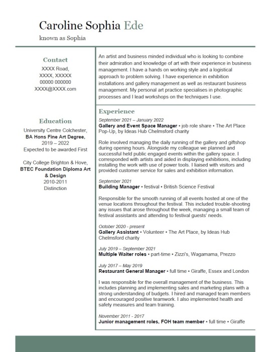
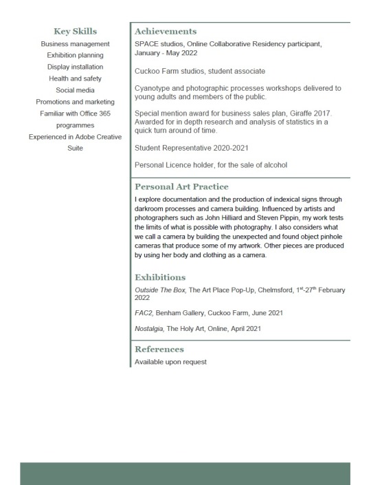
Even if I'm not successful in my application, I am glad I took the time to update and rewrite my CV. I was worried about finding an art role but writing down all my art gallery experience, my art practice and the exhibitions I have participated in and my achievements such as my inclusion in Space Online Collaborative Residency has made me realise I already have a lot of prior experience and skills. I feel less like an imposter and am confident I will find my way into an art career one way or another.
instagram
0 notes
Text
Outside The Box Exhibition
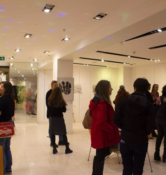
Since September 2021 I have been co-managing The Art Place Pop-Up with Sofia Rojas. We initially believed we would only have the venue space until the end of December. However, we were told in mid December that the venue agreement with the shopping centre could be extended for a further 3 months. I decided to step down from the management position at the end of December as originally planned so I could focus on the final months of my degree. The extension did, however, offer an opportunity to exhibit. The prior 4 months' exhibitions had been mostly pre-planned and booked at the start of the gallery opening. I therefore proposed a 2 week exhibition (this later changed to 4 weeks) in the central section of the pop-up gallery.
I was aware that most sales made in the gallery were for paintings or prints that had more conventional and commercial appeal. These were often landscapes, animals or colourful abstracts that would fit easily into someone's home. Whilst discussing how my artwork doesn't have the same commercial appeal to Edith, we discussed how there is so much more to art than paintings or drawings to a high standard. Edith has been eager to encourage young people to pursue a future in the arts and liked the idea of an exhibition that showed more conceptual and unusual approaches.
I started by approaching five artists (1 ceramicist, 3 fine artists and 1 photographer) who I believed might be interested in a group exhibition. Of the five, four were interested. I explained that as well as being a great opportunity to display work, it was also a great chance to sell artwork. I was hoping this would encourage them to consider including prior artwork instead of making work specifically for this exhibition due to the narrow timeline.
On 24th December I sent out the below table to the four artists asking them to complete and return them to me with accompanying photographs of work. I could then plan out the space to hire to accommodate all the work (every wall and exhibition space in the gallery has an individual price for rental) and return to the artists with a cost.

I initial planned the exhibition to be for 2 weeks that fell within my university semester break. The space picked out was going to be £75, equivalent to £15 per artist including myself. However, Sofia asked if I could extend the exhibition to 4 weeks instead at no extra charge. She was willing to waive the additional cost to save her the hassle of finding additional artists to rent the space during such a busy work period for her.
The planning and logistics of the exhibition only really came together within the week before we were due to open. This wasn't my intention but being so soon after Christmas and with university deadlines falling within January for myself and one other artist, it was inevitable. I was chasing emails for information and only one artist had sent me photographs of her work. One of the fine artists also pulled out of the show in mid January which raised my concerns that I may not have a show to exhibit. These concerns were resolved once I received the remaining three artists payments of £15, securing them into the show.
In mid January I was eager to start advertising the upcoming exhibition in The Art Place Pop-Up window and on social media. I didn't have any images from two of the artists and I had been so busy I wasn't sure what artwork I was going to be putting in myself. I instead decided to screen grab some images from each artist's Instagram page to create a poster for the show. Even if they weren't direct images of the work that was included, they should at least give a flavour of what artwork each artist produces.
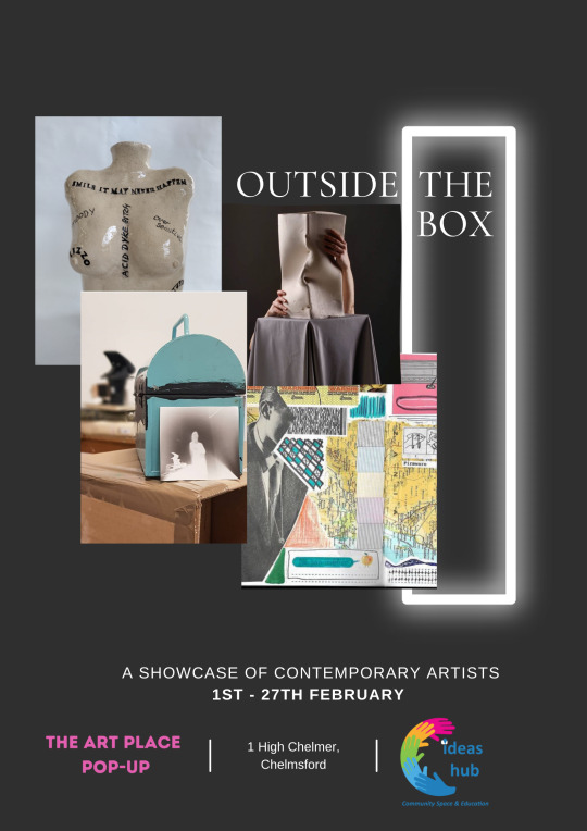
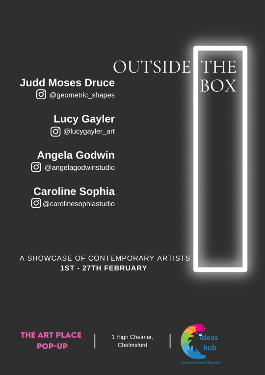
I wanted this to be an opportunity for the artists to promote themselves and their artwork. We therefore decided to include everyone's art Instagram handles on the poster and the labels for their work. The labels included a QR code that guests could scan and be immediately connected to their accounts. Back in December, I really liked the idea of hosting a private view on the opening night with a guest list of local artists and project managers from the Ideas Hub Chelmsford's connections. As we were getting closer to the opening I was running out of time and didn't have the budget to fund buying alcohol and nibbles. We were very fortunate, however, to be asked by Sofia if we wished to piggy back on the sistering LGBTQ+ exhibition for their Launch night on the Wednesday. This exhibition was held in the adjoining space of the gallery and was partly funded by Chelmsford BID society. They had budgeted for a launch event and arranged alcohol, snacks, music and volunteers to assist and was happy for us to also invite our own guest list for a private view of all the exbihibitions.
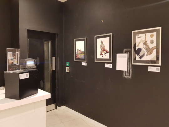
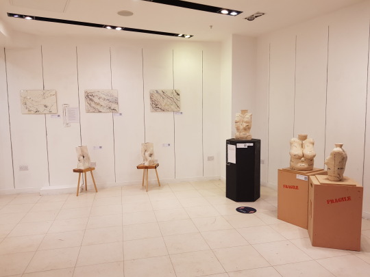
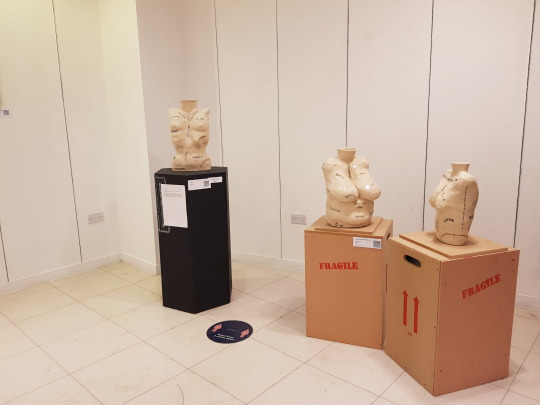
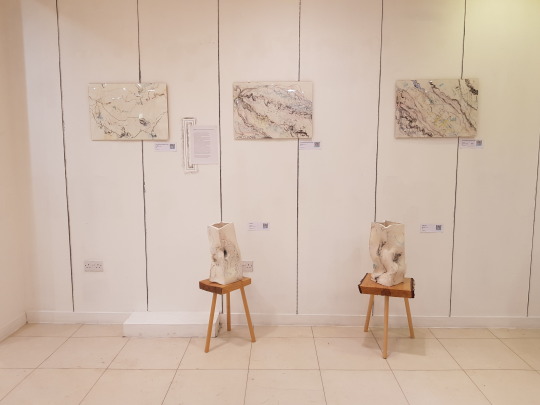
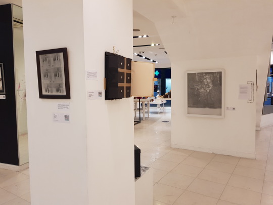
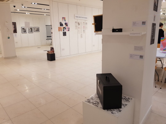
The private view and exhibition were very successful. We had over 50 visitors to the private view. Guests included Mark Wilkinson and Mick Inkpen, two quite prominent artists who took a real interest in our art and the work of the charity. We received lots of positive feedback and I personally had a lot of questions regarding my cameras and how they worked. During the month Lucy Gayler sold two framed drawings for £120 each.
I learnt a lot of lessons regarding planning an exhibition, especially a group show with multiple elements during this process. If I was to do it again (which I hope I will) I would give myself at least 6 weeks to plan and ideally with less distractions such as deadlines, though I am well aware of my tendency to take on multiple projects at once! Working with multiple busy artists is inevitably going to result in needing additional time to chase emails of details and confirmations. I would also like to be able to spend more time on considering my own artwork. In my focus to organise the show as a whole and managing the other artists, I put my own work on the back burner and although very happy with what I exhibited, I would have liked to have considered it more.
0 notes
Text
Simon Carter and Jeven Watkins Jones
Shore Lines at Firstsite, Colchester
11th December - 6th March
Confluence at Benham Gallery, Cuckoo Farm
7th Feburary - 3rd March
In 2019, before the dreaded Covid-19 pandemic changed the way we viewed communication and connection, Simon Carter and Jevan Watkins Jones began a drawing collaboration. Unknown to them the resulting work reflects the uncertain journey the artists and many of us have been through during the multiple lockdowns. How do two artists with the goal of mapping the water ways across the county line that separates them do so whilst restricted to their homes? Well Carter and Watkins navigated the challenge in ways we are all familiar with by now; email attachments, zoom screens and the good old postal system. Once lockdowns ended they met in person and began to work on pieces together, like a celebration of their freedom.
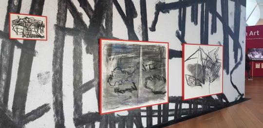
In the most unorthodox and innovative approach to the collaborative drawing the artist stood either side of the River Stour, facing each other over the line that divides their counties. The first challenge was locating each other in the distant landscapes but through mobile phone calls and landmark spotting they succeeded and would draw their view. They later brought their drawings together disregarding up, down, east and west in how they joined their individual perspectives.
Upon speaking with Jeven Watkins Jones he places the success of the collaboration partly on their familiarity with each others work and friendship.
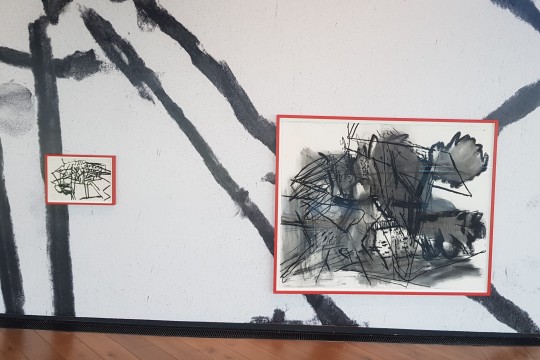
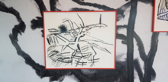
I wasn't able to make the live drawing show at Firstsite. In the show the two artists concurrently worked on the same piece live in front of an audience on the evening of 22nd February. I did, however, watch the close up recording showing at Firstsite. There is an aggression in the way they mark the enormous sheet laid out on the floor. An assertive attack towards the page that comes from confidence and commitment to the mark. As the two artists move around each other, there is a silent conversation communicated only in movement. They are like two well oiled machines that without instruction perform perfectly in collaboration. It is obvious Carter and Jones fully understand each other to the point where they don't need to speak.
There is however a soundtrack of their movements in the scratching and snaps of the charcoal under pressure. Pressure that results in splintering and splattering shards of charcoal being scattered across the work. Some of which can be seen being ground into the paper by hands, knees and elbows. The over-sized works mounted on the adjacent wall prove what we already know from the recording. There are clear, precise, meaningful marks surrounded by the presence of the makers. Smudges made by their movements, some intentional, some less so. The artists' identities are captured in the fingerprints left behind.
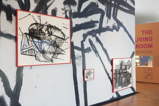
The collection of wall mounted works include large and small pieces. Regardless of size all are powerful and impactful especially in the use of black on white. The only colour in the work is the bold red frames used to mount them.
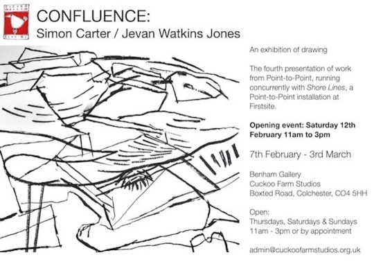
The Benham gallery exhibition Confluence is less formal in structure. The work is set free of the red frame restraints and glass barriers between the viewer and the marks. First impressions may have you think of the artworks layout as chaotic. Some mounted uncomfortably low as to make you crouch for viewing whilst others are mounted towards the ceiling making you crane your neck. There also seems to be no correct way up and multiple pieces are joined with horizons that are strangely vertical. It is, however, as you become familiar with the objectives of the work that this layout makes sense. The orientation and location of the work mirrors peaks and valleys of the landscape. We only view maps in the sense of up, down, left and right due to the long held decision that North is up but that's not how we navigate the real world. The joining of work highlights each artists' personal perspective. The work therefore reevaluates how each of us view the world around us.
0 notes
