skylerscreations
58 posts
Artwork done by Skyler Anthum
Don't wanna be here? Send us removal request.
Photo
Just in case you forget this exists.
It exists.
489K notes
·
View notes
Text
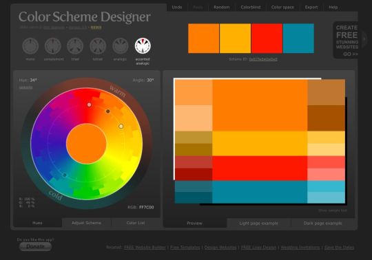
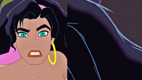
What’s also neat to study with screencaps of disney movies is how they use color in their lines. They don’t just pick any colors!
For example, check out Jasmine and Mulan. Both of them have black hair, but we get subtle differences between them.
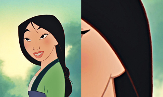
Mulan, for example, has hair made with dark brown lines. We get the idea that her hair is probably a very deep, deep shade of brown, or that as light filters through her hair, we’re seeing that brown subsurface scattering.
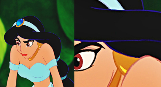
Jasmine, meanwhile, has hair that is so deep black we sometimes see it as blue. This is black hair with cool undertones, as opposed to Mulan’s hair with warm undertones. Which in pure color speak is impossible, but is something that happens with hair, since hair is mildly translucent and reflective.
You can even compare that further with Esmeralda, who has grey lines that give the illusion of neutral undertones.
They can also use color to give characters that fantasy feel or the feel of completely unnatural hair. Princess Aurora, for example, has technically darker hair than Charlotte LaBouff. But, with the lighter outlines? Aurora’s hair looks absolutely fairytale golden, while Lottie’s looks like a more natural flaxen blonde.

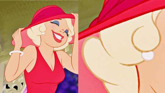
How disney uses color isn’t the be-all end-all, but they can give you some really neat ideas for showing a lot of information in a condensed drawing.
91K notes
·
View notes
Text
my professor: don’t fall in love with the drawing. Fall in love with drawing.
This is so freaking important.
This is literally why we all draw as kids.
Because it makes us happy and we love it. And when we grow up and art becomes this tool to show what we imagine, so other people can see what we imagined, we more and more focus on the end product rather than the process that used to be so much fun.
We see mistakes, we try to get rid of them, we criticize our works until all that is left is stress and bitterness.
This is not why we drew in the first place.
Drawing used to be fun.
And I think it’s nice that she reminded me of it. Because I forgot.
17K notes
·
View notes
Photo

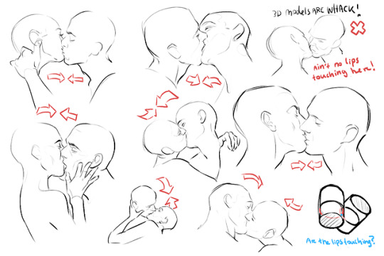
Smooching notes~!
So the people on Twitter seemed to find my notes very useful, So I am sharing them to you guys as well
have fun!
95K notes
·
View notes
Note
Ho would you draw shoulders from the side? I've always struggled with that.
I’ve been thinking about it too, and honestly it’s quite troublesome to think about. I never really thought about how I draw it, I just improvise until it looks believable. However, I did notice there is a trick for it…
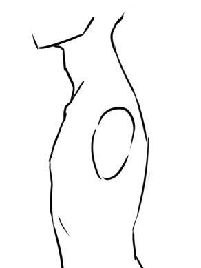
Okay so here’s the body, right? Ignore the obvious anatomy errors, I’m lazy and tired at the moment, but the idea should be clear. Think of the shoulder as ball-jointed doll. Draw the circle in the motion of the body as the base and…
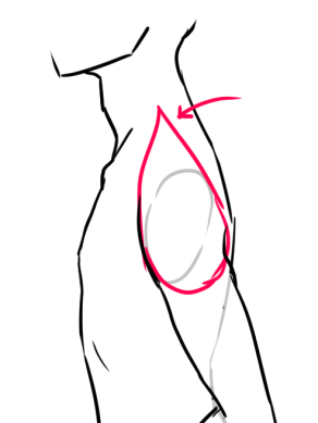
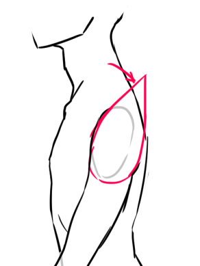
Bam! Put a teardrop around it! I love teardrops as guidelines so much. I don’t think I have to explain it, do I? I think it speaks for itself; rotate the teardrop and the shoulder should follow it. Use it as a guideline and eventually you won’t have to use it anymore, it’ll be there mentally. I do, however, reccomend you pose in front of the mirror to get more correct results on how the lines will bend with the muscles. Just stand in front of the mirror and move your shoulders around, notice what muscles follows and etc.
If you need any more help with this, let me know.
14K notes
·
View notes
Note
How do you do eyes? I’m having lots of troubles with that and would really appreciate your help


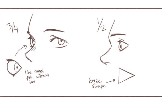

I don’t know which part of drawing eyes you’re struggling with but I hope my explanation is clear enough 😭
12K notes
·
View notes
Text
SenshiStock
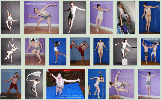
SenshiStock is a collection of non-nude, figure model drawing references.
There are over 2000 FREE pose references on on DeviantArt.
SenshiStock.com has some merch & themed download packs for purchase.
There is a free web sketch app that also works on mobile. There are over 1500 images in rotations with optional tags and timer.
There is a SenshiStock Patreon for supporting the creator in exchange for more pose reference goodies.
—DeviantArt Gallery Shortcuts— General Drawing Poses Foreshortening or Perspective Poses Dynamic Flying Falling Action Poses Male Poses Gun Poses Staff Weapon Poses Ax, Hammer, Bat Poses Sword Poses Small Blade Poses Archery Poses Sailor Guardian and Magical Girl Poses Romance or Couples Poses Sitting and Kneeling Poses Dramatic and Reaching Poses Magic & Hogwarts Poses Defeated or Lying Poses Dance and Performance Poses Back Poses Pin Up Inspired Poses Life In General Poses Fights and Fighting Poses Leaning Poses Pairs Poses Wings Poses Hanging Poses Groups of Three or More Poses Instrument Poses Mirror Poses Pregnancy Poses
7K notes
·
View notes
Text
honestly? starting to flip the canvas during the drawing process improved my art so much yeehaw
70K notes
·
View notes
Text
8 helpful guides for digital artists
There are artists who like videos and there are artists who love books.
In the previous post (here) we gave you a list of helpful and inspiring YouTube channels, so today we are going to share the best books we know about digital art!
First thing we want you to know is about the existence of two great art magazines, ImagineFX and 2DArtist. These magazine focus both on digital and traditional art, sharing guides on programs like Photoshop, Painter, ZBrush and traditional tools. There are two other magazines about digital art, PainterMagazine and Photoshop Creative - though these two are a bit more expensive and much more focused on their software (Corel Painter and Photoshop), while the first two can give you general ideas about art and specific tips and tricks on digital programs as well!
Mind that this list doesn’t have an order of importance, and if we have pro and cons to share, those are written in each book’s description (:
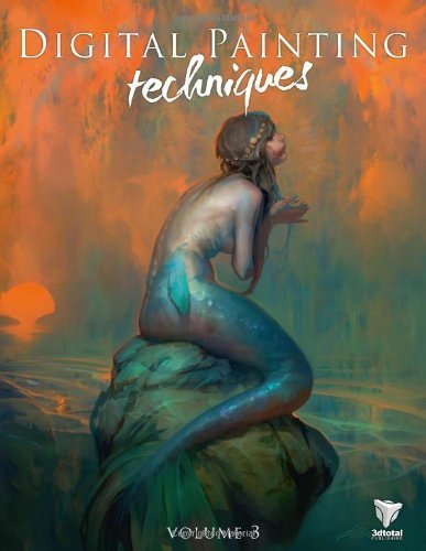
1. Digital Painting Techniques
This is the third volume of the series created by 3dtotal Publishing - you can find all the volumes here.
This book features many illustrations and tutorials done by famous digital artists like Chee Ming Wong, Robh Ruppel and Ignacio Bazan Lazcano. These artists will share their knowledge on concept art, matte painting and digital painting in general.
This book is presented for artists of all levels, from students to professionals. The tutorials are easy to follow, though the theme is quite specific: if you are into sci-fi, fantasy and concept art, well, then this book is for you!
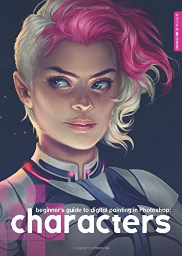
2. Beginner’s Guide to Digital Painting in Photoshop: Characters
Another guide created by 3dtotal Publishing.
This guide is for all those artists interested in creating detailed characters. Two of the featured artists are Charlie Bowater and Derek Stenning.
Despite the title, though, this book isn’t for beginners at all - the artists share tips and tricks, but a basic understanding of digital painting is needed.
The main program used by the artists is Photoshop.
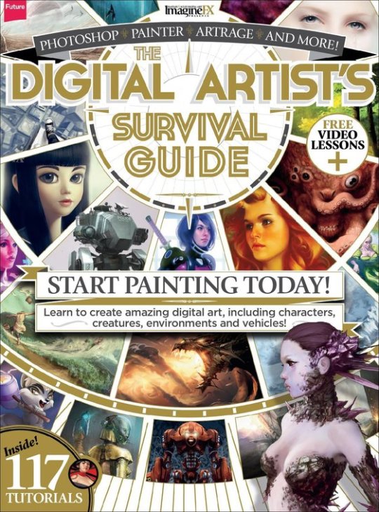
3. The Digital Artist’s Survival Guide
Created by ImagineFX, this is a complete guide for digital artists, be them beginners of professionals, full of advice and inspiring tutorials to paint amazing environments, characters and creatures!
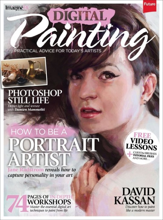
4. Digital Painting
Another great issue created by ImagineFX, Digital Painting is a guide for digital artists who want to learn a bit more of how to paint from life. The book features workshops and video lessons too.
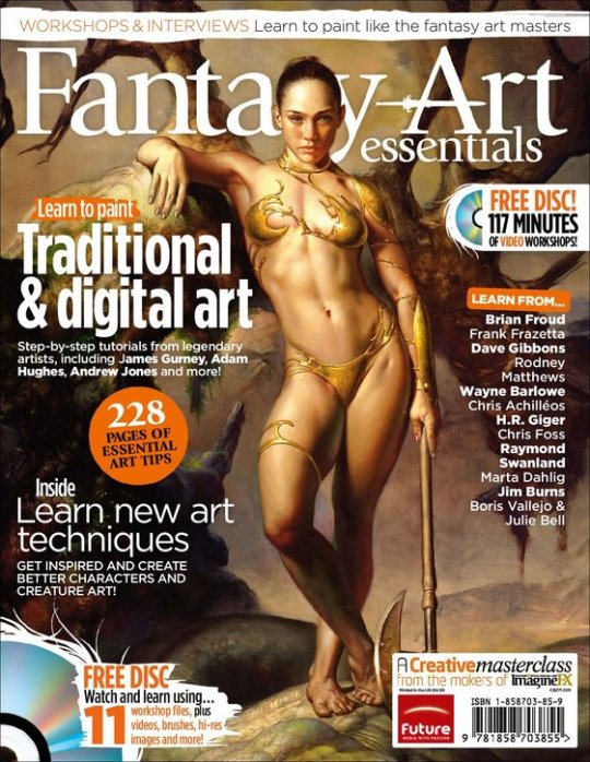
5. Fantasy Art Essentials
If we can say it, this book is our favourite. Not only it contains 228 pages, so more workshops and advices (+ a DVD), but it features both digital and traditional tutorials about fantasy art. So, our blog is about digital art, but this is a hell of a volume with artists like Andrew Jones, Marta Dahlig and Adam Hughes!
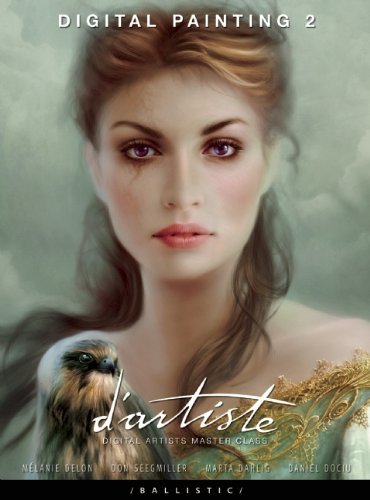
6. d'artiste Digital Painting 2: Digital Artists Master Class
The second volume of d’artiste series created by Ballistic Publishing. This book is a must-have masterpiece for digital artists. It features workshops from top artists like Mélanie Delon, Don Seegmiller and Marta Dahling and tips on apps like Photoshop and Painter. The subjects of the book are character and creature design and environment painting.
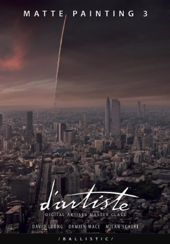
7. d'artiste Matte Painting 3
Another series from Ballistic Publishing, this time dedicated to matte painting. Have you ever seen those incredible landscapes featured in colossal movies or videogames? This book’s going to explain how top artists David Luong, Damien Mace and Milan Schere can paint such masterpieces.
With this guide you can learn about composition and how to start painting from concept to the final artwork.
Be aware that the three masters of this books have worked for World of Warcraft, Game of Thrones, Avatar, Harry Potter, Sherlock Holmes and many other films!
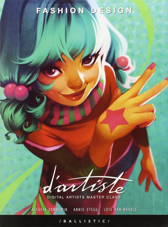
8. d'artiste Fashion Design: Digital Artists Master Class
Let’s face it: if you are an artist and you need help, you can’t say that Ballistic Publishing is useless. On the contrary, we can say that it presents the most complete series of volumes for any digital artist in need (or any art lover who likes his collections thorough and perfect).
This volume is great for character designers and it features a lot of tips and different approaches to the artwork. That means the reader is able to compare different art styles and be inspired from them!
We hope this list will help you! Good luck!
3K notes
·
View notes
Photo
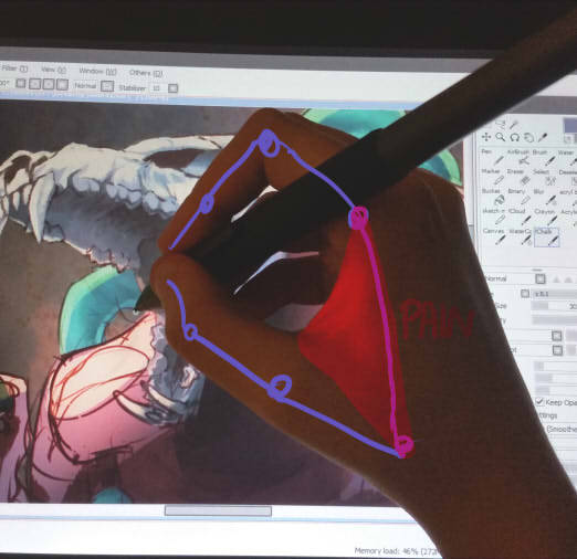
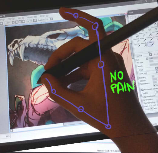
I discovered something useful today, taking breaks or exercising never helps me but THIS does, sharing to save a life
136K notes
·
View notes
Text
Why people like your doodles better than your finished works
Learn from your doodles rather than resent them
I frequently see artists complain that their finished works got less attention than mere sketches, doodles and other smaller or less serious work. Which is frustrating! But almost as often, I can see exactly why the doodle got more attention. I’m going to cover some of these reasons, so you can use that information so you can do more than fume about it.
The doodle is easy to read, the polished work is busy
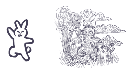
The polished work is completely drenched in little details that the artist slaved over, but the details create a kind of overall noise that makes everything harder to understand, making the whole image less appealing.
Don’t get too lost in little details, work from larger shapes to small details, use things like a highly readable silhouette, contrast, variance in line width or negative space to keep the image understandable. Pay attention to the composition to guide the eye where you want it.
The doodle is high contrast, the polished work is low contrast
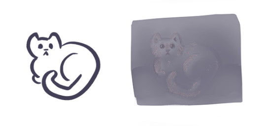
When you do lots of details all equally well lit and easy to see, overall you lose the strong lights and darks that make a work pop. You have to sacrifice some of those details, let them be in shadow or out of focus in the background, to create a more appealing image overall.
You might also be forgetting that without lineart you need to use strong lights and darks, since lineart creates it’s own natural high contrast.
Contrast draws the eye, use that to create focus where you want it.
The doodle is simple to understand, the polished work is highly ambiguous in meaning and message
Many doodles that outstrip the artist’s polished work are jokes. Jokes usually have a specific clear focus and message, the viewer can understand it immediately (if they couldn’t, it wouldn’t be funny). You don’t have to make everything funny, but like a joke, you need to get to the point and give the audience the information they need to “get it.” More details can be present, but the viewer should not be confused about what to look at from the outset. Remember: people will look at and interpret your art in milliseconds. They might give it a longer look but only AFTER that millisecond look.
The initial glance is like the first page of a book. If it wows them they keep looking to understand more, if they are lost and confused, no second chances, they’ve already scrolled away.
You can use things like composition, basic structures of shapes and simple shape symbolism to give viewers the initial information they need to stay interested. Don’t feel like you have to abandon more personal and difficult to parse symbolism, these things can work together to create intrigue.
The doodle is fluid and expressive, the polished work is stiff and dead

The sketch for your polished work needs to be done with spontaneity and fluidity. When you want to really flex your drawing skills and show the world your beautiful realistic human faces, your sublime anatomy, gorgeous textures - it’s easy to forget about the undersketch and jump to rendering as soon as you can, creating a stiff or boring sketch that isn’t worthy of all the time you’re sinking into the minute details.
Practice quick gestures, read up on line of action, and before you make a polished painting, make sure you have a sketch that’s fun to look at even without the detailed rendering. Thumbnailing helps. Studies too. Sometimes you have to do the bad boring sketch, but you can take a few stabs at it.
You can’t make a bad sketch good by painting more details on it, you need to work out the sketch first before moving to the details.
Remember, if you’re going to spend 20 hours painting the thing, you can afford another half hour sketching a few different takes on your idea before digging in.
Lots of doodles, very few polished works
If you mostly post one kind of thing, your audience will be people who like that. Also, you may not have much practice with the techniques you are using in the polished work, while you have become a pro at doodles. You become an expert at what you practice, do more of what you want to be known for, become an expert at it, make it the only thing your audience is there for.
The audience is familiar with the subject of the doodle, unfamiliar with the subject of the polished work
Many artists do doodles of fanart and get fed up that people like that more, but the truth is, they don’t like it “more” they just already know they like it. You can increase the chances of people appreciating your original works by making sure they can understand what’s going on in the illustration without prior knowledge of who these characters are, or simply sticking to it until you have garnered an audience. Just keep at it.
Remember, the creators of the property you made fanart of are themselves artists who were pushing an original idea at one time. You can follow in their footsteps.
The doodle is quirky and unusual, the polished work is stale and samey
This can happen when an artist has an image in their head of what a SERIOUS and PROFESSIONAL painting looks like, usually based on a very narrow subset of artwork, often itself based on the same cargo cult of seriousness.
Try studying works outside your usual stomping grounds. Look to artists that likely inspired your faves (if you’re talking about realistic artists who inspired your favorite concept artists, here’s some likely culprits to get you started on the google search: JC Leyendecker, Alphonse Mucha, Norman Rockwell, James Gurney, Rembrandt), look to artists outside your genre, and look at your doodles and ask yourself what “not serious, just for fun” source of inspiration is making them so fresh and vibrant that your audience is connecting to them so strongly. Study that, respect that fun and try to pull it into your serious work.
The polished work was hard to make and no one cares
Being an artist is hard, and that we keep at it is commendable, but struggling and taking more hours doesn’t make a piece better necessarily.
There are a few things to consider here. First, you need to realize looking to the vague faceless masses of the internet for a fatherly “I’m proud of you, son” moment is always going to be disappointing and painful and attempting to guilt strangers into fulfilling that role for you is awkward and inappropriate. You need artist friends who can recognize your hard work and cheer you on and you need to be your own cheerleader, value your own hard work and practice.
Second, you need to realize torturing yourself doesn’t in and of itself make art better. Hard work is something people love about art, the meaning of someone spending that time, but if I screamed for 8 hours, drew a single line, then posted that, the internet wouldn’t be wrong to be unexcited about it. Rather than blame the viewer, think about two things: how can you make the art itself more appealing while still doing the painting that you’re interested in doing, and how can you do that faster and with less pointless suffering?
It’s okay to be a masochist when it comes to art, many artists are, just make sure you’re spending your time and suffering wisely.
You’re complaining about someone else’s “doodle”
Sketches and cartoons are deceptively hard to make appealing, rather than fume that they are getting more attention, look to them for lessons. What could you learn from them? Could you do it? Maybe you should try. Would make a good exercise.
And never get mad that their drawings are more appealing to the internet than yours, even though they spent less time on their drawing than you did on yours. See above for why time is not important here, but also keep in mind they may have been practicing longer than you or may be more established than you.
Keep working on your art, keep posting, push to be seen, advertise your work, put yourself out there. These things take time but work.
35K notes
·
View notes
Text
free software alternatives
i never stop talking about some of these so i might as well banish them to a single post! you might know about a lot of them already, but feel free to look anyway
Adobe Animate (Flash) → OpenToonz, Synfig Studio, or Pencil2D
Adobe Audition → Audacity
Adobe Illustrator → Inkscape
Adobe Photoshop → GNU Image Manipulation Program or Paint.NET
Adobe Premiere Pro/After Effects → Fusion, Shotcut, OpenShot, Natron, or Blender
Autodesk Maya → Blender
Clip Studio Paint/Paint Tool SAI → Krita, FireAlpaca, (both also include animation tools!) or MediBang Paint
FL Studio → LMMS
Microsoft Office → LibreOffice or Calligra Suite
Scrivener → Celtx (sort of?) or Evernote
VLC media player → VLC media player lol
freeware can be a great opportunity to get a feel for something and learn a new skill. and in some cases, the free versions are almost as powerful, so you might find that you saved a lot of money but made work that was just about equal to what you might have done with paid software!
64K notes
·
View notes
Photo
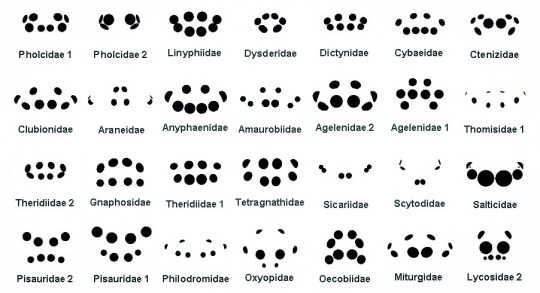
Identification by Spider eyes.
Source unknown.
6K notes
·
View notes
Text
“Don’t trace” originally started as a warning against tracing as art theft (as in, tracing someone else’s art without permission or credit is art theft) and then over the intervening years turned into “you can’t use references because it’s cheating” and I think that’s one of the worst cases of the telephone game I’ve ever personally experienced
you are allowed to trace as practice
you are allowed to trace your own work (for example photographs you took yourself or to keep architectural consistency)
you are allowed to trace things the original artist is encouraging you to trace
you SHOULD use references
you SHOULD be allowed to pick up other artists’ artistic tics you like (…as long as they’re not offensive, like blackfacing, but that’s a different kettle of fish)
you SHOULDN’T go around moralizing at other people about how they learn best because you can and will lose friends that way and you can and will hurt other artists’ development that way.
Also other than art theft there IS no such thing as cheating in art okay use sparkle pens and fan brushes to your heart’s content why is that even a thing I have to say (…and yes I’ve had conversations in the analog world about fan brushes as “cheating” I’m so tired of snotty artists who think you shouldn’t be allowed to use tools that make things easier because they can do it the hard way)
63K notes
·
View notes
Text
An artist : Aw man! I saw my arts were reposted on Instagram. I’ve asked them to take my arts down but they ignored me.
Me : Say no more! Click this link, then click ‘fill out this form’. Fill the form and wait for about 1-2 days, the staffs will remove the image you were reporting from the reposter’s account :^)
359K notes
·
View notes

