Text
Your Innermost Shadows- Unit 3 Commercial
youtube
1 note
·
View note
Text
Commercial Story Board
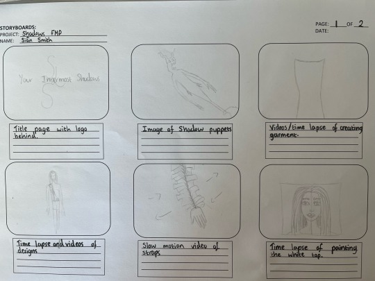
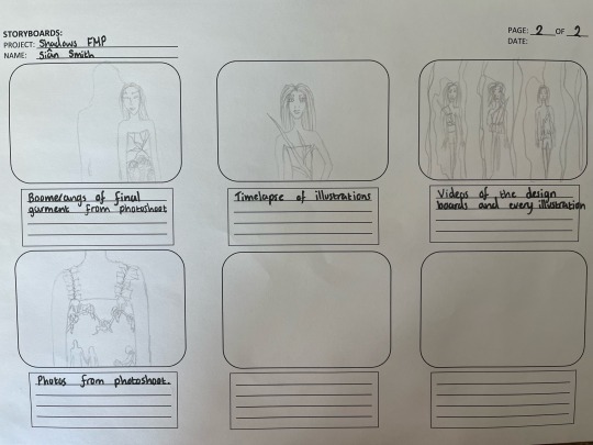
This is my commercial story board which will help me organise my commercial.
1 note
·
View note
Text
Press Release
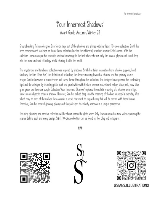
This is my press release about my customer and my collection line.
1 note
·
View note
Text
Action Plan
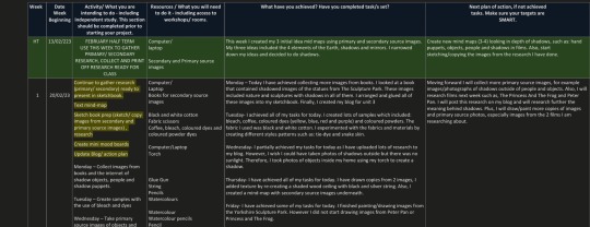

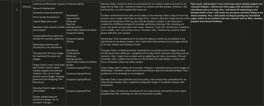
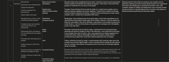
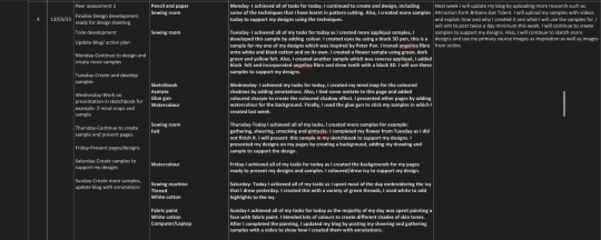
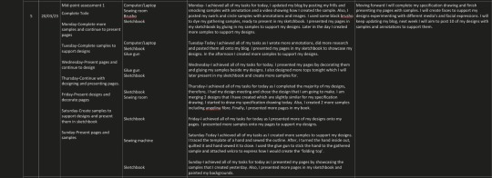

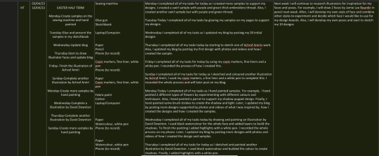
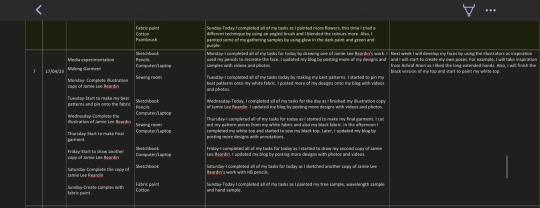

This is my action plan that I completed every day.
1 note
·
View note
Text
Self Assessment
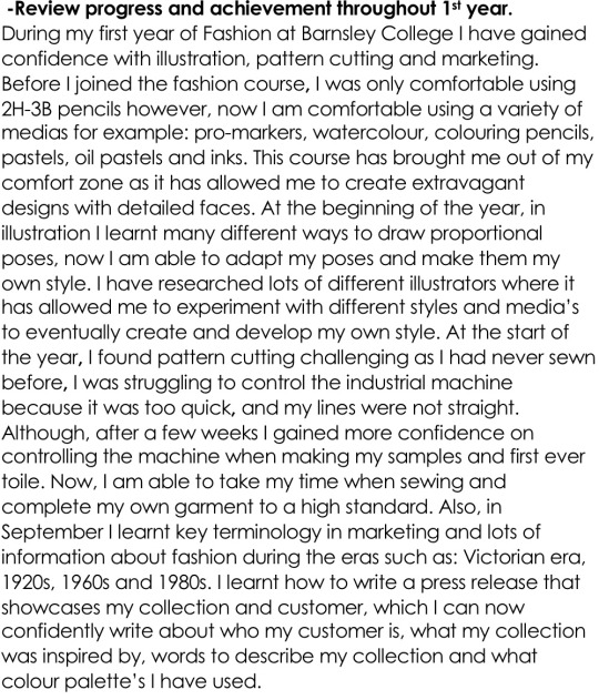
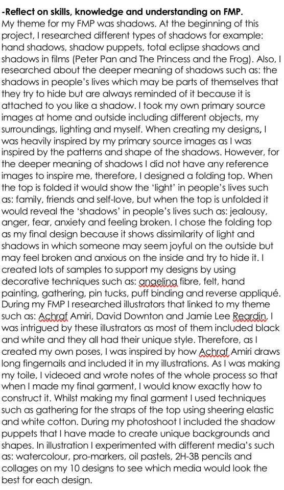
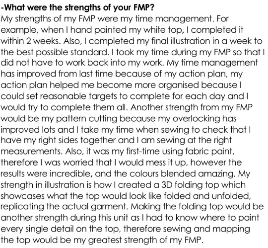
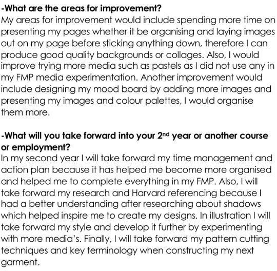
This is my self-assessment reflecting on my first year and my FMP.
1 note
·
View note
Text
Final Design Boards
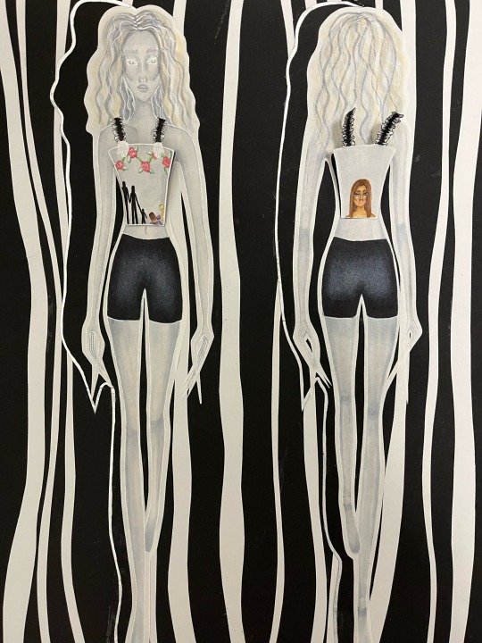
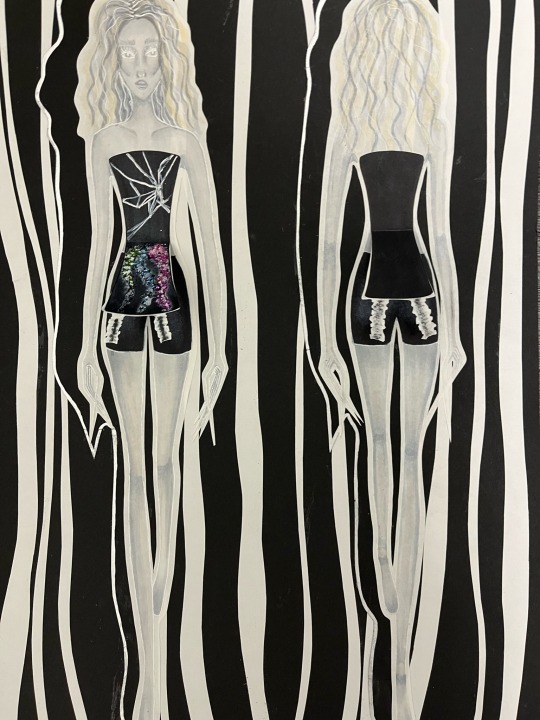
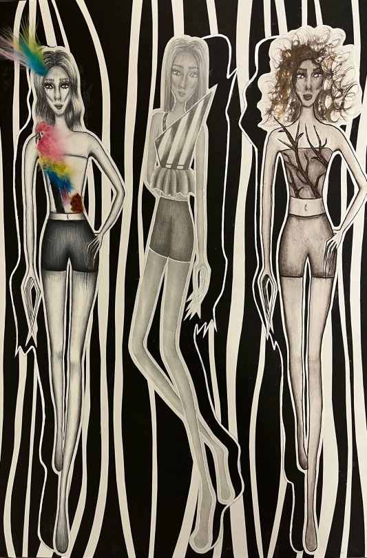
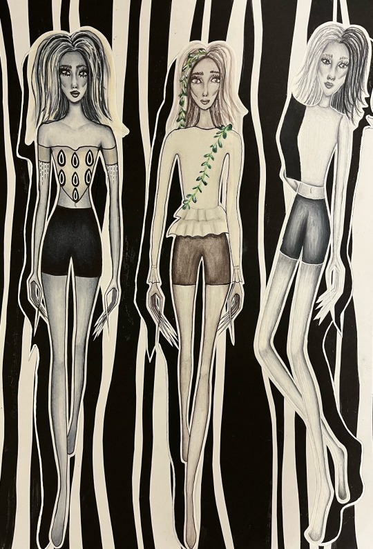
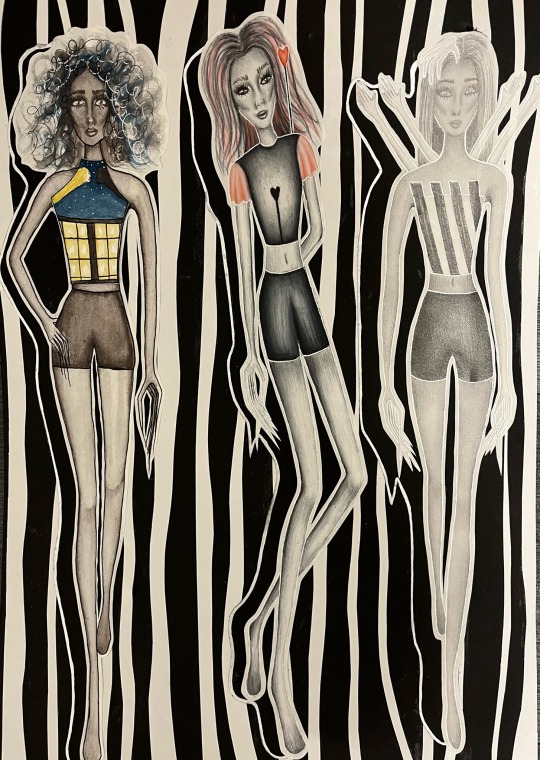
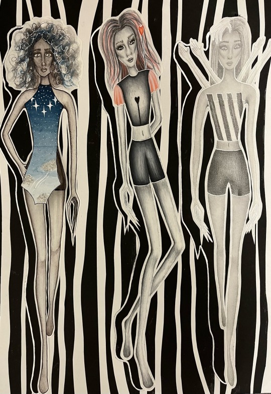
These are my final design boards which I created. I added the silver fine liner to the edge of the shadow. I really like this design board as it makes the illustrations stand out. Also, I like how the background shows a contrast of light and shadows.
1 note
·
View note
Text
Design Board Ideas
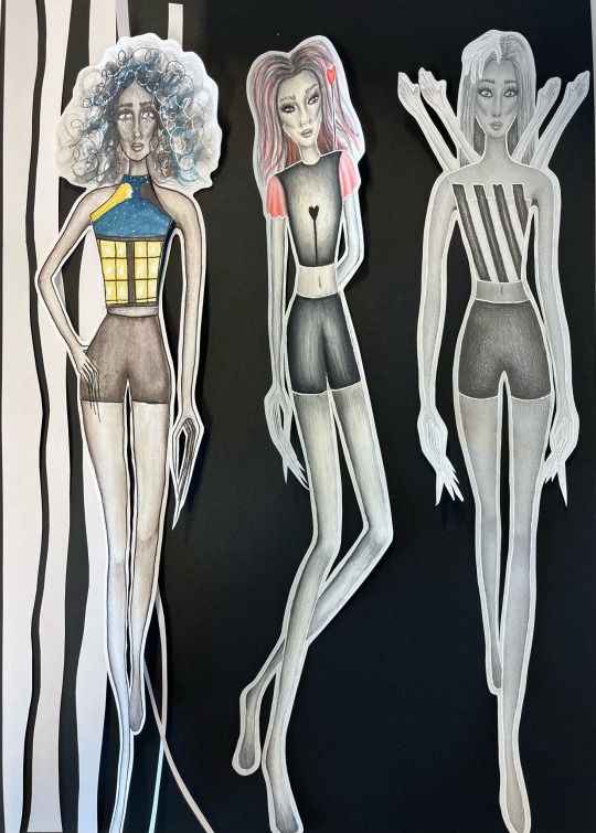
1. I created this design board by cutting strips white paper. I like this background as it shows the contrast of black and white and light and shadows.
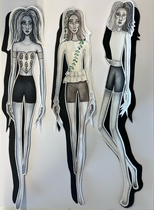
2. I created this design board by drawing the outline of the illustration on black card. After, I cut them out and placed them behind the illustrations so that it looks like a shadow. I really like this idea because makes the illustrations stand out, however I would like to add more to the background.
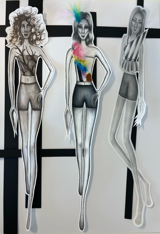
3. I created this design by cutting out black strips of card. I like this design board because it shows the contrast of black and white.
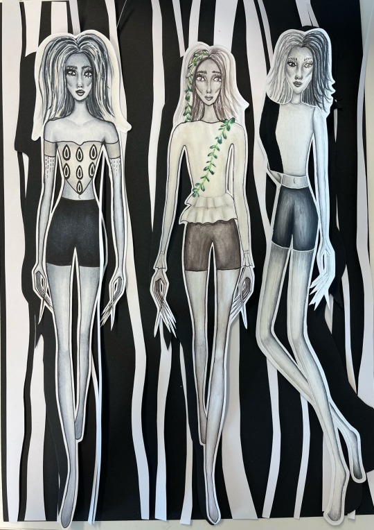
4. I combined the first and second design board ideas as I really liked them both. However, I would like the shadow to stand out more so I will add a sliver outline around the edge.
1 note
·
View note
Text
Method Of Construction Page
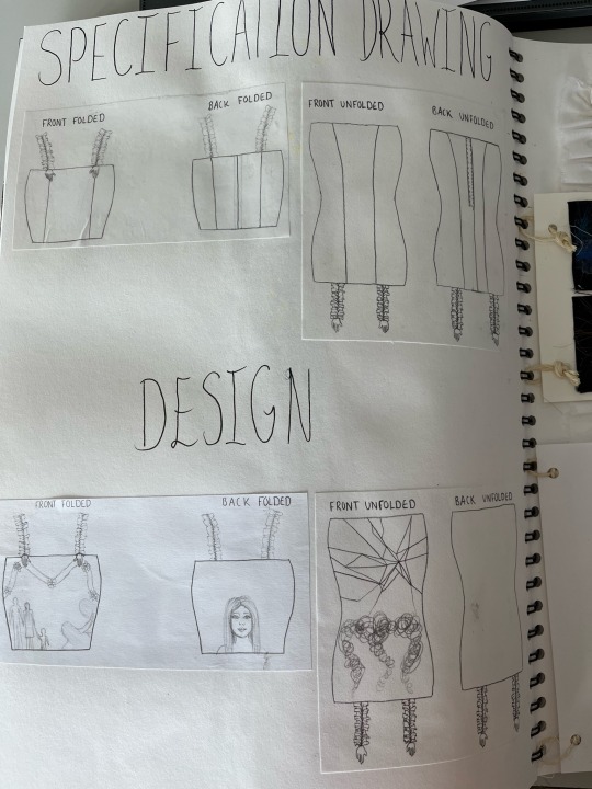
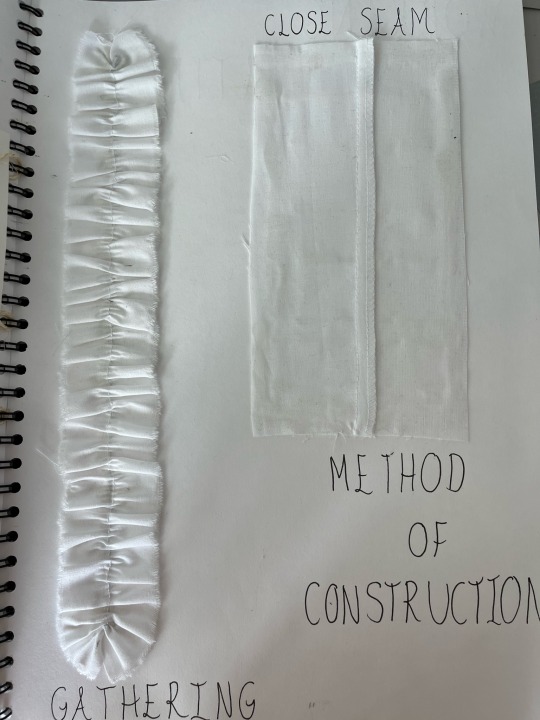
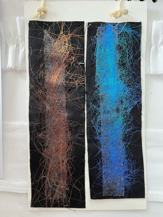
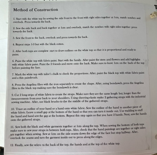
This page showcases the decorative techniques that I have used in my garment, my specification drawing and the design.
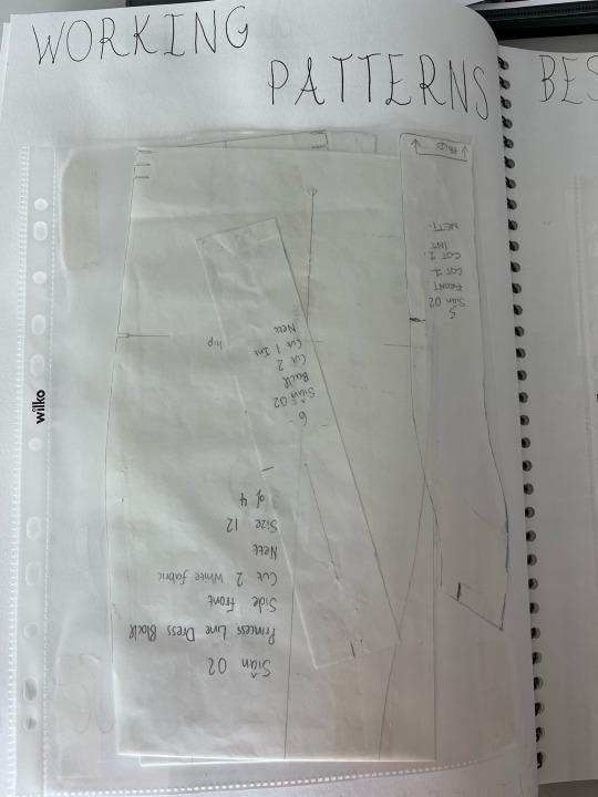
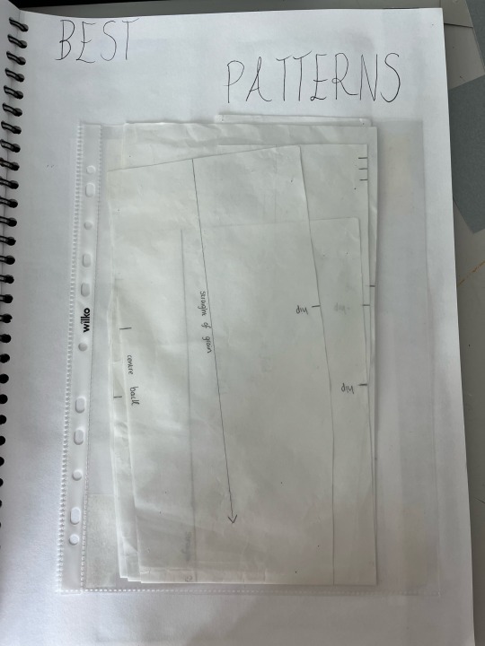
Best Patterns And Working Patterns
1 note
·
View note
Text
Final Design 10/10
I developed this design by making the neckline straight instead of a sweetheart neckline. I changed the straps by making them gathered. Also, I changed the colour of the roses to pink and red. I added more detail to these illustrations by using colouring pencils. This video also contains the back view of my final garment.
1 note
·
View note
Text
Final Design 9/10
I developed this design by adding more stripes to the top. Also, I used a 2H pencil for the hands and arms behind the model instead of a 2B pencil. I changed the hair because I wanted more volume and movement. I included a hand on her head to compliment the design. I fine lined this illustration with a white pen instead of a black fine liner.
1 note
·
View note
Text
Final Design 8/10
I developed this design by adding more shadows to the knees and legs. Also, I extended the tree branches to make them stand out and added black fine liner to add detail.
1 note
·
View note
Text
Final Design 7/10
I developed this design by using colouring pencils instead of copic markers. I prefer the blend of the colouring pencils for the top than my media experimentation illustration because the spotlight is more visible. I changed the hair but kept the colouring scheme as I like the streaks of pink.
1 note
·
View note
Text
Final Design 6/10
I developed this design by adding more shadows and definition to the knees, legs and arms. Also, I changed the design of the top by making the back of the design the front. I prefer this design compared to my media experimentation as it shows the patterns the shadows created on my wall. Finally, I fine lined the illustration in black instead of white.
1 note
·
View note
Text
Final Design 5/10
I developed this design by using black and white pencil crayon instead of black and white oil pastels. I think using the black and beige colouring pencils created a better result as the face looks more detailed. Also, I extended the shadow of the top by making it larger.
1 note
·
View note
Text
Final Design 4/10
I developed this design by adding more volume to the peplum. I added more highlights by using my white pen. Finally, I fine lined the illustration with a white pen.
1 note
·
View note


