shannonwantstohugyoutwo
49 posts
Find the blog for my College work here - http://shannonwantstohugyou.tumblr.com/
Don't wanna be here? Send us removal request.
Photo


0 notes
Text

I decided to draw me and my friends as the kids from IT. I messed around with different patterns and im super happy with how it came out. i may come back to it and add shading, but im okay with how it looks at the moment.
0 notes
Text


two of the same piece but just with different coloured backgrounds. I did this so i could use it as a discord profile picture and it would blend into the background.
3 notes
·
View notes
Photo

this is an emote i made for a discord server that im in
1 note
·
View note
Photo

i then drew my friend sora as an anime boy, as he requested to be drawn
0 notes
Text

i then attempted to draw myself as a cute catgirl, however im not sure on this piece
1 note
·
View note
Text

I drew my friend Sketchy as a cute catgirl
2 notes
·
View notes
Text

I drew my friend Q as a cute anime boyo *.*
1 note
·
View note
Text


I decided to draw my friend Potts as a cute animu boyo <3
0 notes
Text
Celestia Production Log

For the background I decided to use a dark blue and then use a bright purple with 50% opacity to create a gradient. I could have used the gradient tool however I wanted to try and create it myself.

I then did the base drawing of the character I wanted to draw. I based it off of the planning I did in my sketch book and I’m happy with the general shape.

I then created the dress layer, colouring it a blue-purple colour. I thought this colour would look best with the constellations, as it sort of looks like a night sky.

I then drew her arms and neck, and used a masking tool to make it so when I used a large dark pink brush, the colour would only be on the skin, and wouldn’t go onto the background. This saved the time of having to erase it from where I didn’t want it.

I then coloured her eye in light grey and gave her green eyes and coloured her lips in a light red. I chose these colours as they seemed most fitting and I was basing her off of the Ladycat I created previously.

I then coloured her hair blue, adding light blue highlights to show how her hair was styled and to add a lighting effect. I like how I styled it, as she looks almost dreamy, with how her hair looks to be swooshing to the side like she just turned her hair. I may use this style of hair again in the future, as it looks very good and I like the effect it gives to the piece.

I then added the stars to her dress, in places that I wanted to have the main constellations near. I planned out where each constellation would go and then placed them.

I then placed the constellations, basing them on the planning I did in my sketch book. I like how this turned out. I added multiple effects to make them glow and stand out. The effects I used were bevel and emboss, inner glow satin, pattern overlay and outer glow.

I then added stars to her hair, as it seemed to be too plain. I really like the effect this gave to her and will probably use this in the future as it was very simple and easy to do but looks very complicated and gives a nice finish to this piece of the concept. I added the same effects I used with the constellations as these are also meant to be stars in her hair.

For the final touch, I decided to add star sleeves to her dress as her arms looked very plain. I love how this looks, as it has a very geometric look to it as it is triangles and squares. I may use this design in the future, as it looks very celestial, which is the look I was aiming for.
0 notes
Text
Halloween Production Log
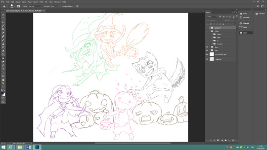
To start off, I drew rough sketches of the image I wanted to create. I used different colours for each character so I could easily determine who was which person. This is actually my second rough draw, as the first one was shapes and general placements of the characters so I could get the shape of them much easier.

I then started the line art for the characters. I drew the pumpkin head character first, as I feel as though he is the main focus of the image and I cannot draw the werewolf character without having the correct placement of his head.

I then drew the werewolf, making sure that the axe looked like it was going into the pumpkin man’s pumpkin. I am happy with how these two look so far.

I then drew the vampire character. Originally, I was going to do a simple straight bottomed cape, however decided to try and make it look like bat wings. I also made the fangs bigger as originally they were too small and couldn’t be seen from far away. I like how this character turned out too.
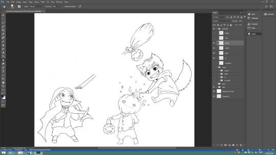
I drew the broom next, but left gaps for where the characters would go. I can always extend or erase the lines if I need to. I struggled with drawing the broom end and looked up some reference images. I am happy with how this turned out, even though it took a bit longer to draw because I needed to look for a reference.

I drew the cat before I drew the witch, so I could draw the back character in more detail. I overdrew the stripes on his arms and then erased the over drawn part, as this way they looked more uniform and natural. Because of the stripes, I didn’t want to add too much detail to the rest of his character or it would look too messy.
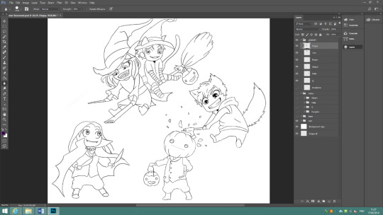
I when drawing the witch I changed the direction her eyes were going a couple of times, as I wanted her to be looking at the vampire girl but the positioning was awkward. I like how it turned out in the end though.

The pumpkins were relatively easy to draw considering I’ve drawn many pumpkins for other projects. I made them look like the typical pumpkins you usually see on Halloween.

I used a mid-toned orange for the pumpkins, and decided that the fake pumpkins that the characters are carrying would also be orange. I made the stems a bright green colour that I personally think stands out against the orange which I really like. I made the eyes and mouth of the pumpkin yellow so it looks like there is a light inside them.
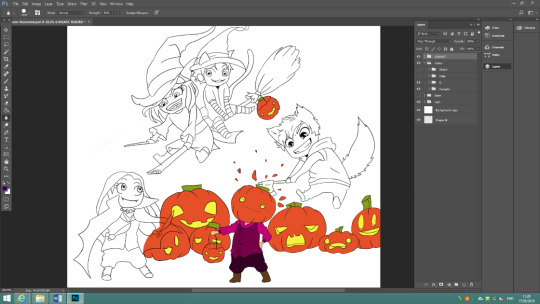
I decided to make the pumpkin character pink as in the rough drawing I did his outline in pink. I feel as though it just suits the character, so I made all his clothes some shade of pink. I chose brown for the boots as I wanted to give the impression that they’re leather.

For the werewolf, I decided on making his hair and tail brown and made his jumper red. I like how bright the red looks with the dark hair and I am happy with this choice. I made his trousers grey, as I didn’t want to use a bright colour that would take away from the red jumper. I chose a dark brown, almost black, for the boots to make them look like dark leather.
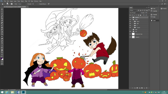
I made the vampire main colours purple and black as on the rough sketch I made her purple. I made sure the colours weren’t the same as the pumpkin man’s colours as I didn’t want them to look too similar. I decided on making her boots brown too, as I feel as though purple boots would be too much of the same colour.
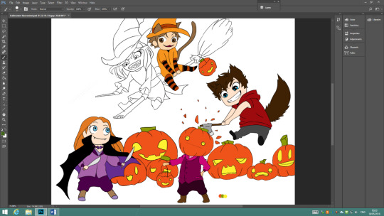
For the cat, I decided on making his colour theme orange. Although there is a lot of orange on the image already, I don’t think this really matters considering it’s a Halloween themed concept. I like how it looks and think the red and black tights and sleeves look good against the bright orange clothes. I chose a light brown or dirty blonde hair colour, as it seemed to fit best with the characters design. I also made his fangs bigger, as before they were too small.

For the witch, I made her colour theme green and black. I like how this turned out, and think that the colours suit a witch well. I chose blonde hair as I feel it goes well with the dark outfit. I also chose green eyes to match her clothes. I decided on changing some of the other characters clothes, this being the pumpkin man’s sleeves and trousers and the vampire’s trousers. I felt they were too pink and purple and I am much happier with how they look now. I also changed the size of the vampires arm, as it is too large in the original.
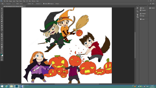
For the broom, choosing colours was easy as I wanted to portray the typical witch’s broom. The straw ends are typically yellow, or a dark yellow and the broom stick is usually a dark brown. I feel as though I chose the colours well, as it does look like a broom. This was one of the easiest pieces of the image as the colours are so simple.
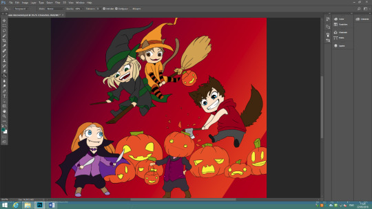
For the background I originally wanted to draw coloured lines and then blend them, however I am not very familiar with the blending tool, and so I decided to use the gradient tool. I altered the placing a couple of times in order to get the gradient I wanted and I’m happy with how it turned out.

I then started working on the background, deciding to do it in layers. I drew the outline for some hills and then coloured it a dark red. I like how this contrasts with the different colours in the gradient, and really makes it stand out.
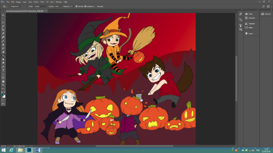
I drew the silhouette of trees and houses in front of the mountains layer to give a better feel of where the image is based. I like the effect this gives to the overall image.
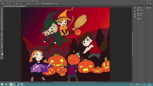
I decided to add a darker layer in front of the previous one, to yet again give it more dimension. I’m really happy with the overall look of the background, and like how it makes the characters stand out.
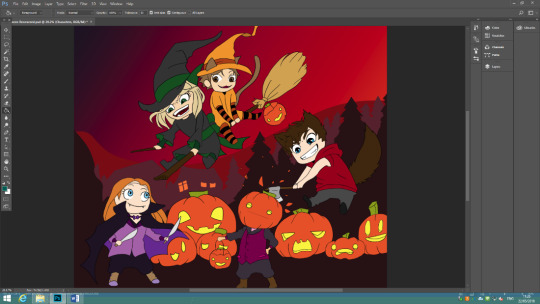
I decided to add orange windows to the house at the back, as the background looked slightly too flat. I think this really finishes of the silhouettes well.

I decided to add stars to the sky, as it looked very plain. I think this does improve it, however there still seems to be a lot of space on the right and left of the image.

I decided to draw ghosts on the right and left, and a smaller one in the middle underneath the witch. I feel as though this really pulls the whole image together and I’m very happy with how it looks. I added a glow to the ghosts as an afterthought, to stop from making them too plain and to make them stand out slightly.
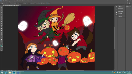
I then started with shading. At first I was going to do all the shading in a mid-grey and then change the opacity, however when I did this it didn’t look very good, so I decided to use darker shades of the base colours. I like how this looks and will continue to do this throughout the shading process.

For the pumpkins, I decided to use a burgundy colour, as this looked better than another shade of orange. I may change the opacity in the future as I think it looks too dark and harsh against the orange but if I do, the opacity change will only be by 25%.

I then did the shading for the pumpkin man. I used a darker grey for the trousers and a dark purple for the shirt. I also used a dark brown for the boots. This character was relatively easy to shade as I had already shaded his head when I was shading the pumpkins.
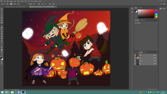
I then did the shading on the werewolf character. I did the shading as normal on the trousers, hair and face, but for the jumper I also added a thin line of shade where the seam of the jumper would have been. I also added a seam on the trousers, and decided that I was going to add a seam to the pumpkin man’s trousers too. I like how this looks and will use this in the future when I draw pieces. It adds extra detail and is very easy to do.
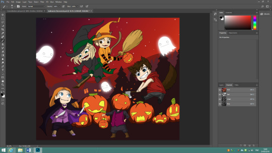
I then shaded the broom. I used a darker yellow for the end of the broom, and then used a light brown for the rest of the broom as the base colour was very dark already. I like how this looks and I’m happy with what this looks like.
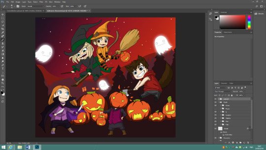
I then shaded the cat boy. When I was shading, I used a dark brown for the suit and the leggings. I also coloured the hair, ears and tail with a dark brown. I then set this whole layer to 50% opacity as I felt like it was too dark. I also used a light grey to add highlights to the leggings instead of using a dark colour, as the stripes were already black. I also decided that the hat was too large and made it smaller. This was a small inconvenience and I’m happy with how it looks now.
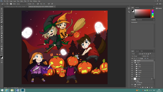
I then shaded the witch, which was the same process as the others.
Overall I’m very happy with how this piece turned out. I like how I shaded each part and how I layered the background. I’m really happy with the gradient in the sky too. This is one of my favourite concept pieces so far as I usually struggle with shading and I feel as though I executed it well.
0 notes
Photo


This is all the final pieces of my work. In this gallery, some of the taller pieces have been cut off, however this doesn't matter as on my Wix website and down below you can find them in full
0 notes
Text
Evaluation
For my Final Extended Project, I decided to do concept art. I chose concept art as I am most familiar with it, and I wish to go into this side of the industry of Games Design. I created multiple pieces of concept which I wish to include in a visual novel game in the future.
My product does not have a specific genre as it is just concept, however if I was to choose a specific one, then it would be horror as I have drawn creepy versions of the characters that I created. The colours of the non-creepy drawings are very light however, so maybe a dark fantasy would be better fitting as a genre. By looking at audience psychographics, now the concept if finalized, I can say that my target audience hasn’t changed much, however it will not appeal to the explorers anymore, as there is no plot to my concept. My product will appeal to mainly aspirers, as my work is solely concept and the aspirers seek status and are materialistic, acquisitive, orientated to image and appearance, persona and fashion. Attractive packaging is more important than the contents which is the perfect audience for my concept. This group is also typically younger people, which is good as my concept is targeted to people over the age of 16 and young adults.


In my proposal I stated that the main focus was going to be concept art for environments and character design, but also mentioned that I would include it into a game. I did not include my concept into a game, as when trying to plan the time out, my focus would have been on the concept rather than the programming of a game. I also stated that I was going to create a plot and models for my concept, however I didn’t have enough time to do everything that I had planned to. Concept and work wise, I was up to date when creating until the sixth week in which I continued the pre-production alongside my concept, as it was the production logs of the concept I was creating and needed constant updating. I did continue to update my blog and Wix website every week, which is what I said I would be doing on my time planner.
The final concept is up to my expectations. I love the way all of them turned out, and I am really happy with everything. I like how all the lines are crisp and clean for the character drawings and I’m happy with the colours I used in all of them. I changed my concept for the better by using my peers’ feedback, this helped me see where I was commonly making mistakes and where I was doing things right. For the latest pieces of my concept, there was nothing to improve upon as I had learnt from all the advice given to me and managed to spot the errors while creating them.
There were many issues that I faced throughout the overall process, however I managed to overcome them all, one way or another. One of the first problems I faces was lack of availability of software at home. This made it so I could only do digital concept at college and because of this a large portion of my time was used doing paperwork. I overcame this problem by managing to get access to Photoshop on my home computer. This made the production of concept art flow much quicker, as I was able to finalize any work at home that I didn’t get to finish at college, and vice versa. Another problem I had was saving images as PDF’s, which made it so I couldn’t edit the layers of the work if I needed to, which was a huge stall on my work. I managed to locate all the original files that were Photoshop documents and put them into the same folder, as well as copying the folder so there was two versions. This made accessing them much easier as they were the correct file format and they were organised.


Another problem I ran into that was a constant issue, is the quality of college computers. One of the rooms I work in has very slow computers which made updating my Wix website impossible as it took too long to arrange different text boxes. Thankfully, the computers in the other room I work in are better and I can update and edit my Wix better. I can also do this at home, so this isn’t a major problem. Another problem that I had was the lack of space left on the computers in both rooms. I was attempting to record myself drawing so I could use it as a production log, however only parts recorded as the file was too large. I overcame this by recording to my USB, or recording to the data drive. This made it so I could record one video in full, without any parts skipping and therefore could quickly edit them and upload them to YouTube. The lack of feedback was also a problem, as for a while I couldn’t get my peers to review my work which made it so I had very little primary research. I also didn’t get feedback on my work from my tutors for a while, however when I asked them to mark a specific part they did give me feedback. I also asked the internet for feedback, and got lots of responses, which made for some good primary research. One of the final problems I had was drawing tablets not working on any of the computers in one of the rooms as they did not have the correct drivers installed and in the other room only two computers worked with a drawing tablet. Because of this, I bought my own drawing tablet so I could work on them from home. This will also benefit me in the future as I now have a drawing tablet that I can access whenever I want to.


When asking for feedback, I created surveys and asked my family and friends to fill it out. I got about twenty responses by doing this, which made for good research. I also asked various people in class constantly for feedback when I had created a new piece of work. This made it so I could get various pieces of feedback to work upon for all my pieces.
There was the opportunity to work with others, however I decided to work on concept on my own. If I was given more time, now that the concept is done, I would work with others to create a fully working game, as that is what I originally wanted to do but couldn’t.
In the final product, some of the main strengths are how well the colours complement each other, as none of them clash and therefore make for a good piece of concept. The process of picking colours was very long, as I experimented with different combinations, but it made it possible to gather a combination of colours that worked well with one another. Another strength is the crispness of the lines in my work and how professionally made they look. This makes the pieces look clean and stops any unnecessary lines from being in the final product. One of the only things that I would say I had to improve on is the shading quality of some of my work. I need to practice shading in the future, as to get a better understanding on how it should look. I feel as though the development of my shading capabilities is clear by looking at the first pieces I created and then comparing them to the latest pieces. I am slightly more confident in my shading abilities, but as stated earlier, I wish to improve on them more.
0 notes


